10,000 search results
(0.078 seconds)
- Yasmine by Arabetics,
$39.00 The Yasmine type family follows the guidelines of the Mutamathil Taqlidi type style. It has one glyph for every basic Arabic Unicode character or letter and one additional, final-position, glyph for each Arabic letter that is normally connected with other letters from both sides in traditional cursive Arabic strings. Yasmine employs four fixed x-height values, two above and two below the x-axis. Values are high to give a slight vertical overall look. Its design uses full curves with equally distributed weight. Yasmine family includes all required Lam-Alif ligatures and uses ligature substitutions, and marks positioning but it does not use any other glyph substitutions or forming. Text strings composed using types of this family are non-cursive with stand-alone isolated glyphs. It employs our “natural Arabic input” method where first glyph is displayed in its non-isolated form. Tatweel (or Kashida) glyph is a zero width space. Keying it before any glyph will display that glyph isolated form. Keying it before Alif Lam Lam Ha will display the Allah ligature. Yasmine family includes both Arabic and Arabic-Indic numerals, all required diacritic marks, Allah ligature, in addition to all standard English keyboard punctuations and major currency symbols. The fonts in this family support the following scripts: Arabic, Persian, Urdu, Pashtu, Kurdish, Baluchi, Kashmiri, Kazakh, Sindhi, Uyghur, Turkic, and all extended Arabic scripts.
 - Amudi by Arabetics,
$39.00 The Amudi type family follows the guidelines of the Mutamathil Taqlidi type style. It has one glyph for every basic Arabic Unicode character or letter and one additional, final-position, glyph for each Arabic letter that is normally connected with other letters from both sides in traditional cursive Arabic strings. Amudi employs four fixed x-height values, two above and two below the x-axis.. Values are high to give a slight vertical overall look. Amudi family includes all required Lam-Alif ligatures and uses ligature substitutions, and marks positioning but it does not use any other glyph substitutions or forming. Text strings composed using types of this family are non-cursive with stand-alone isolated glyphs. It employs our “natural Arabic input” method where first glyph is displayed in its non-isolated form. Tatweel (or Kashida) glyph is a zero width space. Keying it before any glyph will display that glyph isolated form. Keying it before Alif Lam Lam Ha will display the Allah ligature. it Amudi family includes both Arabic and Arabic-Indic numerals, all required diacritic marks, Allah ligature, in addition to all standard English keyboard punctuations and major currency symbols. The fonts in this family support the following scripts: Arabic, Persian, Urdu, Pashtu, Kurdish, Baluchi, Kashmiri, Kazakh, Sindhi, Uyghur, Turkic, and all extended Arabic scripts.
 - Beach Sunshine by Mozatype,
$13.00 Beach Sunshine – Clean Version is a fresh and sweet handwritten font. A little bit quirky, this font looks incredibly adept on a wide variety of contexts. Fall in love with its incredibly versatile style and use it to create spectacular designs! This font is ideal for crafting, branding and decorate your any project. This fonts are perfect for wedding invitations or your blog. Also with their help, you can create a logo or beautiful frame for your home. Or just use for your business, book covers, stationery, marketing, magazines and more. Fall in love with its incredibly versatile style and use it to create spectacular designs! Use this font for any crafting project that requires a personalized look! What’s Included : – Works on PC & Mac – Easy to use ( Installations ) – Easy Convert to webfonts – Compatibility Windows, Apple, Linux, Cricut, Silhouette and Other cutting machines Thanks for downloading, and I hope you enjoy it!
 - Summer View by Yoga Letter,
$16.00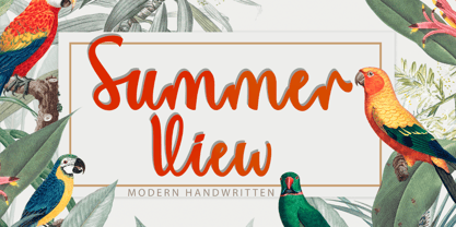 "Summer View" is a beautiful and elegant handwritten font. This font is equipped with uppercase, lowercase, numerals, punctuation, swashes, titlings, alternates, ligatures, and multilingual support. It is very suitable for weddings, engagements, Christmas, Valentine's, winter, autumn, summer, and others.
 - Lonewarc by Forberas Club,
$16.00 Introducing Lonewarc by forberas, This font born to be a Halloween Project. But still can be made as a display font, and still suit your other fun project. Your review and response are most welcome.
 - Bellamy Signature by Stringlabs Creative Studio,
$29.00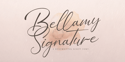 Bellamy Signature is an incredibly distinct, delicate and timeless handwritten font. It looks stunning on wedding invitations, thank you cards, quotes, greeting cards, logos, business cards and every other design which needs a handwritten touch.
 - Another Wonder by Seemly Fonts,
$12.00 Another Wonder is a sweet and simple handwritten font. This font is ideal for stationery, logos, t-shirts, papers, print designs, website headers, picture frames, flyers, album covers, posters, image sliders, and many other things.
 - Vallenia by Arttype7,
$6.00 Vallenia comes with 2 Weights: Vallenia Regular and Vallenia love. Vallenia is perfect for your work with love style. It's very suitable for t-shirts, the web, love greeting cards, weddings, and many other projects.
 - Carmitta by IbeyDesign,
$18.00 Carmitta Modern Calligraphy font is a sweet and delicate handwritten font. Dainty and joyful, this font will be ideal for writing wedding invitations, cards or any other design that may need a romantic, personalized touch.
 - Yogyakarta by Letterafandi Studio,
$10.00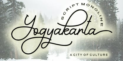 Yogyakarta is a handwritten script font, with an elegant and beautiful look. It looks stunning on invitations, thank you cards, quotes, greeting cards, logos, business cards and every other design which needs a handwritten touch.
 - Bosca by Larin Type Co,
$16.00 Bosca this is an elegant serif font family which includes 4 weights. It is multi-purpose and can be used for a variety of tasks. It can look either conservative and restrained or modern and elegant thanks to ligatures and alternative substitutes, they will add variety to your project and make it more attractive and give many options for creating your design. Heavier weights are great for headlines, logos, and other important things. light will look elegant and more discharged. The regular weight is perfect for text tasks, it has a balanced dynamics and is easy to read. This font is easy to use has OpenType features, and all characters in this font have PUA encoding.
 - Kinesta by Letterhend,
$18.00 Kinesta Sans is a variable sans serif font with with 7 weights. You can play around to match your project, whether for a standout headline, or for a tagline, you name it. Perfect to be applied to the other various formal forms such as invitations, labels, logos, magazines, books, greeting / wedding cards, packaging, fashion, make up, stationery, novels, labels or any type of advertising purpose. Features : Uppercase & lowercase Numbers and punctuation Alternates & Ligatures Multilingual PUA encoded
 - Marker O Type by O Type Foundry,
$15.00 Introducing, Marker O Type. Marker O Type is new signature font like a child's handwriting. The unique typeface brush also feels childish look similar like comic sans. Great for body text in comic book. A unique brush typeface with chill out. This font is perfectly made to be applied mainly in logos and various other formal forms such as invitations, labels, magazines, books, greeting / wedding cards, packaging, fashion, make up, stationery, novels, labels or any type of advertising purpose.
 - Monkeytails by Wiescher Design,
$39.50 I don't know what other typedesigners call those long swirling embellishment, but I call them "Monkeytails". So when I decided on this version of my good old Royal Bavarian, I decided to call the new font "Monkeytails". I just fell in love with this name. Monkeytails and Royal Bavarian should be used together, in order not to have too many embellishments. That's why I offer the two together for a good price. Your swinging typedesigner Gert Wiescher
 - Altrincham by URW Type Foundry,
$39.99 Back when shop window decoration was done with a brush, every window designer had his own style. In this vein the sans serif Altrincham was created. But even as a text font, it has stood the test of time, since it is very easy to read even in smaller point sizes, thanks to its relatively large x-height. With the Altrincham Condensed and Altrincham Wide Bold two other fonts have been created to perfectly complement the font family.
 - Venice Revolution by RM&WD,
$30.00 This font take inspiration by the Venetian famous typographers in 1500s. Is a font designed to perform better when used in high dimension like Headline in Ad, Titles in Magazines or Blogs, Logos, Naming, Packaging... Is easy to have great result using contextual & stilistic alternatives, ligatures and other SS alternatives, as show in the posters. Is highly raccomended graphic applications with OpenType tab, such Adobe Illustrator or Photoshop or Quark Xpress InDesign, for the use of OpenType Features.
 - Message by Wire JNL by Jeff Levine,
$29.00 A Western Union telegram from 1951 provided the typographic inspiration for Message by Wire JNL, which is available in both regular and oblique versions. Unlike other available type fonts which emulate the ink ribbon-struck printed characters from the teletype machines, this version was redrawn to celebrate the actual type design itself. The typeface letter spacing has been equalized so that when in use, it looks much like the printed output of an old telegram messsage.
 - Glory Migella by Syafbe,
$18.00 The Glory Migella typeface is a unique serif/look font combination. Modern embellishments combine with classic fashion lowercase to make a very memorable pair. Perfect for that modern classy vibe. Very suitable for use for logos, magazines, etc. The Glory Migella typeface is a combination of serif typefaces/unique appearance. Modern embellishments combine with classic fashion lowercase to make a very memorable pair. Perfect for that modern classy vibe. Very suitable for use for logos, magazines, and others
 - Myoungwon by Designsuh,
$12.00 Font 'myoungwon' is a 'colorfont' that contains a color(Gradient) other than the existing one of a single color font. You can use it on Photoshop(since CC 2017), illustrator(since CC 2018), InDesign(since cc 2019), QuarkXpress(since 2018), Pixelmator(since macOS 10.14 Mojave), Sketch(since macOS 10.14 Mojave), Affinity Designer(since macOS 10.14 Mojave), Paint.NET(windows only), Microsoft edge(since 38 on windows 10), Safari(since 12, macOS 10.14 & iOS 12), Firefox(since 26), and so on.
 - The Kaluge by Alcode,
$23.00 The Kaluge is a stylish and unique font that will bring a unique style and a trendy look to your designs. Comes with Serif Decorative and Women Abstract Illustrations with trending ligatures and special character, this will make The Kaluga and Women Abstract Illustrations usable in all design projects and work perfectly to pair with any other font. With a unique styles you can create design such as wedding media, book covers, greeting cards, logos, branding, business cards and certificates, even for any design work that requires a classic, formal or luxurious look. Try The Kaluge, Enjoy the richness of OpenType features and let her fun and elegant excitement make you happy and enhance your creativity! You can use this font very easily. • Multilingual Support If you do not have programs that support OpenType features like Adobe Illustrator and CorelDraw X Versions, you can access all alternative flying machines using Font Book (Mac) or Character Map (Windows)
 - Ardalista by Mercurial,
$17.00 Ardalista is lovely script calligraphy made with a touch of sweet, lovely and charming attraction that adds to the impression of a beautiful and elegant. a charming typeface and So beautiful on invitation like greeting cards, sublimation, wedding invitation, branding materials, business cards, quotes, posters, headings, signature, logos, t-shirt, letterhead, signage, lable, news, posters, badges and more What is interesting? Imagine you get a beautiful and very charming font in the design you make. that would be the answer you wanted right now. Ardalista has a script typeface and extra letters that allows you to be more free in designing. What's new? Hey..look at this. besides you get a font with over 150 alternates, ligatures and swashes. let's imagine what you can do with all that. yeah that's awesome. For those with Opentype capable software ( Photoshop CC or any version of Illustrator/ Indesign), Ardalista also comes with Opentype features such as access to all the alternate letters and double letter ligatures. And this Font has given PUA unicode (specially coded fonts). so that all the alternate characters can easily be accessed in full by a craftsman or designer. Don't forget to check out other cool fonts on our store and wait for new fonts. Follow our shop for upcoming updates including additional glyphs and language support. feel free to send me a message, comment, like and share.
 - Redfighter by Ditatype,
$29.00 Redfighter is an attention-grabbing display font with a games theme, featuring large letters and a rectangular shape with sharp corners. This font shows large letters that demand attention and make a statement. The generous size of each character ensures maximum visibility and impactful design elements. This design choice allows this font to stand out and grab the viewer's attention with its imposing presence. The rectangular shape with sharp corners in Redfighter adds a sense of structure and strength to the font. The clean lines and defined angles create a visually bold and striking appearance. This unique feature evokes a sense of power and precision, reflecting the intensity and competitiveness found in the gaming world. For the best legibility you can use it in the bigger text. Enjoy the available features here. Features: Stylistic Sets Multilingual Supports PUA Encoded Numerals and Punctuations Redfighter fits in headlines, logos, posters, titles, branding materials, print media, editorial layouts, website headers, and any other projects that aim to create a strong visual impact. Find out more ways to use this font by taking a look at the font preview. Thanks for purchasing our fonts. Hopefully, you have a great time using our font. Feel free to contact us anytime for further information or when you have trouble with the font. Thanks a lot and happy designing.
 - Sancoale Softened by insigne,
$22.00 Sancoale Softened is the new rounded companion to Sancoale. While the original Sancoale is crisp and defined, its delicate forms also lend themselves well to a lighter, more rounded version. The stems of Sancoale Softened are blunted, and its corners have been carefully rounded, avoiding the “sausage” look seen with some rounded fonts. This blend of definition and delicacy makes the Sancoale Superfamily versatile and appropriate for a variety of applications. The design minimizes the characters to their essence, leaving a default set of simple characters without notches or spurs. However, the typeface family’s slightly technological feel still appears friendly and approachable to the reader. It’s slightly condensed proportions and tall x-height also make the design readable at a wide range of sizes, which works especially well for web pages. These softer letterforms give Softened its unique, futuristic look--great for distinguishing your text or display. There are six weights with true italics. All insigne fonts are fully loaded with OpenType features. Sancoale Softened is also equipped for complex professional typography, including alternates with stems, small caps and plenty of alts, including “normalized” capitals and lowercase letters. The face includes a number of numeral sets, including fractions, old-style and lining figures with superiors and inferiors. OpenType capable applications such as Quark or the Adobe suite can take full advantage of automatically replacing ligatures and alternates. You can find these features demonstrated in the .pdf brochure. The Sancoale family also includes the glyphs to support a wide range of languages, including Central, Eastern and Western European languages. In all, Sancoale Softened supports over 40 languages that use the extended Latin script, making the new addition a great choice for multi-lingual publications and packaging. Sancoale Softened continues with Sancoale’s successfully simple, geometric and legible structure. With its suitability for a wide range of uses, the Sancoale superfamily is a very economical and versatile addition to any designer’s font collection.
 - Modulus by Andrew Footit,
$30.00 Modulus is a clean, minimal, modern sans typeface. It looks smooth in any layout with its sleek rounded lines, use it for your magazines, brochures and editorial layouts. Modulus makes awesome headings, it looks great on its own or with imagery, body copy looks neat and tidy. Modulus is one to add to your font collection.
 - Skittles N Beer NF by Nick's Fonts,
$10.00Handlettering on a 1929 brochure for the P&O British-India Steamship Line inspired this tiddly typeface. Art Deco sensibilities combine with a playful attitude to yield a delightful and amusing headline font. The PC PostScript, TrueType and OpenType versions contain the complete Latin language character set (Unicode 1252) plus support for Central European (Unicode 1250) languages as well. - Stempel Garamond LT by Linotype,
$29.99 Opinion varies regarding the role of Claude Garamond (ca. 1480–1561) in the development of the Old Face font Garamond. What is accepted is the influence this font had on other typeface developments from the time of its creation to the present. Garamond, or Garamont, is related to the alphabet of Claude Garamond (1480–1561) as well as to the work of Jean Jannon (1580–1635 or 1658), much of which was attributed to Garamond. In comparison to the earlier Italian font forms, Garamond has finer serif and a generally more elegant image. The Garamond of Jean Jannon was introduced at the Paris World’s Fair in 1900 as Original Garamond, whereafter many font foundries began to cast similar types. The famous Stempel Garamond interpretation of the 1920s remains true to the original Garamond font with its typical Old Face characteristics. The bold italic was a modern addition at the end of the 1920s and the small caps provided an alternative to the standard capital letters. In the mid 1980s, a light version was added to Stempel Garamond. Since its appearance, Stempel Garamond has been one of the most frequently used text fonts.
 - HWT Bulletin Script Two by Hamilton Wood Type Collection,
$29.95 Bulletin Script was a style offered by several American wood type manufacturers in the late 19th Century. It may actually be one of the most iconic styles of the late 1960 Psychedelic era when Victorian revival was in full swing. The style known as "Bulletin Script No. 2” varies from the more commonly seen Bulletin in that its bottom strokes have a concave swash to them rather than rounded bulbous bottom terminals. This new digitization features over 300 glyphs including Central European characters.
 - Yorkten Slab by insigne,
$- The Yorkten family of fonts is back with another satisfying addition to its clean style. The rhythmic, new Yorkten Slab expands Yorkten’s basic, contemporary form of geometric and simple lines and adds a level of self-confidence and elegance to your work. Slab's basic structure is compact. It’s more condensed than most slabs, so you can save space yet still have clear, consistent readability. The added serifs create a fresh text color, too, that syncs well with the new font’s inherited features. Like its predecessor, Yorkten Slab offers its natural, simple structure with more than fifty fonts in the family and three different widths - extended, normal or condensed. Each group has eight weights from a lean thin to tough looking black, giving Yorkten Slab plenty of bragging rights among its peers. And like Yorkten, too, Yorkten Slab’s greatest value is the ability of its members to work easily and well together and with a variety of other fonts. Yorkten Slab ensures that you have the necessary tools for any challenge. In combination with its superior functionality and excellent readability, this versatile font can be effectively used for many print and screen operations: e-books, applications, headlines, banners, posters and websites to name a few options. Don’t wait any longer. Start tapping the possibilities that Yorkten Slab offers your work.
 - Cabrito Contrast by insigne,
$29.99 The Cabrito family is back again to make a statement. Released as a complement to the children's book, The Clothes Letters Wear, the original Cabrito is light-hearted, fun, and easy to read. Now, balancing this friendliness with a new elegance, Cabrito Contrast steps forward--a handsome typeface with an extra-sophisticated sensibility injected into the design. Still bright and playful in its Cabrito ancestry, this new Cabrito member approaches the field with a cleaner, more reductionist form, ensuring that its polished look retains the readability. Regular features and Italic forms of the 54 fonts include upright alternates, ligatures, and old figures. A range of weights include extended and condensed variants. To preview any of these interactive features, see the PDF manual. The family also includes language support for 72 Latin-based languages, and there are over 600 glyphs for further refining your work. Cabrito Contrast is best used for logos and packaging as well as flyers and websites, though its readability makes it a great option across a wide variety of works. In short, it’s well-designed just for you. Take a stroll with Cabrito Contrast, and see how much fun refinement can be. Along the way, take a look at a few other members of Cabrito, too and see how well the likes of Original, Inverto or Didone can pair with the new Contrast.
 - Strikt by NaumType,
$25.00 Strikt is a variable modular font family with 2 axes, build on a 3x3 grid. It was designed by Peter Bushuev and released in August of 2020. It was inspired by the idea of utilizing the variable font technology to make a font with build-in animation potential. Strikt has 2 variable axes: weight and animation. The first one is self-explanatory, but the animation axis is the main feature of the font. It allows you to morph any glyph to a 3x3 dot array and back. In Strikt Plus modification, this array is the same for each letter, which gives the possibility to transform one glyph to the other. Strikt is also a very sturdy and unique display font. In "Plus" modification it gives even more sci-fi and techno vibes. And in light weights, Strikt becomes more architectural and gives the possibility to make unusual ornamental layouts. Get Strikt to jazz up your design! Try variable versions for kinetic typography and motion graphic. Strikt is a bold choice for posters, album covers, experimental identity and packaging, games, and editorial design.
 - Congress by Monotype,
$29.99Congress from Adrian Williams was shown for the first time at the Association Typographique International Congress, which proved to be so popular in 1980 at Kiel; designed to present a style equally appealling in European languages. Many characters are more condensed than is usual, while others have had certain elements exagerated, bringing notice to new elements of certain letters. The concept being to bring an equality of importance to the whole, producing a collection of International characters working together in harmony on the page -- a common aim that Europeans wish of any Congress. - Congress Sans by Club Type,
$36.99 This sans serif type was completed in 1985, a descendant of the earlier serifed Congress shown for the first time at the Association Typographique International Congress, which proved to be so popular in 1980 at Kiel; designed to present a style equally appealing in European languages. Many characters are more condensed than is usual, while others have been exaggerated. The concept being to bring an equality of importance to the whole, producing a collection of International characters working together in harmony on the page-a common aim that Europeans wish of any Congress.
 - Helena Luis by Romie Creative,
$13.00 Helena Luis is a modern and elegant calligraphic script font that comes with beautiful character changes, a kind of classic decorative copper script with a modern touch, designed with high detail to bring stylish elegance. Helena Luis is smooth, clean, feminine, sensual, glamorous, simple and very easy to read, because there are many fancy and simple letter connections. I also offer several alternative styles suitable for many letters. This font style is perfect for various designs of your work, such as invitations, labels, restaurant menus, logos, fashion, makeup, stationery, novels, magazines, books, greeting / wedding cards, packaging, labels and others. Helena Luis contains 385 characters and alternatives, including various language options. With OpenType features with alternative styles and elegant ties. The OpenType feature does not use manuals, but you can access it manually and for the best results needed for your creativity in this variation of glyphs. The Open Type feature can be accessed using Open Type savvy programs such as Adobe Illustrator, Adobe In Design, Adobe Photoshop Version of Corel Draw X, and Microsoft Word. And this font has provided unicode PUA (special code font). All alternative characters can be easily accessed by craftsmen or designers.
 - Electric Cable by Harald Geisler,
$39.00 ''Sometimes, you fall in love with someone, and, sometimes, you fall in love with something. I fell in love with the work of Harald Geisler. Harald and I met through our work on a couple of Kickstarter projects (Typographic Wall Calendar and The Montserrat Typeface). We sympathised immediately with each other, and that lead us to start a new project. The electricity we felt was captured in Electric Cable (that’s what we named it), a typeface designed in our own image and likeness. Electric cable is connected, and that power leads it to write unexpected things. It’s a letter for the flâneur: it carries within itself a high voltage that makes it lively. It has energy and spark. That’s exactly what we would like in a person. It is a display typeface, current and contemporary. It is based on the connection of two friends who felt the need to create a common language even without speaking the same language. In editorials use, your words will become strikingly beautiful. Electric Cable features geometric, humanistic qualities,and also some script, but ,above all, it has a sense of humor.’’ Julieta Ulanovsky (Usage tip: Use the “
 - Tazugane Gothic by Monotype,
$187.99 The Tazugane Gothic typeface family is the first original Japanese typeface created by Monotype. Designed by Akira Kobayashi, Kazuhiro Yamada and Ryota Doi of the Monotype Studio, the Tazugane Gothic typeface offers ten weights and was developed to complement the classic Latin typeface, Neue Frutiger. The design of the Tazugane Gothic typeface balances an original, humanistic style with elements of traditional Japanese handwriting. The two typefaces work together in a natural, seamless and adaptable manner so that Japanese and Latin texts can be used side-by-side for a wide range of applications, including in magazines, books and other print media; on digital devices; in branding and corporate identity systems; and in signage for buildings, highways and mass transit. Tazugane Gothic was updated to support the “Reiwa” new era symbol. Reiwa can be written as two kanji: 令和. This update to Tazugane Gothic includes Reiwa designed as a single ligature and is encoded as U+32FF. The inspiration for the Tazugane Gothic typeface is as elegant as its design. Since antiquity, cranes have been regarded in East Asia as auspicious birds for their noble appearance and elegance in flight. The typeface is named Tazugane Gothic in honor of the longevity of the crane, with the goal that it will be used for many years to come. The combination of the Tazugane Gothic typefaces’ traditional and humanistic elements, along with its intended ability to complement popular Latin typefaces, makes it one of the most uniquely flexible designs for applications where Japanese and Latin texts can be used together. The typeface family was created to have wide appeal, with a pleasing and consistent experience for readers, for use on screen, in print, in signage, packaging and advertising. Tazugane Gothic has 10 weights. The Light, Book, Regular, Medium and Bold weights are considered best for text sizes. The Ultra Light, Thin, Heavy, Black and Extra Black weights are recommended for headline sizes.
 - Quinn Display Typeface by FoxType,
$50.00 Introducing Quinn Display new generation Typeface created for building brand identity. Quinn Typeface created with the vision of to attract the audience to your brand . The finest details of this typeface are methodically and mathematically created. Quinn is created with all the tasks of a corporate font and also for the usage in a variety of projects, including branding, logos, titles, headlines, servers, posters, screens, display, digital ads, and everything else. We are putting a lot of effort on this font as a long-term project.
 - Moraco by FoxType,
$50.00 Introducing Moraco Display new generation Typeface created for building brand identity. Moraco Typeface created with the vision of to attract the audience to your brand. The finest details of this typeface are methodically and mathematically created. Moraco is created with all the tasks of a corporate font and also for the usage in a variety of projects, including branding, logos, titles, headlines, posters, screens, display, digital ads, and everything else. We are putting a lot of effort on this font as a long-term project.
 - Andulka by Storm Type Foundry,
$44.00A universal typeface for books, magazines and newspapers must be economizing, quiet, strong in drawing, but original and peaceful at the same time. Type "for all weather" must resist also many difficulties of printing on different surfaces. Therefore, the basic design "Text" is slightly darker and legible from 6 point size even in a dim light, whereas "Book" reduces the effect of running ink and saves toner cartridge. In offices of smaller companies these lighter fonts are welcomed as toner-savers. Andulka also need less space on the page than other text typefaces and saves paper too. Medium and Bold designs keep the original grace, changing its weight only in shadows. Italics may remind humanistic inspiration and forcing the horizontal of x-height with robust horizontal serifs, whereas Roman lower case maintains the baseline. Basic numerals are non-aligning proportional, but there are available upper case figures as well as special numerals drawn for the same height as small caps, which is just about a hairline above the x-height. The characteristic feature of Andulka is a squinted eye in letters 'a', 'c', 'f', 'r', 's', 'k', and softened diagonals through all characters in family. Diagonals were always disturbing and gripping attention extensively. Serifs are stressed trapezoids reminding small beaks at curved endings, descenders 'j' and 'y' may evoke tail feathers of budgerigar. Andulka [budgerigar] sings lovely and is everyday quiet companion. The whole family consists of 24 separate fonts for graphic studio, office or home. - Davison Spencerian by House Industries,
$33.00 As one of the most distinguished lettering artists of the 20th century, Meyer “Dave” Davison’s greatest contribution to the American visual landscape is arguably Davison Spencerian. The alphabet made its first appearance in Photo-Lettering’s 1946 catalog and remains a benchmark of the ornamental script genre. Thanks to the skillful hands of Mitja Miklavčič and the tireless eyes of House Industries designers Ben Barber and Ken Kiel, we have preserved the poise and precision of Davison’s masterwork in this faithfully-rendered digital incarnation. From automotive exhaust accessories and pirate-themed wedding invites to New Orleans sissy bounce hip-hop CD covers and upmarket bivalve ambrosia packaging, Davison Spencerian offers sober sophistication and unparalleled flexibility. DAVISON SPENCERIAN CREDITS: Typeface Design: Meyer “Dave” Davison Typeface Digitization: Mitja Miklavčič Typeface Direction: Ben Kiel and Ken Barber Like all good subversives, House Industries hides in plain sight while amplifying the look, feel and style of the world’s most interesting brands, products and people. Based in Delaware, visually influencing the world.
 - Devin by Linotype,
$29.99Devin is designed mainly for the benefit of the advertising industry, and it surely is a nice typeface for headings, isn't it? And you should see what a nice body type it makes! I had no other typeface in mind when working with it, but I can now find several typefaces it is related to. It reminds of the egyptienne group, but I did't really plan that. The name Devin is taken from my birth region. There is a castle with that name on the northern Adriatic coast (known even from Rilke's Duino elegies - Duino is another name of the same castle). A castle ruin called Devin, too, can be found on a height above the Danube in Slovakia, not far away from its capital Bratislava. Devin was released in 1994.