10,000 search results
(0.069 seconds)
- Christmas Weather by Letterafandi Studio,
$14.00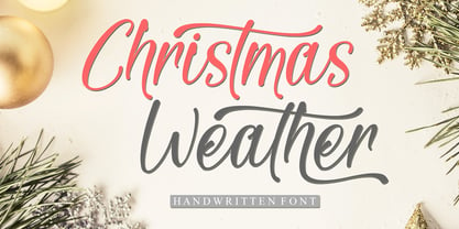 Christmas Weather is a stylish and incredibly elegant script font. It looks stunning on wedding invitations, thank you cards, quotes, greeting cards, logos, business cards and every other design which needs a handwritten touch.
 - Protocol by Rômulo Gobira,
$11.99 Protocol is an experimental pixelated font, which allows you to easily experiment and to combine it with other typefaces. This version (1.0) comes with 580+ glyphs, multiple language support and some unique emoji characters.
 - Foda Slab by Fo Da,
$20.00 Foda Slab is a powerful Arabic slab typeface that has two styles : Regular and Hollow. With 886 glyphs Foda Slab has many ligatures which makes it suitable for headlines and other different graphic contexts.
 - Capsbats by Typephases,
$25.00 Everything your head should not be or would rather not do is here. A complete collection of 225 illustrations (plus bonus shadows) in three fonts. The illustrations collected in the Capsbats keep the free-flowing lines of the ink-on-paper sketches. As a dingbat, or pictorial typeface, the Capsbats are very versatile: you can use them immediately in any application. The vectorial format of the font file means they are scalable with no loss of quality. And you can customize them in no time in your favourite graphics program. They can be used out of the box, as accents or spot illustration, or enlarged, combined, coloured, textured... to achieve an infinite variety of results easily. With Capsbats you have an incredible resource for your concept illustration needs: enlarge them and you can create a high impact page layout, posters, magazine covers and book jackets, advertising... The Capsbats Shadows are bonus silhouettes that you can use in very different situations. Use these shadows to fill them with your own patterns, or use them as a mask or clipping path, to paste the images you want inside them. The possibilities are endless. We didn't limit our imagination in drawing them, so why would you when using them? The book 1000 Heads is a compendium of the drawings featured in the Capsbats and Entestats and it gives a glimpse of the limitless applications of this collection.
 - Hanna by Wilton Foundry,
$29.00Hanna has its roots in the Plato and Cilantro fonts published earlier by Wilton Foundry. It is an informal roman and very legible at any size - a rare combination for many applications. Hanna was specifically designed to generate additional income for an orphanage in Ethiopia. Hanna Teshome runs an orphanage of roughly 140 children in Addis Ababa, Ethiopia. She is an amazing lady with a deep passion for orphan kids as well as innocent kids that find themselves in jail because their mothers have been imprisoned - they are treated as prisoners and are typically sexually abused - it is not uncommon for them to commit suicide when they are released from jail at age 18. Most of the orphans end up with Hanna because one or both of their parents have died from AIDS. Hanna relies entirely on donations to keep her orphanage running and this font is a small but tangible way for you to help make a difference in the lives of the orphan kids. I am committed to helping Hanna after visiting the orphanage several times and seeing the jails from where the kids have been rescued. Hanna is my hero because she stepped out of her comfort zone, with no financial support, to take care of the kids. My hope is that you will use this font as a messenger of good. All of Wilton Foundry royalties for this font will go to the support of Hanna’s orphanage in Ethiopia. Thank you in advance for your support on behalf of Hanna and the kids! - Haboro Slab by insigne,
$- Haboro Slab. It’s a nose-to-the-grindstone kind of font like the first of its family. This slab serif pushes through the clutter powerfully in editorial and corporate work such as business websites and software. The Haboro hyperfamily as a whole is known for its ability to make the work clear and simple, even with the fonts’ advanced angle--and Slab is no change here. Consistent with Haboro, too, the simplified geometric features of the slab face just make sense, no matter where you use it. Its timeless wedge-molded serifs give this family the formula it needs to function flexibly in jobs from fashion to packaging. Enhance your output with the font’s wide range of ligatures and alternates, including OpenType alternates. Use Haboro Slab’s large pair of solution glyphs and various other OpenType specifics, too, to give your message the clarity it deserves. Even more, it couples well with the sophisticated didone of the Haboro hyperfamily to further expand your capabilities. Haboro Slab has every quality you need for successful lettering. Use this modification on a classy tradition to mold and shape your next layout, whether website, iPhone app, advertising, or newspaper. There is no work Haboro Slab won’t power through.
 - Beautiful Christmas Monogram by Yoga Letter,
$20.00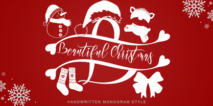 "Beautiful Christmas Monogram" is a beautiful and unique monogram font. This font is equipped with monograms, uppercase, lowercase, numerals, punctuation, and multilingual support. Very suitable for Christmas, winter, Christmas invitations, Christmas parties, Christmas ornaments, Christmas decorations, and others.
 - Dhefentha by Yoga Letter,
$16.00 "Dhefentha" is a unique and elegant handwritten font. Equipped with uppercase letters, lowercase letters, numerals, punctuations, swash, titling, uppercase alternates, ligatures and multilingual support. This font is very suitable for Valentine's Day, wedding, engagement, Christmas, fall and others.
 - Akhilona by Yoga Letter,
$16.00 "Akhilona" is a very elegant and aesthetic handwritten brush font. This font is equipped with uppercase, lowercase, numerals, punctuation, and multilingual support. It is suitable for weddings, engagements, birthdays, photography, back to school, Christmas, parties, invitations, and others.
 - Beautiful Easter by Yoga Letter,
$14.00 "Beautiful Easter" is a quirky and cute handwritten font. This font is decorated with bunny ears in the uppercase. Equipped with uppercase, lowercase, numerals, punctuation, and multilingual support. It is suitable for Easter, spring, wedding moments, and others.
 - FS Olivia Paneuropean by Fontsmith,
$90.00Antwerp On a visit to Belgium and the Netherlands while still an MA student at Reading University, Eleni Beveratou made some important discoveries. First, there was the letter ‘g’ from the Didot family seen at Plantin Moretus Museum in Antwerp, which seemed “almost like a mistake”. Then there were strange details such as the serifs on the “l”, “h”, “k”, “b” and “d” in Egmont Cursive and other typefaces by Sjoerk Hendrik de Roos, found in volumes of poetry she picked up from a chaotic bookshop in Amsterdam. These were characters that stood out from the text but seemed to blend harmoniously with the rest of the letters. “And there it was, the spark. I decided to design a typeface that would capture the details of the process of writing.” A guiding hand Eleni shared her initial thoughts with Phil Garnham and Jason Smith. They liked what they saw in her tentative first sketches, and gave her the chance to develop her ideas further. Phil, in particular, provided valuable input as FS Olivia took shape. Eleni’s main influence – the handwritten – would give the font its character. “When creating a typeface,” says Eleni, “it’s fair to say that it reflects some of the designer’s personality. And that’s certainly the case with FS Olivia. “Although technology is part of my everyday life. I am a great admirer of traditional graphic design where you can touch and feel paper and ink.” Irregular “What I particularly like,” says Eleni, “is that a printed item can develop its own personality sometimes as a result of imperfections in the print. “FS Olivia has some of these characteristics as it’s inspired by handwriting, and yet it also includes some very modern features.” Feminine and fascinating, FS Olivia captures the expressive twists and turns of (the poet’s?) pen on paper, with low junctions, deep top serifs and semi-rounded edges. Round outstrokes contrast with the rough corners of the instroke, while strong diagonals and inclined serifs create a richly textured pattern. Polytonic It’s only fitting that there should be a version of this poetic font for one of the birthplaces of poetry and song. Eleni, who hails from Athens, developed an extensive range of glyphs that could be used for the Greek language, in both modern and ancient texts. For the latter, there is a version of Olivia for displaying polytonic Greek (a system that utilises a range of accents and “breathings”), which brings the 21st century technology of OpenType to the presentation of poetic texts from Ancient Greece. Just think what Homer could have done with that. - FS Olivia by Fontsmith,
$70.00 Antwerp On a visit to Belgium and the Netherlands while still an MA student at Reading University, Eleni Beveratou made some important discoveries. First, there was the letter ‘g’ from the Didot family seen at Plantin Moretus Museum in Antwerp, which seemed “almost like a mistake”. Then there were strange details such as the serifs on the “l”, “h”, “k”, “b” and “d” in Egmont Cursive and other typefaces by Sjoerk Hendrik de Roos, found in volumes of poetry she picked up from a chaotic bookshop in Amsterdam. These were characters that stood out from the text but seemed to blend harmoniously with the rest of the letters. “And there it was, the spark. I decided to design a typeface that would capture the details of the process of writing.” A guiding hand Eleni shared her initial thoughts with Phil Garnham and Jason Smith. They liked what they saw in her tentative first sketches, and gave her the chance to develop her ideas further. Phil, in particular, provided valuable input as FS Olivia took shape. Eleni’s main influence – the handwritten – would give the font its character. “When creating a typeface,” says Eleni, “it’s fair to say that it reflects some of the designer’s personality. And that’s certainly the case with FS Olivia. “Although technology is part of my everyday life. I am a great admirer of traditional graphic design where you can touch and feel paper and ink.” Irregular “What I particularly like,” says Eleni, “is that a printed item can develop its own personality sometimes as a result of imperfections in the print. “FS Olivia has some of these characteristics as it’s inspired by handwriting, and yet it also includes some very modern features.” Feminine and fascinating, FS Olivia captures the expressive twists and turns of (the poet’s?) pen on paper, with low junctions, deep top serifs and semi-rounded edges. Round outstrokes contrast with the rough corners of the instroke, while strong diagonals and inclined serifs create a richly textured pattern. Polytonic It’s only fitting that there should be a version of this poetic font for one of the birthplaces of poetry and song. Eleni, who hails from Athens, developed an extensive range of glyphs that could be used for the Greek language, in both modern and ancient texts. For the latter, there is a version of Olivia for displaying polytonic Greek (a system that utilises a range of accents and “breathings”), which brings the 21st century technology of OpenType to the presentation of poetic texts from Ancient Greece. Just think what Homer could have done with that.
 - Verve by Altered Ego,
$65.00Called by some the "Archetype of the millennium", Verve is a seven-weight typeface family. It features a complete Adobe character set with kerning and fit to match. The alternate characters offer some variations on s,f,h,j,k,S,T,Y and others, plus this font has the Euro symbol. Verve is the fourth in an on-going series of condensed typefaces that I’ve been designing since 1989. My concept was to create an elegant condensed typeface that would be a "typeface for the millennium," in style and functionality. At the very core of all my designs is a typographic problem I wanted to solve, or a market niche that I think needs filled. Verve addresses both of those concerns, without copying or borrowing from its predecessors. There’s the challenge of creating a rich and interesting typeface with an austerity of line and elegance of form. I’m a minimalist by nature – but I wanted Verve to have a sensuous feel in certain respects – yet have that sensuality balanced by the uniformity of the uniform character widths. Gottfried Pott always stresses "theme and variation," and "point and counterpoint," and that’s what I’m doing in Verve. What one finds in musical composition is evident in Verve. Perfect for book covers, CD packaging, club flyers, retail packaging (especially bottles!), identity design and multimedia. The adventurous can try it in text, but it will give you a headache. The beauty of Verve is in thesize and weight variations which create a rich typographic texture in this font. - Sundowners by PintassilgoPrints,
$29.00 Sundowners is a smiley face. It is a simple and versatile font, with a pocketful of cool interlocking glyphs for those days of groovier moods. It also brings a handful of amusing initial and terminal forms and a couple of ornaments. That simple. And that nice.
 - Pulse JP Arabic by jpFonts,
$29.95 النبض - the Pulse Pulse JP ME is a constructivist text and display font that differs from comparable fonts due to its special sharpness and harmonious balance. Its technical and constructed form creates a somewhat artificial impression of particular appeal. It is ideal for display on the screen and can be used in many projects. Pulse JP ME is a super family consisting of 48 fonts from compressed to expanded in six weights each. This opens up a wide designspace with the possibility of combining typefaces of the same character in a wide variety of variants and being able to adapt them to very different conditions. The details of the individual fonts are coordinated with each other with great precision and perfectly implemented in terms of craftsmanship. In all variants, this leads to a very balanced design with particular sharpness. The very extensive character set supports 120 Latin + 7 Arabic languages + Hebrew. The Arabic characters were designed in close collaboration with the Iranian designer Prof. Raafat Negarandeh. Here the constructivist approach is repeated within Arabic proportions. This leads to a very reduced and clear design with high legibility. Additional typographical adjustments can be made in the variable font, which is also available. There all variants are stored in a single font and can be continuously fine-tuned between them.
 - Clytone by Logofonts,
$10.00 Clytone is Script fonts Vintage looks and feel inspired by the 1980s lettering design made stronger and bolder for today's projects that look more vintage. The goal was to take the simple but effective designs from this era. Clytone are fonts are great for product logo, poster, headline, card logo, clothing brand logo, lettering artwork, t-shirt designs, Vintage design, magazine, packaging, stationery and much more. Easily creates your own logo type with fonts. Clytone has an Open Type feature to access a large selection of unique alternative letters and many ligatures to make it easier for you to create. Clytone can be accessed perfectly on design applications such as Adobe Illustrator, Adobe Photoshop, Corel Draw, Affinity Designer but does not rule out the possibility that it can also be accessed using web-based applications such as kittl, canva, artboard studio and others.
 - The Lucky by Masinong Studio,
$12.00 The Lucky combines a retro and hand-lettering style. I'm made it with a personal touch in every single curve. I hope this can inspiration to your work. It pairs perfectly with other fonts and contains a handy set of bonus swashes. It is ideal for logos, handwritten quotes, product packaging, headers, posters, merchandise, social media and greeting cards. Features: Basic Latin A-Z and a-z Numbers Symbols Stylistic Set Ligature PUA Encode Multilanguage Support To enable the OpenType Stylistic alternates, you need a program that supports OpenType features such as Adobe Illustrator CS, Adobe Indesign & CorelDraw X6-X7. There are additional ways to access alternates, using Character Map (Windows), Nexus Font (Windows), Font Book (Mac) or a software program such as PopChar (for Windows and Mac). If you have any question, don't hesitate to contact me by email masinong.studio@gmail.com :)
 - Fadilla by MrLetters,
$20.00 Fadilla Script is perfect for branding, wedding invitations, magazines, mugs, business cards, quotes, posters, and many more that you can use on your big project will be very beautiful. Fadilla Script is equipped with OpenType feature and has many glyphs, giving you the chance to choose letters to your liking, having lots of variations and choices for each letter, so you can customize your design choices. Fadilla Script also support other languages. You need a program that supports OpenType features such as Adobe Photoshop CS / Adobe Photoshop CC, Adobe Illustrator CS / Adobe Illustrator CC, Adobe Indesign and Corel Draw and many more programs that support OpenType. If you don't have a program that supports OpenType, you can access all the alternate glyphs using Font Book (Mac) or Character Map (Windows) If you have any question, don't hesitate to contact me by email.
 - Vegande by Logofonts,
$10.00 Vegande is Script fonts Vintage looks and feel inspired by the 1980s lettering design made stronger and bolder for today's projects that look more vintage. The goal was to take the simple but effective designs from this era. Vegande font are great for product logo, poster, headline, card logo, clothing brand logo, lettering artwork, t-shirt designs, Vintage design, magazine, packaging, stationery and much more. Easily creates your own logo type with fonts. Vegande has an Open Type feature to access a large selection of unique alternative letters and many ligatures to make it easier for you to create. Vegande can be accessed perfectly on design applications such as Adobe Illustrator, Adobe Photoshop, Corel Draw, Affinity Designer but does not rule out the possibility that it can also be accessed using web-based applications such as kittl, canva, artboard studio and others.
 - Galdy by Logofonts,
$10.00 Galdy is Script fonts Vintage looks and feel inspired by the 1980s lettering design made stronger and bolder for today's projects that look more vintage. The goal was to take the simple but effective designs from this era. Galdy font are great for product logo, poster, headline, card logo, clothing brand logo, lettering artwork, t-shirt designs, Vintage design, magazine, packaging, stationery and much more. Easily creates your own logo type with fonts. Galdy has an Open Type feature to access a large selection of unique alternative letters and many ligatures to make it easier for you to create. Galdy can be accessed perfectly on design applications such as Adobe Illustrator, Adobe Photoshop, Corel Draw, Affinity Designer but does not rule out the possibility that it can also be accessed using web-based applications such as kittl, canva, artboard studio and others.
 - Grandiose by Ahmad Jamaludin,
$13.00 Say hello to New Stylish Script, Grandiose! This font combines stylish letter shapes with contemporary twist. It's the perfect fit for all luxury projects, such as elegant logos, printed quotes, lovely wedding invitation cards, social media headers, product packaging and a lot more! It includes full set of elegant uppercase and lowercase letters, multilingual symbols, numerals, punctuation. The font has smooth wet ink texture, so would be perfect for all types of printing techniques+you can do embroidery, laser cut, gold foil etc. What's Included? - Grandiose OTF - More than 100 of glyphs - Ligatures - Works on PC & Mac - Simple Installations - Accessible in the Adobe Illustrator, Adobe Photoshop, Adobe InDesign, even work on Microsoft Word. - PUA Encoded Characters - Fully accessible without additional design software. - Multilingual Support Let me know if you have any other questions. Thanks and have a wonderful day, dharmas
 - Wreath by insigne,
$25.00 Haul out the holly. Insigne’s font Wreath has hit the shelves just in time for the holidays. Wreath is a script face drawn with a pointed brush. Designed by the elves of the insigne workshop, its unique forms were created to dress up your gift labels and a wide variety of other holiday collateral. With five different weights and five different variants that allow for a distressed appearance, Wreath is no Scrooge. Its numerous alternates help to make your designs happy all the way. They allow for varying the ending characters of the lowercase to give your designs an automatic handwritten appearance. In addition, there are ligatures that extend the handwritten appearance and alternate options, including randomized alternates to create a unique appearance every time the font is used. There’s over six-hundred fifty glyphs in every font.
 - Kaipara by Gleb Guralnyk,
$14.00 Presenting originally designed decorative font named Kaipara. The main goal of this font is a pattern that flows between the characters. Each letter has six variations that switches automatically to create a solid pattern feeling. Check out that "context alternates" OpenType feature is activated to achieve neccessery result. Also a simple supporting font is available here. Note: Please note that full pattern effect is working only with english alphabet and numbers. All other characters has only one variation. Note: Check out that all of your letters has the same case (lowercase or uppercase) to make the effect work properly.
 - Extenda by Zetafonts,
$39.00 Extenda is a variable width sans serif type family designed by Francesco Canovaro with Andrea Tartarelli and Cosimo Lorenzo Pancini.It been created to provide designers with a powerful but flexible tool to create strong headlines, logos, and display text with tight spacing and maximum space coverage. Rather than providing a family of weights, it gives you a fine-grained range of widths to choose from, allowing maximum control in display editorial uses, and proportional size variation in logo design, keeping consistent appearance and readability. From the vertical, ultra-condensed and thin Pica, Nano and Micro weights to the wide and ultra-bold Peta, Exa and Yotta weights, all Extenda fonts include an extended character set covering Latin languages as well as ones using Cyrillic and Greek for a coverage of 200+ languages. Full Open Type features are included, from small caps to stylistic alternates, positional number forms and discretionary & standard ligatures. The 11-weights family is complemented by the Extendable special weight, that uses Open Type scripts to create a dynamically scaling typeface where each letter becomes automatically tighter or wider than the previous one.
 - California Kingston by Crumphand,
$25.00 California Kingston display is a typography design product that is specifically created for use in the headlines, titles, or other prominent text elements of a design. This typeface is often characterized by its bold, attention-grabbing appearance and its ability to make text stand out on a page. The main goal of a California Kingston font display is to create an impact and draw the viewer's attention. This is typically achieved through the use of thicker and more pronounced strokes, unique shapes and design elements, and often, a more stylized appearance. California Kingston displays can be used in a variety of design projects, including posters, logos, packaging, advertisements, and more. They are often paired with complementary fonts to create a well-designed and cohesive visual identity. When choosing a California Kingston font display, it is important to consider the project's overall aesthetic and message, as well as the intended audience. It's also essential to ensure that the font is legible and easy to read, even at smaller sizes. Overall, a California Kingston font display is an excellent way to make a bold statement in a design and to capture the viewer's attention.
 - Paihuen beta by RodrigoTypo,
$25.00 Paihuen Beta A Typography that plays with the Rupestre concept, contains 6 variants that can be combined with each other to make more powerful and entertaining titles.
 - Brootahh by Alit Design,
$16.00 Presenting the 🗯️💬The Brootahh Comic Typeface💬🗯️ by alitdesign. The Brootahh Comics typeface is inspired by the style of letters in comics that have less serious and fun characters. The lettering of the Brootahh font is a sans serif with distorted characters which gives a fun and design impression for children. The Brootahh font has 2 families, namely the Brootahh Blup font which has more bubble characters that can support comic characters to be cooler. The Brootahh font is perfect for creating designs with non-serious concepts, designs for children, book headers, and of course for text on comics. The Brootahh Comics typeface also gets a bonus character of 230 Comic-themed illustrations that make creating designs even easier. Simply by downloading The Brootahh Comics typeface creating a Comic and non formal themed design is very quick and easy. The Brootahh Comics typeface is perfect for magazine cover designs, brochures, flyers. Instagram ads, Canva Design and so on with comic, non-serious, pop art, game mobile and fun design. Besides that this font is very easy to use both in design and non-design programs because everything changes and glyphs are supported by Unicode (PUA). The Brootahh Comics typeface contains 618 and Brootahh Blup 498 + 230 bonus glyphs with many unique and interesting alternative options.
 - Ramadhan Day by Pixesia Studio,
$29.00 Introducing Ramadhan Day - Arabic Style Display Font Ramadan Day is an Arabic display font that brings a modern and elegant look to your designs. With its flowing curves and sleek lines, this font is perfect for creating striking and sophisticated headlines or logos. It is also great for invitations, greeting cards, posters, and other designs related to the holy month of Ramadan. This font is fully Unicode-compliant, making it easy to use in a wide range of design software. Whether you're a professional designer or just looking to add some flair to your personal projects, Ramadan Day is a versatile and stylish choice. FEATURES - Stylistic Alternates - Ligatures - PUA Encoded - Uppercase and Lowercase letters - Numbering and Punctuations - Multilingual Support - Works on PC or Mac - Simple Installation - Support Adobe Illustrator, Adobe Photoshop, Adobe InDesign, also works on Microsoft Word Hope you Like it. Thanks.
 - Thurof by Twinletter,
$17.00 Welcome to the world of Thurof, a bubble typeface that will provide a strong, bold, and whimsical touch to your projects. Do you want to make your messages more colorful and entertaining? Thurof is the ideal candidate. Thurof is available in three different styles: Regular, Outline, and Shadow. This means you can produce an effect that is appropriate for your project, from bright to lighter with an outline or shadow effect. Thurof's plethora of variant ligatures and characters distinguishes it from other languages. This allows you to use your imagination to create unique and inspiring designs. Thurof's multilingual support will also assist you in spreading your message over the world. Thurof is an excellent choice for projects that demand a fun, playful appearance. Allow Thurof to transform your message into something vibrant and inspiring, and leave an indelible impact.
 - Mashok by Twinletter,
$18.00 Mashok is a retro condensed font that exudes a vintage feel, perfect for adding a touch of nostalgia to your designs. This font features a tall and narrow letterform, making it ideal for creating eye-catching headlines and titles. With its unique stylistic alternates and ligatures, Mashok adds an extra level of charm and personality to your designs. Whether you’re creating posters, book covers, or other graphic design projects, Mashok is sure to make your text stand out. Give your designs a retro flair with Mashok today! What’s Included : - File font - All glyphs Iso Latin 1 - Alternate, Ligature - Simple installations - We highly recommend using a program that supports OpenType features and Glyphs panels like many Adobe apps and Corel Draw so that you can see and access all Glyph variations. - PUA Encoded Characters – Fully accessible without additional design software. - Fonts include Multilingual support
 - Salt & Spices Mono by Fontforecast,
$29.00 Salt&Spices Mono is the mono lined version of Salt & Spices Pro. Where Salt & Spices Pro has the rough contours and high contrast that is typical for dip pen calligraphy, Salt & Spices Mono has clean crisp smooth letterforms that result in a totally different look and feel. Great for creating neon effects. Fun features like connecting spaces and long swashes for customization of words and phrases are preserved in Salt & Spices Mono. This versatile 10 font family, consisting of 4 casual script styles: Regular, Bold, Shadow and Bold Shadow offers great flexibility. For instance: the appearance of initial and terminal letters can be customized using the glyph pallet. Contextual alternates, Swashes and Stylistic sets give you the ability to replace spaces by 3 alternate connecting spaces or add swashes to initial/terminal letters. Double letter ligatures help sustain the natural flow of handwriting. In addition to the 4 script styles 3 SmallCaps Sans styles and 3 SmallCaps Serif styles were added, all mono lined. They add great variation to your designs and supplement and support each other perfectly. Add exceptional language support to all that and you have the perfect ingredient to spice up even the most demanding design project. You'll need an Open Type savvy application to get the most out of Salt & Spices Mono.
 - Juvenis by Storm Type Foundry,
$32.00Designs of characters that are almost forty years old can be already restored like a historical alphabet – by transferring them exactly into the computer with all their details. But, of course, it would not be Josef Tyfa, if he did not redesign the entire alphabet, and to such an extent that all that has remained from the original was practically the name. Tyfa published a sans-serif alphabet under the title Juvenis already in the second half of the past century. The type face had a large x-height of lower-case letters, a rather economizing design and one-sided serifs which were very daring for their time. In 1979 Tyfa returned to the idea of Juvenis, modified the letter “g” into a one-storey form, narrowed the design of the characters even further and added a bold and an inclined variant. This type face also shows the influence of Jaroslav Benda, evident in the open forms of the crotches of the diagonal strokes. Towards the end of 2001 the author presented a pile of tracing paper with dozens of variants of letter forms, but mainly with a new, more contemporary approach: the design is more open, the details softer, the figures and non-alphabetical characters in the entire set are more integral. The original intention to create a type face for printing children’s books thus became even more emphasized. Nevertheless, Juvenis with its new proportions far exceeds its original purpose. In the summer of 2002 we inserted all of this “into the machine” and designed new italics. The final computer form was completed in November 2002. All the twelve designs are divided into six variants of differing boldness with the corresponding italics. The darkness of the individual sizes does not increase linearly, but follows a curve which rises more steeply towards the boldest extreme. The human eye, on the contrary, perceives the darkening as a more fluent process, and the neighbouring designs are better graded. The x-height of lower-case letters is extraordinarily large, so that the printed type face in the size of nine points is perceived rather as “ten points” and at the same time the line spacing is not too dense. A further ingenious optical trick of Josef Tyfa is the figures, which are designed as moderately non-aligning ones. Thus an imaginary third horizontal is created in the proportional scheme of the entire type face family, which supports legibility and suitably supplements the original intention to create a children’s type face with elements of playfulness. The same applies to the overall soft expression of the alphabet. The serifs are varied; their balancing, however, is well-considered: the ascender of the lower-case “d” has no serif and the letter appears poor, while, for example, the letter “y”, or “x”, looks complicated. The only serif to be found in upper-case letters is in “J”, where it is used exclusively for the purpose of balancing the rounded descender. These anomalies, however, fit perfectly into the structure of any smoothly running text and shift Juvenis towards an original, contemporary expression. Tyfa also offers three alternative lower-case letters *. In the case of the letter “g” the designer follows the one-storey form he had contemplated in the eighties, while in “k” he returns to the Benda inspiration and in “u” adds a lower serif as a reminder of the calligraphic principle. It is above all the italics that are faithful to the tradition of handwritten lettering. The fairly complicated “k” is probably the strongest characteristic feature of Juvenis; all the diagonals in “z”, “v”, “w”, “y” are slightly flamboyant, and this also applies to the upper-case letters A, V, W, Y. Juvenis blends excellently with drawn illustrations, for it itself is modelled in a very creative way. Due to its unmistakable optical effect, however, it will find application not only in children’s literature, but also in orientation systems, on posters, in magazines and long short-stories. - PF Adamant Sans Pro by Parachute,
$45.00 Adamant Sans on Behance. Adamant Sans: Specimen Manual PDF. Adamant Sans is a contemporary and very functional typeface. It stands out from the crowd with its uniquely designed rounded corners and beautiful italics. This carefully designed family consists of 18 fonts, including true italics. Its extreme weights, such as hairline and black are ideal for setting big and powerful headlines, while intermediate weights work very well in long texts at small point sizes. Weights are finely balanced so that they can be easily combined, depending on the type of paper and other conditions. Thanks to its proportions, high x-height and wide apertures, this typeface is very legible and suitable for setting books, magazines, newspapers, but is also valuable for use in large sizes, as well as for complex corporate projects. It supports advanced typographic features such as small caps, lining and oldstyle figures in proportional and tabular widths, fractions, ligatures, etc., and provides simultaneous support for Latin and Cyrillic as well as kerning for these languages. Adamant Sans is the ideal companion of the Adamant serif version.
 - Sirichana Thai by Linotype,
$40.99Sirichana is a monolinear Thai typeface with Light and Bold weights. The modern design is characterized by its traditional proportions but with almost geometric construction. Originally released by Linotype for digital photocomposition, it is now in OpenType format. This makes it possible to dynamically and precisely position the various levels of superscript and subscript vowel signs and tonal marks. In addition to this, the complete Unicode page range for Thai is covered to ensure flawless conversion between other OpenType fonts using Unicode. The accompanying Latin design matches well in scale and texture and supports most Western European languages making it ideal for setting bilingual texts. - Reluctant Aviator by Hanoded,
$15.00 I read something interesting the other day: in 1910 a cat called Kiddo snuck on board an airship and was found by aeronaut Walter Wellman - after he had already taken off in an attempt to cross the Atlantic Ocean. Wellman and Kiddo spent 71 hours aboard the airship, but never completed the journey, due to engine problems and foul weather. Luckily, they were both rescued. It was a funny story, so I decided to name a font after it. Reluctant Aviator is a handmade font (pen and paper). It has a rough edge, some shaky glyphs and a lot of bravado. Comes with diacritics and swashes.
 - Kristabelle by Letterara,
$12.00 Kristabelle is a handwritten script with a modern and sensible style. This font is ideal for weddings and other romantic invitations. Kristabelle works both on Mac & PC and is easy to install. It contains ligatures and multi-lingual support (ä ö ü Ä Ö Ü ß ¿ ¡). To access the alternate glyphs, you need a program that supports OpenType features such as Adobe Illustrator CS, Adobe Photoshop CC, Adobe Indesign, and CorelDraw. More information about how to access alternate glyphs, check out this link (http://goo.gl/ZT7PqK) To stay up to date of my latest fonts, follow me and let be friends because there will be many promos.
 - ITC Einhorn by ITC,
$29.99Einhorn is a peculiar typeface. Difficult to classify, this upright, bold, script-like semi serif typeface was designed in 1980 by Alan Meeks. Meeks was inspired by the art nouveau period, and may have been trying to liven up the design scene. In 1980, typefaces like Helvetica and Univers were ubiquitous, and the digital revolution was still years away. Experimental faces like Einhorn helped fill the gap for creative designers looking for untraditional choices in which to set headlines and advertising work. The merit of pioneer display faces like Einhorn have never lessened; Einhorn still sets a mean display text, and works great in logos and other corporate ID solutions. - Salt & Spices Pro by Fontforecast,
$29.00 Salt&Spices Pro is a welcome addition to the ever popular modern calligraphy genre. Digitizing the many handwritten samples into a fully functional connected script was done with great precision, carefully guarding the authentic look and feel of vintage dip pen calligraphy. Salt&Spices Pro is a very versatile 9 font family, consisting of 3 casual styles: Regular, Bold and Shadow. With 587 glyphs each, they offer great flexibility in customizing words and phrases to suit your personal taste. For instance: the appearance of initial and terminal letters can be customized using the glyph pallet. Contextual alternates, Swashes and Stylistic sets give you the ability to replace spaces by 3 alternate connecting spaces or add swashes to initial/terminal letters. Double letter ligatures help sustain the natural flow of handwriting. In addition to the 3 calligraphic family members 3 SmallCaps Sans styles and 3 SmallCaps Serif styles were added. They all have 435 glyphs and match very well because they were designed using the same vintage nib. Each of the styles can add great variation to your designs and they supplement and support each other perfectly. Add exceptional language support to all that and you have the perfect ingredient to spice up even the most demanding design project.
 - Kinfolk Pro by Fontforecast,
$29.00 Kinfolk Pro is a font collection of six fonts. The main styles Rough and Smooth are extremely sturdy and bold brush fonts. As the name suggests the smooth style has clean, crisp contours and the rough version has the authentic strokes of a slightly dried out brush. Both versions have 606 glyphs and 4 alternate ornamented capital letters to play with, organized in stylistic sets. With Discretionary Ligatures and Contextual Alternates activated you can access elongated swashes by simply typing +1 (+2, +3, +4, +5) in front of any letter and =1 (=2, =3, =4, =5) at the back. On top of that Kinfolk Pro Rough and Smooth have some extra stand alone swashes that can be accessed via the glyphs panel or by typing _1, _2 ,_3 _4 _5. Kinfolk Pro Script is a fully connected script that goes together beautifully with the other styles. For the best connections, activate Discretionary Ligatures and Contextual Alternates. Additionally there is Kinfolk Pro Ornaments for extra swashes, ink blobs and interesting strokes. Kinfolk Pro Arrows and Kinfolk Pro Flowers both offer 230 glyphs to further juice up your designs. You'll need an Open Type savvy application to get the most out of Kinfolk Pro.
 - Feathery by kapitza,
$49.00 Feathery is a collection of 45 cute and fantastical bird illustrations. All illustrations are drawn by hand and of the highest quality.