10,000 search results
(0.077 seconds)
- Sandwich Shop JNL by Jeff Levine,
$29.00 A 1930s WPA (Works Progress Administration) poster promoting national parks depicts Native Americans overlooking the land with the tag line "his hunting ground of yesterday". The hand lettering of that text is reminiscent of Futura Black and similar Art Deco stencil-influenced type designs, but is rendered in an oblique lower case with no capitals. Re-drawn as Sandwich Shop JNL, the typeface is now available in both regular (vertical) and oblique versions.
 - Breathe by Lián Types,
$20.00 ATTENTION COSTUMERS! A new version of this font was released in 2019. Take a look: Breathe Neue Reaching a total of more than 1000 glyphs, Breathe Pro is Maximiliano R. Sproviero’s gift of the year. The aim of the designer was once more to give the user the chance to play and travel from very formal and conservative letterforms to the amazing world of swashes and flourishes. Possibilities of alternating and ligating characters in this font are absolutely fantastic. After his last creation, Parfait Script, Lián wanted to make a more universal font. Delighted by typographic works of Didot and his followers of the beginnings of 1800, Maximiliano R. Sproviero started what became another obsessive project, which is now named Breathe, “cuando las letras respiran...” what could be translated as “when letters breathe”, due to the feeling that you are reading letters that are alive. Breathe comes in two styles which have a significant difference as regards to the quantity of glyphs available inside. If you want to get the most complete style, with over 1000 glyphs, (including contextual alternates, stylistic alternates, swashes, terminal forms, titling alternates, historical forms, stylistic sets, standard ligatures, stylistic ligatures, decorative ligatures and frames) then your choice should be Breathe Pro. On the other hand, if you are interested in having a less decorative font with the nice touch of Lián’s style, then your choice should be Breathe Standard, a more limited version of Breathe, including terminal forms (leaves) and frames. With Breathe Pro you will surely have fun at the same time you are designing and that is not an unimportant thing. The world of type-designers is growing each year, and the features of Open-Type are letting them think their creations as if they were truly pieces of art. At least, Breathe Pro is inspired in the Art of our predecessors, those who with a pen loaded of ink would decorate each letter, each page in such a lovely way. Yes, -lovely- is the word. We would not have the amazing lettering artists, calligraphers, typographers of nowadays if that -love for letters- had not traveled from generation to generation. Breathe Pro is an example of this love. An example of what Maximiliano R. Sproviero feels about typography and letters. Pssst... Look for more images and the User’s Guide at the gallery section to see it in use! http://origin.myfonts.com/s/aw/original/89/0/46067.pdf
 - Veljovic Script by Linotype,
$103.99ITC Veljovic Script was designed by Jovica Veljovic and displays an obvious calligraphic heritage. The designer was strongly influenced by German designer Hermann Zapf and Israeli designer Henri Friedlander. ITC Veljovic Script exhibits a crisp precision, as if the letters were cut in stone rather than drawn with pen and ink. - The Candy by DainType,
$15.00 When the conditions are met, a heart is attached to the capital letter. It feels soft and lovely. It goes well with wedding cards, invitations, elegant brochures, web images, and promotional materials. If you do not apply the open type feature, the letters without hearts are applied, so you can use it in two moods.
 - LT White Fang - Personal use only

- Sign Helpers JNL by Jeff Levine,
$29.00Sign Helpers JNL is a collection of silhouette images carefully redrawn from two distinct sources. Prior to their bankruptcy in 1984, the Holes-Webway Company of St. Cloud, MN produced thousands of their "Webway" sign kits that were utilized by merchants, libraries and schools throughout the country. At one point they included in their sales catalog a selection of die-cut images for embellishing sign work. In the late 50s and throughout the 60s, the Joseph Struhl Company (now known as Magic Master Industries) produced cling vinyl sign kits for business, and a home movie titling set for do-it-yourself film makers. This set also featured die-cut embellishments. A generous selection of designs from both kits have been faithfully re-drawn in digital form to pay tribute to two innovative companies. Other fonts based on products from these companies are Sign Kit JNL (Webway® Sign Kit), Cling Vinyl JNL, and Sign Maker JNL (Magic Master® Sign Kits). Trademarked names are used purely for reference purposes. - Juxta Sans Mono by NaumType,
$19.00 Juxta Sans Mono is an experimental monospace sans, an extension of the Juxta superfamily. During the creation of the Juxta script, I felt that the aesthetics and the main idea of the font had promising potential and I started thinking about a pair for it. So the idea of Juxta Sans Mono was formulated. Juxta has several style-forming elements: 45° beveled or cross out bowls, squared m and w arcs and other unobvious letter structures. Despite its unusual and sometimes odd (f, g, m) letterforms, Juxta Sans is fairly easy to read due to its monospace font nature and wide spacing. Juxta Sans Mono offers great customization potential. It has two sets of stylistic alternates — [salt] makes a letter underscored, but keep it in line, [ss01] replaces some of the glyphs with different letterforms. The [case] function automatically adjusts the height of the punctuation marks to the neighbor letter and [onum] is a set of old style numbers. Juxta Sans Mono also has subscript and superscript features, but they are utilized a bit unconventionally — if you want to customize your logo or headline, you can make a glyph superscript and the one next to it subscript and they automatically kern into one letter width. You can see examples of using these features in the presentation. Juxta Sans Mono is available in 8 weights, including Thin, Light, Regular, Medium, SemiBold, Bold, ExtraBold and Black. It extends multilingual support to Basic Latin, Western European, Euro, Catalan, Baltic, Turkish, Central European, Pan African Latin, Afrikaans, and Basic Cyrillic.
 - CA Superpilot by Cape Arcona Type Foundry,
$29.00 Introducing the CA Superpilot Sans & Script family pairing - the ultimate package designed specifically for creatives and designers. The CA Superpilot Sans font family, with its contemporary take on Futura, is the perfect choice for those seeking a sleek and modern typeface. With five weights and italics, this font is flexible enough to be used in any project. In addition, it includes an extensive Central European character set and alternate characters, ensuring that your designs will stand out in any language. On the other hand, the CA Superpilot Script font family is a monoline script font that takes inspiration from vintage camera equipment logos and type designations from the 1950s. The result is a unique and retro-inspired typeface that adds personality and charm to any project. With regular and italic styles, you have plenty of options to work with. Despite being a script typeface, its bold strokes and clean lines make it ideal for captivating and impactful headlines in uppercase. Using these two fonts together gives you unmatched flexibility for any project, whether it's branding, website design, or print design. Don't miss out on this essential font pairing - get it today!
 - Heist by Nyalaapi,
$15.00 Heist is a sporty font, comes with two styles that make perfect for your design. Ideal for branding project, logos, quotes and every other design which need strong feel. Features - 4 Ligatures - Multilingual support Open type features can be accessed using Open Type programs such as Adobe Illustrator CS/CC, Adobe Photoshop CS/CC, Adobe Indesign & CorelDraw X6-X7.
 - Qadar by Dumadi,
$18.00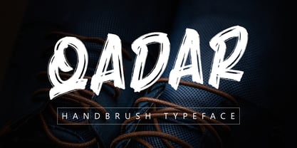 Qadar is an elegant looking brush font, created using the perfect brush app for any design project. very beautiful if used as a font for your branding media so that your design is very impressed with character. This font is perfect for collaboration with tumbler design, skateboard, web design, poster design, t-shirt design, and other designs.
 - Sunshine Gabriela by Letterena Studios,
$9.00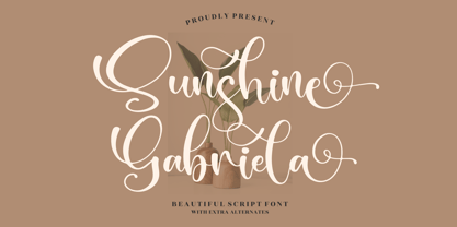 Sunshine Gabriela is a beautiful script font, suitable for any projects such as logos, branding projects, homeware designs, product packaging, mugs, quotes, posters, shopping bags, t-shirts, book covers, name cards, invitation cards, or greeting cards. You can also use it for labels, photography, watermark, special events, and all your other lovely projects that need a beautiful script taste.
 - Bandolina by Hanoded,
$15.00 Bandolina is a fun, hand drawn typeface. Didone-ish, off-key, jumpy and full of happy glyphs. It comes with a bagful of quirkiness, a pinch of eccentricity and a full range of diacritics.
 - Bargiery by Solidtype,
$15.00 Please welcome our newest script typeface. Bargiery - Calligraphy script. Beautiful and elegant script typeface with unique alternatives and italics. This font is very suitable for use, especially in logos, and various other formal forms such as invitations, labels, logos, magazines, books, greeting / wedding cards, packaging, fashion, make up, stationery, novels, labels or other types. advertising purposes. To enable OpenType Stylistic alternates, you will need a program that supports OpenType features such as Adobe Illustrator CS, Adobe Indesign & CorelDraw X6-X7, Microsoft Word 2010 or later versions
 - Aviano Future by insigne,
$24.99 The Aviano series returns with a vigorous and futuristic sans serif. Aviano Future’s powerful squared forms lend intensity and authority to your designs. Aviano Future’s extended forms give the face strength and muscle. Aviano Future is a versatile new addition to the Aviano titling series. Aviano Future comes in six different weights with “fast” Fasts and is packed with OpenType features. Want to use more traditional rounded forms? Need swash forms? Art Deco alternates? Aviano Future includes 390 alternate characters. Eleven style sets are available, two sets of art deco inspired alternates, small forms, tough swash, constructivist titling and traditional stylistic alternates. Aviano Future also includes 40 discretionary ligatures for artistic typographic compositions. Please see the informative .pdf brochure to see these features in action. OpenType capable applications such as Quark or the Adobe suite can take full advantage of the automatically replacing ligatures and alternates. This family also includes the glyphs to support a wide range of languages. Aviano Future is a great choice for a professional designer that wants to achieve a technological, futuristic or epic look. Be sure to check out the rest of the Aviano series which can be used as complementary faces, including Aviano, Aviano Serif, Aviano Sans, Aviano Didone, Aviano Flare and Aviano Slab.
 - Mrs Eaves XL Serif by Emigre,
$59.00 Originally designed in 1996, Mrs Eaves was Zuzana Licko’s first attempt at the design of a traditional typeface. It was styled after Baskerville, the famous transitional serif typeface designed in 1757 by John Baskerville in Birmingham, England. Mrs Eaves was named after Baskerville’s live in housekeeper, Sarah Eaves, whom he later married. One of Baskerville’s intents was to develop typefaces that pushed the contrast between thick and thin strokes, partially to show off the new printing and paper making techniques of his time. As a result his types were often criticized for being too perfect, stark, and difficult to read. Licko noticed that subsequent interpretations and revivals of Baskerville had continued along the same path of perfection, using as a model the qualities of the lead type itself, not the printed specimens. Upon studying books printed by Baskerville at the Bancroft Library in Berkeley, Licko decided to base her design on the printed samples which were heavier and had more character due to the imprint of lead type into paper and the resulting ink spread. She reduced the contrast while retaining the overall openness and lightness of Baskerville by giving the lower case characters a wider proportion. She then reduced the x-height relative to the cap height to avoid increasing the set width. There is something unique about Mrs Eaves and it’s difficult to define. Its individual characters are at times awkward looking—the W being narrow, the L uncommonly wide, the flare of the strokes leading into the serifs unusually pronounced. Taken individually, at first sight some of the characters don’t seem to fit together. The spacing is generally too loose for large bodies of text, it sort of rambles along. Yet when used in the right circumstance it imparts a very particular feel that sets it clearly apart from many likeminded types. It has an undefined quality that resonates with people. This paradox (imperfect yet pleasing) is perhaps best illustrated by design critic and historian Robin Kinross who has pointed out the limitation of the “loose” spacing that Licko employed, among other things, yet simultaneously designated the Mrs Eaves type specimen with an honorable mention in the 1999 American Center for Design competition. Proof, perhaps, that type is best judged in the context of its usage. Even with all its shortcomings, Mrs Eaves has outsold all Emigre fonts by twofold. On MyFonts, one of the largest on-line type sellers, Mrs Eaves has been among the 20 best selling types for years, listed among such classics as Helvetica, Univers, Bodoni and Franklin Gothic. Due to its commercial and popular success it has come to define the Emigre type foundry. While Licko initially set out to design a traditional text face, we never specified how Mrs Eaves could be best used. Typefaces will find their own way. But if there’s one particular common usage that stands out, it must be literary—Mrs Eaves loves to adorn book covers and relishes short blurbs on the flaps and backs of dust covers. Trips to bookstores are always a treat for us as we find our Mrs Eaves staring out at us from dozens of book covers in the most elegant compositions, each time surprising us with her many talents. And Mrs Eaves feels just as comfortable in a wide variety of other locales such as CD covers (Radiohead’s Hail to the Thief being our favorite), restaurant menus, logos, and poetry books, where it gives elegant presence to short texts. One area where Mrs Eaves seems less comfortable is in the setting of long texts, particularly in environments such as the interiors of books, magazines, and newspapers. It seems to handle long texts well only if there is ample space. A good example is the book /CD/DVD release The Band: A Musical History published by Capitol Records. Here, Mrs Eaves was given appropriate set width and generous line spacing. In such cases its wide proportions provide a luxurious feel which invites reading. Economy of space was not one of the goals behind the original Mrs Eaves design. With the introduction of Mrs Eaves XL, Licko addresses this issue. Since Mrs Eaves is one of our most popular typefaces, it’s not surprising that over the years we've received many suggestions for additions to the family. The predominant top three wishes are: greater space economy; the addition of a bold italic style; and the desire to pair it with a sans design. The XL series answers these requests with a comprehensive set of new fonts including a narrow, and a companion series of Mrs Eaves Sans styles to be released soon. The main distinguishing features of Mrs Eaves XL are its larger x-height with shorter ascenders and descenders and overall tighter spacing. These additional fonts expand the Mrs Eaves family for a larger variety of uses, specifically those requiring space economy. The larger x-height also allows a smaller point size to be used while maintaining readability. Mrs Eaves XL also has a narrow counterpart to the regular, with a set width of about 92 percent which fulfills even more compact uses. At first, this may not seem particularly narrow, but the goal was to provide an alternative to the regular that would work well as a compact text face while maintaining the full characteristics of the regular, rather than an extreme narrow which would be more suitable for headline use. Four years in the making, we're excited to finally let Mrs Eaves XL find its way into the world and see where and how it will pop up next.
 - Sonata Allegro by Tamar Fonts,
$35.00 “The Emperor Has Clothes” Like in music — the Allegro Sonata form consists of three main sections—the Exposition (section), the Development, and the Recapitulation — so in regard to this Allegro Sonata font family — there is an Exposition (font), a Development, and a Recapitulation—in which each theme is restated alongside its development material. While the Recapitulation font is perfect for titling and branding, the Exposition is perfect for branding {as demonstrated in the Inspiration Gallery pertaining this font} as well as being a comfortable read in long runs of text. The Exposition rounded, mono-line, with great x height, contemporary—A Synthesis Between Geometric & Hand-drawn—font, is at times geometric and at times hand drawn; in the end it all came down to finding the balance in a typeface between the robustness needed to function as a text face and enough refinement to look good as a display font. Following the Exposition, comes the Development (section), decorative, botanic-like, exuberant and playful font, signifying ABUNDANCE [of possibilities] & BENEVOLENCE—in regard to each theme/character, and to demonstrate—that 'structures' in music, are solid structures—like architecture {contrary to the words of J. W. von Goethe, who said: “Music is liquid architecture; Architecture is frozen music”}, just in some spiritual domain that is far beyond one's physical senses to grasp. Like in my art and music works in which I consider its 'Texture' element of vital importance, so is the case when it comes to type, as apparent in my previous Phone Pro/Polyphony font, as well as in this current Sonata Allegro/Development font. Each glyph has its own uniqueness, and when meeting with others, will provide dynamic and pleasing proximity. And due to the [individualistic] nature of this Development font, just a minimal amount of kerning/pairing were necessary... The development font is an extravagant design that looks best when used at large sizes—perfect for titling, logo, product packaging, branding project, wedding, or just used to express words against some [light or dark] background. Finally, “The (Exposition Font) Emperor Has (the Development Font) Clothes!” As said, there are three fonts/styles altogether in this Sonata Allegro type family, designed with the intention of harmonizing between Latin and Hebrew, which makes it an ideal font for the side-by-side use of Latin and Hebrew characters. However, they are being sold separately (kindly search for “Sonata Allegro Hebrew” on this MyFonts site), so they are economical for those interested just in either one of them. My aim is to shake up the type-design world with a range of distinctive fonts which break away from the generic letterforms, to make your design projects stand out—as a graphic designer, add this font to your most creative ideas for projects. This typeface has [lots of ligatures /] OpenType features, to enhance your designs even more — happy designing! Sonata Allegro Features: · 3 Weights/Styles · Multilingual Support · Proportional Figures & Ligatures While using this product, if you encounter any problem or spot something we may have missed, please don't hesitate to write to us; we would love to hear your feedback—in order to further fine-tune our products. Copyright Tamar Fonts/Hillel Glueck 2022 ALL RIGHTS RESERVED Any unauthorized distribution of my work is strictly prohibited, and will be prosecuted; do the right thing, and do not participate in the piracy of my typefaces; if you appreciate my work, then please pay for it and help me prosper — thank you!
 - Sonata Allegro Hebrew by Tamar Fonts,
$35.00 “The Emperor Has Clothes” Like in music — the Allegro Sonata form consists of three main sections—the Exposition (section), the Development, and the Recapitulation — so in regard to this Allegro Sonata font family — there is an Exposition (font), a Development, and a Recapitulation—in which each theme is restated alongside its development material. While the Recapitulation font is perfect for titling and branding, the Exposition is perfect for branding {as demonstrated in the Inspiration Gallery pertaining this font} as well as being a comfortable read in long runs of text. The Exposition rounded, mono-line, with great x height, contemporary—A Synthesis Between Geometric & Hand-drawn—font, is at times geometric and at times hand drawn; in the end it all came down to finding the balance in a typeface between the robustness needed to function as a text face and enough refinement to look good as a display font. Following the Exposition, comes the Development (section), decorative, botanic-like, exuberant and playful font, signifying ABUNDANCE [of possibilities] & BENEVOLENCE—in regard to each theme/character, and to demonstrate—that 'structures' in music, are solid structures—like architecture {contrary to the words of J. W. von Goethe, who said: “Music is liquid architecture; Architecture is frozen music”}, just in some spiritual domain that is far beyond one's physical senses to grasp. Like in my art and music works in which I consider its 'Texture' element of vital importance, so is the case when it comes to type, as apparent in my previous Phone Pro/Polyphony font, as well as in this current Sonata Allegro/Development font. Each glyph has its own uniqueness, and when meeting with others, will provide dynamic and pleasing proximity. And due to the [individualistic] nature of this Development font, just a minimal amount of kerning/pairing were necessary... The development font is an extravagant design that looks best when used at large sizes—perfect for titling, logo, product packaging, branding project, wedding, or just used to express words against some [light or dark] background. Finally, “The (Exposition Font) Emperor Has (the Development Font) Clothes!” As said, there are three fonts/styles altogether in this Sonata Allegro type family, designed with the intention of harmonizing between Latin and Hebrew, which makes it an ideal font for the side-by-side use of Latin and Hebrew characters. However, they are being sold separately (kindly search for “Sonata Allegro Hebrew” on this MyFonts site), so they are economical for those interested just in either one of them. My aim is to shake up the type-design world with a range of distinctive fonts which break away from the generic letterforms, to make your design projects stand out—as a graphic designer, add this font to your most creative ideas for projects. This typeface has [lots of ligatures /] OpenType features, to enhance your designs even more — happy designing! Sonata Allegro Features: · 3 Weights/Styles · Multilingual Support · Proportional Figures & Ligatures While using this product, if you encounter any problem or spot something we may have missed, please don't hesitate to write to us; we would love to hear your feedback—in order to further fine-tune our products. Copyright Tamar Fonts/Hillel Glueck 2022 ALL RIGHTS RESERVED Any unauthorized distribution of my work is strictly prohibited, and will be prosecuted; do the right thing, and do not participate in the piracy of my typefaces; if you appreciate my work, then please pay for it and help me prosper — thank you!
 - Pineapple Delight Pro by CheapProFonts,
$10.00 This font has a whimsical mix of four kinds of handwritten lettering: plain, looped, blotched and stylish double lined. The playful letter mixture really livens up the text. Cute. Perfect for scrapbooking :) ALL fonts from CheapProFonts have very extensive language support: They contain some unusual diacritic letters (some of which are contained in the Latin Extended-B Unicode block) supporting: Cornish, Filipino (Tagalog), Guarani, Luxembourgian, Malagasy, Romanian, Ulithian and Welsh. They also contain all glyphs in the Latin Extended-A Unicode block (which among others cover the Central European and Baltic areas) supporting: Afrikaans, Belarusian (Lacinka), Bosnian, Catalan, Chichewa, Croatian, Czech, Dutch, Esperanto, Greenlandic, Hungarian, Kashubian, Kurdish (Kurmanji), Latvian, Lithuanian, Maltese, Maori, Polish, Saami (Inari), Saami (North), Serbian (latin), Slovak(ian), Slovene, Sorbian (Lower), Sorbian (Upper), Turkish and Turkmen. And they of course contain all the usual "western" glyphs supporting: Albanian, Basque, Breton, Chamorro, Danish, Estonian, Faroese, Finnish, French, Frisian, Galican, German, Icelandic, Indonesian, Irish (Gaelic), Italian, Northern Sotho, Norwegian, Occitan, Portuguese, Rhaeto-Romance, Sami (Lule), Sami (South), Scots (Gaelic), Spanish, Swedish, Tswana, Walloon and Yapese.
 - Cactus Flower SG by Spiece Graphics,
$39.00 Cactus majestically blooming in the desert is truly a wondrous event! As the landscape cools, nature blossoms into a beautiful rainbow of colors. These same harmonies and contours, plus a dash of ruggedness and legibility, help to make Cactus Flower Open a superb choice for display work. This cowboy boot style is an old Speedball favorite originated by lettering artist Ross F. George. It’s especially useful for creating distinctive headlines and titles where a Tuscan look is desired. The engraved appearance of the open style adds a delightful touch to this Old West typeface. A solid version is also available. You will find small caps, petite figures, and various alternates included for your convenience. Cactus Flower Open is also available in the OpenType format. Some new characters have been added to this OpenType version including stylistic alternates, discretionary f-ligatures, and initials. These advanced features work in current versions of Adobe Creative Suite InDesign, Creative Suite Illustrator, and Quark XPress. Check for OpenType advanced feature support in other applications as it gradually becomes available with upgrades.
 - Ares by Adam Jagosz,
$15.00 Ares is a crisp all-caps display typeface suitable for sci-fi logos and titles. It owes its peculiar futuristic vibe to angular, top-heavy letters that hang from the cap-height instead of sitting on the baseline. The typeface consists of six subfamilies available in 10 weights, as well as as two variable fonts of three axes: Weight [wght], ranging from 1 to 1000, Mid-height [MHGT], ranginf from 0 to 1000, Tracking [TRAK], ranging from 0 to -40. The mid-height axis affects the typeface's waistline, including crossbars, and divides the fonts into three subfamilies: Ares Lo, Ares, and Ares Hi. These three families are solid-stroked, and the other three families are their stencil-stylized counterparts: Ares Broken Hi, Ares Broken, and Ares Broken Lo. The tracking axis is only available in the variable versions, and proportionally affects the kerning, thus helping set the type more tightly without effort. Ares supports a wide range of Latin-based orthographies, including not only European, but also Vietnamese as well as major African languages like Hausa, Fula or Ewe.
 - Poppy Spoor by Yumna Type,
$15.00 Would you like a legible, professional, prominent font? Well, if that is what you want, you will probably have trouble finding one as it is a time-wasting process and is a hard challenge. Let us introduce you to a perfect font for any project, the Poppy Spoor. Poppy Spoor, unlike the other display fonts, is a display font with rather square letters to show you fun, soft, modern impressions due to the thin line designs in low contrasts. This font type, giving you a clipart as a bonus, is legible and is better applied for big text sizes. You can maximize your designs with Poppy Spoor’s features to remain the best in every design at any time. Features: Alternates Ligatures Multilingual Supports PUA Encoded Numerals and Punctuations Poopy Spoor fits best for various design projects, such as brandings, posters, banners, headings, magazine covers, quotes, invitations, name cards, printed products, merchandise, social media, etc. Find out more ways to use this font by taking a look at the font preview. Thanks for purchasing our fonts. Hopefully, you have a great time using our font. Feel free to contact us anytime for further information or when you have trouble with the font. Thanks a lot and happy designing.
 - Richard Starkings by Comicraft,
$39.00 A NEW HOPE! You begged with us..! You pleaded with us..! But we decided to release the official Richard Starkings font anyway! Huh? WHAT? You heard that line before? Where? Hmm... on this very site...? Well, yes, the Hedge Backwards font is all fine and dandy and does resemble the lettering legerdemain of comic book lettering robot, Richard Starkings... but has it been tweaked over the years to better suit the writing stylings of ELEPHANTMEN creator and writer, Richard Starkings? Has it been refurbished and digitally remastered by ELEPHANTMEN designer and Comicraft Secret Weapon, John JG Roshell? Hmm? No? Well then... here it is, retooled, reimagined and reStarkingsed...ah, what the hell, we started from scratch! This ain't no Greedo Shoots First -- you won't have to keep your pasty '70s VHS recordings of previous Richard Starkings Fonts inside a concrete bunker. Because any other font that claimed to be the official Richard Starkings font would have been called The Official Richard Starkings Font, would it not?
 - Bigelow Rules Pro by Stiggy & Sands,
$29.00 Bigelow Rules Pro is a serif display face that mixes everything up. It shuffles between lowercase and smallcap letterforms, it lifts the baseline to center beside the Capitals, some letters have a slight swash flair while others maintain a neutral stance, and yet it has a smallcaps feature that drops the smallcaps down to the baseline. Its just an all out fun fest waiting to be played with. Bigelow Rules Pro is loaded with features to give you plenty of customisation options: - A mix of small caps & lowercase forms for lowercase standard (vertically centered) - A SmallCaps feature for baseline aligned all SmallCaps letterforms. - A Full set of Inferiors and Superiors for Limitless Fractions - Tabular, Proportional, and Oldstyle figure sets - Stylistic Alternates feature for Caps to SmallCaps Approx. 653 Character Glyph Set: Bigelow Rules Pro comes with a glyphset that includes standard & punctuation, international language support, basic ligatures, alternate numeral styles, subscript and superscript, and Small Cap letters.
 - Twine by Wilton Foundry,
$29.00 By twisting and weaving separate strands of rope together, a stronger TWINE is created. The distinctive “valleys” that give the twine its twisted and wavy appearance is the result of the twining process. Similarly, TWINE the font, is an exaggerated representation of the calligrapher’s individual pen strokes that create a cohesive character which is enhanced with the stencil. Unlike other stencils, TWINE emphasizes calligraphic strokes, so you will find it very legible even in small point sizes. Check it out! Furthermore, twine is inspired by Plantin, an old-style serif typeface named after the printer Christophe Plantin, which is based on the 16th century Gros Cicero face cut by Robert Granjon. Twine is a great choice when you need a font that is timeless, contemporary and distinctive. Perfect for Advertising, Corporate identities and Packaging design, Museum display, Technology, Hospitality, Travel, and Retail applications. Twine is available in TWINE Regular, TWINE Italic, TWINE Bold, TWINE Bold Italic. It is a Stencil that is Distinctive, Contemporary, and Timeless.
 - Rough Sketch by Java Pep,
$13.00 Introducing Rough Sketch fonts duo. This font has character like the name "rough" but yet elegant. Rough Sketch is suitable use for stand out and contradiction themes. This font also elegant for logo, web titles, poster, quote, book or magazine cover, poster and more. Benefit of Rough Sketch Packages Perfect collaboration of Rough Sketch and Roug Duo. You can get two fonts that always well-suited to collaborate in your design or project so this font complete each other. Multilingual Support and ligature set. This font is already for multilingual support for Italian, French, Spain, Danish, Czech, Portuguese, Hungarian, Irish, English, Finnish, Norwegian, Polish etc or contact me if you need to add your language. Ligatures is two or more of letters are joined as a single font like or, sr, pr, and etc. I hope you enjoy using Rough Sketch - fonts duo, if you have anything question about this font please let me know with your comments. Thanks for reading and have a nice day:)
 - Linotype Bengali by Monotype,
$103.99 Linotype Bengali, a revival This project by Neelakash Kshetriymayum and Fiona Ross commissioned by Monotype is at heart a revival of the now ubiquitous original Linotype Bengali typeface designed by Tim Holloway and Fiona Ross (1978-1982) based on Ross’s research for her doctoral studies in Indian Palaeography. The new Linotype Bengali is informed by more recent research by Ross and Kshetrimayum resulting in additional glyphs that serve contemporary needs in a variety of genres – the original had been specifically designed for newspaper composition and in now outdated digital formats. The new design makes use of OpenType features with the employment of contextual vowel signs for Bengali – a feature that Ross and Holloway had first introduced in Indian scripts for the Adobe Devanagari typeface – and has sophisticated contextual mark positioning. Furthermore, whereas the original design had existed in only two typestyles, extensive work has been undertaken to produce this new design in 5 weights: Light, Regular, Medium, Bold and Black. It has been an important aspect of this project to remain true to the original design concepts, and so to achieve optimal readability for sustained reading at small type-sizes, but the additional weights enable differentiation in document design, and afford users scope to produce textural variety in their outputs. This revival design is intended to widen the hitherto very limited palette of typographic choices in the field of textual communication in Bengali, Assamese and other languages that make use of the Bengali script.
 - ITC Vineyard by ITC,
$29.99Although inspired by the engraved lettering on eighteenth-century English trade-cards, ITC Vineyard has unusual characteristics of its own. The type retains some quality of copperplate scripts, but the differentiation between thicks and hairlines is not very sharp. There are a few cursive forms, but most of the letters are romanized: they are almost upright and not joining. Occasional flourishes are casually interpreted from various sources such as the lettering on trade-cards and writing masters' copybooks. “I think it is a new kind of 'copperplate script' which is not too formal and easier to read,” claims designer Akira Kobayshi. Irregularities are apparent in the angle of caps and numerals, but the face's quirkiness gives a type page some friendliness rather than cold brilliancy. ITC Vineyard is designed in two weights: regular and bold. Each variation includes several extra characters such as an alternative lowercase 'd' with a long arm, a T-h ligature, swelled rules, and a pair of flourishes. Swash caps are available for both weights. The swash caps variation also includes oldstyle figures. Kobayashi notes: “There are a few swash-cap lowercase combinations that collide or look awkward. In that case, I recommend using the plain caps. Setting all swash cap copy should also be discouraged.” Featured in: Best Fonts for Tattoos - Miramonte by Ascender,
$29.99 Miramonte Pro was designed by Steve Matteson in 2006 as a friendly sans serif design suitable for user-interface design, corporate branding and publishing. The name means 'behold the mountains' in Spanish, suggesting the rustic, unrefined type design. Miramonte is based on Stanislav Marso's humanist sans serif released by Grafotechna in 1960. This revival includes a cursive style italic rather than a sloped roman. Miramonte Pro includes an extensive character set for publishing Central and Eastern European languages. Its OpenType features include proportional figures, and tabular figures.
 - Guhly by Ingo,
$35.00 A modern Sans Serif — prosaic, designed geometrically, beautiful in large sizes All the dimensions of the font are based on Factor 10. The general principle of construction leads to slim forms and nearly equally wide characters. So the font appears very solid but is actually difficult to decipher in longer texts. Along with the ”normal“ Guhly Regular there are also the two versions Guhly Light and Guhly Bold, whereas in each only the vertical strokes [Guhly Light] or horizontal [Guhly Bold] have been changed in strength. The result is a very individual decorative effect which slightly reflects old circus and western scripts. The lower case characters in the version Guhly Book are, therefore, optimized to be suitable for longer texts in smaller font sizes — because after all, sometimes you should read a bit more than just the headline… The design of a shampoo bottle stands behind the creation of this sans serif display font. Prominent, clearly constructed forms with circular arcs define its appearance. This is a font primarily designed for use with capital letters — for all sorts of advertising purposes, headlines and titles. But lower case letters also belong to a good functional font; so, of course, Guhly includes them and ligatures for the more ”critical“ letter combinations as well as stylistic alternates for the letters K (or k), V (v) and o. As a decorative “encore”, the Guhly family also contains the “normal” weight in two variants: on the one hand the Guhly Cutout – these are letters without counter, as if the letters were cut out and the internal surfaces fell out; and on the other hand the Guhly stencil – as the name suggests, a stencil font with the typical bars that give a stencil the necessary cohesion.
 - Navaja by Andinistas,
$39.95 Very few letter types with the context of grunge style fonts offer hierarchies to differentiate words in sentences or paragraphs. With Navaja I developed a font family that meets this need. This family is useful to organize the information into a hierarchy with an eroded look. Its central idea mixes grotesque, geometric and humanistic letter conventions. This way, Navaja is a grunge-sans with dense proportions to make graphic design with eroded character. Its main purpose appeared when one of my customers asked me for a t-shirt design for a fan club of an important football player. For this reason its starting point were stained and muddy letters characterizing the toughness and coldness of the sport. Over time their glyphs began to imitate the robustness of "wood type & Tuscan Type" widely used in posters in the late nineteenth century. Its purpose was strengthened in a family with 6 members that when mixed they produce mind catching contrast levels ideal for designing T-shirts, stickers, flyers, brochures, posters, billboards, cinema or TV. Therefore its variants are short up and down height X combined with different widths that by working together produce information that radiates outstanding apparently destroyed controlled violence. Navaja Dingbats consists of 52 illustrations useful for frames and textures. In that vein, the origin of each member comes from skeletons of Roman and Italic calligraphy. The low amount of contrast between thick and thin lines matching the contours apparently gnawed but strictly regulated by optical adjustments equating the sum between full and empty areas. Factors such as finishes, shapes and counter internal and external forms are meticulously planned although its scruffy look which strategic arrangements are offset to provide color typographical homogeneous. And in conclusion, I have plans to continue expanding the family with more complete versions in the future.
 - Nigo by Linecreative,
$16.00 Nigo is a stylish font It has both modern and retro look - clear, modern and fun, Perfect for make any project like header, quote, layout magazine and other. Even better if you use it on 60s and 70s design project
 - Compact Hebrew MF by Masterfont,
$59.00 This font family is your best choice when you want to effortlessly make your brochure or signs stand out!
 - Le Monde Livre Std by Typofonderie,
$59.00 A text face in 4 styles Before the arrival of Phototypesetting, each font size had a specific design. Le Monde Livre, designed by Jean François Porchez, along with Le Monde Journal re-establishes this practice. When Le Monde Journal was developed specifically for use at small point sizes (below 10 points.) Le Monde Livre works beautifully for book typography, magazine settings. In comparison to the italics in Le Monde Journal, Le Monde Livre’s italics are of a totally different design, closer to the models of the Renaissance. The families match well together on the same page, Le Monde Journal for small sizes settings, Le Monde Livre for large settings. The verticals metrics and proportions of Le Monde Livre are calibrated to match perfectly others Typofonderie families.
 - Asrog Genos by Product Type,
$19.00 Welcome to the future with Asrog Genos, a futuristic technology font that designs each letter with a modern, sophisticated touch. Every character in Asrog Genos exudes a future feel, giving the appearance of cutting-edge technology. Asrog Genos brings elements of technology into your designs, creating a font that is not only eye-catching but also embraces the essence of innovation. Asrog Genos is an ideal choice for projects that require a touch of futuristic technology. Whether you are designing user interfaces, technology promotional materials, or other futuristic design elements, this font brings an unmatched modern aura. Do not miss this opportunity! Get the Asrog Genos Futuristic Technology Font now and let each character be a portal to your design future. **Uppercase
 - Sign Paintoh by Letterhend,
$19.00 The Sign Paintoh is a retro bold script which will bring you back to 60s feel. The swashes makes this font looks great for retro lettering which you can create in a sec! This font perfectly made to be applied especially in logo, and the other various formal forms such as invitations, labels, logos, magazines, books, greeting / wedding cards, packaging, fashion, make up, stationery, novels, labels or any type of advertising purpose. Features : uppercase & lowercase numbers and punctuation multilingual ligatures alternates swashes PUA encoded We highly recommend using a program that supports OpenType features and Glyphs panels like many of Adobe apps and Corel Draw, so you can see and access all Glyph variations. For accessing opentype feature, kindly check this link letterhend.com/tutorials/using-opentype-feature-in-any-software/
 - Balboa Plus by Parkinson,
$20.00 Balboa Plus is a condensed sans serif display family. It was originally conceived as a simple black and white typeface. But it seemed unfinished, begging for something more. I decided to try adding a couple layers of fill and detail to try and make it interesting. The result is this four-layer chromatic font family. The Primary Font is the Main Font. The other fonts ( Fill, Inline, and Gradient) only exist to support the Primary Font. The Fill font should sit behind the Primary font (there is a little color trapping going on). The rest is even easier. There is a free downloadable PDF Balboa User Manual in the Gallery section for this family. It has samples and some backstory. Balboa™ is a trademark of Parkinson Type Design.
 - Girl Script by Scholtz Fonts,
$10.00 Based on the popular Girltalk font, cute, cheeky Girlscript, was specially designed for the young-teen market. I felt that it was time for Girltalk to have a "big sister" script font to complete the group. Pretty & feminine, with a large dose of cheek, Girlscript is great for: -- “girl style” stationery -- diary covers -- clothing hang-tags -- party invitations -- greeting cards -- book covers -- movie posters -- CD covers -- game advertising media Girlscript is perfect for hen parties, baby showers, pamper parties and other occasions that bring out the “girl in” women. Think sugar 'n spice, think cute 'n cheeky, add a dash of Girlscript and you're on a winning streak! Girlscript is fully professional, carefully letterspaced and kerned. All upper and lower case characters, punctuation, numerals and accented characters are present.
 - Boldistrike by Letterhend,
$19.00 Boldstrike is a retro bold script which will bring you back to 60s feel. The bold letterform with swash makes this typeface looks standout to be used for your retro theme project. This font perfectly made to be applied especially in logo, and the other various formal forms such as invitations, labels, logos, magazines, books, greeting / wedding cards, packaging, fashion, make up, stationery, novels, labels or any type of advertising purpose. Features : uppercase & lowercase numbers and punctuation multilingual ligatures alternates swashes PUA encoded We highly recommend using a program that supports OpenType features and Glyphs panels like many of Adobe apps and Corel Draw, so you can see and access all Glyph variations. For accessing opentype feature, kindly check this link letterhend.com/tutorials/using-opentype-feature-in-any-software/
 - Mein Schatz by Font-o-Rama,
$25.00Mein Schatz's (in English: Darling) characteristic feature is the availability of ligatures in the expert set. The font offers – among others – the ligatures sh, sp, st, tz and alternatives for f, l and z. The expert set’s majuscules have curved elements in addition, thus allowing designers to put the typeface to highly individualistic use for displays and logos. Another feature of the font are the two different figure systems. Further to the normal table figures, Mein Schatz also offers old style figures, mainly for use in continuous text. Table figures as well as old style figures are available in all four cuts, i.e. regular, bold, italic and bolditalic. Furthermore designers will enjoy the additional curved ornaments. The curved ornaments and ligatures don’t only add a playful character to the typeface but also hence the name. - Litter Funk by PizzaDude.dk,
$15.00 You may already have guessed it...Litter Funk is experimental typography. Some letters are fat blocks, others have stars, stripes or dots, some are funny and funky while others are plain weird - but all in all, they leave a really nice confusing effect when used. Due to the contextual alternates, each letter comes in 5 different versions, and automatically cycle as you type. Well, the font was fun to make - I hope you have fun using it! :)
