10,000 search results
(0.064 seconds)
- Flinckstone by Maulana Creative,
$11.00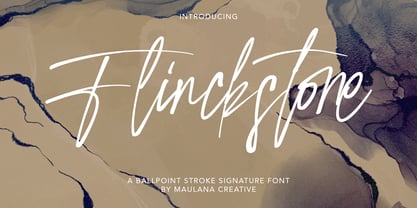 Flinckstone Ballpoint Stroke Signature Font Flinckstone Ballpoint Stroke Signature Font is beautiful script made by love. Flinckstone Script with natural handwriting touch is suitable for you who needs a typeface for Headline, Apparel, Invitation, Branding, Wedding, Logo Design, Lettering, Logotype, Clothing, Poster, Magazine and other design project.
 - Delivery by Artyway,
$20.00 Delivery is a bold, geometrical font in square shapes with modern spurs, uppercase and lowercase, accented, additional characters ligatures and stylistic alternates, numbers and punctuations, currency and other symbols.
 - Maradona Signature by NJ Studio,
$19.00 Maradona Signature a stylish signature font is a font with 59 ligatures,9 swash and ending swash. It features signature characters that will take your projects to the next level! This font is PUA code which means you can easily access all the glyphs and swashes that are full of signature! It also features many special features including glyphs and alternate ligatures. font designs that are made for various vector designs, printing such as digital wedding blogs, online shops, social media, while printing can be used in the field of product clothing, accessories, bags, pins, logos, business cards, watermarks and many others ... so it can make your product look cute and attractive, and also Multilingual support!!! Happy design ...
 - Klanting by Kulokale,
$17.00 Klanting is a stylish, clean, and modern condensed sans font, with style that is very different from the others. This font comes in two styles, Regular and Oblique Version. Klanting is well-suited for posters, social media, headlines, magazine titles, clothing, large print formats - and wherever you want to be seen. Inspired by the style of design that is currently popular, and this is the answer to all the needs of every idea that you will pour in this modern era. We highly recommend using a program that supports OpenType features and Glyphs panels such as Adobe Illustrator, Adobe Photoshop CC, Adobe InDesign, or CorelDraw, so you can see and access all Glyph variations.
 - Vandal Blow Graffiti Regular by Sipanji21,
$15.00 "Vandal Blow" is a 3D layered graffiti font that includes solid, shadow, and inner shadow styles, providing the tools to create a three-dimensional appearance in your text. Fonts with layered styles like this are commonly employed in graffiti art, street art, posters, and other designs where a dynamic and eye-catching 3D effect is desired. By utilizing the solid, shadow, and inner shadow layers in "Vandal Blow," you can enhance the visual impact of your text, creating a sense of depth and dimension. This font is particularly suitable for projects where you want to infuse a graffiti-style aesthetic with a three-dimensional twist, making your text stand out and grab attention.
 - Brugenfield by Zamjump,
$21.00 Brugenfield is a modern serif display with a unique ligature. This typeface has been crafted with care to ensure a premium quality and luxurious feel. The binders make this typeface unique and stand out from regular serif fonts. It is suitable for logos, headlines, titles and various other formal forms such as invitations, labels, logos, magazines, books, greeting / wedding cards, packaging, fashion, make up, stationery, novels, labels or any kind of advertising purposes. We highly recommend using a program that supports the OpenType feature and the Glyphs panel such as many Adobe and Corel Draw applications, so that you can view and access all variations of Glyphs. Email us to zamjump@gmail.com if you need anything! Happy Designing!
 - La Graziela by Letterhend,
$19.00 Please welcome our newest script typeface, La Graziela. A Beautiful and classy script that has many swashes that allows you to create beautiful lettering instantly. it has many stylistic set alternates that you can choose from. This font perfectly made to be applied especially in logo, and the other various formal forms such as invitations, labels, logos, magazines, books, greeting / wedding cards, packaging, fashion, make up, stationery, novels, labels or any type of advertising purpose. Features : uppercase & lowercase numbers and punctuation multilingual ligatures alternates swashes PUA encoded We highly recommend using a program that supports OpenType features and Glyphs panels like many of Adobe apps and Corel Draw, so you can see and access all Glyph variations.
 - Chery Santos by Aqeela Studio,
$15.00 Chery Santos feels equally charming and elegant. It looks stunning on wedding invitations, thank you cards, quotes, greeting cards, logos, business cards and every other design which needs a handwritten touch. This font is PUA encoded which means you can access all of the glyphs and swashes with ease! It features a varying baseline, smooth lines, gorgeous glyphs and stunning alternates. Chery Santos is coded with Unicode PUA, which allows full access to all additional characters without having any special design software. Mac users can use Font Book, and Windows users can use Character Map to view and copy any of the additional characters to paste into your favorite text editor / application.
 - Periplus by PintassilgoPrints,
$26.00 I got rhythm, I got music, I got my swirls, who could ask for anything more? Periplus is quite an eccentric type, full of twists and nice oddities here and there. It is an all-caps font with 2 variations for each letter and number, stored at upper- and lower-case slots. For added amusement, every letter got not 1 or 2, but 4 swash variations. One can be reached through the OpenType swash feature: just select the letter and hit the swash button. The other ones you will access through a glyphs palette. All of them are neatly organized with the 'access all alternates' feature. The font is yet equipped with some stylistic alternates and ornaments. Have fun!
 - Calafati Soft by Wannatype,
$24.00 Basilio Calafati (1800–1878) worked as a magician under the name of Salamucci in the Wiener Prater. Later he obtained the license for a roundabout and other amusement facilities in the Wiener Prater. Calafati typeface family is characterised by little contrast and strong emphasis on the horizontals. It is a robust font that has many applications. Its character shapes are simple and relatively unembellished. With regard to metrics and proportions it combines perfectly with the Wien Pro and the Liebelei Pro. Calafati is available in weights light, regular, medium, bold and black. In 2022, Calafati received a major update. The recent family, Calafati Soft, is an 100% offspring of sharp-edged Original Calafati.
 - Holystain by Letterhend,
$14.00 Holystain is a Foundation display font that strikes the perfect balance between sophistication and approachability. Its classic charm makes it perfect for more traditional designs, while its casual feel makes it good for modern design. This font perfectly made to be applied especially in logo, and the other various formal forms such as invitations, labels, logos, magazines, books, greeting / wedding cards, packaging, fashion, make up, stationery, novels, labels or any type of advertising purpose. Features : Uppercase & lowercase Numbers and punctuation Alternates & Ligatures Multilingual PUA encoded We highly recommend using a program that supports OpenType features and Glyphs panels like many of Adobe apps and Corel Draw, so you can see and access all Glyph variations.
 - Binerka by Letterhend,
$19.00 Binerka is a stylish modern serif font. This typeface has can be used for modern theme or vintage looks with ligatures & alternates. Very suitable for logo, headline, tittle, and the other various formal forms such as invitations, labels, logos, magazines, books, greeting / wedding cards, packaging, fashion, make up, stationery, novels, labels or any type of advertising purpose. Features : uppercase and lowercase numbers and punctuation multilingual ligatures alternates PUA encoded We highly recommend using a program that supports OpenType features and Glyphs panels like many of Adobe apps and Corel Draw, so you can see and access all Glyph variations. How to access opentype feature : letterhend.com/tutorials/using-opentype-feature-in-any-software/
 - Alfazine Script by Mysterylab,
$24.00 Alfazine Script is a bold and spirited script with extensive ornate detailing. This versatile font is evocative of antique signpainters' letters, circus wagon & carnival booth graphics, groovy 1960s psychedelic scripts, and even sportswear team insignias, all combined with a modern approach towards lively curlicues and ball finial stroke ends. As with all other font offerings from Mysterylab Designs, we take great care with artful kerning and weight-matching of glyphs to allow this font to be used not only at attention-grabbing headline and logo sizes, but also at small body copy sizes in extended passages. Alfazine also features an extruded shadow version that's very useful for designing logos and customized layered lettering.
 - AS Palmer by Andrey Sharonov,
$24.00 AS Palmer Script & Sans This pair was inspired by the spirit of the past, when manual labor was common, and technology was just beginning to develop. It was crafted by hand specially for traditional typography lovers and anyone who want to add natural handmade feeling in brand identity. It comes with Regular and Aged versions that expands its posibilities in use. Opentype features Script font has 151 stylistic alternates and 3 variations of end-swashes with about 10 lengths of each style. Stylistic Alternates. The easiest way to get alternate character is to add number for example 2, 3 or 4 after any Uppercase. Each of them has from two up to five alternates. This combination works with activated Standard Ligatures option in Opentype panel (Photoshop / Illustrator). End-swashes. AS Palmer Script has 3 variants of end-swashes and about 10 lengths of each style. It works like Stylistic Alternates with activated Standard Ligatures in Opentype panel. Just add special combination at the end of the word, to get needed swash element and its length. Underscore, double underscore or slash is swash style. Number is length. For example: _3, __5, /6. Just try, it's easy. AS Palmer Sans - different Double letters. This feature work automatically with activated Contextual Alternates in Opentype panel. Note, that this features are not available in Miscrosof Word. Palmer is very good looking in logo, labels, t-shirt prints, product packaging, invitations, advertising and others. I've designed some examples, so you can see how it can be used. Multilingual support (Western European characters). English, Danish, Dutch, Estonian, Faroese, Filipino, Finnish, French, German, Hungarian, Icelandic, Irish, Italian, Norwegian, Polish, Portuguese, Spanish, Swedish, Turkish.
 - Steelfish by Typodermic,
$11.95 Introducing Steelfish, a typeface that will take your designs to a whole new level. This condensed typeface is inspired by newspaper headlines from the turn of the twentieth century, and it is designed to be compact and efficient. Unlike other typefaces that try to emulate specific metal types, Steelfish is a unique blend of various headline fonts that gives it a one-of-a-kind character. Steelfish doesn’t rely on modern-day embellishments or antique ornamentation, which means it can be used seamlessly in both historical and contemporary themes. With its seven weights, including oblique styles, Steelfish is a versatile typeface that can be used for a wide range of design projects. Whether you’re working on a website, a brochure, or a poster, Steelfish is the perfect choice to add a touch of sophistication to your work. In addition to the classic Steelfish, there are other variations to choose from as well. The Steelfish Rounded is perfect for designs that require a softer touch, while the Steelfish Hammer is ideal for bold and impactful designs. Steelfish Steeled adds an industrial edge to your designs, and the Steelfish Unleaded is a stripped-down version for when you need a more minimalist look. Overall, Steelfish is the typeface you need to make a statement in your designs. Its compact letterforms and unique blend of headline fonts give it a character that is both historical and contemporary, making it a versatile and timeless choice for all your design needs. Most Latin-based European, Vietnamese, Greek, and most Cyrillic-based writing systems are supported, including the following languages. Afaan Oromo, Afar, Afrikaans, Albanian, Alsatian, Aromanian, Aymara, Azerbaijani, Bashkir, Bashkir (Latin), Basque, Belarusian, Belarusian (Latin), Bemba, Bikol, Bosnian, Breton, Bulgarian, Buryat, Cape Verdean, Creole, Catalan, Cebuano, Chamorro, Chavacano, Chichewa, Crimean Tatar (Latin), Croatian, Czech, Danish, Dawan, Dholuo, Dungan, Dutch, English, Estonian, Faroese, Fijian, Filipino, Finnish, French, Frisian, Friulian, Gagauz (Latin), Galician, Ganda, Genoese, German, Gikuyu, Greenlandic, Guadeloupean Creole, Haitian Creole, Hawaiian, Hiligaynon, Hungarian, Icelandic, Igbo, Ilocano, Indonesian, Irish, Italian, Jamaican, Kaingang, Khalkha, Kalmyk, Kanuri, Kaqchikel, Karakalpak (Latin), Kashubian, Kazakh, Kikongo, Kinyarwanda, Kirundi, Komi-Permyak, Kurdish, Kurdish (Latin), Kyrgyz, Latvian, Lithuanian, Lombard, Low Saxon, Luxembourgish, Maasai, Macedonian, Makhuwa, Malay, Maltese, Māori, Moldovan, Montenegrin, Nahuatl, Ndebele, Neapolitan, Norwegian, Novial, Occitan, Ossetian, Ossetian (Latin), Papiamento, Piedmontese, Polish, Portuguese, Quechua, Rarotongan, Romanian, Romansh, Russian, Rusyn, Sami, Sango, Saramaccan, Sardinian, Scottish Gaelic, Serbian, Serbian (Latin), Shona, Sicilian, Silesian, Slovak, Slovenian, Somali, Sorbian, Sotho, Spanish, Swahili, Swazi, Swedish, Tagalog, Tahitian, Tajik, Tatar, Tetum, Tongan, Tshiluba, Tsonga, Tswana, Tumbuka, Turkish, Turkmen (Latin), Tuvaluan, Ukrainian, Uzbek, Uzbek (Latin), Venda, Venetian, Vepsian, Vietnamese, Võro, Walloon, Waray-Waray, Wayuu, Welsh, Wolof, Xavante, Xhosa, Yapese, Zapotec, Zarma, Zazaki, Zulu and Zuni.
 - Vabi Dasabi by Chekart,
$20.00 Vabi Dasabi is a unique japanese hand drawn brush font. It comes with uppercase and lowercase characters, set of punctuation marks, numbers, alternative set of latin characters and numbers, Cyrillic characters, ligatures and multilingual support. Perfect for logos, quotes, posters, branding projects, product packaging, t-shirt, book cover, greeting cards and applicable for any graphic design.
 - Polin Sans by Borutta Group,
$39.00 For several years I have been thinking about the design of a type family that explores, on the one hand, the modernist aesthetic that we know, from the Alphabet "a.r." designed by Władysław Strzemiński, and on the other, to the multiscript pre-war Warsaw. This is how the idea of creating the Polin Sans typeface was born. After researching on geometric variants of the Cyrillic alphabet, I was inspired by the text "Towards an open layout: A letter to Volodya Yefimov". I was intrigued by the fact that circular forms, which we are mostly familiar with in the Bulgarian Cyrillic, can be implemented in the classical version, without disrupting the reading process. At the same time, while working on typoteka.pl, I was fascinated by the Hebrew typeface jaffa, published by the Idźkowski & Sk-a foundry, which at some points looks like the Hebrew equivalent of the Alphabet "a.r.". Ben Nathan from Israel joined the project and was responsible for creating his native script. The idea of creating a multiscript family expanded to include Greek and Vietnamese. As a result, Polin Sans is a historical journey through the nooks and crannies of Polish modernism, which was created by people with diverse cultural backgrounds. The Polin Sans family was designed by Mateusz Machalski and Ben Nathan with the support of Michał Gorczyca and Małgorzata Bartosik.
 - Kitsch by Zetafonts,
$39.00 Designed by Francesco Canovaro with help from Andrea Tartarelli and Maria Chiara Fantini, Kitsch is a typeface happily living at the crossroads between classical latin and medieval gothic letterforms. But, rather than referencing historical models like the italian Rotunda or the french Bastarda scripts, Kitsch tries to renew both its inspirations, finding a contemporary vibe in the dynamic texture of the calligraphic broad-nib pen applied to the proportions of the classical roman skeleton. The resulting high contrast and spiky details make Kitsch excel in display uses, while a fine-tuned text version manages to keep at small sizes the dynamic expressivity of the design without sacrificing legibility. Both variants are designed in a wide range of weights (from the almost monolinear thin to the dense black), and are fully equipped with a extended character sets covering over two hundred languages that use latin, cyrillic and greek alphabets. Special care has been put in designing Kitsch italic letterforms, with the broad-nib movements referencing classical italian letterforms to add even more shades to your typographic palette. The resulting alternate letter shapes have also been included in the roman weights as Stylistic Alternates - part to the wide range of Open Type features (Standard and Discretionary Ligatures, Positional Numerals, Small Caps and Case Sensitive Forms) provided with all the 32 weights of Kitsch. Born for editorial and branding use, Kitsch is fashionable but solid, self-confident enough to look classic while ironic enough to be contemporary.
 - Brotherhood by 38-lineart,
$19.00 The current trend is social media, friendship connection applications and personal web portfolios. This media is used to tell about existence, most people like to upload photos on social media networks, even for personal web portfolios, sometimes people prefer to see the side of daily activities rather than products which are offered. Photos are visual responses, and there are many stories that can be told from a photo. But it will look more interesting if it is added with captions. The very appropriate caption is a text in handwriting. This is what inspired us to create attractive handwriting for social media and networking. We started to do a little research to see the trends of this type of font. Here are some of our notes; 1. Texts are usually in the form of relaxed, non-connected handwriting. 2. There are several connected glyphs, usually by the letters 'o', 'i' and 'y'. And double letters like ‘ll’ and ‘tt’. We anticipate this by making ligature for common texts written concatenated. 3. For personal web portfolio needs, provide affirmation as a characteristic. So the first letter is usually in the form of uppercase which is more prominent than the lowercase rhythm. Prominent but still in proportion. So this is "Brotherhood", a handwritten font that you can use for personal brands, captions and even paragraph writing. Expand your friendship and make your business more closely to your customers as a "Brotherhood" with this font.
 - Gummi by Anastasia Kuznetsova,
$22.00 I present to you a fascinating contrasting font system, Gummi! Modern development of 3 fonts, each of which is designed to complement each other in a natural way. This is an extremely versatile font collection, ideal for experimenting with vibrant and modern typographic designs in any modern design. This product includes 3 font files containing uppercase and lowercase characters, numbers and a large set of punctuation marks. Font Features * A-Z; a-z character set; * 1 language (English); * numbers and punctuation marks, symbols A font containing uppercase and lowercase letters, numbers, and a wide range of punctuation marks. Fonts can be opened and used in any software that can read standard fonts, even in MS Word. No special software is required, and to get started. It is recommended to use it in Adobe Illustrator or Adobe Photoshop Made with love ♡ Thanks for checking it out, and feel free to drop me a message if you had any queries! ~ Anastasia
 - Reliant by Intellecta Design,
$32.90 Reliant is a free interpretation of the classic design from fonts "BernhardSchoenschrift", originally designed by Lucien Bernhard and "Liberty", designed by W.T. Sniffin for ATF in 1927, following the original designs from Lucien Bernhard. This enhanced OpenType version has complete sets in Greek and Latin alphabet with Central European, Vietnamese, Baltic and Turkish complete resources with all diacritic signs and punctuation marks plus extra characters belonging this ranges. A Cyrillic alphabet completes the font, and we thanks to Dmitry Greshnev from Green Type. He help us to fix our original Cyrillic alphabet to the Cyrillic readers. We added a extensive set of ligatures (stylistic and contextual alternates plus discretionary ligatures) providing a lot of letterform variations that make your design really special, plus swashes and tails ornaments (to artistic increase any letter of this font) more fractions and number ligatures (a strange idea from Iza W). Over 800 glyphs which you have total access using software such as InDesign, Illustrator, QuarkXpress and others.
 - Grandhappy by Journey's End,
$18.00 Have you ever searched for a font that looked like it was really someone's handwriting, only to find that it was too feminine or too hard to read? I used to want a font like that, too, until I discovered that a font like that had been residing in my attic, in letters to me from my late grandfather. Not only was I thrilled to have a font like this at hand, but also one that would be a memory of my grandfather every time I used it. He was a hard-working man, raising a family during the Depression, yet was still fun-loving, kind, and generous. We called him Grandhappy. As a wedding present, I received from him rolling pins and a cutting board made of 8 different kinds of wood that he pieced together. In this font, the bullet is a rolling pin in honor of that! Other than the fact that this is a font from the hand of one greatly loved, my favorite thing is that although a True Type Font, it has some features of an Open Type font. There are many alternative letter choices available through the use of little-used keys on the keyboard and alt codes. This font was chosen to portray Jay Gatsby's handwriting in The Great Gatsby (2013).
 - Vellvé by ITC,
$29.99For over 30 years, Tomás Vellvé created beautiful graphics and distinctive typefaces in his native homeland of Spain. First drawn as a phototype display design in 1971, Vellvé’s only typeface in digital form is an uncommon solution to the problem of creating a new sans serif design. The end result, which bears his name, is a design that stands out from the crowd of other sans serif typefaces. The phototype version was only available in a single, light weight. With the release of the digital fonts, however, three additional weights as well as a companion italic for the light weight were created.The typeface designs were originally drawn for Agfa Monotype (now Monotype Imaging) in 1996 as part of the company’s “Creative Alliance” initiative. Through an exclusive licensing arrangement, the Vellvé™ family has now been added to the ITC Typeface Library.ITC Vellvé is a wide design with strong calligraphic overtones. This is no “anonymous” design like so many modern sans. Letters like the `R, `e and `s clearly show the hand of Tomás Vellvé in the design process. Vellvé provides a fresh choice between geometric sans serifs such as Helvetica® and industrial sans serifs like Futura®. - PF Libera Pro by Parachute,
$79.00 PF Libera was designed at a time of leisure with no particular intention for commercial use. In fact it was offered in the beginning as a freeware. In 2001, designer Charis Tsevis was convinced that it may have some commercial value, so Parachute obtained the rights to sell this typeface. At that time, we did not even imagine what would follow. Since then, PF Libera is one of our most successful typefaces. We have seen it being used in very diverse applications. From publishing to advertising to banking, to transportation, to retail applications. Food, beverages, fashion, automobiles, tourism, the list goes on and on. In any way, this typeface is very personal, modern and provocative. It stays with you and definitely it brings along the message. PF Libera comes in 3 styles. One of them, 'Liberissima', was added later and is more loose than the other two. The new 'Pro' version is powered with 7 OpenType features and is carefully designed to include all languages that are based on Latin, Greek and Cyrillic.
 - Gastine Script by Assami Studio,
$14.00 Introducing Gastine Script modern calligraphy font. Hi Designer, Come again to complete your script font collection ...! Gastine Script is a calligraphy font. This is a modern thin font with an italic style. Here you will get a beautiful modern font. This font is available in several modern swirls that can make your work look elegant, sweet and perfect. With this style, this font will be suitable for logos, branding projects, design of household appliances, product packaging, mugs, quotes, posters, shopping bags, logos, t-shirts, book covers, business cards, invitation cards, greeting cards, and all your other beautiful projects. Gastine Script has 380+ glyphs included alternative, ligatures characters and various language support: ŠÀÁÂÃÄÅÆÇÈÉÊËÌÍÎÏŸŽÐÑÒÓÔÕÖØÙÚÛÜÝßàáâãäåæçèéêëìíîïñòóôõöøùúûêýÿŒœšž You can use this font for your work very easily. Because there are many features in it. Contains a complete set of upper and lowercase letters, punctuation, numbers, ligatures, alternates and multilingual support. This font also includes several ligatures and alternative styles Set Stylistic For those of you who have software that is able to work OpenType (Corel Draw / Photoshop / Illustrator / InDesign). Thank you!
 - Untrouble by Dumadi,
$20.00 Untrouble – Elegant Futuristic Font is a powerful font that is here to answer design problems. with the presence of this font will maximize the project to the point of perfection. Untrouble is perfect for design, esports, logos, social media, branding, advertising, product design, handwritten quotes, product packaging, headers, posters, merchandise, and other designs. What’s Included : + Standard glyphs + UPERCASE + Web Font + Multilingual Accent + Works on PC & Mac, Simple installations Accessible in Adobe Illustrator, Adobe Photoshop, Adobe InDesign, even work on Microsoft Word. PUA Encoded Characters – Fully accessible without additional design software. Fonts include multilingual support + Image used: All photographs/pictures/vectors used in the preview are not included, they are intended for illustration purposes only. Thanks
 - Rummage Sale by Ingrimayne Type,
$11.95 Several years ago I was asked to do a sign for a rummage sale. To print the words RUMMAGE SALE, I took letters from some of the ornate fonts I was working on at the time. I liked the results, so made them into a font. Fonts from which the letters come include HippityDippity, Tuskcandy, Letunical, OakPark, WyomingStrudel, NeuAltisch, WyomingMacroni, WyomingPastad, and Rundigsburg. The original typeface had two variants of each letter, one on the upper-case keys and the other on the lower-case keys. The name of the original font, RummageSaleOne, acknowledged that a greater selection of letters was desirable but it was only with the upgrade of 2020 that the greater selection was added. The additional variants were added in two ways: as a separate typeface (RummageSale-Two) and also as OpenType stylistic alternatives.
 - Middle Name by Graphicfresh,
$14.00 Middle Name - Minimal Classic Font Middle Name Sans is a geometric styled font. However, the design strays from the natural limitations of many sans-type fonts. Its eccentric style with a mix of today's styles makes this font suitable for various purposes. We added a bit of a classic touch to it. So that users can reminisce with the style of the past. You can create various designs with this font. Such as logos, posters, design templates, magazines, flyers and others. The strong character of the letters makes your design feel more modern and minimalist. Middle Name Sans comes with two versions. Regular and italic versions. When downloading, If there are things you want to ask or problems you face with this font. Don't hesitate to ask us. Because we are very happy to help you. Thanks Graphicfresh
 - STP Stencil Cyrillic by Sete Std,
$30.00 Developed from the STP Display Cyrillic, the STP Stencil Cyrillic Typeface follows the same characteristic premise as its sister, in addition to composing the same number of Cyrillic and Latin characters. What distinguishes them it’s that the STP Stencil Cyrillic can be applied more easily anytime, anywhere, increasing the possibility of being used in a more craft and artistic way. Since it has characteristics of a stencil font, it brings a more urban and contemporary look, which makes ideal to use it in public spaces with large circulation of people. In addition, wayfinding, architectural, advertising, packaging, posters, among others projects, are a good request for STP Stencil Cyrillic show its vigor and all its beauty. The STP Stencil Cyrillic is a modular feature source, perfect to use it in major event signaling projects or similar. It can also be useful in any demands that requires improvisation and quick solutions. The STP Stencil has very expressive forms and counterforms, but still counts with the practicality of a stencil source and its infinite possibilities of use.
 - ITC Kahana by ITC,
$29.99As if gliding in on the tide, ITC Kahana floats across the page with the pulse and sway of the sacred Hawaiian hula dance. The original drawings for this display typeface were created while designer Teri Kahan lived in the Aloha State, and its bold verticals symbolically convey the power and strength of the Polynesian people. Kahan has spent most of her life working with letters. She discovered Speedball lettering pens in her teens, opened a design studio that specialized in the lettering and calligraphic arts while in her early twenties, and grew her business in California and Hawaii. Today, she embraces new design challenges and digital technology, but letters are still at the core of her work. In ITC Kahana, Kahan created a design that is both distinctive and versatile. Menus, posters, display headlines, packaging and brochures fall easily within this typeface's range. And the word “kahana” is more than just a namesake: in Hawaiian, “kaha” means “to mark, draw, place, turn or surf,” and “na” means “belonging to.” ITC Kahana also includes an enchanting decorated alphabet in the lowercase position that expands this typeface's usefulness to the designer. - Epoque Seria by Rafaeiro Typeiro,
$24.00 Époque Seria is that kind of person who looks really cute when angry. This font was derived from the Époque family. She is the little sister to Époque - a little shorter with her smaller x-height and — how do you say it in the typographic circle — your eyes are also smaller (and you know you squint when things get serious, isn't it?). The genealogy of these font face is undeniable, but Époque Seria has a ‘personality’ very different from her older sister. The reduction of the x-height also shakes somewhat with the cap that had crossbar. To accompany the package of standardization, the letters that don't have their straight axes were changed, which brought to the set more Cs and Gs contemporaries. In addition, other measures were taken as a greater softness in the variation of the weights and the abandonment of the black weight, being considered too heavy for this version.
 - Rally Symbols 2D by 2D Typo,
$24.00 The Rally Symbols 2D font family has been developed for integrated graphical motor racing design. First of all that includes rally, rally raid, cross-country rally and hill climb. With the Rally Symbols 2D - Signs font one can create quality road maps with rally routes and various symbol books. The font also includes symbols that can serve as workpieces to create competition logos and other design solutions. The Rally Symbols 2D - Arrow font has been specially developed for building tulip diagram road books. It includes various ready-made combination of traffic direction indicators and individual elements that can be combined together. The Rally Symbols 2D - Picto font can be used for the same purposes but also contains a range of convention that can help to find one’s bearings on the ground. This is a a wide range of icons or pictograms of various scenery, for example: different buildings, churches, cemetery, bridges, tunnels, different types of trees, posts, etc.
 - Capitolina by Typefolio,
$39.00 Capitolina is a family of 10 typefaces with a contemporary design style, based on different historical models. The original shape of serifs was a reference to 19th century’s Clarendon types though this inspiration remains as a subtle feature of the final design. Even subtler are the calligraphic influences, better noticed in the italics. The result is a set of typefaces that look more ‘constructed’ than ‘written’, referring to a rationalist style. However, it has a distinct approach to the aesthetic treatment of typographic forms that resembles the humanist tradition. Available in five weights of roman and italic types, Capitolina has a wide glyph palette that contains 800 glyphs in each font. Besides supporting basic Latin, western, central, and southeastern European sets, it has several OpenType features, such as case-sensitive forms, small capitals, ligatures, localized forms, number forms, fractions and more. Capitolina is, therefore, a great choice for projects in editorial design and other related applications.
 - Layal by Arabetics,
$39.00 Layal is an Arabetic type design with a calligraphic flavor. It follows the guidelines of the Mutamathil Taqlidi type style with one glyph for every basic Arabic Unicode character or letter, as defined in Unicode Standards version 5.1, and one additional, final-position, glyph for each Arabic letter that is normally connected with other letters from both sides in traditional cursive Arabic strings. Layal employs variable x-height values. It includes all required Lam-Alif ligatures and uses ligature substitutions and selected marks positioning but it does not use any other glyph substitutions or forming. Text strings composed using types of this family are non-cursive with stand-alone isolated glyphs. Tatweel (or Kashida) glyph is a zero width space. Keying it before any glyph will display that glyph isolated form. Keying Tatweel before Alif Lam Lam Ha will display the Allah ligature. Layal family includes both Arabic and Arabic-Indic numerals; all required diacritic marks, Allah ligature, in addition to standard English keyboard punctuations and major currency symbols. Layal is available in normal, bold, black, light, and extra light, each both in regular and italic styles.
 - Neues Bauen by Hanoded,
$10.00 Neues Bauen is a Bauhaus inspired font with some interesting glyphs. It is slightly rounded in places, but sharp in others and it will most certainly make your designs stand out. Neues Bauen in other words, like the style that emerged in pre-war Germany, is a statement.
 - Floral Decay by Mircea Boboc,
$22.00 This is Floral Decay, your seasonal autumn font with jaded, weathered, and earthy contours of rustic lettering. As they blend into words, the characters evoke floral arrangements of a decaying beauty. It is versatile, playful, and perfect for Graphic Design decorations! This font is unique because, in order to create it, I had to answer some tricky questions: What makes autumn… autumn? Capturing the essence of the other seasons into your letters comes easier. For instance, in order to suggest summer, you only need to draw a few flowers. How about autumn? You could garnish your letters with a few grapes, you might think, but it would only result in a grape-themed font. The notion that is more directly associated with autumn is the image of falling and withering leaves, which brought me to the second question. How exactly are you going to create something beautiful out of a somewhat morbid premise, like wilted leaves? Well, I soon realized that by creating a handwritten font and preserving the right imperfections, you can actually portray collateral beauty. In this context, asymmetry is important because it suggests decay. Further on, the design concept required the letters to come very close together, so that every typed word can be regarded as a floral arrangement. How close together, though? As much as possible without confusing one with the other, risking a lack of legibility. Therefore, in contrast with the demo version of this font, this actual version provides the ideal kerning.
 - Kingfish by Fype Co,
$16.00 Kingfish is a perfectly playful display font with sweet ligatures. Inspired by hand lettering marker pen with bold, thick and strong style. The unique characteristics of kingfish make it suitable for logotype, packaging, branding, heading, poster, apparel, title, and more kids content. With a set of ligature characters make your have many choices to be creative. It brings joyful and happiness to all of us.
 - Classic Ribbon by Putracetol,
$28.00 Introducing a new Display Typeface called "Classic Ribbon". Inspired from music poster, carnival, typography and tatto from classic culture with inline style. This Inline style font works great as a headline for music promotion, film titles, Youtube tutorials and gig posters, and when combined with the included graphic presets and achieves a truly realistic classic look. This font is suitable for your projects such as logos, wedding invitations, branding, landing pages, apparel, posters, headlines, greeting cards, invitation cards, social media, crafting, quote and more. This font can be used and supported in various programs and OS, such as procreate, cricut, windows, macOS and others. This font is also support multi language.
 - Patent Reclame by HiH,
$10.00 Patent Reclame manages to be light-hearted, while clearly showing its blackletter roots both in the shape of the individual letters and the rhythm of text on a page. The designer is unknown. Schriftgeisserei Flinsch of Frankfurt a.M. cast the face around 1895. Nicolete Gray shows a quite similar face called “Graphic,” from Stephenson Blake in 1896. Personally, I don't think that Patent Reclame looks like an English design, but I do not have any proof one way or the other. The numbers are proportional, intended for posters, not spreadsheets. Two ornaments are included, an art nouveau rose at #172 and a lilypad with long tendril at #177. Great for invitations, posters and flyers announcing fun events. Do not use for obituaries. Quite readable in smaller sizes for short blocks of text. I really like the buoyant quality -- a nice combination of discipline and enthusiasm.
 - Chypre by insigne,
$- 21st century innovation demands a 21st century style. It’s the age of virtual assistants. It’s machine learning and AI. It’s blockchain and cryptocurrencies. Shape the feel of these modern concepts with the mechanically-inspired forms of Chypre. Chypre’s subtle technological feel is perfect for our culture’s evolving electronic media applications. At its source, the carefully adjusted character designs and the balanced weight contrast convey to the modern reader an understanding of cutting edge concepts through a pleasing human feel. Unlike many other tech-driven fonts out there, this next-gen cyborg is a great option for text settings as well as headlines. The new face is composed of six styles, including numerous alternates which dramatically alter the appearance. There are also extra letter shapes, numerous figure options, and extensive language support. Designed to fit where you need a high-tech feel, Chypre is a modern font for a modern age.