10,000 search results
(0.048 seconds)
- Kleptocracy by Typodermic,
$11.95 Introducing Kleptocracy: the compact industrial typeface that’s taking the design world by storm. With a sleek and efficient assembly line design, this font purrs where other factory-made fonts rattle and buzz. But don’t be fooled by its hard edges and utilitarian lines. Kleptocracy’s cursive elements add a touch of warmth and whimsy, bringing together the best of both worlds. From the gentle curves of the “g” to the playful loop of the “y”, this font is anything but stark and frigid. Available in three weights, three widths, and italics, Kleptocracy is the versatile typeface that can adapt to any project. Its compact design makes it perfect for small spaces and modern layouts, while its industrial roots give it a bold and confident presence. So whether you’re designing a logo, creating a website, or crafting the perfect brochure, Kleptocracy has you covered. It’s time to ditch those outdated fonts and upgrade to the sleek and stylish Kleptocracy. Most Latin-based European writing systems are supported, including the following languages. Afaan Oromo, Afar, Afrikaans, Albanian, Alsatian, Aromanian, Aymara, Bashkir (Latin), Basque, Belarusian (Latin), Bemba, Bikol, Bosnian, Breton, Cape Verdean, Creole, Catalan, Cebuano, Chamorro, Chavacano, Chichewa, Crimean Tatar (Latin), Croatian, Czech, Danish, Dawan, Dholuo, Dutch, English, Estonian, Faroese, Fijian, Filipino, Finnish, French, Frisian, Friulian, Gagauz (Latin), Galician, Ganda, Genoese, German, Greenlandic, Guadeloupean Creole, Haitian Creole, Hawaiian, Hiligaynon, Hungarian, Icelandic, Ilocano, Indonesian, Irish, Italian, Jamaican, Kaqchikel, Karakalpak (Latin), Kashubian, Kikongo, Kinyarwanda, Kirundi, Kurdish (Latin), Latvian, Lithuanian, Lombard, Low Saxon, Luxembourgish, Maasai, Makhuwa, Malay, Maltese, Māori, Moldovan, Montenegrin, Ndebele, Neapolitan, Norwegian, Novial, Occitan, Ossetian (Latin), Papiamento, Piedmontese, Polish, Portuguese, Quechua, Rarotongan, Romanian, Romansh, Sami, Sango, Saramaccan, Sardinian, Scottish Gaelic, Serbian (Latin), Shona, Sicilian, Silesian, Slovak, Slovenian, Somali, Sorbian, Sotho, Spanish, Swahili, Swazi, Swedish, Tagalog, Tahitian, Tetum, Tongan, Tshiluba, Tsonga, Tswana, Tumbuka, Turkish, Turkmen (Latin), Tuvaluan, Uzbek (Latin), Venetian, Vepsian, Võro, Walloon, Waray-Waray, Wayuu, Welsh, Wolof, Xhosa, Yapese, Zapotec Zulu and Zuni.
 - Sixties Stencil JNL by Jeff Levine,
$29.00 Probably one of the most unusual applications of a stencil took place in 1964 when Union Carbide [then-owner of the still-new line of "Glad" brand plastic wrap and storage bags] sponsored a $100,000 contest to match up a stencil of their logo in order to win a prize. The magazine ad told of how one thousand lucky participants would win $100 by simply taking a die-cut stencil of the brand name to the store and overlaying it on the logo printed on the food wrap box to see if it aligned perfectly. The hand-lettered title proclaiming "match the stencil and win" was done in a casual sans design and reflected the cheerfulness of many typestyles found in ads during the late 50s and early 60s.
 - Libertat by Elyas Beria,
$9.00 In a not-too-distant future, humanity was ruled by a powerful, technologically advanced empire known as the Synod. The Synod controlled all forms of communication, and through this, they controlled the minds of the people. But a small group of rebels, known as the Resistance, had managed to evade the Synod's surveillance and formed a secret underground movement. They were determined to overthrow the Synod and restore freedom to the people. One of the Resistance's key members was a young artist named Trystån. He had a unique talent for creating powerful, visually striking posters that captured the spirit of the Resistance's message and spread it to the masses. Trystån had just completed a new poster, one that would be critical to the Resistance's plans. It depicted a single, outstretched hand holding a traditional Kimarii laser staff, with the words "Libertat!" emblazoned across the top. The poster featured a striking and powerful font that perfectly captured the spirit of the Resistance's message. The font was a combination of bold lines, elegant confident curves, and strong angles, giving it a sense of strength and determination. The lettering was large and prominent, filling up much of the poster, making it hard to miss. The letters seemed to be almost carved into the surface, giving the impression of something that was permanent and unshakable. The font was colored in dark shades, and was a sans serif typeface, that gives the message a very modern and current feel yet also feels vintage and retro, connecting the present with the struggles of the past. And with multilingual support, the typeface ensured that the message of the Resistance could be disseminated in every language on the planet. The background was minimalistic and in contrast, with a neutral palette, with just a hint of a sand-like color, representing the harsh conditions of the land that the people were fighting for their rights. The focus was all on the lettering, and how it conveyed the message. The poster was indeed a moving piece of graphic design, with its strong, striking font, and powerful imagery. It was clear that Trystån had put a lot of thought and care into its design. The poster, he hoped, would connect with people on an emotional level and inspire them to rise up against the oppression of the Synod Empire. The poster was set to be distributed at a major rally in the capital, where the Resistance was hoping to gain the support of thousands of citizens. But the Synod was not about to let this happen. They had long suspected the existence of the Resistance and had been working to infiltrate their ranks and discover their plans. The night before the rally, the Synod launched a surprise raid on the Resistance's hideout, capturing Trystån and several other members of the Resistance. Trystån was thrown into sand pits and interrogated by the Synod's top agents. They wanted to know everything about the Resistance's plans, including the details of the poster and the rally. Trystån, knowing the importance of the poster, refused to give in, even under the harshest of conditions. Meanwhile, the rally was drawing near, and the Resistance was desperate to get the poster out to the public. They knew that it was their only hope of gaining the support they needed to overthrow the Synod. They came up with a plan to smuggle the poster out of the hideout, but it would be a risky endeavor. As the rally began, the Resistance made their move, slipping the poster into the hands of the crowd. Trystån's poster had made a big impact in the rallies, and soon it became the symbol of hope for the resistance, and the visual representation of their struggle for freedom. The poster had become the catalyst for the revolution, and it would be remembered for many years to come as the symbol of the fight for freedom and democracy. The image of the outstretched hand holding the Kimarii laser staff struck a chord with the people, and they began to rise up against the Synod's oppression. Trystån, still locked away in the sand pits behind a stasis feild, could only imagine the scene unfolding outside. But he knew that his work had helped to spark a revolution, and he felt a sense of pride and accomplishment. The Resistance, with the help of the rally, was able to overthrow the empire, and Trystån was released, celebrated as a hero and hailed as the artist who helped to bring about the new era of freedom and democracy. The poster Trystån had designed had become the symbol of a new era, and it would hang in museums and public places as a reminder of the power of resistance and art, in the face of oppression. Features: regular and light weights numbers and punctuation multilingual characters
 - Ballpoint Catalog by Double Z Studio,
$19.00 Ballpoint Catalog is a handwriting typeface, based on my dad's real handwriting, he was a teacher. I'm amaze by its smoothness and elegant, not fully follow the rules of penmanship handwriting but he has his own style of script which make it more human, natural handwriting rather that 'generic' handwriting typeface style. This typeface contain several ligatures to make it more natural in the writing. Suitable for any uses from branding, book cover, menu, quotes, invitation, wedding cards, advertising, blog, etc. Features Latin A-Z and a-z Numbers Symbols Ligature To enable the OpenType Stylistic alternates, you need a program that supports OpenType features such as Adobe Illustrator CS, Adobe Indesign & CorelDraw X6-X7. There are additional ways to access alternates/swashes, using Character Map (Windows), Nexus Font (Windows), Font Book (Mac) or a software program such as PopChar (for Windows and Mac).
 - Monserga FFP - Personal use only

- Tiresias by Bitstream,
$29.99Tiresias was designed for subtitling by Dr. John Gill from the Royal National Institute for the Blind (RNIB), in the United Kingdom. The Tiresias font is designed to have characters that are easy to distinguish from each other, especially important for the visually impaired. The following key factors were considered during the design process: character shapes, relative weight of character stokes, intercharacter spacing, and aspect ratios that affect the maximum size at which the type could be used. The benefits of the Tiresias font are greatest on lower resolution displays, such as televisions, train and airline information terminals, and low resolution displays on wireless communication and handheld devices. InfoFont is for printed instructions on public terminals where legibility is the primary consideration; these instructions are often read at a distance of 30 to 70 cm. Infofont is not designed for large quantities of text. The Tiresias LPfont is a large print typeface specifically designed for people with low vision. Large print publications should be designed to specifically help with reading problems, and should not just be an enlarged version of the ordinary print. The Tiresias LPfont family, made up of roman, italic, and bold weights, was designed to address and solve these issues. The RNIB developed PCfont for people with low vision to use on computer screens. It is designed for use at larger sizes only. PCfont includes delta hinting technology in the font to ensure pixel-perfect display at key sizes. Signfont is for fixed (not internally illuminated) signage. The recommended usage is white or yellow characters on a matt dark background. Note that the “Z” versions have slashed zeroes, and are identical in all other respects. These faces were developed together with Dr. John Gill of the National Institute of the Blind, Dr. Janet Silver; optometrist of Moorfields Eye Hospital, Chris Sharville of Laker Sharville Design Associates, and Peter O'Donnell; type consultant. Tiresias himself is a figure from Greek mythology, a blind prophet from Thebes. - Nyala by Microsoft Corporation,
$49.00Nyala is an Ethiopic font designed by John Hudson and Geraldine Wade. The Nyala font features Ethiopic harmonized with Latin characters for bilingual documents. The Nyala typeface is named for the Mountain Nyala, a native antelope found in the mountains of Ethiopia. The Ethiopic characters in the Nyala font were designed by John Hudson based on initial drawings by Geraldine Wade. The Latin characters in Nyala were designed by John Hudson to be in harmony with the Ethiopic characters. The Nyala font supports Ethiopic, Amharic, Tigrinya and Tigre, and also other modern tongues of Ethiopia and Eritrea including Ge'ez - the ancient scriptural language. View Nyala Type Specimen (PDF) - Mg Dalenaf by NJ Studio,
$19.00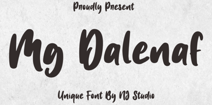 Hi...Thank for your visit :) Mg Dalenaf a unique font. It features unique characters that will take your projects to the next level! This font is PUA code which means you can easily access all the glyphs and swashes that are full of love! It also features many special features including glyphs. font designs that are made for various vector designs, printing such as digital wedding blogs, online shops, social media, while printing can be used in the field of product clothing, accessories, bags, pins, logos, business cards, watermarks and many others ... so it can make your product look cute and attractive, and also Multilingual support!!! Happy design ...
 - Havel by T4 Foundry,
$39.00Havel is an updated interpretation of a Czech type design from the 1930s. It is powerful and very condensed. At a quick glance you might find kinship with other condensed typefaces of the same period, like Spire (Sol Hess, 1937), Onyx (Gerry Powell for ATF, 1937) or Quirinus Bold (Alessandro Butti, 1939). But Havel has its very own look, rooted in the rapidly disappearing "Eastern European Type", a typographical tradition where poster and packaging design were the highlights. Torbjörn Olsson has revived this classical Czech beauty, and the Open Type version, Havel Pro, can also be used for Czech, Hungarian, Polish, Estonian, Latvian and Lithuanian. - Boondoggle by Wilton Foundry,
$29.00I created this font to capture the innocence and playfulness of doodle lettering that is created in schools everywhere. Typographic rules are non-existent and the characters are sometimes oddly and incorrectly shaped but that's exactly what gives it charm. What really got me started was Napoleon Dynamite, his drawings and "typography". This font does not mimic what you see in the movie at all, but it attempts to capture the same spirit of high school "doodle typography". My favorite line: "I am pretty much the best artist I know". The font was named after Boondoggle keychains, the other craft most scholars acquire at some point in their school careers. - Giomonte by Keristyper Studio,
$14.00 Introducing Giomonte Handwritten Script. Signature script font that feels beautiful classy, elegant, and modern. This type of font is perfectly made to be applied especially in logos, and other various formal forms such as invitations, labels, logos, magazines, books, greeting/wedding cards, packaging, fashion, makeup, stationery, novels, labels, or any type of advertising purpose. Multilingual support: Afrikaans, Albanian, Catalan, Danish, Dutch, English, Estonian, French, Finnish, German, Icelandic, Indonesian, Italian, Malay, Norwegian, Portuguese, Spanish, Swedish, Zulu, and many more. What’s Included : Standard & Multilingual glyphs Ligature Works on PC & Mac Simple installations Accessible in Adobe Illustrator, Adobe Photoshop, Adobe InDesign, and even work on Microsoft Word. Hope you enjoy our font!
 - Dusty Circus by Baseline Fonts,
$24.00 Dusty Circus™ is a five layer stacking display face designed to be infinitely morphed. The metrics are set identically in the individual and family set, to provide for typographic ease (although we seem to prefer an offset appearance). Great for a vintage western feel or a modern aesthetic. In addition, note that it is very easy to omit a layer and add multiple copies of other layers to produce a 3D bevel on the fly, or inline styles with flair and substance. LTD is a short set for non-commercial use only and combines two of the layers with many features/glyphs removed.
 - Varese by Tarallo Design,
$18.99 Varese is a geometric and modular typeface inspired by early 1900s Art Deco posters. Its heavy weight is excellent for headlines, display, or large body text. The lowercase is similar to the uppercase, yet many of the lowercase letters have interior spaces and several have some variations on the form (see H/h, E/e, F/f, I/i, J/j, L/l, N/n, T/t). The lowercase also has two alternate glyph sets that are half size and align with cap height. One of the alternate glyph sets has an underline and the other set does not. Varese has a sibling, Varese Soft.
 - Freehouse by Device,
$39.00 Freehouse is a reinterpretation of the well-remembered Watney’s logo, a brewery and pub chain infamous for its poor quality beer and brutalist decor. In Design Research Unit’s corporate guidelines from 1966 the font is described as Clarendon Bold Expanded — however, this is not the case. Clarendon has square serifs, whereas the Watney’s font is rounder and friendlier. A fixture of the British high street landscape for decades, this digitisation adds a full international character set, numbers, punctuation and many other characters that did not exist in the original. A distressed version that evokes rough print on a wet beermat has also been developed.
 - Glober by Fontfabric,
$39.00 The Glober font family includes 18 weights - nine uprights with nine italics. It is characterized by excellent legibility in both - web & print design areas, well-finished geometric designs, optimized kerning, excellent web-font performance and legibility etc. Inspired by the classic grotesque typefaces - Glober has his own unique style in expressed perfect softened geometric forms. The font family is most suitable for headlines of all sizes, as well as for text blocks that come in both maximum and minimum variations. Glober font styles are applicable for any type of graphic design in web, print, motion graphics etc and perfect for t-shirts and other items like posters, logos.
 - The Flash by NJ Studio,
$19.00 Hi...Thank for your visit :) the flash a signature font with beginning and ending swash. It features ligatures characters that will take your projects to the next level! This font is PUA code which means you can easily access all the glyphs that are full of swash! It also features many special features including glyphs. font designs that are made for various vector designs, printing such as digital wedding blogs, online shops, social media, while printing can be used in the field of product clothing, accessories, bags, pins, logos, business cards, watermarks and many others ... so it can make your product look swash and attractive, and also Multilingual support!!! Happy design ...
 - Daily Flashback by Letterhend,
$17.00 Daily Flashback is a sophisticated serif typeface. Perfectly to be applied to the other various formal forms such as invitations, labels, logos, magazines, books, greeting / wedding cards, packaging, fashion, make up, stationery, novels, labels or any type of advertising purpose. Features : lowercase uppercase numbers and punctuation multilingual alternates PUA encoded We highly recommend using a program that supports OpenType features and Glyphs panels like many of Adobe apps and Corel Draw, so you can see and access all Glyph variations. How to access opentype feature : letterhend.com/tutorials/using-opentype-feature-in-any-software/ Email us to letterhend@gmail.com if you need something! Happy Designing!
 - Vistr by Kobuzan,
$18.99 Vistr is a reverse-contrast display typeface inspired by western movies, infused with the tension of classic horror films. Powerful serifs, smooth curves, sharp details and an impressive contrast of strokes are unusually combined with each other. This creates a dramatic, eye-catching effect. Which is ideal for use in large sizes in titles and headlines to create a gloomy mood. This is an ALL-CAPS font. There is support for extended Latin, basic Cyrillic, and Greek. Features: – Total glyph set: 351 glyphs; – 1 style; – Support 210+ languages; – Latin Extended; – Cyrillic Basic + Bulgarian letters; – Greek; OpenType features: – Uppercase; – Proportional numerals; – Punctuations and symbols; – Arrows; – Stylistic alternates (ss01).
 - Kiera by Putracetol,
$22.00 Kiera - Display Typeface Font is an outstanding modern typeface that will add a unique touch to any display design. The font is inspired by vintage typography and posters with display themes, resulting in a classic, fun, and trendy impression that is easily recognizable. Kiera's unique features include the use of ligatures, making it stand out even more among other modern display typefaces. Kiera is an ideal choice for various display purposes, including album covers, posters, labels, t-shirts, apparel, signage, quotes, logos, greeting cards, and logotypes. Additionally, this typeface font supports multiple languages, making it suitable for a wide range of design projects. This font also offers a range of Open Type features that are accessible via Open Type savvy programs like Adobe Illustrator, Adobe InDesign, Adobe Photoshop Corel Draw X version, and Microsoft Word. The Open Type features include Swash, Stylistic Sets, Stylistic Alternates, Contextual Alternates, and Ligature, which provide an array of creative possibilities to enhance your design. Kiera font is also compatible with different devices. In conclusion, Kiera - Display Typeface Font is an exceptional font that combines vintage typography with modern design elements to create a unique and versatile display typeface that works for a wide range of design projects. Whether you are working on album covers, posters, labels, t-shirts, or any other display project, Kiera will make your designs stand out. With its multiple language support and Open Type features, Kiera is a must-have for any designer looking for a modern and unique display typeface.
 - Geographica Script by Three Islands Press,
$39.00 Time-tested elegance is what you’ll get with Geographica Script, a handwritten typeface steeped in 18th century sophistication. Source materials include the maps of Emanuel Bowen (circa 1694–1767), Geographer to King George II, as well as English and American trade cards from the middle 1700s, including the work of artist and printmaker William Hogarth (1697–1764). A kindred font to our Geographica serif family, Geographica Script is a painstaking replication of the elegant roundhand cursive seen in engravings of the period. Geographica Script has more than 1,100 glyphs, including scores of standard and contextual ligatures, three full uppercase alphabets, historical forms, decorative flourishes, and full Latin support. It’s also got fifty evocative ornaments inspired by map and trade card illustrations, e.g., lion rampant, unicorn rampant, crowns, anchors, sailing ships, whale, dolphin, sun, moon, and many others. Note: To prevent Microsoft Word from cutting off Geographica Script’s extra-long descenders, set line spacing (Format —> Paragraph —> Spacing) to 1.5 lines.
 - Amoresa by Andrey Sharonov,
$22.00 Amoresa script was handwritten under inspiration of traditional calligraphy and the wonderful mystic soundtrack of Wojciech Kilar. This font comes with a clean and aged version, beautiful uppercase and lowercase alternates, ligatures and end-swashes. You can easy get alternate characters just by adding number 2, 3, or 4 after any uppercase. Each of them has from one to four stylistic alternates. Lowercase has alternates too. Aurora has eight lengths of end-swashes. Just add underscore and a number from 1 to 8 after any letter at the end of the word ( _1 _2 _3 ... _8). Amoresa has multi-lingual support (Western European characters) for the following languages: English, Danish, Dutch, Estonian, Faroese, Filipino, Finnish, French, German, Hungarian, Icelandic, Irish, Italian, Norwegian, Polish, Portuguese, Spanish, Swedish. In my examples I show how this script can be used. It's very well suited for logotypes, wedding invitations, alcohol labels, romantic cards and others. Recommended to use in Adobe Illustrator or Photoshop. The special features don't work in Microsoft Word.
 - Brecksville by OzType.,
$15.00 Brecksville is a condensed grotesk typeface that takes inspiration from early German designs of the mid-19th century. It was designed as part of my current research into grotesk typefaces and different letterforms, as part of my dissertation research, “Perfected Letters: German Grotesk in the Nineteenth Century”, which focuses on the role of German design in typography. The Brecksville font family provides a wide range of weights, ranging from light to bold for both its rounded display style and more rugged sharp style. Both its styles feature the same horizontal proportions and metrics so they can freely be combined with no spacing issues. Brecksville's visually punchy condensed style and sharp edges, allows it to stand out on the screen – at almost any size. Its black composition also brings out the details needed in magazine and tabloid headlines, while maintaining readability throughout. The rounded display version is ideal for posters and other uses where you want something eye catching but not too hard on the eyes.
 - 1512 Initials by GLC,
$20.00 This set of initial decorated letters is an entirely original creation, drawn inspired by Italian renaissance patterns. It contains two roman alphabets : one drawn in white on black background and the other in black on white. We have included a few fleurons and decorative elements. It can be used as variously as web-site titles, posters and flyers design, publishing texts looking like ancient ones, or greeting cards, all various sorts of presentations, as a very decorative, elegant and luxurious additional font... This font supports strong enlargements remaining very smart and fine. It's prefered height is about one inch equivalent to about four lines of characters. This font may be used with all blackletter fonts, but works especially well with 1543 Humane Jenson, 1557 Italique and 1742 Civilite, without any anachronism.
 - California Signature by Bosstypestudio,
$16.00 California Signature is the perfect blend of Luxury and Unique. California Signature is a set of Seven modern fonts: upper and lowercase serifs and stylized script. The subtle curves of the serifs create a feminine feel. California Signature is perfect for logos, social media posts, invitations, and many other projects. It comes with multilingual support as well. These notes include: • California Signature Script Regular / Bold • Thin and realistic signature font containing 24+ ligatures and substitutes, lowercase, uppercase, all punctuation & numbers. • California Signature Serif Regular / Italic / Outline / Bold / Heavy • California Signature supports the following languages; English, French, Italian, Spanish, Portuguese, German, Swedish, Norwegian, Danish, Dutch, Finnish, Indonesian, Malay, Hungarian, Polish, Croatian, Turkish, Romanian, Czech, Latvian, Lithuanian, Slovak, Slovenian. I hope you enjoy this font. If you have any questions, feel free to message me :)
 - Honnie by Letterhend,
$19.00 Honnie is a quirky display font with unique and contemporary letterform. It comes with free illustration which is perfect to combined with this font. This type of font perfectly made to be applied especially in logo, headline, signage and the other various formal forms such as invitations, labels, logos, magazines, books, greeting / wedding cards, packaging, fashion, make up, stationery, novels, labels or any type of advertising purpose. Features : numbers and punctuation multilingual PUA encoded We highly recommend using a program that supports OpenType features and Glyphs panels like many of Adobe apps and Corel Draw, so you can see and access all Glyph variations. How to access opentype feature : letterhend.com/tutorials/using-opentype-feature-in-any-software/ Email us to letterhend@gmail.com if you need something! Happy Designing!
 - Kabusi by Twinletter,
$15.00 Kabusi San Serif is a premium font family with 18 different styles to choose from. Designed to aid you in the creation of visually stunning projects of all types. It is the most widely used typeface on the internet, in printed materials, and in other design projects. This Kabusi San Serif font embodies both modernity and classicism while remaining simple and clean in appearance. Apart from their great looks, this premium font family will assist you in giving your company a more unique look that will pay off! of course, your various design projects will be perfect and extraordinary if you use this font because this font is equipped with a font family, both for titles and subtitles and sentence text, start using our fonts for your extraordinary projects.
 - Logirent by Letterhend,
$17.00 Logirent is a unique typeface which is speciality made for a logotype. The customized ligatures is what makes this font unique. This type of font perfectly made to be applied especially in logo, headline, signage and the other various formal forms such as invitations, labels, logos, magazines, books, greeting / wedding cards, packaging, fashion, make up, stationery, novels, labels or any type of advertising purpose. Features : numbers and punctuation ligatures multilingual alternates / swashes and ligatures PUA encoded We highly recommend using a program that supports OpenType features and Glyphs panels like many of Adobe apps and Corel Draw, so you can see and access all Glyph variations. How to access opentype feature : letterhend.com/tutorials/using-opentype-feature-in-any-software/ Email us to letterhend@gmail.com if you need something! Happy Designing!
 - Akagi by Positype,
$25.00 Akagi started as a rough sketch while on a really long plane ride to Tokyo in 2007. I wanted to develop a sans that was a complete departure from my successful Aaux Pro (now Aaux Next) sans serif family. Whereas Aaux and its siblings are rather unforgiving and stark in their presentation, I wanted this new sans serif to "smile" at you when it's on the page. When the plane landed and I realized I did not sleep through the 15 hour trip, my brain shut off, the laptop closed and I hopped in the car to the hotel—forgetting the "new sans" folder on my desktop. Fast forward a few months and I found myself seeing a lot of crisp, rigid, robot-like sans serif typefaces everywhere... I enjoy these new crop of faces but wanted to see something "friendlier" and remembered my earlier sketch work. The groundwork was there screaming at me to complete and Akagi arose from the ashes. To be truly satisfied with it personally, a great deal of time was spent trying to create a harmony between line and curve in an attempt to show that you can be crisp, clean and legible and still keep some personality. The Light and Fat weights (regular and italic) are my favorites and I hope to see them as the workhorses of the typeface.
 - Habita Scenic by Mans Greback,
$59.00 Habita Scenic is the heavy and beautiful serif font that adds a touch of femininity and class to any project. Designed by Mans Greback in 2023, this font features high contrast and retro style, making it the perfect choice for designers looking to add a touch of cool to their work. With its beautiful swash letters, Habita Scenic is perfect for logos, headlines, and other creative projects. This font's classic and elegant design makes it an ideal choice for high-end brands and premium products. If you're looking for a font that exudes sophistication and timeless style, look no further than Habita Scenic. Use underscore _ anywhere to make a swash. Example: Love_Passion The Habita Scenic family consists of four high-quality fonts: Regular, Italic, Bold and Bold Italic The font is built with advanced OpenType functionality and has a guaranteed top-notch quality, containing stylistic and contextual alternates, ligatures and more features; all to give you full control and customizability. It has extensive lingual support, covering all Latin-based languages, from Northern Europe to South Africa, from America to South-East Asia. It contains all characters and symbols you'll ever need, including all punctuation and numbers.
 - Caskey by Twinletter,
$15.00 Caskey is a unique font with a graffiti motif, outdoor activities, and an abstract display with gorgeous graphics. We put all of it into this typeface, which we dubbed Caskey. We also include alternates, ranging from thin to thick, to make it easier for you to use; you are free to choose whichever suits you best. Now is the time to use this typeface to bring your specific project to life. This graffiti font is great for product logos, poster titles, headlines, packaging, film titles, logotypes, gorgeous writing, and trendy graffiti designs, among other things. Of course, if you utilize this font in your numerous creative projects, they will be perfect and outstanding. Use this typeface right away for your one-of-a-kind and remarkable projects.
 - Edison Swirl SG by Spiece Graphics,
$39.00 Edison Swirl, with its terminals majestically looping and twirling in a circular fashion, quickly takes us back to the Victorian era of type. This unusual fancy face, which dates back to the early 1900s, distinguishes itself by employing splayed M & N caps. Some letterforms also contain double cross-strokes for added interest. Edison Swirl is full of ornament and detail which creates a truly striking pattern of intrigue and delight. Edison Swirl is also available in the OpenType Std format. Some new characters have been added to this OpenType version. Advanced features currently work in Adobe Creative Suite InDesign, Creative Suite Illustrator, and Quark XPress 7. Check for OpenType advanced feature support in other applications as it gradually becomes available with upgrades.
 - F2F Metamorfosi by Linotype,
$29.99The techno sound of the 1990s, a personal computer, font creation software, and some inspiration all came together to inspire the F2F (Face2Face) font series. Alessio Leonardi and his friends had the demand to create new unusual typefaces, which would be used in the leading German techno magazine of the day, Frontpage. Even typeset as small as 6-points, in nearly undecipherable layouts, it was a pleasure for the kids to read and try to decrypt the messages. Letterforms in F2F Metamorfosi are parts of other characters that have been rotated to take on new meaning. For instance, an upside down V has become an A, a German ß has become the B, and a left parenthesis has become the C, etc. - Marista by Zephyris,
$- Marista is a bit of an unusual design, a cursive monospaced font inspired by the classic cursive typewriter fonts used in the 1960s-70s. It is designed to feel 'real', and captures some of the light irregularities in line weight which characterise real typewritten text rather than their computer equivalents. Marista is distinctive but easily readable, even in block text where some monospaced fonts suffer. Marista is best used at small to medium sizes, and at a uniform size throughout a document or design to capture the typewritten feel. The italic is more similar to authentic typewriter cursive fonts. Try it for your next letter or invitation!
 - Retiro Std by Typofonderie,
$59.00 Full of life Hispanic Didot in 2 optical sizes Retiro is a daring interpretation of Spanish typography. Severe, austere and yet, full of life, Retiro is a vernacular version of Castilian and Andalusian in a typical Didot. Named after a lovely park in Madrid, Retiro started life as a a bespoke typeface designed to give a unique voice to the magazine Madriz. In 2006, the founder of Madriz was looking for a Didot for his new magazine. The Didot is the archetypal typeface used in high-end magazines. Retiro is a synthesis of these high contrast styles mixed with an Hispanic mind. Result is then, after 2-3 years of work, a typeface with countless variations to establish typographic shades adapted to different sections and pages of the Madriz. In 2014, it was necessary to further revise the typeface before its launch at Typofonderie. In order to keep its originality, the unique weight was retained, but complemented with optical size variants to set highly contrasted headlines into various sizes, visually balanced. How to use Retiro optical sizes? Each font provided in Retiro family is named according to the scale of body size: 24 pt and 64 pt. Of course, these names are referring to the body sizes used in typographic design. In the “glorious old days,” the letterpress period, it was customary to cut punches directly to the size at which typefaces would be used. The punchcutter had to visually adapt his design to the engraving size. The aim was to optimize the best contrast and general weight, but also to respect both design’s and reader’s needs. In Retiro’s case, intended for large titling sizes, it’s an adaptation of this ancient practice for our contemporary uses. Although each font is named by a typographic point size, do not feel obliged to use this font at this precise size, but why not, in larger or smaller. It’s rather the concept of gradients that must be preserved in layouts, rather than strictly size numbers. It’s up to the designer to select the right font size for his own designs. Granshan Awards 2012 Creative Review Type Annual 2011 Designpreis 2011 Club des directeurs artistiques, 41e palmarès Type Directors Club 2010 Certificate of Type design Excellence
 - Gobsmacked by Hanoded,
$15.00 Gobsmacked is a rather new English word. It has been around since 1959 and was used mostly around Liverpool at that time. The word means: ’astounded’, ‘flabbergasted’ (another nice word!) or ‘speechless’. Gob could be of French or Scottish Gaelic origin and means ‘mouth’. Gobsmacked font was created using a brush and black gouache. The result is a very eroded, very legible and quite unique brush font. I have created alternates for the lower case letters, plus two double letter ligatures (oo and ss). Use it for any design that needs a little brushwork; I am sure the result will leave you gobsmacked!
 - Metal Thorn by Alit Design,
$22.00 Introducing "Metal Thorn" – a font that seamlessly blends the raw power of metal with the edgy intensity of thorns, all wrapped up in a cutting-edge cyber aesthetic. This font is a manifestation of metal brutalism, designed to make a bold statement with its fierce and avant-garde personality. Metal Brutalism Concept: Inspired by the industrial strength and unapologetic nature of metal, Metal Thorn embodies the essence of brutalism, creating a visual impact that is both commanding and unyielding. Fierce Thorn Design: The thorn elements within the font give it a sharp and aggressive edge, adding an extra layer of intensity. Each character is crafted with precision, making Metal Thorn a formidable choice for those who seek to convey strength and determination through typography. Modern Cyber Feel: Infusing a touch of cyber aesthetics, Metal Thorn transcends traditional boundaries. Its sleek and futuristic design elements make it perfect for projects that demand a contemporary, cutting-edge vibe. Extensive Glyph Set: With a generous set of 1014 characters, Metal Thorn ensures versatility and flexibility in your design projects. From standard Latin characters to multilingual support, this font caters to a wide range of creative needs. Alternate and Ligature Support: Unlock even more design possibilities with alternate characters and ligatures. Metal Thorn allows you to experiment with different letterforms, providing options for a customized and dynamic typographic experience. Multilingual Support: Metal Thorn breaks language barriers, offering comprehensive multilingual support. Communicate your message globally with ease, as this font accommodates a diverse range of languages. Whether you're working on a poster, branding, digital art, or any other creative endeavor, Metal Thorn is your go-to choice for a font that demands attention. Elevate your designs with the raw energy of metal, the fierceness of thorns, and the modern sophistication of cyber aesthetics – all encapsulated in the captivating Metal Thorn font.
 - Arthur Cabinet by SIAS,
$49.90 The Arthur Cabinet font family offers a most particular range of seven fancy ornamental fonts in the spirit of the Art Deco era. These fonts celebrate the age of elegance, stylishness and refinement to its very best. They give you a unique tool for exquisite designs. The fonts of this family are derivatives from the Arthur Sans series, which you may also want to have a look at. Use this unique typefaces for distinctive personal stationary, outstanding headlines, captivating brochures and invitations; for marvellous logotypes, wonderful menus, hotel leaflets, exciting ads … for brillant designs. Each Arthur Cabinet font features the same comprehensive Euro-Latin encoding for full language support. Additionally, every font includes a small supplementary set of fine ornaments. – For an even more comprehensive range of Arthur embellishments check out the font Arthur Sans Regular or Arthur Ornaments! Have also a look at the sister fonts of the gorgeous Arthur Sans Family, which will offer you yet another wonderful scope of fascinating typographic possibilities. ________________________________________________________________________________ Tip: Set Sample text (see below) manually to [ABCDE…] to view effectively the fonts most relevant parts! ________________________________________________________________________________
 - Andron 1 Monetary by SIAS,
$79.00 Andron 1 Monetary is a special supplement font containing 120 monetarian and weight measurement characters, both historical and modern. It provides a most comprehensive repertoir of even older currency unit signs as testified in manuscripts and printed sources. Among the most recently launched national currency signs, the Rubel, Manat and Turkish Lira characters are present with their new Unicode values. – All glyphs are drawn in the classical Andron style and blend perfectly with all other Andron fonts. – This font is a valuable addition to your Andron library.
 - Bollolo by YuliusParyadi,
$11.00 Bollolo (Handwritten) is a fun and playful font. Bollolo name is made from bolo-bolo which is mean lets be friend. This font is readable, catchy, and easy to use. This font is suitable for quotes, logo designs, kids toys, story book, and many other design projects. Bollolo is includes: - full set uppercase and lowercase letter; - numerals; - multilingual support; - large number of punctuations; - ligatures. Please add this font as your favorite, hit like button, or follow me. I'll very happy for that and appreciated it.
 - Gopetter by HansCo,
$12.00 Gopetter is a casually and quickly handwritten brush script. Letters are made with procreate brush pen on ipad. Then scanned and carefully drawn into vector format. There is just a right amount of texture left so it looks good in small and big sizes. These elements gives modern, clean and elegant. Gopetter font has five sets include with swashes to give some variation for your project. Some projects that are suitable for this font include quotes, invitations, menus, taglines, flyers / posters and many others. Enjoy!
