10,000 search results
(0.074 seconds)
- Lolotte by Nantia.co,
$22.00 The Lolotte Multilingual Signature Font is a signature decorative font with which you can achieve a handwritten-type lettering feeling. Lolotte Multilingual Signature Font is a multilingual lettering font with Greek (of course), extended Latin characters and diacritics. This signature style is perfect for your modern graphic design projects. This font has a really nice flow so you can use it in a large body of text if you want to give it a handwritten vibe. It can also be used on social media content, for branding or packaging applications. Also, Lolotte Multilingual Signature Font is the ideal typeface for branding and packaging. Additionally, you can use Lolotte Multilingual Signature Font on wedding invitation designs. Especially if you are looking for a font for Instagram quote posts or any other social media content, this typeface is for you!
 - Structorator by Furiosum,
$15.00 Structorator is a grid-based, experimental display font. This typeface emerged from experiments with generative type design. It evolved from a piece of code into a fully usable opentype font. The two main features are its rigid but playful design and a multitude of alternate glyphs. These features make it possible to create interesting lettering when using the default spacing. The glyphs are constructed from a limited set of patterns which are arranged within a predefined grid. The line thickness corresponds to the different cuts. Due to the rather complex shape this font will look best in larger sizes and resolutions. Its best suited for headline, display or illustrative work. - 3 weights: light, medium and heavy - 5 character sets - 3 number sets - Basic punctuation - Seperate diacrits - Ornamental glyphs - Access via stylistic sets *OT feature - Random access from the whole range of chars *OT feature - Total of 1062 Glyps
 - Dobro by Sudtipos,
$39.00 Strings vibrating against wood. Counterpoints. Strong beated rhythms and smooth flexible melodies. Repetitive sequences and syncopations. Sweeps and slides. Folk and tradition. That's how Dobro sounds. Inspired by the spirit of bluegrass music and the aesthetic of its wood type gig posters,this typeface explores certain concepts of rhythm and seeks to translate a piece of this universe into writing. Meant to be used in large sizes, Dobro is a 6-font set designed to work nicely together. It comes in 4 different weights, one color font with miscellaneous and connectors, plus frames and borders that pay tribute to vintage wood type catalogues. As an old company motto used to say: "Dobro means good in any language!" ––––––––––––––––––– IMPORTANT INFO ––––––––––––––––––– When you license Dobro you will download a pack with OpenType fonts but also a Color Font version of Dobro Drunk. (To use color fonts Photoshop CC 2017 /2018, Illustrator CC 2018 or QuarkXpress 2018 is required). If you create outlines in illustrator you can also modify the colors! Dobro Drunk BW OTF font (works like any font but is black & white.) Web files are only black and white until browsers support color fonts.
 - CAL Bodoni Ferrara by California Type Foundry,
$47.00 Bodoni Ferrara™ Fashionable, Luxury Heritage: The Original Bodoni Ferrara Sculpted from hi-res photos and scans of Bodoni's original Ferrara Font—his 1818 Manuale Tipografico and 1768 specimens. It has never before been available. This cut of Bodoni specially selected by Dave Lawrence from rare book specimens. Part of the California Type Foundry Origin Series. 3 Display Fonts in One!! And 6+ style mixes. Bodoni's 1st Draft - Transitional Serif Bodoni was often inspired by French type designs. His first draft of Ferrara was inspired by Pierre Simon Fournier. But Bodoni added his own Italian sensibilities. Bododni’s first, transitional style can pair with humanist sans, and transitional fonts. Bodoni's Rework - Modern Serif Later, Bodoni reworked Ferrara to match the later neo-classic style or modern serif of Firmin Didot¹. Bodoni’s modern style can pair with geometric sans, grotesque sans, neo-grotesque sans, gothic sans, copperplate script, . Informal On™ - Informal Mode by CAL Type Foundry This can pair with “infant” fonts. Geometric sans, and other sans or serifs with one-storied a’s. + Bodoni’s Tivoli a for another option! Works great with Fournier¹ fonts and grotesques, since the terminals will match. Font Pairing Guide This font includes a 78 page Ferrara Pairing Guide. This book shows you 131 pairings with text fonts. 47 pairings with subheader fonts! We want to help you get more out of your font collection. Design Features • Subtle forward angle (0.5-1.5°) makes Ferrara more lively and engaging than most Bodoni or Didot fonts. • Round curves make this font feel letter-pressed. • Bodoni's original tall x-height and slightly condensed proportions: great for headlines, where space is at a premium. • Better uppercase. Uppercase punctuation for design apps. • Proportional oldstyle and lining figures, both modern style and transitional numbers. Every pair of numbers is kerned for display sizes: no unsightly gaps! • Multiple special symbols for whenever you need a design to pop, including 3 of Bodoni’s amazing ampersands. Language Features Latin standard for western European and other languages. +Advanced support for: German, French, Spanish, Portuguese, Italian, and French. Special, uppercase umlauts for titles! Compare to metal Bauer¹ Bodoni! Special context kerning for French, Spanish, Portuguese, Italian, and French, to allow better better words like L'Angelique & “¿Nosotros?”. This kerning gets rid of unsightly gaps between “¿ and other combinations. Can’t Find the Pairing Guide? Can't find the pairing guide? Google “California Type Foundry” and grab the pairing guide. Get another free pro font while you’re there! Ferrara: many sizes, styles, moods and situations. It's a classic, fashionable font for display, headlines, and titles. Grab Ferrara today! ----------- ¹Trademarks of their respective owners. Ferrara™ is a trademark of the California Type Foundry.
 - Lucky Goldfish by Hanoded,
$15.00 I am not really sure if goldfish in general are lucky. They tend to swim in circles in a bowl, but maybe, years from now, scientists discover that these goldfish count themselves lucky to be in a bowl, rather than in a stream in Asia. Personally, I think they’d be better off in a stream. Lucky Goldfish font is a cute and happy font, ideally suited for book covers, posters and toy packaging. Comes with a school of diacritics too.
 - Leuk by Wilton Foundry,
$29.00 The Dutch word “leuk" translates loosely to English as pleasant, jolly, funny, witty, clever, nice, sweet, kind, nice, amusing, entertaining, and funny. Leuk, the font, is a small, highly legible font with a witty, sociable personality that engages it’s readers. My challenge in designing Leuk was to find a unique feature to set apart the font without losing the fundamentals of type design. In the process of doing so, I created a virtual font “smile and wink” in the “o” upper and lowercase with integrated stencil-connecting strokes within the “a,e, k, z, o, ß” to reveal Leuk’s calligraphic roots. Legible and friendly, Leuk is designed for use in advertising, brochures, promotion, book cover design, packaging, and the like. The Leuk family consists of Leuk Light, Leuk Light Italic, Leuk Regular, Leuk Italic, Leuk Bold, Leuk Bold Italic, Leuk Black, Leuk Black Italic in Opentype format.
 - Shibby by Hanoded,
$15.00 shibby adj (etc.). Used to indicate that something is “cool.” Apparently Shibby was first used in the 1999 movie Dude, Where’s My Car? I don’t think Shibby is THE cool word of the moment, but I think it is cool enough for this rather shibby font!
 - Alisal by Monotype,
$29.99 Matthew Carter has been refining his design for Alisal for so long, he says, that when he was asked to complete the design for the Monotype Library, it was almost as if he were doing a historical revival of his own typeface. The illusion even extended to changes in his work process: although he now does all his preliminary and final drawing on screen, the first trial renderings of Alisal were done as pencil renderings. Alisal is best classified as an Italian old style design. Originally created between the late 15th and mid-16th centuries in northern Italy, the true Italian old styles were some of the first roman types. They tend to be the most calligraphic of serifed faces, with the axis of their curved strokes inclined to the left, as if drawn with a flat-tipped pen or brush. These designs offer sturdy, free-flowing and heavily bracketed serifs, short descenders, and a modest contrast in stroke weight. Alisal has nearly all the classic Italian old style character traits, plus a few quirks of its own. It is calligraphic in nature, with more of a pen-drawn quality than faces like Palatino or Goudy Old Style. It is more rough-hewn than either Goudy's Kennerley or Benton's Cloister, and is generally heavier in weight than most of the other Italian old style designs. One place where Alisal makes a clean break with traditional old style designs is in the serifs. While sturdy and clearly reflecting pen-drawn strokes, Alisal's serifs have no bracketing and appear to be straight strokes crossing the main vertical. Like Caslon or Trajanus, Alisal is a handsome design when viewed as a block of copy. Ascenders are tall and elegant, and serve as a counterpoint to the robust strength of the rest of the design. Alisal is available as a small family of roman and bold with a complementary italic for the basic roman weight, providing all that is needed for the majority of text typography. Alisal is not as well-known as some of Carter's other typefaces, but this lovely and long-incubated design was certainly worth the wait.
 - Kadupul Flowers by Gatype,
$12.00 Kadupul Flowers is an incredibly unique handwritten,The shape is modern and style is very natural.modern calligraphy font. Masterfully designed to become a true favorite, the name of this font is also inspired by the name of a flower that is popular in the world this font has the potential to bring each of your creative ideas to the highest level! Kadupul Flowers features a varied baseline, gorgeous glyphs, and stunning alternatives. Hand-drawn design elements allow you to create many beautiful typographic designs in an instant like branding, web design and editorial, prints, crafts, quotes, It's great for logotypes, wedding invitations, romantic cards, labels, packaging, spelling of names and others. Kadupul Flowers includes OpenType stylistic alternates, ligatures and International support for most Western Languages. To enable the OpenType Stylistic alternates, you need a program that supports as Adobe Illustrator CS, Adobe Indesign & CorelDraw X6-X7, Microsoft Word 2010 or later versions. How to access all alternative characters using Adobe Illustrator: https://www.youtube.com/watch?v=XzwjMkbB-wQ Kadupul Flowers is coded with PUA Unicode, which allows full access to all the extra characters without having special designing software. Mac users can use Font Book , and Windows users can use Character Map to view and copy any of the extra characters to paste into your favorite text editor/app. How to access all alternative characters, using Windows Character Map with Photoshop: https://www.youtube.com/watch?v=Go9vacoYmBw
 - Rocaie by astype,
$37.00 The Rocaie fonts are base on antique Rococo letters from an gilding workshop. I was very lucky to acquire this set of metal letters in early 2018. Each of the letters has ornaments engraved by hand into its cast brass shapes. When drawing the digital outlines, I tried to preserve the handmade look of the original leaf engravings. Each of the letters uses a slightly different ornament pattern: no pattern is repeated identically. I expanded the very limited character set of the original, adding all the missing characters that today’s commercial fonts are expected to contain. I made additional font styles to easily add colour layers, outlines, and 3D shadows to the typeface. It’s up to you to decide how to “build” your colour font! You can combine the predefined font styles Regular, Pearl, Solid, Outline, and Magnum with each other, or with the Fill font styles. But you don't need to use all font styles to compose something nice! Have as much fun as I did with this Baroque beauty and enjoy the vintage.
 - Burner by Graffiti Fonts,
$29.99 Burner is an advanced, connecting, wildstyle graffiti font family including over 200 unique letters, numbers & symbols. The family includes outlines, fills, details and more. Mix and match glyphs from 3 alphabets, add end pieces and more. Repeating flames, arrows & flourishes & other embellishments are included. The Burner family includes 3 full alphabets in each of the 4 styles as well as numbers, punctuation and a wide array of arrows, bars , begining & end pieces. Like some of our earlier wildstyle typefaces such as RaseOne or WildStyle, the Burner font family is a layered type system made to work as a team. In nearly any application 2 or more styles can be easily layered to create advanced, multicolor, wildstyle pieces. This layering system provides a shortcut to time consuming effects such as sharp corners & variable widths on outlines, fills & details. The original glyphs were all drawn by hand taking inspiration from actual painted & drawn wildstyles from RaseOne spanning the late 90's to about 2006.
 - RRollie by Eurotypo,
$38.00 RRollie is a typeface family inspired on the proportions of the Roman capital in the Augusto's age, some of them can be seen in inscriptions of Pompeii; in this particular case, it has taken an inscription from a tomb of the year 15 AD. The subtlety of the serif is hardly insinuates, helping to strut the terminals of the stems. Ascenders and descenders are very short. The thickness variation is presented quite delicate, highlighting the light-dark passage and even the agile counterblocks of the typeface. These fonts can be used in many kind of graphic works by its strong personality, visual impact and readability. This font family include OpenType features: Standard and discretionary ligatures, small caps, case sensitive from, old style figures, tabular, diacritics for western languages and many others. Roberto Rollie (1935-2003) was an outstanding professional of Graphic Design, Photography and Visual Artist. He was involved in the creation of the career of Visual Communication Design at the Faculty of Fine Arts (National University of La Plata, Argentina), in the late '60s; he was a pioneer and great teacher too, who loved the Roman Capitals for its subtle and balanced design, especially for high readability and clever design. Those who, like me, knew him as a person and teacher, we are deeply grateful for having received their warmth and enthusiasm for graphic design.
 - Andhibath by Sabrcreative,
$17.00 Introducing Andhibath Bold Script Font, a captivating script typeface that exudes elegance and versatility. With its bold strokes and graceful curves, this font is perfect for adding a touch of sophistication to your design projects. Whether you're creating invitations, branding materials, packaging, or any other creative work, Andhibath will elevate your designs with its unique charm. The Andhibath font features both uppercase and lowercase letters, allowing you to mix and match different letterforms for a customized look. It also includes numbers and punctuation, ensuring that your compositions are comprehensive and well-rounded. With multilingual support, you can effortlessly incorporate various languages into your designs, making it suitable for projects with a global reach. One of the standout features of Andhibath is its PUA encoding. This means that accessing the font's special ligatures and glyphs is a breeze, giving you even more creative possibilities. The ligatures add a natural and handcrafted feel to your text, enhancing its visual appeal. With its script style, Andhibath captures the essence of handwritten elegance. It is ideal for a wide range of design applications, from wedding stationery and logos to social media graphics and advertising materials. The versatility of this font allows you to adapt it to different themes and moods, whether you're aiming for a classic, modern, or whimsical look. Experience the beauty and versatility of Andhibath Bold Script Font. Let its graceful curves and bold presence make a lasting impression in your designs.
 - 2 Mass J1808 by Kosinsky,
$30.00 2Mass J1808 is an experimental modern sans serif typeface. Open geometric shapes combined with futuristic style and wide letters make the text he typed quite attractive. Perfect for creating modern branding, logos, website design and many other ideas. Supports extended Latin, Cyrillic and OpenType functions. The font was developed in 2018-2020. Type designer Igor Kosinsky.
 - Monalissa by Yoga Letter,
$12.00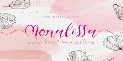 Monalissa is a very beautiful, high-quality font that is made with great love. This font can make your work more beautiful and elegant. This font is perfect for marketing your products, promoting your business, making quotes, weddings, invitation cards, logos, branding and status updates on social media, can also be used to beautify your beautiful moments, and others.
 - Heroum by Typebae,
$15.00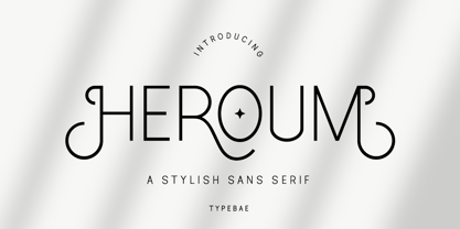 Heroum is stylish and beautiful sans serif font. It will look perfect in photography designs, watermarks, social media posts, advertisements, logos, branding, and various other projects. To use stylistics and ligatues, you don't need to use software that supports opentype, because we have made it separately so it's very easy to use. Features? Stylistic Alternates Ligatures Multilingual PUA Encode
 - The Bold Taffi by Scratch Design,
$12.00 The Bold Taffi is a bold, big, huge, geometric sans-serif with a modern style. This font is eye-catching custom-made and still has a fun and retro style. This font is perfect for headlines, logos, brandings, packaging, posters, labels, and other designs that need a high-fashion font. Includes: Two styles Numbers & punctuation Multilingual support Ligatures
 - Khinta by FadeLine Studio,
$10.00 Khinta comes in a bold and clean style, this font is firm, luxurious and simple. With a style like this, this font will be very suitable to use for logo's, branding projects, homeware designs, product packaging, mugs, quotes, posters, shopping bags, logo's, t-shirts, book covers, name cards, invitation cards, greeting cards, and all your other lovely projects.
 - Diamond Cubic by Attractype,
$17.00 Diamond Cubic is a modern serif font with a geometrical and a slightly condensed design which makes it particularly effective for space economizing. It will look fantastic with short and middle length text blocks, headlines, presentations, logo, branding, poster, packaging or any other creative design. Diamond Cubic containing small caps and glyph coverage for several languages.
 - Deltras by Abbasy Studio,
$17.00 Deltras is handmade modern vintage display typefaces, which is combining the style of classic typography with an modern handlettering style. The font have smooth edges to make vintage printing, so it will bring a handdrawn classic look feels. It easily cooperating together and perfect for creating the traditional style logos, labels, package design, lettering for t-shirts and much others. There are more than 355 glyphs in the font including Stylistic sets, Contextual Alternates etc. OpenType features with Stylistic Alternates, Contextual Alternate in some characters that allows you to mix and match pairs of letters to fit your design.
 - Halloween Party by Yoga Letter,
$14.00 This font is named "Halloween Party". This font was intentionally made to add to the excitement of the Hallowen event that will soon arrive. This "Halloween Party" font is very scary because there is blood on it. This font is perfect for adding to the excitement and mysticism of your Halloween event. In addition to Halloween events, this font can also be used as a movie title, book title or something else that is horror, can also be used to write quote words, tell mystical things, or as a horror and mystical pickle invitation card, and others.
 - Cosmic Sans by Zachary Mazur,
$15.00 Cosmic Sans was my first font ever created for a school project. The class I made this font for was my Advanced Typography and was a semester project. I really couldn't think of a title for this font, until one of my good friends said, "Why don't you name it Cosmic Sans?" I searched the internet for any other fonts with that name, and sure enough there wasn't. Thus the name stuck. This font is more or less a display font, thus every secondary character was not created. I hope you enjoy this font and much as I have while creating it!
 - Filarion by Locomotype,
$15.00 Filarion is inspired by a bit of 60s typography. At first glance it looks contrasting but is executed in a different way. The lines are drawn irregularly so that it looks casual and not stiff. From a clean basic form (Regular), Filarion was developed into three different variants, namely Bulbous, Noetic and Print. Each of them has an oblique style. So you will get 8 fonts from Filarion family. This font is suitable for use as a title in broadcast videos, movies or poster designs. It can also be used on quotes and other promotional materials that require extra attention.
 - Helmswald Post by Sharkshock,
$125.00 Helmswald Post is a handsome Blackletter that's been years in the making. There's a mix of wispy terminals, flamboyant caps, and the use of negative space to create contrast. Elements from High German, Old English, and many other styles make their way into this gorgeous display font. The result is a medieval looking script with cleaner, more modern feel. In addition to European accents Helmswald Post is equipped with Cyrillic, alternates and ligatures. Old world numerals are present by default but may be substituted by accessing the stylistic sets. Use it for a book cover, web headings, or a restaurant logo.
 - Sumply by Martin Gnadt,
$14.99 Sumply is a multi-layered type family based on geometric forms. A monospace display typeface which comes as a family of four. It is equipped with OpenType features and contextual alternatives to create a versatile and fresh output. Sumply initially was designed to be used in personalization processes in digital printing. By choosing the basic geometric cut (FOUR), patterns and various graphic elements can be created just by importing text variables into the indesign data merge. If combined with the other cuts the possibilities are sheer endless. Sumply was selected to be in the 2016 edition of Typodarium.
 - Gart Serif by Vitaliy Gotsanyuk,
$25.00 Gart Serif is a serif font that combines traditional Antiques from the 18th century with modern solutions. Compared to other Antiques, Gart Serif stands out with its "display" metrics that enhance its character without compromising readability. With a variety of weights, Gart Serif can have an elegant demeanor seen in its thin weight or a more robust and sturdy presence in its bold rendition. It serves well for setting large amounts of text as well as for short headlines. Gart Serif comprises 5 weights, 642 glyphs, basic Cyrillic and extended Latin, several stylistic sets, ligatures, numeral sets, and a variable font.
 - Edgewater by cm5dzyne,
$16.00Initially created for use in a logo and with a limited number of characters, Edgewater evolved into a full typeface suitable for everything from projects requiring a space-age, futuristic feel to logotype for the most refined, conservative corporations. Edgewater was joined in November, 2008, by Edgewater Hairline, which supports more than 30 languages and is especially attractive in larger point sizes. The hairline version also is a nice complement to the other fonts in the Edgewater series, though still striking enough to stand on its own as the dominant visual in a virtually unlimited number of displays. Timeless, unique and flexible. - Linotype Syntax Serif by Linotype,
$29.00Linotype Syntax™ Serif is the serif typeface that complements Linotype Syntax™, both created by Swiss type designer Hans Eduard Meier in 2000. With this new design, Meier has at last given shape and structure to the invisible muse that inspired him in the 1950s when he conceived his monoline sans serif based on humanist or Oldstyle letterforms. The calm legibility of this workhorse text family is accented by Meier’s signature of subtle dynamic movement, making it ideal for longer texts in books and magazines. It combines harmoniously with the other Syntax typefaces, Linotype Syntax™ and Linotype Syntax™ Letter. - Fehlian by SIAS,
$39.90 In Fehlian I blended features of my earlier Arthur and Lindau releases. Fehlian is a sturdy yet sophisticated Art Deco style Roman semi-serif. It is an excellent choice for titlings, headlines, labels, shopfronts and any other display usage which needs to be typographically furnished with something special. Moreover, besides the plain Fehlian font you have the option of yet another two wonderfully decorated versions which lend even more beauty to your designs. Note that Fehlian is a capitals-only product. It has no lowercase but the uppercase is completed for multilingual usage and supports every Euro-Latin language.
 - Feeling Things by Abbasy Studio,
$18.00 Introducing Feeling Things, A Modern Serif Font with Retro Vibes. It was inspired by retro typography designs in 70's. There are more than 375 glyphs in this font including Multilanguage Support. OpenType features with Stylistic Alternates, Contextual Alternate and ligatures in some characters that allows you to mix and match pairs of letters to fit your design. Feeling Things is perfectly suitable for made to be applied in logo, and the other various formal forms such as invitations, labels, logos, magazines, books, greeting / wedding cards, packaging, fashion, make up, stationery, novels, labels or any type of advertising purpose.
 - P22 Flora Mambo by P22 Type Foundry,
$24.95 P22 Flora Mambo is based on the distinctive style of 20th century illustrator Jim Flora. Most widely known for his Jazz album covers of the 1940s & 50s, Flora's style shows his fantastic imagination and bold graphic style. The P22 Flora Mambo Set contains 3 fonts- Flora Mambo, a 2-part font that can be used to achieve 2-color text in the style of Flora's iconic 1955 album design, Mambo for Cats and Flornaments, a set of 72 ornaments that features a variety of Flora's illustrative styles from his Jazz album covers to children's books to his fine art prints. Please note that P22 Flora Mambo B is not intended to be used on its own but rather is included with P22 Flora Mambo to create 2-color text. For best results, use with page layout applications. The fonts contained in the P22 Flora Mambo Set are licensed through the Estate of James Flora and JimFlora.com .
 - Ahmed by Linotype,
$187.99Ahmed is a modern Arabic headline face, first produced by Linotype-Hell Ltd. in the early 1980s. Originally developed as a simplified face, its design recalls the inscriptional and decorative tile work lettering of the medieval period. The strong treatment of the tails of certain characters departs from the more traditional style of tapering these finials, introducing a modern feel to the design. The contrasting proportions of the tall vertical strokes and the rather elongated counters lend a monumental look to Ahmed, allowing its effective use in titling. During the later 1980s Ahmed was developed into a traditional typeface, with the introduction of medial forms to improve character spacing and balance. Recently, Ahmed has been converted into the OpenType font format, ensuring its continued popularity as a heading face for newspaper typesetting. The Ahmed typeface contains two weights, Ahmed and Ahmed Outline. Both of the OpenType fonts include Latin glyphs from Clearface Gothic Roman inside the font files, allowing a single font to set text in both most Western European and Arabic languages. The two Ahmed fonts include the Basic Latin character set and the Arabic character set, which supports Arabic, Persian, and Urdu. They include tabular and proportional Arabic, Persian, and Urdu numerals, as well as a set of tabular European (Latin) numerals. - Univers Next Cyrillic by Linotype,
$49.00 Linotype Univers is a completely reworked version of the original Univers typeface family designed by Adrian Frutiger in 1957. After a long process of painstakingly detailed revision, Frutiger and the design staff at Linotype completed this large joint project in 1997. The result: a brilliant and cohesive font family of 63 weights and styles including the 4 monospaced typewriter weights. All the existing weights were completely redrawn, with careful attention paid to making the proportions more consistent with each other and improving fine details such as curves and thick-to-thin stroke ratios. The family was expanded from 27 to 63 weights, providing a much larger framework to graphic designers for choosing just the right style. The bold and condensed weights were reworked for improved legibility and on-screen application. The stroke weights were revised for consistency within each face as well as in relationship to the other weights. By following Frutiger's original designs, the humanist character of the sans serif Univers now comes through more distinctly. The systemized numbering system has also been updated. With its sturdy, clean forms Univers can facilitate an expression of cool elegance and rational competence. In fact, the strong familial relationships between all the styles and weights make it a serviceable choice for large graphic design projects that require versatility with consistency. Frutiger was successful in staying true to his initial aims; the new Linotype Univers does indeed work in longer texts as well as for display settings. In 2010 the typeface family was extended and renamed into a more logical naming of "Univers Next" to fit better in the Platinum Collection naming.
 - Univers Next Paneuropean by Linotype,
$89.00 Linotype Univers is a completely reworked version of the original Univers Univers typeface family designed by Adrian Frutiger in 1957. After a long process of painstakingly detailed revision, Frutiger and the design staff at Linotype completed this large joint project in 1997. The result: a brilliant and cohesive font family of 63 weights and styles including the 4 monospaced typewriter weights. All the existing weights were completely redrawn, with careful attention paid to making the proportions more consistent with each other and improving fine details such as curves and thick-to-thin stroke ratios. The family was expanded from 27 to 63 weights, providing a much larger framework to graphic designers for choosing just the right style. The bold and condensed weights were reworked for improved legibility and on-screen application. The stroke weights were revised for consistency within each face as well as in relationship to the other weights. By following Frutiger's original designs, the humanist character of the sans serif Univers now comes through more distinctly. T he systemized numbering system has also been updated. With its sturdy, clean forms Univers can facilitate an expression of cool elegance and rational competence. In fact, the strong familial relationships between all the styles and weights make it a serviceable choice for large graphic design projects that require versatility with consistency. Frutiger was successful in staying true to his initial aims; the new Linotype Univers does indeed work in longer texts as well as for display settings. In 2010 the typeface family was extended and renamed into a more logical naming of "Univers Next" to fit better in the Platinum Collection naming.
 - Seventies by Lián Types,
$37.00 'Meeeeoooow'! Seventies is another of my 'funkadelic' attempts (1) to fill the existing gap of seventyish looking fonts. In my opinion, that decade has a hidden treasure regarding type that remains unexplored: Only very few fonts rescue its 'groovy' essence, its ‘colourful’ qualities. But, don't have a cow man , and keep on truckin! With Seventies, my new foxy mama , your projects will stand out among the rest. Since there’s not much information available about this kind of lettering I had to get ideas from other styles: Nowadays it’s easy to find all kind of books or guides to understand and practice how different styles of calligraphy and lettering should be done. However, for some reason, 60s and 70s letters seemed to ignore/be free of rules... Was this suggesting the birth of postmodernism? I incorporated some ideas of the copperplate style of calligraphy: The ductus of its forms may be compared to the way letters are made in snell/engrosser’s script. Obviously, this is just the idea behind; the delicacy of thins is replaced here with the graceful imprint of really thick thicks with a brushy look and tons of good vibe . Seventies will work awesome in posters, brands, magazines, book-covers of any kind, due to its modern look adapted to our century. Well, catch you on the flip~side ! STYLES To make you more psyched , Seventies is a layered font! See examples in the posters using Seventies Shade, Seventies Shine and Seventies Printed. NOTES (1) My first one was with Beatle in 2014.
 - Culoare by Luxfont,
$18.00 Introducing space-bright COLORED hologram font. Soft color transitions combined with minimalistic clean glyphs. Ideal for modern web and print design. Excellent readability of glyphs for both the title and the large volume of text is preserved. Multi-colored modern family with different types of coloring - a highlighted gradient border of letters or fully hologram glyphs - a large selection of 11 ready-made font styles. Originality of the font will fit well into the fashionable logo, headline in the magazine or on the website, emphasize the trend of the product in branding and complement web advertising on social media. This font family is based on the Regular font Boldini - which means that if necessary you can combine these two families and they will be absolutely stylistically identical and complement each other. Check the quality before purchasing and try the FREE DEMO version of the font to make sure your software supports color fonts. Features: Free Demo font to check it works. 11 OTF SVG color fonts in the family Free Demo font to check it works. Gradient and hologram fonts Kerning IMPORTANT: - OTF SVG fonts contain vector letters with gradients and transparency. - Multicolor OTF version of this font will show up only in apps that are compatible with color fonts, like Adobe Photoshop CC 2017.0.1 and above, Illustrator CC 2018. Learn more about color fonts & their support in third-party apps on www.colorfonts.wtf -Don't worry about what you can't see the preview of the font in the tab "Individual Styles" - all fonts are working and have passed technical inspection, but not displayed, they just because the website MyFonts is not yet able to show a preview of colored fonts. Then if you have software with support colored fonts - you can be sure that after installing fonts into the system you will be able to use them like every other classic font. Question/answer: How to install a font? The procedure for installing the font in the system has not changed. Install the font as you would install the classic OTF | TTF fonts. How can I change the font color to my color? · Adobe Illustrator: Convert text to outline and easily change color to your taste as if you were repainting a simple vector shape. · Adobe Photoshop: You can easily repaint text layer with Layer effects and color overlay. ld.luxfont@gmail.com
 - Sweet Honey by BlackLotus,
$12.00 Sweet Honey is a display font inspired by the cuteness and joy of childhood. Any design made using this font will bring out a cheerful, cute, and unique feel that blends together. Each Uppercase and Lowercase character in this font is made as unique as possible, so that this font can stand out and be easy to remember whenever people look at it. This font has 2 styles, namely regular and bubble, these styles make this font more varied so that it adds inspiration to every design that is made. Sweet Honey is perfect for use in brochures, book titles, magazines, posters, announcements, and more.
 - Aquus by phospho,
$39.00 Aquus is a contemporary all-caps display font that refines the elegance of a classic Didone with experimental interventions. Geometric elements and subtle details are found in its letters, many of which connect to ligatures. Most alternate glyphs can be switched automatically by use of the Stylistic Set function in OpenType-supporting applications, others you can access manually via the glyphs palette. You may try Aquus Linearis as a fashionable outline variant, which reveals its beauty especially when combined with imagery. Use them best for concise strings of characters, such as logotypes, packaging or magazine titles. Aquus Simplex is their sober companion, based on the same letterforms, minus the geometric ornaments and conjunctions.
 - Sangday by Bosstypestudio,
$12.00 Sangday is an elegant calligraphy font that comes with a very beautiful character change, a kind of classic decorative script with a modern touch, designed with high details to present an elegant style,.. BSangday is attractive because the typeface is pleasing to the eye, clean, feminine, sensual, glamorous, simple and very easy to read, thanks to its many luxurious letter relationships. I also offer a decent number of stylistic alternatives for some of the letters. Classic style is very suitable to be applied in various formal forms such as invitations, labels, restaurant menus, logos, fashion, make up, stationery, novels, magazines, books, greeting/wedding cards, packaging, labels or all kinds of advertising purposes and many others. .. Thanks & Happy Designing!
 - Lanore by Atom,
$14.00 Lanore is a modern font that is elegant and luxurious. Made especially for who makes logo designs, wedding supplies, branding, beauty packaging, and more. Create your modern, clean and elegant design with Lanore. Made with OpenType features and including titling and swash, 01-06 alternative characters for lowercase letters, numbers, punctuation, alternatives, and also supports other languages. Thank you for visiting my store and happy buying!