10,000 search results
(0.285 seconds)
- Vintage Scripter by Nathatype,
$29.00 Looking for a font that will make your branding stand out? Do you sometimes have an appetite for a bit more wholesome typography? Looking for a fabulous, stylish, and adventure font? We've got what you want. Vintage Scripter- AScript Font Vintage Scripter is a flowing and fun font. This font features thick and angular letters that easy on the eyes and nice to look while it’s also easy to read. Vintage Scripter becomes more special with extruding version option. It has a beautiful and balanced character, making it suitable for a variety of purposes. such as posters, logos, product packaging, branding, titles, signs, labels, mugs, book covers, quotes, and others. Our font always includes Multilingual Support to make your branding reach a global audience. Features: Ligatures Stylistic Set Swashes PUA Encoded Numerals and Punctuation Thank you for downloading premium fonts from Natha Studio
 - Monotype Clarendon by Monotype,
$40.99The first Clarendon was introduced in 1845 by R. Besley & Co, The Fan Street Foundry, as a general purpose bold for use in conjunction with other faces in works such as dictionaries. In some respects, Clarendon can be regarded as a refined version of the Egyptian style and as such can be used for text settings, although headline and display work is more usual. - Vintage Galore by Letterhend,
$12.00 Vintage Galore is a handmade blackletter font font with casual & classic feels. This font will bring you back to 90s feel.This font perfectly made to be applied especially in logo, and the other various formal forms such as invitations, labels, logos, magazines, make up, stationery, novels, labels or any type of advertising purpose. Features : Uppercase & lowercase, Numbers and punctuation, Alternates & Ligatures, Multilingual & PUA encoded
 - Rumo Script by Bean & Morris,
$35.00 Rumo Script is a bright, breezy, free-flowing contemporary script to lighten the load when a change of pace is required to communicate freshness, fun, lifestyle and a general 'good feeling'. Designed so that some letters connect while others don't giving a spontaneous feel at the same time keeping it a 'considered' style. Rumo (pronounced Roo-mo) will enhance your graphics and give them that 'wow' look!
 - Air Leving by Jehansyah,
$9.00 Air Leving this is an elegant font This is an elegant font, with alternatives that you can use as needed, this font is also very suitable to be used as a logo or product icon, it adds to your creative experience and will look much different from the others, suitable for all types of elegant and minimalist themed designs. Include : numeric alternate Latin Thank you very much
 - 1540 Mercator Script by GLC,
$38.00 This font was inspired by the so-called Litterarum latinarum, quas italicas, cursoriasque vocant, scribendum Ratio (Louvain 1540), a manual intended for calligraphers by the well known scientist Gerhard Mercator. It was a magnificent “Cancellaresca corsiva” design, enriched with many alternates, final loops and ligatures. We have added a lot of accented and other characters required for modern use that did not exist in the original.
 - Spicy Hour by PizzaDude.dk,
$17.00 Spicy Hour can be used for all your dishes and designs that needs that extra seasoning. Just mix, and you are ready to go! The ingredients includes contextual alternates, which in this case means that every letter has 5 different versions, which automatically cycles as you type. In other words, it spices up your text! Multilingual support is also a part of the dish!
 - Tiffany Laurence by Ronny Studio,
$24.00 Tiffany Laurence Serif is a classy eighties magazine-inspired font - with complementary italic versions. Both come in two versions one with more contrast and sharper than the other. In true Eighties style. This font looks premium and is very suitable for your design needs such as invitations, labels, logos, magazines, books, greeting / wedding cards, packaging, fashion, make up, stationery, novels, labels or any type of advertising purpose.
 - Monotype New Clarendon by Monotype,
$29.99The first Clarendon was introduced in 1845 by R. Besley & Co, The Fan Street Foundry, as a general purpose bold for use in conjunction with other faces in works such as dictionaries. In some respects, Clarendon can be regarded as a refined version of the Egyptian style and as such can be used for text settings, although headline and display work is more usual. - Megar by Viaction Type.Co,
$20.00 Megar is a display font with a bold retro feel and available in 2 styles, regular & oblique. It is suitable to complement your work with a retro or pop art theme. Megar is sold at affordable prices and you will get lots of bonus background gradient & gradient shapes. Get this font right now! Don't miss this product from us! Also check out our other products. Viaction Type
 - Legal by Linotype,
$29.99The Legal typeface family grew out a sans serif project that Hellmut G. Bomm began in the 1970s (his HGB Grotesk). This refined, industrial type family is well suited for short amounts of text, headlines, corporate identity and logo design. In small sizes, the typeface works like many other sans serifs, but with better differentiation between characters. The Legal family includes oldstyle figures and true italics. - Quatsity by Ingrimayne Type,
$5.00 Quatsity is a squarish or boxy serifed font with rounded corners. Quatsity is is suitable for titles or signage and legible enough for small blocks of text. Quatsity-Light was constructed in 1995 by blending two very different faces, a typeface very similar to Kwersity (with low contrast) and one similar to Qwatick (with high contrast). The other seven styles were added in 2020.
 - Thalia Threshold by Letterhend,
$16.00 Thalia Threshold is a brush script with charm classic. You can playaround with alternate characters. This font perfectly made to be applied especially in logo, and the other various formal forms such as invitations, labels, logos, magazines, books, greeting / wedding cards, packaging, fashion, make up, stationery, novels, labels or any type of advertising purpose. Features : Uppercase & lowercase Numbers and punctuation Alternates & Ligatures Multilingual PUA encoded
 - CG Clarendon by Monotype,
$29.99The first Clarendon was introduced in 1845 by R. Besley & Co, The Fan Street Foundry, as a general purpose bold for use in conjunction with other faces in works such as dictionaries. In some respects, Clarendon can be regarded as a refined version of the Egyptian style and as such can be used for text settings, although headline and display work is more usual. - Haunted Gallery by Letterhend,
$17.00 Haunted Gallery is a fun horror typeface with classic letterform. You can play around with the ligatures.This font perfectly made to be applied especially in logo, and the other various formal forms such as invitations, labels, logos, magazines, books, greeting / wedding cards, packaging, fashion, make up, stationery, novels, labels or any type of advertising purpose. Features : Uppercase & lowercase Numbers and punctuation Alternates & Ligatures Multilingual PUA encoded
 - 1467 Pannartz Latin by GLC,
$38.00 This family was inspired by the edition De Civitate Dei (by Sanctus Augustinus) printed in 1467 in Sobiano (Italy, Roma) by Konrad Sweynheym and Arnold Pannartz who was the Punchcutter. It is one of the first few “Roman style” fonts, just before the birth of Jenson’s pattern (look at 1470 Jenson Latin). The present font contains all of the specific latin abbreviations and ligatures used in the original (about 54). Added are the accented characters and a few others not in use in this early period of printing. Decorated letters such as 1512 Initials, 1550 Arabesques, 1565 Venetian, or 1584 Rinceau can be used with this family without anachronism. If Italic style is required (not yet existing in early time of printing), we recommend using 1557 Italique.
 - Jungle Mask by Ergibi Studio,
$21.00 Jungle Mask This typeface has been made carefully to make sure its premium quality and luxury feel. The many alternate character on serif makes this typeface unique and stands out rather than the regular sans font, perfectly for headlines, logos, posters, packaging, T-shirts,coffee shops, restaurants, magazine's headers, signs or gift/post cards,cafe's and weddings or any type of advertising purpose. If there is a problem, question, or anything about my fonts, don't hesitate to ask! Big Thanks Ergibi Studio
 - Gigafly by ROHH,
$39.00 Gigafly™ is a contemporary high-contrast sans-serif display typeface designed for branding and impactful posters. The family features very modern and sharp design language, opening a world of lively compositions full of strength, energy and movement. Its playful contrast makes it stand out from the crowd and gives it a unique type of cheerful elegance. Gigafly features lots of stylistic alternates, allowing to create a collage-like, dynamic compositions by mixing the styles and weights of the letters. To make things even more fun, the family contains a set of quirky icons that will inject even more personality into your designs (do not miss out on the super cool manicules!). The family is very powerful, extravagant, playful, yet it manages to keep its elegance - it can be more calm, measured and simple when needed as well. It has a vibe of modern, crisp sans-serif as well as fashion magazine type didone. The full family consists of 15 styles - 5 weights in 3 different optical sizes for headlines, display sizes and big posters. The family offers a 2-axis variable (weight and optical size) font that contains every style and gives even more flexibility and versatility. Each font features 1400 glyphs, including uppercase, lowercase, icons, tons of alternates, as well as other OpenType features such as stylistic sets, case sensitive forms, lining and old style figures, basic fractions and superscript/subscript, slashed zero, currencies and symbols.
 - Astire Klarish by Dora Typefoundry,
$20.00 Introducing, Astire Klarish is a new retro serif with all clean and soft lines, tight curves, a combination of regular and italic versions adding to the appeal and trendy elegant look! This serif typeface that looks amazing in both large and small settings is perfect for your design needs yet still clean and elegant to apply to a variety of other formal forms such as invitations, labels, logos, magazines, books, greeting/wedding cards, packaging. , fashion, make up, stationery, novel, label or any kind of advertising purposes. WHAT YOU GET : Astire Klarish Regular (Open type) Astire Klarish Italic (Open type) Astire Klarish Bold (Open type) Astire Klarish Bold Italic (Open type) This type of family has become the work of true love, making it as easy and fun as possible. I really hope you enjoy it! Thank you.
 - Marshmallow by Positype,
$39.00 Marshmallow is a fun, fat, super high-contrast script typeface in two variants. A slick connected (Script) and a mellow unconnected (Fluff) style that provides the versatility you need regardless of the display usage you plan. Marshmallow Script tops out at 820 characters, and both fonts feature a wide array of swash and stylistic alternates that complement the other, with varying options in the three additional stylist sets, titling alternates, ligatures and contextual ligature combinations. The fonts even contain ordinals, superior and inferior numerals, OpenType-generated fractions. All of these extras are produced with a sense of decadence and fun to expand the possible uses of the typeface. It can’t be used everywhere, but when it is used, it should be used with indulgent abandon… which is pretty much what happens any time we take a soft, gooey bite into marshmallow now, right?!
 - Nora Grotesque by vve.type,
$34.99 Nora Grotesque is a modern sans serif type family of five weights plus true matching obliques, all completely equipped with opentype features, fractions, lining numbers, old style figures, capsular numbers, superscript and inferiors. It has been designed parallel within the neogrotesque universe of typefaces and is inspired by humanist proportions and humanist-grotesk features in multiple languages, support Central and Eastern European as well as Western European languages. Working on Nora Grotesque type family, we've aimed to create a modern geometric grotesk with the widest implementation range, a reliable workhorse. Nora Grotesque is equipped for complex, professional typography with a high x-height for maximum legibility and a powerful personality then other alternates. We've been especially careful working on the uniq geometry of each glyph, both from the point of view of visual correctness and forms continuity.
 - Genau by Aronetiv,
$9.99 The Genau family is a geometric sans serif designed under the influence of the constructivist schools of Vkhutemas and Bauhaus. Despite the traditional shapes, the family has characteristic features in the modern outline. The sharp junction of round and straight strokes repeats the sharp tails in “a” “d” “n” “u” and other. The family has an even, smooth texture. The family has been developed to advert materials for architecture, design, education, modern art. The family has high readability in a small size, and doesn't lose aesthetic qualities when enlarged. The font family contains 8 styles The font is equipped with a Variable file with two axes (weight and slope) Supports languages of central Europe and some languages of eastern Europe Contains small uppercase letters Contains tabular figures There are several alternates in the font The font has more than 1700 kerning pairs
 - Kometa by Kiril Zlatkov Type Foundry,
$40.00 Kometa Sans is a contemporary grotesk with a certain personality. She has a steady geometric skeleton, but its appearance is rather humanistic. The precise details of the artwork, the carefully drawn true italics, the six types of numerals, the variety of alternates, the broad range of open-type features and the extensive glyph set can meet most of the contemporary typographer’s demands for a neutral, but not boring type family for both long text and display use. Among the distinctive qualities of Kometa are also the forms of ligatures (both default and discretionary). They follow the natural constructive transitions between oval parts and stems, which is an advantage to mark, at least for designers who respect the beauty of clean forms. Note the specially designed Kometa Unicase sub-family, substantially enough to exist as a separate typeface. Its elegant and expressive letterforms are boosting further the power to create outstanding design work. Kometa Unicase has original and playful, yet reasonable approach to letterforms variety. Kometa has a very broad usability range – from logotypes and poster designs to corporate identities and complex editorial projects. The contemporary Cyrillics of Kometa allows easily completion of graphically consistent multilingual corporate and artistic design projects. Designed by Kiril Zlatkov and Vassil Kateliev.
 - Rodeo Rebels by Putracetol,
$24.00 Rodeo Rebels is a display typeface with a retro, cowboy, and western theme. It's perfect for designs that require a bold and masculine touch, such as branding, packaging, posters, and headlines. The font was inspired by vintage rodeo posters and the American Old West, where bold, slab-serif typography was a common sight. To make the most out of Rodeo Rebels, consider using it in designs that require a rugged and tough aesthetic, such as clothing and apparel, whiskey and beer packaging, and Western-themed events. Pairing it with other vintage-inspired elements, such as distressed textures and illustrations, can also help create a cohesive look and feel. With its bold and rugged aesthetic, Rodeo Rebels is a font that demands attention. It's perfect for projects that require a vintage and masculine vibe, and its features make it a versatile choice for a wide range of designs. Give your projects a touch of the American Old West with Rodeo Rebels, and let its bold and rugged style do the talking.
 - Uranus by Supremat,
$12.00 Uranus is a futuristic font inspired by space and extraterrestrial civilizations. The proportions of the letters are wide, the elements of the letters have organic curves, reminiscent of the design of streamlined spaceships. What gives the font a special character is the excessive contrast between the upper element and the crossbar in letters such as A, B, E, F, K, P, R. In these letters, there is a barely noticeable intra-letter gap in the form of a line. Due to this contrast and rounded elements in these letters, a negative space of a triangular shape also turned out. Particular attention should be paid to the broad language support for the font. The font has support for Latin, extended Cyrillic, and Korean (2780 base syllables). Total glyphs: 3562. Uranus is well-suited for large typography, logos, and any other design related to futurism and space.
 - Typewriter Sans JNL by Jeff Levine,
$29.00 At first glance, Typewriter Sans JNL seems to look like the pantograph lettering of an engraved sign or the rounded-end lettering from an architect's templates. It might also be mistaken for plastic pin-back lettering used on some bulletin boards. In actuality, the design is based on examples of an electric typewriter ball element with a sans font named "Dual Gothic", suggested for use "in credit reports and other financial applications".
 - Linotype Chineze by Linotype,
$29.99The German designer Peter Huschka created Linotype Chineze, a family of typefaces that resemble the calligraphic strokes found in Chinese characters, in 2002. Using a variety of brush-like elements, Linotype Chinese imbues the Roman alphabet with an Eastern flair. Try out this font in a menu, a comic book, or on food packaging! Like this foreign feeling? Check out Sinah and Sinah Sans, two other Eastern-inspired font families from Huschka." - Aflah Akbar by Studio Hello Good,
$12.00 Aflah Akbar is an elegant sans serif font with lots of ligatures in it, this font has 354 glyphs so it is perfect for those of you who want to use it as a logo or other design needs, whether it's for magazines, skincare, perfume, jewelry, stationary offices, newspapers, book covers. , web designing. The Aflah Akbar font has regular, smooth, slant, shadow, line and 3d options, the Aflah Akbar font itself can support 67 languages.
 - Yalta Sans by Linotype,
$29.00 Yalta Sans combines the warmth of a traditional humanist design, the clarity of a grotesque and the modernity of a square sans. Several design traits contribute to this melding of diverse typographic concepts. Characters find their foundation in stroke-based shapes rather than constructed forms. Curve stokes are also slightly squared and counters are open. Curved strokes join verticals at nearly right angles to create a strong horizontal stress, aiding the reading process. The resulting design is exceptionally legible while still inviting. Although Yalta Sans is clearly differentiated from its calligraphic ancestors, many details of the design emulate the distinctive characteristics of typefaces from the Renaissance. Tapering horizontal stokes also give Yalta Sans a dynamic relationship with linear grotesque while its angled stroke terminals echo the work of a calligraphic brush Yalta Sans italics are cursive designs that are in keeping with humanistic letterforms and are markedly narrower than the Roman characters. Lining and old style figures, small caps and a suite of ligatures also make for a remarkably versatile typeface family.
 - Le Monde Courrier Std by Typofonderie,
$59.00 A rounded slab in 4 styles In our age, since the arrival of microcomputing, the majority of professional letters have been composed in quality typefaces. Typewriters & the typestyles they used have become antiques. A letter set in Times or Helvetica & printed with a laser printer at 600 dpi or more are of such quality that one can no longer distinguish it with a document produced by offset printing. But letters composed in this way appear overly institutional when a bit of informality is needed. Le Monde Courrier, designed by Jean François Porchez, attempts to re-establish a style halfway between writing and printing. Informal neo-tech style This rounded slab serif returns the informal character of “typewritten” fonts to letters and suit well all bad conditions, from inkjet printed memos to webfonts use. With a unique typographic colour, it integrate itself with the rest of the Le Monde family with effective contrast. The verticals metrics and proportions of Le Monde Courrier are calibrated to match perfectly others Typofonderie families. Bukva:raz 2001 Type Directors Club .44 1998 European Design Awards 1998
 - FS Koopman Variable by Fontsmith,
$299.99New York to London via Europe The hardworking FS Koopman is a crossbred workhorse which draws inspiration from Swiss and Germanic grotesks, American gothics and early British grotesques, but refuses to fit neatly into any of these categories. Its neither one nor the other, but all of the above. Fontsmith designers Andy Lethbridge and Stuart de Rozario decided to take the characteristics they admired from each category and distill them down into one functional family. Neo meets Neue FS Koopman aims to swim against the tide of Helvetica-ish derivatives by bringing some personality and soul to a genre that all too often ends up feeling bland and sterile. FS Koopman subtly embraces the quirkiness and charm often seen in early twentieth century designs but pairs this with the functionality of later pioneers of the genre. It’s a grotesque isn’t it? The term grotesque surfaced around the early 1800s and refers to the early sans serif designs that many initially believed were strange or ‘grotesque’ due to their lack of elegant serifs. Later variations became known as neo-grotesques and this moniker stuck around even after they gained mass popularity. Some American variants became known as gothics. FS Koopman takes cues from all three categories and blends them into one cohesive design. - Majesty by Monotype,
$25.99 Majesty is a refined and elegant incised serif typeface designed to convey a sense of drama with any implementation of it. However, Majesty’s austerity is softened by the inherent familiarity of its letterforms. Having being inspired by classic engraved type, it has the echoes of familiar stone inscriptions over the centuries embodied within this 7-font type family. Majesty has a branding and titling focus, this is most apparent in the all cap letter combinations that are incorporated. Just activate Discretionary Ligatures and watch your type shape-shift on the fly to create interesting and appealing typography. There are a select number of Swash/Stylistic Alternates included that can also help you embellish your designs. Other features include Proportional, Tabular, and Old Style Figures, as well as Small Caps and Petite Caps, with the latter harmonising perfectly with the lowercase glyphs so that you can create unicase-style typography. You can find out more at majesty-font.com . Key features: • 5 text weights – Light to Black, plus Display and Poster weights • Small Caps, Petite Caps, Ligatures and Discretionary Ligatures • European Character Set – Latin Only • 840 glyphs per font.
 - Stone Hinge Pro by CheapProFonts,
$10.00 This font has sort of a rustic an ancient look, like stone carvings... The lowercase j has been redesigned to better fit with the other letters, and I've also made an alternate f (as an OpenType contextual alternate) to make a tighter fit with following tall letters. ALL fonts from CheapProFonts have very extensive language support: They contain some unusual diacritic letters (some of which are contained in the Latin Extended-B Unicode block) supporting: Cornish, Filipino (Tagalog), Guarani, Luxembourgian, Malagasy, Romanian, Ulithian and Welsh. They also contain all glyphs in the Latin Extended-A Unicode block (which among others cover the Central European and Baltic areas) supporting: Afrikaans, Belarusian (Lacinka), Bosnian, Catalan, Chichewa, Croatian, Czech, Dutch, Esperanto, Greenlandic, Hungarian, Kashubian, Kurdish (Kurmanji), Latvian, Lithuanian, Maltese, Maori, Polish, Saami (Inari), Saami (North), Serbian (latin), Slovak(ian), Slovene, Sorbian (Lower), Sorbian (Upper), Turkish and Turkmen. And they of course contain all the usual "western" glyphs supporting: Albanian, Basque, Breton, Chamorro, Danish, Estonian, Faroese, Finnish, French, Frisian, Galican, German, Icelandic, Indonesian, Irish (Gaelic), Italian, Northern Sotho, Norwegian, Occitan, Portuguese, Rhaeto-Romance, Sami (Lule), Sami (South), Scots (Gaelic), Spanish, Swedish, Tswana, Walloon and Yapese.
 - Harlem Text by Solotype,
$19.95This bold blackletter is rather wide, which enhances its readability. In Victorian job printing it was not unusual to find one line of blackletter in a card or handbill, just for contrast. This one came on the scene sometime in the 1880s. - Proba Pro by Mint Type,
$- Proba Pro is a geometric sans with lowered x-height, prominent ascenders and descenders and a subtle humanist touch. It comes in 7 weights + matching italics each supporting numerous Latin-based languages as well as major Cyrillic languages. It is packed with OpenType features like ligatures, small caps, 4 sets of digits, 2 stylistic sets, superiors and inferiors, fractions, ordinals, and respective punctuation varieties including all-cap punctuation. There are also language-specific alternates for Romanian Ș/ș, Catalan punt volat, and correct small-cap versions for i/ı in Turk languages. Some of the styles of Proba Pro can be found in Mint Type Editorial Bundle together with other fonts which make some great pairs. Check it out!
 - Golden Pepper by Letterhend,
$16.00 Golden Pepper is a vintage display typeface with the touch of nostalgic feel. The bold looks make this font standout to be used as a title or a logo. This font perfectly made to be applied especially in logo, and the other various formal forms such as invitations, labels, magazines, books, greeting / wedding cards, packaging, fashion, make up, stationery, novels, labels or any type of advertising purpose. Features : Numbers and punctuation Stylistic alternates multilingual PUA encoded We highly recommend using a program that supports OpenType features and Glyphs panels like many of Adobe apps and Corel Draw, so you can see and access all Glyph variations. Email us to letterhend@gmail.com if you need something! Happy Designing!
 - Vilgorda by Letterhend,
$19.00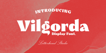 Vilgorda is a unique bold display font. This type of font perfectly made to be applied especially in logo, headline, signage and the other various formal forms such as invitations, labels, logos, magazines, books, greeting / wedding cards, packaging, fashion, make up, stationery, novels, labels or any type of advertising purpose. Features : uppercase & lowercase numbers and punctuation multilingual PUA encoded We highly recommend using a program that supports OpenType features and Glyphs panels like many of Adobe apps and Corel Draw, so you can see and access all Glyph variations. How to access opentype feature : letterhend.com/tutorials/using-opentype-feature-in-any-software/ Email us to letterhend@gmail.com if you need something! Happy Designing!
 - Glico Prime by Letterhend,
$17.00 Glico Prime is a heavy, bold, standout sans serif with futuristic theme. It has few styles with 3 stylistic, This type of font perfectly made to be applied as a headline, logo, title, quotes which is need a standout font, and the other various formal forms such as invitations, labels, logos, magazines, books, greeting / wedding cards, packaging, fashion, make up, stationery, novels, labels or any type of advertising purpose. Features : Regular, inline & outline 3 stylistic set numbers and punctuation multilingual ligatures PUA encoded We highly recommend using a program that supports OpenType features and Glyphs panels like many of Adobe apps and Corel Draw, so you can see and access all Glyph variations.
 - Linotype Sicula by Linotype,
$29.99Linotype Sicula, from German designer Roberto Manella, is part of the TakeType Library, chosen from the entries of the Linotype-sponsored International Digital Type Design Contest 1999 for inclusion on the TakeType 3 CD. It is available in two weights, regular and oblique. Linotype Sicula will quickly win over any nostalgic spirits. Ornamental and sweeping, the figures line up on the paper, their contrasting strokes and playfully irregular forms giving them an exuberant, decorative character. The careful details of each figure come to light best when used in larger point sizes. Linotype Sicula is therefore best for headlines and can easily inspire typographic experiments and its capitals can serve as initials combined with other typefaces, especially sans serif. - Ctoxina by FSdesign-Salmina,
$39.00 The Ctoxina family is growing. Due to the success the author decided to add an outline version of the font. The typeface is now available in 6 different styles: light, light italic, regular, italic, bold and bold italic. The Atoxina family is designed especially for the burgeoning market of starships and other space cruisers. The fonts are ideal for internal and external use (including zero-g and occasional bursts of cosmic rays), and with their simplified forms are expected to survive well in non-linear galaxies. With their unusual diagonal half-pixels the fonts are striking as abstract designs at astronomical sizes, where small text may be placed within the black holes formed inside the letters.