10,000 search results
(0.049 seconds)
- Eastlove by Forberas Club,
$16.00 Eastlove is a Handwritten Script font that will make your designs look classic, Farmhouse, Boho, and Feminine. It is a great font for events, Wedding Project, signature, album covers, logos, branding, magazines, social media posts, advertisements, but it also works great for other projects. Add it to your fonts’ library, and it will enhance your creativity! Eastlove is best for: - logos, branding, & Signatures. - Flyers, Album cover, Magazine, & Advertisements. - Website design , design blogs, & fashion. - Quote graphics for social media. - and also it works great for other projects. Whats included : - Font File - Character Set - Numerals and Punctuation (OpenType Standard) - Accents (Multilingual characters) If you have any questions, before or after purchase, please feel free to get in touch.
 - Mideo by Forberas Club,
$16.00 Mideo is a Handwritten Script font that will make your designs look classic, Farmhouse, Boho, and Feminine. It is a great font for events, Wedding Project, fashion, apparel projects, signature, album covers, logos, branding, magazines, social media posts, advertisements, but it also works great for other projects. Add it to your fonts’ library, and it will enhance your creativity! Mideo is best for: - logos, branding, & Signatures. - Flyers, Album cover, Magazine, & Advertisements. - Website design , design blogs, & fashion. - Quote graphics for social media. - and also it works great for other projects. Whats included : - Character Set - Numerals and Punctuation (OpenType Standard) - Accents (Multilingual characters) If you have any questions, before or after purchase, please feel free to get in touch.
 - Hendrix by Scriptorium,
$18.00I had a chat recently with a customer who is a big fan of lettering from the psychedelic poster era. The discussion got me thinking about poster lettering we hadn't yet made into fonts, and a particular sample from a Jimi Hendrix poster I had played around with but never finished making into a font. So I went back to the drawing board and the result is the new Hendrix font. Unlike many of our other Psychedelic fonts which are stripped down to their basic character forms, this font includes the outlines characteristic of a lot of poster lettering from that period. It also includes variant versions of a number of the characters - Paperclip Wire by Blackout,
$20.00Paperclip Wire is a great font for anyone looking to have a straightforward yet elegant look. All letters consist of Capitals yet the uppercase letters are exaggerated. Because of the nature of the font I suggest using it in no less than 20 pt. font. However, because it is simple it can easily be read when printed. This typeface was developed loosely based on a paper clip itself. the x-height was determined based off the size ratio of the clip and the cap height was based off of a paper clip as it is folded open. The overall shape is straight lines and subtle curves, all relating to each other to allow for a constant flow of letters. - Clockwise by Ana's Fonts,
$14.00 Clockwise is a friendly sans serif font with 4 weights and italics. It includes over 315 glyphs, including: Small caps Ligatures And a bonus set of dashes and borders to help accent and decorate your text. Clockwise is perfect for both texts and titles, and pairs beautifully with other fonts already in your library, especially handwritten and serif fonts. Use it in everything from logotypes to social media posts, website and magazine layouts to poster designs.
 - Tuscaloosa by Greater Albion Typefounders,
$7.00 Tuscaloosa is a classic American 'Wild West' Tuscan typeface-we thought it would make a suitable Independence Day tribute to our many American clients. It's ideal for wherever that 'Western' feel is wanted. Posters, signage, the sides of stagecoaches etc... Three faces are offered, a pristine and sharp regular form, a somewhat distressed 'Rustic' face and the rather more distressed 'Extremely Rustic'. So why not mosey on down the saloon with Tuscaloosa!
 - Kingsmead Script by Hanoded,
$15.00 Last year I spent some time exploring the city of Bath in England. Its claim to fame are the Roman Baths in the city center, which are well worth a visit. Kingsmead is an electoral ward within Bath and I thought it was an apt name for this rather stylish - if old fashioned - font. Kingsmead Script is a handmade font. It comes with diacritics and some discretionary ligatures for double lower case letter combinations.
 - Umbilical Noose by Hanoded,
$15.00 Umbilical Noose is a rather scary typeface. It is quite similar to an older font of mine: Nyctophobia. The name comes from a Nirvana song called Heart Shaped Box, in which Kurt Cobain sings: "throw down your umbilical noose, so I can climb right back". I have always liked that phrase a lot. Umbilical Noose is an all caps font, but upper and lower case are different and you can easily interchange the glyphs.
 - Eclectic Crumpany NF by Nick's Fonts,
$10.00 No mystery here: this monocase neon face is based on the old logotype lettering for The Electric Company TV show. This version adds a little jolt with happy outlet characters in the dagger and double dagger positions, a plug at the section mark, and a rather novel treatment of the mu character. This font contains the complete Latin language character set (Unicode 1252) plus support for Central European (Unicode 1250) languages as well.
 - Bessie Mae Moocho NF by Nick's Fonts,
$10.00A thoroughly fun font based on handlettering found on a travel brochure for IMM Steamship Lines, circa 1927, and named after a fictitious girl who likes kissing alot. - Dan Panosian by Comicraft,
$29.00 It’s true -- having your own font IS The Secret Of Happiness! At times suave and sophisticated, at other times rough and ready for anything, superstar comics artist Dan Panosian has worked on the likes of CAPTAIN AMERICA, SPAWN, THE FLASH,, SPIDER-MAN, X-THE X-MEN and GREEN LANTERN, as well as the movie, HARRY POTTER AND THE SORCERER'S STONE and games like DUKE NUKEM. He hasn't been seen in comics for some time, but he’s back, baby, working on a series of JOHN TIFFANY bandes desinée, and he’s brought his own font with him, courtesy of that awfully nice John JG Roshell at Comicraft. John Tiffany is one of the best bounty hunters in the world and he has no illusions about the world that employs him. Tiffany relies exclusively on four people: the Reverend Lovejoy, who taught him to love his money; Wan Chao, of the geek underworld who serves as an interface with the outside world; Dorothy, his partner, and Magdalena, the ‘call girl in his life.’ But in Mexico, the hunter has become prey, his head has a price. And if his rivals know his location, it means that John Tiffany was betrayed by one of four people he thought he could trust...and now he can rely on only ONE thing, his secret weapon. His FONT. See the families related to Dan Panosian: Urban Barbarian.
 - #NAME? by OtherwhereCollective,
$29.00 -OC Format Sans is the third incarnation of this geometric grotesk sans serif which fuses the style of Futura with the rhythm and proportions of Akzidenz. It comes in two styles, standard and a new Print family where crisp sharp edges have been made blunt in reference to the ink spread that occurs when printing on uncoated paper stock. It can give digital media a softer more approachable analog aesthetic. Typical of both grotesk and geometric styles the design has an even weight with minimal stroke contrast and the slanted form is an oblique rather than a true italic. The default double-story �a� and �g� give an academic touch, the single story versions of Set 1 are more friendly and approachable while Set 2 changes the look into something more scientific. Made with tireless attention to detail and kerning it's perfect for logotypes and extensive text, supports multiple languages and comes with a plethora of OpenType features including standard and discretionary ligatures, social icons, symbols, and multiple figure styles including roman numerals.
 - Avineo by Valentino Vergan,
$16.00 Avineo is a unique modern display typeface, which comes with a set of creative lowercase characters. The Avineo typeface has an ultra-fat look, which makes it perfect for logo and poster design. The Avineo typeface also comes in three styles, Regular, Outline and Extended, each style has an oblique version. The Avineo typeface comes with multilingual support for languages such as: Danish, English, Finnish, French, German, German (Switzerland), Norwegian Bokmål, Norwegian Nynorsk, Portuguese, Spanish, Swedish, Swiss German. The Avineo typeface has a unique design, which will make your next project standout. The Avineo typeface can cover a wide range of projects such as: brand packaging, brochures, magazines, logos, posters, flyers, book covers, quotes, branding, billboards, social media, pictograms and much more. If you are looking for something unique, bold and creative for you next project, the Avineo typeface is the font for you. WHAT YOU GET: Avineo Regular.otf Avineo Oblique.otf Avineo Outline.otf Avineo Outline oblique.otf Avineo Extended.otf Avineo Extended oblique.otf AVINEO INCLUDES A FULL SET OF: Uppercase and lowercase letters. Numbers. Punctuation. Ligatures. Alternates. Multilingual Symbols. We hope you enjoy using the Avineo typeface.
 - Narrow Way by Ingrimayne Type,
$9.00 NarrowWay is a family of 18 condensed and ultra-condensed sans-serif typefaces. The family started with the ultra-condensed widths, then the condensed and regular widths (the regular is still quite condensed) were added. All widths have three weights and each weight has an italics style. These 18 styles lack a true lowercase but rather have a set of alternative characters, some based on lower-case forms, on the lower-case keys. Some alternative letters can be reached with the OpenType feature of stylistic sets. The character spacing in most of the styles is quite loose and it can be tightened with an application's character spacing if needed. These typefaces are display faces that can be useful for squeezing tall lettering into tight spaces. They are not readable at small point sizes.
 - Razom Script by DizajnDesign,
$39.00 Razom Script is a typeface with deep roots in pointed brush calligraphy that takes advantage of current font technology to go beyond handwriting and reach new limits. A successful blend between printed and handwritten letterforms is visible when comparing upper and lowercase. The weight of the typeface evolve in a way that pushes the limits of a script typeface to suggest new uses. Normally, families are developed in weights, not proportions. Also, having several weights in a script family is rather rare. But in Razon Script, as the fonts gain weight, big differences show up in the font outlines: the thin weight looks soft and delicate but as we examine darker variables, they also seem to get broken. The counters of the letters rotate from vertical to horizontal during this process.
 - Exorts Compressed by Seventh Imperium,
$15.00 Exorts Compressed is a display font family. This square condensed sans is designed with an increased cap character and tight kerning to give the ability create the large and bold typography. It is made specifically for editorial design, headlines, posters, magazines, clothing and other purpose printed material. The family comes in weight from extra light to extra bold and have italic version of each weight. Features include: OpenType stylistic sets, ligature, and Multiple Language Support.
 - Mantika Book Paneuropean by Linotype,
$67.99Mantika Book expands the Mantika super family: a contemporary serif font with a soft, yet robust character and a classic lookMantika Book, an Antiqua, is the third member of the Mantika super family, which consists of the Mantika Sans and Mantika Informal. Designer Jürgen Weltin has gone back to the roots of his font, which he had originally derived from a Renaissance Antiqua. These origins are recognizable in the first member of the Mantika family, Mantika Sans, in the form of carefully suggested line use and a contrast in the weights that recalls the Antiqua. This solid sans serif, optimized for use in text, also has a particularly energetic and dynamically designed italic. Mantika Informal also brings to mind a cursive font at first glance; ultimately, however, it is not easily categorized. Its light, organic shapes combine the informally flowing style of cursive handwriting with the open and airy form and contrast of a humanist sans serif. The shapes in the serif Mantika Book are also based on the Renaissance Antiqua, just like the other members of the Mantika super family. However, the contrast in the weights is somewhat stronger than is conventional for this genre, and the serifs are characteristically asymmetrical, with slanted ends. Lightly grooved stems with an implied curvature in the lower-case letters as well as dots whose shape flirts with a fountain pen lend the Mantika Book a dynamic and particularly friendly character. Details like the open "g" or the contoured foot of the "k" emphasize this dynamism. The letters of Mantika Book have the same large x-height as the other members of the super family, but are equipped with somewhat longer ascenders and descenders. - Pasquale by Monotype,
$39.00Pasquale was designed by Tony Stan. The Pasquale font family has short ascenders, and the lowercase and caps A, B, D, E and Q are open. This versatile warm design is suitable for advertising, magazines, brochures, letterheads and text work. - Chateau by Wilton Foundry,
$29.00 On the one hand Chateau is almost palatial but at the same time it has a quite earthy personality as represented by the stenciled strokes. However, this stencil effect serves to refine the strokes by creating the illusion of a completed thin stroke. Chateau is more of a hybrid roundhand script with its contrasting ornate capitals. Originally a fortified residence in France was called a Chateau. Today there are many estates with true Chateaux on them in Bordeaux, but it is customary for any wine-producing estate, no matter how humble, to prefix its name with "Chateau". This is true whether the building itself is a magnificent palace or a shack. The distinctive chateau architecture was in inspiration for the name of this script. Chateau is ideal for packaging design, invitations, announcements, headlines, brochures, menus, weddings, scrapbooking, etc. Chateau is available in Opentype, Postscript and Truetype for Macs and PCs.
 - Compass St by TipografiaRamis,
$35.00 Compass St – a new addition to the existing Compass TRF Stencil fonts, originally released in 2010. Package consists of two fonts with rather different, both decorative, styles. Typeface is released in OpenType format with extended support for most Latin languages.
 - Dash Wisher by PizzaDude.dk,
$15.00 The name Dash Wisher is a wordplay. The letters of the font are also quite playful - you never know what comes next, when typing. There is no exact x-heigh, the baseline is jumpy, the descender and ascender are messed up...there are no real rules for Dash Wisher! But with all that in mind, it comes out surprisingly legible, which means it does have a wide range of use. Let your fantasy and imagination break the boundaries and Dash Wisher do the rest - or maybe the other way around! :) I've added both ligatures to substitute double letters and a set of alternate letters as well.
 - Notorious by W Type Foundry,
$15.00 Notorious is a brush script typeface with features that come from gestural calligraphy plus a touch of personality, therefore, it delivers wider freedom in both rhythm and composition of words. As a result, this typeface is highly suitable to convey expression in a most natural way. Notorious is composed by two styles; the first one is black and the other one textured. Both generate a more natural look when it comes to writing. Every weight includes alternative characters, ligatures, numbers, final forms, swashes, extras and catchwords giving you more options in terms of fostering your creativity. If you are looking to create expressive and gestural messages Notorious is your ideal choice.
 - Core Magic by S-Core,
$20.00 Core Magic is a slab-serif version of Core Circus which is a layered type family consisting of seven 3D effect layers, eight 2D effect layers and one shadow effect layer. Uppercase and lowercase letters are separated by such features that counters are opened or closed. Core Magic provides other closed counter styles such as numbers with opentype feature (Stylistic Alternatives). Using Core Magic with Core Circus could make your works more charming and special with endless combinations (at least 262,551 kinds). This family is really nice for book titles, headlines, logotypes and any artworks. Also available the rough version of this family - Core Magic Rough.
 - Daytona by Monotype,
$50.99 The Daytona™ typeface family grew out of a desire to provide improved fonts for use in televised sporting events. Jim Wasco drew the design as sturdy squared letters based on humanist shapes and proportions. Letters were kept narrow for economy of space, and inter-character spacing was established for easy reading. While televised sporting events may have initially been his target, the design considerations he incorporated into the Daytona family also enabled it to perform well in a variety of other video and on screen environments. Daytona Variables are font files which are featuring two width axes and have a preset instance from Thin to Fat.
 - Pressroom by Three Islands Press,
$24.00Pressroom is a modern "legibility face," designed to be easy-to-read under even the harshest conditions. As you might expect of such a typeface, it's got an ample x-height, robust serifs, and minimalist descenders -- but Pressroom displays more grace and allure than most families of this kind. (Its designer nonetheless describes Pressroom as having "the sophistication of a crocodile.") Pressroom has regular, italic, and bold italic styles, along with a special black weight intended for headlines, callouts, and other display uses. Numerals are semi-cap in all but the black, where they are fully lining. Would work well in newsletters, flyers, office forms, or even periodicals. - Lagosi by Jetsmax Studio,
$- Lagosi is a pointed serif typeface inspired by the features on the lagosi fabric found in wajo. They range in weight from light cuts that are bold and elegant to black and strong. Packed with more sets of Italic gestures and other custom bindings, this typeface is perfect for adding sparkle and elegance to your designs. What’s Included: Ligature & Unique Works on PC & Mac Simple installations Accessible in the Adobe Illustrator, Adobe Photoshop, Adobe InDesign, even work on Microsoft Word. PUA Encoded Characters – Fully accessible without additional design software. Fonts include multilingual support for; Afrikaans, Albanian, Catalan, Danish, Dutch, English, French, Hungarian, Icelandic, Italian, Spanish, Portuguese, German, Swedish, Norwegian, Polish, Indonesian, Turkish, Zulu Lagosi is very suitable for branding projects and many designs purpose like advertising, posters, invitations, branding, logos, magazines, merchandise, presentations, etc. Get Free one weight from the Lagosi family for Free! Apply to your amazing projects and enlarge your creative tools by adding the complete Lagosi family to your font library.
 - Komet Pro by Jan Fromm,
$65.00 Komet is a sturdy typeface with a calm and upright feel. Although it derives inspiration from classical English sans-serifs, it’s not too closely related to that model. Komet, instead, feels rather more lively and contemporary. Its compact spacing, low stroke contrast and heavy dots and accents give it an almost monolinear quality. The diagonals are slightly curved and the counters of the round letters such as b, o and q are generously wide. The muted, understated middle weights are built for extended body copy, while Komet’s thin and dark weights look brisk and assertive and make for subtly expressive headlines. Komet is an ideal choice for editorial design, branding and corporate design. The Komet Pro family comes in eight weights with matching italics, from Thin to Black. Each font contains around 850 glyphs, including a rich repertoire of OpenType features. Small caps, ligatures, ten different figure sets with matching currency symbols, stylistic alternates and arrows make Komet Pro a comprehensive toolkit for ambitious typography.
 - Cozy Sweater by Larry Nickname,
$9.00 It was originally inspired by my winter scarf knitting exploits. I discovered that making wool scarves was generating beautiful patterns and I wanted them to become a source of inspiration for a style. I made a few collages, and they became letters. Other characters came up with ease. It is readable, but long essays are not its main purpose. It is decorative and will look casual and very attractive on any ad as a title or a short phrase. It also demonstrates very good performance in automatic 3D generators, like Xara 3D maker, used in making examples of how this font can be utilised. It was designed to be thin, soft, with the capacity to cover empty space and to create a vibrant environment. Small characters are different from capital letters, they are stylistic alternates. Some letters are slightly ominous or dynamic, others create a soothing feeling. Using several colors make it shine, but it is complex, it looks good in monochromatic compositions as well.
 - Molde by Letritas,
$25.00 Molde is a super sans serif font family, belonging to the neo-grotesque style. Formally, Molde was inspired by the extreme sobriety of famous post-Bauhaus Swiss Movement of the mid-twentieth Century. The masters of this style are famous for eliminating all the ornaments, as a brilliant mind said “Ornament und Verbrechen”(Ornament and Crime) as a creation law: ending up with only the essential. Thanks to the purity of its shapes, Molde spreads the message as clear as possible and this quality makes it much more versatile than any other typography. Molde can be therefore used in all types of designs, If we consider its personality and its amount of weights and widths. Molde is composed of 6 widths ranging from the tablet to the expanded and in the set of characters includes a Unicase version and a small caps version. The family is composed of 3 parts: the regular version, the italic version and the reverse version. Each one of them has 9 weights. Each weight has 649 characters and it has been thought for 219 latin languages.
 - Teutonia by HiH,
$10.00 How can Teutonia be called “Art Nouveau” with all those straight lines? It seems like a contradiction. In fact, however, Art Nouveau embraces a rather wide variety of stylistic approaches. Five well-known examples in the field of architecture serve to illustrate the range of diversity in Art Nouveau: Saarinen’s Helsinki Railroad Station, Hoffman’s Palais Stocklet in Brussels, Lechner’s Museum of Applied Arts on Budapest, Mackintosh’s Glasgow School of Art and Gaudi’s Sagrada Familia in Barcelona. Only the last fits comfortably within the common perception of Art Nouveau. Whereas Gaudi would avoid the straight line as much as possible, Macintosh seemed to employ it as much as possible. The uniting factor is that they all represent “new art” -- an attempt to look things differently than the previous generation. Even when they draw on the past -- e.g. Lechner in the use of traditional Hungarian folk art -- the totality of the expression in new. Teutonia clearly shows its blackletter roots in the ‘D’ and the ‘M.’ Roos & Junge of Offenbach am Main in Germany produced Teutonia in a "back-to-basics" effort that has seen many quite similar attempts in the field of topography. In 1883, Baltimore Type Foundry released its Geometric series. In 1910, Geza Farago in Budapest used a similar letter design on a Tungsram light bulb poster. In 1919 Theo van Doesburg, a founder with Mondrian and others of the De Stijl movement, designed an alphabet using rectangles only -- no diagonals. In 1923 Joost Schmidt at Bauhaus in Weimer took the same approach for a Constructivist exhibit poster. The 1996 Agfatype Collection catalog lists a Geometric in light, bold and italic that is very close to the old Baltimore version. Even though none of these designs took the world by storm, they all made a contribution to our understanding of letterforms and how we use them. Teutonia is compact and surprisingly readable at 12 points in print, but does not do as well on the screen. Extra leading is suggested. Four ligatures are supplied: ch, ck, sch and tz. The numerals are tabular.
 - Snow Crystals by Deniart Systems,
$20.00 It's time to just let it snow! Deniart’s Snow Crystals typeface is an original design featuring 62 unique symbols. These charming snow crystals are sure to add elegance to all your winter designs - the set includes traditional style snow crystals as well as an assortment of bonus characters such as star-bursts and holiday accents. This font comes with a PDF guide to put all these special characters right at your fingertips! Note - if you want an even broader range of snow flakes, you may also like our second snow font known as "Star Crystals".
 - Safe Font by Galapagos,
$39.00Some typefaces are more deserving of the reference "original typeface design" than are others. Such a typeface is Steve's Safefont GD. It is indeed safe to say that this design has caused some controversy. However, the management of Galapagos Design Group believes that the message of the typeface, even before its characters are used to form words in print, is important enough-and the design itself compelling enough-to warrant the risk of any unintended offense it might cause. Safefont GD is made up of condoms, in various shapes and sizes. The design originated as a lampoon of contemporary-punk- and -garagefont- designs of the nineties. It soon evolved into the quintessence of socially conscious design. Steve suggests this typeface could be "useful as a public service font aimed at important health and social issues." In addition, Safefont GD lends itself to a wide range of fun uses. - Sports World - Unknown license

- Designosaur - 100% free

- Web Serveroff - 100% free

- Chewies by Letterhend,
$19.00 Chewies is a quirky bold font with unique letterform. You can playaround to fit the form using uppercase and lowercase mode. This font perfectly made to be applied especially in logo, and the other various formal forms such as invitations, labels, logos, magazines, books, greeting / wedding cards, packaging, fashion, make up, stationery, novels, labels or any type of advertising purpose. Features : uppercase & lowercase numbers and punctuation multilingual PUA encoded We highly recommend using a program that supports OpenType features and Glyphs panels like many of Adobe apps and Corel Draw, so you can see and access all Glyph variations.
 - Artographie by Mans Greback,
$49.00 Artographie is a Art Deco sans-serif family. The lettering was designed by Måns Grebäck during 2019 and 2020. It gives any project a moderist appearance, as a reinvention of the hundred-year-old style of design, adapted and adjusted to fit in present-time purposes and technology. The typeface is a family containing five styles: Thin, Light, Medium, Bold and Black. The weights are top quality and created to balance perfectly against each other. It has a very extensive lingual support, covering all European Latin scripts. The font contains all characters you'll ever need, including all punctuation and numbers.
 - Melody Break by Letterhend,
$17.00 Melody Break is a playful bold display with unique letterform. You can play around to fit the form using uppercase and lowercase mode. This font perfectly made to be applied especially in logo, and the other various formal forms such as invitations, labels, logos, magazines, books, greeting / wedding cards, packaging, fashion, make up, stationery, novels, labels or any type of advertising purpose. Features : Uppercase & lowercase Numbers and punctuation Alternates & Ligatures Multilingual PUA encoded We highly recommend using a program that supports OpenType features and Glyphs panels like many of Adobe apps and Corel Draw, so you can see and access all Glyph variations.
 - Bekorg by Twinletter,
$14.00 Bekorg is a graffiti-themed font with an unusual and weird shape, yet its application was developed with neatness and harmony in mind. Use this font in your projects to create a cool style that will instantly capture and amaze your audience. This graffiti font is great for product logos, poster titles, headlines, packaging, film titles, logotypes, gorgeous writing, and trendy graffiti designs, among other things. Of course, if you utilize this font in your numerous creative projects, they will be perfect and outstanding. Use this typeface right away for your one-of-a-kind and remarkable projects.
 - Love The Journey by Letterhend,
$14.00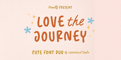 Love The Journey is a cute handwritten font. It comes with 2 looks, regular and slant version. This font perfectly made to be applied especially in logo, and the other various formal forms such as invitations, labels, logos, magazines, books, greeting / wedding cards, packaging, fashion, make up, stationery, novels, labels or any type of advertising purpose. Features : Uppercase & lowercase Numbers and punctuation Alternates & Ligatures Multilingual PUA encoded We highly recommend using a program that supports OpenType features and Glyphs panels like many of Adobe apps and Corel Draw, so you can see and access all Glyph variations.


