10,000 search results
(0.047 seconds)
- Bodoni Ornamental by FontMesa,
$30.00 New for 2020 Bodoni Ornamental now has two italics to choose from, one basic italic and a second which is more of a true italic with a few uppercase letters that have been stylized. Only one italic can be style linked to the regular upright version so in the second italic we've added Avanti to the name which means forward in Italian. When purchasing the regular upright and Avanti italic together they will install as two separate families. Bodoni Ornamental is a revival of a very old typeface based on the Poster Bodoni letter shape. Giambattista Bodoni passed away in 1813, this decorative version was created in the 1820’s or 1830’s which was the time period when many of these ultra bold decorated type faces began to appear, the original artist is currently unknown. The original version of this ornate classic was only available as a set of uppercase letters, today over one hundred eighty years later this font is now complete with a new lowercase, numbers and accented characters for Eastern, Central and Western European countries. Due to the ornate detail in Bodoni Ornamental when printing itís recommended to use a laser printer 600dpi or greater, a 1200dpi printer will give you the best results rendering the most detail at the smallest possible point size for this font. Small home user Ink Jet printers are not recommended for Bodoni Ornamental unless you set the font to a very large point size. With Ink Jet printers much of the detail in the letters will bleed together as the ink hits the page, commercial Ink Jet printers such as GiclÈe printers may give good results. When using Bodoni Ornamental for digital images including web site graphics it may help to add a one pixel stroke fill around the letters setting color to white or grey, this may help the web site images display better on some computer's. You will need a photo editing application such as Adobe Photoshop to create your image adding the stroke fill and save as a jpg , png or gif file. I hope you enjoy this old font as much as I did making it. Note: When previewing the Bodoni Ornamental font in the Windows font preview you may notice some letters appearing lighter and some darker, this is a problem with the preview window and some ornate fonts, Bodoni Ornamental will print normal and not with mixed light and dark letters.
 - Beiko by Nantia.co,
$12.00 Beiko Uppercase Greek Font is a decorative display font, made from digitized brush hand lettering. Of course, the uppercase font supports a full set of Greek characters and an extended Latin character set with diacritics. Also, this handwritten font is ideal for handcrafted projects. The hand-brushed organic style of Beiko is ideal for logotypes. In fact, this cute typeface can be your next typeface for your graphic design needs. From Instagram quotes to product packaging, merchandise, and branding projects, this font is so fun to use. Also, it can be used on social media content, for branding, poster design, for children projects, and any other kind of product packaging.
 - Seacoast by Fikryal,
$18.00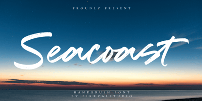 Seacoast is a hand brush font perfect for crafting, branding, invitation, stationery, wedding designs, social media posts, advertisements, product packaging, product designs, label, photography, watermark, special events, or anything. Seacoast comes with a full set of uppercase and lowercase letters, ligatures, multilingual symbols, numerals, and punctuation.
 - Anathema by Bluestype Studio,
$16.00 Anathema is a retro themed script font created using beautiful hand strokes. quickly create awesome designs with this font! Very suitable for branding, quotes, logotype, headline, tittle, and the other various formal forms such as invitations, emblems, logos, magazines, books, packaging, clothing, t-shirt, and labels.
 - Changer by Fikryal,
$18.00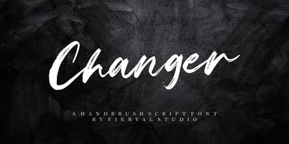 Changer is a hand brush font perfect for crafting, branding, invitation, stationery, wedding designs, social media posts, advertisements, product packaging, product designs, label, photography, watermark, special events, or anything. Changer comes with a full set of uppercase and lowercase letters, ligatures, multilingual symbols, numerals, and punctuation.
 - Historical by Runsell Type,
$9.00 Introducing Historical - Hand Drawn Script Historical consists of clean and textured feature as well as an aesthetic for premium logotypes. The family includes various script styles. Every single letter contains beautiful alternates characters (ss01 - ss10) and features ligatures. Historical can be applied in designs such as logotypes, brand, packaging, branding, quotes, business cards and more custom design. It features uppercase, lowercase, numeral, punctuation & symbol, ligatures, stylistic alternates, multilingual support, PUA encoded (fully accessible without additional design software).
 - Bokar by Pelavin Fonts,
$25.00 I am inspired by imagery that technology has rendered obsolete. I treasure anachronistic packaging and design which has somehow evaded obliteration by focus groups.I especially admire the packaging for A&P coffee brands Eight O'Clock, Red Circle and Bokar whose eccentric yet elegant typography harkens back to an earlier, less complicated era. The font Bokar is my nod of appreciation to those robust and full-bodied blends spared from the bland, tasteless scourge of corporate branding.
 - Lust Sans by Positype,
$39.00 Lust Sans is the penultimate exploration of producing a high-contrast sans wholly influenced by its bracketed ancestor. The aspect of this endeavor I enjoyed the most was finding sneaky ways to infuse warmth and whimsy into the letterforms when you least expect it. The result, however, is subtle and uniquely balances against Lust and Lust Didone without becoming cold and overbearing. To accomplish this, Lust Sans has 6 weights. What I found during development was, based on any setting where Lust or Lust Didone were in the same layout, the amount of contrast shown with Lust Sans needed to be adjusted. Expanding the weight offering, produces opportunities for Lust Sans to modulate the rhythm of the layout comfortably while keeping contrast—this is even more obvious with the Italics. I love those. You will too. If you don’t, you do not have a soul. Not sorry. The Lust Collection is the culmination of 5 years of exploration and development, and I am very excited to share it with everyone. When the original Lust was first conceived in 2010 and released a year and half later, I had planned for a Script and a Sans to accompany it. The Script was released about a year later, but I paused the Sans. The primary reason was the amount of feedback and requests I was receiving for alternate versions, expansions, and ‘hey, have you considered making?’ and so on. I listen to my customers and what they are needing… and besides, I was stalling with the Sans. Like Optima and other earlier high-contrast sans, they are difficult to deliver responsibly without suffering from ill-conceived excess or timidity. The new Lust Collection aggregates all of that past customer feedback and distills it into 6 separate families, each adhering to the original Lust precept of exercises in indulgence and each based in large part on the original 2010 exemplars produced for Lust. I just hate that it took so long to deliver, but better right, than rushed, I imagine.
 - Allison Dream by Rochart,
$15.00 Hello! We introduce our product called Allison Dream. The Allison Dream font is a modern Hand lettering. We give you a swash to make your design look more awesome. Allison Dream font is great for logotype, Branding Design, Logo Design, Digital Lettering Arts, T-Shirt/Apparel, Poster, Magazine, Signs, Advertising Design, wedding invitation and any hand lettered needs. Allison Dream font Features : Upper and Lowercase Standard Characters, Punctuation, Numerals and Multilingual. PUA Encoded Characters – Fully accessible without additional design software. Ligatures and Stylistic Alternates.
 - Anisha by 38-lineart,
$13.00 “Anisha”. This font is the Great choice for brand identity, branding and just branding ... we have studied various branding of modern products and we found a very interesting style, which is a combination of "calligraphy signature and clean sans". This is like combining two different elements and together in a composition that is very luxurious and elegant. Anisha calligraphy, bold and thin sans, all of which consist of regular and slant versions, so the number of fonts in this package consists of 6 fonts, the more choices the more design combinations you can make. Anisha is a beautiful high fashion font that makes for gorgeous logos, posters, blog posts, social media, and more! I love using them together with layer masks in Photoshop, so it looks like the script is running through the lines of the sans serif. Anisha Script includes 2 alternates for uppercase and 4-5 alternates for lowercase, and additional ligatures to make everything look totally hand-done.
 - Upton by Halbfett,
$30.00Upton is a modern and condensed sans serif. The initial inspiration for its design came from lettering Wim Crouwel created for a poster design. It also takes some cues from neutral grotesks like Helvetica and Akzidenz. Because of its narrow letterforms, Upton is best applied to headlines and poster-sized typography. Upton’s italics were designed with high-quality compensation for all circles and strokes. Upton ships in two different formats. Depending on your preference, you can install the typeface as two Variable Fonts or use the family’s 14 static OpenType font files instead. Those weights run from Extralight to Extrabold. While the static-format fonts offer a good intermediary-step selection, users who install the Variable Font have vastly greater control over their text’s stroke width. The weight axes in Upton’s Variable Fonts allow users to differentiate between almost 1,000 possible font weights. That enables you to fine-tune your text’s exact appearance on-screen or in print. In its fonts, Upton has several ligatures. That includes optional “discretionary ligatures,” which bring a unique tone to display usage. For instance, the fonts include optional ligatures for the letter combinations “E-T”, “F-l”, “L-E-T-T-E”, “L-E-T-T”, “L-E-T”, “L-E-L-O”, “L-U”, “i-j”. and “m-m”. There are also many alternate glyphs. Stylistic Set 1 substitutes in new forms for “G”, “R”, “a”, “f”, “g”, “i”, “r”, “t”, and “y”. Six more Stylistic Sets have alternates for the “æ”, “g”, “k”, “o”, “K”, “O”, and “Q”. Additional OpenType features activate other useful features, such as fractions, numbers in circles, or symbols. - Winterbreak Trio by Ana's Fonts,
$14.00 Winterbreak is a playfont font and doodles set. It includes: 3 variations of the Winterbreak font that can be used together to create interesting hand-lettering compositions 1 set of doodles that complement the handwritten fonts perfectly Use Winterbreak in designs such as postcards and notes, posters, logotypes, social media posts, branding and packaging.
 - Beauty Handwriting by Nirmana Visual,
$22.00 Beauty Handwriting is a Natural handwriting modern calligraphy font. full set of lowercase and uppercase letters, numerals and punctuation, multilingual symbols, lowercase beginning and ending swashes. 80 ligatures giving realistic hand-lettered style. Beauty Handwriting offers beautiful typographic harmony for a diversity of design projects, including logos & branding, social media posts, advertisements & product designs.
 - Hello baby by Letterfreshstudio,
$13.00 Hello baby! A new fresh an modern hand lettered font with decorative characters and a dancing baseline. So beautiful on invitation like handicraft, greeting cards, branding materials, business cards, quotes, posters, and more design concepts. Features : Ligatures Stylistic sets Basic Latin A-Z and a-z Numbers International Symbols included Punctuation Ligature Thank You.
 - Oh Lady Script by Letterfreshstudio,
$12.00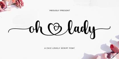 Oh Lady ! A new fresh an modern hand lettered font with decorative characters and a dancing baseline. So beautiful on invitation like handicraft, greeting cards, branding materials, business cards, quotes, posters, and more design concepts. Features : Ligatures Stylistic sets Basic Latin A-Z and a-z Numbers International Symbols included Punctuation Ligature Thank You.
 - Moreganic by Invasi Studio,
$19.00 Inspired by plants and healthy lifestyles. Introducing Moreganic Font, our new and fun font collection. Combining a hand-drawn style with a modern touch. Moreganic comes with Alternates that you can use to give more options to your projects. Moreganic Font is ideal for branding projects or packaging that need an organic and playful feel.
 - Organico by Meat Studio,
$17.50 Organico was created as an organic, hand made font. It is designed to be adaptable and useable across a wide range of markets, brands and disciplines. It has upper and lowercase characters with alternatives for all, as well as all the other glyphs you’d expect. It also utilises a number of opentype features, such as standard and discretionary ligatures, contextual alternates and stylistic sets.
 - Bellamy by Calamar,
$12.00 Bellamy is a hand-drawn calligraphic script with dancing baseline and lots of possibilities. This expressive font will look awesome on your cards, wedding invitations, headings, branding materials, quotes, t-shirt and any other amazing projects you are working on. Bellamy includes Upper and Lowercase Basic Characters, Alternates Lowercase Characters, Standard Ligatures, Numbers and Punctuation. Bellamy has multilingual support for the Western and Central European Languages.
 - Hendbras by Seniors Studio,
$15.00 Hendbras is handcrafted font duo created with a brush and ink, bold and irregular baseline. Contains a complete set of lowercase, uppercase, alternates, ligatures, punctuation, numbers, and multilingual support. This font ideal for use in watercolor design or lettering style bold hand, such as posters, wedding elements, t-shirt, apparel, cover books, business cards, greeting cards, branding, merchandise, invitations and handmade quotes and more.
 - Comet Hotspur by Putracetol,
$28.00 Comet Hotspur - Display Typeface Font is a bold and distinctive font that seamlessly blends modern and retro aesthetics. With its unique character shapes, bold strokes, and alternative letterforms, this font offers a captivating typographic solution. The font exudes a retro bold and vintage vibe while maintaining a fresh and contemporary edge. Whether you're creating logos, branding materials, titles, posters, film graphics, cards, quotes, or landing page titles.
 - Miegha by Dora Typefoundry,
$18.00 Miegha is a serif typeface inspired by the beauty of classic serif and calligraphy styles, Both upright and italic fonts blend with modern appeal and unique binding, high contrast and light weight font perfect for feminine logo signs, fashion heads & editorial designs, branding projects , Apparel Branding, packaging, magazine titles, advertisements, T-shirts, postcards and more. Here's what's included: · Alternates & Ligatures · Numbers & punctuation · Characters with accents · Supports Multiple Languages · PUA Encoded This type of family has become the work of true love, making it as easy and fun as possible. I really hope you enjoy it! Thank You!
 - Sagittarius by Hoefler & Co.,
$51.99 A typeface with lightly-worn futurism, Sagittarius is equally at home among the beauty and wellness aisles, or the coils of the warp core. The Sagittarius typeface was designed by Jonathan Hoefler in 2021. A decorative adaptation of Hoefler’s Peristyle typeface (2017), Sagittarius’s rounded corners and streamlined shapes recall the digital aesthetic of the first alphabets designed for machine reading, a style that survives as a cheeky Space Age invocation of futurism. Sagittarius was created for The Historical Dictionary of Science Fiction, where it first appeared in 2021. From the desk of the designer: Typeface designers spend a lot of time chasing down strange valences. We try to figure out what’s producing that whiff of Art Deco, or that vaguely militaristic air, or what’s making a once solemn typeface suddenly feel tongue-in-cheek. If we can identify the source of these qualities, we can cultivate them, and change the direction of the design; more often, we just extinguish them without mercy. Sometimes, we get the chance to follow a third path, which is how we arrived at Sagittarius. During the development of Peristyle, our family of compact, high-contrast sans serifs, I often found myself unwittingly humming space-age pop songs. Nothing about Peristyle’s chic and elegant letterforms suggested the deadpan romp of “The Planet Plan” by United Future Organization, let alone “Music To Watch Space Girls By” from the ill-advised (but delicious) Leonard Nimoy Presents Mr. Spock’s Music from Outer Space, but there they were. Something in the fonts was provoking an afterimage of the otherworldly, as if the typeface was sliding in and out of a parallel universe of high-tech spycraft and low-tech brawls with rubber-masked aliens. It might have had something to do with a new eyeglass prescription. But I liked the effect, and started thinking about creating an alternate, space-age version of the typeface, one with a little more funk, and a lot more fun. I wondered if softer edges, a measured dose of seventies retrofuturism, and some proper draftsmanship might produce a typeface not only suitable for sci-fi potboilers, but for more serious projects, too: why not a line of skin care products, a fitness system, a high-end digital camera, or a music festival? I put a pin in the idea, wondering if there’d ever be a project that called for equal parts sobriety and fantasy. And almost immediately, exactly such a project appeared. The Historical Dictionary of Science Fiction Jesse Sheidlower is a lexicographer, a former Editor at Large for the Oxford English Dictionary, and a longtime friend. He’s someone who takes equal pleasure in the words ‘usufructuary’ and ‘megaboss,’ and therefore a welcome collaborator for the typeface designer whose love of the Flemish baroque is matched by a fondness for alphabets made of logs. Jesse was preparing to launch The Historical Dictionary of Science Fiction, a comprehensive online resource dedicated to the terminology of the genre, whose combination of scholarship and joy was a perfect fit for the typeface I imagined. For linguists, there’d be well-researched citations to explain how the hitherto uninvented ‘force field’ and ‘warp speed’ came to enter the lexicon. For science fiction fans, there’d be definitive (and sometimes surprising) histories of the argot of Stars both Trek and Wars. And for everyone, there’d be the pleasure of discovering science fiction’s less enduring contributions, from ‘saucerman’ to ‘braintape,’ each ripe for a comeback. A moderated, crowdsourced project, the dictionary is now online and growing every day. You’ll find it dressed in three font families from H&Co: Whitney ScreenSmart for its text, Decimal for its navigational icons, and Sagittarius for its headlines — with some of the font’s more fantastical alternate characters turned on. The New Typeface Sagittarius is a typeface whose rounded corners and streamlined forms give it a romantically scientific voice. In the interest of versatility, its letterforms make only oblique references to specific technologies, helping the typeface remain open to interpretation. But for projects that need the full-throated voice of science fiction, a few sets of digital accessories are included, which designers can introduce at their own discretion. There are alternate letters with futuristic pedigrees, from the barless A popularized by Danne & Blackburn’s 1975 ‘worm’ logo for NASA, to a disconnected K recalling the 1968 RCA logo by Lippincott & Margulies. A collection of digitally-inspired symbols are included for decorative use, from the evocative MICR symbols of electronic banking, to the obligatory barcodes that forever haunt human–machine interactions. More widely applicable are the font’s arrows and manicules, and the automatic substitutions that resolve thirty-four awkward combinations of letters with streamlined ligatures. About the Name Sagittarius is one of thirteen constellations of the zodiac, and home to some of astronomy’s most inspiring discoveries. In 1977, a powerful radio signal originating in the Sagittarius constellation was considered by many to be the most compelling recorded evidence of extraterrestrial life. Thanks to an astronomer’s enthusiastically penned comment, the 72-second transmission became known as the Wow! signal, and it galvanized support for one of science’s most affecting projects, the Search for Extraterrestrial Intelligence (SETI). More recently, Sagittarius has been identified as the location of a staggering celestial discovery: a supermassive black hole, some 44 million kilometers in diameter, in the Galactic Center of the Milky Way. <
 - Experiment Brush Script by Dhan Studio,
$18.00 Experiment is a modern brush script font perfectly textured and based on the expression of the signature style that flows freely, friendly and organic. It's hand painted with love. Experiment Brush Script contains ligatures and alternates characters in Open Type Features. Perfect for brand projects, logos, product packaging, posters, invitations, greeting cards, news, blogs, and more. Add personal charm to everything!
 - Mackless Script by Sibelumpagi,
$12.00 Mackless is a clean script font inspired by hand-lettering, bold script, brush script, and logotype. It comes with an extra extruded font for a good combination on your design need, and includes OpenType features with PUA encoded such as alternates and ligatures. Mackless would be good for branding, logotype, poster, badge, book cover, invitation, t-shirt design, packaging and many more.
 - Enjoy Doodle by Nathatype,
$29.00 Looking for a font that’ll make your branding radiate elegance? A versatile, modern, and happy font? Then we’ve got just the font for you! Enjoy Doodle-Handwritten Font Enjoy Doodle is a modern hand-crafted font that’ll make your audience swoon and enhance your branding projects, printed materials, and website design. Every stroke and curve was created to portray the essence of elegance and style. Go ahead and use it on your headings, promote your online sales, Instagram quotes, and even printed materials like business cards, t-shirts, or invitations. Features: Stylistic Set Ligatures Swashes PUA Encoded Numerals and Punctuation Thank you for downloading premium fonts from Nathatype
 - Kathedral by Scratch Design,
$16.00 Please welcome, Kathedral! Kathedral is a stylish signature script font that will give instant and gorgeous flair to your designs. This font is highly detailed and has a beautiful shape. It will give you vintage, dazzling and memorable vibes in your design. All lowercase letters include beginning and ending swashes, giving a realistic and beautiful hand-lettered style. This font will be perfect for wedding cards, invitations, branding, wine industry branding, posters, magazines, logos and many more. What you'll get : Uppercase and lowercase Numbers & punctuation Multilingual support Alternates for Uppercase and lowercase (with swashes) Ligatures Line Swashes Thank you for your purchase! Hope you enjoy our font!
 - Sui Generis by Typodermic,
$11.95 Looking for a typeface that’s as unique as your personality? Look no further than Sui Generis, the rounded square sans-serif that’s unlike any other. With its technical letterforms and boxy curves, Sui Generis has an industrial character that’s all its own. It’s the kind of typeface that demands attention, without ever feeling pushy or obnoxious. In fact, its understated charm is part of what makes it so special. But don’t let its quirky personality fool you—Sui Generis is as practical as it is unique. With four weights, two widths, italics, and an outline style, it’s incredibly versatile and perfect for any project that requires a touch of character. So if you’re tired of bland, run-of-the-mill typefaces that all look the same, give Sui Generis a try. Its square letterforms and distinctive voice will make your design stand out from the crowd, and leave a lasting impression on anyone who sees it. Most Latin-based European writing systems are supported, including the following languages. Afaan Oromo, Afar, Afrikaans, Albanian, Alsatian, Aromanian, Aymara, Bashkir (Latin), Basque, Belarusian (Latin), Bemba, Bikol, Bosnian, Breton, Cape Verdean, Creole, Catalan, Cebuano, Chamorro, Chavacano, Chichewa, Crimean Tatar (Latin), Croatian, Czech, Danish, Dawan, Dholuo, Dutch, English, Estonian, Faroese, Fijian, Filipino, Finnish, French, Frisian, Friulian, Gagauz (Latin), Galician, Ganda, Genoese, German, Greenlandic, Guadeloupean Creole, Haitian Creole, Hawaiian, Hiligaynon, Hungarian, Icelandic, Ilocano, Indonesian, Irish, Italian, Jamaican, Kaqchikel, Karakalpak (Latin), Kashubian, Kikongo, Kinyarwanda, Kirundi, Kurdish (Latin), Latvian, Lithuanian, Lombard, Low Saxon, Luxembourgish, Maasai, Makhuwa, Malay, Maltese, Māori, Moldovan, Montenegrin, Ndebele, Neapolitan, Norwegian, Novial, Occitan, Ossetian (Latin), Papiamento, Piedmontese, Polish, Portuguese, Quechua, Rarotongan, Romanian, Romansh, Sami, Sango, Saramaccan, Sardinian, Scottish Gaelic, Serbian (Latin), Shona, Sicilian, Silesian, Slovak, Slovenian, Somali, Sorbian, Sotho, Spanish, Swahili, Swazi, Swedish, Tagalog, Tahitian, Tetum, Tongan, Tshiluba, Tsonga, Tswana, Tumbuka, Turkish, Turkmen (Latin), Tuvaluan, Uzbek (Latin), Venetian, Vepsian, Võro, Walloon, Waray-Waray, Wayuu, Welsh, Wolof, Xhosa, Yapese, Zapotec Zulu and Zuni.
 - Andara by BonjourType,
$15.00 'Andara' is a handwritten font. We created this font for any modern branding brand. Unique and natural hand touch gives a different impression, this can make attention to take a closer look at your brand. Some agencies like this font for branding modern products, you can also make a large number of logos with one font as this font is suitable for use on web logos, signatures, portfolios, prints, headers, magazines, book covers, printed t-shirts, crafts, and cosmetic packaging. Hope this is a font worthy of your collection. Thank you,
 - Ruskye by LetterStock,
$25.00 Introducing "Ruskye" - Your Original Hand-Drawn Retro Lettering Font Step into the nostalgic embrace of "Ruskye," a font crafted with a blend of original hand-drawn charm and retro lettering vibes. Perfect for posters, invitations, and vintage-themed branding projects, this font encapsulates the essence of a bygone era, offering a timeless touch to your designs. Key Features: Original Hand-Drawn Craftsmanship: Each character in "Ruskye" is meticulously hand-drawn, adding a touch of authenticity to your projects. Retro Lettering Vibes: Immerse your designs in the classic charm of retro lettering, making "Ruskye" an ideal choice for projects seeking a vintage aesthetic. Why Choose "Ruskye": Craft posters that evoke the timeless spirit of hand-drawn artistry. Design invitations that transport recipients to the golden era of retro aesthetics. Establish a brand presence with a font that effortlessly captures the essence of vintage lettering. Download "Ruskye" Now and Infuse Your Designs with Timeless Retro Charm!
 - Bussi by Schriftlabor,
$29.99 Bussi is an inline font family full of extras. It is rich with alternatives and symbols, which makes it a playful font to use. It was inspired by hand lettering and bullet journaling. The font is perfect for branding and packaging to bring your extra brand personality—an ideal font to use for stationery design or even movie titles. Versatile and high-quality Bussi will be your new font love. Bussi was inspired by hand lettering and bullet journaling. The first drafts were designed during studying for my high school graduation, where I would focus more on the headline lettering than on the actual content. I tried to motivate myself by lettering joyful, swirly headlines, and keywords. Originally designed as a caps-only headline font, over the years more and more letters and symbols were added, resulting in nearly 1400 glyphs and 5 different stylistic sets. Designed by Stella Chupik and Schriftlabor team.
 - Kimberley by Typodermic,
$11.95 Introducing Kimberley, the cutting-edge sans-serif typeface that will bring your message to the forefront of the modern era. Inspired by the bold and timeless corporate industrial logos of the 1970s, Kimberley’s squarish design and sleek angles will captivate and inspire your audience with its effortlessly cool, machine-made aesthetic. With seven distinct weights and accompanying italics, Kimberley is the ultimate tool in your design arsenal. Whether you’re creating a sleek corporate identity or crafting eye-catching advertising campaigns, Kimberley’s versatility ensures that your message will be delivered with clarity and distinction. So don’t settle for less, choose Kimberley and let its contemporary style and sophisticated edge elevate your design game to new heights. Upgrade your typography today with Kimberley and unleash the power of a truly modern typeface. Most Latin-based European writing systems are supported, including the following languages. Afaan Oromo, Afar, Afrikaans, Albanian, Alsatian, Aromanian, Aymara, Bashkir (Latin), Basque, Belarusian (Latin), Bemba, Bikol, Bosnian, Breton, Cape Verdean, Creole, Catalan, Cebuano, Chamorro, Chavacano, Chichewa, Crimean Tatar (Latin), Croatian, Czech, Danish, Dawan, Dholuo, Dutch, English, Estonian, Faroese, Fijian, Filipino, Finnish, French, Frisian, Friulian, Gagauz (Latin), Galician, Ganda, Genoese, German, Greenlandic, Guadeloupean Creole, Haitian Creole, Hawaiian, Hiligaynon, Hungarian, Icelandic, Ilocano, Indonesian, Irish, Italian, Jamaican, Kaqchikel, Karakalpak (Latin), Kashubian, Kikongo, Kinyarwanda, Kirundi, Kurdish (Latin), Latvian, Lithuanian, Lombard, Low Saxon, Luxembourgish, Maasai, Makhuwa, Malay, Maltese, Maori, Moldovan, Montenegrin, Ndebele, Neapolitan, Norwegian, Novial, Occitan, Ossetian (Latin), Papiamento, Piedmontese, Polish, Portuguese, Quechua, Rarotongan, Romanian, Romansh, Sami, Sango, Saramaccan, Sardinian, Scottish Gaelic, Serbian (Latin), Shona, Sicilian, Silesian, Slovak, Slovenian, Somali, Sorbian, Sotho, Spanish, Swahili, Swazi, Swedish, Tagalog, Tahitian, Tetum, Tongan, Tshiluba, Tsonga, Tswana, Tumbuka, Turkish, Turkmen (Latin), Tuvaluan, Uzbek (Latin), Venetian, Vepsian, Võro, Walloon, Waray-Waray, Wayuu, Welsh, Wolof, Xhosa, Yapese, Zapotec Zulu and Zuni.
 - Atrament by Suitcase Type Foundry,
$75.00The Atrament font family was originally conceived in 2003 as the corporate display type family for Suitcase Type Foundry. Its original source of inspiration is the front cover of the Devetsil - Revolucni slovn’k almanac (1922), designed by Karel Teige. The lettering on this cover is a condensed sans serif with rounded stroke terminals. Atrament is significantly broader than the model and its characters are better balanced, reflecting the evolution of semi-condensed sans serifs throughout the 1960s. The horizontal strokes of both lower and upper case are less stressed than the vertical stems. Noteworthy are the unusual tiny gaps in the apex and vertex of letters with diagonal strokes, designed to prevent ink from spreading and smudging the letter shapes. This detail is one of the main features of the font's character. The general feel of the italics closely matches the strictly vertical, parallel character of the regular cut. When converting the family to OpenType the alternate character shapes from the Alternator weights were incorporated in the regular cut, which allows the user to switch selected characters from one shape to another within the same font. A number of glyphs and accents were corrected, and all the glyphs missing in the Suitcase Standard character set were added, along with the relevant kerning pairs. The individual weights of Atrament Std thus contain accented upper and lower case, small caps, alternate glyphs for most European languages, nine types of numerals, superscript characters, caps glyph versions, and much more. Its narrow proportions make Atrament the perfect choice whenever economy of space is a must. It is however not very well suited for setting long texts. Ideal for headlines and display use, it is perfect for situations where the text needs to make a great impact in a little space. - Andron 2 by SIAS,
$44.90 The sister fonts Andron 2 English and Andron 2 Deutsch provide a groundbreaking new possibility to render literature text bodies in a sophisticated traditional and yet modern way of type. In German typographic history there has once been a long-lasting struggle called the Frakturstreit (the blackletter quarrel). It was about wether German text ought to be composed in blackletter or rather in Roman type, a question upon which even Goethe, Schiller and other period celebrities got grey over time. However, blackletter type remained alive and has just recently seen an astonishing renaissance. This is not about a blackletter revisionism or some ‘mixture’ concept arguably bridging the gap between either worlds. Andron 2 English and Andron 2 Deutsch offer a new approach to circumvent that old antagonism. As for the lowercase letters I applied certain features of blackletter type onto the glyphs – but entirely abandoned the principle of the broken stroke as such. The result is a lowercase alphabet in the classical Andron style which may be considered an attractive alternative for text in English, German or even other languages. So it’s no longer entirely about choosing between ‘modern’ Roman or ‘ancient’ blackletter only. Andron 2 English Regular and Andron 2 Deutsch Regular feature the same lowercase glyphs but differ in the majuscules (Andron 2 English has normal Latin capitals). ++++ 2012 + NEW! +++ In response to its growing popularity we now present five new fonts as part of the Andron 2 series. Andron 2 English is completed by an Italic and a Bold font. Andron 2 Deutsch now contains three interesting alternative fonts: Italic, Scriptive and Laendlich. Last but not least – A new set of wonderful classical typographic ornaments is part of the Italic and Scriptive fonts. – You can also purchase these ornaments separately as “Andron Ornamente”.
 - FormPattern Color Six by Tarallo Design,
$14.99 Use this font to make lines, borders, patterns, backgrounds, unique bullets, or use it inline within text. Let your imagination explore the possibilities to combine these geometric shapes. Use letter spacing to connect the shapes in a continuous pattern, or space them apart horizontally. Stack them vertically and control their distance with leading (line spacing). Make fields of pattern and explore layering and opacity for color mixing. FormPattern Color Six takes inspiration from mosaic patterns seen in the south of Italy. It is easier to use this font to make patterns than to use drawings because you can control the size, color, and spacing from the type menu. It is also an effective way to make web graphics that are responsive with text. Using it is simple. As you type, forms will appear instead of letters. Each font in this collection is a colored set. The sets are primary, secondary, tertiary, analogous, dark, old world, vintage, greyscale, cool grey, and warm grey. There is a solid font that can be colored in the same way as regular fonts. The color fonts are accessed in the type menu where you would normally find the different weights or italics Most design software, such as Illustrator, InDesign, and Photoshop provide a glyphs palette where you can choose the precise form you want. It can work with the simplest text editors too. However, these may not support the color options. FormPattern Color Six is a vector-based and fully scalable SVG OpenType format. Color fonts are supported by Photoshop 2017, Illustrator 2018, and QuarkXPress 2018 (and later versions). This version of FormPattern Color Six is compatible with all FormPattern fonts by Tarallo Design. The display artwork shows it paired with the typeface Scanno.
 - Fazeta by Adtypo,
$38.00 Fazeta is a type family that uses the optical sections. It is a modern static antiqua (it has not obliqued axis, serifs without slopes) but distant from ceremonious and rigid look of this type category. Inspiration was typeproduction from Czechoslovakia 60’s - J. Týfa, V. Preissig, J. Linzboth or A. Krátky. Common factor of this typefaces is vivid and sharp design with stable serifs, tend to rational construction rather than calligraphy and some sophisticated small details vitalized general impression. In this case are facetted asymmetrical arches (some abbreviation). Specific of this typeface is a short arch of glyph “f” that allows comfortable typesetting without ligatures obligation. In character set are besides classical ligatures discretionary ligatures for special occasions. Another surprising element is that all vertical strokes are slightly expanded upwards. These details become invisible in small text but in larger sizes impressed the eye and fix attention to headline. For traditional text feeling are here alternative glyphs “a, c, f, j, k, r, y, K, R” terminated with typical serif. Typeface is graded by optical size into 3 variants - caption (robust structure with low contrast, suitable for size 6 - 9 pt), text (medium contrast, suitable for ordinary text about 10 pt) and display (high contrast and subtle details for 20 pt and higher). Every variant has 5 weights (light, regular, medium, bold and black) with italics. Typeface is with their naked cold expression suitable for neutral text without emotional feelings. In contrast with most antique typefaces this is intended for modern glossy white paper where crisp details can excelled. Every font contains 1140 glyphs, between them original small capitals, various digits, fractions, indexes, matematical symbols, arrows, borders and many alternative glyphs. To see more please check the PDF specimen.
 - Mantika Book Paneuropean by Linotype,
$67.99Mantika Book expands the Mantika super family: a contemporary serif font with a soft, yet robust character and a classic lookMantika Book, an Antiqua, is the third member of the Mantika super family, which consists of the Mantika Sans and Mantika Informal. Designer Jürgen Weltin has gone back to the roots of his font, which he had originally derived from a Renaissance Antiqua. These origins are recognizable in the first member of the Mantika family, Mantika Sans, in the form of carefully suggested line use and a contrast in the weights that recalls the Antiqua. This solid sans serif, optimized for use in text, also has a particularly energetic and dynamically designed italic. Mantika Informal also brings to mind a cursive font at first glance; ultimately, however, it is not easily categorized. Its light, organic shapes combine the informally flowing style of cursive handwriting with the open and airy form and contrast of a humanist sans serif. The shapes in the serif Mantika Book are also based on the Renaissance Antiqua, just like the other members of the Mantika super family. However, the contrast in the weights is somewhat stronger than is conventional for this genre, and the serifs are characteristically asymmetrical, with slanted ends. Lightly grooved stems with an implied curvature in the lower-case letters as well as dots whose shape flirts with a fountain pen lend the Mantika Book a dynamic and particularly friendly character. Details like the open "g" or the contoured foot of the "k" emphasize this dynamism. The letters of Mantika Book have the same large x-height as the other members of the super family, but are equipped with somewhat longer ascenders and descenders. - DNP Shueitai by DNP,
$225.00 Shueitai is a typeface that has been undergoing development for more than a century, starting from the days when Dai Nippon Printing Co., Ltd. (DNP) was still known as Shueisha. As Japan underwent rapid modernization during the early years of the Meiji era, Shueisha, believing that printing was a business befitting a modern civilized society, began operations with a focus on letterpress. Before long the company expanded into developing its own typefaces. In 1912 it completed a full range of Mincho type, in sizes from Sho-go (#0 size, 42pt) through Hachi-go (#8, 4pt), which it called "Shueitai" a new style that came to form one of the two mainstreams of Japanese typefaces and continues to have a significant influence on font design even today. The Shueitai typeface is distinguished by abundant variations matching the size of type and the changing demands of the times. Whether it is the spirited and powerful Sho-go, the delicate and flowing San-go (#3, 16pt), or the bright and solidly reassuring Shuei-Mincho L, all Shueitai typefaces share a vibrant brushwork that adds an expression of eloquence and a burst of brilliance to every printed word. Currently, Shueitai is composed of 17 kinds of fonts useful for various purposes. The world has witnessed vast changes in the environment surrounding the printed world, with the tran-sition first from letterpress to Desktop Publishing, and most recently to e-books. But no matter how this environment might evolve, the written word remains the basis of communication, and the importance of beautiful and readable typefaces stays unchanged. In preparation for the changes that will inevitably come during the future, DNP will continue to evolve the Shueitai designs from now on. Through its continual reinvention, Shueitai, a typeface consistently adopted at the vanguard of the industry, perhaps represents Japanese innovation at its very best.
 - Kis Antiqua Now TB Pro by Elsner+Flake,
$99.00 In the course of the re-vitalization of its Typoart typeface inventory, Elsner+Flake decided in 2006 to offer the “Kis Antiqua” by Hildegard Korger, in a re-worked form and with an extended sortiment, as an OpenType Pro-version. After consultation with Hildegard Korger, Elsner+Flake tasked the Leipzig type designer Erhard Kaiser with the execution of the re-design and expansion of the sortiment. Detlef Schäfer writes in “Fotosatzschriften Type-Design+Schrifthersteller”, VEB Fachbuchverlag Leipzig, 1989: No other printing type has ever generated as far-reaching a controversy as this typeface which Jan Tschichold called the most beautiful of all the old Antiqua types. For a long time, it was thought to have been designed by Anton Janson. In 1720 a large number of the original types were displayed in the catalog of the „Ehrhardische Gycery“ (Ehrhardt Typefoundry) in Leipzig. Recently, thanks to the research performed by Beatrice Warde and especially György Haimann, it has been proven unambiguously that the originator of this typeface was Miklós (Nicholas) Tótfalusi Kis (pronounced „Kisch“) who was born in 1650 in the Hungarian town of Tótfal. His calvinistic church had sent him to the Netherlands to oversee the printing of a Hungarian language bible. He studied printing and punch cutting and earned special recognition for his Armenian and Hebrew types. Upon his return to Hungary, an emergency situation forced him to sell several of his matrice sets to the Ehrhardt Typefoundry in Leipzig. In Hungary he printed from his own typefaces, but religious tensions arose between him and one of his church elders. He died at an early age in 1702. The significant characteristics of the “Dutch Antiqua” by Kis are the larger body size, relatively small lower case letters and strong upper case letters, which show clearly defined contrasts in the stroke widths. The “Kis Antiqua” is less elegant than the Garamond, rather somewhat austere in a calvinistic way, but its expression is unique and full of tension. The upper and lower case serifs are only slightly concave, and the upper case O as well as the lower case o have, for the first time, a vertical axis. In the replica, sensitively and respectfully (responsibly) drawn by Hildegard Korger, these characteristics of this pleasantly readable and beautiful face have been well met. For Typoart it was clear that this typeface has to appear under its only true name “Kis Antiqua.” It will be used primarily in book design. Elsner+Flake added two headline weights, which are available as a separate font family Kis Antiqua Now TH Pro Designer: Miklós (Nicholas) Tótfalusi Kis, 1686 Hildegard Korger, 1986-1988 Erhard Kaiser, 2008
 - Apresia Script by Asritype,
$42.00 Inspired by various shapes such as leaves, flowers, hearts etc., Apresia Script is harmonically crafted. My first intention is only for standard design, but, later added simpler characters for normal(standard) typings. Apresia Script is rich with capital letter variants and ornaments. There are also lowercase variants in lesser numbers. I assume that many or perhaps most people want to have their name or the other of their important designs to be written with some letters that are in various shapes harmoniously. Apresia Script with more then 4000 glyphs support this aim, also support many latin based languages. However, because of many variations, except the standard characters, the full marked capitals are only set in two variants; in ss01 and ss02, which is also some marked lowercases included here. Swash variants (swsh) consist only one variant of every uppercase and lowercase characters, but no marked characters. All the others capital and lowercase variants are put in stlystic alternatives (salt). There are tens of unmarked caps and fewer for unmarked lowercase in salt (see Apresia Script opentype features(1) poster for some). The ornaments can be accessed via opentype ornaments(ornm), using less() characters for easier access. There are also beginning small letter(lowercase) ornaments, end word(lowercase) ornaments and insertion ornaments to make your typing/design more flourish, using ornm via “[“ (bracketleft), “]” (bracketright) and “\” (backslash), respectively. For marks; marks via combining marks and mkmk was set for many characters variants, however, it seem most applications not yet support this features. Alternatively, you can add non standard unicode combining marks via ornaments for the language supported: asterisk “*” list for uppercase marks above letters; ASCIIcircum “^” list for lowercase marks above letters; underscore “_” for uppercase and lowercase marks below the letters; numbersign “#” for slashing characters, horn, caron alternate and reversed comma for g, (see Apresia Script opentype features(2) poster and save it if you download the font). Thus, it is recommended to have the application which are support these opentype features such as: Adobe in Design, Adobe Illustrator, CorelDRAW or others for easier accessing the glyphs. Still, for non supported applications, you can insert these glyphs via Character maps, insert symbols or other similar tools. Apresia Script will go for most typing/design such as invitation, wedding card, greeting card, banners, logos and many others. Use it for whatever you intended to, Apresia script will give an amazing end design, though you are not a designer. As intended to be able to be used by many, this font is set in an affordable price. Thank you very much for downloading this font.
 - Laster by Calamar,
$12.00 Introducing you my NEW Laster Font! It's hand-drawn signature font with dancing baseline and elegant smooth lines that will look awesome on your branding materials, wedding invitations, headings, greeting cards and any other amazing projects you are working on. Laster font includes Upper and Lowercase Basic Characters, Standard and Discretionary Ligatures, Numbers and Punctuation. Laster is also available for Western European, Central European and South Eastern European Languages.