10,000 search results
(0.028 seconds)
- Greatest Holiday by Abo Daniel,
$15.00 GREATEST HOLIDAY - the pencil font - is amazing natural font. It made based on real handwriting. It can be used for cafe or coffee shop menu lists on board, branding, photography, invitations, watermarks, advertisements, product designs, labels, product packaging, book content, quotes and more. It came with number & punctuation, multilingual support, and PUA encode Hope you like this product. Regards Abo Daniel
 - Linoblox by Ana's Fonts,
$12.00 Linoblox is a sans and ornaments font family made using hand-carved linoleum, based on my Bloxhall art deco font. This collection has a quirky handmade look, but can also be used in retro and vintage designs, such as collages. The fonts have a realistic ink stamp texture that will look great in logos, notes and quotes, social media posts, and branding and packaging. Linoblox includes: Linoblox font in three variations: regular, jumpy and underlined An ornaments font, with doodles, swashes, smudges and frames (Please note: this is the same set of ornaments as the Notes From Home serif font)
 - FS Brabo Paneuropean by Fontsmith,
$90.00Worldly Even though it’s a new arrival, FS Brabo has seen the world. Designed by a Brazilian working in London and studying in Belgium under a Dutchman, it’s certainly well-travelled. And it was inspired by the extraordinary archive of early book typefaces at the world-renowned Plantin-Moretus Museum in Antwerp, while Fernando Mello was attending Frank Blokland’s Expert class Type Design course at the Plantin Institute of Typography. It was there that Fernando became engrossed in the collection of early metal type, matrices, punches and type samples by figures such as Garamond and Granjon. So much so that he took on the mighty task of developing ‘a beautiful, functional, serifed text font’ of his own. Heroic FS Brabo’s journey from sketch to font family took an epic three years, starting in Antwerp, continuing at Fontsmith in London, and reaching its conclusion back in Fernando’s home city of São Paulo. No wonder Fernando was reminded of another titanic face-off: that of Antwerp’s Roman hero of legend, Silvius Brabo, and the evil ogre, Antigoon. Brabo came to the town’s rescue after the tyrannical giant had been charging ships’ captains extortionate taxes and chopping off the hands of those who refused to pay up. Having finally downed Antigoon after a long and terrible duel, Brabo cut off the giant’s own hand and threw it into the river Scheldt, unwittingly giving the town its name: the Dutch for ‘hand-throw’ is hand werpen. What better way for Fernando to name his literary typeface than after the hero of Antwerp’s oldest tale? The garalde factor FS Brabo is not a revival, but a very much a contemporary, personal interpretation of a garalde – a class of typeface originating in the 16th century that includes Bembo, Garamond and Plantin, with characteristically rounded serifs and moderate contrast between strokes. Brabo’s ‘ct’ and ‘st’ ligatures, upper-case italic swashes and contextual ending ligatures – ‘as’, ‘is’, ‘us’ – all preserve the beauty and character of traditional typefaces, but its serifs are chunkier than a garalde. Their sharp cuts and squared edges give them a crispness at text sizes, helping to bring a beautifully bookish personality to hardworking modern applications. A workhorse with pedigree It may give the appearance of a simple, four-weight typeface, but FS Brabo has hidden depths beneath its simplicity and beauty. OpenType features such as cap italic swashes, contextual ending swashes – programmed only to appear at the end of words – and stylistic alternatives make this a complete and well-equipped typeface. Comprehensive testing was carried out at text and display sizes, too, to prevent counters from filling in. All of which makes FS Brabo a very modern take on a traditional workhorse serif typeface: colourful and versatile enough to adorn not just editorial projects but also signage, advertising and logotypes. - FS Brabo by Fontsmith,
$80.00 Worldly Even though it’s a new arrival, FS Brabo has seen the world. Designed by a Brazilian working in London and studying in Belgium under a Dutchman, it’s certainly well-travelled. And it was inspired by the extraordinary archive of early book typefaces at the world-renowned Plantin-Moretus Museum in Antwerp, while Fernando Mello was attending Frank Blokland’s Expert class Type Design course at the Plantin Institute of Typography. It was there that Fernando became engrossed in the collection of early metal type, matrices, punches and type samples by figures such as Garamond and Granjon. So much so that he took on the mighty task of developing ‘a beautiful, functional, serifed text font’ of his own. Heroic FS Brabo’s journey from sketch to font family took an epic three years, starting in Antwerp, continuing at Fontsmith in London, and reaching its conclusion back in Fernando’s home city of São Paulo. No wonder Fernando was reminded of another titanic face-off: that of Antwerp’s Roman hero of legend, Silvius Brabo, and the evil ogre, Antigoon. Brabo came to the town’s rescue after the tyrannical giant had been charging ships’ captains extortionate taxes and chopping off the hands of those who refused to pay up. Having finally downed Antigoon after a long and terrible duel, Brabo cut off the giant’s own hand and threw it into the river Scheldt, unwittingly giving the town its name: the Dutch for ‘hand-throw’ is hand werpen. What better way for Fernando to name his literary typeface than after the hero of Antwerp’s oldest tale? The garalde factor FS Brabo is not a revival, but a very much a contemporary, personal interpretation of a garalde – a class of typeface originating in the 16th century that includes Bembo, Garamond and Plantin, with characteristically rounded serifs and moderate contrast between strokes. Brabo’s ‘ct’ and ‘st’ ligatures, upper-case italic swashes and contextual ending ligatures – ‘as’, ‘is’, ‘us’ – all preserve the beauty and character of traditional typefaces, but its serifs are chunkier than a garalde. Their sharp cuts and squared edges give them a crispness at text sizes, helping to bring a beautifully bookish personality to hardworking modern applications. A workhorse with pedigree It may give the appearance of a simple, four-weight typeface, but FS Brabo has hidden depths beneath its simplicity and beauty. OpenType features such as cap italic swashes, contextual ending swashes – programmed only to appear at the end of words – and stylistic alternatives make this a complete and well-equipped typeface. Comprehensive testing was carried out at text and display sizes, too, to prevent counters from filling in. All of which makes FS Brabo a very modern take on a traditional workhorse serif typeface: colourful and versatile enough to adorn not just editorial projects but also signage, advertising and logotypes.
 - Ken Aroque by Beewest Studio,
$90.00 Ken Aroque Font is Engraved Bold Decorative Font that ornamental. This Font is Best as tittle of the novel, Poster, Theater, Logo and also tatoo. This font is bold , strong , classic and luxurious in the same time.
 - Hello Sweet by Sakha Design,
$10.00 Hello Sweet is a trendy and fun display font. It is great for delivering any message with confidence, authenticity and charm. Use it for cartoons, magazine covers, games or pretty much anything that requires a jolly touch.
 - Areplos by Storm Type Foundry,
$53.00To design a text typeface "at the top with, at the bottom without" serifs was an idea which crossed my mind at the end of the sixties. I started from the fact that what one reads in the Latin alphabet is mainly the upper half of the letters, where good distinguishableness of the individual signs, and therefore, also good legibility, is aided by serifs. The first tests of the design, by which I checked up whether the basic principle could be used also for the then current technology of setting - for double-sign matrices -, were carried out in 1970. During the first half of the seventies I created first the basic design, then also the slanted Roman and the medium types. These drawings were not very successful. My greatest concern during this initial phase was the upper case A. I had to design it in such a way that the basic principle should be adhered to and the new alphabet, at the same time, should not look too complicated. The necessary prerequisite for a design of a new alphabet for double-sign matrices, i.e. to draw each letter of all the three fonts to the same width, did not agree with this typeface. What came to the greatest harm were the two styles used for emphasis: the italics even more than the medium type. That is why I fundamentally remodelled the basic design in 1980. In the course of this work I tried to forget about the previous technological limitations and to respect only the requirements then placed on typefaces intended for photosetting. As a matter of fact, this was not very difficult; this typeface was from the very beginning conceived in such a way as to have a large x-height of lower-case letters and upper serifs that could be joined without any problems in condensed setting. I gave much more thought to the proportional relations of the individual letters, the continuity of their outer and inner silhouettes, than to the requirements of their production. The greatest number of problems arose in the colour balancing of the individual signs, as it was necessary to achieve that the upper half of each letter should have a visual counterbalance in its lower, simpler half. Specifically, this meant to find the correct shape and degree of thickening of the lower parts of the letters. These had to counterbalance the upper parts of the letters emphasized by serifs, yet they should not look too romantic or decorative, for otherwise the typeface might lose its sober character. Also the shape, length and thickness of the upper serifs had to be resolved differently than in the previous design. In the seventies and at the beginning of the eighties a typeface conceived in this way, let alone one intended for setting of common texts in magazines and books, was to all intents and purposes an experiment with an uncertain end. At this time, before typographic postmodernism, it was not the custom to abandon in such typefaces the clear-cut formal categories, let alone to attempt to combine the serif and sans serif principles in a single design. I had already designed the basic, starting, alphabets of lower case and upper case letters with the intention to derive further styles from them, differing in colour and proportions. These fonts were not to serve merely for emphasis in the context of the basic design, but were to function, especially the bold versions, also as independent display alphabets. At this stage of my work it was, for a change, the upper case L that presented the greatest problem. Its lower left part had to counterbalance the symmetrical two-sided serif in the upper half of the letter. The ITC Company submitted this design to text tests, which, in their view, were successful. The director of this company Aaron Burns then invited me to add further styles, in order to create an entire, extensive typeface family. At that time, without the possibility to use a computer and given my other considerable workload, this was a task I could not manage. I tried to come back to this, by then already very large project, several times, but every time some other, at the moment very urgent, work diverted me from it. At the beginning of the nineties several alphabets appeared which were based on the same principle. It seemed to me that to continue working on my semi-finished designs was pointless. They were, therefore, abandoned until the spring of 2005, when František Štorm digitalized the basic design. František gave the typeface the working title Areplos and this name stuck. Then he made me add small capitals and the entire bold type, inducing me at the same time to consider what to do with the italics in order that they might be at least a little italic in character, and not merely slanted Roman alphabets, as was my original intention. In the course of the subsequent summer holidays, when the weather was bad, we met in his little cottage in South Bohemia, between two ponds, and resuscitated this more than twenty-five-years-old typeface. It was like this: We were drinking good tea, František worked on the computer, added accents and some remaining signs, inclined and interpolated, while I was looking over his shoulder. There is hardly any typeface that originated in a more harmonious setting. Solpera, summer 2005 I first encountered this typeface at the exhibition of Contemporary Czech Type Design in 1982. It was there, in the Portheim Summer Palace in Prague, that I, at the age of sixteen, decided to become a typographer. Having no knowledge about the technologies, the rules of construction of an alphabet or about cultural connections, I perceived Jan Solpera's typeface as the acme of excellence. Now, many years after, replete with experience of revitalization of typefaces of both living and deceased Czech type designers, I am able to compare their differing approaches. Jan Solpera put up a fight against the digital technology and exerted creative pressure to counteract my rather loose approach. Jan prepared dozens of fresh pencil drawings on thin sketching paper in which he elaborated in detail all the style-creating elements of the alphabet. I can say with full responsibility that I have never worked on anything as meticulous as the design of the Areplos typeface. I did not invent this name; it is the name of Jan Solpera's miniature publishing house, in which he issued for example an enchanting series of memoirs of a certain shopkeeper of Jindrichuv Hradec. The idea that the publishing house and the typeface might have the same name crossed my mind instinctively as a symbol of the original designation of Areplos - to serve for text setting. What you can see here originated in Trebon and in a cottage outside the village of Domanín - I even wanted to rename my firm to The Trebon Type Foundry. When mists enfold the pond and gloom pervades one's soul, the so-called typographic weather sets in - the time to sit, peer at the monitor and click the mouse, as also our students who were present would attest. Areplos is reminiscent of the essential inspirational period of a whole generation of Czech type designers - of the seventies and eighties, which were, however, at the same time the incubation period of my generation. I believe that this typeface will be received favourably, for it represents the better aspect of the eighties. Today, at the time when the infection by ITC typefaces has not been quite cured yet, it does absolutely no harm to remind ourselves of the high quality and timeless typefaces designed then in this country.In technical terms, this family consists of two times four OpenType designs, with five types of figures, ligatures and small capitals as well as an extensive assortment of both eastern and western diacritics. I can see as a basic text typeface of smaller periodicals and informative job-prints, a typeface usable for posters and programmes of various events, but also for corporate identity. Štorm, summer 2005 - FS Pele by Fontsmith,
$50.00 Iconic Conjuring memories of chunky typefaces from the late-60s and early-70s, and named after the world’s greatest footballer of that and probably any other era, FS Pele is one of a set of Fontsmith fonts designed specifically for headlines and other prominent applications. “We wanted to create fonts that could be integral to the design of posters, album covers and magazines,” says Jason Smith. Welcome to FS Pele, iconic, like its namesake (though, perhaps, a little less nimble). Big Pele, little Pele There was only one Pele. But there are two sizes of FS Pele. FS Pele One, with the finer counters and details, adds considerable weight and style at large sizes, especially in big block headlines on posters. FS Pele Two’s thicker “slots” make it a better choice for smaller-sized text. A load of blocks FS Pele began as an exercise by Phil Garnham in turning squares into legible letters, via the least means necessary. The idea extended his ideas about logo-making, and the search for a stamp-like brand mark that lends authority, stability and instant identification. “The thought that the type was a 2D/3D jigsaw of slotted, architectural pieces was almost an after-thought. I wanted to create a strong, stacking, block aesthetic for the most contemporary poster design. “At the time there were a lot of designers creating their own versions of the same thing but I wanted to take the blocker forms to the next step, and infer a more legible text without sacrificing the idea.”
 - FS Pele Variable by Fontsmith,
$199.99Iconic Conjuring memories of chunky typefaces from the late-60s and early-70s, and named after the world’s greatest footballer of that and probably any other era, FS Pele is one of a set of Fontsmith fonts designed specifically for headlines and other prominent applications. “We wanted to create fonts that could be integral to the design of posters, album covers and magazines,” says Jason Smith. Welcome to FS Pele, iconic, like its namesake (though, perhaps, a little less nimble). Big Pele, little Pele There was only one Pele. But there are two sizes of FS Pele. FS Pele One, with the finer counters and details, adds considerable weight and style at large sizes, especially in big block headlines on posters. FS Pele Two’s thicker “slots” make it a better choice for smaller-sized text. A load of blocks FS Pele began as an exercise by Phil Garnham in turning squares into legible letters, via the least means necessary. The idea extended his ideas about logo-making, and the search for a stamp-like brand mark that lends authority, stability and instant identification. “The thought that the type was a 2D/3D jigsaw of slotted, architectural pieces was almost an after-thought. I wanted to create a strong, stacking, block aesthetic for the most contemporary poster design. “At the time there were a lot of designers creating their own versions of the same thing but I wanted to take the blocker forms to the next step, and infer a more legible text without sacrificing the idea.” - Intima Politha by Attype Studio,
$15.00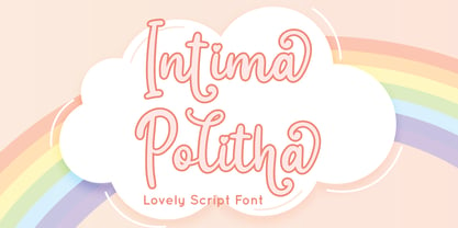 Intima Politha is a lovely script font with stylistic set and alternates. Fall in love with its incredibly versatile style and use it to create spectacular designs! Intima Politha is perfect for branding, logo, invitation, quotes, apparel design, product packaging, merchandise, game titles, cute style design, Book/Cover Title and more. What's Included : - Ending Swash - Multilingual Support --- Hope you enjoy with our font! Attype Studio
 - Musical Score JNL by Jeff Levine,
$29.00 A number of pieces of antique sheet music utilizing the same Roman typeface were the inspirational basis for Musical Score JNL. This antique design closely resembles pen lettering and its hand-made charm due to the rounded stroke ends and varying character widths. Informal, yet attractive - the character design evokes the feeling of the turn of the previous century and simplicity of life at that time.
 - Decima Mono Cyr by TipografiaRamis,
$39.00 Decima Mono Cyr is an upgraded edition of Decima Mono X fonts (released in 2014). The new version consists of the same (six) styles updated with larger character sets by extending number of Latin and Cyrillics Asian region languages. The typeface is intended for use in display sizes, but is also quite legible in text and is well suited for editorial and brand design.
 - Doodlez Forever by Abo Daniel,
$19.00 Proudly Present DOODLEZ FOREVER - The Real Doodles Font- The font that made special for doodle lovers. This font is very unique and user friendly. It's great for branding, packaging, T-shirt design, pillow design, quotes and many more. It came with multilingual support and already PUA encoded. Doodlez Forever is very worth to be picked into your collection. Trust me ! Regards, Abo Daniel Sturio
 - Pinky Sunday by Attype Studio,
$15.00 Pinky Sunday is a Script Vintage font with stylistic set and alternates. Combine Pinky Sunday stylistic set to get amazing letterform! Fall in love with its incredibly versatile style and use it to create spectacular designs! Pinky Sunday is perfect for branding, logo, invitation, quotes, apparel design, product packaging, merchandise, game titles, cute style design, Book/Cover Title and more. What's Included : - Beginning & Ending Swash - Multilingual Support
 - Grayson 1940s Art Deco Typeface by Hipfonts,
$18.00 Grayson is a 1940s art deco typeface. The inspiration came from vintage store signs in London, New York, and other major cities. The font is clean, easy to read, and its letterforms are memorable which makes it perfect for branding. You can use this font for a wide variety of projects, possibilities are endless. The downloads comes with OTF and TTF versions of the font. Enjoy!
 - Nautilus Text by Linotype,
$29.99Hellmut G. Bomm first released his Linotype Nautilus typeface in 1999. Ten years later, he updated and expanded the design. Now users have two additional families at their disposal: Nautilus Text and Nautilus Monoline. Nautilus Text bears more similarities to the original Linotype Nautilus. The letters shows a high degree of contrast in their stroke modulation. Bomm's intention was to create a clear, highly legible face. While the even strokes of most sans serif types eventually tire the eyes in long texts, the marked stroke contrast of Nautilus Text lends the face its legibility. The characters were drawn with a broad tipped pen. Like serif typefaces, the forms of Nautilus Text display a variety of elements. Its characters are narrow, with relatively large spaces between them. This helps create an overall open appearance, and allows a large quantity of text to fit into a small space. Nautilus Monoline's letters share the same overall proportions as Nautilus Text's. But as their name implies, they are monolinear. Their strokes do not have the calligraphic modulation that Nautilus Text features. This allows them to set another sort of headline, making Nautilus Monoline a refreshing display type choice to pair with body text set in Nautilus Text. - Nautilus Monoline by Linotype,
$29.99Hellmut G. Bomm first released his Linotype Nautilus typeface in 1999. Ten years later, he updated and expanded the design. Now users have two additional families at their disposal: Nautilus Text and Nautilus Monoline. Nautilus Text bears more similarities to the original Linotype Nautilus. The letters shows a high degree of contrast in their stroke modulation. Bomm's intention was to create a clear, highly legible face. While the even strokes of most sans serif types eventually tire the eyes in long texts, the marked stroke contrast of Nautilus Text lends the face its legibility. The characters were drawn with a broad tipped pen. Like serif typefaces, the forms of Nautilus Text display a variety of elements. Its characters are narrow, with relatively large spaces between them. This helps create an overall open appearance, and allows a large quantity of text to fit into a small space. Nautilus Monoline's letters share the same overall proportions as Nautilus Text's. But as their name implies, they are monolinear. Their strokes do not have the calligraphic modulation that Nautilus Text features. This allows them to set another sort of headline, making Nautilus Monoline a refreshing display type choice to pair with body text set in Nautilus Text. - Shinobu by Lurinzu Studios,
$15.75 "Shinobu" is an elegant psychedelic display font that combines characteristics of Art Nouveau and Modren San serif types. The name "Shinobu" comes from the anime character " Shinobu Kocho" from an anime called "Demon Slayer". Like "Shinobu's" characteristics, This exudes elegance and poshness while still having that quirkiness. This display font is intended to be used in big-scale designs such as headlines, posters, flyers, apparel, quotes, greeting cards, product packaging, album covers, movies, and more. *This font includes letters, numbers, alternates, and all essential marks needed.
 - Gabriel Bautista by Comicraft,
$29.00 Comix Gorilla GABRIEL BAUTISTA is the artist of John JG Roshell's CHARLEY LOVES ROBOTS series. His incredible watercolors graced the pages of ELEPHANTMEN #50. In some circles he is known as "Galvo" or "Gabo" and he has brought his brofu color skills to the pages THE SPIRIT, ALL STAR WESTERN and also illustrated JESUS CHRIST, IN THE NAME OF THE GUN. He is also the creator of comic battling site ENTERVOID.COM and indy press PULPOPRESS.COM. He loves his girl, his dog lulu and his font.
 - Valsity by Ingrimayne Type,
$9.00 Valsity is a squarish slab-serif family with five weights and two widths, each with an italics for a total of twenty members. With negligible contrast, it is almost monoline. It is for decorative uses; it is too square and lacks the contrast to make it a good choice for extensive text. Valsity began with a blending of two other squarish slab-serifs, Valgal and Kwersity, and its name reflects that ancestry. From there it took on a life of its own, often diverging from its parents.
 - Noise Maker by Bogstav,
$15.00 Can noise be a beautiful sound? Well, I guess...because the other day when I was playing the good old Bleach album by Nirvana (which I consider lovely grunge music!) my wife yelled "Could you stop that noise?!" - and I answered "What noise?!" - ha-ha-ha! Anyway, I finished this font while listening to that particular lovely noise, and I knew that this crunchy, grungy, handmade and full of contextual alternates and multilingual font had to be named something with the word "noise" in it!
 - New Car Tag JNL by Jeff Levine,
$29.00 Around 2018 or 2019, the State of Florida introduced new letter and number characters on its auto plates. Inspired by this change, Jeff Levine Fonts offers up a digital version of this lettering named New Car Tag JNL, which is available in both regular and oblique versions (for those who want a more sporty look). Some people prefer a rounded 'zero' to differentiate between the regular zero and the letter 'O'. You can find this alternate character located on both the solid bar and broken bar glyphs.
 - Sticky Toffee by Hanoded,
$15.00 I don’t have a sweet tooth myself, but I do like toffee! One of my favourite desserts is English Sticky Toffee Pudding, so I really had to name a font after this delicacy. Sticky Toffee is a bold display font. It’s all caps (in case you might have missed that), but upper and lower case differ and can be used together to create a more ‘natural’ look. Sticky Toffee comes in two great styles: Regular and Sprinkles, and has all the diacritics you’ll need.
 - Polke by ArtyType,
$29.00 Polke is a single weight display face brimming with style and charm but simultaneously exuding impressive core strength and a vibrant personality. Floating ball terminals rub shoulders with contrasting sharp and rounded letterforms to produce a distinctively decorative headline font built on robust foundations. Polke's name is derived from the striking terminal dots which dominate the character set, creating a Polka-Dot effect throughout. I also had the artist Sigmar Polke in mind which explains the spelling, and so the two ideas simply morphed together.
 - The Keandro by Reyrey Blue Std,
$14.00 The Keandro is a bold script typeface with noble and vintage looks. The Keandro has lots of alternate characters, swashes and ligatures. It has also a bunch of tails with different widths to give the vintage logotype or sports look to your design. It’s well suited for logos, lettering artwork, t-shirt designs, editorial illustrations to name a few. This font is PUA encoded which means you can access all of the glyphs and swashes with ease! Includes: Uppercase and Lowercase Swash Ligatures PUA Encode Support
 - ITC Franklin Gothic LT by ITC,
$43.99 Franklin Gothic was designed between 1903 and 1912 by Morris Fuller Benton for the American Type Founders Company. The font serves as the American Grotesk prototype. It was named after Benjamin Franklin. Even today, Franklin Gothic remains one of the most widely used sans serif typefaces. The robust character of the font gives text a modern feel. It is widely used in newspapers and advertising and is frequently seen in posters, placards and other material where space is restricted. Featured in: Best Fonts for Tattoos
 - Heartfilia by RagamKata,
$14.00 Heartfilia, this font is as elegant as its name. It’s unique look makes it incredibly authentic serif font. The font gives off an elegant and classic feel, while still appearing modern and in line with the current design trends. Orchestra is a well- suited font for a high-end design, makes it more eye-catching. Orchestra will make your designs, such as invitations, posters, product package design, and many more, looks more exclusive and luxurious. Enhance your design by the elegant yet classic appearance of Orchestra.
 - Sekhmet by Three Islands Press,
$29.00Stylish, elegant, and alluring, Sekhmet got its name from the lion-headed war goddess of ancient Egypt. And the typeface does possess a kind of feline, forward-directed energy - a result of its calligraphic detailing combined with a very slight slope in the roman. Sekhmet is essentially a display face; still, it's as carefully crafted as any of the designer's text fonts and so also works well in reasonably large text blocks, especially at larger point sizes. Comes with a book-weight roman and calligraphic italic. - Jules by DSType,
$45.00 At first glance, Jules, appears to be just one more Didonic variation, but a closer look starts revealing all the extraordinary features of this type family, specially designed for use in extremely big sizes. Jules reflect the last of the late 18th century and was inspired by several plates from a portuguese calligrapher named Antonio Jacintho de Araujo. Available in three different optical sizes: Big, Colossal and Epic, Jules has a plethora of ligatures and stylistic alternates, plus refined Italics and a super elegant Swashes version.
 - Racing Foner by Multype Studio,
$24.00 Racing Foner is a racing sport display font. A strong, bold and unique style instantly gives your design power and uniqueness. This font perfect font for sport or racing themed projects, such as logo, poster, games, product design and much more.
 - Nasser by Eyad Al-Samman,
$3.00 “Nasser” is a Kufic modern Arabic typeface. It is suitable for books' covers, advertisement light boards, and titles in magazines and newspapers. It is very distinctive when used in black and white printout. It decorates colored pages and makes artworks more attractive. This font comes in three different weights. My father’s name is “Nasser”. Consequently, “Nasser” Typeface was designed for eternizing the memory of my late father. He was the person who taught me how to like arts, literature, and languages. Besides, my first cute child is named also “Nasser.” The main characteristic of “Nasser” Typeface is in its modern non-descender style for some of its Arabic characters such as “Sad”, “Seen”, “Sheen”, “Qaf” and others. The shape of the characters' “dot”, “dots”, and “point” is innovative; a triangle with a semi-circle shape. “Nasser” Typeface is suitable for books' covers, advertisement light boards, and titles in magazines and newspapers. Its characters' modern Kufic styles give the typeface more distinction when it is used also in posters, greeting cards, covers, exhibitions' signboards and external or internal walls of malls or metro’s exits and entrances. It can also be used in titles for Arabic news and advertisements appeared in different Arabic and foreign satellite channels.
 - Sabbatical by Fontforecast,
$17.00 Sabbatical is a no nonsense brush font family with lots of character. The family contains 3 hand-lettered fonts, Regular, Bold and Basic. This dry textured script font is inspired by travel journals written by adventurous souls, hence the name. The design is perfect for any type-based creations, quotes, invites, packaging, branding and much more! Sabbatical Basic has his own unique form which complements Sabbatical Regular and Bold. It consists of a fun caps font with an even more playful variation. All Sabbatical fonts have alternate glyphs that can either be accessed by the swashes feature, stylistic sets, or glyphs panel, depending on the application you are using. There are lots of discretionary ligatures that offer more variation. With over 880 glyphs the design options are unlimited.
 - Hello Kindess Brush by Lucky Type,
$18.00 Hi designer, let me introduce my newest font Hello Kindess. Hello Kindess is my newest font brush that I made using a simple brush with a modern style and irregular base line. contemporary approach to design, natural handmade, suitable for use in title designs such as clothing, invitations, book titles, stationery designs, quotes, branding, logos, greeting cards, T-shirts, packaging designs, posters, and more. Hello kindess Font consists of 2 kinds of styles namely upright and italic style so that designers are free to choose the desired style. Hello Kindess Font Also has 20 Extras made by hand which are very suitable for various purposes in design. Extras that I made with full detail so it looks very unique. Thank you for seeing I hope you like it.
 - Plastilin by ParaType,
$25.00 Plastilin type family of two weights obtained its name due to the soft, curved, stroke terminals of characters (J, K, L, R and others) and the little pointed serifs, as if extruded from stroke plastic mass. The character set has a lot of additional Latin and Cyrillic ligatures, as well as several alternate letter forms. Plastilin was designed for ParaType by Oleg Karpinsky in 2005. It is for use both in display setting and short text passages. In 2008 the author added two weights (Light and Black) and improved letterforms of some characters.
 - Hasan Ghada by Hiba Studio,
$59.00 Hasan Ghada is an Arabic display typeface. It is useful for titles and graphic projects. The font is based on the simple lines of Modern Kufi calligraphy with new ideas for square shapes and geometric feel. It supports Arabic, Persian and Urdu. This font was designed in 2002 and the first version was released under name KactTitle in the typefaces group of King Abdulaziz City for Science and Technology (KACST), which supported the Linux operation system. In 2007, I developed this font and created five weights of it.
 - Deca Serif by ParaType,
$30.00 Super family Deca consists of ten fonts. Six sans serif styles form the Deca Sans family and four styles of serif family named Deca Serif . These are low contrast fonts of pure design with ovals bent to rectangular shapes. They are nicely readable in small sizes and can be recommended for scientific, legal, official and business documents. Serif and sans serif fonts were designed in comparable proportions, they are balanced by color and have similar details in basic shapes. These features provide high compatibility and assume collective usage of the fonts in documents.
 - Deca Sans by ParaType,
$30.00 Super family Deca consists of ten fonts. Six sans serif styles form the Deca Sans family and four styles of serif family named Deca Serif . These are low contrast fonts of pure design with ovals bent to rectangular shapes. They are nicely readable in small sizes and can be recommended for scientific, legal, official and business documents. Serif and sans serif fonts were designed in comparable proportions, they are balanced by color and have similar details in basic shapes. These features provide high compatibility and assume collective usage of the fonts in documents.
 - Lemony Crumpet by Kitchen Table Type Foundry,
$10.00 A crumpet is a small griddle bread, mostly enjoyed in the UK, North America, Australia and New Zealand. I have never had one, but I have heard of them and I like the name - which is probably Welsh in origin. Lemony Crumpet is a whimsical, handmade font. It is tall & thin, shaky and jumpy and I wouldn’t use it as a poster font because of its delicate properties, but it would look fantastic on book covers, product packaging and websites. Comes with extensive language support and a set of alternates for the lower case letters.
 - Wood Type Calendar JNL by Jeff Levine,
$29.00 Wood Type Calendar JNL is a set of components for making monthly calendar pages. Based on a set of vintage wood type numbers, the dates 1 through 31 are found on the "A-Z" and "a-e" keys; the 23/30 and 24/31 ligatures are on the "f" and "g" keys. On the "h" and "i" keys are blank outline and solid blocks for balancing the calendar layout. The "j" through "u" keys have the names of the months, and the "1" through "7" keys contain the days of the week.
 - Peanut Ache by PizzaDude.dk,
$17.00 I don't know what it is with me and peanuts. I simply love it! I like peanuts in all kinds of meals: breakfast, lunch, dinner and even in desserts! But with an addiction like this, an overload of peanuts sometimes appear...and I guess that's where the name of this font comes from :) The Peanut Ache font is super clean, and super steady - use it for anything that needs a clean look! I've added 5 slightly different versions of each letter, and this really helps making your text to look even more fresh and lively!