3,398 search results
(0.023 seconds)
- Nelona by Mega Type,
$15.00 Nelona An elegant font designed when in a creative mood and perfect shape, inspired by the bold, natural look of serifs so beautiful for today's fashion. bold, balanced and varied, born for luxury and beauty. including uppercase letters, numbers, and various kinds of punctuation. Nelona is perfect for invitations, logos & branding, photography, advertising, watermarks, social media posts, product packaging, product designs, labels, wedding designs, stationery, special events or anything else needed to create a theme. Hope you enjoy our fonts and if you have any questions, feel free to message & I'll be happy to help :)
 - Banner by ITC,
$29.99The calligraphy font Banner was designed by Martin Wait in 1986 and mixes the character of the 1940s with that of the 1980s in its forms. The round and somewhat reserved lower case letters make a balanced basis for the generous capitals. Black outer contours surround a white inner area and are heavier on the right side of the figures, making the characters look as though they have shadows. Banner should be used in point sizes of 18 and larger and is meant for lighthearted short texts or headlines. - Anargya by IbraCreative,
$17.00 Anargya is a timeless beauty classic serif typeface that exudes elegance and sophistication. Its meticulously crafted letterforms showcase a harmonious balance between thick and thin strokes, creating a sense of timeless grace and legibility. With a refined, high-contrast design, Anargya brings a touch of traditional charm to contemporary designs, making it a versatile choice for branding, editorial, and luxury aesthetics. Its gracefully tapered serifs and graceful curves imbue it with an air of sophistication and refinement, making it a perfect choice for projects that demand a timeless, classic typographic style.
 - Anything by Supersemarletter,
$10.00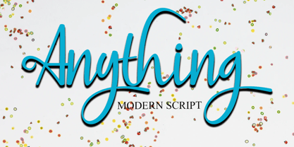 Anything is a handwritten script style in Uppercase and Lowercase feel nice balanced. Provide ligatures with special character make the design letter looks incredible. Honestly it works perfectly for headlines, logos, posters, packaging, T-shirts and much more. Font Features : • Regular version • Character set A-Z in uppercase and lowercase • Ligatures in Lowercase and special • Alternates option • Numerals & Punctuation • Accented Characters • Multiple Languages Supported Recommended to use in Adobe Illustrator or Adobe Photoshop with opentype feature. If you have questions, just send me a message and I'm glad to help.
 - ITC Novarese by ITC,
$40.99 Novarese font is the work of designer Aldo Novarese. He created 218 typeface cuts but as he was writing his book, Alfabeta, he decided to include only those he considered indispensable. He divided his fonts into 4 categories and in the designing of Novarese, took the best characteristics of each group and combined them into this font. In the style of Latin stone scripts of the second century BC. Novarese is a well-balanced and relatively wide text font with classic forms. ITC Novarese™ font field guide including best practices, font pairings and alternatives.
 - Histadia by IbraCreative,
$17.00 Histadia is a strikingly modern chic serif typeface that seamlessly blends timeless elegance with contemporary aesthetics. Its graceful, high-contrast letterforms exude sophistication and versatility, making it an ideal choice for a wide range of design projects. The font’s crisp lines and refined serifs convey a sense of refined luxury, while its clean, minimalist detailing ensures legibility and impact in both print and digital applications. Histadia captures the essence of classic serifs while embracing a modern sensibility, making it a versatile choice for those seeking a harmonious balance between tradition and innovation in typography.
 - Bricksram by Parker Creative,
$18.00 Bricksram is a sleek and modern geometric sans serif font that draws inspiration from popular typefaces like Futura, Gotham, and Proxima Nova. With its own unique flair and minimalistic design qualities, Bricksram is the perfect choice for those looking to achieve a clean and contemporary look across a variety of mediums. Featuring sharp angles and smooth mathematical curves, Bricksram's meticulous balance creates a super clean and eye-catching aesthetic. With a choice of eight different font weights, this versatile typeface is ideal for demanding design applications like websites, logos, mockups, apps, ads, and more.
 - Big Top by Comicraft,
$19.00 Step Right Up, Step Right Up, the Font Circus is in town and ready to reveal our stupendous new tent-pole feature! Step inside for the best seat in the house. Ringmaster Roshell Beauregard dons his Big Top Hat especially for this occasion and promises us that Clowntime ain't over until the Bearded Lady takes a custard pie in the face. Our Big Top Bonanza performance begins with sideshow attractions and distractions, high-wire acrobats and low-cost rubber band guns. Can you smell the greasepaint and hear the roar of the crowd already...?
 - Sraben Grotesk by Yukita Creative,
$14.00 Sraben Grotesk is a beautiful, versatile font that's perfect for all kinds of projects! It features balanced and harmonious proportions, plus bold variations to make certain elements stand out. This font offers classic characteristics inspired by Grotesk typography, making it an ideal choice for posters, flyers, brochures, brand identity designs, and magazine layouts. Whether you're looking to create something new or bring a creative twist to an existing project, Sraben Grotesk can be the perfect choice. Let its clean aesthetic fuel your imagination and inspire you as you achieve your design goals!
 - Kecumik by IbraCreative,
$17.00 Kecumik, a stunning Glamour Serif typeface, seamlessly blends elegance with modern sophistication. Its graceful letterforms exhibit a harmonious balance of curves and serifs, exuding a timeless allure that captivates the eye. Kecumik’s intricate details and refined strokes contribute to its distinctive personality, making it an ideal choice for projects that demand a touch of glamour and a nod to classical aesthetics. Whether used in editorial design, branding, or luxury packaging, Kecumik’s versatile charm elevates any visual composition, embodying a sense of refined beauty that resonates across diverse design applications.
 - Galaktik by ExFour,
$19.00 Galaktik is a fresh embodiment of the monospace font. Born out of creative ideation, it attempts to pay homage to a long history of display fonts while exhibiting contemporary, playful accents. This balance of geometric shapes and creative expression allows Galaktik to feel both familiar and yet unique. Features Numerals Punctuations Special Characters Galaktik's freshness fits modern typographic schemes, futuristic logos, and even command-line consoles. The limits are boundless. Thank you for your purchase! Feel free to reach out for any issues or if need any assistance.
 - Aprex Sans by S6 Foundry,
$20.00 Aprex Sans perfectly balances the minimalist quality associated with contemporary sans with flair within the width of the counters and comfortable, breathable apertures. — Throughout weights and sizes, the typeface has great legibility and good contrast between positive and negative space, making it stunningly versatile. — With a seamless combination of contemporary details and classic styles, Aprex Sans draws inspiration from the mid-century humanist and grotesque typefaces, and its solid and straightforward structure is characterized by angular connections between curves and stems. Aprex Sans is geometric in nature with humanist qualities rooted in the Swiss tradition.
 - Le petit cochon by Nantia.co,
$12.00 Le Petit Cochon is an adorable chubby typeface. It is a cute font that has a great variety of applications with multilingual support. Chubby Font Le Petit Cochon is a lettering font with Greek (of course), Latin characters and diacritics. The font is hand crafted, but still is maintaining it’s legibility and balance so it can be used in packaging or logotypes and branding. Especially if you are looking for a font for Instagram cute quote posts or any other social media content, this typeface is the perfect match for you!
 - Fortuna by Linotype,
$29.99Fortuna has some resemblance with handtexted characters based, loosely, on the classic italic. But, like Ad Hoc, Fortuna is drawn on a monitor in every detail. The name is Latin and means fate, luck. The composer Carl Orff was actual at the time when I worked with Fortuna, because he had been born 100 years earlier. Orff's Carmina Burana were being introduced on the radio when I was wondering what to call my most recent creation. The song cycle begins with a song to Fortuna: a fated choice of name. Fortuna was released in 1995. - Vernata by IbraCreative,
$17.00 Vernata, an enchanting and elegant serif font, captivates with its timeless sophistication and refined charm. Each letter is meticulously crafted, embodying a perfect balance of curves and straight lines that exude a sense of grace and luxury. The delicate serifs add a touch of classic flair, while the overall design maintains a modern sensibility. The spacing and proportions of Vernata are expertly calibrated, ensuring readability and an effortless flow of text. Whether used for invitations, branding, or editorial design, Vernata brings a magical allure to any project, seamlessly blending tradition with contemporary aesthetics.
 - Acello by Craft Supply Co,
$20.00 Acello – Geometric Sans Serif Font Modern Simplicity Acello, the Geometric Sans- serif font, effortlessly infuses modern simplicity into your display designs. Clean lines and a sleek aesthetic captivate your audience, ensuring a contemporary appeal. Versatile Elegance Crafted for diverse display purposes, Acello seamlessly adapts, adding a touch of versatile elegance to logos, headlines, and more. Its adaptability ensures a refined look for any visual project. Readability Redefined Prioritizing clarity, Acello’s balanced proportions enhance readability. Each character is meticulously crafted for optimal legibility, ensuring your message is clear and accessible to all.
 - Aniuk by Typejockeys,
$40.00 Aniuk is an original display type family from Typejockeys designed and optimized for the use in large sizes. With five robust weights—Regular, Medium, Bold, Heavy and Black—it is perfectly suited for editorial, posters or logo design. Aniuk is lively, young, and probably a little crazy. However, there certainly is one thing that it is not: boring. A perfect balance of characteristic curves and edgy details make this a strong but playful typeface. Be passionate, get emotional and express yourself with a variety of five different weights. A solid partner for your creative adventures.
 - Cindie Mono by Lewis McGuffie Type,
$34.99 Cindie Mono is a multi-width display font. Six different widths – A (condensed) through F (super extended) – mathematically correspond with one-another creating a stackable type family. Each face contains all caps full West, Central and East European language support. All diacritics and marks are done in a hairline to add style and contrast. And Cindie Mono is ideal for posters, headlines and display lettering. The inspiration for Cindie Mono came from the lettering styles on optometrists sight-test posters. Then through several stages of development the overall concept for Cindie became of a half-broken Commodore64 and the computer from the 1985 movie 'Weird Science' hooked up to a dot-matrix printer spitting out reams of mechanical but distorted mono-lettering all the while an old modem you can't seem find keeps beeping and beeping and beeping...
 - FF DIN Slab Variable by FontFont,
$419.99 FF DIN: the famous, faithful and first revival of DIN 1451. FF DIN originates in the lettering models from the German standard DIN 1451, and is considered the perfect standard typeface due to methodical and engineered design. FF DIN Slab is a robust compliment to the FF DIN family. Designed by Antonia Cornelius and Albert-Jan Pool, it offer designers tools to create greater rhythm and design depth. FF DIN Slab’s proportions have been meticulously aligned with its Sans origins, offering the perfect balance between positive and negative space. The serifs are assertive, sturdy and balanced, they are engineered to emphasis a strong horizontal flow through text, a grounded utility and assurance in headlines. The result of this attention to detail is a typeface that harmonizes beautifully with other FF DIN styles. Pushing font technology to its limits, FF DIN Slab is also available as a Variable font. Allowing creatives to design hyper specific variations which thrive in any design space, and even seamlessly animate movement from one state to the next. FF DIN Slab distinctively carries on its parent’s DNA, speaks the same native language — but with a strong peculiar dialect. It expands the DIN family worthily — independent but integrated — and opens totally new possibilities of uses with the whole DIN family.
 - FF DIN Slab by FontFont,
$50.99FF DIN: the famous, faithful and first revival of DIN 1451. FF DIN originates in the lettering models from the German standard DIN 1451, and is considered the perfect standard typeface due to methodical and engineered design. FF DIN Slab is a robust compliment to the FF DIN family. Designed by Antonia Cornelius and Albert-Jan Pool, it offer designers tools to create greater rhythm and design depth. FF DIN Slab’s proportions have been meticulously aligned with its Sans origins, offering the perfect balance between positive and negative space. The serifs are assertive, sturdy and balanced, they are engineered to emphasis a strong horizontal flow through text, a grounded utility and assurance in headlines. The result of this attention to detail is a typeface that harmonizes beautifully with other FF DIN styles. Pushing font technology to its limits, FF DIN Slab is also available as a Variable font. Allowing creatives to design hyper specific variations which thrive in any design space, and even seamlessly animate movement from one state to the next. FF DIN Slab distinctively carries on its parent’s DNA, speaks the same native language — but with a strong peculiar dialect. It expands the DIN family worthily — independent but integrated — and opens totally new possibilities of uses with the whole DIN family. - Crucifix by Canada Type,
$39.95In June of 2004, Canada Type released Crucifix, a condensed three-tiers typeface that tried to bridge the gap between traditional blackletter forms and the traditional European gothics. The main goal of Crucifix was to have as many as 4 different variations on each letter form, so the original release consisted of three fonts: a main font with a standard character set, a small caps set, and a unicase variation. Now Canada Type presents the next generation of this typeface: Crucifix 2.0 and Crucifix Pro. This new version takes advantage of both Unicode and OpenType technologies to make Crucifix as versatile as ever. The PostScript Type 1 and the True Type version boast extended Latin character set support, including Western, Eastern and Central European, Turkish and Baltic, as well as two non-Latin scripts: Cryillic and Greek. The OpenType version, Crucifix Pro, goes even further by including all of above in one font, along with proper automation to accommodate on-the-fly ligatures, small caps, numerators, denominators, some fractions and a ton of stylistic and contextual alternates - all programmed to work with the latest OpenType-enabled programs. Unique, stark, and with more than 900 characters, Crucifix has that clinical sharpness and special dramatic wonder to make it perfect for mystery, gothic, and horror design settings. - Glance Slab by Identity Letters,
$29.00 Dynamic and sportive. A well-balanced experiment for sparkling headlines. Glance Slab is an experimental design that plays on the tension between connection and detachment. In this typeface, serifs may be detached and some strokes may not connect to their stems. This creates a dynamic impression of balance and movement. The elegance of an ice skater and the determination of a quarterback: Glance Sans has it all. Where a curve meets a stem and where serifs seem to “hover” near their respective letters, the nonjoining elements create an impression similar to a stencil typeface. But here, the function of the gaps differs from strictly stencil designs: while the gaps provide a “sparkling” effect in Glance Slab that’s clearly visible in large sizes, they take on the role of ink traps when set smaller, making for surprisingly legible body copy. With its strong visual character, this font family is quickly recognizable, making it perfectly suitable for branding and any large-scale application, such as posters, billboards, and event signage. Glance Slab consists of seven weights from Thin to Black. Each style has a character set of about 570 glyphs, which includes circled numbers and arrows (positive and negative versions), ligatures, extended language support, and many other features.
 - Rustery Mirages by Fikryal,
$25.00 Introducing Rustery Mirage, a striking modern serif font that effortlessly blends timeless elegance with contemporary flair. With its sleek and sophisticated design, Rustery Mirage is the perfect choice for projects that demand a touch of refinement and versatility. Crafted with meticulous attention to detail, Rustery Mirage exudes confidence and professionalism. Its clean lines and balanced proportions create a harmonious balance between classic charm and modern aesthetics. The font’s serifs add a touch of traditional grace, while it's sleek curves and subtle flourishes lend a fresh and stylish appeal. Rustery Mirage is highly legible, making it an excellent choice for various applications. Whether you’re designing branding materials, editorial layouts, website headers, or social media graphics, this font will effortlessly enhance your project’s visual impact. Its versatility allows it to shine in both print and digital mediums, adapting seamlessly to any design environment. Experience the allure of Rustery Mirage and elevate your designs to new heights. Captivate your audience with this modern serif font that exudes elegance, versatility, and a touch of contemporary sophistication. Let Rustery Mirage be your go-to choice for creating stunning typographic masterpieces that leave a lasting impression. If you have any questions please don’t hesitate to contact me follow my Instagram: @fkryall Thank you
 - PT Root by ParaType,
$40.00 PT Root is a contemporary sans serif with strict, laconic forms. It’s a versatile typeface that provides a wide range of possibilities. Regular style works great in long texts (both on screen and in print), as well as in the interfaces. Medium and Demibold are good for signage, while the lightest and boldest styles look great in large sizes and are suitable for the brand identity. PT Root is a sans serif with 10 weights and a variable version. Its character set includes extended Latin and extended Cyrillic, three arrow variants, fractions, index numbers and letters. PT Root automatically lifts dashes and brackets with the case change. Its characters have stylistic variants, including the single-storey a, a strikethrough zero and some local alternates for Bulgarian and Serbian Cyrillic. PT Root can work in a project both independently and in pairs. Contemporary serif typefaces are the best text companions for it — try for example PT Serif, Yefimov Serif or Scientia. In case PT Root is the only text typeface in the project, then combine it with serious typefaces, such us technical (Din Condensed as an example) or pronouncedly contemporary typefaces, including postmodern ones, from Stapel or Spile to Helsa.
 - Novelia Pro by Joelmaker,
$20.00 Novelia Pro & Novelia Pro Small Cap is a multi purpose serif font, with a swirly blend that is very spoiled in the eyes, unique and elegant, and ready to accompany and play around with you in preparing the next design project. Novelia can be used for various purposes such as posters, logos, t-shirt, signage, business card, magazines, book cover, wedding invitation, greeting cards etc. Novelia Pro & Novelia Pro Small Cap allow you to create custom dynamic text. You can access by turning on; Stylistic Alternates, Titling,Swash, as well as ligatures in Photoshop, Adobe Illustrator, Adobe InDesign or through a panel of glyphs such as Adobe Illustrator, Photoshop CC, Let's switch from the regular character into character alternative to get the text with the layout of your dreams. Novelia Pro also includes glyphs, punctuation, numbers, and multilingual. Novelia Pro & Novelia Pro Small Cap features +1000 glyphs and has given PUA encoded (specially coded fonts), with tons of alternate characters. The pack can be accessed in full by any crafter or designer, without the requirement for extra design software, COMPATIBLE WITH SILHOUETTE & CRICUT DESIGN SPACE.
 - Katz Pajamas JNL by Jeff Levine,
$29.00 According to Wiktionary, "the cat's pajamas" was a slang phrase coined by Thomas A. Dorgan, the well-known journalist, cartoonist and sportswriter of that era. The phrase became popular in the U.S. in the 1920s, as the word "cat" was used as a term to describe the unconventional flappers from the jazz era. This was combined with the word pyjamas (a relatively new women's fashion during that time) to form a phrase used to describe something that is the best at what it does, thus making it highly sought and desirable. Wikipedia adds that Dorgan was the first to use the terms "twenty-three, skidoo", and "yes, we have no bananas", "apple sauce" and "solid ivory", which also became part of the slang of the "Roaring Twenties". Katz Pajamas JNL is a condensed slab serif typeface based on the title lettering for the 1944 sheet music "Pretty Kitty Blue Eyes", hence the pun-laden font name paying homage to this bit of verbal Americana as well as making the pajamas a pair owned by Mr. Katz instead of the fashionable feline. Available in both regular and oblique versions.
 - FF Pastoral by FontFont,
$50.99 A sturdy workhorse with the grace of a gazelle, the FF Pastoral typeface family marries pure craftsmanship with rapturous excesses of form. With his fifteenth release under the FontFont brand, prolific French designer Xavier Dupré has filled a typographic toolbox with plentiful options ranging from a tender, feathery Thin to a robust, healthy Black. At a glance, FF Pastoral appears deceptively simple, particularly in the middle weights. That surface serenity is intentional and allows for easy reading and quick comprehension of short blocks of copy. Upon closer inspection, FF Pastoral is complex and nuanced, carrying a balanced tension in its forms. This plays particularly well in magazine spreads and corporate logos, where uniqueness is a virtue. In creating his latest design, Dupré drew inspiration from a tasteful mix of references, combining diverse elements with a deft hand. While its letter shapes were informed by humanist-geometric hybrid Gill Sans, FF Pastoral’s proportions have been optimized for contemporary typography. Slightly condensed but generously spaced, FF Pastoral features a tall x-height, open counters, and subtle, sprightly italics slanted at just 5°. Proportional oldstyle figures are the default in the family, with tabular and lining numbers and fractions accessible through OpenType features. Elegant details evocative of calligraphy judiciously pepper the FF Pastoral glyph set. The ‘e’ bears an oblique crossbar, while the right leg of the ‘K’ and the ‘R’ are insouciantly curved in both the upright and italic variants. Further flourishes appear throughout the italics, notably in the ‘T’ and the ‘Z’, the gloriously looped tail of the ‘G’, and an extraordinary ampersand. Sharp-eyed fans of Dupré’s work may feel like they’re in familiar territory, and they would be right. An early version of FF Pastoral sprang to life in 2017 as Malis, a family in four weights on the heavier side of the spectrum. Over time, Dupré refined his original design, expanding it with four lighter styles and including true italics for all. The lightest weights are ethereal, with exquisitely delicate strokes drawing the eye in and across a line of type. The most substantial styles are tremendous in their power, allowing text to make a deep impression in print or on screen. Fully fleshed out, FF Pastoral works sublimely in a vast array of text and display settings. Dupré sees his latest FontFont offering as a ‘cultural’ typeface, perfect for the pages of an oversized coffee-table book or business communications where warmth and informality will win the day. Born in Aubenas, France (1977), Xavier Dupré is a gifted user of type as well as an award-winning type designer and lettering artist. After training in graphic design in Paris, Dupré studied calligraphy and typography at the Scriptorium de Toulouse. Since releasing FF Parango in 2001, Dupré has published such FontFont classics as the FF Absara and FF Sanuk superfamilies, FF Megano, FF Tartine, and FF Yoga. A designer of Khmer fonts as well as Latin typefaces, Dupré splits his time between Europe and Asia.
 - Sucesion Slab - Personal use only

- Tobelord by Haksen,
$17.00 TOBELORD is a strong modern sans serif style with All Caps feel nice balanced. Its wide range of uppercase with ligatures allow versatile design options and works perfectly for headlines, logos, posters, packaging, T-shirts and much more. Ligatures feature is default setting in Adobe Illustrator or Adobe Photoshop in Uppercase character. So when you want not to use the ligatures. Open glyphs panel : In Adobe Photoshop choose tool Window Character and then please klick fi symbol In Adobe Illustrator choose tool Window Type Open Type and then please klick fi symbol Have a great day, Haksen
 - Dining Room JNL by Jeff Levine,
$29.00 Inspired by the basic letter concept of Walter Huxley's 1935 gem Huxley Vertical, Dining Room JNL is a completely re-drawn typeface, adding even more of an Art Deco feel to an already classic Deco-era letter form consisting of condensed, rounded letters. Thick vertical lines balance against lighter weight ones, giving a dramatic contrast so typical of the Streamline Era of design concepts. This font marks another milestone in the Jeff Levine library of retro-inspired type faces. Beginning in 2006 with only ten designs, the collection has grown steadily with Dining Room JNL being the 750th font in the library.
 - K haus 105 by Talbot Type,
$19.50 K-haus 105 is inspired by the work of graphic designer and typographer, Herbert Bayer, during his time at the Bauhaus around 100 years ago — work that kick-started graphic design as we know it, to this day. It owes something to the simple geometry of Bayer’s hand-drawn, ‘universal typeface’, updated and expanded to deliver a clean, balanced, geometric sans for today. Also available as K-haus 205 , featuring a few, more 'daring' characters here and there, chiefly in the lower case set. Both variations include an extended character set, featuring accented characters for Central European languages.
 - Pro League 2020 by Alphabet Agency,
$20.00 Pro League 2020 font family is a sleek modern sans serif font family that provides italic and weight options that balance well with each other and provide various options for the user. If you are looking to present a clean, sleek professional look that is easy on the eyes - then this is a font family for you. Pro League 2020 font family contains 6 fonts - Pro League 2020 Condensed Regular, Pro League 2020 Condensed Regular Italic, Pro League 2020 Condensed Light, Pro League 2020 Condensed Light Italic, Pro League 2020 Condensed Extra Light and Pro League 2020 Condensed Extra Light Italic.
 - Taro by Dharma Type,
$19.99 Taro Why do designers make more and more geometric fonts? There are already many geometric sans in the world. Because It is a natural flow of design. It is true that we like geometric type instinctively. Taro was designed to archive a good balance between the following three things geometrically. 1. To be Natural, Flowing, Organic. 2. To be Neutral, Unbiased, Universal. 3. To be legible, distinguishable, readable. Consists of eight weights and their matching italics. Supporting almost all latin languages. All-caps text for one line or a few is as wonderful as normal mixed-case typesetting.
 - Bohemian by URW Type Foundry,
$39.99 Mixed designs of Futura and Bodoni (Fudonis) are quite popular. Apart from being contemporary, such fonts provide excellent readability. However, most of the existing 'mixtures' were not good enough in terms of balance for P. Kraft. He was finally inspired by a noticeable 'mixture' in a Japanese fashion magazine. His intention was not to combine two existing fonts but to design a completely new typeface: Bohemian - named after the well-known Japanese fashion style in Shibuya/Tokyo - the Bohemian Style.Bohemian and Parametra can be mixed perfectly since their proportions and dimensions are the same.Bohemian was designed for the URW++ FontForum.
 - Artographie by Mans Greback,
$49.00 Artographie is a Art Deco sans-serif family. The lettering was designed by Måns Grebäck during 2019 and 2020. It gives any project a moderist appearance, as a reinvention of the hundred-year-old style of design, adapted and adjusted to fit in present-time purposes and technology. The typeface is a family containing five styles: Thin, Light, Medium, Bold and Black. The weights are top quality and created to balance perfectly against each other. It has a very extensive lingual support, covering all European Latin scripts. The font contains all characters you'll ever need, including all punctuation and numbers.
 - Ancress by Tour De Force,
$25.00 Ancress is modern geometric sans serif family with display elements. Designed in 14 styles with extended Latin character map, Ancress uses simple geometric shapes for achieving all characteristics of modern sans family: wide versatility, full legibility and design recognition. Letter shapes are visually softened with rounded corners and straight endings. Characteristic letters are visible in every word typed with Ancress, so it is not a typeface that differs from others by single letter only, it is graphically well balanced and thymically smooth typeface that should refine any design project – from editorial design, posters, packages, branding to websites, applications and outdoor graphics.
 - Anggie Display by Gatype,
$18.00 Anggie Display is an elegant script with a creative mood and perfect form, inspired by today's beautiful serif Display. thick, balanced and varied, born for luxury and beauty. In my example I show how this script can be used. It's great for logotypes, branding, wedding invitations, romantic cards, alcohol labels, packaging, name spelling and more. Anggie Displaycomes with beautiful uppercase and lowercase letters, numbers, and punctuation. In addition to the main character set, there are many alternative characters, early and late sweeps. Available Fonts: . Multilingual. . Ligature. . Swash. . Stylistic Set. If you have any questions don't hesitate to contact me! Thank you,
 - Natural Curves OG by Kingpin Designs,
$9.00 'Natural Curves OG' is a friendly typeface that works seamlessly without any trimmings. It's perfect for giving any work a hand-drawn look and feel. The typeface is balanced so the eye doesn't move straight to any singular letter, which means that creating a hierarchy with other elements in your design is simple. Colour blocking to support brand identity is easy with this typeface, and it adds character simply and authentically. This typeface was created for my own brand's identity, and it's been great to add splashes of art in the form of type all over my website and collateral.
 - Povetarac Didone by Tour De Force,
$25.00 Povetarac Didone font family is part of Povetarac Superfamily together with Povetarac Sans and Povetarac Display. Available in 6 weights with matching italics, Povetarac Didone relays on lively uppercase proportions that took inspiration from vintage typefaces. It is well balanced family, elegant and fully recognizable. One of its characteristics are straight and wide terminals without usual serifs for this kind of typefaces. Playful and harmonic italics are one more uniqueness of Povetarac Didone. They were gently crafted to fulfil they role not just for editorial use, but as display typeface as well. Comes with Fractions and extended Latin character map.
 - Boudoir by Juraj Chrastina,
$29.00 Come into the boudoir. This simple hand-drawn sans tries to invoke the same feelings as its name - and not to be overluscious. Boudoir is sweet and sensual like women, but it’s at the same time uncluttered and masculinely straightforward. The font borrows some playful capital shapes from the all caps Baronessa and draws inspiration for others from old classics. Thanks to the bolder weights, it can also be used in smaller sizes, you can combine different weights for different sizes to obtain a more balanced look, or you can just give emphasis using different weights.
