10,000 search results
(0.077 seconds)
- Neacademia by Rosetta,
$70.00 Neacademia is a Latin and Cyrillic type family inspired by the types cut by 15th century punchcutter Francesco Griffo for Venetian printer Aldus Manutius. Beyond the letterforms themselves, however, the digital fonts themselves are based on the techniques and methods Griffo employed. The family comprises four distinct variants optimised for specific point sizes, as was traditional in metal type. While the display sizes maintain a visual link to calligraphic roots, text sizes exhibit more typographic qualities, following the hand of the carver. Likewise, Neacademia maintains its even colour on the page by carefully employing alternative letterforms, rather than leaning on a multitude of kerning pairs. A geeky little detail you’ll likely need to point out with a magnifying glass to your type friends, but creating a neat texture that works in readers favour nonetheless. Neacademia’s historically sensitive eye is put to work for modern typographers’ needs. It incorporates Griffo’s italic capitals and harmonizes them with the lowercase and the romans — where the original Aldine italics had no capitals of their own and simply re-used the uprights. It was designed with specific allowances for letterpress photopolymer printing. Printed digitally, it can tolerate – and even benefit from – low resolution, rough paper, and low-grade presswork. In many ways, it feels like using metal type again!
 - BF Konkret Grotesk Pro by BrassFonts,
$39.99 BF Konkret Grotesk Pro, designed by Guido Schneider, is a contemporary grotesque with a straightforward style – but a very individual touch. Inspired by classic grotesque typefaces, Konkret Grotesk Pro impresses with its unique character and rhythm: It’s elegant and edgy, flexible and forceful. The Pro family supports up to 220 Latin-based languages. Each of the 16 fonts contains more than 1500 glyphs, including small caps, 7 figure sets, fractions, many ligatures, currency symbols, alternates, special characters and other useful symbols. 11 style sets give you the option to individualize and adjust the typeface to the requirement of your design, without changing the general visual feeling. In this way you can also switch the simply slanted styled Italic into a “real Italic”. BF Konkret Grotesk Pro is a typeface family that can adapt to many requirements without losing its character and expression. The range of 8 weights provides all possibilities. Due to the lovingly designed details, Konkret Grotesk Pro works both in small sizes as well as in display applications. Thus, Konkret Grotesk Pro is ideally suited for contemporary and demanding typographic tasks, both in the fields of editorial design, branding, posters and advertising. (The new Pro edition is the extended and optimized version of the previous BF Konkret Grotesk.)
 - Peridot Devanagari by Foundry5,
$9.00 Mesmerised by the sparkling greenish-yellow mineral called Olivine hidden within the black basalt of Lanzarote's lava fields, we named the gem of our library after this natural beauty. Peridot is not just another typeface – it's a multifaceted sans serif type system crafted with passion and precision by Foundry5. Painstakingly developed through long hours and a keen focus on every minute detail, this typeface boasts a high-quality 10 weight family with matching italics in 6 widths, and the highly versatile variable format. Brimming with character, Peridot invites you to experiment with its various stylistic variants, allowing you to tailor the typographic tone to fit your creative vision perfectly. The diverse range of widths and styles in Peridot offers a dynamic typographic toolbox, ready to inspire and captivate even the most innovative designers. Peridot Devanagari supports Devanagari and Latin and covers over 330 languages. It includes all required localised variants, tabular numerals and currencies, fractions, clever discretionary ligatures and many more features. Peridot performs in varied environments – from branding, display, corporate use, editorial, advertising, poster, web, screen usage etc. Think of any other use case as well, and Peridot will perform. Peridot Devanagari comprises 20 static fonts, family package, and variable support. It is the gem you ought to have in your collection.
 - 1812 by Apostrof,
$40.00 '1812' type family is a revival and further development of the typeface '1812' by Lehmann Type Foundry (St. Petersburg). It was created for the centenary of the French invasion of Russia, known in Russia as the Patriotic War of 1812 along the lines of decorative engraved inscriptions and ornamented typefaces of that time, presumably by the artist Alexandre Benois. It was used mainly for the decoration of luxurious elegant publications. Later, in 1917, this typeface was used on the Russian Provisional Government banknotes. In the Soviet period of time '1812' appeared to be one of the few typefaces included in the first Soviet type standard OST 1337. It was produced for manual typesetting until the early 1990s. This typeface could be seen on Soviet letterheads, forms, posters and even air tickets. The digital version development was launched in 2010. The original version was supplemented with lowercase letters and alternative symbols, the extended Latin and Cyrillic alphabets were fully supported. The font was evolved into a family of 14 decorative styles which can refine any design giving it a festive and elegant but at the same time strict and nostalgic look. Despite its decorative nature, '1812' is perfectly readable in small emphasized text blocks due to its classic shape and careful spacing.
 - Duepuntozero Pro by Zetafonts,
$39.00 Created as a logo typeface in 2004 by Francesco Canovaro, Duepuntozero is one of Zetafonts classic typefaces. A monolinear sans serif typeface with rounded corners and condensed proportions, strictly based on modular geometric design, it was at first designed in five weights to be used as a condensed companion typeface to the rounded display family Arista. In 2019 the family was completely redesigned by the Zetafonts Team, expanding the original character set to include cyrillic and greek glyphs and adding four extra weights and italics to the original weight range. This restored and revamped version, named Duepuntozero Pro, also includes full Open Type features for positional figures, fractions and Small Caps. With his rounded, minimal aesthetic, Duepuntozero embodies the desire for simplicity and playfulness of contemporary mobile applications, making it a perfect choice for gaming and app interface design. Its compact design allow for maximum space saving on mobile screens when used as a text typeface, while the strictly geometric design and the extreme range of weights (including thin and black) make it excel in display, logo and editorial use. A complementary set of free icons in the same range of weights of the font is provided to help designers build consistent branding through pictograms in infographics, interfaces and editorial products.
 - ITC Astro by ITC,
$29.99ITC Astro is the typeface that proves you can get your work done while watching cartoons. “It all started as a series of doodles while I was watching The Jetsons,” recalls Sasa Petricic. “The show's impossibly simplistic vision of the twenty-first century cried out for a font that fit into that world -- a world where everyday objects can carry far more fun and personality than they should.” ITC Astro is the first commercial typeface design from Petricic, whose “day job” is working as a reporter for the Canadian Broadcasting Corporation. Petricic has filed stories from across Canada and around the world for CBC's flagship evening newscast, The National. His reports have also appeared on CNN and BBC Television. Petricic's work as a correspondent and video journalist have taken him to six continents, covering everything from famine and genocide in Africa to the war in Iraq. With such serious matters filling the hours of Petricic's day as a journalist, it's not hard to see why he conceived Astro as a welcome blast of whimsy. “As I began to draw the design,” he says, “I decided that every part of Astro should be a cartoon character unto itself.” Each character has its own baseline shadow (or coaster, or circular antigravity generator, depending on how you look at things). The angular caps dance jauntily, rocking from left to right, while a suite of companion small caps provide backup. The end result is a design quite unlike any other, with surprising charm and versatility. ITC Astro comes in a two-weight family of White and Black. - Blackheat by Almarkha Type,
$19.00 Blackheat is a bold, condensed sans with 4 styles inspired by the title of the sports poster. We designed it to look very energetic, taking into account the thickness and density of each glyph. Extra ligatures give you even more possibilities. This family is suitable for the titles, clothes, posters, magazines, brochures, packaging, websites and much more.
 - Quitador Sans by Linotype,
$57.99 The Quitador™ Sans family is a fresh and distinctive design with roots that go back to the original Quitador typeface. Like its slab serif relative, the Quitador Sans suite of typefaces is large with several weights of roman and italic designs, making it an excellent choice for a wide variety of print and on-screen projects.
 - Wafterby by Paramajan,
$8.00 Wafterby is a handsome sans serif typeface family. It comes in eight weights which have a minimal and clean feel. Its design is based on circle and line geometric shapes. It can be used as a cute minimal-style header display or as a stylish text for magazine, blog, corporate branding, packaging, wedding invitation project, etc.
 - Xenois Serif by Linotype,
$29.99“Drawing letters is my passion,” says Erik Faulhaber, the designer of the Xenois typeface family. Pronounced “zeeno-is,” the design distills character shapes into what Faulhaber believes are their purest forms. “I studied many typefaces, carefully examining their structure, before I began drawing Xenois. Then I actually wrote out a detailed design brief establishing the goals for my design.” - Deka by Australian Type Foundry,
$35.00 Deka was 10 years in the making. Intended as a clean and straightforward sans serif family, it has just enough personality to stand out. Helvetica this ain't! Deka has 8 weights, language support for all Latin plus cyrillic languages, and loads of Opentype features. It is a versatile workhorse suitable for both text and display usage.
 - FF Fudoni by FontFont,
$41.99 Dutch type designer Max Kisman created this display FontFont in 1991. The family contains 3 weights and is ideally suited for festive occasions, film and tv, music and nightlife as well as poster and billboards. FF Fudoni provides advanced typographical support with features such as ligatures and case-sensitive forms. It comes with proportional lining figures.
 - FF Dome by FontFont,
$41.99 British type designer Neville Brody created this display FontFont in 1993. The family contains 3 weights and is ideally suited for advertising and packaging, film and tv, poster and billboards, software and gaming as well as sports. FF Dome provides advanced typographical support with features such as ligatures and case-sensitive forms. It comes with proportional lining figures.
 - Freshy by Katatrad,
$19.00 Freshy is friendly, artistic typeface that is clean enough to use for longer text. It is a complete family with 6 weights and there italic. It has an amazing character set and some of ornaments for your design. Freshy is perfect to use in any friendly situation such as a lovely packaging, restaurant menu, children's book and etc.
 - Concasse by Lillan Team,
$9.90 The family comes in five weights from Thin to Black, all with true italics; and a variable file in weight and slant. Concasse is multi-purpose and reads well in body copy, the open shapes ensure excellent legibility in even the smallest text sizes, while the lightest and boldest weights deliver impact to headlines and other display uses.
 - FF Soupbone by FontFont,
$41.99 Canadian type designer Bruce Alcock created this script FontFont between 1993 and 2011. The family contains 4 weights and is ideally suited for advertising and packaging, festive occasions as well as film and tv. FF Soupbone provides advanced typographical support with features such as ligatures, case-sensitive forms, and stylistic alternates. It comes with proportional lining figures.
 - FF Irregular by FontFont,
$41.99 Austrian type designer Markus Hanzer created this display FontFont in 1994. The family has 6 weights, ranging from Light to Black (including italics) and is ideally suited for editorial and publishing and poster and billboards. FF Irregular provides advanced typographical support with features such as ligatures and case-sensitive forms. It comes with proportional lining figures.
 - Tourette by Barnbrook Fonts,
$30.00 Tourette draws inspiration from 19th century French light slab serifs. This area of typography is relatively unexplored in contemporary design. Tourette includes two versions, Normal and Extreme. Normal is simple, delicate and legible, whereas Extreme is full of little flourishes that grant an exquisite, slightly frivolous, feel to the weight. Tourette is a progression of the Expletive Script family.
 - Bricola by K-Type,
$20.00 Bricola (rhymes with Nicola) is a condensed display face that contrasts soft curved outlines with sharp cuts and counters. Sturdy and idiosyncratic, Bricola is an eye-catching blend of functional and funky, appropriate for headlines, labels and branding. The licensed family includes Regular and Bold weights that both pack a punch, and also two handy italics (obliques).
 - Masko by Areatype,
$23.00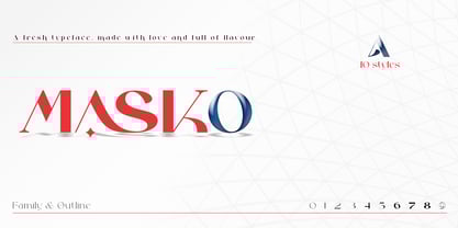 Masko is a very versatile font.perfect for magazine images, to wedding invitations, to branding, poster design, and more. Files included: Masko Family Masko Outline Numerals & Punctuation Stylistic Alternates & Ligatures PUA Encoded Characters Thanks so much for looking, I really hope you enjoy it and please don't hesitate to drop me a message if you have any issues or queries :)
 - FF Dirtyfax by FontFont,
$30.99 German type designer Fabian Rottke created this display FontFont in 1995. The family contains 2 weights: Regular and Heavy and is ideally suited for film and tv, music and nightlife, poster and billboards as well as software and gaming. FF Dirtyfax provides advanced typographical support with features such as ligatures. It comes with proportional lining figures.
 - Hlad by Tour De Force,
$25.00 Hlad is incised sans serif family inspired by carved Roman letters. Hlad comes in 5 weights – Thin, Light, Regular, Semi Bold and Bold. It is a low contrast typeface, with asymmetric flare serifs and sharp bowl and shoulder endings. Hlad combines elegance of calligraphic endings with stable, solid constructional stems from sans serif group of typefaces.
 - Kingkey by TypeClassHeroes,
$17.00 Kingkey and Kingkey Neue is a serif family comes with Classic and Modern. It's clean and smooth with 9 variable much ligature inside. Suitable to create any branding, product packaging, invitation, quotes, t-shirt, label, poster, logo etc. Feature Uppercase & Lowercase Number & Symbol International Glyphs Multilingual support Alternative Ligature If you need anything else just shoot me message.
 - Ramen Sans by Nina Belikova,
$20.00 Ramen Sans is a friendly grotesque type family with the warmth of serif types and a little bit of the edginess of geometric sans! Designed with body text in mind, it offers 5 weights (and their italics), small caps, tabular figures, fractions, numerators, denominators, and supports the Adobe Latin 3 character set (most western and central European languages).
 - Blop11 by osialus,
$15.00 Blop11 is a geometric sans-serif type family, consisting of 3 weights. Blop11 Bold is inspired by 1800s-style wood, poster typeface. Owing to its rounded terminals, Blop preserves natural organic quality of wood typeface. The Regular and Light versions are contemporary original projects. Blop11 is well-suited to headlines and short text. See also Blop77
 - Figural by ITC,
$29.99Figural is the work of Michael Gills, developed under the direction of Colin Brignall. It is based on an original 1940 design of Czechoslovakian designer Oldrich Menhart. All original characteristics were carefully retained in this distinguished typeface family. Figural is highly legible, making it perfect for both short pieces in advertising text or larger applications in magazines or books. - Neuf by Velvele,
$9.99 Neuf family is an experimental search for new Art Deco letterforms, which are still easy to read and generate some unexpected attention.The distinguishes Neuf favoured by Art Deco and its predecessor Art Nouveau with a modern design touch. The style of Neuf is characterized by geometric shapes and craft motifs with Machine Age imagery and materials.
 - FF Lancé by FontFont,
$41.99 German type designer Joachim Müller-Lancé created this sans FontFont in 1997. The family contains 3 weights and is ideally suited for advertising and packaging and sports. FF Lancé provides advanced typographical support with features such as ligatures and case-sensitive forms. It comes with proportional lining figures. In 1993, FF Lancé received the Morisawa award.
 - FF Call by FontFont,
$41.99 German type designers Maik Ignaszak, Stefan Kisters, and Astrid Koenig created this display FontFont in 2000. The family has 36 weights, (including italics) and is ideally suited for poster and billboards, small text as well as software and gaming. FF Call provides advanced typographical support with features such as ligatures. It comes with proportional lining figures.
 - FF Amoeba by FontFont,
$41.99 British type designer Peter G. Warren created this display FontFont in 1995. The family contains 3 weights: Light, Regular, and Bold and is ideally suited for festive occasions, music and nightlife as well as software and gaming. FF Amoeba provides advanced typographical support with features such as alternate characters and case-sensitive forms. It comes with proportional lining figures.
 - Startup by Serebryakov,
$30.00Startup is a nine style type famaly. It combines the aesthetics of gothic sans and Neo-grotesques. Created specifically for the creation of startup identity. When you need something that doesn't scream, but has personality. This type family can be used in the design of the logo, as well as apply it to headlines and secondary texts. - Freud by Juraj Chrastina,
$29.00 Freud is a sans family of 9 weights ranging from hairline to extra bold (also available as a 5 styles Economy Pack). It’s a legible face with straightforward geometry spiced with lovely humanist terminals. Some strokes are cut at an angle to enhance its identity. Freud provides a strong partner both for screen and print projects.
 - Tobi Pro by RodrigoTypo,
$15.00 Tobi Pro - the new version of Tobi "the previous year" - is a geometric typographic family with an organic touch. Contains 7 fun variants, shadows, dingbats and effects for the Heavy variant, also has OpenType alternatives in all its variants. Tobi is a perfect typeface for posters, packaging, logos and any visual communication application inherent to children and youth designs.
 - Maison by Milieu Grotesque,
$99.00 Maison is a mono-lined grotesque constructed using rigid elements to achieve a minimalist industrial feel in homage to the early twentieth century modernist design concepts.Originally created as a mono-spaced typeface family—with less optical corrections than its successor Maison Neue—Maison has been further developed to work equally in both mono-spaced and proportional alignments.
 - Concavex by Ingrimayne Type,
$9.00 ConcavexCaps is a whimsical bold display typeface family in three styles that are designed to used in layers. It is caps-only, with the upper-case and lower-case keys differing for the BCGKRS characters. Horizontal elements of the letters are straight and vertical elements are curved, flaring either in or out. ConcaveWarp is a distorted form of ConcavexCaps.
 - Pasta Script by Just in Type,
$25.00 The Pasta Script Family is a delicious script typeface inspired by the Italian spaghetti movement. For display use on every kind of support, choose between Spaghetti or Spaghettini according to the size of your text, and if Fettucine is your choice – get pleased by it’s generous curves. The Cuccina Dingbats are free to use on any kind of work =)
 - BF Girando Pro by BrassFonts,
$39.99 Girando is the traditional book typeface with distinctive personality and a contemporary twist! Inspired by the everlasting ideas of Claude Garamond, it impresses with many fine details and an elegant shape – viable not only in small sizes. The family includes 2 harmonic weights, true italics, small caps, old style and lining figures and pretty as well as useful ligatures.
 - Sumptuous by Locomotype,
$15.00 Sumptuous is a classic sans-serif family that combines geometric and humanist shapes. It comes in 14 weights, 10 uprights and 10 italics. Each weight includes OpenType features such as standard ligatures, directional ligatures, tabular figures, fractions and more and also extended language support. Suitable for magazines, headline, body text, logo, poster and other graphic design projects.
 - Tarpon Springs JNL by Jeff Levine,
$29.00 An early-1960s Canadian magazine ad for a brand of birth control pills featured the least likely spokesperson – Annette Funicello (“starring in “Beach Blanket Bingo” and “How to Stuff A Wild Bikini”). The text was hand lettered in an Art Deco-inspired sans serif type design. Tarpon Spring JNL is available in both regular and oblique versions.
 - Dottie by Ingrimayne Type,
$12.95 Dottie is based on a matrix of dots. It was inspired by the output of old, cheap, dot-matrix printers. In addition to Dottie-Regular with round dots, the family group includes DottieDiamond with diamond dots, DottieSquareTwo with square dots that do not overlap, and DottieSquare with square dots that overlap to create horizontal and vertical bars.