10,000 search results
(0.039 seconds)
- BobTag by JOEBOB graphics,
$- BobTag was written on paper taped to a wall for extra grungyness. Looks like it was actually written on an irregular surface. Caps only.
 - Elio & Oliver by SilverStag,
$19.00 I am thrilled to unveil my latest creation, the Elio & Oliver font family. Inspired by the timeless elegance and undeniable allure of Italy, this sans serif typeface captures the essence of sophistication and refinement. Named after the main protagonists of the beloved novel "Call Me by Your Name," Elio & Oliver is a testament to the power of passion, beauty, and the transcendent experiences that shape our lives. Just like their story, this font aims to evoke emotions and create a lasting impression. With nine meticulously crafted weights ranging from the delicate Ultra Light to the bold intensity of Black, Elio & Oliver offers a spectrum of possibilities. Each weight is thoughtfully designed to ensure versatility and harmonious visual aesthetics across various design projects. Intricate and purposeful, the font pack boasts over 30 ligatures that seamlessly combine letters, elevating the fluidity and legibility of your typography. These ligatures add an extra touch of sophistication to your designs, making them truly stand out. Recognizing the importance of language diversity, Elio & Oliver is equipped with full language support, enabling you to effortlessly communicate your message to a global audience. From English to Italian, French to Spanish, and beyond, this font embraces the richness and cultural nuances of different languages. Whether you're working on editorial layouts, branding projects, or digital interfaces, Elio & Oliver will infuse your designs with an air of refined elegance. It is the embodiment of style and grace, effortlessly capturing attention and leaving a lasting impression on viewers. Step into the world of Elio & Oliver, where every letter tells a story and every curve is a testament to the power of design. It's time to elevate your creative projects and evoke the spirit of Italian chicness with this exquisite typeface. Discover Elio & Oliver and let your designs speak the language of timeless elegance. If you end up publishing your designs on Instagram, tag me - @silverstagco and I will make sure to showcase your design and work to my audience as well! Elio & Oliver - Elegant Sans Serif Includes: Elio & Oliver Font Family - 9 Font Weights - From Ultra Light to Black Elio & Oliver Variable Font Over 30 ligatures and alternate letters Numerals & Punctuation Language Support Web Font Kit is included as well Detailed instructions on how to use alternates in most of the apps on your computer as well for Canva Happy creating everyone!
 - Butter - Unknown license

- Gothic Special Medium Italic by Wooden Type Fonts,
$15.00 A revival of one of the popular wooden type fonts of the 19th century, suitable for text or display, short descenders, tall ascenders, the narrow, italic version, completing the family of 6 fonts in total, sans serif.
 - Gorod.Volgograd by FontCity,
$15.00The general idea: Can You imagine to yourself, what the hydroelectric power station is? The building of this electricity production foundry is half hidden under the water, but the visible above-water part astonishes your sense. It is a construction almost 1,5 km length dammed out the powerful river stream. Besides thousand of electricity conduction lines supports it bears also the highway and the railroad. From a faraway distance the train seems like a caterpillar that has climbed up the stout tree. There are also the navigable sluices, the flood channels and other erections. The idea of this typeface outlines arrived to the authors exactly on the viewing platform, under the impression of the waterfalls, which are escaping from the dam womb, falling from almost 50 meters altitude and becoming white-haired during this flight. Release: in the form of "gorod.Volgograd" font with the one style. We work with other styles now and sometime we will be very glad to introduce the Bold and Italic styles to You. We should explain the font name meaning. "Gorod" is "city of" in Russian and Volgograd is the old, big and famous Russian city. The Volga hydroelectric power station of a name of XXII congress of the CPSU caused the Volgograd sea formation. It expands of 14 km width and more than 600 km along the Volga river-bed. But HEPS isn't the sole Volgograd sight. There are many interesting places here. The most known tourist sight, the visit card of Volgograd is the Mamaev Hill. Being here You can see almost all 100 kilometers of city length. Due to its geographical position, Mamaev Hill has got a great importance during the Great Patriotic War (1941-1945). It became and still is the Main Height of Russia. Soviet people have built the huge stately memorial ensemble here. There are many other witnesses of the heroic past of Volgograd: the Alley of Heroes, the Perished Fighters Square, the Soldiers Field and others. The line of tank turrets is stretched out along all town not far from Volga bank. It marks the line, where fascist troops was stopped in 1943. It is very amazingly when You dive under the ground on a usual tram. Volgograders have built a few underground station for the high-speed tramway. The river tram need a quarter of an hour to get an island in the Volga. And You need the same time to walk across the river station. The Volga-Don navigable channel starts from Volgograd. There are planetarium, circus, some theatres, many museums in Volgograd. One of football matches of Euro-2004 qualifying round took a place in the "Rotor" stadium in Volgograd. Volgograd holds the longest - above 50 km - park in the world. Its avenues, squares, embankments are beautiful, Volgograd central districts are built in unique architecture style called the Stalin Empire. You can enjoy fountains, parks, attractions, water-pools and other Volgograd sights. If You visit Volgograd once You'll never forget it. You can read about the ancient history of Volgograd city on the Tsaritsyn font page. Also we plan to create the Stalingrad font and give You a short story about another period in Tsaritsyn-Stalingrad-Volgograd history. - Merilee by SummitType,
$25.00 Fonts with handwritten characteristics are always an attractive option when creating projects that call for a personal touch. Merilee helps deliver a natural pattern to computer generated text, helping readers feel a more personal attachment to the words in front of them. Merilee includes a full character set (UPPER and lower case), all punctuation, all special characters, Euro symbol, and all Latin Extended-A characters, making this font a perfect match for a variety of creative projects including holiday and kids projects, signs, logo designs, banners and advertisements.
 - Djakarta by Murisa Studio,
$10.00 Djakarta font is one of the best fonts we created. With great care we guarantee that this font has a scalable alphabetic structure. Each letter is well made so that this font can be used optimally by everyone. Confidence, that's what you will get when you use this font
 - Adultometric Pro by CheapProFonts,
$10.00 This is the mature version of our previous release Infantometric Pro - The same basic skeleton, but with a more normal x-height. One feature is that no letters (except some accented letters - with cedillas, ogoneks and comma accents) go below the baseline, so this is one condensed font that is perfect for headlines! :) ALL fonts from CheapProFonts have very extensive language support: They contain some unusual diacritic letters (some of which are contained in the Latin Extended-B Unicode block) supporting: Cornish, Filipino (Tagalog), Guarani, Luxembourgian, Malagasy, Romanian, Ulithian and Welsh. They also contain all glyphs in the Latin Extended-A Unicode block (which among others cover the Central European and Baltic areas) supporting: Afrikaans, Belarusian (Lacinka), Bosnian, Catalan, Chichewa, Croatian, Czech, Dutch, Esperanto, Greenlandic, Hungarian, Kashubian, Kurdish (Kurmanji), Latvian, Lithuanian, Maltese, Maori, Polish, Saami (Inari), Saami (North), Serbian (latin), Slovak(ian), Slovene, Sorbian (Lower), Sorbian (Upper), Turkish and Turkmen. And they of course contain all the usual "western" glyphs supporting: Albanian, Basque, Breton, Chamorro, Danish, Estonian, Faroese, Finnish, French, Frisian, Galican, German, Icelandic, Indonesian, Irish (Gaelic), Italian, Northern Sotho, Norwegian, Occitan, Portuguese, Rhaeto-Romance, Sami (Lule), Sami (South), Scots (Gaelic), Spanish, Swedish, Tswana, Walloon and Yapese.
 - Quarca by insigne,
$24.75 Quarca's masculine power runs strong across the page with bold self-assurance and a raw energy that courses through its thick veins. Don't think the continuous, smooth geometry of this semi-modular face is captively chained to the grid, though. Quarca has been cautiously optimized to engage the reader's eye. Achieving an attractive balance to its sturdy design, the open forms of this "rounded square" geometric sans -together with a tall x-height- make the font legible even when using the compact widths. This high-impact typeface definitely doesn't sacrifice versatility for style. These compact widths, with their raw heart and strength, are perfect for callouts, while the extended widths provide you with the platform for a punchy and extremely efficient headline. The font has a thinner weight and transcends to an intense bold. The face's geometric or technological construction also tends to make it right at home on the web. The family consists of 36 fonts -six weights plus italics. Where Quarca truly stands out, though, is its wide number of OpenType typographic choices and optional glyphs, allowing you to design your piece with a personal, one-of-a-kind variant touch. These variations consist of Experimental Capitals, Angled Capital Terminals, and "Future Stencil". In all, you can find more than one hundred of these alternate glyphs. Quarca is well-suited for anything you are able to throw at it. Devised for today's multi-disciplined designer, this clear and infinitely versatile family provides tremendous value to your toolbox.
 - Santoro Script by Jukebox Collection,
$36.99 Santoro Script is a fun, happy script font created in the style of handpainted sign lettering. The first brand-new font added to the Jukebox library since 2011, it displays a jubilant attitude which will add a spontaneous, warm and friendly look to any design. The typeface contains three versions of every letter found under the Swash and Stylistic Alternates OpenType features as well as a few additional letter versions and ligatures under the Titling and Discretionary Ligatures OpenType features. These extra alternates help give the font a hand painted feeling. Jukebox fonts are available in OpenType format and download packages contain both .otf and .ttf versions of the font. They are compatible on both Mac and Windows. All fonts contain basic OpenType features as well as support for Latin-based and most Eastern European languages.
 - Ariata by Monotype,
$50.99 Ariata™, from Malou Verlomme, is three typefaces in one. Like phases of the moon, they gracefully meld from one to the other. The “Text” weights are sturdy designs that perform as well in blocks of copy as they do in the occasional headline. The “Display” versions of Ariata are delicate but confident designs that shine in large sizes, while the “Stencil” typefaces are eye-catching and provocative. Each version is available in four weights, from a forthright regular to a robust black, making for a family that is comfortable taking on a wide variety of tasks. The individual designs can be combined with each other to create a distinctive, yet cohesive typographic statement, or stand on their own as confident communication tools. If you want a little more variety, Ariata’s solid glyphic shapes will serve as a dynamic counterpoint to just about any Humanistic sans. Space economical and distinctly original, Ariata easily creates commanding headlines, pull-quotes and subheads. Packaging, game branding, posters, book jackets and advertising design are all also within its comfort zone. While primarily intended for print applications, Ariata’s full-bodied x-heights, generous counters and clear apertures make for a design that is also at home in many digital environments. Verlomme is an award-winning Senior Type Designer at Monotype. He has a degree in graphic design from l'École Duperré in Paris, and an MA in Typeface Design from the University of Reading. He taught type design at several universities in Paris and still occasionally lectures and gives workshops. His typeface Camille has the honor of being part of the collection at France’s Centre National des Arts Plastiques (CNAP). Verlomme also designed Placard® Next, Madera™ and Johnston100, London’s new underground branding typeface. Click here to see all of https://www.monotype.com/studio/malou-verlomme Malou Verlomme’s typeface designs.
 - Khatt by Arabetics,
$39.00 Khatt tries to mimic the concept behind the meaning of the Arabic word Khatt: a straight horizontal line. The word Khatt is also the word for calligraphy in the Arabic language. Even though Khatt is a cursive style font it offers clearly distinguished and visually unified letter shapes in every position of a word. Khatt supports all Arabetic scripts covered by Unicode 6.1, and the latest Arabic Supplement and Extended-A Unicode blocks, including support for Quranic texts. It comes with five weights, regular, medium, bold, light, and ultra-light. Each weight has normal and left-slanted “italic” styles. The script design of this font family follows the Arabetics Mutamathil Taqlidi style and utilizes varying x-heights. The Mutamathil Taqlidi type style uses one glyph per every basic Arabic Unicode character or letter, as defined by the Unicode Standards, and one additional final form glyph, for each freely-connecting letter in an Arabic text. Khatt includes the required Lam-Alif ligatures in addition to all vowel diacritic ligatures. Katts’s soft-vowel diacritic marks (harakat) are positioned with most of them appearing on similar lower or upper positions to emphasize they are not part of letters.
 - Melodia by PintassilgoPrints,
$29.00 This one may look rather strange at a first sight, but it has the true power of coolify written pieces. (Please don’t use it to say “Attorneys’s Conference”, nor “Annual Statement of Accounts”, unless you mean them to be cool, which is very unlikely.) Melodia has 3 glyph drawings for each uppercase letter, 3 more for each lowercase and 2 for the numerals. There are even alternates for punctuation, go figure: there are 3 commas and 3 periods. Surprising. To activate the automatic cycling of all these alternates, simply turn on the Contextual Alternates feature in your application. And it doesn’t hurt to remind: use it only on cool stuff.
 - Printout by Hanoded,
$15.00 Font naming is not all that difficult. Take Printout for example. I was busy working on this font, when my niece came over with a poem she needed to have printed. One of her classmates had the same request (they’re writing poems for our national Remembrance Day). As I was printing out these poems, I thought the name Printout would be perfect for the font I was working on. See? It’s not rocket science! Printout is a totally awesome, completely handmade font. I used an almost dried out Japanese brush pen to get the eroded effect. Maybe I should name my next font ‘Dried Out Brush Pen’? I’ll let you know.
 - Pleiad by URW Type Foundry,
$39.99 Seven superb scripts, to be freely mixed with one another. Alone, each of them flows nicely, but combined they reach ultimate vitality and grace. The Pleiades are one of the most beautiful constellations in the sky, and in Greek mythology they were seven divine sisters. Luxurious freedom of choice and excellent readability make Pleiad the perfect face for a variety of projects, from stylish invitations to magazine ads, from poetry books to restaurant logos. Sometimes calm, sometimes flittering – but always fair and graceful – this sublime calligraphic type family will hold an everlasting fascination.
 - Cheerful Day by Letterara,
$14.00 Cheerful Day is a cute and casual handwritten font with an incredibly friendly feel. It features gorgeous swashes and ligatures that make this script incredibly versatile. Whether you’re looking for fonts for Instagram or calligraphy scripts for DIY projects, Cheerful Day will turn any creative idea into a true piece of art! Fall in love with this font and bring your projects to the highest levels! This font is PUA encoded which means you can access all of the glyphs and swashes with ease! It features a varying baseline, gorgeous glyphs, and stunning alternates.
 - Montells by Olexstudio,
$16.00 MONTELLS - Display Font will look gorgeous on all your designs, invitation, poster design, book design, branding materials, logo's and all project design other. MONTELLS - Display Font contains standard characters, character is Uppercase, Lowercase, numbers, punctuation, ligatures and international glyphs.
 - Alore by AB Studio,
$9.49 Alore is a modern serif font family in geometric design, based on the complimenting design of AB ONE. By focusing on the small details during the design, a font was made that comes with a very dynamic style, combining modern elements with classical serif elements. Use Alore for a wide range of your projects, from headlines all the way to messages and text.
 - Fox Wizard by Fox7,
$12.00 Fox Wizard is a vintage and cool slab serif font. this font is perfect for publications, logos, business cards, or printed on t-shirts, this font will look outstanding on everything, no matter the topic. This font will be an incredible asset to your fonts’ library, as it has the potential to elevate any creation.
 - Coengkil Olstd by Olexstudio,
$19.00 COENGKIL Olstd Display Font will look gorgeous on all your designs, poster design, book design, branding materials, logo's, and all project design other. WHAT'S INCLUDED COENGKIL Olstd Display Font contains standard characters, All Chacacter is Uppercase, numbers, punctuation, Stalistic ALternates, ligatures and international glyphs Happy Designed.! regard olexstudio
 - Rockinsoda by Holis.Mjd,
$14.00 Rockinsoda child’s handwriting style font with little improvisation on uppercase mode, although these fonts are all uppercase fonts. This font also has alternate on lowercase letters that can be used for the last letter or word cover. This font is perfect for something related to food, children, kids illustrations, book titles, website title, writing on video, or anything you can try to gain experience in graphic design needs.
 - Lost Hills JNL by Jeff Levine,
$29.00Lost Hills JNL is a split-serif Western font based on Jeff Levine's Brogado JNL. Named for an actual location in California, this font has all the basic characteristics of a traditional Old West design. - Speedster by Vozzy,
$10.00 Introducing a vintage label font named Speedster. This strong typeface is perfect for lettering on vintage style posters, t-shirts, greeting cards, logo etc. All available characters and styles you can see at the preview.
 - Dragon Heroes by Letterara,
$16.00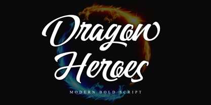 Dragon Heroes is a modern bold script font, carefully handcrafted to become a true favorite. Its casual charm makes it appear wonderfully down-to-earth, readable, and, ultimately, incredibly versatile. This font will look outstanding in any context, whether it’s being used on busy backgrounds or as a standalone headline! This font is PUA encoded which means you can access all of the glyphs and swashes with ease!
 - Blacker Script by Letterara,
$14.00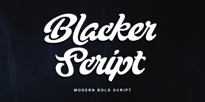 Blacker Script is a modern bold script font, carefully handcrafted to become a true favorite. Its casual charm makes it appear wonderfully down-to-earth, readable, and, ultimately, incredibly versatile. This font will look outstanding in any context, whether it’s being used on busy backgrounds or as a standalone headline! This font is PUA encoded which means you can access all of the glyphs and swashes with ease!
 - Geryline by Slex Studio,
$11.00 Geryline simplifies elegance into one truly outstanding handwritten font. It maintains its classy calligraphic influences while feeling contemporary and fresh. This versatility will appeal to a wide range of crafty ideas, from letterheads and titles, to stationery. This font is PUA encoded which means you can access all of the cute glyphs and swashes with ease! It also features a wealth of special features including alternate glyphs and ligatures.
 - Astoria Titling by Nick's Fonts,
$10.00Somewhat of a mongrel, this font combines uppercase letters from an oriental font designed by Paul Carlyle and Guy Oring in 1938, and lowercase letters based on yet another variant of Joan Truchut-Blanchard’s Super Veloz system. As its name implies, it’s quite suitable for titles of all kinds. The Opentype version of this font supports Unicode 1250 (Central European) languages, as well as Unicode 1252 (Latin) languages. - Bookkeeper JNL by Jeff Levine,
$29.00 Bookkeeper JNL is based on the lighter weight version of R. Hunter Middleton's 'Karnak', produced in 1936 for Ludlow. "Karnak" itself was based on the geometric slab-serif "Memphis", designed in 1929 by Dr. Rudolf Wolf and released originally by the Stempel Type Foundry of Germany. According to Wikipedia, "Karnak" "was named after the Karnak Temple Complex in Egypt, in reference to the fact that early slab serifs were often called "Egyptians" as an exoticism by nineteenth-century type founders." Available in both regular and oblique versions, Bookkeeper JNL serves well as both a headline and text type face.
 - Jannon Pro by Storm Type Foundry,
$55.00 The engraver Jean Jannon ranks among the significant representatives of French typography of the first half of the 17th century. From 1610 he worked in the printing office of the Calvinist Academy in Sedan, where he was awarded the title "Imprimeur de son Excellence et de l'Academie Sédanoise". He began working on his own alphabet in 1615, so that he would not have to order type for his printing office from Paris, Holland and Germany, which at that time was rather difficult. The other reason was that not only the existing type faces, but also the respective punches were rapidly wearing out. Their restoration was extremely painstaking, not to mention the fact that the result would have been just a poor shadow of the original elegance. Thus a new type face came into existence, standing on a traditional basis, but with a life-giving sparkle from its creator. In 1621 Jannon published a Roman type face and italics, derived from the shapes of Garamond's type faces. As late as the start of the 20th century Jannon's type face was mistakenly called Garamond, because it looked like that type face at first sight. Jannon's Early Baroque Roman type face, however, differs from Garamond in contrast and in having grander forms. Jannon's italics rank among the most successful italics of all time – they are brilliantly cut and elegant.
 - Zeitung Pro by Underware,
$50.00 Zeitung is a sans serif family which works equally well on print and web. First of all: Zeitung is a sans serif made according to contemporary standards: 8 weights, romans and italics, all equipped with small caps. Lots of OpenType features, like uppercase punctuation or 5 figure styles to make sure any of your mathematical or financial charts, tables and diagrams look cool. Zeitung’s typographic palette focuses on utility and legibility, but in the farthest corners you’ll discover a rich array of flavours: punchy black weights, fashionable thin styles, carefully hand crafted true italics, distinct small caps. But Zeitung has more to offer. Its optical sizes offer the best style for each size of your text. Zeitung fonts are devided to two optical families: Zeitung Standard and Zeitung Micro. Zeitung Standard works great in most sizes, while Zeitung Micro fonts are specially made for very small sizes in print and web. Zeitung Micro fonts are perfectly legible in web, where the same technical font styles have to survive in many environments, from older browsers to most up to date mobile screens. Next to that: the lightest weights also function as grades, because they share the same metrics. This can be very handy for selecting the optimal weight for your specific situation, especially on screens or when type is printed by a newspaper press. Letters are rendered in many various ways on different screens. Maybe the interface of your next app requires a different grade than your latest website? Zeitung allows you to change the weight of your text without any further consequence for the design. That is a welcome relief during the design process. Zeitung will help to bring your message across in many different circumstances, from large text in print to small type on screens.
 - Wozniak by Untype,
$22.00 Wozniak is a workhorse sanserif typeface in 16 styles that includes a 16 styles display font on itself. On its default shapes brings a modern, clear and bright personality to the text and a wide range of possibilities by supporting many OpenType features, such as oldstyle, lining & tabular numbers, small caps, inferiors & superiors, discretionary ligatures, numerators & denominators, extended fractions, case sensitivity forms and more, all carefully crafted and balanced for excellent legibility and optimum performance both on screen and on paper. But that's not all, every style also includes two complete uppercase sets of display alternates and more than 180 stylistic ligatures inspired by the digital revolution and the early 80s aesthetics. All this blend into a flexible and multifunctional set of over 1600 glyphs, support for more than 200 latin script languages and the potentiality of use in long text settings, headlines or branding, travelling from modern to vintage with absolute ease and naturality. Wozniak was named after Steve Wozniak as a tribute to the pioneers of the digital revolution.
 - Checker by Shinntype,
$29.00 Checker is an all-cap ‘three-D’ font which automatically alternates white letters on black tiles with black letters on white tiles, by means of the Contextual Alternates feature. Checker is an attention grabber suitable for logos, titles and short headings. With its tiled construction, it's a natural for colorful interpretation. The letters are properly italicized and back-slanted, and adjusted for maximum readability within the constraints of the font’s concept. The letter style is bold grotesque, so Checker will mix smoothly with any other fonts in a layout.
 - Dealers by Gumpita Rahayu,
$20.00 Back to the past when the old building and the beauty of a old store decorated by distinctive signage. With a clear feels of authentic historical value and the today's needs must be balanced in order to create the nostalgic feels. Introducing an authentic touch based on old fashioned signage developed into the wood type feels, and it's called Dealers. Dealers is a development of the classic taste wood type to form a solid blocked shapes, modern serifs, and with all caps based characters and slightly condensed. With specific characteristics, dealers font is intended for coffee shops, stores, restaurant menu that you want to create the impression of a classic and harmonious. With the addition of catchwords in the OpenType features, allowing you to be more creative to meet the requirements on the design you create.
 - Olap Metric by S6 Foundry,
$20.00 Olap Metric is a modern, one-of-a kind font that will make your designs stand out against the competition. With 9styles and Multi-languages support, this stylistic display type has what you need for all sorts of projects! The family has been developed as a modern playing system allowing the mixing of infinite combinations. Perfectly suited for headlines, large-format prints, brand identities, social media, advertising, editorial design, posters, magazines, logos, headings, digital and more.
 - Rachert by ahweproject,
$9.00 Rachert is a retro bold font that will bring you back to the 70s. Fall in love with its unique character and use it to create gorgeous wedding invitations, beautiful stationery art, eye-catching social media posts, and much more! Rachert is PUA encoded which means you can access all glyphs and swashes with ease!
 - Quatrain by Hanoded,
$15.00 Quatrain is a hand-drawn, all caps typeface based on Bodoni. It is a little rough, a little uneven, but lively and elegant as well. Quatrain looks good on packaging, or in headlines. Comes with an abundance of diacritics.
 - Long Underwear by Comicraft,
$29.00 Boy, they're everywhere. One of your neighbors is probably one of them, Freaking super-heroes (TM, ©, ®, SM blah blah blah) are more ubiquitous in cities these days than Simon Cowell is on talent shows. Notice how that guy on the subway -- the one with the boy scout haircut? -- see how he keeps his shirt buttoned all the way up? He's not sweating either... that's 'cause he's probably from some dead planet that exploded twenty years ago. His REAL parents wrapped him in blankets and, when he turned 18, his Ma on Earth turned those same blankets into Long Underwear for her foster son. He's probably wearing his long underwear right now. That's why he's smiling at you through his horn rimmed glasses. He thinks you don't know. Thinks he's special. Thinks he's a super-hero (TM, ©, ®, SM blah blah blah). Ain't that Super?
 - FF Mutual by FontFont,
$50.99 FF Mutual is a friendly geometric sans serif full of subtle, unexpected details. Designer Luis Bandovas drew inspiration from an unlikely source—the credits from one of his favorite childhood shows, Space 1999—and turned that spark into a typeface that is warm and approachable, but contemporary. Bandovas built FF Mutual on a geometric skeleton, but the typeface has enough humanist touches to offset the rigidity usually found geometric designs. These touches are most apparent in the italics, where curved strokes on the “a” and “l” bring a softness to text. Generous spacing, angular details on letters like the “r” and “t,” and flared terminals on the “e,” “s,” and “c,” add further character to the design. FF Mutual’s bold shapes and retro-inspired warmth make it ideal for headlines, where the subtle details can really shine. The typeface is similarly well-suited for small blocks of text such as captions and call-outs, packaging design, and branding.
 - Glaciar by TripleHely,
$16.00 Glaciar is a script typeface based on brush handwriting and inspired by old-style bas-reliefs. All contours were carefully cleaned of brush roughness, but at the same time, minor imperfections were left to create the unique character of this font Glaciar has a built-in auto replacement for lowercase letters without connecting strokes (in the case of word ends) and for ligatures (in the case of letter pairs that do not fit well together). In addition, there are alternates glyphs with starting and ending swashes - the last ones can be used with any OpenType software. And finally, the font has wide multilingual support and can be used in texts in 195 languages Glaciar is a good choice for branding and design projects as well as a cute text overlay to any background image
 - Artificial Intelligence by Mans Greback,
$59.00 Artificial Intelligence is a computer generated typeface, in a brush handwriting style. As the world's first public and commercially available AI typeface, Artifical Intelligence celebrates the interaction between humanity and technology, in an attempt to blur the lines between hard data and interpretation. Based on 400 of Mans Greback's typefaces, this machine learning is bold and expressive, with a touch of retro while keeping it hip. It is provided in an all-caps uppercase style, Artificial Intelligence Caps, as well as the Regular style with lowercase lettering. The font is built with advanced OpenType functionality and has a guaranteed top-notch quality, containing stylistic and contextual alternates, ligatures and more features; all to give you full control and customizability. It has extensive lingual support, covering all Latin-based languages, from Northern Europe to South Africa, from America to South-East Asia. It contains all characters and symbols you'll ever need, including all punctuation and numbers.
