10,000 search results
(0.052 seconds)
- Bestvall by Twinletter,
$17.00 The BESTVALL type family is a highly athletic and dynamic typeface capable of evoking the energy of sport in its literal and historical form. Building on traditional athletic typefaces, BESTVALL font implements new shapes inspired by historical trends and modern typography, giving it the ability to add personality to any set of words. Features include slab and display types, oblique styles, multiple ligatures, and style alternatives. This display typeface has been designed to stand out and grab the attention of a wide audience. What’s Included : - All glyphs Iso Latin 1 - Alternate, Ligature - Simple installations - We highly recommend using a program that supports OpenType features and Glyphs panels like many Adobe apps and Corel Draw, so you can see and access all Glyph variations. - PUA Encoded Characters – Fully accessible without additional design software. - Fonts include Multilingual support
 - Copperplate Classic Medium by Wiescher Design,
$49.50 Copperplate was the classic nineteenth century engravers typeface, consisting of capitals and small caps only. Among others (for example Deberny & Peignot) F. W. Goudy's cut for ATF around 1901 is probably the most widely known. Copperplate typefaces are traditionally used for business cards and all that "serious" stuff. My Copperplate Classic is a completely new design, based on some old samples. To make it look more up-to-date and elegant, I gave it some extra swings here and there. The old fonts were all designed with clogging corners or points that can break off in the minds of its designers. Today we do not have those problems any longer, so I could give my Copperplate Classic real sharp pointed serifs. To give you more choice I now added this medium cut in three variations, medium, sans and rounded! Enjoy! Gert Wiescher
 - Copperplate Classic Light by Wiescher Design,
$88.00 Copperplate was the classic nineteenth century engraver's typeface, consisting of capitals and small caps only. Among others (for example Deberny & Peignot) F. W. Goudy's cut for ATF around 1901 is probably the most widely known. Copperplate typefaces are traditionally used for business cards and all that "serious" stuff. My Copperplate Classic is a completely new design, based on some old samples. To make it look more up-to-date and elegant, I gave it some extra swings here and there. The old fonts were all designed with clogging corners or points that can break off in the minds of its designers. Today we do not have those problems any longer, so I could give my Copperplate Classic real sharp pointed serifs. To give you more choice I now added this light cut in three variations, light, sans and rounded! Enjoy! Gert Wiescher
 - Lamp Post JNL by Jeff Levine,
$29.00 Lamp Post JNL is a digital interpretation of a design popular in the early 1900s called Post Old Style; no doubt inspired by a certain Saturday periodical with a similar name. There is an intrinsic charm to lettering that evokes a hand-made look, and this design is a perfect example of the genre. Available in both regular and oblique versions, it will add the nostalgia of simpler times to any print or web project.
 - Camplones by Miracledsign,
$8.00 Camplones is a handwritten font that accentuates the style and curve of the hand when inking the ink on the paper by perfecting the shape of each character so that Camplones looks very beautiful when applied in a sentence. Camplones is specially shaped and made so that users feel the touch of a hand that lives in the character of the letters so that it has tremendous value when used in your templates, game fonts, wedding invitations or sales products which will surely be very attractive to consumers when they see it and will definitely love it. make the product look more elegant and will increase the selling value of your product.
 - Chalfont by Alan Meeks,
$45.00 The typeface was designed after seeing a photocopy of some News Gothic text where the ink had faded on the bottom of each character. As character recognition is generally based on the top half of a character, readability was never compromised. Rather like Antique Olive the characters have a top heavy look when viewed straight on, however, as most type is read at an angle with the top further away than the bottom this top heavy look is diminished.
 - Cat Finger by TypoGraphicDesign,
$9.00 The typeface Cat Finger is designed from 2021 for the font foundry Typo Graphic Design by Manuel Viergutz × Carmen Thiemer. The display font based on the human hand. Started analog with acrylic paint, a finger and a white paper. After scanning, a digital brush was created. With the help of a touch tablet, this brush was used as a writing tool. One font-stlye written with the left hand (left) and one with the right hand (right).
 - AT Move Powerplay by André Toet Design,
$39.95 POWERPLAY a monospace lowercase alphabet with a 3D twist. Designed by André Toet in 1976 (during his study at Central School of Art & Design, London, UK) and he redesigned this in 2011. The name Powerplay is based on the Battersea Power Station, London. The remarkable architecture of the building is also used as a decor for films and for one of the covers by Pink Floyd (Animals, the flying pig). Concept/Art Direction/ Design: André Toet © 2017
 - Kaat by ChrisNuijen.com,
$29.00 Kaat is a new type (2013). It was designed by Chris Nuijen and named after his daughter Kaat. It represents the period in which everyone has their face behind the latest mobile phone screen or interactive games console. "Kaat"is slick, modern and progressive, to reflect our busy immediate life style, whilst providing the essentials in a period where people can be judged on television. Kaat is here to stay and to evolve. Everyone wants to try to be that little bit different, but essentially we are all the same, with the same inherent needs, just like babies or children. We need to be fed, watered, nurtured and loved, the only difference is in today's world you can do all that from behind a screen. "Kaat" bridges that gap, transcending the basic needs of type, with the sophistication and fast paced sharpness of today, everyone wants to be different but we all stay the same, this is a reflection in the thickness and shape of each glyph. The font represents how we are molded and cast differently in yet we still stay the same, because we need the repetition! Everything needs to be done quicker, simpler and cheaper. We eat we sleep we communicate.
 - Digot by Fontsphere,
$16.00 DIGOT is a pixel-style, grid-based, geometric, display typeface. The idea for this font was born while combining lettering and illustrations in a geometric and pixel art style. What was needed was a font built with attention to detail for an interesting and unconventional creation of text and geometric images. The font is designed so that its modules lie on a grid and have their own rhythm and geometric order. So that it gives great editing possibilities and allows you to maintain a unique look. Optimal kerning is important here. The spacing between and within characters is well thought and designed to respect these rules (e.g. full pixel increments). Digot typeface offers a lot of creative possibilities in many types of graphic design and digital art. Posters, t-shirts, apparel printing, as well as website design, brand identity, and much more. The font contains a large range of characters, numbers, punctuation. Although it is an all-caps font, the T character is in two options. Digot includes support for a wide range of languages, e.g. Cyrillic, etc. Enjoy!
 - Anchorage by Otto Maurer,
$19.00 Anchorage is a maritime linear Font with Anchor Graphics in the Caps. This Font is for all Sailors and Captains all over the world. It comes in many styles and with a graphic Font full of maritime graphics.
 - Frasa by Tokotype,
$39.00 Frasa is a contemporary serif family with characteristics that arise from the charms of Caslon and a touch of transitional style; the design offers distinctive proportions to serve long-running small text and the sturdiness of its own form to help as a headline font. Frasa shows that the family is shaped by the traditions of its ancestors through small details that show the personality of the typeface, such as pointed ball terminals and strong shoulders. The italic weights have their own beauty, which is created to humanize the form based on a stylized and natural cursive style with the aim of emphasizing the text's essential elements. The addition of small caps, old-style figures, ligatures, etc. to this type family satisfies conventional typographic requirements. Frasa typefaces can eventually lead to the use of powerful design tools to create editorial and casual design styles.
 - Pricing Labels JNL by Jeff Levine,
$29.00Pricing Labels JNL gives you a set of digital price gun labels in fifty-one of the most common store departments, plus an untitled title label on the lower case ‘z’ key. Additionally, numbers for creating prices are on the standard keystrokes (for dollar amounts), and smaller numbers/underscores (for cents amounts) are on the shift key groupings for the number keys. The dollar and cents sign are on the left and right brackets, the decimal point is on the period key and the words “each” and “for” [set sideways] are on the greater and lesser keys. - Cacao by Wiescher Design,
$39.50 Cacao is another one of my "found fonts". I found this one in an old advertising for a French cocoa drink. Since I am a vervent lover of cocoa, I will give you my recipe for a normal coffee mug full of delicious hot cocoa. Mix three heaped teaspoons of sugar with one and a half to two teaspoons of finest cocoa powder. Then add a little cold milk, stir, add a little cold milk, stir, and so on until you have a mushy creamy consistency. Now slowly add - always stirring - boiling hot water til the cup is almost full. Top with a little liquid cream and enjoy! If you have a package design job, use my Cacao font and stir in some creativity. Your sweet-tooth designer, Gert Wiescher.
 - Mortice by ArtyType,
$24.00 I set out to create a solid, bold, strong, rugged font, one that would lend itself to any industrial type of use, and by that I mean industry in general, but probably sectors that would still be considered male preserves such as carpentry or metalwork. I thought specifically of mortice & tenon joints, whilst toying with shape and form for this self imposed challenge. I was also visualizing a router tool used for producing most wood joints nowadays. I think the general premise worked out well; in the end I settled on the name Mortice, referring to the slots or negative spaces that the matching part, or tenon would fit into.
 - Charlize by GRIN3 (Nowak),
$26.00 Charlize is a handwritten, fully connected script with ligatures to help with flow and readability. It can be used for invitations, greeting cards, posters, advertising, weddings, books, menus etc. Charlize pro is the most complete style, it contains over 740 glyphs. Every lowercase letter has six variations (uppercase letter has two). To get the alternate glyph just add "+","*","--","__","++" or "==" before the letter in any OpenType savvy application or manually chosen the characters from Glyph Palette. Charlize One and Charlize Two have less glyphs than the Pro one, they contain less alternates and ligatures. Language support includes Western, Central and Eastern European character sets, as well as Baltic and Turkish languages.
 - Ligaturess Serif by Caron twice,
$19.00 Ligaturess Serif is a modification of Textworthy Serif. This modification contains 79 uppercase ligatures. 59 lowercase ligatures. And 493 ligatures with diacritics marks. Ligatures are groups of letters joined together and usually compensate for the free space between individual letters. Ligaturess Serif, in addition to the basic ligatures - fi, fl... - also includes superstandard ones - CA, OO, ST, SS, VA... -. Text set in Ligaturess Serif has a unique and interesting look. The font works well in headings. And when using capital letters. A book cover, a chapter title, an inscription on a poster or even an interesting logo are the places for which the Ligaturess Serif font was designed.
 - Gatteway Signature by Bluestype Studio,
$16.00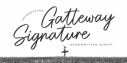 Hello ! This is our newest product font called Gatteway Signature. Gatteway Signature is a stunning script with a bold vibe. Get inspired by its cool feel. This font is suitable for use on photography, business cards, weddings, t-shirt designs, logos, magazines, quotes, fashion, watermarks, invitations, signatures. What's include: - Gatteway Signature Thank you, and don't forget to check out our other products.
 - Rainbow Saturday by Bluestype Studio,
$16.00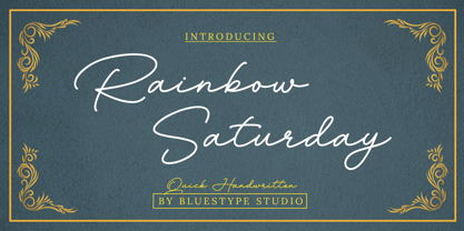 Hello ! This is our newest product called Rainbow Saturday. Rainbow Saturday is a stunning signature font with a modern twist. Get inspired by its modern simplicity! This font is suitable for use on business cards, weddings, t-shirt designs, logos, magazines, quotes, fashion, watermarks, invitations, signatures. What's include: - Ligature Thank you, and don't forget to check out our other products.
 - D.I.Y. Time by Latinotype,
$19.00 D.I.Y. Time is a hand drawn type system designed by Luciano and Coto inspired by the DIY philosophy which has been transformed into a whole global counterculture movement, identifying the new generations that reprice the handwork, paying attention to quality, processes and materials used in the manufacture of goods and objects, food, clothing, furniture etc. This beautiful philosophy inspires us every day. Is present in our homes, in our lifestyle and this time we have given him way through a typeface family that mixes different styles but integrates them through language handmade. The result is a typeface based on hand lettering drawing with different brushes and pens on paper. With versions ranging from organic proposals as DIY time hand to other based on the classic proportions of Gill as DIY time sans. To accompany a set of compound words designed on the needs of small farmers and a set of ornaments illustrated, everything you need to begin to make your own.
 - Aliyana by Sulthan Studio,
$12.00 Aliyana script - a new fresh handmade calligraphy font. Very suitable for greeting cards, branding materials, business cards, quotes, posters, and more! Aliyana script - includes many alternative characters.Is coded with PUA Unicode, which allows full access to all the extra characters without having special designing software. Mac users can use Font Book. Windows users can use Character Map to view and copy any of the extra characters to paste into your favourite text editor. For folks who have opentype capable software : The alternates are accessible by turning on "Stylistic Alternates" and "Ligatures" buttons on in Photoshop's Character panel, or via any software with a glyphs panel, e.g. Adobe Illustrator, Photoshop CC, Inkscape.
 - Letterpress Assistants JNL by Jeff Levine,
$29.00 Letterpress Assistants JNL once again combines a choice of cartoons, embellishments, ornaments and sales helpers (all redrawn from vintage source material) into one handy digital font.
 - Printers Dingbats JNL by Jeff Levine,
$29.00 Printers Dingbats JNL gathers another assortment of classic cartoons, borders, embellishments, sales helpers and whatnots into one digital file; all re-drawn from vintage source material.
 - SK Nowatorus by Shriftovik,
$48.00 SK Nowatorus is a modern experimental display grotesque. This typeface challenges the usual ideas about the structure of symbols and harmony in the typesetting line. The typeface symbols are based on the average contrast of thicknesses and on the contrast of the shapes of the symbols themselves. The font combines both narrow characters of the main set and wide additional ones. This, coupled with a wide range of alternatives and ligatures, gives huge opportunities for creative experiments. SK Nowatorus supports a multilingual set of Latin Pro and Cyrillic Pro. This typeface is perfect for poster design and for a set of small text blocks due to the presence of a capital and lowercase set.
 - Heavitas Neue by Graphite,
$20.00 Heavitas Neue is versatile and flexible all caps font family, with most of the upper case characters different from the lower case ones. By using either only upper case, or only lower case, or a mixed combination of upper and lower characters, a totally different look of the font can be achieved. Heavitas Neue has a strong and distinct character, suitable for, but not limited to, logotypes, headlines, branding, books, signage, motion graphics and packaging.
 - Bellvyne by Krafted,
$10.00 Looking for an elegant but unique serif font that looks equally great on screen as well as on paper? Introducing Bellvyne - A Serif Font. Stylish with a touch of modern, Bellvyne is perfect for making your brand stand out. It’s a great choice for web pages, apps, ads, banners, promotions, printed cards, packaging, and pretty much anything else your project needs. What you’ll get: Multilingual & Ligature Support Full sets of Punctuation and Numerals Compatible with: Adobe Suite Microsoft Office Keynote Pages Software Requirements: The fonts that you’ll receive in the pack are widely supported by most software. In order to get the full functionality of the selection of standard ligatures (custom created letters) in the script font, any software that can read OpenType fonts will work. We hope you enjoy this font and that it makes your branding sparkle! Feel free to reach out to us if you’d like more information or if you have any concerns.
 - Res Publica by Linotype,
$29.99Res Publica is a workhorse. It is quite anonymous as typeface, without any distinctive marks. But it gives a harmonious text body, well suited for large amounts of text, such as official public reports, magazines based mainly on text, school books, and so on. The public" concept is part of the name. Res Publica is Latin for "public matters". The word republic has the same origin. Res Publica was released in 1992. - Bonsai by Three Islands Press,
$29.00 Years ago, I developed an interest in the Japanese art of dwarfed potted trees, bonsai. I bought some books on the subject from Brooklyn Botanic Garden. In one -- Handbook on Bonsai: Special Techniques (seventh printing, February 1976) -- the type was bad. Old worn lead type, I suspect, spread wide in the tops of characters and disappearing on the bottoms. Two decades later, I came across my Brooklyn Botanic Garden collection and was struck again by this interesting type. Inspired, I made a typeface. Didn't take me long to decide on a name for it, either: a name with a double-meaning, based both on its look and its inspiration. Bonsai, the typeface, has two styles, a roman and a true italic.
 - La Coffee by Creativetacos,
$12.00 Introducing La Coffee Font, a sleek, cool and professional handmade font that is perfect for adding a unique touch to your branding, logos, or your instagram quotes. It includes uppercase, lowercase, numbers, symbols and with Latin extended character support, it is versatile for a variety of creative endeavors, while exuding a rustic charm. La Coffee will look great on invitations, packaging, slideshows, logos, headlines, lettering, posters, branding, inspirational quotes, headlines, magazine layouts, website designs, advertising, invitations, packaging designs, book covers and any other creative endeavour. What's Inside the Product? - Weight of the Font: Regular The Font Kit comes packed with: - Big Letters (Uppercase) - Small Letters (Lowercase) - Numbers & Symbols - Multilingual Support Here's a sneak peek at the characters supported: - All the letters from A-Z (uppercase and lowercase) - All the numbers from 0-9 - All these special characters - !"#$%&'()*+,-./:;=?@[]^_`{|}~ ¡¢£¤¥§¨©ª«®°±²³´¶¸¹º»¿ˆˇ˜–—‘’‚‛“”„†‡•…‰‹›⁄€™− - And a range of international characters like á â à ä å ã æ ç é ê è ë í î ì ï ı ñ ó ô ò ö õ ø œ š ß ú û ù ü ý ÿ ž  À Ä Å Ã Æ Ç É Ê È Ë Í Î Ì Ï Ñ Ó Ô Ò Ö Õ Ø Œ Š Û Ù Ü Ý Ÿ
 - HU Retroround KR by Heummdesign,
$50.00 'HU Retroround KR' is a font that captures the feel of the retro typefaces used on signboards during Korea's modernization era. This font has a variable function, allowing users to fine-tune the thickness they want. (Available only in Adobe programs.) Six basic weights are provided so that they can be used even in programs that do not apply the variable function. This font includes Hangul, Korean.
 - Weekday Mornings by Bogstav,
$17.00 "Weekday Mornings" are the 2 first words from the song "Nancy" by Prefab Sprout. Just like the song, the font has a romantic theme and could be considered as "easy listening". Well, I've added 7 slightly different versions of each letter, enough to make the font look like the real handwriting which was the base of the font. Fun fact: I had this song on repeat when finishing the font. I still do love that song! :)
 - Doublethink by Barnbrook Fonts,
$30.00 Doublethink was developed from lettering drawn in the 1960s by Vinko Ožić-Pajić and used on the shop fronts of Yugoslavian state-owned clothes company Standard Konfekcija. The original design has been reinterpreted and expanded and is offered as a two weight typeface—Doublethink Medium and Doublethink Bold Inline. Standard Konfekcija was established first as a military fabric company and later became the premier fashion brand outlet in the Communist state of Yugoslavia. It is famous for being the first shop in the country to offer plastic bags (Standard Konfekcija stores ceased trading after the fall of Communism).
 - Helena Signature by Pixesia Studio,
$15.00 Introducing Helena Signature - Signature Script Font Coming with special features combined with such an elegant style, Helena Signature becomes one of a kind typeface that you'll surely need. With its unique, bubbly yet extravagant mode, this Helena Signature typeface will suit any occasion. The handwriting style of this Helena Signature typeface not only shows the authenticity but also provides such a familiar and personal feeling—which adds the kind of intimacy that the readers are probably seeking. The beauty of its style is also engaging, easily catches the readers eye and creates the eager for them to read any kind of message that the Helena Signature is delivering. Hope you Like it. Thanks.
 - Loose Pen by Pedro Teixeira,
$14.00 Do you suffer from OCD? Then this font is perfect for you. Or maybe not. Sometimes I like confusion, chaos, imperfect things, because I can often see beauty in them. In this font I drew the letters with a pen and or with just the index finger on a tablet, completely free, without improvement. The chaos ensuing. As if I was rushing notes just for me. Then, without changing the design any further, but to make the chaos minimally legible, I decided - look at this madness! - to organize the chaos. In other words, I aligned metrics and kerning, and the end result was this. I hope you like it and that it is very useful for you. Cheers.
 - Le Havre Rough by insigne,
$19.00 Le Havre Rough. It’s high-resolution, hand-crafted letterpress to the core. Based on insigne’s popular Le Havre typeface, this new heat-treated, weathered face of all caps joins the realism and appeal of the top-quality Le Havre family. Rough’s eroded, printed look is extremely customizable, offering eleven distressed choices that appear fantastic even at large output sizes. Go ahead. Try it on, say, a billboard. Maybe even Times Square. The font includes hand-printed texture and distinctive shadow choices, too. Options include three inline versions, two shadow layers, and a clean primary version. Combine and match the options easily as you need, layering normal and shadow variations to alter appearance and texture. You can activate Art Deco alternates by using OpenType contextual alternates. Rough has an extra-large character set for many languages. Additionally, the typeface offers 62 extra ornaments like arrows, emblems, numbers & lines. Use its full texture and grit to capture the classic, genuine print feel that you need in your project. A few suggestions for use: - In Photoshop, jigger with various 'anti-aliasing' options for best outcomes. Smooth or strong is generally best. - In Illustrator, the shadow layer occasionally doesn't align when using the regular layer. To fix the alignment, open the type drop-down menu and choose Area Type Options > Em Box Height. Learn more about the using layered type styles on this informative video.
 - Toleis by Twinletter,
$12.00 Toleis is a san serif font that we designed for you. Much attention is paid to the correct position of the accent. All overhead has its own height, which creates an additional level of readability. As well as numbers and punctuation, which are an integral part of any text. This pack includes alternative options for many glyphs — old-style figures, straps, style sets, and more. So you can customize the font to your liking and keep your look consistent.” of course, your various design projects will be perfect and extraordinary if you use this font because this font is equipped with a font family, both for titles and subtitles and sentence text, start using our fonts for your extraordinary projects.
 - More Printing Helpers JNL by Jeff Levine,
$29.00More Printing Helpers JNL gathers another assortment of vintage printing embellishments and ornaments from the late 1800s. Within the standard twenty-six alphabet keys are pointing hands, corner pieces, border elements and decorative center and end pieces. On the lower case, certain elements have been flipped or inverted for matching effects. Some additional positions are available on the 1 through 9 keys and on the colon and semicolon. A bonus to this font: three expandable panels. the first (with decorative end caps) is attained by typing the left parenthesis for the left side, the hyphen for the center lines and the right parenthesis for the right side. The second one features ribbon ends, and the combination of the less than-equal-greater than keys creates this panel. The third design can be made by typing the left brace/vertical bar/right brace keys. - Atlas - Unknown license

- Pulpo by Floodfonts,
$49.00 A friendly and comfortable typeface inspired by Century Schoolbook and Clarendon. Despite the strength and sturdiness of the design, each letter shape carries warmth and an echo of the human hand, concealing some nostalgia. The family is ideally suited for editorial, advertising and packaging as well as web and app design. A massive body combined with low stroke contrast, make it very suitable on screen and for small text sizes on newsprint paper. For more information visit the microsite.
 - Bitblox by PSY/OPS,
$10.00 Bitblox fonts are based on the lettering created for Glyfyx’ eponymous wooden alphabet blocks. The characters are inspired by the low-res bitmap lettering seen on early generation computer devices. The Bitblox family consists of eight pixelated fonts, including a trio of styles that stack up to create a colorful, dimensional effect. An extensive multi-styled dingbat collection is also included. The Bitblox lettering was designed by James Beall with PSY/OPS Type Foundry, for Glyfyx Inc.
