10,000 search results
(0.03 seconds)
- Dai Vernon by E-phemera,
$20.00 DaiVernon is based on the handwriting of card magician extraordinaire Dai Vernon. Known as "The Professor", Vernon was a beloved expert in sleight-of-hand and card magic. These fonts are based on the penmanship in his notebooks from the 1920s, which feature almost no lowercase letters. DaiVernon Direct is based on what appears to be his hastier style, while DaiVernon Misdirect is based on his neater hand. Numerous OpenType bonus glyphs, contextual alternates and discretionary ligatures help to create the feel of his handwriting. Thanks go to Michael Albright, David Ben, and Gene Matsuura for helping to provide access to Vernon's notebooks.
 - ITC Jeepers by ITC,
$29.99Designer Nick Curtis found the inspiration for this typeface on a 1920s poster for a German bookseller, by Berlin poster artist Paul Scheurich. ITC Jeepers retains the spontaneity and playfulness of Scheurich's original lettering and adds a few surprises of its own, one being the somewhat exclamatory ear on the lowercase "g". It was, in fact, the excited look of this particular character that gave rise to the font's name. Not to be outdone, the exclamation point takes on an even more startling demeanor. The monoweight, slab serif design has a friendly personality, perfect for headlines and other display uses. - Greissler by Markus Fetz,
$21.00 GREISSLER is a Retro Display Font inspired by old letterings on store fronts and building facades in Vienna. "Greißler" is a term used in the east of Austria and means small grocer. In Vienna you can still see some of the letterings "Lebensmittel", "Feinkost", etc. on the storefronts of mostly abandoned shops. Similar letters can be found on "Gemeindebauten" (council housing) from the 1920s.
 - Goodnight Thahira by Josstype,
$13.00 hahira A hand brush to write a script, first drawn on paper and then remastered on a computer to provide free brush smooth flowing script, which looks perfectly on an image or as a classy logo. Thahira - A comic script font super clean, simple and elegant work of producing stand-alone pieces sophisticated typography or in combination with a script font. Mailinfo: joelpopon@gmail.com
 - Chaweng by profonts,
$41.99 Chaweng is a coastal region on Ko Samui, an island in the Golf of Thailand, about 20 miles off the mainland. The design of Chaweng is based on some 'Latinese' characters Peter Rosenfeld detected while celebrating Chinese New Years Eve with people from Thailand and China on the beach of Chaweng. Ralph M. Unger took on the idea and developed a completely new typeface, very beautiful, very 'Latinese'. Chaweng obviously shows some of the typical characteristics of Chinese ideograms, still keeping a high level of legibility. To add something really special, Unger digitized the Chinese signs of the zodiac which change annually, on the occasion of the Chinese New Years Eve.Chaweng is perfect for signs and small texts, e.g. for any Asian restaurant and shops, menues, displays, China towns etc.
 - Hargloves Sans by Heypentype,
$20.00 Hargloves sans remixes between grotesque proportions and 80’ industrial inspired-typefaces. Yes, it is a major improvement from original Hargloves fonts with completely different projections. Hargloves Sans intended primarily for text, editorial or long-form text. This new design emphasized on reader joy experience when reading text without losing typeface characters. Hargloves Sans support almost all Latin script language, roughly around 356 latin language according to hyperglot analytics. This language coverage is heypentype priority to serve all possible Latin script language all over the world. The premise is simple, because it is text typeface it should cover all Latin script languages whether its popular language or not. Hargloves Sans have a higher x-height compared to Hargloves. Higher x-height will give a seamless, undistracted reading. The open counter on nearly squared proportions is Hargloves Sans main character. There’s a lot of feature coming for this typeface in the future.
 - Piambis by Aga Silva,
$24.99 Piambis Family has been featured in "Slanted #28 Contemporary Typefaces 2016/17" This handwritten font family that boasts great variety of glyphs - many of which are fancy alternates for standard letters (click on text written in Piambis below, then click on “Glyphs”). This font is designed so the letters are available via standard programs ie. Word. It is recommended however that you use professional software such as Photoshop or Illustrator to make your work easier as there are over 1600 glyphs in each of the fonts included in Piambis family. About the family: The chief difference between the files in the family are finishes to the capital letters (in all languages) and appearance of the lowercase “f”. The fonts support all languages that use latin script - yes - Vietnamese (Tiếng Việt) and Pinyin is also available.
 - Bodoni Classic Deco Two by Wiescher Design,
$39.50 Bodoni Classic Deco Two, like the original Bodoni Classic Deco, breaks all rules. Giambattista Bodoni himself would probably hate me for doing it; he was a real purist. The whole idea of the Bodoni typeface is no embellishments and here I go and decorate those nice clear letters. Shame on me! But I find this is a very nice and useful typeface for all kinds of cards and certificates. So I just did it for all of you out there that are not born purists, and want a little embellishment to their lives. And to make things worse, I added a small caps cut. I even decorated the numbers. This Bodoni is the condensed version!!! Enjoy! Yours, still breaking all the rules, Gert Wiescher
 - Puffypuff by Konstantine Studio,
$16.00 Introducing the Puffypuff - A new experimental display typeface inspired by the pillow and cloud shape and behavior. Interpreted into a bunch of letters, so it can be a font that you can't resist to have. Usage tips: Play with strokes to give bold comical and vintage vibes. Duplicate the word and make it all black for the back one, and slide it down a little bit to make a shadow effect. Mix the letters with other fonts in one word to make such an experimental visual concept with it (see 3rd poster). Perfectly fit for logo, branding, poster, music project, album cover, cover artwork, events, y2k concept, graffiti concept, brutalism, modern aesthetic, graphic design project, fashion, apparel, merchandise, and many more.
 - Mortend by Arterfak Project,
$20.00 Introducing our new exploration named Mortend, a strong expanded font family. Mortend designed with geometric shapes, bold, strong curves, and modern feels. Inspired by the brutalism poster and minimalism design which has been trending nowadays, and gives you more chance to express your creativity. This font family brings a strong feel yet elegant look that you can use for many purposes. Mortend is an all-caps font with the different letterforms of 'small-caps' that you can combine at will. This family is highly recommended for display or headline on your poster, flyer, apparel, motion graphic, logotype, signage, packaging, labels, and more! The regular and light one, also good for short body text and quotes. Fonts featured: Uppercase Smallcaps Numbers Symbols & punctuation Standard accented characters
 - Equipage by Kitchen Table Type Foundry,
$16.00 Équipage is a French word meaning ‘crew’. It is used for the crew on boats, airplanes, but it also applies to horse-drawn carriages and all that goes with it. Originally the word means ‘to fit out’ and it is probably derived from the Norse word ‘skipa’, which means ‘arrange, fit out a ship’. Then, if you’re really interested, the word ‘ship’ hails from this same word, just like the Danish ‘skib’, Middle Dutch ‘ship’, Dutch ‘schip’ and German ‘Schiff’. See? You learn something every day! Équipage is a really nice, handmade serif font. It is quite elegant and would look fantastic on labels, postcards and book covers. Comes with extensive language support and a set of alternates for the lower case glyphs.
 - Mirola by Nathatype,
$29.00 Looking make your brand unique and memorable? Maybe you wish to create advertisements that draw attention? If you can say “yes” to any of these then hold on to your seats and get ready for a modern, fun, and delightful experience! Mirola-Serif Font Mirola is a serif that is aimed to be used in modern style. It fits right in with your designs. It’s beautiful without trying too hard, it’s gorgeous without being apologetic, it’s brave in the face of uncertainty, these all represent you. Go ahead and use it on your website, for your social media branding, Pinterest banners, printed invitations, and more! Features: Stylistic Set Alternates Swashes PUA Encoded Numerals and Punctuation Thank you for downloading premium fonts from Nathatype
 - Astrotype by Linotype,
$29.99Astrotype is an excellent choice for use in astronomical or astrological literature – books, journals, magazines, etc. It can be used effectively both within the text and in accompanying graphics. Using all weights also opens up a number of illustrative possibilities, for instance on posters or tarot cards. Clarity, homogeneity and pure simplicity give Astrotype its unique character. Based on the same elements and with consistant proportions, the characters display a natural elegance and harmony. The type really stands out through the ease with which it can be integrated into text and the many creative possibilities of combinations of different weights. For instance, try placing Astrotype N dot over Astrotype P dot and using different colors – perfect for onscreen buttons, icons or decorations. - Professor Minty by Chank,
$99.00 Professor Minty is a cartoon-inspired kind of comic font with a lotta bounce and a whole buncha spooky fun. Both regular and bold are based on Chank’s first fonts, Mister Frisky and Uncle Stinky. The Bold version is brand new in 2011, never before available. But here both of those fonts are combined into one extra-savvy font that does all kinds of tricks. It has many extra special OpenType features, like Swash, Contextual Alternates and Small caps and more. There’s even a “decaf” feature (Stylistic Set #1) which tones it down a bit if the account people think it is just too exciting. Works good for Halloween, Christmas and Valentine’s Day, oddly enough. Who knew those three holidays had anything in common?
 - Pretty Garden by Letterhend,
$17.00 Pretty Garden Collections is a font pack consist of 3 fonts, added with doodle dingbats. These fonts were created based on authentic hand writing with natural signature style. It worked well to combine these three fonts into one lettering. This type of font perfectly made to be applied especially in logo, and the other various formal forms such as invitations, labels, logos, magazines, books, greeting / wedding cards, packaging, fashion, make up, stationery, novels, labels or any type of advertising purpose. Features : 3 style font and 1 doodle dingbat uppercase & lowercase numbers and punctuation multilingual PUA encoded We highly recommend using a program that supports OpenType features and Glyphs panels like many of Adobe apps and Corel Draw, so you can see and access all Glyph variations.
 - Sparthones by Mokatype Studio,
$22.00Sparthones is an authentic display font with a beautiful character. This font building with lots of ligatures and versatile pairing between lowercase and uppercase and it makes this font more unique, beautiful, elegant, and stylish, it’s really perfect for headlines, typography, Poster, magazines, brochures, packaging, websites, and much more for your design needs, making your designs look like Luxurious nuances. What's Included : Standard glyphs Ligatures Alternates Web Font International Accent Works on PC & Mac Simple installations Accessible in Adobe Illustrator, Adobe Photoshop, Adobe InDesign, and even work on Microsoft Word. PUA Encoded Characters - Fully accessible without additional design software. Fonts include multilingual support Image used: All photographs/pictures/vectors used in the preview are not included, they are intended for illustration only. Thank You - Virgolate by Letterhend,
$19.00 Virgolate is a beautiful and classy script based on manual calligraphy ink on a paper. This fnt has many swashes that allows you to create beautiful lettering instantly. it has many stylistic set alternates that you can choose from. This font perfectly made to be applied especially in logo, and the other various formal forms such as invitations, labels, logos, magazines, books, greeting / wedding cards, packaging, fashion, make up, stationery, novels, labels or any type of advertising purpose. Features : uppercase & lowercase numbers and punctuation multilingual ligatures alternates swashes PUA encoded We highly recommend using a program that supports OpenType features and Glyphs panels like many of Adobe apps and Corel Draw, so you can see and access all Glyph variations.
 - Storyline by Comicraft,
$19.00 It starts slowly, gently drawing you in... you're introduced to a number of strangely interesting and compelling characters. The plot seems at first to be satisfyingly predictable, then -- suddenly -- the narrative takes a completely unexpected turn! The protagonist is thrown into a series of devastating and alarming twists and turns! The antagonist triumphs -- evil trounces good, mass hysteria seizes the city streets! Our Hero is separated from his One True Love, and it seems that she has fallen for The Villain of the Piece! Will Good Prevail? Will Evil Perish? Will Love Conquer All?!? I don't know yet -- that's as far as I've got. Don't worry, it has a Great Ending.
 - Handyrush by Zamjump,
$19.00 Introducing Handyrush Script font. It was inspired by retro typography designs in the 80's. There are over 250 glyphs in this font including Multilanguage Support. The OpenType feature with Stylistic Alternate to replace letters in the middle and end with a swash, and there are 3 swashes, and to display stylistic alternates it's quite easy just by typing characters+underscor / underscor+characters. specially for swash just type underscore underscore + a / b / c. Handyrush Script is very suitable for application especially on logos, and various other formal forms such as invitations, labels, logos, magazines, books, greeting / wedding cards, packaging, fashion, make up, stationery, novels, labels or all types of advertising purposes .
 - Odalisque NF by Nick's Fonts,
$10.00Here’s a revised and updated version of one of my oldies, based on the typeface Chic, designed by Morris Fuller Benton. The addition of small caps, improved kerning, and an expanded character set make this one an excellent choice for projects that demand grace, elegance and a bit of mischievous fun. This font contains the complete Latin language character set (Unicode 1252) plus support for Central European (Unicode 1250) languages as well. - RNS Pictografica Cocina by RNS Fonts,
$9.00 RNS Pictografica Cocina (Kitchen, culinary arts and food related font) it is comprised of 230 glyphs, it's based on a modular structure of a minimal thickness on lines and round corners, making a clean visually drawing, give importance to the surround white for improve contrast. The font is better used on a big white canvas for achieve visual focus. And in great sizes for more impact, however the font is legible even at small sizes.
 - Showpiece JNL by Jeff Levine,
$29.00 Showpiece JNL was redrawn from the hand lettering for the name and address of a music publisher found on some 1930s-era sheet music. The lettering style has features influenced a bit by both the end of the Art Nouveau period and the beginning of the Art Deco movement.
 - TagBoyHardcore by PizzaDude.dk,
$15.00TagBoyHardcore is based on my own tagging style when I did graffiti in the mid-eighties. The font is roughly scanned and spaced narrowly in order to keep the original bad boy style. Pump up your text by starting and ending sentences with parentheses, brackets or the curly brackets. - Bumpy Ride by Hanoded,
$16.00 I live in a small hamlet near the Rhine river. It is a sleepy little town and it doesn’t have any facilities. For groceries I need to go to the next town. The only road leading to that town has been closed for half a year, because of ‘maintenance’, so doing groceries got a lot trickier. The fastest way to travel is through yet another hamlet in the forest, on a very narrow road with extremely bumpy shoulders. Yes, you’ve guessed it: it is a Bumpy Ride. Bumpy Ride was made using a so called Brush Pen. It comes with all the accents and a sweet set of alternates for the lower case letters.
 - Ekorre by Mans Greback,
$49.00 Ekorre is a professional serif typeface. Drawn and created by Mans Greback in 2021, this creative font family has a vivid retro style and a strong personality, and is constructed with soft corners and flowing shapes. The letterforms express empathy, while retaining seriousness. It is provided in six complementing high-quality styles: Ekorre Regular, Ekorre Bold, Ekorre Black and each one as Italic. Ekorre is built with advanced OpenType functionality and has a guaranteed top-notch quality, containing stylistic alternates, ligatures and more features; all to give you full control and customizability. It has extensive lingual support, covering all Latin-based languages, from North Europa to South Africa, from America to South-East Asia. It contains all characters and symbols you'll ever need, including all punctuation and numbers.
 - Styla Pro by URW Type Foundry,
$39.99 Styla is a refined romantic sans, in the best tradition of Didot and Bodoni. The combination between Styla’s feminine grace and sharp endings creates an air of seduction, ideal for magazines, ads and books on fashion, fine arts, philosophy, luxury goods, women and love. A typographic jewel, Styla brings romantic sensuality and refinement to the world of sans-serifs.
 - Danish Script Initials JNL by Jeff Levine,
$29.00 A set of transfer patterns for sewing decorative monogram initials on clothing was manufactured by Women's Day magazine circa the 1940s. Designed by renowned Copenhagen-born industrial artist and letterer Gustav Boerge Jensen [April 8, 1898 - June 27, 1954], these initials have been redrawn into a digital font entitled Danish Script Initials JNL. Large initials are on the uppercase A-Z keys, while smaller initials are on the lower case a-z keys and are centered to the larger cap height. An ornament is provided on the asterisk key, and can be placed between the small initials and the larger initial for decorative effect.
 - Ethos by Fonts With Love,
$- Ethos is a contemporary serif fontfamily by Fonts With Love. It comes in 36 fontstyles with true italics and a huge bunch of opentype features like small caps, ligatures, nominators and denomiators, fractions and many more. Its x-height is pretty high, which makes it legible even on small fontsizes. Above that, the lighter weights have a rather low-contrast linestyle, which improves the legibility on display application especially on smaller sizes. On larger fontsizes, the typeface stands out with a distinctive character of geometrically shaped letters with soft rounded corners. Each fontface contains 500+ glyphs, supporting a huge amount of languages, mathematical operators, symbols and punctuations.
 - Petals BF by Bomparte's Fonts,
$39.00 Ooh so soft, so curvaceous, so voluptuous and so swash-buckling. Hey, I'm talking ’bout Petals BF! Here’s a design inspired by the work of Dave West and infused with a plethora of pleasingly plump letterforms, with swashes reminiscent of 60s and 70s types. But here’s the twist: where you might typically expect to find ball terminals, you'll experience some sensuous curls; and some playful letterforms such as lowercase h, k, m, and n, may even call to mind that groovy look of ’60s bell-bottoms. Spread across its capitals and lowercase are swash variants for beginning, middle and ending letterforms —candy for your eyes. Petals BF is where Didone style happily marries the organic and curvaceous forms of Art Nouveau. Strange I know, but so is a duckbill platypus —and somehow they all seem to work surprisingly well. Among the many typographic niceties you'll discover, are such Opentype features as Contextual and Stylistic alternates, Ligatures, Case-sensitive forms and Fractions. Please note: these magical features demand the use of opentype-savvy applications such as Adobe Creative Suite, QuarkXPress and etc. Petals BF is multilingual, and speaks the languages of Western, Eastern and Central Europe, in addition to Turkish and Baltic. It gets around. So let your creativity blossom with Petals in projects that involve headlines, magazine layouts, product packaging, logos, signage, branding and etc.
 - Ragnar by Linotype,
$29.99Ragnar can be called a typeface for compact typography. It is loosely related to the Saga typeface in many ways, even including its name. During discussing on what Saga should be called, the name "Ragnarök" (Twilight of the Gods) was humorously suggested. "Ragnarök" would of course have been unsuitable, since it uses a letter with a diacritic sign, and in many computer systems, that is a deadly sin. But the shorter form, Ragnar, was kept in mind, and later used for this typeface. Additionally, Ragnar is a common male Scandinavian name. - Kingthings Willow - 100% free

- Kingthings Willowless - 100% free

- Cantoni by Debi Sementelli Type Foundry,
$59.99 I have a new baby sister! Check her out in her crib: Cinque Donne The Cantoni Font family is a hand lettered font with a variety of standard and alternate characters that play together well. And with a total of 1265 glyphs, you can play for as long as you like. Now Cantoni and Cantoni Pro also come in BOLD! Additional features include: Roman numerals, Fractions, Ordinals, Ornate and Old Style numbers, Greek symbols, a set of Flourishes, Ornaments and DIY Wedding Words and Images. It also includes Western and Central European, Romanian and Turkish language support. Named after my large Italian family, the unique variety of letters based on my own fluid upright style of brush lettering, reminds me of every family I know. There are creative and conservative siblings, crazy in a good way cousins, affable aunts and corny joke telling uncles who somehow come together and form one cohesive unit. In the same way, using the Open Type features to insert a “wild t”, begin a name with a “flashy f” or end a word with a “rambling r”, the font comes to life. The party starts. The fun begins. And soon they're all laughing and dancing up and down the baseline. Like a family gathering to celebrate a special occasion, there is a palpable sense of joy expressed through the letters and images, not unlike the sharing of good food, memorable stories and lots of laughter. While Cantoni Basic gets the party started, the Cantoni Font Family Total Design offers a complete package of options for your unique creations. On behalf of the whole Cantoni family, thanks for joining in the fun. I'll see you on the dance floor. Enjoy! Debi Check out my other script fonts Belluccia and Dom Loves Mary offered through the Correspondence Ink Foundry here at MyFonts!
 - Retrofit by Vanderfont,
$29.00 The evocative and original Retrofit is based on typefaces of the 1940s and 50s, which extolled the virtues of American products in glossy magazines for the new suburban consumer. Oversized terminal bulbs and occasional slab serifs lend a rhythm and a bouncing baseline provides just the "zing" to spice up that bland typographic treatise. Retrofit's easy familiarity can be seen on children's books, games, food packaging, and other places where a kid friendly note is needed. Retrofit has been adapted by Quickutz for their punched letter cutting tool, and re-named "Maggie".
 - Louis by Canada Type,
$24.95 Louis is a faithful digital rendition and expansion of a design called Fanfare, originally drawn by Louis Oppenheim in 1927. Redrawn digitally by Rod MacDonald, and engineered in-house by Canada Type, Louis includes the many alternates that came with the original design, and then some. It was also expanded into three variations, including a soft-cornered style, and a rough woodcut one. And of course, the codepage support covers the majority of Latin-based languages.
 - The Chairman by Heinzel Std,
$20.00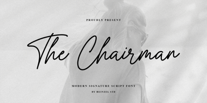 The Chairman is a flowing handwritten font, described by an elegant touch, perfect for your favorite projects. It looks stunning on wedding invitations, thank you cards, quotes, greeting cards, logos, business cards, magazine, marketing materials and every other design which needs a handwritten touch. Fall in love with its incredibly distinct and timeless style and use it to create spectacular designs! The Chairman Features : Uppercase and Lowercase Numerical and Punctuation Ligatures PUA Encoded Multilingual Language Easy To Use
 - Think Road by Akrtype Studio,
$19.00 Think Road... This idea originated during the year-end holidays, trying to casually scribble on paper so it becomes handwritten, Think Road includes uppercase and lowercase letters, numerals, and supports multilingual. This smooth handwriting is perfect for creating signature logos and watermarks for photography studio or blogger, best for initial or branding logos
 - Brighter Sunday by Din Studio,
$25.00 What is the right font to beautify your designs? Brighter Sunday is the answer. Brighter Sunday is a duo font mixture of script and serif font from which you can either combine as a set of beauty or separate a part based on their own beautiful style. The curves and strokes resembling a handwriting style on the script expresses elegant, natural vibrations. In addition, the serif style weights will leave strong, modern impressions to all of your designs. Enjoy the interesting features available on this font. Features: Ligatures Stylistic Sets Multilingual Supports PUA Encoded Numerals and Punctuations Brighter Sunday fits for any design projects, such as posters, banners, logos, invitations, magazine covers, quotes, headings, printed products, social media, etc. Find out more ways to use this font by taking a look at the font preview. Thanks a lot for purchasing our font. Happy Designing.
 - Motorway by K-Type,
$20.00 MOTORWAY is the companion typeface to TRANSPORT, the British road sign lettering. The Motorway alphabet was created for the route numbers on motorway signage, and is taller and narrower than the accompanying place names and distances which are printed in Transport. However, for Motorway Jock Kinneir and Margaret Calvert created only the numbers 0 to 9, the capitals A, B, E, M, N, S and W, ampersand, slash, parentheses and a comma. So, although the lettering made its first appearance on the Preston bypass in 1958, K-Type Motorway is the first complete typeface and contains all upper and lower case letters, plus a full complement of punctuation, symbols and Latin Extended-A accented characters. As with the Transport alphabet the starting point was Akzidenz Grotesk, Motorway taking inspiration from condensed versions. Changes were mainly driven by a quest for legibility, resulting in some reduced contrast between horizontal and vertical strokes, and Gill-esque straight diagonal limbs on the 6 and 9, and high vertex for the M. Kinneir and Calvert designed the limited range of characters in two weights; a SemiBold 'Permanent' weight for use as white letters on blue motorway signs, and a Bold 'Temporary' weight for heavier black letters on yellow non-permanent signage. In addition to creating full fonts in both original weights, the K-Type family adds a new Regular weight, plus a set of italics, completing a highly usable condensed typeface which, while rooted in history, is fully functional for both print and web usage. The K-Type fonts are spaced and kerned normally, simply increase the tracking to recapture the generous spacing of motorway signage.
 - Blackhaus by Canada Type,
$25.00Almost a half of a millennium after being mistaken for the original 4th century Gothic alphabet and falsely labeled "barbaric" by the European Renaissance, the blackletter alphabet was still flourishing exclusively in early 20th century Germany, not only as an ode to Gutenberg and the country's rich printing history, but also as a continuous evolution, taking on new shapes and textures influenced by almost every other form of alphabet available. Blackletter would continue to go strong in Germany until just before the second World War, when it died a political death at the height of its hybridization. For almost 50 years after the war, blackletter was very rarely used in a prominent manner, but it continued to be seen sparely in a variety of settings, almost as a subliminal reminder of western civilization's first printed letters; on certificates and official documents of all kinds, religious publications, holiday cards and posters, to name a few. In the early 21st century, blackletter type has been appearing sporadically on visible media, but as of late 2005, it is not known how long the renewed interest will last, or even whether or not it will catch on at all. The last few years before World War II were arguably the most fascinating and creative in modern blackletter design. During those years, and as demonstrated with the grid-based Leather font, the geometric sans serif was influencing the blackletter forms, taking them away from their previous Jugendstil (Art Nouveau) hybridizations. Blackhaus is a digitization and elaborate expansion of a typeface called Kursachsen Auszeichnung, designed in 1937 by Peterpaul Weiss for the Schriftguss foundry in Dresden. This is one of very few designs from that time attempting to infuse more Bauhaus than Jugendstil into the Blackletter forms. This is why we used a concatenation of the words blackletter and Bauhaus to name this face. The result of injecting Bauhaus elements into blackletter turned out to be a typeface that is very legible and usable in modern settings, while at the same time harking back to the historical forms of early printing. The original 1937 design was just one typeface of basic letters and numbers. After digitizing and expanding it, we developed a lighter version, then added a few alternates to both weights. The Rough style came as a mechanically-grunged afterthought, due to current user demand for such treatment. Having the flexibility of 2 weights and many alternates of a blackletter typeface is not a very common find in digital fonts. More specifically, having the flexibility of 2 weights and alternates of a 20th century blackletter typeface is almost unheard of in digital fonts. So the Blackhaus family can be quite useful and versatile in an imaginative designer's hands.

