10,000 search results
(0.027 seconds)
- Cubicoola by Little Type,
$20.00 Cubicoola is a playful, friendly and distinctive all-caps typeface inspired by hand-drawn posters. The deliberately wide width of some characters along with the gently variated angle, creates playful combinations. A symmetrical thin stroke with rounded endings makes it modern and legible typeface. It fits on book covers, posters, labels, greeting cards, announcements, headline messages, packaging or perhaps your next project logo. Applicable pretty well to all topics for kids. Contains a total of 429 glyphs, including latin extended diacritics for most languages. Carefully tuned kerning and 18 ligatures makes it even usable for longer paragraphs. Useful in both big and small sizes. Give it a try and summon interesting and creative letter combinations.
 - Tamiami JNL by Jeff Levine,
$29.00Tamiami JNL is based on a popular old typeface from the early 1900s, best known as "Cuba". 90 miles Northwest of that tropical island is Miami, Florida... and the Tamiami Trail was one of the first connecting routes between the City of Tampa on the West coast of Florida and Miami on the East coast - hence the conjunction "Tamiami". - Future History by Sarid Ezra,
$17.00 Introducing, Future History, a unique font with sans and serif in one font! Future History is a modern and stylish font that combined sans and serif in one font. With sans as uppercase dan serif as lowercase. You can use the lowercase and uppercase in the same word that will make your text more stand out! And the best of this font is the italic version as the alternates which mean you can combine it all without worrying about the kerning! You can use this font for the magazine, poster, and suitable for headline. This font also support multi language.
 - Circe Slab by ParaType,
$40.00 Circe Slab is a slab version of the popular geometric sans serif Circe . It contains variations in weight and contrast, including three regular styles that range from non-contrasting geometric to almost typical book serif contrast ones. In addition, all text styles have narrowed versions. The character set of the font includes small caps, minuscule figures and a wide variety of alternative capitals and small caps. Regular styles of Circe Slab are suitable for long texts and the light and bold ones for headlines. The font was designed by Alexandra Korolkova with the assistance of Olexa Volochay and released by Paratype in 2018.
 - Calypso I by Typolar,
$65.00 Calypso I (Italian) draws its inspiration from type founders' plentiful show-off-letters, which were typical on title pages and lithographs in the early 19th century. It borrows luscious details from these but inherits a stiff modern backbone from its parent, Calypso E (Egyptian). Within the Calypso type family all fonts share the same dimensions and work together consistently. Calypso I supports many languages and includes, for example, four sets of basic numerals, circled numbers, alternative characters, case sensitive forms and dingbats. Give it a go on drop caps and headlines or even set short paragraphs with it. It loves colour and effects.
 - Buckley by Laura Worthington,
$23.00 Buckley is a condensed, hand-lettered font based on characters created with my favorite vintage fountain pen: a Waterman Ideal #2. Its textured strokes reveal its ink-on-paper origins, while randomized contextual alternates cycle through letterforms as you type, for a convincing and handwritten look. Buckley’s friendly, happy, and casual appearance helps make packaging, greetings, and storybooks charming and approachable. See what’s included! http://bit.ly/2c98p0L This font has been specially coded for access of all the swashes, alternates and ornaments without the need for professional design software! Info and instructions here: http://lauraworthingtontype.com/faqs/
 - Horror Party by Ake,
$12.00 Horror Party is a spine-chilling Halloween display font designed to send shivers down your spine. With a ghoulish twist on traditional lettering, this font adds a touch of eerie enchantment to your designs. Perfect for t-shirt designs, party invitations, and all things spooky, Horror Party brings the thrill of the macabre to your creative projects. Unleash your dark side and let this font make a haunting impression!
 - Kisba Nova by Identity Letters,
$29.00 Kisba Nova – A character actor that turns heads. Spiky serifs, soft ball terminals. All eyes on Kisba Nova: enter a typeface designed to arouse attention. Kisba Nova is that one guest who joins a party, and a murmur goes through the crowd. Kisba Nova is pure charisma. Opposites attract: Kisba Nova combines sharp wedge serifs and spiky spurs with round and soft ball terminals. Infuse this with a neoclassical stroke contrast and you get a thrilling typeface driven by visual extremes. Sure: Kisba Nova is a diva. But it’s a pro, after all. That’s why it comes in two optical sizes: Headline and Text. This makes sure it looks gorgeous in any situation. The Kisba Nova Headline subfamily is flaunts the trademark flamboyant looks and extravagant letters like f and k. They bring you all of the excitement of the showbiz in large applications—use it for sizes of 24 Pt. and more. The extraordinarily designed, thin and monolinear diacritics, punctuation marks, and symbols of Kisba Nova Headline add to this modern and elegant character. Kisba Nova Headline consists of seven weights from Thin to Black, offering plenty of possibilities to set headlines and titles. With about 600 characters per weight, it contains enough functionality for the demands of a skilled typographer. OpenType features, such as a large set of ligatures, extended language support, case-sensitive forms, different sets of figures, and arrows, enable sensational designs both in web & print layouts. The Kisba Nova Text subfamily comes with decreased contrast, more generous letter proportions, and wider spacing. Instead of employing flashy thin and monolinear diacritics, punctuation marks, and symbols, Kisba Nova Text aims for a more even texture on the page. It retains the true, elegant Kisba DNA while allowing you to set legible copy in sizes between 9 and 18 Pt. Nothing will distract your reader–Kisba Nova Text aims to please. Kisba Nova Text consists of seven weights from Thin to Black, offering plenty of possibilities to set body copy and subheadlines. With about 600 characters per weight, it contains enough functionality for the demands of a skilled typographer. OpenType features, such as a large set of ligatures, extended language support, case-sensitive forms, different sets of figures, and arrows, enable sensational designs both in web & print layouts. Kisba Nova celebrates the dual nature of softness and sharpness in a single typeface. It’s a character actor that turns heads.
 - Hello Sweets Script by Seniors Studio,
$15.00 Hello Sweets Script is a hand-brushed modern calligraphy script font, created with both pen & brush. dancing baseline with separate swashes that can be applied to the beginning and ends of all lowercase. Were painted on paper. scanned, vectorized and carefully made into a font. Hello Sweets includes several ligatures, alternates and international support for most western languages. For the separate swashes font, type lowercase a-z for the beginning swashes and end swashes (can not access to a glyphs panel. need to add swashes manually). Ideal for logo, wedding invitations, businness card, poster, merchandise, greeting cards, prints, blog banners, apparel, quotes and so much more!
 - Unchain My Heart by Harald Geisler,
$68.34 Unchain My Heart is Font that renders hearts on a string with a capital letter in the middle. All hearts are designed to align to a perfect string by remaining the handmade look. Lowercase letters produce a heart with outline. Uppercase letters produce a filled heart. Type in a parenthesis and a loose string end will be rendered either on the right or left side. Look in the full character set to find out more about the special decoration. Ideal for individualized mailings and greeting cards. Unchain My Heart is a part of the Light Hearted Font Collection that is inspired by a recording of Jean Baudrillard with the title, "Die Macht der Verführung" (The Power of Seduction) from 2006. Further inspiration came from the article, "The shape of the heart: I'm all yours". The heart represents sacred and secular love: a bloodless sacrifice. by British writer Louisa Young printed in EYE magazine (#43) London, 2002.
 - Sunny Sam by Mans Greback,
$39.00 Sunny Sam is a fun handwritten typeface. It was drawn and created by Måns Grebäck during 2019 and 2020. The movements of this happy script font represents optimism and vivacity. Sunny Sam comes in three high-quality styles: Thin, Medium and Bold. The three weights works great as complements to one another. It has an extensive lingual support, covering European Latin scripts. Sunny Sam contains all characters you'll ever need, including all punctuation and numbers.
 - Plena by Arodora Type,
$40.00 The Plena font offers a modern all-caps experience. All glyphs have incision and unified alternatives and can be shaped for your intended use. This font is crafted for different design trends and would look great for your large print banner headers. It can be preferred by the designer in accordance with its intended use and can be used impressively and strikingly with its large family on different platforms. Plena also offers multilingual support.
 - Initial Seals JNL by Jeff Levine,
$29.00 Initial Seals JNL was created by utilizing the typeface from Gummed Letters JNL and one of the decorative dingbats from Miscellany JNL. On the capital A-Z keys, the letters are black on a white on black seal design, while the lower case a-z keys have a seal version in solid black with white letters. Corresponding blank versions of the seals are on the left and right parenthesis keys, and the period key has a fill oval for overlaying background colors onto the black and white set.
 - HS Alhoson by Hiba Studio,
$50.00 HS Alhoson is based on the font HS Alnasma font that is an Arabic display typeface, under “titles” category. It is useful for book titles, creative designs and modern logos. Also, it is used when a contemporary and simple look is desired that can fit with the characteristics of Latin fonts where horizontal parts are thinner than vertical ones for use in technical and engineering company. The font is based on some modern lines of Kufi calligraphy along with some derived ideas of Latin fonts, maintaining the beauty of the Arabic font and its fixed rates. This font supports Arabic, Persian, Urdu, Kurdish and Pashto and also includes Basic Latin and consisting of two weights (regular and bold) which can add to the library of Arabic and Latin fonts contemporary models that meet with the purposes of various designs for all tastes.
 - Lupulus by W Type Foundry,
$25.00 Lupulus is a typeface inspired by the works of german expressionist artist and type designer Rudolf Koch. Drawing inspiration from types such as Neuland and Kabel for some of its features, it possesses a gothic and contemporary essence. Its constant rhythm; strict, solemn, yet boldly exuberant keeps it clean and functional. Its expressiveness allows for a wide range of uses: short texts, headlines, posters and branding, for which it is exceptionally well-suited. Lupulus consists of 17 fonts: 8 weights, 8 italic variables and one free ornamental variable. Featuring alternate characters, it is a comprehensive and versatile set built to suit your design needs. It comes fully equipped with Opentype for any and all technical requirements. Learn about upcoming releases, work in progress and get to know us better! On Instagram W Type Foundry On facebook W Type Foundry wtypefoundry.com
 - Peanut Crunch by Hanoded,
$15.00 I really like peanuts! My family and I often eat an Indonesian snack called Rempeyek, which is a deep fried, battered peanut cracker and I was probably craving one when I made this font. Peanut Crunch is a hand painted display font. It comes with some alternates and a bunch of ligatures for you to play around with.
 - Handmade Dropshadow JNL by Jeff Levine,
$29.00 Handmade Dropshadow JNL was modeled from lettering found on a vintage silk screened metal sign used for point-of-sale marketing. Before the advent of computers and modern techniques, silk screens were hand cut using material called frisket and knife tools, and the lettering reflected the human inconsistencies of cutting these lettering into the template surface for transfer.
 - Gullywasher NF by Nick's Fonts,
$10.00One in the series of fonts called Whiz-Bang Wood Type, intended to be set large and tight. Gullywasher is distinguished by its unusual letterforms and “pineapple” serifs. The font takes its name from a Texas term for a heavy rain. Both versions of this font include the complete Unicode Latin 1252 and Central European 1250 character sets. - Collonse by Liartgraphic,
$16.00 Hello guys! Introducing our newest product, we call this product the Colonse font Colonse font is a font family consisting of regular, bold and hollow colons With a unique and firm touch Colonse font is great to use on: fashion magazines, logos, and photography, landing pages, flyers, What's included - multilingual support Thank you, best regards Ali Sifak Muftari
 - San Marcos NF by Nick's Fonts,
$10.00In his book Victorian Display Alphabets, Dan X. Solo called this specimen "Marquette". This unicase version features a complete character set, and is named after a favorite watering hole in Texas on the Guadeloupe River. Both versions of this font contain the Unicode 1252 (Latin) and Unicode 1250 (Central European) character sets, with localization for Romanian and Moldovan. - Kinda Sweet by Heinzel Std,
$16.00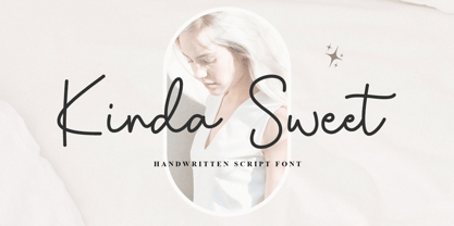 Kinda Sweet is a flowing handwritten font, described by an elegant touch, perfect for your favorite projects. It looks stunning on wedding invitations, thank you cards, quotes, greeting cards, logos, business cards and every other design which needs a handwritten touch. Fall in love with its incredibly distinct and timeless style and use it to create spectacular designs!
 - Day Tripper NF by Nick's Fonts,
$10.00An undeniably Art Deco font with some unexpected twists and turns, this typeface is based on a design originally called "Dignity Roman", a product of the fevered imagination of the rather unconventional 30s lettering artist Alphonse E. Tripp. Both versions of the font include the 1252 Latin and 1250 CE character sets (with localization for Romanian and Moldovan). - Meilleur by Heinzel Std,
$16.00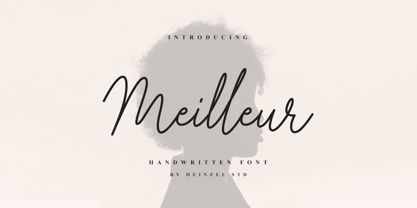 Meilleur is a flowing handwritten font, described by an elegant touch, perfect for your favorite projects. It looks stunning on wedding invitations, thank you cards, quotes, greeting cards, logos, business cards and every other design which needs a handwritten touch. Fall in love with its incredibly distinct and timeless style and use it to create spectacular designs!
 - Busted Soul by Heinzel Std,
$17.00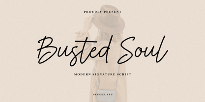 Busted Soul is a flowing handwritten font, described by an elegant touch, perfect for your favorite projects. It looks stunning on wedding invitations, thank you cards, quotes, greeting cards, logos, business cards and every other design which needs a handwritten touch. Fall in love with its incredibly distinct and timeless style and use it to create spectacular designs!
 - Yin Yang Messages by Ingrimayne Type,
$9.00 YinYangMessages contains two sets of letters, those on the upper-case keys that fit on the left side of a yin-yang symbol and those on the lower-case keys that fit on the left side of a yin-yang symbol. One can alternate the two sets manually but the OpenType contextual alternatives feature does this automatically in any program that supports this feature. The family contains two fonts. In one the filled half is on the left and in the other the filled half is on the right. The slash and backspace keys contain blank halves of the symbol, which are useful for completing words with an odd number of letters. The two styles can be used in layers. YinYangMessages is a fun and playful family that every once in a while may be the ideal typeface for some unusual situation.
 - Tuba by Canada Type,
$24.95 Initially commissioned in the summer of 2009 for a popular North American ice cream parlor chain we cannot name, Tuba started with a reconceptualization of a somewhat flawed '72 alphabet idea by Swiss graphic designer Erwin Poell. During the back-and-forth of the custom project, other ideas seeped into the design, mostly from other Canada Type fonts, like Fab, Jonah, Jojo and Teaspoon. The end result was what the client called a "sugar circuit trigger alphabet". This now is the retail version of that project. Tuba's main style is a straight-forward mix of 60s/70s art nouveau ideas and late-70s/early-80s tube aesthetic. The Highlight and Outline styles are almost necessary spinoffs for this kind of typeface. And the all-caps Black style is a nod to the fat font fad of the past couple of years. All styles contain many alternates – so many that each style is almost two fonts in one. Make sure to check out the character sets for a few nice and useful surprises. Life's too short. Seek sweetness. Get gooey.
 - Bulblamp by Popskraft,
$9.00 Layered font set 3D Bulb lamp Bulblamp is a 12 component font system that can be layered in different ways to create endless classic titling effects used commonly in signage by skilled sign painters and sign makers and any who interested in simple and flexible ways to make graphic design. Examples of how to use this you can see on the images. Moreover, You can start fast in Figma, Illustrator and Photoshop with predefined downloadable package. ! Download free predesigned Figma, Illustrator and Photoshop sets for this fonts here: https://drive.google.com/open?id=17ogdSIjPuLA5-CUaAO1TlqJGbRPWy5iA&authuser=popov_av%40koriphey.ru&usp=drive_fs Each file is named according to its purpose. The number indicates the recommended order of the layers. 1 below, 5 on top. 1 means you should place it first. Of course, you do not have to use all the fonts, and vice versa - you can repeatedly use the same font style with different styles. What is Layered font? In fact, these are common fonts located in a stack strictly one above the other. This allows quickly create unique text effects using ordinary fonts. Where can you use this? These fonts can be used in any program that allows you to stack fonts as objects strictly one above the other, however it is recommended to work in professional programs such as Illustrator, Photoshop, Figma and so on ... How to use this font set quickly? For quick use, I recommend using ready designs for Figma, Photoshop or Illustrator. Download fonts and Install all fonts. Go to the link https://drive.google.com/open?id=17ogdSIjPuLA5-CUaAO1TlqJGbRPWy5iA&authuser=popov_av%40koriphey.ru&usp=drive_fs which has contained pre-made solutions for this font applicable in Figma, Photoshop or Illustrator and download presets. Follow the recommendations on the pages. Basically, you will need to replace the words in the template with your own, then edit colors and transfer the result to your design. In that’s all, it's easy.
 - Broadside Text by Device,
$39.00 Broadside Text is a companion to Broadside, and is optimised for use at smaller sizes. More open counters, more generous letter-spacing and additional fractions increase legibility. The original Broadside family is suitable for headlines and larger sizes, and also comes with condensed and extended versions. Broadside is a versatile, authoritative and functional family inspired by the sans serifs seen on ’40s and ’50s patriotic posters and period advertising. It is available in seven weights across condensed, normal and extended widths, each with reweighed italics. The type from this period was very often hand-drawn, and so differs considerably from poster to poster. Many American examples of this period use a Photo-Lettering style called Murray Hill and its derivatives, although their UK counterparts, designed by such luminaries as Abram Games or Tom Eckersley, are more stylistically diverse. Even though no single model is available to base a digitisation on, there are certain recurring stylistic quirks that give the type its unique flavour, and so the most interesting examples from several sources were be combined for the final family. Alternate short descenders, allowing for tighter line spacing, can be toggled on or off in the Opentype panel of Indesign or Illustrator. Tabular and lining numerals and a single-story ‘a’ are also available in all weights and styles.
 - Dupincel by Plau,
$30.00 A typeface for telling stories. After seven years through which Rodrigo Saiani worked on Dupincel, Plau’s team still had months of dedication until found a good way of summing up this typeface. All this effort was rewarded, though, when we came up with a motif that gave Dupincel the grandiosity it deserves. Telling stories is this typeface’s gift because it has the emotion for it, resources for it and the breadth for it. Like all that wasn’t enough, it has the scale for it: optical sizes Small, Medium and Large make Dupincel optimized for stories of every length. From short stories displayed big or long stories on small letters. We don’t want to dictate the types of stories either, anything goes. But if ornaments make a good fit with that story, we will be even more thrilled. In the end, Dupincel makes us want to find new stories to tell.
 - Tea Chest by Linotype,
$29.99The English typographer Robert Harling created Tea Chest in 1939 with the Stephenson Blake foundry. Today, this classic design is available in digital format from Linotype GmbH. Tea Chest is a bold stencil face. The font's narrow letters are all caps, and they sport small, slab serifs. Harling's design was most likely reminiscent of the old industrial lettering painted onto boxes and wooden crates that used to be shipped all over the world on the high seas. These letters had to be simple to reproduce, easy to read, and not take up too much space! Try out Tea Chest for large signage displays, on exotic product packaging, or in magazine or newsletter headlines. - SF Saggar by Sultan Fonts,
$19.99 SF Saggar is an Arabic typeface for Print and screen. Inspired by an alphabet written by the calligrapher and artist Mohamed Said Al-Saggar 40 years ago to simplify Arabic printing. Saggar is from Naskh style and contains 3 weights: Regular, bold and black. SF Saggar is a simple and little detailed font and its three weights are fully harmonized, one letter with one length on the line, and words with a uniform length on the line, gives a comfortable reading look.
 - Affair by Sudtipos,
$99.00 Type designers are crazy people. Not crazy in the sense that they think we are Napoleon, but in the sense that the sky can be falling, wars tearing the world apart, disasters splitting the very ground we walk on, plagues circling continents to pick victims randomly, yet we will still perform our ever optimistic task of making some little spot of the world more appealing to the human eye. We ought to be proud of ourselves, I believe. Optimism is hard to come by these days. Regardless of our own personal reasons for doing what we do, the very thing we do is in itself an act of optimism and belief in the inherent beauty that exists within humanity. As recently as ten years ago, I wouldn't have been able to choose the amazing obscure profession I now have, wouldn't have been able to be humbled by the history that falls into my hands and slides in front of my eyes every day, wouldn't have been able to live and work across previously impenetrable cultural lines as I do now, and wouldn't have been able to raise my glass of Malbeck wine to toast every type designer who was before me, is with me, and will be after me. As recently as ten years ago, I wouldn't have been able to mean these words as I wrote them: It’s a small world. Yes, it is a small world, and a wonderfully complex one too. With so much information drowning our senses by the minute, it has become difficult to find clear meaning in almost anything. Something throughout the day is bound to make us feel even smaller in this small world. Most of us find comfort in a routine. Some of us find extended families. But in the end we are all Eleanor Rigbys, lonely on the inside and waiting for a miracle to come. If a miracle can make the world small, another one can perhaps give us meaning. And sometimes a miracle happens for a split second, then gets buried until a crazy type designer finds it. I was on my honeymoon in New York City when I first stumbled upon the letters that eventually started this Affair. A simple, content tourist walking down the streets formerly unknown to me except through pop music and film references. Browsing the shops of the city that made Bob Dylan, Lou Reed, and a thousand other artists. Trying to chase away the tourist mentality, wondering what it would be like to actually live in the city of a billion tiny lights. Tourists don't go to libraries in foreign cities. So I walked into one. Two hours later I wasn't in New York anymore. I wasn't anywhere substantial. I was the crazy type designer at the apex of insanity. La La Land, alphabet heaven, curves and twirls and loops and swashes, ribbons and bows and naked letters. I'm probably not the very first person on this planet to be seduced into starting an Affair while on his honeymoon, but it is something to tease my better half about once in a while. To this day I can't decide if I actually found the worn book, or if the book itself called for me. Its spine was nothing special, sitting on a shelf, tightly flanked by similar spines on either side. Yet it was the only one I picked off that shelf. And I looked at only one page in it before walking to the photocopier and cheating it with an Argentine coin, since I didn't have the American quarter it wanted. That was the beginning. I am now writing this after the Affair is over. And it was an Affair to remember, to pull a phrase. Right now, long after I have drawn and digitized and tested this alphabet, and long after I saw what some of this generation’s type designers saw in it, I have the luxury to speculate on what Affair really is, what made me begin and finish it, what cultural expressions it has, and so on. But in all honesty it wasn't like that. Much like in my Ministry Script experience, I was a driven man, a lover walking the ledge, an infatuated student following the instructions of his teacher while seeing her as a perfect angel. I am not exaggerating when I say that the letters themselves told me how to extend them. I was exploited by an alphabet, and it felt great. Unlike my experience with Ministry Script, where the objective was to push the technology to its limits, this Affair felt like the most natural and casual sequence of processions in the world – my hand following the grid, the grid following what my hand had already done – a circle of creation contained in one square computer cell, then doing it all over again. By contrast, it was the lousiest feeling in the world when I finally reached the conclusion that the Affair was done. What would I do now? Would any commitment I make from now on constitute a betrayal of these past precious months? I'm largely over all that now, of course. I like to think I'm a better man now because of the experience. Affair is an enormous, intricately calligraphic OpenType font based on a 9x9 photocopy of a page from a 1950s lettering book. In any calligraphic font, the global parameters for developing the characters are usually quite volatile and hard to pin down, but in this case it was particularly difficult because the photocopy was too gray and the letters were of different sizes, very intertwined and scan-impossible. So finishing the first few characters in order to establish the global rhythm was quite a long process, after which the work became a unique soothing, numbing routine by which I will always remember this Affair. The result of all the work, at least to the eyes of this crazy designer, is 1950s American lettering with a very Argentine wrapper. My Affair is infused with the spirit of filete, dulce de leche, yerba mate, and Carlos Gardel. Upon finishing the font I was fortunate enough that a few of my colleagues, great type designers and probably much saner than I am, agreed to show me how they envision my Affair in action. The beauty they showed me makes me feel small and yearn for the world to be even smaller now – at least small enough so that my international colleagues and I can meet and exchange stories over a good parrilla. These people, whose kindness is very deserving of my gratitude, and whose beautiful art is very deserving of your appreciation, are in no particular order: Corey Holms, Mariano Lopez Hiriart, Xavier Dupré, Alejandro Ros, Rebecca Alaccari, Laura Meseguer, Neil Summerour, Eduardo Manso, and the Doma group. You can see how they envisioned using Affair in the section of this booklet entitled A Foreign Affair. The rest of this booklet contains all the obligatory technical details that should come with a font this massive. I hope this Affair can bring you as much peace and satisfaction as it brought me, and I hope it can help your imagination soar like mine did when I was doing my duty for beauty.
 - BOMADHA by Twinletter,
$15.00 Bomadha is a one-of-a-kind display font with Asian elements. The typeface, which has been built with remarkable harmony in every phrase structure that arises, makes your complete project look luxury and gorgeous, causing your entire audience to fall in love with it. Logotypes, food banners, branding, brochure, posters, movie titles, book titles, quotes, and more may all benefit from this font. Of course, using this font in your various design projects will make them excellent and outstanding; many viewers are drawn to the striking and unusual graphic display. Start utilizing this typeface in your projects to make them stand out.Caps only fonts.
 - SK Glypher by Shriftovik,
$10.00 SK Glypher™ is a super experimental accidental typeface. It is designed under the impression of petroglyphs (ancient writing), which ancient people painted the walls of their caves. The angular and very unusual shape of the typeface allows you to create stunning typeface compositions based on it, which are suitable for both poster design and web design. The SK Glypher supports many languages and language groups: Latin Pro, which supports all 104 Latin languages, Cyrillic Pro, which is suitable for most Slavic languages, as well as the typeface supports Greek. As a nice bonus, the SK Glypher typeface has specially drawn icons and arrows that perfectly diversify the text.
 - Ecliptica BT by Bitstream,
$50.99Ecliptica is an extended family of five very condensed typefaces in a single bold weight. The creation of Australian designer Robert Bell. Ecliptica has a Sans, a Semi-Serif, a Serif and a single Cursive that can be used with any of the other three styles. As an added bonus, Robert also designed a modern Blackletter companion. The Ecliptica family is an unusual layout of styles and all work equally well with one another. The OpenType versions of the Ecliptica fonts support an extended Latin character set that includes a full array of fractions as well as additional ligatures. The Sans and Cursive fonts contain some cap and lowercase alternates. - Guenter by ParaType,
$25.00 Guenter type got its name after Guenter Gnauck — the calligrapher from Eastern Germany whose works brought an inspiration and initial incitement for the design. But in contradiction to the calligraphic nature of the inspiration source Guenter has a specific construction that is built solely with straight stems. Like KvadratZ family Guenter belongs to so called 'in-one-touch' series. The first version in one basic style was developed by Zakhar Yaschin in 2001. In 2009 the font was redesigned with addition of 3 new styles and released by ParaType as a family.
 - RMU Initials by RMU,
$20.00 Four fonts entirely of decorative initials of which the uppercase basic letters of RMU Initials One are occupied by Walthari initials, the lowercase ones by Eckmann initials, both released first by Rudhard’sche Gießerei, Offenbach, Germany, about 1900. RMU Initials Two consists of Jubilaeumsinitialen in the uppercases and Augsburger Initialen in the lowercases. RMU Initials Three comes with floral ornaments, whereby the lowercase initials can be colorized by yourself due to non-joining elements. RMU Initials Four consists of hand drawn initials by Rudolf Koch and letters of a former Klingspor font called Queen.
 - Casual Deco JNL by Jeff Levine,
$29.00 The hand lettered sans serif title on the1931 sheet music for “(Potatoes are Cheaper-Tomatoes are Cheaper) Now’s the Time to Fall in Love” presented another opportunity to create a typeface from the wealth of unusual alphabets found on the covers of vintage and antique song sheets. However, it seems that even as late as the 1930s, song writers had the urge to pen long-worded titles for their musical compositions. This thirteen word verbal excursion became the model for Casual Deco JNL, which is available in both regular and oblique versions.
 - MFC Chaoxiang Monogram by Monogram Fonts Co.,
$269.00 The inspiration source for Chaoxiang Monogram is another hand-drawn treasure from a vintage embroidery publication which plays on the anglo-version of chinese letters with stabbing strokes and the charm of the orient. While the original intent of this monogram style is uncertain, the possibilities of its use are up to your imagination. This is one of many monogram designs from the early 1900’s which fall into a two letter format bound within a framing element. Download and view the MFC Chaoxiang Guidebook if you would like to learn a little more.
 - Stadium JNL by Jeff Levine,
$29.00 Block-style typefaces make excellent sports-themed fonts, and Stadium JNL is no exception-- but this lettering style is also filled with nostalgia for decades past. Modeled from one of the many classic designs found in the Speedball® Lettering Textbook, this style of alphabet was quite popular in signage of the 1920s and 1930s. Stadium JNL fills the bill either way-- a font that is just as much at home on a gridiron or baseball diamond, or as lettering for a garage, warehouse or attention-getting ad copy.