10,000 search results
(0.03 seconds)
- Khalitta by Yoga Letter,
$14.00 Khalitta is a modern calligraphy font. This font is very elegant and beautiful and is perfect for all types of your work. This font is perfect for weddings, branding and logos, for marketing your business, status updates on social media, and for capturing beautiful and romantic moments, and more.
 - Persephone NF by Nick's Fonts,
$10.00A bold headline font with a decidedly Greek flavor, based on an ATF font called Pericles. A great alternative to Lithos or Lithograph. Both versions of this font contain the Unicode 1252 Latin and Unicode 1250 Central European character sets, with localization for Romanian and Moldovan. - Aghellay by Liartgraphic,
$16.00 Meet our newest product, we call this product Aghellay font. Aghellay font are cute typeface font Whit a uniqe touch and assertive. Aghellay font is very nice to use on: fashion magazine, logos, ,and photography, landing page, fliyer. What’s includes - multilingual support - alternate - ligature Ali Sifak Muftari
 - Bougenville by Liartgraphic,
$16.00 Meet our newest product, we call this product Bougenville font. Bougenville font are typeface font Whit a uniqe touch and assertive. Bougenville font is very nice to use on: fashion magazine,logos ,and photography, landing page, fliyer, What’s includes - Multilingual support - alternate - ligature Ali Sifak Muftari
 - Smena by ParaType,
$30.00 Smena was based on the lettering of the so called 'calligraphic style' that was very popular during the period 1940-1970. The style was used in logos, book and magazine headlines, posters, signage etc. For use in advertising and display typography. Licensed by ParaType in 2006.
 - Jasmin by Vincenzo Crisafulli,
$29.00 Jasmin is a tribute to the ancient stories of The Thousand and One Nights, in which a main story serves as a connection for a series of other stories, just like all the other glyphs are derived from one of Jasmin's letters or from a sign. A graphic path in which we tried to combine the calligraphy designed with a quill with geometric research. Among the glyphs there is one referring to a letter from a famous font by Paul Renner, made by Fonderia Bauer in 1927.
 - Urban Barbarian by Comicraft,
$19.00 He’s been mixing one part artist and one part barbarian since 2005. Brutal, ruthless, cutthroat, he moves through the concrete jungle, unsheathing his, um, sword, taking what he wants without care or remorse. He follows no rules. He is the URBAN BARBARIAN. The Spoils of Battle Await Him! Is he Conan? Roger ‘Mad Men’ Sterling? No, he’s Dan Panosian. Artist. Author. Lover of fine women, drinker of fine scotch, drawer of fine pictures. This is his fine font. Well, one of them. See the families related to Urban Barbarian: Dan Panosian Features: Two fonts: all-uppercase GIANT and upper/lowercase DWARF.
 - Quartz by ITC,
$29.99The figures of Quartz font are based on those on digital clocks and LCD displays. All strokes are set at right angles to one another to create abstract characters. Fonts created for electronic displays gained in popularity at the same time as the computer became an everyday object. The standard is still around today and is the model for numerous interpretations. Fonts like Quartz have already won a firm position in trend typography. They embody the spirit of the late 20th century. Quartz font is a good choice whenever a marked contrast to everyday alphabets is the goal. - dearJoe 7 by JOEBOB graphics,
$39.00 The dearJoe series of fonts came to life around the year 1999, when I created dearJoe 1, which was a first (and half-assed) attempt to convert my own handwriting into a working font. Being able to type in my own hand had always been a childhood fantasy, and even though I only partly understood the software, a working font was generated and I decided to put it on the internet for people to use in their own personal projects. Which they did: at this moment the dearJoe 1 font has been downloaded millions of times and can be found on Vietnamese riksjas, Tasmanian gyms and chocolate stores on 5th Avenue for instance. The font is not something I am particularly proud of, but it started me of in building what's now the JOEBOB graphics foundry. Inbetween creating other fonts, the dearJoe series has become a theme I revisit every once in a while, trying to create an update on how my handwriting has evolved, along with my abilities in creating fonts that mimic actual handwriting. In the last decade or so I started implementing ligatures and alternate characters, which helped a lot in coming to a result that can almost pass for actual handwriting. The 2019 dearJoe 7 font is the latest addition to this font family. All characters were scanned from handwritten notes, cherrypicking the characters and letter-combinations I liked best. They were written with a Lamy M66 B pen and only minor adjustments were made to the original scans, leaving most little flaws and rough edges as they were for a convincing ball-point on paper result. The font comes with over 150 ligatures, making sure the font has a variated and credible overall look and feel.
 - Exit Strategy by Hanoded,
$15.00 Every exit is an entry somewhere else. It’s a quote by British playwright Tom Stoppard and I really like it! Exit strategy is a rough brush font, which I made using Chinese ink (where would I be without my Chinese ink??) and the new batch of French paper I bought. Use this font to highlight all that is important, stick it on posters, slap it on book covers - it will definitely do the trick!
 - Cartoon Cavalcade JNL by Jeff Levine,
$29.00 There are times when a customer might look over a dingbat font and like a few of the images because they suit a particular need, but hesitates on purchasing the font because enough of those images isn't available. For all of the lovers of vintage letterpress cartoon cuts, Cartoon Cavalcade JNL collects sixty two assorted images from many of the Jeff Levine Fonts dingbat collections and places them within one singular file.
 - Tonus by Hurufatfont,
$29.00 Tonus Super Family; It is a family of five character styles built on the same skeleton. The entire Tonus Family is built on the skeleton of the "sans" family, it is the only family where five different styles are presented together. All families have an equal number of characters. It has rich opentype features. It inspires designers for different and creative applications such as brand building, periodicals, packaging, and social cultural event designs.
 - Front Row JNL by Jeff Levine,
$29.00 Front Row JNL is an all-caps reinterpretation of Morris Fuller Benton's 1937 type design "Empire", and is available in both regular and oblique versions. As is often the case when a digital type font is based on a few letter examples found on a printed sample [in this case, the sheet music of the 1946 Guy Lombardo hit "What More Can I Ask For"], the missing characters were drawn from scratch.
 - Supper Club JNL by Jeff Levine,
$29.00After creating the all-caps version of Supper Club JNL, a conversation between Jeff Levine and fellow font designer Ray Larabie brought forth the idea that one of Ray's freeware fonts had a lower case that would perfectly fit Jeff's design. With Ray's permission, Jeff adapted the lower case to his capital letters and the final version of Supper Club was born. Two separate ideas become one stylish Art Deco type design. - Deco Banner JNL by Jeff Levine,
$29.00 Deco Banner JNL is composed of reverse lettering on a black background with Art Deco end caps. To create a banner, first type the plus sign for the left end cap, then your text. To add a space between words, use the bar on the shift position of the backslash key then continue on. To add the right end cap, type the equal sign.
 - Thug Life by Aldedesign,
$39.00 Thug Life is a cool and high-tech display font. Created out of pixels, this font will look both futuristic and interestingly on each of your gaming designs. It is PUA encoded which means you can access all of the glyphs and swashes with ease!
 - La Gathe by Slide Shoot,
$12.00 La Gathe is an elegant serif font. Different letters make this font has its charm. Fall in love with its incredibly versatile style and use it to create spectacular designs. It is suitable for various products such as invitations, product packaging, quotes, product design, crafter, labels, photography, watermarks, logos & branding. FEATURES Ligatures Uppercase and Lowercase letters Numbering and Punctuations Multilingual Support Works on PC or Mac Simple Installation Support Adobe Illustrator, Adobe Photoshop, Adobe InDesign, also works on Microsoft Word Hope you Like it. Thanks.
 - I am not a robot by PizzaDude.dk,
$15.00 The other day I had to login to a page several times, and as security I had to check the "I am not a robot" box. Actually, I think I did a login at that particular page like 30 times that day...and in the end I was thinking "Come on, you should know by now that I am not a robot" And even though I thought it was a repetitious hassle I figured that I needed to name a font "I am not a robot" - and not a robotic-like one, but a sweet and funny cartoonish one! :)
 - Alisha by alphArt,
$15.00 Hello everyone, this time we would like to introduce a sweet calligraphy font that we just made with passion and enthusiastic, this font comes with a touch of lovely font. Introducing this sweet calligraphy font called "alisha | Sweet Calligraphy Font", this lovely font comes with uppercase letters, lowercase letters, multilingual support, numbers and punctuation. This sweet calligraphy font is suitable for you to use as quotes, instagram posts, invitations, magazines, cards, product packaging, headers and whatever your imagination. This is the file you get on the download page: - alisha.otf - alisha.ttf note : to use alternative end text is just block end letters and select alternative letters on glyphs option. it may be used in almost any program by using your Operating System’s utilities (CharacterMap for Windows and Font Book for Mac.), as well as Illustrator, Photoshop CC 2017 and several other applications. we hope you enjoy this font. If you have any questions please don't hesitate to drop me a message :) Thank you, Best regards alphArt
 - WT Hilton Script by Winston Type Co.,
$19.00 WT Hilton is a font family of royal script that inspired from the Spencerian era in 1840. The strokes are graceful and rhythmic, and letterforms are characterized by flowing loops and flourishes. WT Hilton consists of four styles that variables from the Monoline to the thicker one called Hilton Fancy, each style are stands on its own character. With 100+ language support, WT Hilton is well-suited for any project such as prints, branding, magazine, headline, poster, packaging, weddings, headline, movie, title, logos, branding, invitations, quotes, social media, websites, magazine and so much more.
 - Braytons by Keristyper Studio,
$14.00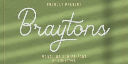 Braytons Script is a flowing monoline handwritten font, described by an elegant touch, perfect for your favorite projects. Fall in love with its incredibly distinct and timeless style and use it to create spectacular designs! Braytons Handwriting Font multilingual support: Afrikaans, Albanian, Catalan, Danish, Dutch, English, Estonian, French, Finnish, German, Icelandic, Indonesian, Italian, Malay, Norwegian, Portuguese, Spanish, Swedish, Zulu, and many more. What’s Included : Standard & Multilingual glyphs Ligature Works on PC & Mac Simple installations Accessible in Adobe Illustrator, Adobe Photoshop, Adobe InDesign, and even work on Microsoft Word. Hope you enjoy our font!
 - Banret by Ryzhychenko Olga,
$12.00 Banret is built using simple geometric shapes. It is mostly the result of my experiments on the other font I made earlier in 2016, called Inventor. Font is inspired by old fonts of the beginning of the 20th century. Capital letters are built with one to four proportions. The font has four weights: normal, and bold, and two alternatives: ribbon, and flag. As far as it is a decorative font, it is not designed for large amounts of text. But it is perfect for creating branding elements, logos, slogans and posters.
 - HS Wamda by Hiba Studio,
$40.00 HS Wamda is based on some modern style of Naskh calligraphy which supports Arabic, Persian and Latin with a Sans Serif with subtle round on stems and corners. The typeface has been optimized for corporate identity work, editorial design, book, magazine and modern projects when a contemporary and simple look with a similarity between Arabic and Latin is requested. It features a small number of ligatures. Its proportions allow high impact on the tightly set lines of big and small text alike. This font consists of five weights (Thin, Light, Regular, Mediums and bold). It can constitute a striking addition to the library of Arabic and Latin contemporary fonts models that meet the purposes of various designs for all tastes.
 - Paprika by W Type Foundry,
$15.00 Paprika is a cute script with a slight messy touch. It is inspired in the modern calligraphy trends, therefore, sometimes it can be seen as an elegant typeface or as an spontaneous font; it depends on the context in which it is being used. This is the first W script, making our catalogue wider and more eclectic, all thanks to our new team member Isabel La Rivera. Paprika includes capital swashes, contextual ligatures, alternatives letters, and extras, making this project perfectly suited for several areas of graphic design. Learn about upcoming releases, work in progress and get to know us better! On Instagram W Foundry On facebook W Foundry wtypefoundry.com
 - Melodia by PintassilgoPrints,
$29.00 This one may look rather strange at a first sight, but it has the true power of coolify written pieces. (Please don’t use it to say “Attorneys’s Conference”, nor “Annual Statement of Accounts”, unless you mean them to be cool, which is very unlikely.) Melodia has 3 glyph drawings for each uppercase letter, 3 more for each lowercase and 2 for the numerals. There are even alternates for punctuation, go figure: there are 3 commas and 3 periods. Surprising. To activate the automatic cycling of all these alternates, simply turn on the Contextual Alternates feature in your application. And it doesn’t hurt to remind: use it only on cool stuff.
 - Summer Loving by Nicky Laatz,
$17.00 Throw on some shades and get summer ready with the new Summer Loving Font Family! Summer Loving consists of 3 fonts, 2 of which are brush scripts, one textured and a solid version, and a smooth-edged all caps sans serif font. Packed with opentype ligatures and handy alternate letters, the script fonts have natural hand brushed strokes to give your project that ultra-realistic and natural look. 4 Handy Swashes can by created simply by typing out bracket pairs with your opentype ligatures setting active : () {} []
 - Alecko by Evolutionfonts,
$- Alecko is a distinctive didone-style typeface, which is strongly influenced by calligraphy, but is at the same time drawn with mathematical precision. Its advantages are summarized in its slogan: “One typeface, many possibilities”. Once you decide to use it, you can alter its look in a variety of ways: Should the contrast between the horizontal and vertical strokes of the glyphs be high or low? Is it appropriate to apply engraving to the letters (and what color?). Should the glyphs be connected to one another? Alecko is equipped with a lot of alternative characters, which are automatically inserted as you type, in order to achieve a “handwritten” look, however, it can also work without them. Each of these options is appropriate depending on the design context and we want to encourage you to explore every one of them, which is why we sell the whole family for a considerably smaller price, than the combined price of all weights. And If you don't feel like spending money at all, just download the free weight. Have fun.
 - Juggling Squad by Bogstav,
$19.00 The name of the font is from the hilarious movie "21 Jump Street" - and that is where the similarity ends. While the movie is quite funny, it is also super goofy! I can't say the same about the font, because terms like organic and organic comes to my mind. Strange, yes! And I have really no good reason for this naming, other that its an odd way to tribute this one of my all time favourite comic movies! :)
 - Alessandra by Lunas Type,
$19.00 Introducing Alessandra, a stunning script font inspired by the elegance of Victorian style. With its graceful curves and intricate details, Alessandra exudes a timeless beauty that captivates the senses. This font is adorned with exquisite ending and beginning swashes, adding a touch of refinement and sophistication to every letter. Perfectly suited for various design needs, Alessandra shines brightest on wedding invitations, greeting cards, and any project that calls for a touch of romance and charm. Let Alessandra elevate your designs with its enchanting allure, bringing a sense of elegance and grace to your creative endeavors.
 - Gogles by Aqeela Studio,
$18.00 Inspired by strange classic typography, Gogles has its own unique style. This font is best suited for headlines of all sizes, as well as for blocks of text that have maximum and minimum variations. The Gogles style applies to all types of graphic designs on the web, print, moving images and more, and is perfect for t-shirts and other items such as posters and logos.
 - Commuters Sans by Dharma Type,
$19.99 Commuters Sans is a daily type. Classic but Modern. Very simple geometry and wide type with warm clearness. Useful for both body-text and titling by their minimal glyph shapes and slightly wide and eye-catching proportion. Consists of eight weights and their matching italics. Supporting almost all latin languages. All-caps text for one line or a few is as wonderful as normal mixed-case typesetting.
 - Hellschreiber by Jörg Schmitt,
$35.00 The birth of the monospaced types dates back to the past. There was a need for the creation of typesets for typewriters. The difficulty was to align the different glyphs in the same width. This led to particular problems with letters like “M” and “l”; the former seemed to be squeezed into the same width of all letters and the second one appeared way too streched. Despite – or perhaps because of – the impression of the typewriter is still popular with Graphic Designers. Nowadays there are even monospaced versions of primarily proportional types; for example the the Sans Mono designed by Lucas de Groot or the DIN Mono. Then again, why not the other way round?! In the first half of the Nineties, Erik Spiekermann developed a proportional type named ITC Officina based on the Letter Gothic. According to a survey on the 100 best fonts of all time conducted by FontShop, ITC Officina is in an eighth place, far ahead of its forerunner. This was the reason for me to create a wider design with a Serif and a Sans Serif based on the queen of all monospaced types – the Courier.
 - Fontazia Motyl by Deniart Systems,
$24.00 Fontazia Motyl features 52 unique fantasy butterflies motifs. These whimsical glyphs are great for backgrounds, accents, greetings, and even tattoos. Add one or add them all - these dingbats are a sure thing for all your inspirations! For more butterfly fun, check out our butterfly inspired florals: Fontazia Papilio .
 - Twista by Viktor Nübel Type Design,
$25.00 Twista is a typeface from the realm of impossible constructions, from letters of illusions, the world of M.C. Escher. It takes its place in the tradition of typefaces playing with 3-dimensional drawings on a 2-dimensional surface. iÍt tricks the eye and attracts our gaze. Carefully choose which messages you set in Twista, they might be read with an invisible question mark added at the end. All letters and characters come in two versions.
 - FS Untitled Variable by Fontsmith,
$319.99Developer-friendly The studio has developed a wide array of weights for FS Untitled – 12 in all, in roman and italic – with the intention of meeting every on-screen need. All recognisably part of a family, each weight brings a different edge or personality to headline or body copy. There’s more. Type on screen has a tendency to fill in or blow so for each weight, there’s the choice of two marginally different versions, allowing designers and developers to go up or down a touch in weight. They’re free to use the font at any size on any background colour without fear of causing optical obstacles. And to make life even easier for developers, the 12 weight pairs have each been designated with a number from 100 (Thin) to 750 (Bold), corresponding to the system used to denote font weight in CSS code. Selecting a weight is always light work. Easy on the pixels ‘It’s a digital-first world,’ says Jason Smith, ‘and I wanted to make something that was really functional for digital brands’. FS Untitled was made for modern screens. Its shapes and proportions, x-height and cap height were modelled around the pixel grids of even low-resolution displays. So there are no angles in the A, V and W, just gently curving strokes that fit, not fight, with the pixels, and reduce the dependency on font hinting. Forms are simplified and modular – there are no spurs on the r or d, for example – and the space between the dot of the i and its stem is larger than usual. The result is a clearer, more legible typeface – functional but with bags of character. Screen beginnings FS Untitled got its start on the box. Its roots lie in Fontsmith’s creation of the typeface for Channel 4’s rebrand in 2005: the classic, quirky, edgy C4 headline font, with its rounded square shapes (inspired by the classic cartoon TV shape of a squidgy rectangle), and a toned-down version for use in text, captions and content graphics. The studio has built on the characteristics that made the original face so pixel-friendly: its blend of almost-flat horizontals and verticals with just enough openness and curve at the corners to keep the font looking friendly. The curves of the o, c and e are classic Fontsmith – typical of the dedication its designers puts into sculpting letterforms. Look out for… FS Untitled wouldn’t be a Fontsmith typeface if it didn’t have its quirks, some warranted, some wanton. There’s the rounded junction at the base of the E, for example, and the strong, solid contours of the punctuation marks and numerals. Notice, too, the distinctive, open shape of the A, V, W, X and Y, created by strokes that start off straight before curving into their diagonal path. Some would call the look bow-legged; we’d call it big-hearted. - FS Untitled by Fontsmith,
$80.00 Developer-friendly The studio has developed a wide array of weights for FS Untitled – 12 in all, in roman and italic – with the intention of meeting every on-screen need. All recognisably part of a family, each weight brings a different edge or personality to headline or body copy. There’s more. Type on screen has a tendency to fill in or blow so for each weight, there’s the choice of two marginally different versions, allowing designers and developers to go up or down a touch in weight. They’re free to use the font at any size on any background colour without fear of causing optical obstacles. And to make life even easier for developers, the 12 weight pairs have each been designated with a number from 100 (Thin) to 750 (Bold), corresponding to the system used to denote font weight in CSS code. Selecting a weight is always light work. Easy on the pixels ‘It’s a digital-first world,’ says Jason Smith, ‘and I wanted to make something that was really functional for digital brands’. FS Untitled was made for modern screens. Its shapes and proportions, x-height and cap height were modelled around the pixel grids of even low-resolution displays. So there are no angles in the A, V and W, just gently curving strokes that fit, not fight, with the pixels, and reduce the dependency on font hinting. Forms are simplified and modular – there are no spurs on the r or d, for example – and the space between the dot of the i and its stem is larger than usual. The result is a clearer, more legible typeface – functional but with bags of character. Screen beginnings FS Untitled got its start on the box. Its roots lie in Fontsmith’s creation of the typeface for Channel 4’s rebrand in 2005: the classic, quirky, edgy C4 headline font, with its rounded square shapes (inspired by the classic cartoon TV shape of a squidgy rectangle), and a toned-down version for use in text, captions and content graphics. The studio has built on the characteristics that made the original face so pixel-friendly: its blend of almost-flat horizontals and verticals with just enough openness and curve at the corners to keep the font looking friendly. The curves of the o, c and e are classic Fontsmith – typical of the dedication its designers puts into sculpting letterforms. Look out for… FS Untitled wouldn’t be a Fontsmith typeface if it didn’t have its quirks, some warranted, some wanton. There’s the rounded junction at the base of the E, for example, and the strong, solid contours of the punctuation marks and numerals. Notice, too, the distinctive, open shape of the A, V, W, X and Y, created by strokes that start off straight before curving into their diagonal path. Some would call the look bow-legged; we’d call it big-hearted.
 - Black Vosten by Pandanwangi,
$19.00 Black Vosten is a textured brush font with a contemporary design style. Made with a brush on paper, then scanned and carefully drawn into vector format. It has a charming, authentic and relaxed feeling and is perfect for adding a natural touch to your design. Fall in love with unique and authentic letters!
 - Bullet Numbers by Wiescher Design,
$9.50 This is a must read!!! BulletNumbers come in very handy for all kinds of lists that don't exceed 100 categories. I have long since been using my own BulletNumbers in positive and negative and four styles, serif, sans, engravers and script, a fitting one for every occasion. Now I perfected them for all of you. Here is how to use them: (Important! Set letterspacing to '0', otherwise the two digit numbers will overlap!!!) The numbers 1-0 reside on the standard keys. Two digit numbers 01-99 can be composed out of left and right half circles by using (lowercase) 'abcdefghij' for the first digit (left half circle) and 'lmnopqrstu' for the second digit (right half circle). The critical pairs (all combinations with 1) can be found in various places. Type '!' for 10, '#' for 11, '$' 12, '%' for 13, '&' for 14, '(' for 15, ')' for 16, '*' for 17, '+' for 18, ',' for 19, '-' for 21, '.' for 31, '/' for 41, ':' for 51, ';' for 61, '?' for 81, '_' for 91. The two arrows are on the < and > keys. '100' can be found with shift+option+1. Last but not least, the capital letter bullets A-Z can be found on the shift+letter A-Z. Yours very practical Gert Wiescher
 - Wicked Culture by Sarid Ezra,
$17.00 Introducing, Wicked Culture, an eccentric font with sans and handwritten in one font! Wicked Culture is a modern and quirky font that combined sans and handwritten typeface in one font. With sans as uppercase dan handwritten as lowercase. You can use the lowercase and uppercase in the same word that will make your text more stunning and special! You can use this font for the magazine, poster, and suitable for quotes. This font also support multi language. What you will get: All Caps Font with different uppercase and lowercase Well Kerned.
 - Betterside by Typestory,
$10.00 Betterside is a sweet and cursive handwritten font. This gentle font will look gorgeous on a variety of design ideas. It will add a joyful and romantic touch to each of your projects! The font is perfect for greeting cards, branding, business cards, quotes, posters, stickers, blogs, logos, weddings, signage, packaging, birth announcements, photo overlays, wall art, quotes, printed materials, bags, t-shirts and more. . . ! What’s Included : Web Font Ton of glyphs Ligature, Alternate & Swashes Works on PC & Mac Simple installations Accessible in the Adobe Illustrator, Adobe Photoshop, Adobe InDesign, even work on Microsoft Word. PUA Encoded Characters – Fully accessible without additional design software. Thank you for your purchase! That’s it !! Have fun using our font 🙂