10,000 search results
(0.049 seconds)
- Nicla by madeDeduk,
$15.00 Introducing Nicla is a brand new beautiful script family with beautiful ligatures, much special alternative glyphs to get more stunning and multilingual support. Use this beautiful font for all your designs project, event and more. Feature 9 Weight UPPERCASE & Lowercase Number & Symbol International Glyphs Alternative & Ligatures Feel free to drop us a message any time and follow my shop for upcoming updates Shoot me on email at: dedukvic@gmail.com and find more previews on my Instagram here : https://www.instagram.com/acekelgondolayu/?hl=en Hope you enjoy it.
 - ITC Vino Bianco by ITC,
$29.99ITC Vino Bianco was created by German designer Jochen Schuss. He drew his inspiration from the handwriting of the waiter in his favorite local pub, especially the form of the capital Q. Based on this one character Schuss developed the entire alphabet. The figures are sketchy and generous and look as though they were written on paper with a ball point pen. Vino Bianco is an alphabet of capital letters, each of which also has an alternative form, making it very flexible and true to the tendency of true handwriting. In spite of its fine strokes, the overall look is open and light due to the large amount of space each character occupies. The cheerful, carefree ITC Vino Bianco is best used for headlines and short texts. - Griezelig by Hanoded,
$15.00 I love creating fairytale fonts, but for some reason I haven’t made one for quite a while. So, without further ado, I present Griezelig! Griezelig in Dutch means ‘scary’ or ‘creepy’. The word itself even looks kind of creepy! Griezelig was loosely based on two of my favourite (but unfortunately rather inconspicuous) fonts called Hexenhammer and Bronwen.
 - Coverack by Scriptorium,
$18.00Coverack was inspired by some hand lettering spotted by Dave Nalle on a pub menu blackboard during a recent trip to England. It's in the tradition of Celtic uncial lettering, but is extra bold and has some fantastical embellishments. The name comes from a lovely little town on the Cornish coast where the designer stayed during the trip. - Sweet Lemon by Hanoded,
$15.00 Sweet Lemon started off as something completely different, but I screwed up and closed one the the glyphs by accident. I kind of liked it, so I made three distinct fonts, each one with its own Italic style. In short: when a font is called Sweet Lemon, you should use it for Lemonade packaging. Or whatever.
 - Schuss Slab Pro by typic schuss,
$42.56 I was working about 10 years exclusively for a type company. Based on my experiences, I built this superfamily. Schuss™ Sans PCG is a humanistic sans-serif with a little contrast. Small Caps, greek and cyrillic are included. Also tab, prop, lining, old style and small cap figures. It's a typeface with clear and open characters. All complicated shapes are cleaned and simplified with a bit elegance. Schuss™ Slab Pro is a slab serif, based on the Schuss™ Sans. Schuss™ News Pro is the modeled style between Schuss™ Slab Pro and Schuss™ Serif Pro. Schuss™ Serif Pro is the antiqua shape. Additionally all serifs are cleaned up. There is just one-side-serif in the "n" for example. Tab figures (except small caps), mathematical signs and currency symbols have a width system accross all styles and weights.
 - Schuss Serif Pro by typic schuss,
$42.56 I was working about 10 years exclusively for a type company. Based on my experiences, I built this superfamily. Schuss™ Sans PCG is a humanistic sans-serif with a little contrast. Small Caps, greek and cyrillic are included. Also tab, prop, lining, old style and small cap figures. It's a typeface with clear and open characters. All complicated shapes are cleaned and simplified with a bit elegance. Schuss™ Slab Pro is a slab serif, based on the Schuss™ Sans. Schuss™ News Pro is the modeled style between Schuss™ Slab Pro and Schuss™ Serif Pro. Schuss™ Serif Pro is the antiqua shape. Additionally all serifs are cleaned up. There is just one-side-serif in the "n" for example. Tab figures (except small caps), mathematical signs and currency symbols have a width system accross all styles and weights.
 - Schuss News Pro by typic schuss,
$42.56 I was working about 10 years exclusively for a type company. Based on my experiences, I built this superfamily. Schuss™ Sans PCG is a humanistic sans-serif with a little contrast. Small Caps, greek and cyrillic are included. Also tab, prop, lining, old style and small cap figures. It's a typeface with clear and open characters. All complicated shapes are cleaned and simplified with a bit elegance. Schuss™ Slab Pro is a slab serif, based on the Schuss™ Sans. Schuss™ News Pro is the modeled style between Schuss™ Slab Pro and Schuss™ Serif Pro. Schuss™ Serif Pro is the antiqua shape. Additionally all serifs are cleaned up. There is just one-side-serif in the "n" for example. Tab figures (except small caps), mathematical signs and currency symbols have a width system accross all styles and weights.
 - Schuss Sans PCG by typic schuss,
$- I was working about 10 years exclusively for a type company. Based on my experiences, I built this superfamily. Schuss™ Sans PCG is a humanistic sans-serif with a little contrast. Small Caps, greek and cyrillic are included. Also tab, prop, lining, old style and small cap figures. It's a typeface with clear and open characters. All complicated shapes are cleaned and simplified with a bit elegance. Schuss™ Slab Pro is a slab serif, based on the Schuss™ Sans. Schuss™ News Pro is the modeled style between Schuss™ Slab Pro and Schuss™ Serif Pro. Schuss™ Serif Pro is the antiqua shape. Additionally all serifs are cleaned up. There is just one-side-serif in the "n" for example. Tab figures (except small caps), mathematical signs and currency symbols have a width system accross all styles and weights.
 - Nova Horst by PintassilgoPrints,
$35.00 Nova Horst is an amplified version of Horst, a highly original font (MyFonts Rising Star) based on etchings by the extraordinary artist and printmaker Horst Janssen. Nova Horst keeps all the amazing wilderness of the original font, while enriched with sharp OpenType programming, plus a whole new set of alternates, a handy set of ornaments and loads of cool unpredictable overlapping glyphs. Language support was also expanded. Now there are 5 sets of letters, 2 sets of numerals and a robust set of discretionary ligatures. OpenType functionalities now include an extremely playful Contextual Alternates feature and also Discretionary Ligatures and Stylistic Alternates. Nova Horst is an energizing blend of eccentric characters, cool OpenType features, loads of alternates and a meticulous kerning table. But be warned: as the original font, this one is quite addictive! A quick roadmap: • All features turned off: you can choose the different letterforms stored on upper- and lowercase sets. There are no overlapping letters. • Contextual Alternates turned on: you get alternating characters from 4 sets of glyphs, with loads of overlapping letters, all managed by a carefully handcrafted kerning table. The result is a very cool random effect on glyphs distribution. • Discretionary Ligatures turned on: now some additional glyphs enter the scene. There are more than 60 ligatures glyphs which substitute pairs of letters for some extra-coolness • Stylistic Alternates turned on: access the counterless glyphs from the Stylistic Alternates set. Use each feature alone or mix them up for added boldness. Gorgeous extravaganza guaranteed!
 - Lakeland JNL by Jeff Levine,
$29.00 Lakeland JNL was inspired by lettering seen on a vintage container of Yankee brand motor oil. Originally all-caps on the package, the remaining characters were developed to expand on this casual semi-script design which was popular during the 1940s.
 - Highriser by Nicolas Deslé,
$19.90 Highriser is a highly legible, uppercase-only bold condensed sans. Designed to be used for headlines, or visual identities, both digital and print. One weight, fits all.
 - Amanila by RahagitaType,
$16.00 Amanila simplifies elegance into one truly outstanding handwritten font. This font is the perfect fit for all of your logos, branding, social media, and crafty DIY projects.
 - Hoochie by Etewut,
$27.00 Hoochie is a display font family based on sans serif. It has 4 styles: regular, display, mono and rough. All european languages with special characters are included.
 - Brer Rabbit by Kitchen Table Type Foundry,
$15.00 Brer Rabbit (or Brother Rabbit) is the central figure in an oral tradition passed down by African-Americans. Brer Rabbit is a trickster, just like the other popular trickster character in African stories called Anansi the spider. Brer Rabbit was based on an old font of mine called Rabbit On The Moon. It is a nice, cute children’s book font that comes with extensive language support and Brer Rabbit himself, in the shape of the alternative asterisk glyph.
 - Composer JNL by Jeff Levine,
$29.00 There are thousands of pieces of vintage sheet music available for collectors and curiosity seekers. Prior to the 1930s, a large percentage of them had wonderfully hand-lettered titles on the covers, but gradually there was a shift by music publishers to utilizing metal type for the bulk of their output. Normally set in an all-caps format, certain type faces reappeared in growing frequency and familiarity. Composer JNL is one such example of a “workhorse” font, and has been re-drawn and reinterpreted by Jeff Levine Fonts in both regular and oblique versions. It is based on the design "Glamour", released by Lanston Monotype in 1948; which in turn was based on "Corvinus", designed by Imre Reiner.
 - Zibryain by Ably Creative,
$12.00 Zibryain is a unique display font. Modern style created as a result of my experiments on letterforms, on the one hand I like the appearance of the individual curved lines, on the other hand they seem very strange, foreign and illogical. It was like looking into a microscope and seeing something strange. I wanted to develop and study these forms as something new, because I had never seen anything similar before. The result is a contrasting font that has sharp, smooth curves and lines. The Zibryain font is perfect for designing company logos, online game logos, magazine covers, biographies, business cards and all your design work of course. become more attractive in appearance.
 - Boxy by Hackberry Font Foundry,
$24.95 In my on-going quest for display fonts to be used with my books and on my book covers, I decided I need a squared sans serif. I started the build off of Fiscal, a font I designed back in 2006. I never liked the font, plus my tastes have changed. So, I opened it, made it narrower, increased the x-height, and various stuff like that. I made it much heavier—an ended up with Boxy. Then my brain slapped me and said, "Why don't you make a sorta modern version?" So, I did and decided to call that style Chic. But then I wanted a thin version also. Fiscal was always too heavy and ponderous for me. So, I made the Thin style. Finally, I felt I needed an italic of Chic. OpenType features didn't seem to work well with the family, so all I added was oldstyle figures. So, I ended up with another of my unique families—with two unmodulated fonts: Thin and Medium, and two modulated fonts: Chic and Chic Italic. But, I'm pleased with it. My hope is that you will like it also.
 - South Sand by Viswell,
$17.00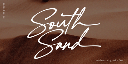 South Sand is a stylish and lovely script font. It looks stunning on wedding invitations, thank you cards, quotes, greeting cards, logos, business cards and every other design which needs a handwritten touch. This font is PUA encoded which means you can access all of the glyphs and swashes with ease! South Sand features : Uppercase & Lowercase Character Numeral & Punctuation Alternate & Ligatures Ending Swash Lowercase Multilingual
 - Ouachita Way NF by Nick's Fonts,
$10.00One in the series of fonts called Whiz-Bang Wood Type, intended to be set large and tight. Ouachita Way is an ultrabold and boxy caps and small caps font, especially well-suited for commadning headlines. Based on nineteenth-century “Grecian” fonts, the name comes from a forest and a river in Arkansas. Both versions of this font contain the Unicode 1252 Latin and Unicode 1250 Central European character sets, with localization for Romanian and Moldovan. - Framealot by Ingrimayne Type,
$14.95 Framealot is a frame or border or page divider construction kit. By choosing and mixing various elements, a wide variety of different geometric borders or frames or dividers are possible. The largest set is on the upper-case keys. There are two other sets on the lower case keys (plus the comma and period.) The characters above the number keys (the whole top row with shift, plus {}| keys are another set. And there are a couple of other small sets. Not all the sets allow vertical dividers. Outlined versions are available on the outline style, and the filled style either inverts the pattern or removes white interior sections for the outline version (and has some other differences compared to the other two versions). Use a character map to find all the parts of a set, type them out on your document, and then copy and paste to construct your border or frame. Have fun with it!
 - Mrs Onion by Hipopotam Studio,
$26.00 Mrs Onion is an all uppercase, multilayer typeface with lots of possibilities. It consists of 38 fonts that can be divided into two groups – Regulars for a day-to-day use and Monsters if you want to walk on the wild side. You can combine up to 6 styles to achieve complex and colorful effects. We created a dedicated, simple website at mrs-onion.love, where you can learn how the layering of styles works and test your own words and phrases on some predefined samples. You can also download a manual from here and enjoy it offline. Feel free to use Mrs Onion not only for posters, invitations, book covers, apps, games, and any kind of headlines but also for mugs, t-shirts, logotypes, walls, cars, and hot balloons.
 - Quebra Condensed by Vanarchiv,
$55.00 Quebra Cond is an extend display sans-serif font family, available with four widths (Extra Condensed, Condensed, Normal and Expanded) and ten weights, italics versions are available. The main strokes contain small breaks simulating modulated variations on the letterforms, these details are more present on large body sizes. All font versions contain Latin and Cyrillic encoding characters and also ligatures, case-sensitive forms, fractions, oldstyle and finally tabular figures.
 - Quebra Expa by Vanarchiv,
$55.00 Quebra Expa (Expanded) is an extend display sans-serif font family, available with four widths (Extra Condensed, Condensed, Normal and Expanded) and ten weights, italics versions are available. The main strokes contain small breaks simulating modulated variations on the letterforms, these details are more present on large body sizes. All font versions contain Latin and Cyrillic encoding characters and also ligatures, case-sensitive forms, fractions, oldstyle and finally tabular figures.
 - Hebrew Le Be Tanach by Samtype,
$149.00 This typeface is based on Guillaume I Le Bé typeface. This font has all diacritic accents including the chanting diacritic (trop) and modern Nikud (Holam Chaser, Shevana, Kamatz Katan and Dagesh Hazak).
 - Golden Treasure by Gleb Guralnyk,
$14.00 Golden Treasure is a vintage font with an original, decorative look and seamless connected letters. All available characters you can see on the 5th screenshot. Thank you and have a great day!
 - Hebrew Le Be Std by Samtype,
$59.00 This typeface is based on Guillaume I Le Bé typeface. This font has all diacritic accents including the chanting diacritic (trop) and modern Nikud (Holam Chaser, Shevana, Kamatz Katan and Dagesh Hazak).
 - Cardilan Tatto by Romie Creative,
$21.00 Introducing our new product called Cardilan font. Cardilan includes upper and lower case letters, numbers, various kinds of punctuation and ligatures. All lowercase letters include line endings and alternative fonts.
 - Scalar Biform NF by Nick's Fonts,
$10.00 Here's a trip back to the Disco Age, based on a font called Gemini Biform from Fotostar. Big, bold, brassy and sassy. Both versions support the Latin 1252, Central European 1250, Turkish 1254 and Baltic 1257 codepages.
 - Rosegrace by Balpirick,
$15.00 Rosegrace is a Modern Handwritten Script Font. Rosegrace feels equally charming and elegant. It looks stunning on wedding invitations, thank you cards, quotes, greeting cards, logos, business cards and every other design which needs a customized touch. This font is PUA encoded which means you can access all of the glyphs and swashes with ease! This font includes - also multilingual support - Uppercase Beginning Swash - Lowercase Beginning & Ending Swash Enjoy the font, feel free to comment or feedback, send me PM or email. Thank you!
 - Caltic by Ingrimayne Type,
$12.95 Caltic-Holiday, Caltic-Festival, and Caltic-Straight are three eye-catching, very bold typefaces that are suitable for posters and signage. Caltic-Holiday and Caltic-Festival base letter shapes on trapezoids with curved sides but with curves that are reversed going from one to the other. Caltic-Straight has letters based on trapezoids with straight sides. None are suited for text and with their built-in spacing will not work as all upper-case or all lower-case. All three come in two widths, regular and wide, giving the Caltic family six members. Caltic has nothing to do with Celts. The Calt refers to the calt or contextual alternative OpenType feature that makes this typeface work. When the letters on the upper-case keys alternate with the letters on the lower-case keys, they fit snuggly together. As long as the user has a word processor that supports the contextual alternatives feature, there is no need for the user to alternate letters; the calt feature does it automatically. Although the fonts seem similar to hand-drawn lettering that was done on posters and signs during the hippie era of the 1960s and 1970s, I can find nothing quite like them. My inspiration for them is older, in a newspaper from 1932 that led to the typeface family PoultySign. Caltic (and Lentzers) are the result of seeing what else I could do with the inspiration that sprang from that 1932 newspaper.
 - Pink Lemonade by Typadelic,
$19.95 Pink Lemonade (formerly called Fresh Paint) is just like cool, tart lemonade on a hot summer’s day...refreshing! With varying widths and irregular sizes of the lowercase letters, Pink Lemonade lends a bouncy rhythm to text. Works very well for scrapbooking, invitations, children’s books, recipe books, titling, display purposes, etc.
 - 99 Names of ALLAH Handwriting by Islamic Calligraphy75,
$12.00 We have transformed the “99 names of ALLAH” into a font. That means each key on your keyboard represents 1 of the 99 names of ALLAH Aaza Wajal. The fonts work with both the English and Arabic Keyboards. We call this Calligraphy "Handwriting" for obvious reasons. The first "Alef" has a "fatha", this indicates that the name can be pronounced only one way, "AR-RAHMAAN". (in the zip file you will find a pdf file explaining the differences in the "harakat", pronunciation and spelling according to the Holy Quran). The calligraphy is very easy to read, no letters overlaps and the decorative symbols are at minimum. Decorative letters used in this calligraphy: "Mim, Aain, Sin, HHe, He, Saad & Ta". Purpose & use: - Writers: Highlight the names in your texts in beautiful Islamic calligraphy. - Editors: Use with kinetic typography templates (AE) & editing software. - Designers: The very small details in the names does not affect the quality. Rest assured it is flawless. The MOST IMPORTANT THING about this list is that all the names are 100% ERROR FREE, and you can USE THEM WITH YOUR EYES CLOSED. All the “Tachkilat” are 100% ERROR FREE, all the "Spelling" is 100% ERROR FREE, and they all have been written in accordance with the Holy Quran. No names are missing and no names are duplicated. The list is complete "99 names +1". The +1 is the name “ALLAH” 'Aza wajal. Another important thing is how we use the decorative letters. In every font you will see small decorative letters, these letters are used only in accordance with their respective letters to indicate pronunciation & we don't include them randomly. That means "mim" on top or below the letter "mim", "sin" on top or below the letter "sin", and so on and so forth. Included: Pdf file telling you which key is associated with which name. In that same file we have included the transliteration and explication of all 99 names. Pdf file explaining the differences in the harakat and pronunciation according to the Holy Quran. Here is a link to all the extra files you will need: https://drive.google.com/drive/folders/1Xj2Q8hhmfKD7stY6RILhKPiPfePpI9U4?usp=sharing
 - AT Move Herengracht by André Toet Design,
$39.95 HERENGRACHT (Patricians' Canal or Lord’s Canal) is the first of the three major canals in the city centre of Amsterdam. The canal is named after the heren regeerders who governed the city in the 16th and 17th century. The most fashionable part is called the Golden Bend, with many double wide mansions, inner gardens and coach houses on Keizersgracht. Former bureau of André Toet (SO)Design was situated there for over 32 years, it was about time to name one of our fonts to: HERENGRACHT. Concept/Art Direction/Design: André Toet © 2017
 - Lazy Dude by Gleb Guralnyk,
$14.00 Hi, introducing a creative bold font Lazy Dude. It's an all caps typeface with smooth curvy shape. Lazy Dude has a wide languages support with west european and cyrillic characters (check out all available characters on previews). Thank you and have a nice day!
 - Vinho De Amora by Mans Greback,
$59.00 Vinho De Amora is a truly vintage serif font. Drawn by Mans Greback between 2019 and 2021, this font is created with inspiration from wine cellars, painted typography and genuine quality produce. It has a distinct sharp character, steady legs and a bold and wide appearance. The Vinho De Amora family consists of three styles: Black, White and Stencil; each one geometrically consistent and complimenting, perfect for stacking on top of each other to create more variations. The font is built with advanced OpenType functionality and has a guaranteed top-notch quality. It has extensive lingual support, covering all European Latin-based languages. It contains all characters and symbols you'll ever need, including all punctuation and numbers.
 - Chiavettieri by Kostic,
$50.00 Chiavettieri draws inspiration from Humanist types, marked by low contrast between thick and thin strokes and the angle of stress in the bowls of letters. On the other hand, generous x-height, clean angled serifs and sharp cuts in the ball terminals suggest a more contemporary look. All these characteristics make it a robust, well balanced, legible typeface ideally suited for book text, editorial and publishing, as well as web and screen text. With distinct Italics, small capitals, complete set of superior lowercase (Latin), oldstyle and lining figures (each in tabular and proportional widths), ligatures, fractions, superior and inferior characters – Chiavettieri is equipped for proper typography.
 - FF Mutual by FontFont,
$50.99 FF Mutual is a friendly geometric sans serif full of subtle, unexpected details. Designer Luis Bandovas drew inspiration from an unlikely source—the credits from one of his favorite childhood shows, Space 1999—and turned that spark into a typeface that is warm and approachable, but contemporary. Bandovas built FF Mutual on a geometric skeleton, but the typeface has enough humanist touches to offset the rigidity usually found geometric designs. These touches are most apparent in the italics, where curved strokes on the “a” and “l” bring a softness to text. Generous spacing, angular details on letters like the “r” and “t,” and flared terminals on the “e,” “s,” and “c,” add further character to the design. FF Mutual’s bold shapes and retro-inspired warmth make it ideal for headlines, where the subtle details can really shine. The typeface is similarly well-suited for small blocks of text such as captions and call-outs, packaging design, and branding.
 - Carlingtown by Red Rooster Collection,
$60.00 This old victorian typeface was originally called Constantia. Since that name was already in use, we decided on a the new name of Carlingtown. Digitally engineered by Steve Jackaman and Ashley Muir.
 - Federico by Olga Umpeleva,
$30.00 Federico is a typeface based on the handwriting of Federico Garcia Lorca, the eminent Spanish poet and playwright (1898-1936). Original version was designed for a book about Lorca. The face has two styles. One looks like an original poets writing, the second looks like if Lorca would write with a ball pen. Federico includes many alternative glyphs and ligatures, which make it look like a real writing of an emotional, negligent, creative man. Despite the fact that Garcia Lorca has written in spanish, the font has western and eastern european, cyrillic, turkish letters.