10,000 search results
(0.042 seconds)
- Ravensara Sans by NaumType,
$19.00 Ravensara Sans — fashionable, high-contrast humanist sans. Ravensara family was born from the idea of taking the concept of Didone to weight extremes. Ravensara Sans is available in 7 weights, including Thin, Light, Regular, Medium, SemiBold, Bold and Black. Depending on weight, Ravensara Sans, like the other members of this font family, show quite different behavior. Heavy weights function above all as display fonts and work particularly great in all-caps. Medium weights of Ravensara Sans represent humanist grotesque, descended from the pages of fashion magazines. Thin weight perfectly complements the others if you need an especially wide choice of weights. Also, all the weights work great in all-caps. Ravensara Sans is a part of the Ravensara superfamily, united by the same anatomy, which currently also includes Ravensara Serif and Ravensara Stencil. If you need to achieve classic Haute Couture look — Ravensara Sans is a great choice. It’s a perfect choice for fashion logos, headlines, short texts, magazines, due to its simplicity looks great in oversize typography, branding, identity, website design, album art, covers, posters, advertising, etc. Ravensara Sans extends multilingual support to Basic Latin, Western European, Euro, Catalan, Baltic, Turkish, Central European, Pan African Latin and Afrikaans.
 - John Sans by Storm Type Foundry,
$49.00 The idea of a brand-new grotesk is certainly rather foolish – there are already lots of these typefaces in the world and, quite simply, nothing is more beautiful than the original Gill. The sans-serif chapter of typography is now closed by hundreds of technically perfect imitations of Syntax and Frutiger, which are, however, for the most part based on the cool din-aesthetics. The only chance, when looking for inspiration, is to go very far... A grotesk does not afford such a variety as a serif typeface, it is dull and can soon tire the eye. This is why books are not set in sans serif faces. A grotesk is, however, always welcome for expressing different degrees of emphasis, for headings, marginal notes, captions, registers, in short for any service accompaniment of a book, including its titlings. We also often come across a text in which we want to distinguish the individual speaking or writing persons by the use of different typefaces. The condition is that such grotesk should blend in perfectly with the proportions, colour and above all with the expression of the basic, serif typeface. In the area of non-fiction typography, what we appreciate in sans-serif typefaces is that they are clamorous in inscriptions and economic in the setting. John Sans is to be a modest servant and at the same time an original loudspeaker; it wishes to inhabit libraries of educated persons and to shout from billboards. A year ago we completed the transcription of the typefaces of John Baskerville, whose heritage still stands out vividly in our memory. Baskerville cleverly incorporated certain constructional elements in the design of the individual letters of his typeface. These elements include above all the alternation of softand sharp stroke endings. The frequency of these endings in the text and their rhythm produce a balanced impression. The anchoring of the letters on the surface varies and they do not look monotonous when they are read. We attempted to use these tricks also in the creation of a sans-serif typeface. Except that, if we wished to create a genuine “Baroque grotesk”, all the decorativeness of the original would have to be repeated, which would result in a parody. On the contrary, to achieve a mere contrast with the soft Baskerville it is sufficient to choose any other hard grotesk and not to take a great deal of time over designing a new one. Between these two extremes, we chose a path starting with the construction of an almost monolinear skeleton, to which the elements of Baskerville were carefully attached. After many tests of the text, however, some of the flourishes had to be removed again. Anything that is superfluous or ornamental is against the substance of a grotesk typeface. The monolinear character can be impinged upon in those places where any consistency would become a burden. The fine shading and softening is for the benefit of both legibility and aesthetics. The more marked incisions of all crotches are a characteristic feature of this typeface, especially in the bold designs. The colour of the Text, Medium and Bold designs is commensurate with their serif counterparts. The White and X-Black designs already exceed the framework of book graphics and are suitable for use in advertisements and magazines. The original concept of the italics copying faithfully Baskerville’s morphology turned out to be a blind alley. This design would restrict the independent use of the grotesk typeface. We, therefore, began to model the new italics only after the completion of the upright designs. The features which these new italics and Baskerville have in common are the angle of the slope and the softened sloped strokes of the lower case letters. There are also certain reminiscences in the details (K, k). More complicated are the signs & and @, in the case of which regard is paid to distinguishing, in the design, the upright, sloped @ small caps forms. The one-storey lower-case g and the absence of a descender in the lower-case f contributes to the open and simple expression of the design. Also the inclusion of non-aligning figures in the basic designs and of aligning figures in small caps serves the purpose of harmonization of the sans-serif families with the serif families. Non-aligning figures link up better with lower-case letters in the text. If John Sans looks like many other modern typefaces, it is just as well. It certainly is not to the detriment of a Latin typeface as a means of communication, if different typographers in different places of the world arrive in different ways at a similar result.
 - Ringlovely by Juncreative,
$17.00 Ringlovely is an elegant and flowing handwritten font. It is PUA encoded which means you can access all of the glyphs and swashes with ease! It features a varying baseline, smooth lines, gorgeous glyphs and stunning alternates. It maintains its classy calligraphic influences while feeling contemporary and fresh. Fall in love with this font and bring your projects to the highest levels!
 - Paradisa by Slex Studio,
$11.00 Paradisa is an elegant and flowing handwritten font. It is PUA encoded which means you can access all of the glyphs and swashes with ease! It features a varying baseline, smooth lines, gorgeous glyphs and stunning alternates. It maintains its classy calligraphic influences while feeling contemporary and fresh. Fall in love with this font and bring your projects to the highest levels!
 - Discolicious by Hanoded,
$15.00 Put the needle in the groove and jive baby! Discolicious brings back the golden age of moustaches and sideburns, psychedelic tie-dyes and bell bottoms. Use this ‘bubblegum’ disco font for your product packaging, magazines and party posters and they’ll look off the hook! Comes with a primo amount of diacritics, so you can let it all hang out! Word!
 - Handayani by RahagitaType,
$17.00 Handayani is a flowing and neat lettered handwritten font, that feels equally charming and elegant. This font is PUA encoded which means you can access all of the glyphs and swashes with ease! It features a varying baseline, smooth lines, gorgeous glyphs and stunning alternates. Fall in love with its incredibly versatile style and use it to create spectacular designs!
 - Zhivilia by Slex Studio,
$11.00 Zhivilia is an elegant and flowing handwritten font. It is PUA encoded which means you can access all of the glyphs and swashes with ease! It features a varying baseline, smooth lines, gorgeous glyphs and stunning alternates. It maintains its classy calligraphic influences while feeling contemporary and fresh. Fall in love with Zhivilia and bring your projects to the highest levels!
 - Fearless Queen by Gassstype,
$25.00 Introduce, New Font in Fearless Queen Inspired from old skool graffiti Sketch and street art, we created this Typeface. Drawn in Procreate app, then vectorized and crafted carefully with passion, love and Prides :). Fearless Queen Typeface Suitable for many design project, branding, packaging, logo, wall art, headline, template, banner, poster, and many more projects. These include all caps, punctuation, and numerals.
 - Challiren by Sealoung,
$10.00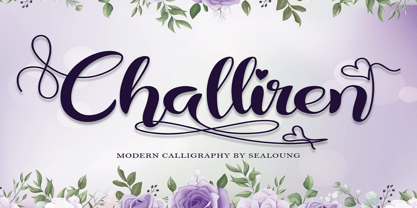 Challiren is an elegant and flowing handwritten font. It is PUA encoded which means you can access all of the glyphs and swashes with ease! It features a varying baseline, smooth lines, gorgeous glyphs and stunning alternates. It maintains its classy calligraphic influences while feeling contemporary and fresh. Fall in love with this font and bring your projects to the highest levels!
 - Marshill by ErlosDesign,
$15.00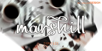 Marshill is an elegant and flowing handwritten font. It is PUA encoded which means you can access all of the glyphs and swashes with ease! It features a varying baseline, smooth lines, gorgeous glyphs and stunning alternates. It maintains its classy calligraphic influences while feeling contemporary and fresh. Fall in love with this font and bring your projects to the highest levels!
 - Buffalo Western by Kustomtype,
$25.00 Frederick Cody, as known as Buffalo Bill, and his renowned travelling Western Circus are now celebrated through the creation of the Buffalo Circus and the Buffalo Western type fonts, both developed quite in the spirit of the stirring wood type fonts from the 19th century. All characters are fully hand traced and vectorized and provided with appealing glyphs and cool catchwords.
 - Hello Hana Script by madjack.font,
$13.00 Hello Hana Script is an elegant and flowing handwritten font. It is PUA coded which means you can access all glyphs and swashes with ease! It features varied baselines, smooth lines, gorgeous glyphs and stunning alternatives. It maintains a classy calligraphic influence while feeling contemporary and fresh. Fall in love with this font and take your projects to the highest level!
 - Hello Shilla by AEN Creative Studio,
$12.00 Hello Shilla is an elegant and flowing handwritten font. It is PUA encoded which means you can access all of the glyphs and swashes with ease! It features a smooth lines, gorgeous glyphs and stunning alternates. It maintains its classy calligraphic influences while feeling contemporary and fresh. Fall in love with Hello Shilla and bring your projects to the highest levels!
 - Buffalo Circus by Kustomtype,
$25.00 Frederick Cody, as known as Buffalo Bill, and his renowned travelling Western Circus are now celebrated through the creation of the Buffalo Circus and the Buffalo Western type fonts, both developed quite in the spirit of the stirring wood type fonts from the 19th century. All characters are fully hand traced and vectorized and provided with appealing glyphs and cool catchwords.
 - Belwe by ITC,
$29.99The typeface Belwe, created in 1926 by German typographer and teacher Georg Belwe, has an uncommon style that is difficult to describe. It is a synthesis of many different genres: it is a slab serif with Art Nouveau style but also with many blackletter influences. The angled serifs on the ascenders and the calligraphic flourishes on the the upper and lowercase V, W, and Ys reference marks made by pens. There are also many other special characters that are unlike any other designs. Have a look at the fun lowercase a, the quirky lowercase f and g, and the unique C, F, L, and R for the uppercase. This design works especially well for display sizes, but is also good for short amounts of text. The mood and image suggested by this typeface is great for menus, invitations, and signs when you want to send a personal and friendly message. It's Art Nouveau roots also give it a place in history for designs from the Victorian period up through the 1920's and 30's - Belwe Mono by ITC,
$29.99 The typeface Belwe, created in 1926 by German typographer and teacher Georg Belwe, has an uncommon style that is difficult to describe. It is a synthesis of many different genres: it is a slab serif with Art Nouveau style but also with many blackletter influences. The angled serifs on the ascenders and the calligraphic flourishes on the the upper and lowercase V, W, and Ys reference marks made by pens. There are also many other special characters that are unlike any other designs. Have a look at the fun lowercase a, the quirky lowercase f and g, and the unique C, F, L, and R for the uppercase. This design works especially well for display sizes, but is also good for short amounts of text. The mood and image suggested by this typeface is great for menus, invitations, and signs when you want to send a personal and friendly message. It's Art Nouveau roots also give it a place in history for designs from the Victorian period up through the 1920's and 30's
 - Zombie Drip by Adita Fonts,
$11.00 Zombie Drip is a hauntingly bold font that will send shivers down your spine. This spine-chilling typeface features a unique dripping effect on each letter, giving it an eerie and macabre appearance. With its thick and powerful strokes, Zombie Drip commands attention and creates an atmosphere of suspense and horror. Perfect for Halloween designs, horror-themed projects, or anything that needs a touch of creepy allure, Zombie Drip adds a bone-chilling twist to your typography. Let the letters drip with fear!
 - Graffito, as its name suggests, draws its inspiration from the raw, expressive energy found in street graffiti. This font is not merely a typeface; it's an artistic statement, embodying the rebelliou...
- Celtic Knots by Clanbadge,
$20.00 While it is obvious that this is an ornamental style font, it is more than that: it is a Celtic Knotwork design tool! Irish, Scottish, Welsh, even Norse and Viking cultures have used knotwork designs for millenia. These ancient traditional interwoven designs are experiencing a revival as Celtic culture gains exposure in the modern world. Intricate Celtic knots are featured everywhere from jewelry to tattoos. While many enjoy them simply for their beauty and fascinating twists, they can also be used to add an air of myth, magic and mystery to any project. The interlaced lines make them perfect for wedding invitations, borders, dividers and rules, web graphics, and logos. I began using Celtic knotwork designs in my own work as part of my knifemaking and jewelry making hobbies. I read all of the books I could find about Celtic knots and at first I drew them by hand with pencil and paper. Then as I realized how nice it would be to have "undos" I switched over to using Corel Draw. Draw proved to be a natural for this type of artwork with tools like contour and the trim function. But even with these great tools, it was still tedious to create these designs. I noticed that I was able to reuse a lot of parts in repetitive sections. I developed a small library of reusable bits and chunks of Celtic designs. I found them so useful and fun to work with that I began thinking about ways to market my Celtic design kit. I thought about CDR and EPS formats, but then I thought of creating this toolset as a True Type Font. That way anyone with ANY program that uses fonts could easily create Celtic knotwork designs. Word processors, embroidery programs, engraving programs, jewelry design programs, CAD/CAM programs...almost every program can use fonts. I was also interested in CNC work and thought that this font would work well for applications such as laser etching, vinyl signs, and machining. With that in mind, I designed each character of the font with extremes of accuracy. If one character from the font is used at one inch tall, every control point will be placed to an accuracy of better than 0.0001 inch. I wanted every piece to meet exactly with the next, with no possibility for misalignment. The different styles are all very carefully created to fit accurately with each other. So the Filled Style fits exactly into the Outline Style, and the Inverse Style fits precisely around the Outline Style so as to make up the background behind the knotwork. Combining the styles allows you to have complete creative control. By assembling the nearly 200 pieces it is quite easy to produce very complex designs. It is actually a bit like playing with a puzzle and many people really enjoy putting the pieces together to make designs. In fact, I have had many customers tell me of how they love playing with this font and making knots into the wee hours of morning. If you like puzzles then you will absolutely love this font! And creating the patterns is just the beginning of the fun! If you apply your favorite Photoshop tricks on them you can make anything from dazzling chrome knotwork to carved stone. Photoshop plug-ins like SuperBladePro are great for converting knotwork text into corroded bronze or rusted iron. Use your knotwork to add texture to a virtual landscape, or add them as surface embelishments on architecture and furniture. You can also make round knotwork by using this font with "WordArt" (WordArt is included with every copy of Microsoft Word. See http://clanbadge.com/round_knots.htm for a tutorial on how to make round knotwork). For Crafters there are limitless uses for this font. It has been used for embroidery, jewelry, leatherwork, stencils, stained glass, quilting, painting, pyrography, woodcarving and lots more. We have even sold copies to monks for use in decorating handmade books!
 - Plague Master by Hanoded,
$15.00 I admit: I had a bit of a crazy week when I thought up an drew this font. I broke my arm during kickboxing training on monday, leaving me in a cast - unable to do most everyday things, like getting a good night's sleep (try sleeping with a humongous cast on your arm). Thank goodness, it is my left arm, so I can still draw letters and use my laptop. So… this font has been made entirely using one arm! It is a bit of a horror font - it sort of sums up my mood right now. Glyphs have very little spacing, adding to the evil look of Plague Master. Comes with a lethal amount of diacritics.
 - Morganhand by Morganismi,
$9.00 Morganhand is a very individual typeface based on the handwriting of Finnish outsider artist Heikki Morgan Hämäläinen. Its economical lines make it very serviceable for numerous uses like cards, notes, prints, comics and so on. Morganhand Outline is based on Morganhand Regular, a handwritten font imitating the writing of Finnish outsider artist Heikki Morgan Hämäläinen. Every drawn line of each glyph is outlined giving a fun expression. The two fonts can be used separately or mixed together. Mightly usable in cards, notes, prints, comics etc. Morganhand Outline supports many European languages. Morganhand supports many European languages. The font works fine with its sister Morganhand Outline which is kind of a modification of it.
 - FF Fago Monospaced by FontFont,
$67.99 FF Fago Thanks to his many years of involvement in major corporate type projects, Ole Schäfer had the necessary resources from which to construct his FF Fago™. The result is an extended family that provides comprehensive typographic support and whose qualities come to the fore in all relevant contexts ? from print to office through internet and wayfinding systems. FF Fago The sizable x-height together with the generous and open design of the characters ensure that the sans serif Fago remains clearly legible even in small point sizes or in potentially difficult situations, such as on wayfinding systems. A subtle contrast in line weight and letter forms that are reminiscent of those of an antiqua typeface provide the font with a restrained yet friendly and lively tone. Available in five weights, each with three different kerning widths and matching genuine italic variants, FF Fago is equipped for practically every situation. There are also small caps, oldstyle and lining figures, a selection of ligatures and geometric symbols. The range of potential applications of this universal font is almost inexhaustible ? it can be used in packaging design, on signs, posters and even for setting longer text sections. Fago is the ideal partner for those working on major corporate projects! FF Fago Correspondence Sans und Correspondence SerifThe Correspondence versions of Fago have been optimized for use in the business environment and in office communication. The carefully modified characters have a particularly robust feel, so that the clear, easily differentiated glyphs allow for straightforward communication even on screen. With these aims in mind, Schäfer has not only adjusted the x-height, but has provided certain letters in the sans variant ? such as the lowercase "i", the "r" and the uppercase "I" ? with serifs. Correspondence Serif, on the other hand, has been conceived as a slab serif throughout and in appearance has the look of the letters produced by the old office typewriting machines. An individual note has been added by providing a few unusual serif forms, as for example in the case of the "m", the "v" and the "y". Both Correspondence Sans and Serif are available in two weights with complementary italic versions and thus are ideally suited for use with standard office programs. This is all rounded off with a selection of office symbols. FF Fago Monospaced The use of a few typographic tricks is necessary to ensure that the letters of the alphabet appear to have the same width. Narrow letters such as "r" and "i" have been made to seem more expansive by using prominent serifs while the broader letters ? a good example is the "m" ? have the forms seen in a condensed font. And it is thanks to this design strategy that Fago Monospaced has the character of old typewriter text. What was once unavoidable because of the technology of the time is now a welcome alternative that can be used for the purposes of emphasis. As an additional supplement to the Fago superfamily, Fago Monospaced can be used, for example, to set short notes or draw attention to special text passages. There are three weights, in their original form without italic variants or small caps, but offering an alternative, technical form of the "0" with a crossbar.
 - Marvelo by Gian Studio,
$12.00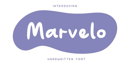 Introducing Marvelo is a comic display font that is fun adn clean. Suitable for use on quotes, displays, logos, branding, social media post, advertisements, product packaging, product designs, labels, photography, watermarks, invitations and more. Displayed fonts: Uppercase, Lowercase, Numbers, Symbols, Accents also Multilingual Support Enjoy the font, feel free to comment or feedback, send me a PM or email. Thank You!
 - Technobaby JF by Jukebox Collection,
$32.99 Technobaby is a funky futuristic font done with modular letterforms. This typeface arose from playing around with the basic rounded rectangle shape. Jason wanted to see how many different letters he could create by simply changing the locations of the slots cut into the rectangles. Overall it lends the font a very cohesive and unique look. Get your "mod" on with Technobaby!
 - Numis by Tyler Jamieson Moulton,
$11.00 Numis was born out of a coin collecting hobby. A quick survey of coins from the late medieval to modern periods to today led to this unicase design. The rounded corners and smoothed edges are meant to evoke a the slightly worn letterfaces found on old coins; a process that tends to bolden the text before being rubbed away completely.
 - Plantain by CastleType,
$49.00 Plantain Stencil is based on Plantain which in turn is my interpretation of Plantin Adweight, which was one of my first commissioned projects (by Smarter Image, long before they went bankrupt). Plantin Adweight is one of the most beautiful designs of the Plantin family, which is a modern revival typeface, cut under the direction of F. H. Pierpont in 1913, who based the design on that of a famous 16th century printer, Christophe Plantin, for whom Pierpont’s font was named. The stencil cut of Plantain adds a bit of sparkle to the design. Supports most European languages that use the Latin alphabet.
 - LTC Jenson by Lanston Type Co.,
$24.95 Jenson Oldstyle was designed by J. W. Phinney of the Dickinson Type Foundry in 1893. Jenson is based on the 'Golden Type' designed by William Morris in 1890 for his private press editions under the imprint of the Kelmscott Press. The original digital Lanston version of this face included a companion Oblique. This remastered set instead features a true italic based on the 1893 ATF italic version as well as a newly digitized Jenson Heavyface based on Phinney's design of 1899. Jenson Italic Pro features alternate lowercase forms based on ATFs then contemporary Cushing Oldstyle Italic.
 - Charming by Sensatype Studio,
$15.00 Charming is a classy font and decorative font for brand and logo design. Inspired by the name, we try to develop some functional font with classy touch and decorative in one package. Based on our experience as a graphic designer who works for a lot of companies, we often are requested to design any graphics with a classy style and decorative. So, we try to brainstorming and create this font to make the idea is going out. This is perfect for BRANDING and LOGO DESIGN. You will get classy, elegant, and certainly unique logos with this font. Charming font is also included full set of: uppercase and lowercase letters multilingual symbols numerals punctuation 2 Style Font Wish you enjoy our font. :)
 - Monly by WildOnes,
$10.00 The main idea behind creating Monly typeface was to combine playfulness with a strong letter construction backbone, so all the letters would stand tall and firm, but not to lose the playfulness. Like people, who grow up but try to save their inner child. By doing so and combining all this, the typeface achieves a great readability and appealing look. Monly font suits best for logos, headlines and small text blocks, but can also be used for big text blocks if the style suits the purpose.
 - MMC Grafik by MMC-TypEngine,
$37.00 Modular Matrix «Calligraffiti» Robotic Letterform Typeface! New Edition. Redesigned with Obliques and OT Features! This Typeface was inspired by Graffiti Calligraphic Broad Markers and Underground Lettering Technic and Style, grid based by squares perpendiculars and Diagonals… Is Part of a juxtaposed “Type-Game” based on inversions and rotations… Type cool legible digital manuscript Aesthetics body text, scripts, lyrics, articles; Plus, Create Fancy Display’s Branding designs, Packaging, Publishing, Advertisement, Posters, Art Support, Motion, Games, tastes good to text on everything! Experiment Automatic and Responsive OpenType Features, like Fractions, Ordinals, Nominators, Denominators, Scientific Inferiors, Numerators, Localized forms and Kerning. Previous Released by MMC-Typo* 2020. Post Released by MMC-TypEngine 2022. Tip 1: Combine styles into infinite possibilities of Digital Monochromatic or Color Typesetting, by ‘central pasting’ or you may dislocate layers for improvisations! TIP 2: *BLIND BLOCKS ‘FREE-STYLES’ Use Block «Free Styles» 1 & 2 also to add 3D, change 3D directions by switching Block 1 to Block 2, that way you can Zig-Zag words and lines. *Also shift the block layer up to bottom limit, it makes the 3D direction turn upside down. *All Styles have 917 Glyphs. Follow the Groove!! & Power to The Pixel!! Greetings !! André, MMC-TypEngine.
 - NT Gagarin by Novo Typo,
$26.00 Anna Gagarin is the loving matriarch of the Gagarin Family. Her life was full of love and passion. She had several affairs with Futurist and Contstructivist artist in the beginning of the 20th century. She was in love with the Russian poet Vladimir Majakovski (born on July 19th, 1893 and died in Moscow on the April 14th, 1930). She gave birth to his son Boris. She called him 'a cloud with trousers'. After this love story, Anna Gagarin met the designer and artist Gustav Klucis in Italy. His radical and political ideas were much too childish for her. After a period of love and passion Anna gave birth to his son. At that time they were in Italy, which explains his italic forms. After her return to Moscow in the beginning of the 1920's Anna was introduced by Alexander Rodchenko. They were heavenly in love but Ilja Stepanova was very jealous on her husband. Anna once said that 'Alexander fills mine construction with love...' That phrase can be an explanation for the term Constructuvism as an art movement. Alexander was the great love of Anna. She gave birth to their love-baby Dimitri Gagarin. That night Alexander designed his most famous poster. A decade before that Anna told it was 'a time for a change'. In a local bar in Sint Petersburg she met Gregory Rasputin. At that time Rasputin was a well known person and a respected member of the Sint Petersburg upper class.His diabolic character influenced Anna and after several months she gave birth to their son Kurt. He inherited the main characteristics of his father. The Gagarin Family wants to give love and wants be loved...
 - Hymers JNL by Jeff Levine,
$29.00 Born on May 8, 1892 in Reno Nevada, Lewis Franklin (“Lew” ) Hymers left an indelible mark as a caricaturist, cartoonist and graphic artist. At the age of twenty [in 1912] he worked for the San Francisco Chronicle. During World War I he worked for the Washington Post. He even was employed for a time by Walt Disney as an animator - but most of his life was spent in either Tujunga, California or his birthplace of Reno, Nevada as a self-employed illustrator. Hymers inked a feature for the Nevada State Journal called “Seen About Town”, which was published during the 1930s and 1940s. In this panel, he caricaturized many of the familiar faces around Reno. He also designed signs, logos, post cards and numerous other commercial illustrations for clients, but what has endeared him to a number of fans was his vast library of stock cuts (the predecessor to paper and electronic clip art) which feature his humorous characters in various professions and life situations. So popular is his work amongst those “in the know” that a clip art book collection of over seven hundred of his drawings that was issued by Dover Publications [but long out of print] commands asking prices ranging from just under $15 to well over $100 for a single copy. Lew Hymers passed away on February 5, 1953 just a few months shy of his 61st birthday. Although his artwork depicts the 1930s and 1940s lifestyles, equipment and conveniences, more than sixty years after his death they stand up amazingly well as cheerful pieces of nostalgia. The twenty-seven images (and some variants) in Hymers JNL were painstakingly re-drawn from scans of one of his catalogs and is but just a tiny fraction of the hundreds upon hundreds of illustrations from the pen of this prolific artist.
 - Sans Andreas by Java Pep,
$11.00 Proudly presenting the newest handwritten font called Sans Andreas. These font made by handwritten style, so all shape looks unique and natural. Sans Andreas is a family font, with 4 styles regular, italic, bold, bold italic. Sans Andreas is also perfect for all your project that has sense fun, playful, art, and .etc If you have any questions or technical support don't hesitate to comment, message or contact java.indonesian@yahoo.com. Have a nice day.
 - Scrapbooker by Sudtipos,
$29.00 After previously collaborating on the bestselling Distillery Set, Carolina Marando and Alejandro got together once again to create this Scrapbooker Set, a new series of fonts that multiply the possibilities. One reason scrapbookers became a kind of design demographic is the appeal of what they do. They make albums of memories, diaries composed of different elements that converge together to lead the viewer to a special moment in time. A paper, a photo, a letter, an event ticket, or a dry petal — everything ends up being part of a collage that tells a story. Words have a key role in such a collage. They use different shapes and forms and combinations to state what cannot otherwise be expressed. They make the collage stronger by clarifying a concept, defining an image, and solidifying a memory. These words for memory albums are the reason for this Scrapbooker Set, six different fonts with different impressions and different personalities — so each part of the memory can have its own identity. People tell you to write your own history. Now you can do that in style.
 - Compita by Studio Buchanan,
$12.00 Compita is a Neo-Grotesk(ish) typeface that started life as a love-letter to Berthold's classic. But for every rigid, Neue-Haasism, there exists an equal and opposite amount of humanist attributes – along with a deliberate dose of creative license. It has some over-emphasised features and terminal endings which help to create its friendly personality, but sits them on a slightly condensed overall width. Together they help balance each other out, creating a face that feels both affable and professional. Aff-essional perhaps? The character set contains everything the modern day designer needs, including diacritic support for over 30 languages. And It’s packed full of the usual opentype features (that most will probably ignore) – Small caps, multiple number sets, and discretionary ligatures, to name just a few. Whether it’s deployed as a display face, or as the dependable choice for text, Compita is useable across multiple disciplines. Set in online, on screen or in print – it’s proof that not everything has to be Montserrat or Raleway...
 - ITC Franklin by ITC,
$40.99 The ITC Franklin™ typeface design marks the next phase in the evolution of one of the most important American gothic typefaces. Morris Fuller Benton drew the original design in 1902 for American Type Founders (ATF); it was the first significant modernization of a nineteenth-century grotesque. Named in honor of Benjamin Franklin, the design not only became a best seller, it also served as a model for several other sans serif typefaces that followed it. Originally issued in just one weight, the ATF Franklin Gothic family was expanded over several years to include an italic, a condensed, a condensed shaded, an extra condensed and, finally, a wide. No light or intermediate weights were ever created for the metal type family. In 1980, under license from American Type Founders, ITC commissioned Victor Caruso to create four new weights in roman and italic - book, medium, demi and heavy - while preserving the characteristics of the original ATF design. This series was followed in 1991 by a suite of twelve condensed and compressed designs drawn by David Berlow. ITC Franklin Gothic was originally released as two designs: one for display type and one for text. However, in early digital interpretations, a combined text and display solution meant the same fonts were used to set type in any size, from tiny six-point text to billboard-size letters. The problem was that the typeface design was almost always compromised and this hampered its performance at any size. David Berlow, president of Font Bureau, approached ITC with a proposal to solve this problem that would be mutually beneficial. Font Bureau would rework the ITC Franklin Gothic family, enlarge and separate it into distinct text and display designs, then offer it as part of its library as well. ITC saw the obvious value in the collaboration, and work began in early 2004. The project was supposed to end with the release of new text and display designs the following year. But, like so many design projects, the ITC Franklin venture became more extensive, more complicated and more time consuming than originally intended. The 22-font ITC Franklin Gothic family has now grown to 48 designs and is called simply ITC Franklin. The new designs range from the very willowy Thin to the robust Ultra -- with Light, Medium, Bold and Black weights in between. Each weight is also available in Narrow, Condensed and Compressed variants, and each design has a complementary Italic. In addition to a suite of new biform characters (lowercase characters drawn with the height and weight of capitals), the new ITC Franklin Pro fonts also offer an extended character set that supports most Central European and many Eastern European languages. ITC Franklin Text is currently under development.
 - Sulatty by Attype Studio,
$15.00 Sullaty is a classy sans serif typeface that suitable for strong and modern looks on your works. Sulatty has two style and ending swashes for chracter j, g & y. Combine this alternate to make a gorgeous typeface for your design! Two style Font: Regular & Outlined Sulatty is perfect for sport product, branding, logo, invitation, stationery, product packaging, merchandise, monogram, blog design, game titles, cute style design, Book/Cover Title and more. Features : - Ligatures - Ending Swashes - Multilingual Support - Made it into separated file to make it easier to use by beginner & separated file user can use the font with software which doesn't accept open type features. --- Hope you enjoy with our font! Attype Studio
 - Arabesque by Scholtz Fonts,
$15.00 Arabesque is a romantic, ornamental font, in which intertwining, flowing lines and generous loops enhance the beauty of the basic shapes. Arabesque successfully combines legibility with a decorative, sumptuous style. In its European interpretation it was also called "Moresque". The font "Ability" was the origin of Arabesque, however, numerous, subtle changes set it apart. Arabesque, is characterised by a small x-height and relatively large ascenders and descenders (loops). The loops are created out of two or three delicate, intertwined lines that contrast with the much less expansive bowls and shapes of the lowercase letters. The capitals, more complex and composed of intertwined lines, echo the elegance of the loops on the lowercase letters. As a result of these changes "Arabesque" is both more readable, controlled and extravagant than "Ability". Suggestions for use: - wedding stationery - greeting cards - valentines day media - beauty products media - lingerie tags - women's magazine pages - classical music media - award certificates - magazine pages The font is fully professional: carefully letterspaced and kerned. It contains over 235 characters - (upper and lower case characters, punctuation, numerals, symbols and accented characters are present). It has all the accented characters used in the major European languages. Arabesque works well in Application packages such as Microsoft Word that do not support professional kerning.
 - Chaotic Circuit - Unknown license

- Static Cling - Unknown license


