10,000 search results
(0.037 seconds)
- Semiautonomous Subunit Clade by Megami Studios,
$34.95 Based on a weird thought of medieval monks hunched over PCs in an abbey on the moon, Semiautonomous Subunit Clade (SSC) is an attempt to find a medium between blackletter and sci-fi fonts. SSC is ideal for those looking for a unique touch in their typography...or who just want that cyber goodness.
 - Breeze by Linotype,
$29.99Breeze is a fun font from Frank Marciuliano where the letters are formed like the sails from the boat. He may have been inspired from the sailboats which he sees on the walks along the shore on the Hudson River. There are two forms available. Left and right define the direction of the blowing wind. - Maximillian CT by CastleType,
$19.00 Another one of those faces that caught my eye in one of my art deco type books, and I wanted it. After I finished the face, I noticed that there is a more clean-cut version of this face in digital format, but my version retains more of the funkiness of the original drawings.
 - Westward JNL by Jeff Levine,
$29.00 Westward JNL is an interesting variation on the popular wood type known as a French Clarendon style, or more popularly known as Western or Circus lettering. Based on an A-Z set of wood type pieces, this novelty approach of curved and wavy horizontal strokes is sure to grab attention when applied to headlines.
 - Caesar Dressing Pro by Open Window,
$19.95 Caesar Dressing is a 'Markers' take on a Greek alphabet. Open Window fonts gravitate towards more experimental or spontaneous renderings and this one doesn't look out of place next to the most experimental of those. It also maintains the geometric balance of a classic Greek-font quite effectively. Designed by Dathan Boardman of Open Window.
 - Guglia by Leo Colalillo,
$20.00 Guglia is an extra textura typeface ispired by the gothic architecture shapes and in particular to his vertical extremization based on a rigid scheme, like the calligraphy of that period. A spire (Guglia in italian) is a tapering conical or pyramidal structure on the top of a building, often a skyscraper or a church tower.
 - Frantic Pace JNL by Jeff Levine,
$29.00 Frantic Pace JNL is based on hand lettering found on the lid of a late 1950s or early 1960s edition of the Print Craft alphabet printing set once manufactured by the Superior Marking Equipment Company of Chicago. The free-form spurred serif lettering is fun and casual; giving the impression of movement or action.
 - Amestina by Aqeela Studio,
$20.00 Amestina’s most recent letter styles are ideal for projects that call for a handwritten aesthetic, including wall displays, wedding invitations, social media post logos, commercials, product packaging, product designs, labels, photographs, watermarks, invitations, and stationery.
 - You Suckin' Thief - Unknown license

- Heinemann by Heinemann Collection,
$39.00 The Heinemann fonts were initially developed by the in-house design team at Heinemann educational publishing out of the necessity to find the perfect font for use in early primary reading books and literacy products. Basic Heinemann is defined by longer ascenders and descenders which help children to distinguish between letters; rounded edges on all letterforms help focus the reader on the individual letter shape; and modified characters (eg. a, g,) ensure instant recognition of letterforms. Heinemann Special offers further modified characters and kerning pairs ideal for dyslexic or special needs use (eg a, d, b). The Heinemann fonts were developed in partnership with children, literacy advisors, teachers of special needs/dyslexia and primary school teachers, and are now released in response to hundreds of requests from publishers, designers and teachers to purchase them. They have been trialled in schools and learning institutions over an 8 year period, and are a favorite for use in both print and electronic product. The modern, clean aesthetic of the fonts ensures that their use can span beyond educational application.
 - Island Life by Wing's Art Studio,
$24.00 Island Life is a font inspired by the loose, wavy style of the type associated with 1970s surf culture. Often found on lo-fi surf movie posters, t-shirts, and decals, it’s an aesthetic that promotes a laid-back, summer-loving style. With a zen “be like water” approach, this font has no straight edges. Behaving like letters inside a Lava Lamp, each individual character blends into a harmonious whole; perfect for groovy titles, logos and headers. The Island Life font features unique uppercase and lowercase characters, along with numerals, punctuation and language support, symbols and lots of custom ligatures for a truly hand-made look. All ligatures function automatically and can be turned on/off using the opentype features built into your software of choice. It’s the perfect font for the summer season and works great across posters, logos, t-shirts, menus and more. I recommend first laying out your text and then experimenting with warp, wave and bulge effects for some excellent results. Check out the visuals to see it in action. Enjoy!
 - Ornate Initials by Gerald Gallo,
$20.00 Style One is composed of a floral ornament rotated and reflected at 90 degree increments combined with a letter or number to form each ornate initial. The initials are A through Z and 1 through 0 for a total of 36 initials. Each initial is located under its respective key in the character set. Style Two is composed of floral ornaments rotated and reflected at 90 degree increments combined with a letter to form each ornate initial. There are two sets of initials A through Z. Under the character set the initials are negative on a positive floral background. Under the shift + character set the initials are positive on a negative floral background. Each initial is located under its respective key. Style Three is composed of floral ornaments rotated and reflected at 90 degree increments combined with a letter or number to form each ornate initial. There are two sets of initials A through Z and 0 through 9 for a total of 72 characters. Under the character set the initials are negative on a positive floral background. Under the shift + character set the initials are positive on a negative floral background. Each initial is located under its respective key.
 - Trump Script by Canada Type,
$29.95 One of the earliest fonts published by Canada Type was Tiger Script, Phil Rutter's digitization of Jaguar, Georg Trump's 1967 wild calligraphic brush face. In 2010, when the font was revisited for an update, it was shown that it too light for applications under 24 pt, and too irregular for applications over 64 pt. So the face was redigitized from scratch. This new digitization brings a more seamless contour and a much steadier stroke, and much better outlines for use at both extremes of scaling. Language support was also greatly expanded, and many alternates and ligatures were added to the redigitized character set. The name was also changed to Trump Script, to better reflect the origins of the design. Trump Script is a master calligrapher's hand producing very uncommon jolts and bursts of sharpness. It showcases some of the most suprising letter forms ever drawn, like the very unique treatments of B, K, W, Y and Z. In the lowercase one can see the cattiest g ever made, and some of the wildest shapes in the f, j, p, y and z. Trump Script comes in all popular formats. The TrueType and PostScript packages are comprised of two fonts. The OpenType version, Trump Script Pro, combines both fonts into one, and includes features for intelligent substitution in software that supports advanced typography. Language support includes Western, Central and Eastern European character sets, as well as Baltic, Esperanto, Maltese, Turkish, and Celtic/Welsh languages.
 - Kattelo by Malindo Creative,
$10.00 Introducing, Kattelo is a beautiful retro style font, with a Kattelo giving a touch of attractive design typography, Kattelo is one of the handwriting projects. It was very inspired by the famous retro typography design. Kattelo also comes with the Extruded Font version. So you don’t need extra effort to make the effect repel for this font,with Kattelo you can create many design styles. Kattelo is also equipped with 514 Glyphs, and also features OpenType. The Features includes: Stylistic Alternates, Swashes, Ligatures, and Stylistic Set.Extrude,and You can pick the alternate for all style Kattelo has given PUA encoded (fonts with special code). This Font Equipped: -Uppercase -Lowercase -Figures & Punctuation -Stylistic Alternatives -Ligatures -Extruded for All Glyph -Language Support To enable the OpenType Stylistic alternates, you need a program that supports OpenType features such as, Adobe Indesign,Adobe Illustrator CS & CorelDraw X6-X7, Microsoft Word 2010 or later versions. How to access alternate glyphs? you can see it on this link goo.gl/1vy2fv If There Any questions, Please Let Me Know,Contact Me,At malindocreative@gmail.com,Your support and suggestion is needed, And I am Happy To Help You. Thank you for your kindness and support,Hopefully Useful,And Good Luck For You.
 - Huckleberry by Canada Type,
$24.95Huckleberry is a revival and expansion of a 1973 typeface called Mark Twain, which was G. Jaeger's reaction to the popularity of VGC's Eightball (also digitized and expanded as Orotund by Canada Type) from across the ocean. Jaeger's reaction was typical German efficacy, with majuscules that surpass their inspiration in art and humour, and minuscules that could have been just the thing if one wanted to make the Eightball lowercase friendlier. Back in its day, this font reached its own heights of popularity in Western Europe, but in the Americas it was less known because art nouveau faces were being made by the hundreds in the 1970s. Round, happy and bouncy, Huckleberry comes as a timely response to public demand for big and cheerful letters. Huckleberry is also very effect-friendly. Stretch it a bit, drop-shadow it, warp it, and it will still keep its cheer and communicate the message with a smile. Huckleberry comes in all popular formats, and contains plenty of alternates sprinkled throughout the character set. - Dimelike by Balpirick,
$15.00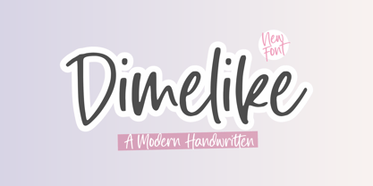 Dimelike is a Modern Handwritten Font. Dimelike feels equally charming and elegant. It looks stunning on wedding invitations, thank you cards, quotes, greeting cards, logos, business cards and every other design which needs a customized touch. - also multilingual support Enjoy the font, feel free to comment or feedback, send me PM or email. Thank you!
 - ITC Redonda by ITC,
$29.99ITC Redonda is the work of Montreal designer Gerard Mariscalchi and based on a common style of 19th century French handwriting. It comes with two sets of caps, both highly flourished, which are complemented by a refined lowercase. ITC Redonda is a distinctive upright script with intricate forms and will lend elegance to any application. - Ambicase Fatface by Teeline Fonts,
$48.00 Most fonts include uppercase and lowercase letters. Some experimentally-minded designers have proposed unicase typefaces as well: rather than having two different forms for a given letter, unicase fonts have one, chosen from the upper- or lowercase forms. Ambicase Fatface takes the next step, offering not "either/or", but rather "both/and". Each letter in Ambicase Fatface is a combination of its traditional upper- and lowercase forms, in an extra-bold style. Its inventive, hybrid forms are a bolder take on those of its 2010 sibling typeface, Ambicase Modern. Ambicase Fatface stands out as a carefully crafted experimental font: its eccentric forms do not hinder its readability. It is suitable for high-style display settings. Ambicase Fatface offers a large character set and extensive OpenType features. Most notably, in modern OpenType-aware applications, Ambicase Fatface can be set in swash mode, which features sophisticated decorative flourishes that differ depending on whether the letter is at the beginning, middle, or end of a word. Ambicase Fatface is available in two optical sizes: Regular and Poster. At very large sizes, the Poster cut, with its finer details, is recommended.
 - ForeignSheetMetal - Unknown license

- VVDS Ginsburg by Vintage Voyage Design Supply,
$10.00 Ginsburg it's a modern display all-caps font-family based on geometric forms and abstract wavy lines with an old school constructivism look. Inspired by Moses Ginsburg architecture projects. Playful, modern, suitable for many typography projects as headers, logos, block texts, etc. You may be more strict in your typography or you may be more groovy or playful with alternates characters. Use this family in vintage spirit for TV series, Podcasts titles, exhibition posters or design a modern extreme sport brochure, . Flexible, Catchy and Brazen — it's all about Ginsburg! Six widths: Thin / Light / Normal / Medium / Semi Bold / Bold. Opentype Features as Stylistic alternates, Oldstyle figures / Fractions. Multilingual
 - Utility Signage JNL by Jeff Levine,
$29.00 Utlity Signage JNL is a collection of fifty-two various "all purpose signs" we've all seen in hardware and variety stores is perfect for spot illustrations in ad copy, making one-off images for props in a stage play or production or even for novelty jokes or gags. NOTE: Usage of this font to create printed or digital "stock signs" for resale is not part of, nor allowed under the terms of the standard Jeffrey N. Levine Software License Agreement. A separate license for the manufacture and distribution of derivative products is required by contacting the font author directly. Please refer to the EULA for further details.
 - Alexander The Great by Omotu,
$19.00 BRIGHT LIGHT! A handwritten script brush font, all caps. BRIGHT LIGHT font is suitable for branding, logotype, apparel, T-shirt, Hoodie, product packaging, quotes, flyer, poster, book cover, advertising, etc. Whats Include? Opentype support Multilingual support PUA encoded Features: All uppercase, numerals, punctuations, and ligatures Accessible in the Adobe Illustrator Glyphs panel, or under Stylistic Alternates in the Adobe Photoshop OpenType menu, Adobe InDesign, Corel Draw, even work on Microsoft Word Please message me if you're unsure of any language support. Thanks for looking, and I hope you enjoy it! Please don't hesitate to drop me a message if you have any issues or queries.
 - Osovec by Dima Pole,
$27.00 This font is dedicated to the glory of the human spirit and honor. Osovec is a fortress of World War I. On the 6 August 1915, the defenders of the fortress, the Russian soldiers, against whom the enemy had used poison gas; though half-dead, were able to rise to the counter. Thus it was that 60 Russian soldiers routed the 2 thousand strong enemy army. This heroic episode has gone down in history as"Attack of the dead". The font contains more than 700 glyphs, support for all 104 European languages, all Slavic languages, a variety of OT features, including ligatures, old numerals, alternatives, ordinals, and many others.
 - Coconut Leaves by Omotu,
$16.00 COCONUT LEAVES! A handwritten display brush font, all caps. Coconut Leaves font is suitable for branding, logotype, apparel, T-shirt, Hoodie, product packaging, quotes, flyer, poster, book cover, advertising, etc. Whats Include? Opentype support Multilingual support PUA encoded Features: All uppercase, numerals, punctuations, and ligatures Accessible in the Adobe Illustrator Glyphs panel, or under Stylistic Alternates in the Adobe Photoshop OpenType menu, Adobe InDesign, Corel Draw, even work on Microsoft Word Please message me if you're unsure of any language support. Thanks for looking, and I hope you enjoy it! Please don't hesitate to drop me a message if you have any issues or queries.
 - Rockyeah by Majestype,
$19.00 Rockyeah is 3 style fonts: brush, serif and sans serif who have strong personalities and work very well in many design projects. - Rockyeah Brush made with fine brush pen with the fastest stroke movement. Comes with over 300 glyphs that will give you a vast possibility to play with each character. - Rockyeah Serif is an interpretation of Rockyeah brush. A serif font that focuses on legible, elegant and unique. With light and bold stroke combination this serif will give a modern-classic vibes on your design project. - Rockyeah Sans a geometric sans serif that focuses on legible, clean and useful for any project. This sans is an interpretation of Rockyeah Serif with the same caps height and bold stroke. This font is suitable for poster, tattoo, tees graphic, headline and etc :) Just play and rock it!
 - Konrad Kachelofen by Proportional Lime,
$9.99 Konrad Kachelofen was a printer in the city of Leipzig beginning around 1483. He printed many works by contemporary authors and also many of the classics. He acquired an unusually large amount of typefaces for his shop, a place that included a wine bar and book store. This type face is based on Typ.11:340G GfT510 Gesamtkatalog der Wiegendrucke and is similar to Proportional Lime’s “Kachelofen'' font. The major differences are that the whole miniscule set is slimmer and the majuscule set has different style glyphs and this face was used solely for titles and section headings because of its sharper and clearer appearance at large point values. Konrad probably died in 1529 after passing his business on to his son-in-law Melchior Lotter, who also went on to fame as an industrious and illustrious printer.
 - White Rainbow by Wyarecreatype,
$13.00 Please welcome, White Rainbow. Fun and casual vintage retro decorative font. The definition of real versatility and flexibility. You can rock on both vibes, retro and modern by using a single font. Yes, just like your favourite day-to-day sneakers. Wide variety of Stylistic Alternates and Ligatures in every single letter to elevate your design game to the next level. Cut the process more because it should be easy. Perfectly fit for the visual project such as logo, branding, poster, food and beverages, social media content, website, UI/UX design, youtube thumbnail, CV, mood board, wedding, you name it. FEATURES Uppercase and Lowercase letters ligature and alternates feature Numbering and Punctuations Multilingual Works on PC or Mac Simple Installation Support Adobe Illustrator, Adobe Photoshop, Adobe InDesign, also works on Microsoft Word Hope you Like it. Thanks. Helotype
 - Tahoma by Microsoft Corporation,
$49.00Tahoma™ Family is one of Microsoft's most popular sans serif typeface families. The original Tahoma™ Family consisted of two Windows TrueType fonts (regular and bold), and was created to address the challenges of on-screen display, particularly at small sizes in dialog boxes and menus. In 2010 Ascender Corporation added italics, so now the Tahoma font family contains 4 fonts in total: Tahoma regular, italic, bold and bold italic. The Latin, Greek and Cyrillic characters were designed by world renowned type designer Matthew Carter, and hand-instructed by leading hinting expert, Tom Rickner. The Tahoma fonts set new standards in system font design. Tahoma is ideal for use in User Interface scenarios and other situations requiring the presentation of information on the screen. Character Set: Latin-1, WGL Pan-European (Eastern Europe, Cyrillic, Greek and Turkish). - Remora Sans by G-Type,
$39.00 Remora is an extensive new humanist sans serif which comes in 2 style variations, the effervescent Remora Sans and its corporate business partner Remora Corp . Both styles include 5 individual width sets ranging from the condensed W1 to the extra-wide W5. Furthermore, with an impressive 7 weights (Thin to Ultra) and true matching italics in each pack Remora is an ultra versatile super family comprising 140 individual fonts, perfect for any typographic assignment or design brief. Remora was designed by G-Type founder Nick Cooke. Both the Sans and Corp families share the same proportions, with the exception of certain key characters that change the overall appearance. Remora Sans is an exuberant and characterful typeface while Remora Corp, as its name suggests, is a businesslike typeface more suited to corporate typography. Quite early on in the design process Nick decided to give Remora Corp equal billing instead of incorporating these glyphs as alternates or a stylistic set that may get overlooked. “I created two separate families after learning a valuable lesson with one of my earlier typefaces, Houschka”, says Nick. “Houschka contained distinctive rounded A’s W’s and w’s, with ‘straight’ styles as character alternates. Even though style sets and alternates are easy to activate they are rarely used, so after many requests for customised versions of the fonts with the straight characters as defaults it was decided to create the separate ‘Alt’ family. So I cut straight to the chase with the two Remora variants and created two complementary families.” Both sets contain many shared letterforms, but it is the alternate characters that significantly alter the appearance of each font. Remora has been carefully designed for optimum legibility at large and very small sizes. Although fairly monolinear in appearance, especially in the lighter weights, particular attention has been paid to optical correction like the overshoots of the curved characters. Open counters and painstaking attention to detail (e.g. weight contrast between horizontal and vertical strokes, junctions of shoulders and stems etc) all boost readability and make Remora a great choice across all media. Remora Sans and Corp are ‘humanist’ rather than ‘geometric’ in style, meaning they’re not strictly based on rectangles and circles, resulting in a warm and friendlier feel. The slightly ’super-elliptical’ rounded forms create generously attractive curves. Remora has very distinctive italics in that they are only inclined by 8 degrees, but are not just based on slanted uprights. The italic styles are very alluring when used for display at large sizes and the good news is they come bundled free with their respective uprights. Each family also contains many OpenType features including proportional and tabular numbers, small caps, discretionary ligatures, plus five stylistic sets for ultra versatile typography.
 - Remora Corp by G-Type,
$39.00 Remora is an extensive new humanist sans serif which comes in 2 style variations, the effervescent Remora Sans and its corporate business partner Remora Corp. Both styles include 5 individual width sets ranging from the condensed W1 to the extra-wide W5. Furthermore, with an impressive 7 weights (Thin to Ultra) and true matching italics in each pack Remora is an ultra versatile super family comprising 140 individual fonts, perfect for any typographic assignment or design brief. Remora was designed by G-Type founder Nick Cooke. Both the Sans and Corp families share the same proportions, with the exception of certain key characters that change the overall appearance. Remora Sans is an exuberant and characterful typeface while Remora Corp, as its name suggests, is a businesslike typeface more suited to corporate typography. Quite early on in the design process Nick decided to give Remora Corp equal billing instead of incorporating these glyphs as alternates or a stylistic set that may get overlooked. “I created two separate families after learning a valuable lesson with one of my earlier typefaces, Houschka”, says Nick. “Houschka contained distinctive rounded A’s W’s and w’s, with ‘straight’ styles as character alternates. Even though style sets and alternates are easy to activate they are rarely used, so after many requests for customised versions of the fonts with the straight characters as defaults it was decided to create the separate ‘Alt’ family. So I cut straight to the chase with the two Remora variants and created two complementary families.” Both sets contain many shared letterforms, but it is the alternate characters that significantly alter the appearance of each font. Remora has been carefully designed for optimum legibility at large and very small sizes. Although fairly monolinear in appearance, especially in the lighter weights, particular attention has been paid to optical correction like the overshoots of the curved characters. Open counters and painstaking attention to detail (e.g. weight contrast between horizontal and vertical strokes, junctions of shoulders and stems etc) all boost readability and make Remora a great choice across all media. Remora Sans and Corp are ‘humanist’ rather than ‘geometric’ in style, meaning they’re not strictly based on rectangles and circles, resulting in a warm and friendlier feel. The slightly ’super-elliptical’ rounded forms create generously attractive curves. Remora has very distinctive italics in that they are only inclined by 8 degrees, but are not just based on slanted uprights. The italic styles are very alluring when used for display at large sizes and the good news is they come bundled free with their respective uprights. Each family also contains many OpenType features including proportional and tabular numbers, small caps, discretionary ligatures, plus five stylistic sets for ultra versatile typography.
 - Journal Sans New by ParaType,
$40.00 The Journal Sans typeface was developed in the Type Design Department of SPA of Printing Machinery in Moscow in 1940–1956 by the group of designers under Anatoly Schukin. It was based on Erbar Grotesk by Jacob Erbar and Metro Sans by William A. Dwiggins, the geometric sans-serifs of the 1920s with the pronounced industrial spirit. Journal Sans, Rublenaya (Sans-Serif), and Textbook typefaces were the main Soviet sans-serifs. So no wonder that it was digitized quite early, in the first half of 1990s. Until recently, Journal Sans consisted of three faces and retained all the problems of early digitization, such as inaccurate curves or side-bearings copied straight from metal-type version. The years of 2013 and 2014 made «irregular» geometric sans-serifs trendy, and that fact affected Journal Sans. In the old version curves were corrected and the character set was expanded by Olexa Volochay. In the new release, besides minor improvements, a substantial work has been carried out to make the old typeface work better in digital typography and contemporary design practice. Maria Selezeneva significantly worked over the design of some glyphs, expanded the character set, added some alternatives, completely changed the side-bearings and kerning. Also, the Journal Sans New has several new faces, such as true italic (the older font had slanted version for the italic), an Inline face based on the Bold, and the Display face with proportions close to the original Erbar Grotesk. The new version of Journal Sans, while keeping all peculiarities and the industrial spirit of 1920s-1950s, is indeed fully adapted to the modern digital reality. It can be useful either for bringing historical spirit into design or for modern and trendy typography, both in print and on screen. Designed by Maria Selezeneva with the participation of Alexandra Korolkova. Released by ParaType in 2014.
 - Trapeze by Solotype,
$19.95We took a distressed-looking Victorian type called Cabinet and redesigned it with clean lines to make it more suitable for today's decorative work. Quite readable in all sizes. - P22 Atomica by P22 Type Foundry,
$24.95 Atomica looks back to the dawn of the nuclear era when fall-out shelters were all the rage. This font contains 62 Atomic Age symbols and Civil Defense emblems.
 - Kalligraaf Arabic by Hanifonts,
$- Kalligraaf is an Arabic typeface and the main focus is on blending traditional and modern rules in the formulation and design of the typeface. Designed with powerful OpenType features in mind.
 - Tant Gertrud by Cercurius,
$19.95 A cross-stitch font based on a classical pattern, including capital and lower-case letters. It is suitable for posters, signs, ads and greeting cards in the Thanksgiving and Christmas season.
 - Graphology Arabic by Hanifonts,
$20.00 Graphology is an Arabic typeface and the main focus is on blending traditional and modern rules in the formulation and design of the typeface. Designed with powerful OpenType features in mind.
 - Linotype Ergo by Linotype,
$40.99Ergo is a relatively new font oriented on the form philosophy of Univers and Frutiger, namely, that a font which the eye should see as correct cannot be constructed. The eye tends to enlarge horizontals and to perceive verticals as weaker, and the stroke differences of Ergo are therefore designed to accommodate this tendency. Ergo makes a dynamic and modern impression and is extremely legible. - Karoline by Gilar Studio,
$16.00 Karoline is a lovely script font with beginning and ending swashes, 31 ligatures that add more beautiful and aesthetic fonts to perfect your extraordinary project. Karoline is a lovely script with handwritten, sophisticated flows. It is perfect for branding, wedding invites, and other romantic projects. "Karoline" includes a full set of uppercase and lowercase letters, multilingual symbols, Alternate,numerals, punctuation and ligatures. Also it includes: -short lowercase beginning and ending swashes which serve to connect two words or letters (This is so perfect for invitations, monograms) All of features and special characters of this font are included in one file. So it is easy to accessed by using program or software that support the opentype like Adobe Illustrator, Adobe Photosop, and Adobe Indesign). This font also very easy to use because compatible for all software even for non-opentype supported.so it would be perfect for all types of printing techniques+you can do embroidery, laser-cut, gold foil, etc. You can mix and match with Opentype feature: Ekstras 31 ligature More than 540 of glyphs Alternates Stylistic sets from ss01 to ss04 If you don't have a program that supports OpenType features such as Adobe Illustrator and CorelDraw X Versions, you can access all the alternate glyphs using Font Book (Mac) or Character Map (Windows). To Access Alternate Characters Click The Link Below: Adobe illustrator CS https://www.youtube.com/watch?v=geL0Ye02Ryk Adobe illustrator CC https://www.youtube.com/watch?v=V25yiUh8BcE Ms Word https://www.youtube.com/watch?v=HxkhZiCuwEw Coreldraw X7 https://www.youtube.com/watch?v=UBVsufJjons Adobe Photoshop CC https://www.youtube.com/watch?v=BYKXl58AdNY Indesign CS https://www.youtube.com/watch?v=HgZTCxKG14Q Check my other Font here : https://gilarstudio.com/ Thanks and happy designing :-)
 - Sevil alias Esra Lite - Unknown license

- Midtown Groveed by Ronny Studio,
$19.00 Midtown Groveed is an elegant classic serif typeface. A simple font, with a thin size, adds an elegant and classy impression. This typeface is perfect for elegant logos, branding, travel promotions, layout magazines, beauty products, product packaging, quotes, or simply as a stylish text overlay onto any background image. 2 Style Font : Regular Bold Midtown Groveed Features : All Caps Numbers & Punctuation Ligature Alternate Multilingual Support Simple installation All of features and special characters of this font are included in one file. So it is easy to accessed by using program or software that support the opentype like Adobe Illustrator, Adobe Photosop, and Adobe Indesign). This font also very easy to use because compatible for all software even for non-opentype supported. Please comment us if you have any questions Thank you and have a nice day. thank you


