8,181 search results (0.019 seconds)
  1. Roman Shaded by URW Type Foundry, $35.00
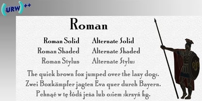
  2. Drum Shake by PizzaDude.dk, $16.00
    Drum Shake is my friendly, all-caps comicbook font - ready to serve and protect your next design!
  3. Local Eatery JNL by Jeff Levine, $29.00
    Here's yet another variation of the classic Futura Black Art Deco stencil form of display lettering. The inspiration for this typeface came from various images of the Blossom Dairy Co. restaurant, originally opened as an ice cream and sandwich shop located on Quarrier Street in Charleston, West Virginia. The restaurant first opened in 1938 as an outgrowth of the Blossom Dairy Co. itself, and existed under various ownerships until it permanently closed on Nov. 11, 2016. Digitally redrawn as Local Eatery JNL, it is available in both regular and oblique versions.
  4. Flatbush Beanery JNL by Jeff Levine, $29.00
    Serve up a generous portion of nostalgia with this retro font inspired by lettering in old diners, drive-ins and eateries of the 40s and 50s.
  5. Hello Eatery Family by Garisman Studio, $19.00
    Introducing Hello Eatery - Handlettering Pack Hello Eatery combines attractive curves with a fresh handlettering starter pack; delivering a stylish script and sans serif which is guaranteed to add an eye-catching appeal to your logo designs, brand imagery, quotes, product packaging, merchandise & social media posts. All Caps letters for Hello Eatery Sans Serif: Hello Eatery One, Hello Eatery Two, Hello Eatery Three & Hello Eatery Script
  6. LHF Centennial Banker by Letterhead Fonts, $42.00
    A bold currency typeface that's perfect for replicating the style of money and old stock certificates. Includes drop caps on lowercase characters.
  7. Art Materials JNL by Jeff Levine, $29.00
    The cover of the 1930s-era “Catalog of Artists’ Materials” from Ernst H. Friedrichs, Inc. (New York) has the words “Artists’ Materials” hand lettered in a stylized Art Deco sans serif type style. This unique design is now the digital font Art Materials JNL, which is available in both regular and oblique versions.
  8. ITC Jiggery Pokery by ITC, $29.99
    ITC Jiggery Pokery is the work of British freelance designer Carol Kemp. ITC Jiggery Pokery evolved from lettering for a project which needed to be quirky, wacky and fun," says Kemp. "The name came to me as the letters appear to jig along - it just seemed to fit. 'Jiggery Pokery' is London Cockney slang which has a variety of meanings. It's used to describe behavior such as 'ducking and diving', trickery, juggling (especially of financial matters!), or 'hanky panky'. My grandparents were Cockneys, and my uncle would use colourful rhyming slang which I loved to hear as a child.""
  9. Miss Blaker Pro by Sudtipos, $45.00
    The Charles Bluemlein Script Collection is an intriguing reminder of the heady days of hand lettering and calligraphy in the United States. From the early 1930s through World War II, there were about 200 professional hand letterers working in New York City alone. This occupation saw its demise with the advent of photo lettering, and after digital typography, became virtually extinct. The odd way in which the Bluemlein scripts were assembled and created - by collecting different signatures and then building complete alphabets from them - is a fascinating calligraphic adventure. Because the set of constructed designs looked nothing like the original signatures, fictitious names were assigned to the new script typefaces. The typeface styles were then showcased in Higgins Ink catalogs. Alejandro Paul and Sudtipos bring the Bluemlein scripts back to life in a set of expanded digital versions, reflecting the demands of today’s designer. Extreme care has been taken to render the original scripts authentically, keeping the fictitious names originally assigned to them by Bluemlein.
  10. Bayern Handschrift NF by Nick's Fonts, $10.00
    A hundred-year-old offering from Bauer & Company, named simply "Manuscript," provided the inspiration for this elegant script face. The name translates as Bavaria Handwriting.
  11. Shade of Adelyne - Personal use only
  12. Avondale SC Shaded - Unknown license
  13. Action Man Shaded - Personal use only
  14. SF Chaerilidae Shaded - Unknown license
  15. SF DecoTechno Shaded - Unknown license
  16. SF RetroSplice Shaded - Unknown license
  17. Action Man Shaded - Unknown license
  18. SF Speakeasy Shaded - Unknown license
  19. SF DecoTechno Shaded - Unknown license
  20. SF Speedwaystar Shaded - Unknown license
  21. SF Speakeasy Shaded - Unknown license
  22. Avondale SC Shaded - Unknown license
  23. Sans Serif Shaded - Unknown license
  24. Shake that booty - Unknown license
  25. SF Speedwaystar Shaded - Unknown license
  26. SF Chaerilidae Shaded - Unknown license
  27. Should've Known Shaded - Unknown license
  28. Preferred Shares JNL by Jeff Levine, $29.00
    A bold, condensed slab serif face A July 9, 1935 trade paper ad for Paramount Pictures’ 1st quarter film releases sported hand lettering with chamfered slab serifs. This condensed type design is now available as Preferred Shares JNL in both regular and oblique versions.
  29. Futura Shaded SH by Scangraphic Digital Type Collection, $26.00
    Since the release of these fonts most typefaces in the Scangraphic Type Collection appear in two versions. One is designed specifically for headline typesetting (SH: Scangraphic Headline Types) and one specifically for text typesetting (SB Scangraphic Bodytypes). The most obvious differentiation can be found in the spacing. That of the Bodytypes is adjusted for readability. That of the Headline Types is decidedly more narrow in order to do justice to the requirements of headline typesetting. The kerning tables, as well, have been individualized for each of these type varieties. In addition to the adjustment of spacing, there are also adjustments in the design. For the Bodytypes, fine spaces were created which prevented the smear effect on acute angles in small typesizes. For a number of Bodytypes, hairlines and serifs were thickened or the whole typeface was adjusted to meet the optical requirements for setting type in small sizes. For the German lower-case diacritical marks, all Headline Types complements contain alternative integrated accents which allow the compact setting of lower-case headlines.
  30. Shake Your Head by PizzaDude.dk, $20.00
    Shake Your Head is a grafitti font which involves both smooth curves and ragged edges. Somewhat a mixture between the grungy lines of TagBoyHardcore and the more elegant swings of TagStarHardcore. Furthermore Shake Your Head is spaced very tight and kerned even tighter in order to keep my way of writing tagfonts!
  31. Friendly Shaded Sans by Greater Albion Typefounders, $16.00
    ‘FRIENDLY SHADED SANS’ is just what the name says. It’s a chubby and cheerful Sans Serif typeface that is ideal for poster work, headings and informal design generally.
  32. Futura Shaded SB by Scangraphic Digital Type Collection, $26.00
    Since the release of these fonts most typefaces in the Scangraphic Type Collection appear in two versions. One is designed specifically for headline typesetting (SH: Scangraphic Headline Types) and one specifically for text typesetting (SB Scangraphic Bodytypes). The most obvious differentiation can be found in the spacing. That of the Bodytypes is adjusted for readability. That of the Headline Types is decidedly more narrow in order to do justice to the requirements of headline typesetting. The kerning tables, as well, have been individualized for each of these type varieties. In addition to the adjustment of spacing, there are also adjustments in the design. For the Bodytypes, fine spaces were created which prevented the smear effect on acute angles in small typesizes. For a number of Bodytypes, hairlines and serifs were thickened or the whole typeface was adjusted to meet the optical requirements for setting type in small sizes. For the German lower-case diacritical marks, all Headline Types complements contain alternative integrated accents which allow the compact setting of lower-case headlines.
  33. Standard Shaded Sans by Yes Please, $35.00
    The Standard Shaded family is an homage to the grandiose Woodtypes of yesteryear. Standard blends a contemporary sense of craft and proportion with a dash of Woodtype-era personality to keep things interesting. The Standard Shaded family features OpenType conventional ligatures, discretionary ligatures and stylistic alternates as well as a standard set of accents and symbols to provide a versatile end-user experience. The Standard Shaded family has seen action in the print, web and motion arenas for clients such as IFC, Showtime, Nike Women's Training, Nike Sportswear, Target and Starbucks.
  34. Show No Shame by PizzaDude.dk, $20.00
  35. Sport Shaded JNL by Jeff Levine, $29.00
    Sport Shaded JNL is a classic block font with a cast shadow, perfect for any project for sports teams, college life or high school activities.
  36. Vanilla Shake JF by Jukebox Collection, $36.99
  37. Archive French Shaded by Archive Type, $19.95
    Engraved display typeface.
  38. Archive Grotesque Shaded by Archive Type, $19.95
    Grotesque shaded display typeface.
  39. Standard Shaded Slab by Yes Please, $35.00
    The Standard Shaded family is an homage to the grandiose Woodtypes of yesteryear. Standard blends a contemporary sense of craft and proportion with a dash of Woodtype-era personality to keep things interesting. The Standard Shaded family features OpenType conventional ligatures, discretionary ligatures and stylistic alternates as well as a standard set of accents and symbols to provide a versatile end-user experience. The Standard Shaded family has seen action in the print, web and motion arenas for clients such as IFC, Showtime, Nike Women's Training, Nike Sportswear, Target and Starbucks.
  40. Soul Material Design Dingbatz by Otto Maurer, $9.00
Looking for more fonts? Check out our New, Sans, Script, Handwriting fonts or Categories
abstract fontscontact usprivacy policyweb font generator
Processing