4,787 search results
(0.058 seconds)
- Tarquin AT by Akufadhl,
$15.00 Tarquin is a All-Caps sanserif typeface, inspired by the beautiful hand-painted sign. It has a strong personality, high contrast stem, and widely opened counter to improve the readibility as it designed for display purposes. It's available in 3 different style, REGULAR, STENCIL, and SHADOW designed for display purpose design Crafted beautifully and carefully with hand.
 - Secession by HiH,
$14.00 Secession is a very readable typeface, suitable for short blocks of text. If you have grown weary of the standard sans-serif faces one sees all the time, you may want to use Secession as a fresh and distinctive substitute. Like Kunstler Grotesk, Secession is one of a number of typeface designs that attempts to reconcile Germany’s blackletter tradition with the international familiarity of roman letterforms in a simple, robust design suitable for meeting the demands of a modern industrial economy, while rejecting the extraneous ornamentation of the departing Victorian era. Unlike Kunstler Grotesk, Secession was designed with a lower case. Secession Bold was originally jointly released as Halbfette Secession by Bauer & Company of Stuttgart and H. Berthold AG of Berlin around 1898. The rest of the family was designed by HiH. The basic family of four: Text, Oblique, Bold and BoldOblique are available in two versions: one set with the standard contemporary lining or ranging numerals for spreadsheets and tables and one set of old-style figures (with OSF in font name) for use with text. The two versions of the basic family, Secession and Secession OSF were released in July 2006. Cousins include ExtraBold, SCOSF Text, and two multi-lingual versions of the text weight. Secession ML includes the Latin Extended-A character set in unicode format plus 17 ligatures and a few strays. Secession GreekML has all the characters of the ML version plus the unicode Greek set and 17 Greek ligatures. Release of the cousins took place in August and October of 2006. Click on BUYING CHOICES. Click on GLYPHS and use drop-down menus and slider to see the all the glyphs for the various fonts. Similar: Birmingham (Ref 100 Ornamental Alphabets, Solo); Spartana (Art Nouveau Display Alphabets, Solo)
 - Sweet Square by Sweet,
$39.00The Engraver’s Square Gothic—like its rounder cousin, the engraver’s sans serif, Sweet® Sans,has been one of the more widely used stationer’s lettering styles since about 1900. Its minimal forms, made without curves, were popularized long ago by bankers and others seeking a serious, established feel to their stationery. One might argue that the design is a possible precursor to Morris Fuller Benton’s Bank Gothic® typeface. Sweet® Square is based on antique engraver’s lettering templates called “masterplates.” Professional stationers use a pantograph to manually transfer letters from these masterplates to a piece of copper or steel that is then etched to serve as a plate or die. This demanding technique is rare today given that most engravers now use a photographic process to make plates, where just about any font will do. But the lettering styles engravers popularized during the first half of the twentieth century remain both familiar and appealing. Referencing various masterplates, Mark van Bronkhorst has drawn Sweet Square in nine weights. The sources offered just uppercase, small caps, and figures, yet similar, condensed examples had a lowercase, making it possible to interpret a full character set for Sweet Square. Italics were also added to give the family greater versatility. The fonts are available as basic, “Standard” character sets, and as “Pro” character sets offering special characters, a variety of typographic features, and full support for Western and Central European languages. Sweet Square gives new life to an uncommon class of typeface: an early twentieth-century commercial invention that brings a singular verve to modern design. Its unique style is as useful as it is novel. Bank Gothic is a registered trademark of Grosse Pointe Group LLC. - Hispania Script by HiH,
$10.00 Hispania Script is a distinctive and distinctly nineteenth century script. It was released by Schelter & Giesecke of Leipzig, Germany around 1890. Particularly noteworthy are the sharply-pointed legs of the upper case ‘K’ & ‘R’ that seem to be characteristic of the period. Similar strokes, often with a slight curve, may be seen in typefaces like Alt-Romanish and Tinteretto by Schelter & Giesecke, Artistic and Lateinsch by Bauer and Berthold and the poster lettering of Edward Penfield. The angle of this script (approximately 24 degrees) and the sharp delicate points must have made the manufacture of this face in metal type a challenge. The resulting type was probably quite fragile and subject to accidental damage. Additionally, the sharp points would be subject to wear. With digital type, these concerns are eliminated. As far as I know, no one has ever dropped a digital letter on the floor. Nonetheless, creating a digital outline for a typeface like Hispania Script, with many crossing strokes, can be quite time-consuming. Even with an accurate scan of a good quality original, it is usually necessary to construct each crossing stroke separately and then remove the overlap in order to obtain a sharp and convincing intersection. Steep internal angles are often defined with two points, rather than one, to minimize ink or toner fill that can muddy the rendering in smaller sizes. Like all formal scripts, Hispania Script is always useful for announcements and invitations. However, the distinctiveness of of this design strongly suggests that there are other applications that may benefit from its use. Step outside the box and try it in some unexpected places. It is the unexpected that often draws a person’s eye.
 - Zamora by Typodermic,
$11.95 Introducing Zamora, the typeface that embodies the grit and determination of the open road. With its cracked finish and sharp Latin serifs, it’s a font that commands attention and respect. Each cut and scratch on the surface of Zamora is like a battle scar, a testament to the font’s toughness and resilience. Zamora is not just any typeface. It’s a font with a history, a story that’s written into every curve and corner. The sharp Latin serifs give Zamora a strong foothold, and the slew of ligatures that come with it give text a natural, unpredictable appearance, like the twists and turns of a winding mountain road. So whether you’re designing a poster for a rockabilly concert, creating a logo for a biker gang, or just looking to add a touch of rebel flair to your work, Zamora is the font for you. Most Latin-based European writing systems are supported, including the following languages. Afaan Oromo, Afar, Afrikaans, Albanian, Alsatian, Aromanian, Aymara, Bashkir (Latin), Basque, Belarusian (Latin), Bemba, Bikol, Bosnian, Breton, Cape Verdean, Creole, Catalan, Cebuano, Chamorro, Chavacano, Chichewa, Crimean Tatar (Latin), Croatian, Czech, Danish, Dawan, Dholuo, Dutch, English, Estonian, Faroese, Fijian, Filipino, Finnish, French, Frisian, Friulian, Gagauz (Latin), Galician, Ganda, Genoese, German, Greenlandic, Guadeloupean Creole, Haitian Creole, Hawaiian, Hiligaynon, Hungarian, Icelandic, Ilocano, Indonesian, Irish, Italian, Jamaican, Kaqchikel, Karakalpak (Latin), Kashubian, Kikongo, Kinyarwanda, Kirundi, Kurdish (Latin), Latvian, Lithuanian, Lombard, Low Saxon, Luxembourgish, Maasai, Makhuwa, Malay, Maltese, Māori, Moldovan, Montenegrin, Ndebele, Neapolitan, Norwegian, Novial, Occitan, Ossetian (Latin), Papiamento, Piedmontese, Polish, Portuguese, Quechua, Rarotongan, Romanian, Romansh, Sami, Sango, Saramaccan, Sardinian, Scottish Gaelic, Serbian (Latin), Shona, Sicilian, Silesian, Slovak, Slovenian, Somali, Sorbian, Sotho, Spanish, Swahili, Swazi, Swedish, Tagalog, Tahitian, Tetum, Tongan, Tshiluba, Tsonga, Tswana, Tumbuka, Turkish, Turkmen (Latin), Tuvaluan, Uzbek (Latin), Venetian, Vepsian, Võro, Walloon, Waray-Waray, Wayuu, Welsh, Wolof, Xhosa, Yapese, Zapotec Zulu and Zuni.
 - Sweet Square Pro by Sweet,
$59.00 The Engraver’s Square Gothic—like its rounder cousin, the engraver’s sans serif, Sweet® Sans,has been one of the more widely used stationer’s lettering styles since about 1900. Its minimal forms, made without curves, were popularized long ago by bankers and others seeking a serious, established feel to their stationery. One might argue that the design is a possible precursor to Morris Fuller Benton’s Bank Gothic® typeface. Sweet® Square is based on antique engraver’s lettering templates called “masterplates.” Professional stationers use a pantograph to manually transfer letters from these masterplates to a piece of copper or steel that is then etched to serve as a plate or die. This demanding technique is rare today given that most engravers now use a photographic process to make plates, where just about any font will do. But the lettering styles engravers popularized during the first half of the twentieth century remain both familiar and appealing. Referencing various masterplates, Mark van Bronkhorst has drawn Sweet Square in nine weights. The sources offered just uppercase, small caps, and figures, yet similar, condensed examples had a lowercase, making it possible to interpret a full character set for Sweet Square. Italics were also added to give the family greater versatility. The fonts are available as basic, “/fonts/sweet/square/” character sets, and as “Pro” character sets offering special characters, a variety of typographic features, and full support for Western and Central European languages. Sweet Square gives new life to an uncommon class of typeface: an early twentieth-century commercial invention that brings a singular verve to modern design. Its unique style is as useful as it is novel. Bank Gothic is a registered trademark of Grosse Pointe Group LLC.
 - Beton by Linotype,
$29.99The Bauer Typefoundry first released the Beton family of types in 1936. Created by the German type designer Heinrich Jost, the present digital version of the Beton family consists of six slab serif typefaces. First developed during the early 1800s, by the 1930s slab serif faces had become one of many stock styles of type developed by foundries all over the world. Because of their distance from pen-drawn forms and their industrial appearance, they were seen as “modern” typefaces. (Their serifs kept them from being too modern.) The first slab serif typefaces were outgrowths of didone style text faces (e.g., Walbaum). As newspapers and advertising grew in importance in the western world (especially in “Wild West” America), type founders and printers began to create bigger, bolder typefaces, which would set large headlines apart from text, and each other. Through display tactics, businesses and industry could begin to visually differentiate their products from one another. This craze eventually led to the development of monster sized wood type, among other things. By the 20th Century, the typographic establishment had begun to tame, categorize, and codify 19th Century type styles. It was in the wake of this environment that Jost developed Beton. The Beton family is a type “family” in a pre-1950s sense of the word. Although six styles of type are available, only four of them fit in logical progression with each other (Beton Light, Beton Demi Bold, Beton Bold, and Beton Extra Bold). The other two members of the family, Beton Bold Condensed and Beton Bold Compressed, are more like distant cousins. They function better as single headlines to text set in Beton Light or Beton Demi Bold, of as companions to totally separate typefaces. - Sure thing! Rainy Days by PizzaDude is a truly special font that carries a unique essence, making it stand out in a sea of typefaces. At its core, Rainy Days embodies a playful yet slightly melanchol...
- Neon Street by Ditatype,
$29.00 Neon Street is a captivating display font that takes inspiration from the dazzling glow of neon lights found on vibrant city streets. With its bold uppercase letterforms and neon-style inline elements, this typeface exudes energy and creates a visually stunning experience. Each letter is meticulously crafted with neon-inspired strokes that run through the center, adding a dynamic and luminous effect. This inline style brings a sense of urban excitement and nostalgia, evoking the vibrant atmosphere of neon-lit cityscapes. Inspired by the enchanting allure of neon signs, Neon Street infuses a sense of liveliness and modernity into each character. The font captures the captivating glow of neon lights, casting a radiant and vibrant hue that is both eye-catching and mesmerizing. This neon style adds a touch of urban energy, making the font truly stand out with its electrifying charm. The uppercase letter forms of Neon Street are bold and assertive, commanding attention with their distinctive design. Enjoy the various features available in this font. Features: Alternates Multilingual Supports PUA Encoded Numerals and Punctuations Neon Street is perfect for headlines, signage, logos, and any design that aims to make a bold statement with a touch of neon-inspired flair. This font will also inject your project with a vibrant and captivating element, whether you're creating posters, branding materials, digital artwork, or anything in between. Find out more ways to use this font by taking a look at the font preview. Thanks for purchasing our fonts. Hopefully, you have a great time using our font. Feel free to contact us anytime for further information or when you have trouble with the font. Thanks a lot and happy designing.
 - Private Eye JNL by Jeff Levine,
$29.00 From 1958 to 1964, one of ABC-TV’s popular shows was the detective series “77 Sunset Strip”. Based in Los Angeles, the fictional detective agency was located next door to Dino’s Lodge, (partly owned by Dean Martin and actually located at 8532 Sunset). It was originally known as the Alpine Lodge. The adjacent building where Stuart Bailey and Jeff Spencer’s private detective service was located in fact housed a popular modeling agency. The ‘77’ address did not exist outside of the realm of the series. However, a wonderful sign with Art Deco-influenced lettering graced the set (on the wall of the office foyer) saying “Bailey & Spencer Private Investigators Suites 101-102”. A screen capture of this sign served as the working model for Private Eye JNL, which is available in both regular and oblique versions.
 - Iowan Old Style BT by Bitstream,
$40.99Iowan Old Style was designed for Bitstream in 1990 by noted sign painter John Downer. Iowan Old Style is a hardy contemporary text design modeled after earlier revivals of Jenson and Griffo typefaces but with a larger x-height, tighter letterfit, and reproportioned capitals. Iowan Old Style Titling was designed by John Downer and added to the Iowan Old Style family in 2002. The cap-only character set includes several ornaments and fleurons, broadening the appeal and functionality of the typeface family. Iowan Old Style was originally designed for Bitstream in 1990 by Downer, a noted sign painter. Iowan Old Style is a hardy contemporary text design modeled after earlier revivals of Jenson and Griffo typefaces but with a larger x-height, tighter letterfit, and reproportioned capitals. Expert and old style figure font sets were added in 2000. - Portuguesa by Sudtipos,
$49.00 Inspired by the graphic spirit of old packaging and store signs of Portugal, this font seeks to transmit the warm and sunny sound of Portuguese language in a visual way. Portuguesa has 3 partners, designed to work nicely together and to complement one with each other. Portuguesa Script, with friendly and rhythmic personality, great for titles and short text, Portuguesa Caps, with small caps and ligatures that perfectly match (and contrast) with the script version. And Portuguesa Icons, that recalls the legendary blue tiles. This last version was specially designed to mix signs up with delightful combinations for creating patterns, borders, stationary, tableware and all kind of commercial products and projects that needs a memorable strike. The possibilities are numberless. As a mantra, Portuguesa is always in a positive mood, spreading the “Portuguese art of welcoming people”. Seja Bem-Vindo!
 - Anadolu by Glyphobet,
$24.99 Anadolu was inspired by the distinct style of sign lettering in rural Turkey, and refined based on sign lettering in Hungary. Shown here are samples in Turkish and Hungarian, as well as Finnish and Estonian, two other languages in the Finno-Ugric language group with Hungarian. The slight curve at the tops of ascenders and bottoms of descenders is inspired by the linguistic process of "vowel harmony" in Turkish and Hungarian. Anadolu is the Turkish name for Anatolia, the peninsula where Turkey lies. The name recalls another sans-serif typeface named for its country of origin. The tittle on the i is reimagined as a diacritic, and the dotless ı is reimagined as the basic, prototypical i. Too many typefaces treat diacritics as afterthoughts. Since diacritics are integral to the languages that inspired Anadolu, they were designed as core components of the typeface.
 - Neon Love by Schriftlabor,
$29.99 Neon Love was designed originally for a circle coaster design with a quote by the Beatles’ “All you need is Love, Love is all you need”. The inspiration of the lettering was a neon sign style where a cursive script is kind of bended from those glass wires. The idea was to get the overall look and feel of neon signs into a font, as well as creating a good raw material to use for some further photoshop effects to enhance the visual presentation. Neon Love has many OpenType features that allow for choices that can make the lettering unique. Neon Love has two versions of the font a Smooth one which is connected and the Cutout version which can be used to create neons and for this it is in parts. Design by Roland Hüse and Schriftlabor team.
 - Neonstar by Mokatype Studio,
$24.00 Introducing the Neon Sci-fi Futuristic Font called Neonstat a unique font with a futuristic style that can make your futuristic logotype more interesting. Inspired by real-world neon light signs, this font is perfect for adding your own glowing light effects or can be used to actually design real-world neon signs. Neonstar font is suitable for your design and allows you to create beautiful designs, headlines, posters, logos, badges, and much more. It is also best used for posts, logos, posters, labels, and more. Works on PC & Mac, simple installations, accessible in Adobe Illustrator, Adobe Photoshop, Adobe InDesign, and even works on Microsoft Word. PUA Encoded Characters - Fully accessible without additional design software. Fonts include multilingual support Image used: All photographs/pictures/vectors used in the preview are not included, they are intended for illustration only. Thank You
 - Sunwind by Wiescher Design,
$39.50 Sunwind is not really made to write long copy. It is a font for shopsigns and short sentences that need that hot, sunny and windy touch. And that is how I got around to designing it: I saw some letters on a shopsign in Cannes when driving into town. I shouted at my son Julius: "Quick take a picture of that sign, the blue one." That's what he did, only he used the macro setting, so I had a very small sign but lots of nice background. Anyway I got the basic idea! Then I made a lot of sketches and this is what came out. I added a smallcaps set and I also made some initials as a rough version, so they look like written with a brush on heavygrain paper. Swinging that brush is yours truly Gert Wiescher
 - Peanut Square Layer by PizzaDude.dk,
$19.00 This is a font that will fit in the "hard to read section" because it may not be super legible at first sight - that is because of the negative space. But when you combine the two layers (Layer and Box) the letter suddenly appears very legible! Play around with your favourite colour palette while adjusting the transparency in order for the colours to blend, giving a really nice handcrafted look! You have 4 different versions of each letter to play around with and of course there is multilingual support!
 - Giulia by HVD Fonts,
$30.00 Giulia is a sweet type family consisting of 12 Fonts. It was created by Hannes von Döhren and published by HvD Fonts. Besides a fancy curly version there is a second version with a more straight architecture, still owning the same soft and friendly character. Informal and easy going at first sight and perfect for display settings, however the straight architecture of Giulia Plain also makes it nice for shorter to medium texts. This contemporary type family is ideal for use in retail, packaging, games, food, kids applications and advertising.
 - Mayonaise by Hanoded,
$8.00 Ah, so you've noticed a typo! Mayonnaise - the sauce, is written with double 'n'! I know. This font was named after a Smashing Pumpkins song that I like very much. Mayonaise is a bit of an ugly duckling. It is strange, open and messy, and might not be love at first sight. BUT, when you spend some time with Mayonaise and get to know her, you might actually fall in love. Just like that song I mentioned earlier. Go on then, give it a try! At this price, you can't go wrong!
 - FF Scuba by FontFont,
$62.99 German type designer Felix Braden created this sans FontFont in 2012. The family has 16 weights, ranging from Thin to Black (including italics) and is ideally suited for advertising and packaging, editorial and publishing, logo, branding and creative industries, poster and billboards, wayfinding and signage as well as web and screen design. FF Scuba provides advanced typographical support with features such as ligatures, alternate characters, case-sensitive forms, fractions, super- and subscript characters, and stylistic alternates. It comes with a complete range of figure set options – oldstyle and lining figures, each in tabular and proportional widths.In 2013, FF Scuba received the CommArts award and was also selected as one of Typographica’s favorite typefaces of 2012.
 - Monsante by Arterfak Project,
$18.00 Introducing Monsante, a modern Art Deco-style font. Inspired by typography from the 1920s, it exudes elegance, luxury, and a touch of modernism. Carefully crafted with distinctive geometric elements and crisp letterforms, this font creates a sense of luxury and sophistication. Monsante is available in two styles: Regular and Inline. These styles are ideal for displays, headlines, film titles, awards, certificates, books, weddings, cards, signage, menus, and more. It also includes special characters that you can mix and match to add characteristics and beauty to your designs. Fonts featured : Uppercase Lowercase Numbers & punctuations Symbols Stylistic alternates Custom ligatures. Transform your projects with Monsante, the font that effortlessly combines timeless charm with a contemporary flair.
 - Andesia by Gatype,
$12.00 Andesia Script is soft and sweet calligraphy typeface, with characters dance along the baseline. It has a casual and elegant touch. Can be used for various purposes.such as logos, wedding invitation, heading, t-shirt, letterhead, signage, lable, news, posters, badges etc. OpenType features with stylistic alternates, ligatures and multiple language support. To enable the OpenType Stylistic alternates, you need a program that supports OpenType features such as Adobe Illustrator CS, Adobe Indesign & CorelDraw X6-X7, Microsoft Word 2010 or later versions. How to access all alternative characters, using Windows Character Map with Photoshop: https://www.youtube.com/watch?v=Go9vacoYmBw Thank you very much for looking and please tell me if you have questions. Designers: khaidir Publisher: Gatype
 - Batoswash by T4 Foundry,
$21.00Avantgarde fonts Batory and Batoswash are monoline sansserifs designed by Bo Berndal. The futuristic Batory (think Bladerunner and Total Recall) and the spicier relative Batoswash come in three versions: Narrow, Middle and Wide. The font family is available in Truetype and Postscript for Mac and PC. Bo Berndal, born 1924, has been designing typefaces over 56 years, for Monotype, Linotype and other foundries. "Batory is a monoline reaction to my many calligraphic fonts", says Bo Berndal. "That is also the reason I did several widths instead of weights. Batory has short stems and high x-height. Batoswash is a Batory gone wild!" The successful Batory has already been used for logotypes, vignettes in magazines and as headline type. - Borensa by Arterfak Project,
$28.00 Introducing Borensa. our brand new serif exploration with reversed contrast and unique shapes. Inspired by the historical books and vintage signage. Borensa is classically elegant to be applied to formal designs and can be used for the headline and long text. This font also has some alternates characters to give you some options in making the design. You can use Borensa for editorial, label, invitation, newspaper, books, poster, flyer, signboard, logo, branding, merchandise, apparel, and many more! We recommend you to use a program that has OpenType support such as Photoshop, Illustrator, Indesign, CorelDraw, etc. Featured : Uppercase Lowercase Numbers & symbols Accented characters Stylistic alternates Ligatures. Thank you for your support and have a nice day!
 - Carnac by Hoftype,
$49.00 Carnac, a minimalistic monoline face follows the same linear structure as its earlier released, rounded counterpart Carnas. Carnac, however, appears crisp and fresh because of its squared edges and angular contours. It is a clean, contemporary face with a wide range of styles from Thin to Black. Designed to be ideal for shorter and longer text applications and also for headlines and signage. The Carnac family consists of 16 styles and is well suited for ambitious typography. It comes in OpenType format with extended language support. All weights contain ligatures, superior characters, proportional lining figures, tabular lining figures, proportional old style figures, lining old style figures, matching currency symbols, fraction- and scientific numerals and matching arrows.
 - Bradrock by Arterfak Project,
$19.00 Introducing Bradrock, a vintage slab serif typeface. Inspired by old-school cowboy design, and circus-style. Bradrock has a more decorative typeface by adding bold bifurcated serif on the letterforms. This font is a perfect choice for vintage or old-school themes. Bradrock is an all-caps font, which represented strength, confidence, and an old-school aesthetic. You can use this font for many purposes such as vintage logos, mugs, embroidery, prints, display, short text, packaging, cards, emblem, signage, and many more! Equipped with special characters to get your design more powerful. TTF & OTF in a zip file including : Uppercase Small-caps Numbers & punctuation Accented characters Stylistic alternates Stylistic set 01-03 That's all, folks! Thank you for visiting.
 - YR Gothic Arabic by Alrefaiy,
$90.00 YR Gothic Arabic font draws inspiration from the Gothic calligraphic style, renowned for its timeless elegance. This style is characterized by a harmonious balance of thick and thin strokes, with a focus on vertical lines. The result is a graceful, fluid letterform, with consistent attention to detail throughout. YR Gothic Arabic font is a sophisticated choice that conveys a sense of refinement and sophistication. With its classic and timeless design, this font is well-suited for various formal applications, such as branding, invitations, and official documents. Its versatility also allows it to be used in a range of other contexts, including advertising and signage, where its sense of elegance and refinement can elevate any design project.
 - Scarletta Script by Rastype Studio,
$10.00 Scarletta Script is a romantic and sweet calligraphy typeface with characters that dance along the baseline. It has a casual and yet elegant touch. It can be used for various purposes such as logos, wedding invitations, headings, t-shirts, letterhead, signage, lables, news, posters, badges etc. The fonts include OpenType features with stylistic alternates, ligatures and multiple language support. To enable the OpenType Stylistic alternates, you need a program that supports OpenType features such as Adobe Illustrator CS, Adobe Indesign & CorelDraw X6-X7, Microsoft Word 2010 or later versions. There are additional ways to access alternates/swashes, using Character Map (Windows), Nexus Font (Windows), Font Book (Mac) or a software program such as PopChar (for Windows and Mac).
 - Frutiger Next Paneuropean by Linotype,
$99.00Frutiger Next is Adrian Frutiger's and Linotype's completely new interpretation of the well known typeface Frutiger released in 2000. For these revised forms, the areas of application are almost limitless. Frutiger Next can be used for anything from office communications to multimedia to complex printed materials. The Frutiger Next family contains small caps, oldstyle figures, and other figure options in every font. Adrian Frutiger's eponymous typeface has been used for decades, everywhere from airport signage to book text to corporate logos to the smallest web graphics. The Italics in the original version of Frutiger were based very closely on the Roman forms; in Frutiger Next, they have been re-designed to be true Italics. - Betterside by Typestory,
$10.00 Betterside is a sweet and cursive handwritten font. This gentle font will look gorgeous on a variety of design ideas. It will add a joyful and romantic touch to each of your projects! The font is perfect for greeting cards, branding, business cards, quotes, posters, stickers, blogs, logos, weddings, signage, packaging, birth announcements, photo overlays, wall art, quotes, printed materials, bags, t-shirts and more. . . ! What’s Included : Web Font Ton of glyphs Ligature, Alternate & Swashes Works on PC & Mac Simple installations Accessible in the Adobe Illustrator, Adobe Photoshop, Adobe InDesign, even work on Microsoft Word. PUA Encoded Characters – Fully accessible without additional design software. Thank you for your purchase! That’s it !! Have fun using our font 🙂
 - Slapjack by Stephen Rapp,
$49.00 Slapjack is a unique rendition of a broad-edged calligraphic script ideal for packaging, signage, and titling. Its presence is strikingly bold and rhythmic, yet stylishly elegant. With a glyph count well over 700, Slapjack is a fully-featured pro font. Both regular and light weights have contextual and stylistic alternates, stylistic sets, swashes, ligatures, fractions, and Central European language support. Using Adobe InDesign which supports Stylistic Sets allows you to instantly convert your text to a version without baseline connectors for a more streamlined look. These can also be selected via the glyph palette. As a bonus feature, unlike most script fonts, Slapjack is designed to also set well in all caps adding to its versatility.
 - Janek by Pawel Fonts,
$35.00 Janek is a semi-serif typeface inspired by old Polish signage. Rather then mimic specific style, it synthesises various inspirations. It is named after an Author of a classic Polish manual, that kickstarted this project, „Techniques of Lettering“ by Jan Wojeński. Large character set and style selection allows for richness of expression. Pointy upright and slightly decorative italic bring unique blend of aesthetics. It works well in rich text and as a striking display. Janek consists of seven italic and seven upright styles ranging from Light, to Black. With extensive language support and wide selection of features, it is suited for range of latin use cases. Janek is a contemporary throwback to the past.
 - Grand Century by Gloow Studio,
$13.00 Introducing Grand Century. Retro styled font, comes with a clean and rustic version of the font. Grand Century is perfect for vintage and retro designs, badges, logos, t-shirts, posters, branding, packaging, signage, book covers and more! Comes with Opentype feature with lots of alternatives, it helps you to create great fonts. This font also supports multiple languages. To access alternative glyphs, you'll need a program that supports OpenType features such as Adobe Illustrator CS, Adobe Photoshop CC, Adobe Indesign and Corel Draw. Supported by: Uppercase Lowercase Alternate Numbers, Punctuation and Symbols Multilingual Support. If you have any questions, feedback or comments, feel free to send me a message. Happy Creative! Thank You!
 - Hermush by Letterhend,
$19.00 Hermush Display is a condensed unique typeface with unusual anatomy. This type of font perfectly made to be applied especially in logo, headline, signage and the other various formal forms such as invitations, labels, logos, magazines, books, greeting / wedding cards, packaging, fashion, make up, stationery, novels, labels or any type of advertising purpose. Features : numbers and punctuation multilingual alternates / swashes and ligatures PUA encoded We highly recommend using a program that supports OpenType features and Glyphs panels like many of Adobe apps and Corel Draw, so you can see and access all Glyph variations. How to access opentype feature : letterhend.com/tutorials/using-opentype-feature-in-any-software/ Email us to letterhend@gmail.com if you need something! Happy Designing!
 - Gill Sans by Monotype,
$45.99The successful Gill Sans® was designed by the English artist and type designer Eric Gill and issued by Monotype in 1928 to 1930. The roots of Gill Sans can be traced to the typeface that Gill's teacher, Edward Johnston, designed for the signage of the London Underground Railway in 1918. Gill´s alphabet is more classical in proportion and contains what have become known as his signature flared capital R and eyeglass lowercase g. Gill Sans is a humanist sans serif with some geometric touches in its structures. It also has a distinctly British feel. Legible and modern though sometimes cheerfully idiosyncratic, the lighter weights work for text, and the bolder weights make for compelling display typography. - Chevin Pro by G-Type,
$72.00 Chevin is a contemporary rounded type family in 6 weights which was designed with functionality and legibility in mind. With its open counters and slightly condensed style, Chevin can be used for text and is particularly suited to signage. Erik Spiekermann is a fan, noting that Chevin “is charming without being cute, and very legible even in small sizes because of its restrained shapes and simple construction.” Chevin is named after a hill on the outskirts of Otley in West Yorkshire. Since 2007, the type family has been highly prominent in the UK as Royal Mail’s corporate font and the typeface that adorns every Post Office in the country. The Chevin Pro set includes additional Greek and Cyrillic layouts.
 - Lagu Serif by Alessio Laiso Type,
$20.00 Lagu Serif blends a geometric inspiration with warm humanist elements, making it the perfect choice for when you need a fresh, contemporary serif typeface. Alessio Laiso has designed Lagu Serif in 18 styles: 9 weights ranging from Thin to Black, with matching, beautiful italics. The companion Lagu Sans makes the Lagu family a real workhorse for any use, including web, digital, print, branding and signage. Lagu Serif has a large x-height and open counterforms, making it easily readable. It comes with powerful OpenType features, including ligatures, alternative glyphs, small caps, fractions, tabular figures, old-style figures, and more. The Lagu family supports 219 languages, covering 100% of the Latin Plus character set.
 - Cynosure Soft by Device,
$39.00 Cynosure Soft is a rounded, friendly version of Cynosur, a humanist sans with a subtle thick/thin stress. This gives it a clean, sharp elegance and precision that can be missing in some more familiar monoline sans faces. The wide range of weights and the matching reweighed italics make it a versatile solution where a consistent appearance across a broad range of applications is required. Its clear and inarguable design make it suitable for a wide variety of uses, from corporate to entertainment, text to headline, signage, logotypes, magazines and reports. The italics retain the design of the upright across all characters, again ensuring consistency. Includes tabular, lining and old-style numerals.
 - Krostenia by Letterhend,
$19.00 Introducing, Krostenia - a monoline script with a touch of vintage look and feel. You will also get 12 detailed hand drawn objects ready to use. This type of font perfectly made to be applied especially in logo, headline, signage and the other various formal forms such as invitations, labels, logos, magazines, books, greeting / wedding cards, packaging, fashion, make up, stationery, novels, labels or any type of advertising purpose. Features : uppercase & lowercase numbers and punctuation multilingual alternates / swashes and ligatures PUA encoded 12 hand drawn objects We highly recommend using a program that supports OpenType features and Glyphs panels like many of Adobe apps and Corel Draw, so you can see and access all Glyph variations.
 - JP Alva Expanded by jpFonts,
$19.95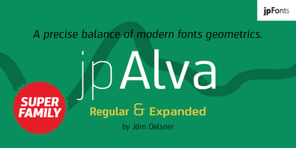 jpAlva is a technical and functional sans-serif that consists of 40 typefaces, divided in 2 font families jpAlva and jpAlva Extended. A universal family of typefaces that fits pretty much any purpose. It illustrates a precise balance of modern geometrics, with a functional yet sparing style that effectively communicates without distraction. A straightforward, unadorned appearance with efficient construction. Simple, clean with a technical note and a wide range of styles it is perfectly suitable for a wide range of applications, from identity systems to editorial design, from signage systems to software applications. Designed with powerful OpenType features (e.g. figure sets, fractions, ligatures, case sensitive forms) and extended language support, it is easy and enjoyable to use.