10,000 search results
(0.046 seconds)
- Yulica Claudy by Areatype,
$13.00 Yulica claudy is a lovely, modern calligraphic script. It features dynamic and pretty swashes and can be used for many purpose, such as titles, signatures, logos, wedding invitations, letterhead, signage, labels, newsletters, posters, badges, etc. Yulica claudy features OpenType, including the initial and terminal letters, ligatures and International support for most Western languages included. Yulica claudy PUA encoded with Unicode, which allows full access to all the extra characters without having to design special software. Mac users can use Font Book, and Windows users can use the Character Map to view and copy one additional character to paste into your text editor / favorite applications. Enjoy using
 - Csemege by Roland Hüse Design,
$19.00 Csemege is a fully cursive even script inspired by Hungary's 60' 70's shop signages of mostly food and grocery stores and restaurants, and their neon light scripts. Csemege means Delicatessen in Hungarian. I have developed this set of characters with Contextual alternates and a few Stylistic alternates to make the letter connections smooth and perfect. It has a friendly look yet decorative and elegant script. For best result please make sure you are using this font with softwares that supports open type features and you have these features turned on: Contextual alternates, Stylistic alternates and Standard ligatures. Language support (accents) : Western European and Hungarian.
 - SIAS Gramma by SIAS,
$29.90 The Gramma font family provides about 240 very basic graphic structures. Compilation of of this set has been inspired not by symblic but by graphical-morphological concerns. Therefore the three fonts (A, B, C) represent the entirety of all possible and simple graphic forms. Glyphs of this kind are likely to be found anywhere: in scripts, in signage, in branding marks – and so on. So, the Gramma font package is applicable to a great variety of usage. Whenever a free choice of elemental graphic motifs is desired – be it ideographical, pictographical or for brand design, this package provides you with nearly any graphic shape imaginable.
 - Nostalgic Script by Dhan Studio,
$17.00 Nostalgic Script is a modern brush font, organic, dynamic and energetic sytle. It can used for various purposes. such as the title, signature, letterhead, signage, labels, newsletters, posters, logo, correspondence, wedding invitations, badges, etc. Nostalgic Script features 315 Glyphs, 143 alternate characters, including initial and terminal letters, alternates, ligatures and International support for most Western Languages is included. Nostalgic Script is coded with PUA Unicode, which allows full access to all the extra characters without having special designing software. Mac users can use Font Book , and Windows users can use Character Map to view and copy any of the extra characters to paste into your favourite text editor/app.
 - Adora Compact PRO by preussTYPE,
$53.90 German type designer Ingo Preuss created this sans Super-family between 2010 and 2015. The family has 84 weights, ranging from Light to Ultra in Normal, Compact, Condensed and Compressed (including italics). It comes in OpenType format with extended language support. All weights contain ligatures, superior characters, proportional lining figures, tabular lining figures, proportional old style figures, lining old style figures, matching currency symbols, fraction- and scientific numerals and matching arrows. The “Adora PRO family” is ideally suited for advertising and packaging, editorial and publishing, logo, branding and creative industries, poster and billboards, small text, wayfinding and signage as well as web and screen design.
 - Worthing by Greater Albion Typefounders,
$14.00 Worthing aims to combine Victorian charm with modern-day requirements for legibility and clarity, and we hope, demonstrates that traditional elegance still has its place in the modern world. Meanwhile, for those who are curious about the naming of our fonts, Mr Lloyd our designer was reading Mr Wells (H. G.) War of the Worlds recently. No doubt some of you will remember the part that Worthing in Sussex played in that story. Worthing is offered in three styles: regular, alternate and shaded. It's ideal for Victorian and Edwardian era inspired design work, posters and signage, as well as for book covers, chapter headings and so forth.
 - Madre Script by Typefolio,
$29.00 Madre Script is a typeface that experiences adopting two building models: the typographic (with repetition of shapes) and the script (with the freedom of writing). The models are presented in a subtle, unobtrusive way and mainly without conflicts. The essence of each personality is present, coexisting harmoniously and enjoying the same stylistic space. After careful evaluation of the connections between characters, intelligent standards have been established for use of the ‘Contextual Alternates - calt’ OpenType feature, that used together with the ‘Ligatures - liga’ feature, offers a gentle and friendly pace. Madre, is therefore, a discreet, near silent ‘scriptypography'. It is the ideal choice for editorial, packaging and branding.
 - Burowai by Arterfak Project,
$18.00 Burowai is an ancient font style. Inspired by the ancient greek letters and the tribal ornaments. This ethnic font inspired by the shapes of tree branches and combined with rough strokes such as ancient symbols found inscribed in caves. Perfect for the natural theme, folk, tribal, children, adventures, and social movement. Burowai is a display font, that represents brave, spirits, natural, and tradition. Perfect for the headline, logo, books, poster, signage, and more. You can mix and match the alternates characters to get more unique tribal handwritten. Fonts featured: Uppercase Allcaps Numbers & symbols Accents Alternates Hope you like it! Thank you for your support and happy designing!
 - Govandi Adhiwan by UICreative,
$23.00 introducing our new product, the name is Govandi Adhiwan Sans Serif Font Family comes with 9 different weights. Modern Sans Serif font that feels beautiful classy, elegant, and modern. This font is perfectly suited for a wide variety of projects, such as signature, stationery, logo, wedding, typography quotes, magazine or book cover, website header, clothing, branding, packaging design, and more. Also for fashion-related branding or editorial design and displays both masculine and feminine qualities. Designed with powerful OpenType features in mind. Perfectly suited for graphic design and any display use. It could easily work for web, signage, corporate as well as editorial design.
 - Alfabetica by Eurotypo,
$22.00 Alfabetica is a modern and humanist Sans Serif typeface. We were looking for a new grotesque energetic but with some classical features. The result of the design is a grotesque slightly condensed with soft strokes, open counters and terminals; giving it a great readability with an esthetic elegance and sensitive appeal. Alfabetica comes in eight weights from Thin to Black, with a matching italic for every weight. This family of fonts provide advanced typographical support with OpenType features such as CE languages, ligatures, oldstyle numeral, case- sensitive forms, fraction and small capitals. Alfabetica is perfectly suited for texts, signage, magazines, web pages, packaging design, advertising, corporate identity and logotypes.
 - Fernolester by Maculinc,
$10.00 Fernolester is a classic themed font with a unique edge and above all; packed with different styles and ligatures - making it easy to create unique characteristics for your project. This typeface has a classic taste, very suitable as a design choice for books, magazines, packaging, branding, signage and many other creative projects. To activate the OpenType Stylistic alternative, you need a program that supports OpenType features such as Adobe Illustrator CS, Adobe Photoshop, Adobe Indesign & CorelDraw X6-X7. and much more This package includes 4 files; Fernolester Regular, Fernolester Italic, Fernolester Regular In Style & Fernolester Italic Instyle as OTF & TTF. Mail support : maculinc@gmail.com Thank you! Maculinc
 - Antapani by Monoco Type,
$15.00 Antapani is a grotesk sans style with some stylistic style to some letter. Designed for readability but can also function as a display text. Come with 9 style from Thin to Black so you can choose which style you want. Designed with opentype features in mind. Each weight includes extended language support (+ Cyrillic), fractions, tabular figures, arrows, ligatures and more. Perfectly suited for graphic design and any display use. It could easily work for web, signage, corporate as well as for editorial design. Designed by Abdurrahman Hanif, a young Jakartans Graphic Designer who fell in love into type design after his graduation. Published by Monoco Type
 - Neue Frutiger Hebrew by Linotype,
$79.00 Neue Frutiger Hebrew was created by Yanek Iontef and a team of designers and font engineers from the Monotype Studio, under the direction of Monotype type director Akira Kobayashi. The family is available in 10 weights from Ultra Light to Extra Black, with matching italics. Neue Frutiger Hebrew embodies the same warmth and clarity as Adrian Frutiger’s original design, but allows brands to maintain their visual identity, and communicate with a consistent tone of voice, regardless of the language. It is part of the Neue Frutiger World collection, offering linguistic versatility across environments – suited to branding and corporate identity, advertising, signage, wayfinding, print, and digital environments.
 - Adora Condensed PRO by preussTYPE,
$53.90 German type designer Ingo Preuss created this sans Super-family between 2010 and 2015. The family has 84 weights, ranging from Light to Ultra in Normal, Compact, Condensed and Compressed (including italics). It comes in OpenType format with extended language support. All weights contain ligatures, superior characters, proportional lining figures, tabular lining figures, proportional old style figures, lining old style figures, matching currency symbols, fraction- and scientific numerals and matching arrows. The "Adora PRO family" is ideally suited for advertising and packaging, editorial and publishing, logo, branding and creative industries, poster and billboards, small text, wayfinding and signage as well as web and screen design.
 - Drunk Cowboy by Chank,
$99.00 Drunk Cowboy is a bouncy version of the popular Old West type style, inspired by hand-made signage in Paducah, Kentucky. The strokes are loopy and loose. The exaggerated terminals give this font a loud, boisterous presence. Drunk Cowboy is a brutish rogue that emanates the fierce independence of Rio as played by Marlon Brando in One Eyed Jacks, but it is most like Paul Newman's Butch Cassidy—a mischievous wise-cracker. And there's gold worth mining for in this font. Dig deep enough and you'll find swash characters and special ligatures, like Th, ST, CT, NT and other popular letter combinations found in the Cowboy dialect.
 - Neue Frutiger Georgian by Linotype,
$39.00 Neue Frutiger Georgian was created by Akaki Razmadze and a team of designers and font engineers from the Monotype Studio, under the direction of Monotype type director Akira Kobayashi. The family is available in 10 weights from Ultra Light to Extra Black, with matching italics. Neue Frutiger Georgian embodies the same warmth and clarity as Adrian Frutiger's original design, but allows brands to maintain their visual identity, and communicate with a consistent tone of voice, regardless of the language. It is part of the Neue Frutiger World collection, offering linguistic versatility across environments – suited to branding and corporate identity, advertising, signage, wayfinding, print, and digital environments.
 - Threepoints West by Type Associates,
$30.00 The Threepoints Series is the result of several years of work that bases three different sans serif type designs on one “shell”. Designed for optimal readability North, with its squarish shapes and rigidity are suggestive of an upright Swiss or Inserat typeface. The East variant takes on the look of another popular condensed grotesk with a softer, more rounded basic shape whilst maintaining the purpose of the original design. With minimal adjustments West leans towards more contemporary European designs. Although these are primarily display typefaces they function extremely well in text sizes in either upper or lowercase composition. Excellent for signage. Each variant comes with matched italic at no additional cost.
 - Threepoints East by Type Associates,
$30.00 The Threepoints Series is the result of several years of work that bases three different sans serif type designs on one “shell”. Designed for optimal readability North, with its squarish shapes and rigidity are suggestive of an upright Swiss or Inserat typeface. The East variant takes on the look of another popular condensed grotesk with a softer, more rounded basic shape whilst maintaining the purpose of the original design. With minimal adjustments West leans towards more contemporary European designs. Although these are primarily display typefaces they function extremely well in text sizes in either upper or lowercase composition. Excellent for signage. Each variant comes with matched italic at no additional cost.
 - Albert Einstein by Harald Geisler,
$29.00 Harald Geisler wants to make you as brilliant as Albert Einstein. Or at least let you write like him. Or at least write in his handwriting. — The Wall Street Journal Imagine you could write like Albert Einstein. The Albert Einstein font enables you to do exactly that. In an joined effort, creators Harald Geisler and Elizabeth Waterhouse, spend over 7 years on finalising the project. It was made possible with the help of the Albert Einstein Archive, the Albert Einstein Estate, and funding by a successful Kickstarter Campaign of 2, 334 backers. The outcome was worth the effort: a font unprecedented in aesthetic technique and a benchmark for handwriting fonts. To create a result that is true to the original, Harald Geisler developed a method to analyse the movement of the famous writer. Letter by letter, every glyph was digitally re-written to create a seamlessly working font. It is the only font that holds 5 variations for each lowercase and uppercase-letter, number, and punctuation sign. Each based on meticulous detail to the original samples of Albert Einstein’s handwriting. The OpenType contextual alternates feature dynamically arranges the letters automatically as you type to ensure that no repeated letter forms are placed next to each other. Stylistic variants can also be accessed through stylistic sets. The font has 10 fine-tuned weights ranging from extra-light to fine and extra bold to heavy. The result is a vivid handwritten text true to the original. A PDF documentation, showing step by step how the font was made and comparing numerous original samples, is included with the font and can be downloaded here. The work has been recognised internationally, by press, Einstein fans, and designers. Some quotes used in images: “The font is beautiful“ — Washington Post “If you could write like Einstein, would it help you to think like Einstein?” — The Times (London) “Finally, if your colleagues aren’t taking you seriously, then perhaps you could start sending e-mails in a new font that mimics the handwriting of Albert Einstein.” — Physics World “Geisler and Waterhouse are really asking deeper questions about the diminishing (or evolving) role of our flawed, variable penmanship as a conduit of thought in today’s pixel-perfect landscape.” — QUARTZ “Your writing will look imaginative — which is exactly what Einstein would've wanted." — Huffington Post Arts & Culture "Forget Myriad Pro, Helvetica or Futura. The only font you’ll ever need" — Gizmodo “Capture a piece of Einstein's genius in your own writing." — Mashable
 - Migueto by Alcode,
$20.00 Migueto is a serif typeface with ligatures also complete multilingual glyphs. Migueto come with Regular style, it will make this typeface can be used in all design projects and works perfectly for pairing with script typeface or handmade fonts, Headlines, Posters, Packaging, T-shirts, Postcards, Invitation, Wedding Sign, Sign Painting, Signboard, and much more. Try Migueto, enjoy the richness of OpenType features and let her fun and elegant excitement make you happy and enhance your creativity! You can use this font very easily. • Multilingual Support And Special Ligatures If you do not have programs that support OpenType features like Adobe Illustrator and CorelDraw X Versions, you can access all alternative flying machines using Font Book (Mac) or Character Map (Windows)
 - Cling Vinyl JNL by Jeff Levine,
$29.00The Joseph Struhl Company of Long Island, NY pioneered the use of cling vinyl in the field of reusable signs. Along with sets of die-cut letters and numbers, one of their main products for many years was a set of letters and numbers silk screened onto vinyl panels for larger window displays. Cling Vinyl JNL is Jeff Levine's tribute to this sign kit and its innovative contribution to retail marketing. The font comes in two styles: Cling Vinyl JNL has white characters on a black background and Cling Vinyl Clear JNL has black characters on an open (clear) background. For those wanting a "panel" space between words, there are two different width ones on the < and > keys. Please note: limited character set. - Ale by Linotype,
$29.99The Ale symbol fonts designed by Alessio Leonardi supply a large range of different characters. The two "Ale Ornaments" fonts contain a large set of different spirals, which can be used on tapestries, or as placeholders in presentations. The four separate "Ale Signs" fonts contain a set of daily glyphs, like male and female, smoking and non-smoking, danger, ying and yang, arrows and mathematical signs. The "Ale Transport" font is a large collection of funny pictures for the various kinds of transportation available over air, land and water. Here you can see Alessio's Italian design joy, which he has presented in many ways. Have fun in discovering the various pictures such as the submarine on the railway, or the airplane with a "Do it again" banner. - Fontwax by Kustomtype,
$25.00 The Fontwax font is inspired by sign painters in sixties advertisings with a touch of Arts & Crafts. This style of type is instantly associated with advertising and design for high-end products. Fontwax is meticulously drawn for quality and readability. Fontwax is great for display, logos, branding, packaging, advertising, food, sports, titles, film, tv, and much more. Fontwax comes in 4 styles which perfectly match together. Fontwax is a great display family with roots in the advertising and sign painting industry of the 20th century. It is smoothly polished with all the features a good designer needs. For the best price, I recommend you grab the whole pack! Fontwax is designed by Coert De Decker in 2018 and published by Kustomtype Font Foundry.
 - Arcus by CarnokyType,
$- Arcus OpenType is a geometrically constructed font. The grounding principle is the round curve. The homogeneous character of this font is guaranteed by using this principle not only in drawings of particular letters but in the shaping of diacritical signs, too. The scope of the typeface weight is from Extra Light to Extra Bold while the complete font family includes 6 weights and their respective, well turned italics. This font contains a wide range of alternative signs, small capitals, lining and oldstyle numerals, fractions, superiors, inferiors, ligatures and discretionary ligatures; all this is within the frame of OpenType functions. This font type is not made for the typography of extensive texts. Best it can be used for headline display typeface or in creating logotypes and corporate identities.
 - Avenue by Funk King,
$10.00 Avenue is a specialty font used to create imitation road signs. This is a very simple concept that can provide some versatile results. With an extensive character set, the possibilities for various signs are endless.
 - Eckhardt Centerline JNL by Jeff Levine,
$29.00 This typeface is one of a number of sign painter-oriented fonts named in honor of Jeff Levine's good friend Albert Eckhardt, Jr. (who ran Allied Signs in Miami Florida from 1959 until his passing).
 - Holo by Missin Glyphs,
$25.00 Inspired by 'Neon Sign' lettering, Holo is a modern, modular, mechanical & industrial display font constructed entirely with polygonal shapes. Holo is suitable for large display settings like sports jerseys, shop fronts, billboards and neon signs.
 - Neue Frutiger by Linotype,
$71.99 The original Frutiger typeface was designed in the early 1970s by Adrian Frutiger and his studio for the way finding system of the Roissy Charles de Gaulle airport in Paris. Soon after the airport was opened, a huge demand for the typeface arose from companies wanting to employ it in other signage systems, as well as in printed matter. The Frutiger typeface came out as part of the Linotype library in 1977. Epitomizing functionality and clarity both in signage and as a bread-and-butter typeface in print, Frutiger became a modern classic. Neue Frutiger® is the 2009 version of the Frutiger typeface family. It was revised and improved by Akira Kobayashi in close collaboration with Adrian Frutiger. While Frutiger Next, the 1999 revision, introduced a new concept (including a larger x-height, a more pronounced ascender height, narrower letter-spacing and, most notably, an italic with calligraphic traits), Neue Frutiger returns to the original 1977 design. The result is a well-balanced range of 10 finely-graded weights. Despite the various changes, the ‘New Frutiger’ still fits perfectly with Frutiger and serves to harmoniously enhance the styles already in existence. Neue Frutiger Variable are font files which are featuring two axis and have a preset instance from UltraLight to ExtraBlack and Condensed to Extended. Featured in: Best Fonts for Resumes, Best Fonts for Websites, Best Fonts for PowerPoints, Best Fonts for Tattoos
 - Blank Manuscript by Aah Yes,
$14.95Blank Manuscript allows you to produce sophisticated musical scoresheets even on basic Word Processors - anything from simple plain staves to complex full-page orchestral scores of your own design, to write in the notation yourself. The basic stuff is really easy and straightforward, but there's some quite advanced things you can do as well. So Copy and Save these Instructions. • The main stuff is simple and tends to follow the initial letter. Treble, Bass and Alto clefs are on upper case T B A (there are more clefs, below). The 5 Lines for the clefs are on L or l. • A small v will give a small vertical line (like a bar line) and a Big U will give a Big Upright - these can start or end a line or piece. • Time Signatures - type the following letters: Think of W for Waltz and it's easy to remember that 3/4 time is on W. Then from that they go up or down together like this: V=2/4 W=3/4 X=4/4 Y=5/4 Z=6/4 Compound Times are on H I J K like this: H=3/8 I=6/8 J=9/8 K=12/8 Common Time and Cut Common symbols can be found on semi-colon and colon respectively (all begin with Co- ). 2/2 3/2 are on lower case a and b, 7/4 and 7/8 are on lower case c and d, 5/8 is on small k (think POL-k-A) • Flat signs are on the numbers. Flat signs on LINES 1 to 5 are on numbers 1 to 5. Flat signs on SPACES 1 to 5 are on numbers 6 to 0 (space 1 being above line 1, space 5 being above the top line of the stave). Sharp signs are on the letters BELOW the long-row numbers. Which is q w e r t for the sharp signs on Lines 1 to 5, and y u i o p for sharp signs on spaces 1 to 5. Doing it this way means it works the same for all clefs, whether Treble, Bass, Alto, Tenor or any other. Sharp and Flat Signs always go in this order, depending on how many sharps or flats your key signature requires: Treble Clef Sharps t i p r u o e Flats 3 9 7 4 2 8 6 Bass Clef Sharps r u o e t i w Flats 2 8 6 3 1 7 = Alto Clef Sharps o e t i w r u Flats 7 4 2 8 6 3 1 • Guitar Chord Boxes are on G and g (G for Guitar) Upper Case G has a thick line across the top Lower case g has an open top, for chords up the fretboard TAB symbols are available: Six-string Tablature is on s & S for Six. Four-string Tablature is on f & F for Four. (Lower case has the "TAB" symbol on it, Upper Case has just the lines to continue.) Five-string tablature, is on lower case "j" (as in BAN-j-O) and of course L or l will continue the 5 lines. •RARE CLEF SIGNS including Tenor Clef, are on various punctuation marks, i.e. dollar, percent, circumflex, ampersand & asterisk, above the numbers 4 to 8. NOTE: The important symbols were kept on the letter and number keys, which are fairly standard all over, but some of the less important symbols are on various punctuation keys, which in different countries are not the same as on my keyboard. If it comes out wrong on your system, all I can say is it's right on the systems we've tried, and they'll be in here somewhere, probably on a different key. CLOSING THE ENDS OF THE LINES and BAR-LINES is done with the 3 varieties of brackets - brackets, brace and parentheses - Left/Right for the Left/Right end of the line. Parentheses L/R () which are above 9, 0 give a clef with a small vertical upright (the same as a bar line). Brace L/R and Brackets L/R (both on the 2 keys to the right of P on my keyboard) will close off a staff line with tall upright bars. Brace gives a double upright - one thick, one thin. Brackets give a single tall upright. A Big Upright is on Big U, (Big U for Big Upright) and a small vertical line is on small v (small v for small vertical). The Big Upright is the maximum height, and the small vertical is exactly the same height as a stave. And there's a tall upright Bar, on Bar (which is to the left of z on my keyboard, with Shift,) which is the same height as the bar on upper case U but twice as broad. • There's a staff intended for writing melodies, which is a little bit higher up than an ordinary treble clef giving a space underneath to put lyrics in - on m and M for Melody line. Lower case has the Treble Clef on, Upper case M has just the higher-up staff lines with no clef. (Use mMMMMMMM etc.) However this clef will be in the wrong place to put in sharp and flat signs, key signatures and so on, so if you use this clef you'll have to write the sharps, flats and key signature yourself. There's also a clef that's smaller (less tall) than the ordinary clef, but with the same horizontal spacing so it will align with other standard-sized clefs - on slash (a plain clef) and backslash (with a Treble Clef). • There are some large brackets for enclosing groups of staves, such as you'd use on large orchestral scores, on Upper Case N O P Q R, which can aid clarity. N and O on the left, Q and R on the right. P is a Perpendicular line to be used on both sides to increase the height of the enclosure, in this way but with the staff lines in between: N Q P P P P P P O R OTHERS —————————————— • Repeat marks are on comma (left) and period/full stop (right). • Hyphen is left as a sort of hyphen - it's a thin line like a single staff line, with the same horizontal spacing as ordinary staff lines - in case you want to draw a line across for a Percussion Instrument, or a Title or Lyric Line. • Space is a Space, but with HALF the width or horizontal spacing as ordinary staff lines, so 2 space symbols will be the same width as a clef symbol or line. • Grave (to the left of 1 on the long row, or hold down Alt and type 0096 then let go) gives a staff line that is one eighth the width of an ordinary staff line. • If you want manuscript in a clef and key which requires a flat or sharp sign in the space underneath the 5 lines, they’re on = equals and + plus . SYMBOLS • Many of these symbols will only be useful if you have worked out in advance which bars will need them, but they are here in case you've done that and wish to include them. • Symbols for p and f (piano and forte) are on 'less than' and 'greater than' < > (above comma and full stop) and m for mezzo is on Question, next to them. They can be combined to make mp, mf, ff, pp, etc. These signs -- and other signs and symbols like Pedal Sign, Coda Sign and so on -- can be found on various punctuation mark keys, including above 1, 2, 3 in the long row, and others around the keyboard. There's a sort of logic to their layout, but in different countries the keys are likely to give different results to what is stated here, so it's probably best to just try the punctuation and see if there's any you might want to use. (But on my keyboard a Coda sign is on circumflex - because of the visual similarity. Pedal sign is on underscore. A "Sign" symbol is on exclamation mark.) They were only included in case you really need them to be printed rather than handwritten. • However, a Copyright symbol is deemed necessary, and also included are a "Registered" symbol and a TradeMark symbol. They are found in the conventional places, and can be accessed by holding down ALT and typing 0169, 0174 or 0153 respectively in the numberpad section and letting go. • Staff lines with arco and pizz. above are on capital C and D respectively ---C for ar-C-o. • An empty circle above a staff line (to indicate sections by writing letters A, B, C or 1,2,3 inside for rehearsal marks) is on n. The actual signs for an A, B, C and D in a circle above the staff line can be produced by holding down ALT and typing 0188, 0189, 0190 and 0191 respectively and letting go. • The word "Page", for indicating page numbers, is on the numbersign key. • The two quotes keys, (quote single and quote double) have symbols representing "Tempo is", and "play as triplets", respectively. • INSTRUMENT NAMES There's a whole lot of Instrument Names built in (over a hundred) which can be printed out above the clef, and you do it like this. Hold down Alt and type in the given number in the numberpad section, then let go. For Piccolo it's 0130, for Flute it's 0131, Cornet is on 0154, Violin is on 0193, and the numbers go up to over 0250, it's a fairly complete set. There's also a blank which is used to align un-named clefs on 0096. Put them at the very beginning of the line for the best results. Here they are: WOODWIND Piccolo 0130 Flute 0131 Oboe 0132 Clarinet 0133 Eng Horn 0134 Bassoon 0135 Soprano Sax 0137 Alto Sax 0138 Tenor Sax 0139 Baritone Sax 0140 Saxophone 0142 Contrabassoon 0145 Recorder 0146 Alto Flute 0147 Bass Flute 0148 Oboe d'Amore 0149 Cor anglais 0152 Pipes 0241 Whistle 0242 BRASS Cornet 0154 Trumpet 0155 Flugelhorn 0156 Trombone 0158 Euphonium 0159 Tuba 0161 French Horn 0162 Horn 0163 Tenor Trombone 0164 Bass Trombone 0165 Alto Trombone 0166 Piccolo Cornet 0167 Piccolo Trumpet 0168 Bass Trumpet 0170 Bass Tuba 0171 Brass 0172 VOICES Vocal 0175 Melody 0176 Solo 0177 Harmony 0178 Soprano 0179 Alto 0180 Tenor 0181 Baritone 0182 Treble 0183 Bass 0197 (see also PLUCKED STRINGS) Descant 0184 Mezzo Soprano 0185 Contralto 0186 Counter Tenor 0187 Lead 0206 BOWED STRINGS Strings 0192 Violin 0193 Viola 0194 Cello 0195 Contrabass 0196 Bass 0197 Double Bass 0198 Violoncello 0199 Violin 1 0200 Violin 2 0201 Fiddle 0252 PLUCKED STRINGS Harp 0202 Guitar 0203 Ac. Gtr 0204 El. Gtr 0205 Lead 0206 Bass 0197 Ac. Bass 0207 El. Bass 0208 Slide Gtr 0209 Mandolin 0210 Banjo 0211 Ukelele 0212 Zither 0213 Sitar 0214 Lute 0215 Pedal Steel 0216 Nylon Gtr. 0238 Koto 0239 Fretless 0244 KEYBOARDS + ORGAN Piano 0217 El. Piano 0218 Organ 0219 El. Organ 0220 Harpsichord 0221 Celesta 0222 Accordion 0223 Clavinet 0224 Harmonium 0225 Synth 0226 Synth Bass 0227 Keyboards 0228 Sampler 0249 PERCUSSION and TUNED PERCUSSION Percussion 0229 Drums 0230 Vibes 0231 Marimba 0232 Glockenspiel 0233 Xylophone 0234 Bass marimba 0235 Tubular Bells 0236 Steel Drums 0237 Kalimba 0240 OTHERS Harmonica 0246 Mouth Organ 0247 FX 0251 Intro 0243 Verse 0245 Refrain 0248 Chorus 0250 un-named 0096 (this is a small spacer stave for aligning clefs without a name) ALSO copyright 0169 registered 0174 TradeMark 0153 Rehearsal marks 0188-0191 (giving A, B, C, D in a circle, an empty circle is on n ) Clef signs for Treble Bass Alto without any staff lines 0253-0255 An Alphabetic List of all signs: a 2/2 time b 3/2 time c 7/4 time d 7/8 time e sharp sign, centre line f Tab sign for 4-string tab g Guitar Chord Box, no nut h half-width stave I sharp sign, third space up j Tab sign for 5-string tab k 5/8 time l Lines - 5 horizontal lines for a stave m Melody Clef - a standard clef but placed higher up, with Treble sign n Stave with an empty circle above o sharp sign, fourth space up p sharp sign, space above stave q sharp sign, bottom line r sharp sign, fourth line up s Tab sign for 6-string tab t sharp sign, top line (fifth line up) u sharp sign, second space up v vertical line (bar-line) w sharp sign, second line up x Fretboard, four strings y sharp sign, first space up z Fretboard, five strings A Alto Clef B Bass Clef C “arco” above stave D “pizz.” above stave E Double Vertical Lines F Four Horizontal lines (for 4-string tab) G Guitar Chord Box with nut H 3/8 time I 6/8 time J 9/8 time K 12/8 time L Lines - 5 horizontal lines for a stave M Melody Clef - a standard clef but placed higher up, plain N Bounding Line for grouping clefs - top left O Bounding Line for grouping clefs - bottom left P Bounding Line for grouping clefs - Perpendicular Q Bounding Line for grouping clefs - top right R Bounding Line for grouping clefs - bottom right S Six Horizontal lines (for 6-string tab) T Treble Clef U tall, thin Upright line V 2/4 time W 3 / 4 time X 4/4 time Y 5/4 time Z 6/4 time 1 flat sign, first line up (the lowest line) 2 flat sign, second line up 3 flat sign, third line up 4 flat sign, fourth line up 5 flat sign, fifth line up (the top line) 6 flat sign, first space up (the lowest space) 7 flat sign, second space up 8 flat sign, third space up 9 flat sign, fourth space up 0 flat sign, space above stave - Plinc Beaux Arts Didot by House Industries,
$33.00 Firmin Didot is credited with establishing the Modern genre of serif typefaces, of which Beaux Arts Didots stands as an exemplary model. Like the French neoclassical architecture of its namesake, Beaux Arts has all the hallmarks of the early nineteenth-century style: a clear and confident construction consisting of simple yet strong lines. Use it for elegant and formal settings, or when a direct typographic tone is desired. Mix it with styles of similar sensibilities such as Plinc Hanover and Davison Spencerian. Digitized from the original Photo-Lettering film matrix in 2014 by Jean-Baptiste Levée. BEAUX ARTS DIDOT CREDITS: Typeface Design: Photo-Lettering Staff Typeface Digitization: Jean-Baptiste Levée Typeface Production: Ben Kiel Typeface Direction: Ken Barber Like all good subversives, House Industries hides in plain sight while amplifying the look, feel and style of the world’s most interesting brands, products and people. Based in Delaware, visually influencing the world.
 - Plinc Buffalo by House Industries,
$33.00 Just as its eponymous ancestors graced vast Western vistas, Buffalo fills broad horizontal typographic topography with distinctive dignity. Buffalo’s migration across a visual landscape that straddles two millennia saw it survive the threat of extinction similar to its mammalian ancestors and emerge with rotund relevance. Now fortified with modern character sets and digital flexibility, nothing espouses an artisanal post-western industrial craft renaissance quite like Buffalo. Legendary lettering artist and type designer Ed Benguiat created the original film version of Buffalo for Photo-Lettering Inc. Working under the direction of the current Photo-Lettering partners, Dutch type designer Donald Roos digitized and expanded Buffalo while expertly maintaining the organic nuances found in the original version. Like all good subversives, House Industries hides in plain sight while amplifying the look, feel and style of the world’s most interesting brands, products and people. Based in Delaware, visually influencing the world.
 - Dorica by Nootype,
$35.00 Dorica is a serif font family optimized for small sizes. It is very sober and simple, with a classic appearance at first sight but the curves and details like the serifs make it very different. The name is inspired by Doric, the simplest of the three orders of organizational systems of ancient Greece. The large x-height makes it perfect for use in magazines and every context which calls for text in small sizes. Dorica comprises 14 styles, from Thin to Black with their corresponding italics. Each font includes small caps, very useful for books, plus OpenType features such as proportional figures, stylistic alternates, tabular figures, numerators, superscript, denominators, scientific inferiors, subscript, ordinals, fractions and many ligatures. The extended character set supports Central, Eastern and Western European languages. The range of styles provides great flexibility for both text and titling, and the ligatures make for an original and creative appearance.
 - Bushel And Peck by Make Media Co,
$12.00 Introducing Bushel and Peck - A flirty, bouncy, SMOOTH Script with over 50 alternates, a handy Sans Serif, and an adorable Dingbat style with loads of farmhouse charm. Use this sweet trio to make logos, greeting cards, signage, apparels, totes, mugs and more!
 - Song Folio JNL by Jeff Levine,
$29.00 A 1940s Australian song folio featuring tunes performed by singer-actress Deanna Durbin had her name hand lettered in an interesting Art Deco style sans. This became the basis for Song Folio JNL, capturing all the nuances of the original in digital form.
 - Wulkie by Fargun Studio,
$12.00 Wulkie Font is handwritten stylish fonts, combines from copperplate to contemporary typeface with a dancing baseline, classic and elegant touch. Can be used for various purposes. such as headings, signature, logos, wedding invitation, t-shirt, letterhead, signage, lable, news, posters, badges etc.
 - Sundylle by Patria Ari,
$10.00 Sundylle is round typeface with clean characters and playful alternates to support your brand/project. Sundylle is perfect for projects such as logos & branding, headlines, posters, signage, advertisements, printed quotes, product packaging, product designs, label, photography, watermark, special events or anything. Thank You!
 - Stand By Me by Natural Ink,
$12.00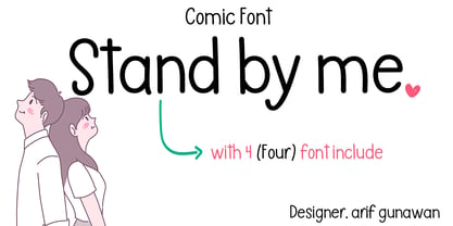 Stand By Me Display is a modern calligraphy design, including Regular. This font is casual and beautiful with swash. Can be used for various purposes. such as logos, product packaging, wedding invitations, branding, headlines, signage, labels, signatures, book covers, posters, quotes, and more.
 - Kole P Rounded by NicolassFonts,
$25.00 Kole P Rounded is based on the Kole font family. The complete family contains 18 weights. Kole P Rounded family is ideally suited for signage, packaging, brand identity, software, editorial design, as well as web and screen design. Perfectly for headlines and logotypes.
 - Dea Githa by Gatype,
$12.00 Dea Githa is sweet calligraphy font, including Regular. This font is casual and pretty with swashes. Can used for various purposes. such as logo, product packaging, wedding invitations, branding, headlines, signage, labels, signature, book covers, posters, quotes and more. Thanks & Happy Designing!
 - Zirphy by ActiveSphere,
$30.00 Zirphy is a rounded geometric display font and works best in display applications, such as posters, headline, magazine, product branding, corporate branding, signage, logos and titles. Each style has a full upper and lower-case, accents, punctuation and a selection of monetary symbols.