10,000 search results
(0.025 seconds)
- Nura by Sabrcreative,
$12.00 Introducing the Nura Font Family is the modern Display sans serif family. The Nura Font family comes in various sizes from Thin to Black, giving you the freedom to get creative with this font. With strong characters in the size of Black, it is very suitable for use for sign displays. and other sizes you can use as needed for your project
 - Masserini by Studio Sun,
$16.00 Masserini is inspired by the 20's art deco era of colorful posters, fonts, and typography with a vintage flair. With its strong geometric shapes and letters, like a style of sans serif that was used in signs and posters during that time period. This collection consists of a variety of widths, weights, and variants to suit your creative needs.
 - Alea Weiqsaw by Sitintahitam,
$25.00 Alea Weiqsaw inspired from victorian era, art neuveau, psychedelic art and music. This font comes with unique trippy style, it will be interesting to make a headlines, packaging design and vintage style logotype like a cover album, sign logotype, vintage headline. Alea Weiqsaw also bring some alternative glyph and unique ornament. This combination allows you to easily develop awesome designs.
 - Rodeo Rebels by Putracetol,
$24.00 Rodeo Rebels is a display typeface with a retro, cowboy, and western theme. It's perfect for designs that require a bold and masculine touch, such as branding, packaging, posters, and headlines. The font was inspired by vintage rodeo posters and the American Old West, where bold, slab-serif typography was a common sight. To make the most out of Rodeo Rebels, consider using it in designs that require a rugged and tough aesthetic, such as clothing and apparel, whiskey and beer packaging, and Western-themed events. Pairing it with other vintage-inspired elements, such as distressed textures and illustrations, can also help create a cohesive look and feel. With its bold and rugged aesthetic, Rodeo Rebels is a font that demands attention. It's perfect for projects that require a vintage and masculine vibe, and its features make it a versatile choice for a wide range of designs. Give your projects a touch of the American Old West with Rodeo Rebels, and let its bold and rugged style do the talking.
 - Galena Pro SC by Typorium,
$45.00 Galena Pro is an extended version of Galena, a typeface published for Bayer Corporation in 1996. Galena Pro is based on the open and organic forms imagined by the writers of humanist Italy, who designed the first so-called Roman characters. Humanist style fonts have moderate stroke contrast, uneven widths, and a classic, but soft and easy-to-read appearance. Galena Pro gives a new birth to the 15th century incunabula, a typographic drawing where the gestures of this standardized handwriting are not mechanical, but more fluid. The Galena Pro series can provide professional typography with OpenType features such as alternative sets of numbers, fractions and an extended character set to support Central and Eastern European as well as Western European Languages. The different styles of the Galena are enriched with a condensed variant to meet the need for space savings in titles and texts.
 - Galena Pro Condensed by Typorium,
$45.00 Galena Pro is an extended version of Galena, a typeface published for Bayer Corporation in 1996. Galena Pro is based on the open and organic forms imagined by the writers of humanist Italy, who designed the first so-called Roman characters. Humanist style fonts have moderate stroke contrast, uneven widths, and a classic, but soft and easy-to-read appearance. Galena Pro gives a new birth to the 15th century incunabula, a typographic drawing where the gestures of this standardized handwriting are not mechanical, but more fluid. The Galena Pro series can provide professional typography with OpenType features such as alternative sets of numbers, fractions and an extended character set to support Central and Eastern European as well as Western European Languages. The different styles of the Galena are enriched with a condensed variant to meet the need for space savings in titles and texts.
 - Plinth by Magpie Paper Works,
$42.00 Hand-drawn by an architectural renderer's daughter, Plinth is an craftsman-inspired font that leaves a strong and lasting impression. Both capital and lowercase letters have been designed for impacting display, but are also easily read in large blocks of text. Plinth includes multi-language support as well as a variety of OpenType features including decorative alternate caps, double-letter ligatures, complete fractions, currency figures, and 4 stylistic sets. Set One replaces commonly used titles (Mr., Mrs., Miss, Ms., and Dr.) with complementary hand-drawn versions. Set Two replaces 8 commonly used prepositions (and, the, to, to the, or, of, for and at) with complementary wordforms. Set Three seats counting contractions (1st, 2nd, 3rd, etc.) in their proper superscript place. And Set Four provides a fancy alternate of both ampersand and asterisk. Plinth is perfect for the designer, architect or orderly list-maker in all of us.
 - Soft Serve by Sentinel Type,
$24.90Looking like happy frosting on a cupcake at a twiddle bug party, this bouncy food entry from Canadian designer Haley Fiege turns the original Jellybrush type into organic happiness you can spread on pancakes, ice-cream, sorbets, sauces and condements, oh peanut butter! Yeah, all kinds of sandwich fillings. Anything really. What else? People who own rubber factories. Anybody in the food business, like green grocers or your local bakery. Thrift stores. Falling somewhere between cushions and cat food, this flexible and inviting letter mixes simplicity with organic character and humor for a wide range of uses. Soft Serve’s compact cursive forms and bouncy friendliness draw on artbrush scripts and the typo-italic model of Renaissance Vatican scribe Ludovico Arrighi. A versatile workhorse ideal for: * Dairy & beverage * Sweets & soft drink * Five minute food & sauces * Pet food & accessories * Bathroom & kitchen * Cushions, pillows, rubber & swimming pool, etc. - Galena Pro by Typorium,
$45.00 Galena Pro is an extended version of Galena, a typeface published for Bayer Corporation in 1996. Galena Pro is based on the open and organic forms imagined by the writers of humanist Italy, who designed the first so-called Roman characters. Humanist style fonts have moderate stroke contrast, uneven widths, and a classic, but soft and easy-to-read appearance. Galena Pro gives a new birth to the 15th century incunabula, a typographic drawing where the gestures of this standardized handwriting are not mechanical, but more fluid. The Galena Pro series can provide professional typography with OpenType features such as alternative sets of numbers, fractions and an extended character set to support Central and Eastern European as well as Western European Languages. The different styles of the Galena Pro are enriched with a condensed variant to meet the need for space savings in titles and texts.
 - Vesta by Linotype,
$29.99 In the late 1990s Gerard Unger won the assignment to design the signage system for the Holy Year celebrations to be held in Rome in 2000. The system he developed in cooperation with the design agency n|p|k used a classically inspired serif typeface, but the earlier proposals included a sans-serif, which became Vesta (2001). Vesta is a versatile family that can be used as a display face alongside Unger's serif faces Gulliver, Capitolium or Coranto; it can also be used on its own, even in longer texts. Vesta is narrower and therefore more economical than some commonly used sans serifs such as Arial and Helvetica; there is also a noticeable contrast between thick and thin parts, which makes it more lively. Vesta is to be extended with narrow versions, small capitals and old style numerals, along with some special versions for headlines.
 - BeachBar by DearType,
$40.00 BeachBar is a modern bold script with a sunny mood. It is inspired by, well, Beach bars, the summer and the sea, the hot afternoons with a cocktail in your hand and the sound of splashing waves. Beachbar turns our love for summer into a dynamic and vivacious font that comes in three different styles to choose from: BeachBar (connecting small letters, disconnected basic caps, ideal for text), BeachBar Alt (all letters are disconnected) and last but not least BeachBar Script (connecting letters, script-like caps and a bold set of swash capitals for more eye-catching designs). All three styles come in six weights making the font versatile and useful both for web and print; think websites, posters, menus, logotypes, cards, signage, packaging and whatnot. BeachBar is friendly, sturdy and it makes a statement, but most of all, it is fun to play with.
 - Plinc Italiano by House Industries,
$33.00 Dave West’s Italiano is a smooth and sensuous typographic dish with a few extra savory dashes. The silky semi-serif combines ingredients from eighteenth-century engraved italics and nineteenth-century Italian Modern, softened by fine stroke endings and plump dolloped terminals. Preserve Italiano’s subtle flavors by maximizing its size in headlines, advertising captions, and identity campaigns, or capitalize on its swash characters to sweeten package and poster designs. However you use it, Plinc Italiano is a tasty typographic treat—non ci piove! Drawn in the late 1960s for Photo-Lettering, Inc., Italiano was digitized by Steve Ross with Ken Barber in 2015. Like all good subversives, House Industries hides in plain sight while amplifying the look, feel and style of the world’s most interesting brands, products and people. Based in Delaware, visually influencing the world.
 - Bouba Round by HVD Fonts,
$40.00 Bouba Round is more than it seems on first sight. It combines the best of two worlds, having an expressive character with its round and friendly shapes and performing great in every typographic aspect. The type family is a true workhorse, ready for serious typography. Creating a round typeface with a great reading experience has been our guiding principle throughout the design process — Bouba Round needed to work in small sizes and long text as well as in Headlines. To ensure a great reading experience in most languages, Bouba Round has a huge language support including nearly all latin based languages, Greek and Cyrillic. On top of an extensive language support, Bouba Round is loaded with a lot of icons, arrows and graphic elements for modern UI/UX design.
 - Refinest by Nathatype,
$29.00 Whether for personal or professional purposes is absolutely needed to light up your result. Ignite the potential within you and elevate all your design performance with the Refinest. Refinest is an amazing serif font. While it certainly gets the job done in terms of readability, the unique characters give this particular font a more artistic vibe but still elegant than other serifs. Features: Alternates Ligatures Swashes Numerals and Punctuations PUA Encoded It can be used for many design projects, such as poster, logo, book cover, branding, heading, printed product, merchandise, quotes, social media campaign, etc. Learn more about how to use it by seeing the font preview. Thank you for purchasing our fonts. Please don’t hesitate to contact us, if you have any further question or issues. We’re happy to help. Happy Designing.
 - Texta Pro by Latinotype,
$29.00 Because all good things can get better. Texta was born in 2014, a collaborative project of the study of humanist models from Edward Johnston to Adrian Frutiger. Texta Pro is a contemporary and rational sans, almost invisible, but not quite. It is a workhorse for any type of project. New design of symbols such as Section, Partialdiff, Dagger, approxequal, among others. Expansion of monetary signs (Bitcoin, Peso, Franc, etc.) Basic ligatures fi, fl. Includes Cyrillic. Added set of small caps for Latin, Cyrillic, numbers, punctuation and monetary. Increased set of monetary and mathematical symbols. Set of 983 glyphs, 487 more glyphs than the update. New ligatures ff, ffi, ffl, It has two stylistic sets, ss01 and ss02 (tails). Set of numbers with versions: higher, lower, denominators, numbered, old, modern and tabular for the last two cases. New fractions added. Set of case sensitive signs.
 - EraMax Radial by Our House Graphics,
$16.00 EraMax Radial is a geometric sans serif meant to be set BIG, for big statements. It's the perfect face for signage, packaging posters, branding and so on and on, where a strong voice is needed. It has a modern look that will work in a retro setting. Or, should that be a vintage look that will work in a modern setting. This is the first of what is to be a series to typefaces inspired by the original hand painted signage found in the TH&B train station in Hamilton Ontario. This classic Art Deco, Or, more precisely, Art Moderne building designed by the New York architectural firm of Fellheimer and Wagner and completed in 1933. The original lettering included about 75% of the uppercase letters only, so the balance of the uppercase and the lowercase plus all the other glyphs were extrapolated from the look and feel of the existing uppercase letters. Figures are based on the numerals on the station clock, with adjustments made to harmonised with the letters.
 - Barbiela Script by Bosstypestudio,
$14.00 Barbiela Script is a modern calligraphy cute font, Can be used for various purposes. such as logos, product packaging, wedding invitations, branding, headlines, signage, labels, signatures, book covers, posters, modern, script, quotes and others.
 - Bomboloni by Goodigital13,
$20.00 will be great for any projects including : branding, logo, stationery, business card, signage, flyer, brochure etc. Almost all industries will be match for this typeface: wedding, events, rmakeup artist, travel, hotel, musician etc, food
 - Alpine Script by Borges Lettering,
$42.00 Get creative with the adventurous brush casual Alpine Script from Charles Borges de Oliveira. This stunning typeface contains 29 alternate characters waiting to be explored. Great for anything from signage to culinary packaging. Enjoy!
 - Ketamine One MF by Masterfont,
$59.00 A practical font family with 3 weights for all your day by day design needs: headlines, signage etc. An extended sans serif typeface with rounded endings that provides unique industrial appearance without losing legibility.
 - Fringio by Rex Face,
$19.99 Fringio is a fun-loving sans-serif display font. Key characters are formed with curved, flowing lines, resulting in some pleasing word forms. Fringio is great for branding, headlines, signage, social media and more.
 - Batish MF by Masterfont,
$59.00 A practical font family with 4 weights for all your day by day design needs: headlines, signage etc. An extended sans serif typeface with rounded endings that provides unique softness appearance without losing legibility.
 - Boldatin by Patria Ari,
$10.00 Boldatin font family, a slab display typeface with different styles (regular, slanted, condensed, condensed slanted) with total of 24 fonts and 6 weight that suit for your project like signage, poster, banner, flyer, etc.
 - Corner by URW Type Foundry,
$35.99 A unique kind of type by Michael Herold: The 14 cuts of Corner are equally distributed to the two style variants A and B. From Thin to Extra Bold, variant A comes with technical and pure forms while B appears with a soft, more personal character. In combination, the two variants add up to a highly versatile family which is very well suited for branding purposes, thanks to its diverse forms of expression. Eine besondere Schriftfamilie von Michael Herold: Die 14 Schnitte der Corner sind auf die beiden Stilvarianten A und B verteilt. Von Thin bis Extra Bold kommt die Corner im Stil A mit technischen, reinen Formen und im Stil B mit weichem, persönlicherem Charakter. Als Kombination ergibt sich eine sehr vielfältige Familie, die sich mit ihren verschiedenen Ausdrucksformen besonders fürs Branding eignet.
 - Neue Frutiger Paneuropean by Linotype,
$79.00During planning for the new Roissy Charles de Gaulle airport in Paris at the beginning of the 1970s, it was determined that the airport's signage system had to include the clearest and most legible lettering possible. The development of all signage was put into the hands of Adrian Frutiger and his studio. The team carried out their task so effectively that a huge demand for their typeface soon arose from customers who wanted to employ it in other signage systems, and in printed materials as well. The Frutiger® typeface not only established new standards for signage, but also for a range of other areas in which a clear and legible design would be required, especially for small point sizes and bread-and-butter type. The typeface family that which emerged as a result of this demand was added into the Linotype library as "Frutiger" in 1977. Frutiger Next, created in 1999, is a further development of Frutiger, not necessarily a rethinking of the design itself. It was based on a new concept, the most obvious visual characteristics of which is the larger x-height, as well as a more pronounced ascender height and descender depth for lower case letters in relation to capitals. This new design created a balanced image and included considerably narrower letterspacing. Frutiger Next meets the demand for a space-saving, modern humanist sans. 2009's Neue Frutiger is a rethink of the 1977 Frutiger family, now revised and improved by Akira Kobayashi in close collaboration with Adrian Frutiger. Despite the various changes, this "New Frutiger" still fits perfectly with the original Frutiger family, and serves to harmoniously enhance the weights and styles already in existence. The perfect mix, guaranteed Neue Frutiger has the same character height as Frutiger. As a result of this, already existing Frutiger styles can be mixed with Neue Frutiger where necessary. Likewise, Neue Frutiger is perfect for use alongside Frutiger Serif. Newly added are the "Neue Frutiger 1450" weights. Especially for the requirements of the newly released German DIN 1450 norm we have built together with Adrian Frutiger specific weights of the Neue Frutiger. The lowercase l" is curved at the baseline to better differentiate between the cap "I", additionally the number "0" has a dot inside to better differentiate between the cap "O", and the number "1" is now a serifed 1. The font contains additionally the origin letterforms from the regular Neue Frutiger font which can be accessed through an Opentype feature." - Neue Frutiger Cyrillic by Linotype,
$89.00During planning for the new Roissy Charles de Gaulle airport in Paris at the beginning of the 1970s, it was determined that the airport's signage system had to include the clearest and most legible lettering possible. The development of all signage was put into the hands of Adrian Frutiger and his studio. The team carried out their task so effectively that a huge demand for their typeface soon arose from customers who wanted to employ it in other signage systems, and in printed materials as well. The Frutiger® typeface not only established new standards for signage, but also for a range of other areas in which a clear and legible design would be required, especially for small point sizes and bread-and-butter type. The typeface family that which emerged as a result of this demand was added into the Linotype library as "Frutiger" in 1977. Frutiger Next, created in 1999, is a further development of Frutiger, not necessarily a rethinking of the design itself. It was based on a new concept, the most obvious visual characteristics of which is the larger x-height, as well as a more pronounced ascender height and descender depth for lower case letters in relation to capitals. This new design created a balanced image and included considerably narrower letterspacing. Frutiger Next meets the demand for a space-saving, modern humanist sans. 2009's Neue Frutiger is a rethink of the 1977 Frutiger family, now revised and improved by Akira Kobayashi in close collaboration with Adrian Frutiger. Despite the various changes, this "New Frutiger" still fits perfectly with the original Frutiger family, and serves to harmoniously enhance the weights and styles already in existence. The perfect mix, guaranteed Neue Frutiger has the same character height as Frutiger. As a result of this, already existing Frutiger styles can be mixed with Neue Frutiger where necessary. Likewise, Neue Frutiger is perfect for use alongside Frutiger Serif. Newly added are the "Neue Frutiger 1450" weights. Especially for the requirements of the newly released German DIN 1450 norm we have built together with Adrian Frutiger specific weights of the Neue Frutiger. The lowercase l" is curved at the baseline to better differentiate between the cap "I", additionally the number "0" has a dot inside to better differentiate between the cap "O", and the number "1" is now a serifed 1. The font contains additionally the origin letterforms from the regular Neue Frutiger font which can be accessed through an Opentype feature." - Neue Frutiger 1450 by Linotype,
$71.99 During planning for the new Roissy Charles de Gaulle airport in Paris at the beginning of the 1970s, it was determined that the airport's signage system had to include the clearest and most legible lettering possible. The development of all signage was put into the hands of Adrian Frutiger and his studio. The team carried out their task so effectively that a huge demand for their typeface soon arose from customers who wanted to employ it in other signage systems, and in printed materials as well. The Frutiger® typeface not only established new standards for signage, but also for a range of other areas in which a clear and legible design would be required, especially for small point sizes and bread-and-butter type. The typeface family that which emerged as a result of this demand was added into the Linotype library as "Frutiger" in 1977. Frutiger Next, created in 1999, is a further development of Frutiger, not necessarily a rethinking of the design itself. It was based on a new concept, the most obvious visual characteristics of which is the larger x-height, as well as a more pronounced ascender height and descender depth for lower case letters in relation to capitals. This new design created a balanced image and included considerably narrower letterspacing. Frutiger Next meets the demand for a space-saving, modern humanist sans. 2009's Neue Frutiger is a rethink of the 1977 Frutiger family, now revised and improved by Akira Kobayashi in close collaboration with Adrian Frutiger. Despite the various changes, this "New Frutiger" still fits perfectly with the original Frutiger family, and serves to harmoniously enhance the weights and styles already in existence. The perfect mix, guaranteed Neue Frutiger has the same character height as Frutiger. As a result of this, already existing Frutiger styles can be mixed with Neue Frutiger where necessary. Likewise, Neue Frutiger is perfect for use alongside Frutiger Serif. Newly added are the "Neue Frutiger 1450" weights. Especially for the requirements of the newly released German DIN 1450 norm we have built together with Adrian Frutiger specific weights of the Neue Frutiger. The lowercase l" is curved at the baseline to better differentiate between the cap "I", additionally the number "0" has a dot inside to better differentiate between the cap "O", and the number "1" is now a serifed 1. The font contains additionally the origin letterforms from the regular Neue Frutiger font which can be accessed through an Opentype feature."
 - Kristopher by Vintage Voyage Design Supply,
$22.00 An elegant serif with contrasting lines and balanced curves. A lot of stylish alternates will give you many useful variations for use. Try to play with the compositions of curves / alternate letters. This font may be conservative and classic, but also may be more playful and modern. It is good for theater or art posters and for modern music, web-pictures or vinyl covers. Of course it also will be good for coffee shops, cafe's, restaurants, magazine's headers, signs or gift/post cards and weddings. Try to use it in your beauty or travel blogs, you will see how many options you will have with stylish Kristopher.
 - XXII Gory Bastard by Doubletwo Studios,
$25.99The Bastard is the cheap alternative for you to easily create a logo for your band or whatever. It comes with a basic characterset and a little bunch of symbols and signs often used in the extreme music sector. Some classical stuff from Death- and Blackmetal like pentagrams and crosses, roots and branches and lots of other things. With all of these you’ll be able to customise your logo to the look of your interest. Open it up in your graphic-editing-application and be creative, play with it and find out what’s possible. Check out the PDF in the Gallery for detailed information. Or on behance.net . - Astro by Just My Type,
$20.00 When Sputnik launched in 1957, the world was launched into the Space Age, baby! It was rockets and soda shops, souped-up jalopies and Fairlane convertibles with radios blaring. Rock and Roll. American Bandstand and the Race to Space. Astro aims to call back those exciting days with a look that might have graced the sign of your local drive-in or donut shop. The uppercase characters look like they could fly, suggesting spacecraft, UFOs. Use it for Retro future events or business branding. It also seems to work exceptionally well, strangely, with French, Icelandic, Japanese and African names and anything to do with fish.
 - Bouwsma Script by Canada Type,
$24.95Bouwsma Script, based on Philip Bouwsma's own handwriting, was originally released in 1994 and settled for nothing less than being an instant classic. One of Bouwsma's widely used works in the 1990s, Bouwsma Script finds its home now at Canada Type, where it was updated with the Euro symbol and complete support for Turkish, Baltic, and Central and Eastern European languages. It now also comes in all popular font formats, including OpenType. Real, casual, friendly, and loaded with the designer's artistic touch, Bouwsma Script can be seen around the globe on plenty of store signs, book covers, product packaging, promotional posters and a variety of other paraphernalia. - Poster Inline JNL by Jeff Levine,
$29.00 The word "Signs" hand-lettered on the cover of a 1930s instructional book on sign and poster lettering was the basis for Poster Inline JNL.
 - Film Noir JNL by Jeff Levine,
$29.00Film Noir JNL is a classic Art Deco Alphabet from the brush of the late master sign painter Alf R. Becker, and appeared in Signs of the Times Magazine. Thanks to Tod Swormstedt of ST Media and the American Sign Museum for providing the reference material to make this font. - Ridgewood JNL by Jeff Levine,
$29.00 While watching a movie filmed on location in New York, one scene stood out with a classic neon sign for a neighborhood restaurant. Ridgewood JNL is based on the lettering from that sign, and emulates many of the Art Deco elements that was so unique to sign work of the day.
 - Bucks by Stereo Type Haus,
$20.00 The idea was to create a legible font based on graffiti (wide tip marker) hand styles. Special attention to tight spacing, stylish caps & alternate drips bring an authentic street aesthetic into any layout or signage.
 - Amassian by Akifatype,
$12.00 Amassian is a modern smooth brush and natural handwritten font, organic, dynamic and energetic sytle.Can used for various purposes. such as the title, signature, logo, correspondence, wedding invitations, letterhead, signage, labels, newsletters, posters, badges, etc.
 - Farland by Rillatype,
$15.00 Introducing, Farland. a bold script font that carries the vintage feel. This font is perfect for logo, headline, signage, packaging, branding, etc. Features : uppercase & lowercase numbers and punctuation multilingual alternates / swashes and ligatures PUA encoded
 - Merina by ActiveSphere,
$30.00 Merina is a fat slab typeface, and works best in text and display applications, such as headline, posters, signage, magazine, product branding, corporate branding, logos and titles. Several alternate characters are included in this typeface.
 - Butterfly MF by Masterfont,
$59.00 A practical font family with 3 weights for all your day by day design needs: headlines, web, signage etc. An extended sans serif typeface with rounded endings that provides unique softness appearance without losing legibility.
 - Milk Child by HafisHidayat,
$20.00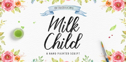 Milk Child is an organic, energetic, dynamic and modern handwriting script that can be used for various purposes, such as with titles, correspondence, wedding invitations, letterheads, signage, labels, signature newsletters, logos, posters, badges, and more.