10,000 search results
(0.051 seconds)
- Day N Nite by Typefactory,
$14.00 Day n Nite is a playful display font. It has a cheerful look that will elevate your crafting projects to the highest level, be it branding, headings, wedding designs, invitations, signatures, logos, labels, and much more!
 - Cafeterio MS by Redcollegiya,
$10.00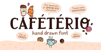 Cafeterio is a hand drawn cute font which makes it great for any children's design, be it a book cover, a t-shirt or a poster. Font includes latin and cyrillic characters, diacritics, numbers and punctuation.
 - Leytta by AEN Creative Studio,
$10.00 Leytta is a sweet, soft hand-lettered handwritten font. Fall in love with its authentic feel and use it to create gorgeous wedding invitations, beautiful stationary art, eye-catching social media posts, and cute greeting cards.
 - Lucky Skirt by Ali Hamidi,
$10.00 Lucky Skirt is a bold, fun, and playful display font. Its well-rounded and slightly chunky characters make this typeface an extremely versatile one! It can elevate the look of almost any of your beautiful creations!
 - Rocktopus by Okaycat,
$24.50 Rocktopus is a minimal fat blocky letter font. Each letter is designed for simplicity and maximum style points. Check it out! Rocktopus is extended, containing West European diacritics & ligatures, making it suitable for multilingual environments & publications.
 - Madelief by Balpirick,
$15.00 Madelief is a sweet, soft hand-lettered handwritten font. Fall in love with its authentic feel and use it to create gorgeous wedding invitations, beautiful stationary art, eye-catching social media posts, and cute greeting cards.
 - Dirty Lizard by Sipanji21,
$20.00 Dirty Lizard is a display font with a graffiti style. It will elevate a wide range of design projects to the highest level, be it branding, headings, wedding designs, invitations, signatures, logos, labels, and much more!
 - Head Strung by PizzaDude.dk,
$17.00 The Head Strung font is designed with a simple and basic serif structure, but has its oddities and curly lines. It comes with 4 different versions of each letter, and these automatically cycle as you type.
 - Mesopotamia by Teweka,
$15.00 Introducing New Mesopotamia Modern Signature, created with signature letters in mind. This font also has Swash, Ligature in it. You can use it as a logo, packaging, headline, poster, t-shirt, greeting card, wedding invitation, etc.
 - Madore by Heinzel Std,
$15.00 Madore is an elegant and modern script font. It maintains its classy calligraphic influences while feeling contemporary and fresh. This versatility will appeal to a wide range of crafty ideas, from letterheads and titles to stationery.
 - Relaunch by Fype Co,
$16.00 Relaunch delivers a classy, smart and timeless look. To make it look like handwriting, we created 20 ligatures and 15 alternates, so you can mix and match it to make a better style on your design.
 - Morning Mood by Tanincreate,
$12.00 Morning Mood Script is a handwritten font reflecting calligraphy lettering. It includes numbers, punctuation, alternates, ligatures, supports other languages. It is perfect for adding a hand lettered style to your stationery, headlines, branding and wedding invitation.
 - Crunk by Nerfect,
$15.00Crunk was inspired by the creator's (at the time) teenaged hoodlum of a brother. The font Crunk is great for headlines and text and has served its creator well over the years since it was made. - Things To Remember by Orenari,
$14.00 Things To Remember is a chill and friendly display font. Its natural and unique style makes it incredibly fitting to a large pool of designs. Level up your creative project with this thin yet memorable font.
 - Proband Special by SH Grafikdesign,
$25.00 The goal was to create a typeface that looks reputable and still original. Notably, some uppercase characters indicate this font its unique character. It is ideally suited for both body text and headings, or modern logos.
 - Steamer by Erik Bertell,
$29.95 Steamer is a grimy grotesque with a thick early 20th century air to it. A tireless workhorse, it is accustomed to carrying out any typographic task from continuous text to bold headlines steadily through any conditions.
 - PF Scandal Pro by Parachute,
$79.00 “A couple of years ago, when I was designing a package for a marmalade range, I started having a go at creating a typeface that would suit the package I had in mind. The whole process was intensely appealing to me: from merely using typefaces as an intricate part of my work as an art director, I started exploring the function of each and every element that a typeface consists of. The two things on my mind in designing a typeface for a marmalade brand were firstly, that I wanted it to have a hand-written feel, so as to exude that old-fashioned, homemade quality, and secondly, that it ought to have a certain sweetness and gentleness that would match the product. However, PF Scandal managed to outgrow its original inspiration. As I continued working on it, I toned down some of its elements to make it more versatile. And so, PF Scandal evolved into a typeface that has a contemporary, and yet handwritten look, which makes it suitable for a wide range of uses. The ‘Pro’ version comes with the full array of European characters including Latin, Greek and Cyrillic as well as 120 matching pictograms". -A.S.
 - Guanabara Sans by Plau,
$20.00 Guanabara is the third release of Plau Type Foundry. It started from the need of a wayfinding typeface that had personality enough to be the brand typeface for a city. The city of Rio de Janeiro, with its never-ending curves and all year long summer weather provided the constraints and requirements of this typeface. From there, it evolved to be a workhorse, with 8 weights from Thin to Black and matching true italics. It just had to have the features that all us designers have grown to love, such as alternate letters (a, g and r for the romans), tabular and proportional figures in lining and oldstyle set-ups as well as small caps, fractions and all that jazz (I mean, samba). And it needed to be recognizable and distinct. For that, design features like tapered R legs, capitals with classic proportions and calligraphic finishes on the terminals proved crucial. And last, but not least, like Rio, it had to welcome many cultures. We came to think of it as the “Typeface from Ipanema”, with a classic, timeless look, swinging elegance and joyful attitude.
 - Sintesi Serif by FSdesign-Salmina,
$- Sans meets serif. Would you like to express tradition by using a contemporary font? Sintesi might be exactly what you are looking for. Sintesi stands for synthesis: the unification of serif and sans-serif into a contemporary font, which surprises with different facets depending on its application. In copy size Sintesi performs like a sans-serif. It is a compact and well readable font that fulfills all requirements of modern digital media. In larger sizes, Sintesi unfolds its traditional character. Now, its strong contrast and the perceptible feather-ductus stand out clearly, as we appreciate it in a historical old style face. Sintesi is completed by a suitable italic. Its cursive character has more to do with writing-speed than to moderate inclination. Therefore Sintesi may be well-suited for many other purposes, not only for emphasis. The whole font family consists of 20 styles and offers a wide range of Western and Eastern European special characters, typographical ligatures, uppercase, oldstyle and fraction figures. Sintesi (Serif) builds together with Sintesi Semi and Sintesi Sans an extended family. Start combining antiquity with modernity! Download a free trial version of Sintesi with a reduced character set. Check it out!
 - Cresta by James Todd,
$40.00 Loaded with personality and functionality, Cresta is built to look good while surviving the worst conditions. It is at home on screen and in a magazine. Its six weights are intended to be used everywhere. Unlike most typefaces, Cresta was built without a reference. For this project, everything design choice was based on what worked best for a workhorse sans serif family. Cresta was originally created as the primary typeface for this website. This meant it needed to work in copy, headlines, and navigation across all devices, browsers and operating systems. This meant it needed to be sturdy and have enough character to make it stand out from other UI typefaces. With its large x-height, ample counters, and giant apertures, Cresta is meant for easy utility in rough conditions. Even with all of this, that doesnít mean that its dull; as the weights increase, the style of Cresta becomes more appearant. This style is defined most apparently by the terminals on the lowercase r and the angle of the joins between the curved and straight strokes (such as in the connection on the n).
 - Letterboard by Sunday Creative Co.,
$12.00 Creatives understand the compulsion to make something of worth. And each creative person has a toolbox they grab from often. Letterboard Lite is the narrow geometric sans that can headline or support whatever project is next on your list — the one unfussy tool you’ll use time and again. With its geometric shapes, Letterboard is a ground-floor sans that stabilizes the foundation upon which everything else will be built. It cements the context unobtrusively without begging to be acknowledged. Pair Letterboard with any script typeface and it will highlight that script’s qualities, whether capricious or elegant. Pair it with a serif or slab serif for an obvious change of tone: With a modern slab, trends will be respected, but it will act more coy with an old-school chunky slab. Letterboard’s geometry is easily subsumed as a partner to a range of serifs, from classics to the latest releases. These qualities and its narrowness make it easy for Letterboard to be used as a large display font in headlines or branding applications. Letterboard comes with 270 characters necessary for setting over 150 Latin-based languages: A–Z with diacritics, lining numerals, and the most common punctuation and symbols.
 - Namile by Craft Supply Co,
$20.00 Introducing Namile – Playful Sans Serif A Playful Twist on Sans Serif Namile, our Playful Sans Serif font, is a delightful departure from the ordinary. Its quirkiness and fun factor set it apart from the crowd. Eccentric Display Font Crafted especially for eccentric displays, Namile injects a delightful dash of whimsy and vibrancy into your creative projects. Versatile for a Range of Designs Namile’s versatility truly shines in various design contexts. This makes it an ideal choice for a broad spectrum of creative endeavors, from branding to posters. A Playful and Memorable Experience Namile ensures that your content is not only playful but also memorable. It captivates your audience, leaving a lasting and cheerful impression. In Conclusion In summary, Namile – Playful Sans Serif is the font that brings a playful and quirky twist to the world of sans serif fonts. Its versatility allows it to shine in various creative projects, ensuring they stand out with a sense of fun and vibrancy. Whether it’s for branding, posters, or any other design endeavor, Namile captivates your audience, leaving a memorable and cheerful mark, making it accessible to a diverse readership.
 - Ambicase Fatface by Teeline Fonts,
$48.00 Most fonts include uppercase and lowercase letters. Some experimentally-minded designers have proposed unicase typefaces as well: rather than having two different forms for a given letter, unicase fonts have one, chosen from the upper- or lowercase forms. Ambicase Fatface takes the next step, offering not "either/or", but rather "both/and". Each letter in Ambicase Fatface is a combination of its traditional upper- and lowercase forms, in an extra-bold style. Its inventive, hybrid forms are a bolder take on those of its 2010 sibling typeface, Ambicase Modern. Ambicase Fatface stands out as a carefully crafted experimental font: its eccentric forms do not hinder its readability. It is suitable for high-style display settings. Ambicase Fatface offers a large character set and extensive OpenType features. Most notably, in modern OpenType-aware applications, Ambicase Fatface can be set in swash mode, which features sophisticated decorative flourishes that differ depending on whether the letter is at the beginning, middle, or end of a word. Ambicase Fatface is available in two optical sizes: Regular and Poster. At very large sizes, the Poster cut, with its finer details, is recommended.
 - Jack Knife by Mike Zuidgeest,
$14.00 The "Jack Knife" font is a unique, handcrafted font that perfectly captures the spirit of the medieval time period. With its spiky, pointy design, this font exudes strength, courage, and boldness – making it the perfect choice for anyone looking to add a touch of daring to their brand. The sharp, jagged edges of the "Jack Knife" font give it a rugged, rustic feel that is both timeless and modern. Its bold, thick strokes make it easy to read even from a distance, while the intricate details and delicate curves add a touch of elegance and sophistication. Whether you're looking to create a bold, daring logo for a whisky brand or add a touch of adventure to your design, the "Jack Knife" font is the perfect choice. Its unique design and versatile style make it suitable for a wide range of projects, from branding and packaging to advertising and social media. So if you're looking for a font that embodies the spirit of the medieval period and exudes strength, courage, and boldness, look no further than the "Jack Knife" font – the perfect choice for anyone who wants to make a bold statement with their design.
 - Mikea by Craft Supply Co,
$20.00 Introducing Mikea – Elegant Luxury Font Elegance Personified Mikea – Elegant Luxury Font is, without a doubt, the epitome of sophistication and class. It has been meticulously crafted to infuse a touch of opulence into your designs. Luxury Redefined Furthermore, this sans serif font exudes luxury in every letterform, making it an ideal choice for projects that require a sense of opulence and refinement. It takes the concept of luxury to a whole new level. Timeless Elegance Mikea encapsulates timeless elegance. It ensures that your designs maintain a sense of prestige and grandeur that stands the test of time. With Mikea, your work exudes a classic charm. Perfect for Prestigious Projects Whether it’s high-end branding, premium packaging, or upscale invitations, Mikea’s elegant luxury font elevates the perception of your projects to new heights. It is the ultimate choice for conveying prestige. In Conclusion In conclusion, Mikea – Elegant Luxury Font is your gateway to a world of sophistication and grandeur. With its timeless elegance and unparalleled refinement, it effortlessly adds a touch of luxury to your designs. When you choose Mikea, you choose the finest in typographic elegance, setting a standard of opulence and prestige that leaves a lasting impression.
 - Bigsize by Astageni,
$16.00 Unleash the playful vibes with Bigsize, a vibrant display font crafted to command attention and inject a dose of fun into any design. The bold, rounded letterforms make it a perfect choice for titles, headlines, and product packaging. Its whimsical charm also positions it as an ideal companion for brands targeting a youthful or lighthearted audience. Bigsize isn't just about fun; it's designed to be both playful and functional. Its readability, even at larger sizes, ensures that your message shines through. The font's distinctive style is a testament to the designer's creative exploration of letterforms, resulting in a typeface that strikes the perfect balance between playfulness and legibility. With over 350 glyphs, including support for broad Latin and Cyrillic languages, Bigsize proves its versatility across various design projects. Whether you're working on posters, billboards, logos, or digital ads, this font is your ticket to making a bold and memorable statement. Whether you're crafting a poster, developing packaging for a brand, or spearheading an advertising campaign, Bigsize is the font that will set your project apart. Its bold and comical aesthetic captivates your audience's attention, while its readability ensures your message resonates effortlessly."
 - Evalfey Variable by insigne,
$99.99 Introducing Evalfey— a script that captivates at first glance. With its refined and polished demeanor, Evalfey invites you into a world of elegance, yet its simplicity makes it incredibly accessible. The elevated x-height, distinctive flag-like terminals, and the fluidity of its sweeping strokes imbue the font with a harmonious and flowing quality, elevating your designs to new heights. Ideal for wedding invitations and more, Evalfey Script exudes a romantic allure with its brushed look and pronounced 'nuptial' ambiance. Whether it's for save-the-date cards, thank-you notes, or any cherished wedding memorabilia, Evalfey is the epitome of sophistication and grace. Stand out from the ordinary with Evalfey— a font that marries simplicity with regality, making it the quintessential choice for weddings that aspire to be remembered. The lofty x-height, elegant terminals, and rhythmic strokes render Evalfey a crown jewel in typographic design. Elevate your special moments with Evalfey, a harmonious blend of elegance and simplicity, making it your go-to font for wedding invitations, announcement cards, and any keepsake that calls for a touch of the extraordinary. Production assistance from Lucas Azevedo.
 - Chester Chesire by Putracetol,
$23.00 Chester Chesire - Elegant Font Duo is a digital product featuring a script and serif font duo designed with an elegant and luxurious style. Inspired by classic design with a modern touch, this font aims to provide a captivating and professional impression in various design contexts. It is particularly suitable for magazines, the fashion industry, headlines, printing materials, wedding invitations, and businesses seeking an aesthetic and beautiful font. One of the key highlights of Chester Chesire is its diverse range of alternative characters, allowing for interesting design variations and personalized text looks. It offers excellent compatibility with different businesses and industries, making it a great choice for fashion companies, design studios, creative agencies, advertising firms, and more. With Chester Chesire - Elegant Font Duo, you gain access to an elegant and luxurious font that enhances your design projects. Its rich alternative characters provide flexibility and creativity, while its compatibility with different software and operating systems ensures ease of use. Elevate your visual message and design impression with this captivating font, perfect for magazines, fashion, weddings, and businesses that prioritize a refined aesthetic. Add Chester Chesire to your font collection and enjoy the benefits of its professional appearance and high-quality design.
 - Premium Sans by ZeeshanFoundry,
$40.00 Premium Sans is a professional typeface which is aspired to solve the major typographic challenges in editorial, print, Graphic design, Commercial designs and other form of templates and documents such as pdf or ms word. It has four weights light, regular, semi bold, bold. Each with an italic profile, so in total it has 8 typefaces. We created this typeface to have attention of reader in Graphic commercial designs and as well as on editorial designs. The X-height plays a great role in readability of a typeface, so we tried to give it a reasonably high x-height with accordance to ascenders and descenders. We've engineered it in such a way that it can easily be paired with script, slab serif and serif typefaces. Premium sans is made on minimum required character set which will be handy while typing currency symbols like cents, dollars or euro and also be very useful when typing the characters consisting of diacritic. We've designed it in such a way that either you write a long content for editorial purposes or you create a typographic or graphic/commercial design it will look nice and fine which is the uniqueness of this font.
 - Organic Pro by Positype,
$29.00 When I released the original Organic in 2009, I was satisfied with it. It was what was possible from me and the technology at the time. The Organic Pro of 2021 takes those original desires of delivering a highly legible and friendly sans serif, and doubles down on those notions, while exploring what further infusing warmth in a highly structured sans serif can really do for a client. Free of distracting and potentially dating visual traits and cues that could be seen as endemic of a specific time period or ‘type trend’, Organic Pro is its own person—take it or leave it. Inviting warmth, assured reliability, and a head nod of confidence is what you walk away with—a stark contrast to the cold, impersonal geometrics and grotesques proliferating the design annuals currently. Releasing this typeface now, completely redrawing the masters, as well as expanding the weight and language options, should be seen as a laid back challenge that we need to do less with type, let it communicate confidently and warmly when it needs to, and stop forcing one-size-fits-all type trends on everyone.
 - Blackduck by Eurotypo,
$60.00 “Blackduck” font is a typical Gothic, usually named “Blackletter” . This typeface was born with the name of “Textur” and developed from Carolingian cursive. It was used in the middle age as sacred script, became increasingly narrower, his vertical lines were emphasized and his strokes very compacted to save space. Along the time the early German print typefaces derived in others styles that were more readable such as Schwabacher and Fraktur, very popular in Germany and sometimes associated to the identity of the country. The font "Blackduck" was inspired mixing carefully the last two “Blackletters”. We try to joine some characteristics of both to reach good legibility without loosing the strong impact and powerfulness of the shapes. Some minuscules like the “o” “c” “e” “d” are rounded on both sides, while both strokes join in an angle at the top and at the bottom. Some other lower cases are formed by an angular and rounded stroke. This font contains a full set of OpenType features; swashes, stylistics alternates, old style figures (Arabic numeral were carefully shape integrated), ligatures and some extras ornaments were added to help in your design. "Blackduck" includes diacritic signs for Central European languages.
 - Ongunkan Bosnia Pyramid by Runic World Tamgacı,
$100.00 The signs of the Bosnian pyramids The pyramid researcher, Semir Osmanagic, began excavations in 2005 in Visoko, Bosnia, 30 km North from Sarajevo. Mr. Senad Hodocic, the curator at the local museum, pointed out at the pyramidal shape of the Visocica Mountain, which grabbed Osmanagic's attention. It is also suspected that the four adjacent hills, covered by plants and greenery, also hide the pyramids. The main sites of the excavations are called the Pyramid of the Sun and the Pyramid of the Moon, and the results achieved so far have already proved that those structures are man-made and artificial. The Pyramid of the Sun is bigger and older than the pyramid in Giza, which was built by Pharaoh Cheops 4600 years ago. Gábor Szakács, who went to the site in June 2006 for the first time, found the symbols on the megalithic blocks inside the tunnel of the Pyramid of the Sun, which correspond to the ancient Hungarian runic writings. Further information about the Bosnian Pyramids is available at the website http://www.piramidasunca.ba/. There are also researchers who do not accept the subject of the Bosnian pyramids. Time will tell the truth.
 - Boatman by YdhraStudio,
$20.00 Boatman Font – 3 Styles + Extras We introduce our new font called Boatman. Boatman is a (All Caps) vintage display font inspired from classic whiskey labels, vintage labels and sing painting. Boatman comes with 3 styles (Regular, Outline and Stamped) that extends the possibilities when you design something. Boatman also has the Stylistic Set. With the Stylistic Set, Boatman gives you so many options to create something awesome. Mix and match the alternate characters to add an attractive message to your design. Furthermore the Boatman includes a Set of Ornament Labels which perfectly complement text compositions. You can see it on my presentation examples. Boatman is great for Logotype, Branding Design, Logo Design, Badges, Digital Lettering Arts, T-Shirt/Apparel, Headline, Posters, Magazine, Signs, Advertising Design, and any vintage design needs. Boatman Features : - All Caps Characters, Punctuation, Numerals. - Opentype Feature such as Stylistic Set. - Fully accessible without additional design software. - Includes a range of multilingual characters. - Ornament Labels You can access all those alternate characters by using a program that supports OpenType features such as Adobe Illustrator CS, Adobe Indesign & CorelDraw X6-X7. Guides to access all alternates glyphs : http://adobe.ly/1m1fn4Y
 - Tinkuy Patterns by Sudtipos,
$29.00 Meaning of Tinkuy. Tinkuy is a Quechua word that means a meeting of opposing forces that complement each other. A meeting of opposites and differences. A meeting point where different thoughts, interests, feelings and aspirations confront and converge, providing the resurgence of new ways of thinking and that are embodied in confrontational actions, in mobilizations that seek change. Tinkuy patterns is born from the analysis of different archaeological pieces of native cultures of the Andes, where the visual signs that are recorded on them are related to the concept of encounter. It is part of the research project Crónicas Visuales del Abya Yala by designer Vanessa A. Zúñiga Tinizaray. — The Tinkuy Patterns. The Tinkuy Patterns system is divided into six files containing a total of more than 2650 modules that can be combined together creating an infinite range of possibilities. The digitization of the typeface family has been carried out by Ale Paul, through the Sudtipos foundry. An infinite number of possible combinations can be accessed by using the letters on the keyboard. Although a certain shape predominates in each set, they can be combined with each other.
 - Vtg Stencil France No1 by astype,
$40.00 The Vtg Stencil fonts from astype are based on real world stencils from several countries. In the case of French stencils the challenge was special, because of the varieties of different widths and weights between the stencil sets – so I made France No. 1, No. 3 and No. 5. The most unique and eye-catching elements of typical French stencils are the figures 1, 2, 3, 7 and a specially 5. The figure 5 changes in style on smaller stencil sizes, its bobble getting replaced by something like a “breve”. The letters J and Q can differ in style too. While the local stencil lettering styles are gradually disappearing in other countries, there are regions in France, such as Normandy and Brittany, where these stencils are still in use today. They are used for technical lettering, which is what stencils were originally intended for, but also for ads and information signs in a more artistic or patriotic context. Over the time, these stencil letters became a globally recognized landmark of French design and French taste. All styles offering an extended Latin character set. » pdf specimen «
 - PT Sans Pro by ParaType,
$50.00PT Sans Pro is a comprehensive type family intended for a wide range of applications. It consists of 32 styles: 6 weights (from light to black) with corresponding italics of normal proportions; 6 narrow styles; 6 condensed styles; 6 extra condensed styles and 2 caption styles (regular and bold). The design combines traditional conservative appearance with modern trends of humanistic sans serif and possess enhanced legibility especially in caption styles. These features, besides conventional use in business applications and printed materials, make the fonts usable for direction and guide signs, schemes, screens of information kiosks, and other objects of urban visual communications. The fonts have extended Latin and Cyrillic character sets serving alphabets of all title languages of the national republics of Russian Federation and supporting the most of the languages of neighboring countries. Each font contains about 1400 characters including small caps for all alphabetic characters, 4 sets of figures with lining and old style variations, stressed Cyrillic vowels, indices, fractions and so on. Design -- Alexandra Korolkova with assistance of Olga Umpeleva and supervision of Vladimir Yefimov. The fonts released by ParaType in 2010. - Mirenath by Arterfak Project,
$13.00 Introducing Merinath Typeface a rounded vintage monoline. Merinath is clean modern-vintage display font which inspired from old school letterpress and rounded sans serif shapes. This font was created and explored become 3 styles with over 500 glyphs on each font. Also with many features that give you many options in your design project. You can access the open type features by accessing Font Book (Mac) and Character Map (Win) or you can get it in design software like Photoshop, Illustrator, CorelDraw, InDesign etc. Here's what you'll get : - Merinath Normal : Looks good for a headline, editorial, body text, and other formal styles. - Merinath Rounded : With the inky effect, this style is awesome for old school, hipster, vintage, typographic, sign board, logo design and letterpress effect. - Merinath Bold : Suitable for food, kids, logotype and other joyful designs. TTF & OTF format features : - Uppercase - Lowercase - Numbers - Symbols - Ligatures - Stylistic alternates - Contextual alternates - Swashes - Stylistic set 01 - Stylistic set 02 - Multilingual characters : Afrikaans, Albanian, Catalan, Croatian, Czech, Danish, Dutch, English, Estonian, Finnish,French, German, Hungarian, Icelandic, Italian, Lithuanian, Maltese, Norwegian, Polish, Portugese, Slovak, Slovenian, Spanisch, Swedish, Turkish, Zulu Thank you for visits and enjoy!
 - Cheltenham Pro by SoftMaker,
$15.99 Where most typefaces are designed by just one individual, quite a few people have been involved in perfecting Cheltenham over the times. In 1896, the architect Bertram Grosvenor Goodhue created the initial design for Ingalls Kimball at the Cheltenham Press. Just a few years later, Morris Fuller Benton devised a full family of Cheltenhams for ATF. This is the basis of the design we have today. In 1975, Tony Stan revived this classic typeface and did what was customary at the time: increase the x-height and make the Cheltenham family more regular. SoftMaker updated the design yet again in 2012. The result is Cheltenham Pro, a typeface that is exceptionally readable and holds up even in adverse printing conditions. SoftMaker’s Cheltenham Pro typeface family contains OpenType layout tables for sophisticated typography. It also comes with a huge character set that covers not only Western European languages, but also includes Central European, Baltic, Croatian, Slovene, Romanian, and Turkish characters. Case-sensitive punctuation signs for all-caps titles are included as well as many fractions, an extensive set of ligatures, and separate sets of tabular and proportional digits.
 - Fer by ParaType,
$30.00 Fer is a sans-serif font for body text, not lacking in its own distinctive voice. The aftertaste of reading the text set in Fer is like reading the letters on old rusty plates somewhere in Southern Europe, hence the name (Fer means iron in French). Being a modern system that includes a variable font with weight and optical size axes, Fer combines the features of geometriс sans serifs and old sans serifs with closed apertures. The typeface contains three sets of styles: for captions, text and headings, — with the weight ranging from regular to black. Fer was created with the idea to unite nations. The Latin character set supports all European languages, most African languages and Vietnamese. Cyrillic has support for all living Cyrillic languages and some obsolete characters too. The font also supports the Greek language. Additionally, the character set includes currency signs of all supported languages’ countries, old style, lining, tabular and proportional figures as well as numbers in squares and circles. Lastly, the font has lots of localized letterforms and stylistic sets. Fer was designed by Dmitry Goloub for Paratype in 2020–2023.
 - Hand Shop Pack by Fontscafe,
$29.00 We’re really excited to unveil our all-new line of ‘HAND SHOP FONTS’. As the name suggests, these are fonts that have a hand-made or hand-typography feel reminiscent of shop signboards from the past with an attentive focus by the shop owners, always looking to discover exciting and unique ways to promote their products or services. While for decades typography has strived hard for perfection, one of the routes taken by the typography world as a whole has been to eliminate any form of ‘human imperfection’ in the typesets, but what about the times when you DO want to send across emotions of a personal human touch through your fonts? We did a step back...these fonts will give your shop-signs a personal touch, telling your buyers that they will get personalized attention, be it through an online or an offline business…We hope you love them as much as we do. The “Hand Shop EXTENDED Pack” containing a total of 14 fonts from the “Hand Shop Banners & Elements Pack” (3 fonts) , the “Hand Shop Typography Pack 01” (8 fonts) and the “Hand Shop Typography Pack 02” (3 fonts)