10,000 search results
(0.046 seconds)
- Winterous by Meutuwah,
$10.00 Winterous, is another elegant modern handwritten and signature which is combining the style of classic font with an modern style. combines from copperplate to contemporary typeface with a dancing baseline, modern and elegant touch. including alternates, and ligatures. Languages supported: Breton, Catalan, Czech, Danish, Estonian,French, German, Hungarian, Icelandic, Italian, Romanian, Scottish Gaelic, Slovak, Latvian, Lithuanian, Norwegian, English, Finnish, Polish, Portuguese, Slovenian, Spanish, Swedish, Turkish, Welsh. Basically, all european languages that are based on latin alphabet.Can be used for various purposes.such as headings, logos, wedding invitation, t-shirt, letterhead, lable, news, posters, badges etc. To enable the OpenType Stylistic alternates, you need a program that supports OpenType features such as Adobe Illustrator CS/CC, Adobe Indesign CS/CC, Adobe Photoshop CS/CC, CorelDraw X6-X7 & Microsoft Office. a font that made the hand by having the character up and down like a dancer. Freestyle has a very unique style of signature, it is very suitable for use in the work of modern design.
 - Beefcakes by Monotype,
$50.99 Inspired by butcher shop and supermarket window advertising, Beefcakes™ emulates "big brush” style lettering – with a contemporary twist. Not for the typographically timid, this is a design that makes a powerful and friendly statement in print and on screen. Advertising headlines, posters, cover art, menus and packaging are all in Beefcakes’ wheelhouse. While it would be a little crowded on small screens, big type in web sites and games are also part of Beefcakes kit-bag. Drawn by Jim Ford, Beefcakes’ big, sassy and playful shapes are sure to grab attention. Its letterforms are dense and sturdy – yet soft and welcoming as your mom’s old couch. The suite of Beefcakes fonts is available as all-caps designs with small caps, in roman, italic and shadow flavors. As a nod to the typeface’s inspiration, Beefcakes fonts also include a set of decorative abbreviations (lb, oz, kg, in, etc.) for bold signage and showcard-style displays.
 - Haydena by Gatype,
$12.00 Haydena Script is a calligraphic manuscript font, modern, dynamic and pretty with swashes. It can be used for many purposes. such as titles, signatures, logos, wedding invitations, letterhead, signages, labels, newsletters, posters, badges, etc. To activate OpenType Stylistic alternative, you need a program that supports OpenType features such as Adobe Illustrator CS, Adobe Indesign and CorelDraw X6-X7, Microsoft Word 2010 or later. How to access all of the alternate characters, using the Windows Character Map to Photoshop: https://www.youtube.com/watch?v=Go9vacoYmBw How to access all of the alternate character using Adobe Illustrator: http://youtu.be/iptSFA7feQ0nn Haydena Script is PUA encoded with Unicode, which allows full access to all the extra characters without having special design software. Mac users can use Font Book, and Windows users can use the Character Map to view and copy one additional character to paste into your favorite text applications. Thank you very much for looking and please tell me if you have questions.
 - Derby Script by madjack.font,
$13.00 Derby Script is a modern, organic, dynamic and energetic brush font. Can be used for various purposes. such as titles, signatures, logos, correspondence, wedding invitations, letterheads, signage, labels, newsletters, posters, badges, etc. Derby Script (otf) To activate the OpenType Stylistic alternative, you need a program that supports OpenType features such as Adobe Illustrator CS, Adobe Indesign & CorelDraw X6-X7, Microsoft Word 2010 or a later version. How to access all alternative characters, using the Windows Character Map with Photoshop: https://www.youtube.com/watch?v=Go9vacoYmBw How to access all alternative characters using Adobe Illustrator: https://www.youtube.com/watch?v=XzwjMkbB-wQ Derby Script is coded with PUA Unicode, which allows full access to all additional characters without having to design any special software. Mac users can use Font Book, and Windows users can use Character Map to view and copy additional characters for pasting into your favorite text editor / application. Thank you so much for looking up and letting me know if you have any questions
 - Anitasha by Great Studio,
$14.00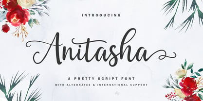 Anitasha is a modern pretty script font, organic, dynamic and energetic style. Can be used for various purposes such as the titles, signature, logos, correspondence, wedding invitations, letterhead, signage, labels, newsletters, posters, badges, etc. To enable the OpenType Stylistic alternates, you need a program that supports OpenType features such as Adobe Illustrator CS, Adobe Indesign & CorelDraw X6-X7, Microsoft Word 2010 or later versions. How to access all alternative characters, using Windows Character Map with Photoshop: https://www.youtube.com/watch?v=Go9vacoYmBw How to access all alternative characters using Adobe Illustrator: https://www.youtube.com/watch?v=XzwjMkbB-wQ Anitasha is coded with PUA Unicode, which allows full access to all the extra characters without having special designing software. Mac users can use Font Book and Windows users can use Character Map to view and copy any of the extra characters to paste into your favorite text editor/app. Thanks so much for looking and please let me know if you have any questions.
 - Roundup by Ingrimayne Type,
$10.00 The Roundup family was inspired by fonts from the late 19th century, though it is not based on any one of them. Roundup-Caps was the first of the group to be constructed. It has two sets of upper-case letters that have minor differences. It has reverse contrast, that is, the verticals are thinner than the horizontals. Unlike most of the "Old-West" fonts with reverse contrast, the serifs are not square but have an odd, rounded shape. Roundup-Regular replaced the second set of caps with lower-case letters. A bold style strengthens the vertical elements so that it no longer has reverse contrast. Both the regular and bold styles have matching oblique styles. Finally, there is a hollow version with a shadow to the lower right. This shadowed style has had its inside taken out, creating RoundUp-ShadowInside. The spacing is the same as RoundUpShadowed so it can be layered over RoundUpShadowed to easily create two-colored lettering.
 - Bridgate Script by Rotterlab Studio,
$9.00 Kimberly Script is a contemporary calligraphic typeface, a mixture of retro script. get a classic and elegant touch. Can be used for various purposes.such as logos, wedding invitations, t-shirts, letterheads, signage, labels, news, posters, badges etc. Kimberly Script features 583+ glyphs and 350 alternate characters, ligatures, swash and multiple language support. To enable the OpenType Stylistic alternates, you need a program that supports OpenType features such as Adobe Illustrator CS, Adobe Indesign & CorelDraw X6-X7, Microsoft Word 2010 or later versions. There are additional ways to access alternates/swashes, using Character Map (Windows), Nexus Font (Windows), Font Book (Mac) or a software program such as PopChar (for Windows and Mac).How to access all alternative characters, using Windows Character Map with Photoshop: https://www.youtube.com/watch?v=Go9vacoYmBw Files include: Kimberly Script.OTF Kimberly Script Bold.OTF Kimberly Script Italic.OTF If you need help or advice, please contact me by e-mail Thank you
 - Elephant Party by Breauhare,
$19.99 Elephant Party playfully dances along its baseline in bold and rounded style. This warm and friendly whimsical design has lots of trunk space and is reminiscent of groovy ‘60s and ‘70s typography where letter spacing was admittedly tight, but cozy. Like snuggling up to a warm fire while toasting marshmallows. Like snuggling under a warm blanket. Like, well, you get the point. Elephant Party is an equitable font that includes a diversity of multilingual support, and will communicate your message with a funky, retro vibe and festive mood. It’ll break out into a happy dance across a wide variety of your design projects ranging from children’s books, t-shirts, posters, logotypes, product packaging, merchandise, branding and beyond. And it’ll groove across a variety of environments from print to digital media. So come on in, join the “Party”, it’s ELEPHANTASTIC! Digitized by John Bomparte.. ***Breauhare’s My Left Hand font makes a cameo appearance on the poster of Chocolola bars.
 - Epoque Seria by Rafaeiro Typeiro,
$24.00 Époque Seria is that kind of person who looks really cute when angry. This font was derived from the Époque family. She is the little sister to Époque - a little shorter with her smaller x-height and — how do you say it in the typographic circle — your eyes are also smaller (and you know you squint when things get serious, isn't it?). The genealogy of these font face is undeniable, but Époque Seria has a ‘personality’ very different from her older sister. The reduction of the x-height also shakes somewhat with the cap that had crossbar. To accompany the package of standardization, the letters that don't have their straight axes were changed, which brought to the set more Cs and Gs contemporaries. In addition, other measures were taken as a greater softness in the variation of the weights and the abandonment of the black weight, being considered too heavy for this version.
 - Arteliria Script by Rifa Studio,
$16.00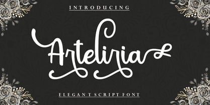 Arteliria Script is a soft and sweet calligraphic typeface, with the characters dancing along the baseline. It has a casual and elegant touch. Can be used for various purposes such as logos, wedding invitations, headings, t-shirts, letterheads, signage, labels, news, posters, badges etc. OpenType features with alternative styles, ligatures, and multiple language support. To enable the OpenType Stylistic alternative, you need a program that supports OpenType features such as Adobe Illustrator CS, Adobe Indesign & CorelDraw X6-X7, Microsoft Word 2010 or later. How to access all alternative characters, using the Windows Character Map with Photoshop: https://www.youtube.com/watch?v=Go9vacoYmBw How to access all alternative characters using Adobe Illustrator: http://youtu.be/iptSFA7feQ0 There are additional ways to access alternatives/swashes, using the Character Map (Windows), Nexus Font (Windows), Font Book (Mac) or a software program such as PopChar (for Windows and Mac). Need help? If you need help or advice, please contact me by email. Thank You!
 - Blantone by Nk Studio,
$18.00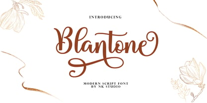 Blantone Script is a soft and sweet calligraphic typeface, with the characters dancing along the baseline. It has a casual and elegant touch. Can be used for various purposes such as logos, wedding invitations, headings, t-shirts, letterheads, signage, labels, news, posters, badges etc. OpenType features with alternative styles, bindings, and multiple language support. To enable the OpenType Stylistic alternative, you need a program that supports OpenType features such as Adobe Illustrator CS, Adobe Indesign & CorelDraw X6-X7, Microsoft Word 2010 or a later version. How to access all alternative characters, using the Windows Character Map with Photoshop: https://www.youtube.com/watch?v=Go9vacoYmBw How to access all alternative characters using Adobe Illustrator: http://youtu.be/iptSFA7feQ0 There are additional ways to access alternatives/swashes, using the Character Map (Windows), Nexus Font (Windows), Font Book (Mac) or a software program such as PopChar (for Windows and Mac). Need help? If you need help or advice, please contact me by email. Thank You!
 - Ponderosa by Adobe,
$29.00Ponderosa font is a joint work of the typeface designers K.B. Chansler, C. Crossgrove and C. Twombly, who also created Rosewood, Zebrawood and Pepperwood together. As the name suggests, it is so-called wood type. The origins of this kind of typeface can be found in the early 19th century. Called Italian or Italienne, these typefaces quickly became very popular. They are distinguished by square serifs whose width is larger than the stroke width of the characters. When the letters are set together, the heavy serifs build dark horizontal bands. The distinguishing characteristic of Ponderosa lies in its extremely fine figures between heavy serifs. The designers approached the boundaries of the impossible with this contrast. The typeface is reminiscent of the Wild West with its shootouts and heroes as well as of the 1970s with their platform shoes and wild hair-dos. When used carefully in headlines, Ponderosa font will surely attract attention. - Impending Distaster by Hanoded,
$15.00 There's nothing really disastrous (impending or not) going on in my life right now, but I have always liked the expression. I thought about it when I watched a news item about the recent storm we had in Europe. The news showed footage of a person narrowly escaping a huge falling tree. Impending Disaster font is certainly no disaster. I created it using my fantastic Chinese ink and a broken tapas skewer (I seemed to have run out of my regular satay skewers). The result is a slightly rough, comic book kinda font. It comes with two sets of alternates for the lower case letters (which cycle as you type), one set of stylistic alternates for the 'O' glyph (and all accented O's), an alternate ampersand, asterisk, question mark and exclamation mark and a set of alternate numerals. Impending Disaster comes with extensive language support, including Vietnamese, Greek and Sami - so don't come running and say you didn't have any options! ;-)
 - Delwyn by Jorsetype,
$20.00 Delwyn is a Serif font family, which has a condensed and explicit character with 10 variants, namely; Thin, Light, Extra Light, Regular, Medium, Semi Bold, Bold, Extra Bold, Black and Extra Black. Delwyn gives a clear and elegant look to logos, quotes, headings, wedding invitation, t-shirt, letterhead, lable, news, posters, badges, magazines, films. etc. Delwyn is a versatile typography filled with the character you want. with Marston you work.Marston has standard styles, Stylistic Alternates and ligatures. and includes upper and lower case letters, numbers and punctuation marks. Multilingual support for various languages including: French, German, Spanish, Portuguese, Italian, Dutch, Finnish, Swedish, and more. The different weights give you full range to explore a whole host of applications, while the outlined fonts give a real modern feel to any project.OpenType features can be accessed by using OpenType smart programs such as Adobe Photo Shop, Adobe Illustrator, Adobe Indesign, Corel Draw and Microsoft Office. can also be accessed through the character map
 - 750 Latin Uncial by GLC,
$38.00 This font was inspired by the Latin script used in European monasteries from circa the 5th to 8th centuries, before the Carolingian “Caroline” (look at our 825 Karolus). It was a regular script, rounded, written slowly, used mainly for specially meticulous books, with a few ligatures, legible, but only with lowercase. The capitals consisted of enlarged lower cases, but here, we have preferred to use two slightly different patterns. Our lower cases are a synthesis from a lot of variants (mainly from the “First Bible” of Charles The Bald), the upper cases were mainly inspired from a 700’s manuscript from the abbey of Fécamp (France). We have adapted the font for contemporary users, differentiating between U and V, I and J, which has no relevance for ancient Latin scribes, and naturally with Thorn, Oslash, Lslash, K, W... punctuation and the usual accented characters which did not exist at the time. It can be used with 799 Insular Title.
 - Hitrogent by Artisan Studio,
$25.00 Hidrogent is a sans Serif font family, which has a condensed and explicit character with 6 variants, namely; Hidrogent Extra Light Ultra Condensed Hidrogent Regular Ultra Condensed Hidrogent Medium Ultra Condensed Hidrogent Extra Bold Ultra Condensed Hidrogent Black Ultra Condensed Hidrogent Extra Black Ultra Condensed Hidrogent gives a clear and elegant look to logos, quotes, headings, wedding invitation, t-shirt, letterhead, lable, news, posters, badges, magazines, films. etc. Hidrogent is a versatile typography filled with the character you want. with Marston you work. Multilingual support for various languages including: French, German, Spanish, Portuguese, Italian, Dutch, Finnish, Swedish, and more. The different weights give you full range to explore a whole host of applications, while the outlined fonts give a real modern feel to any project.OpenType features can be accessed by using OpenType smart programs such as Adobe Photo Shop, Adobe Illustrator, Adobe Indesign, Corel Draw and Microsoft Office. can also be accessed through the character map.
 - Hero Sandwich Pro by Comicraft,
$19.00 As comic book readers know all too well, team ups are every super hero’s bread and butter... when the brave and the bold are in a pickle, and super villains are running onion rings around them, here’s how they roll: They Meat! They Team-Up with your taste buds! They Fight Hunger! Our original Hero Sandwich font has become a go-to for video game and app graphics, due to its easy readability and friendly demeanor. The new Pro version adds nine weights from Thin to Heavy, with matching italics, plus a versatile Variable Font to dial in your preferred combination of weight and italic slant. Each weight includes four numbering options and support for 222 languages, including Cyrillics. So take a footlong bite out of crime, and make the subways safe again with our mouthwatering Hero Sandwich! Prepared with care and plastic gloves by those awfully nice chaps at the Comicraft deli.
 - Big Brush by Canada Type,
$20.00Big Brush is the result of me seeing Brush Script everywhere around me. Toronto signage is full of Brush Script. My last two trips to the West Coast showed me mostly Brush Script. Brush Script must be the most widely overused North American script font of all time. Don't we all know at least one restaurant or bar with its sign made in Brush Script? And aren't you just sick of the weird F, Q and T of Brush Script? Well, out with the old and in with the new. Big Brush was made as a replacement for Brush Script, and then some. While Brush Script has only the single familiar letters we all know, Big Brush comes in two fonts, so you can keep the design fresh the neat and keep them guessing at the same time. The next time you want to design something that calls for strong, fast brush calligraphy, do the world's bored eyes a favor and use Big Brush instead. - Ressonant by Octopi,
$9.00 With reference to the Type Heritage Project, this font (designer unknown) was cut by Henry Brehmer of New York for the Dickinson Type Foundary of Boston in c1879 and had the original trade name of Renaissant. John F. Cumming later cut a light-face derivative called “Artistic.” A history of the un-patented face can be found at the Type Heritage Project website. Ressonant has a full character set as well as ligatures, superiors, inferiors, numerators, denominators, old style figures, and auto-fractions. There are also alternate caps for N and M as in the original, and, unlike the original, comes in four weights. This font is a documented revival of a 19th-century typeface. The year, country, designer and/or foundry of origin will be published in a series of textbooks entitled “The Type Heritage Project.” Volume I explores quintessential Victorian faces, a spectacular trove of innovative gems; you can see samples by clicking the Type Heritage Project link above.
 - Burner by Graffiti Fonts,
$29.99 Burner is an advanced, connecting, wildstyle graffiti font family including over 200 unique letters, numbers & symbols. The family includes outlines, fills, details and more. Mix and match glyphs from 3 alphabets, add end pieces and more. Repeating flames, arrows & flourishes & other embellishments are included. The Burner family includes 3 full alphabets in each of the 4 styles as well as numbers, punctuation and a wide array of arrows, bars , begining & end pieces. Like some of our earlier wildstyle typefaces such as RaseOne or WildStyle, the Burner font family is a layered type system made to work as a team. In nearly any application 2 or more styles can be easily layered to create advanced, multicolor, wildstyle pieces. This layering system provides a shortcut to time consuming effects such as sharp corners & variable widths on outlines, fills & details. The original glyphs were all drawn by hand taking inspiration from actual painted & drawn wildstyles from RaseOne spanning the late 90's to about 2006.
 - Muller by Fontfabric,
$47.00 Muller Specimen: http://bit.ly/mullers Muller Narrow Specimen: http://bit.ly/mullerns The very first sketches of Muller were made about four years ago. In the process they changed to the point where they had nothing in common with the original idea. As it is with most work we do, when we seek perfection, changes are inevitable. It was specifically designed with a wider structure for better appearance in small sizes and the extra attention to the detail was needed for the big sizes. We managed to find the right balance for the perfect universal font family. The family consists of 20 weights, ranging from Thin to Heavy with matching Italics. This font family is suited for everything, ranging from advertising, packaging, editorial and branding, to web and screen projects. Muller comes with a complete range of figure options, including proportional and old style figures, each in its tabular version. It also includes advanced typographic features such as ligatures, fractions, alternate characters, case-sensitive forms, superscripts and subscripts.
 - Rainbow by Nk Studio,
$20.00 Rainbow is a soft and sweet script typeface, with the characters dancing along its baseline. It has a casual and elegant touch. Can be used for various purposes such as logos, wedding invitations, headers, t-shirts, letterheads, signboards, labels, news, posters, badges etc. OpenType features with alternate styles, ligatures and multi-language support. To activate the OpenType Stylistic alternative, you need a program that supports OpenType features such as Adobe Illustrator CS, Adobe Indesign & CorelDraw X6-X7, Microsoft Word 2010 or a later version. How to access all alternative characters, using the Windows Character Map with Photoshop: https://www.youtube.com/watch?v=Go9vacoYmBw How to access all alternative characters using Adobe Illustrator: http://youtu.be/iptSFA7feQ0 There are additional ways to swap / swap, using Character Map (Windows), Nexus Fonts (Windows), Font Book (Mac) or a software program such as PopChar (for Windows and Mac). Need help? If you need help or advice, please contact me via email. Thank you!
 - Bodoni Classic Cyrillic by Wiescher Design,
$55.00 One day shortly after Christmas 2004, the art-director of Vogue Moscow called me. Would I maybe make a Cyrillic version of my Bodoni Classic Text typeface? Well, since I had been thinking about doing it since a long time, this was the perfect reason to finally do it. It was not an easy venture, since I do not have the faintest idea of Russian but, together with those nice people in Russia and a fellow helpful type designer in Kiev, I managed. I did an enormous amount of kerning, thanks to the help of the Moscow Vogue office. Here the fonts are now for all of you: five text cuts, plus one standard roman cut that has no Cyrillic letters but an extra set of medieval numbers. At Vogue they are happy with the fonts, even though I did not quite adhere to Bodoni's originals in this case. Nastarowje (or whatever you say in Russia), Gert Wiescher
 - Ico Phone by Setup,
$19.95 Ico Phone is a set of 115 symbols depicting anything that happens on the screen of a regular mobile phone. To name a few, there are Bluetooth and sync icons, signal bars, battery statuses, media playback icons, USB symbol, lock icon as well as a wifi signal strength indicator. The style of Ico is inspired by the look of symbols used on the classic monochrome LCD displays. The symbols are monolinear with rounded corners, composed of a smallest possible number of elements. In addition, the rounded style is accompanied by a second style with sharp corners and more detailed drawing. All symbols of Ico share the same width, making the font compatible with the LCD typeface ION. Together, they are the perfect sollution for LCD style typography. Ico Phone is a part of a larger set. Have a look at the other available Ico fonts and don't forget to check back soon for even more additions.
 - Bedfore Script by Lettersams,
$14.00 Bedfore Script is a romantic typeface. vintage script font that is thick, elegant & fun. very suitable for various purposes and wants. Like logo, label, wedding invitation, brand, t-shirt, letterhead, nameplate, news, book covers, magazine, oster, badge, etc. Bedfore Script features OpenType stylistic alternates, ligatures and International support for most Western Languages is included. To enable the OpenType Stylistic alternates, you need a program that supports OpenType features such as Adobe Illustrator CS, Adobe Indesign & CorelDraw X6-X7, Microsoft Word 2010 or later versions. Bedfore Script is coded with PUA Unicode, which allows full access to all the extra characters without having special designing software. Mac users can use Font Book , and Windows users can use Character Map to view and copy any of the extra characters to paste into your favourite text editor/app. If you need help or have any questions, please let me know or via email "lettersams@gmail.com" I'm happy to help :) Thanks & Happy Designing!
 - Cholla by Emigre,
$49.00 The Cholla typeface family was designed by Sibylle Hagmann in 1998-99 and named after a species of cactus she encountered in the Mojave Desert. Cholla was originally developed for the Art Center College of Design in Pasadena, California. There, art director Denise Gonzales Crisp and associate designer, Carla Figueroa, collaborated with Hagmann to create a series of fonts that would offer a great deal of variation. The variety was needed to echo the school's nine different departments, yet together the fonts had to exude a unified feel. It was first used in the radically designed 1999/2000 Art Center catalog which won a honorable mention in I.D. magazine and was featured in Eye No. 31. Originally Hagmann set out to design a typeface that, as she recalls, "I could feel comfortable making, first of all, and one that would serve a purpose and had a clear idea behind it, and something that I would want to use myself." Stylistically Hagmann set out to create "12 cuts with slightly different personalities, with different ideas applied. For example the bold weight isn't simply the Regular with weight gain, but has bold letterforms with their own peculiar details. What all weights share and what is the necessary unifying detail is the tapered curve - marked out, for example, in the lowercase b's left top and bottom of the bowl." Gonzales adds: "The forms seemed classical as well. This combination could have a long life, and be timely. I also saw - at least in the beginnings of Cholla - forms that connoted hybrid, of inter-connection, of human and machine growing together. These notions seem appropriate for a school that teaches design and art." Greek version by Panos Haratzopoulos.
 - Atocha by Sudtipos,
$49.00 It was expected that Joluvian’s third type font would be inspired by the city where he currently resides: Madrid, Spain. His previous creations had originated in Venezuela (Zulia) and The Philippines (Salamat), both, places where he had once lived. Joluvian believes “now is the time to pay tribute and show gratitude towards a city that has bestowed me with so many fortunes.” He considers that Madrid’s people, streets, scents, flavor and sounds are gift enough to awaken the creative urgency in any artist. This time around, it is being expressed through the crafts of the Typographic industry. Since his arrival in Spain, Joluvian has been attached to the city’s central area, specifically to the renowned Atocha Street and its railroad station. It was precisely on that street that Joluvian and Mauco Sosa, his friend and partner, decided to establish the Patera Studio: a charming creative space that birthed the concept for this new font which they proudly named Atocha Script. The artists where still in the final phases of their previous script, Salamat, when the idea for Atocha came about. This dynamic is actually very typical of the artistic process, in which every finished product spawns the need to create its next level offspring. “Working on Atocha and Atocha Caps has been a very pleasant journey. We have given our best efforts, for we wanted to offer a typeface that was both versatile and user-friendly on a number of applications, showing a wide scope of alternatives in our glyphs,” says the artist. The illustrations were created by Mauco, to ensure visual integration that would showcase the work of both members of the Patera Studio and their complementing aesthetic voices. Atocha, as Salamat and Zulia before, was digitized by Alejandro Paul.
 - Identa by Sudtipos,
$39.00 Because we know that you will never get tired of using them and that you will always need a new tool for Identity Design, we created Identa. Conceived to translate corporate and humanist ideals in its typographic form, it seeks a dialogue between neutrality and contemporaneity. With a pragmatic attention to functionality that does not forget aesthetics. It is a Sans serif model, accessible and well-founded. All-terrain, workhorse that seeks to be reliable and durable. It solves any type of content with efficiency, intelligence and professionalism. Its clean forms and x-height make it a very competent face for both short identifiers and long text bodies, ideal for display use where legibility and personality must match new design needs within a company. It is available in eight styles, ranging from its White version to the darker Vantablack, each optimally set with its respective italic variables, and a Dingbats font designed to solve everyday cases. Each font contains 737 glyphs, macro and micro aesthetic details inspired by current visual communication systems and trends. The dingbats font includes 303 signs and is a set of icons and symbols that can be used in multiple environments, both for print and digital media. This typeface family seeks to meet the needs of brand designers looking to create an assertive appearance, whatever the case. It is a solid and self-confident typeface, without appearing overly constructed; on the contrary, its nuance makes it look fresh.
 - Fushar Arabic by Mikołaj Grabowski,
$19.00 Fushar Arabic is a bold comic color font family which comes in 5 layer-styles easy to compose in a multicolor manner and 3 OpenType-SVG color styles to make the work faster and easier. Character set covers Latin A-Z all caps, Arabic, Persian and Urdu with 230 ligatures, European, Arabic and Persian / Urdu localized digits, punctuation, currencies and other symbols - the total of 729 glyphs. The idea came from a custom logotype I made several years ago for a local charity organisation that helps children. The logotype was based on bold letters with light that make the "balloon" effect visible in "Holes" style. Later I expanded the family with "Cuts" and all the derivative fonts that make the whole color family. The purpose was to create a funny, friendly and playful script that would embrace the beauty of the Arabic alphabet. Solid, Cuts and Holes are classic one-color styles which can be used separately to compose a simple text. With Shadows and Lights they can produce a multicolour design, as shown on the images above. To save the time, there are three already prepared combinations in the new OpenType-SVG color format. The features include required ligatures, discretionary ligatures, proper mark attachment, contextual alternates, case-sensitive forms, ordinals, localised Persian/Urdu numerals, superscript (1, 2, 3) & fractions. Now you can buy Extended Latin character set (uppercase and lowercase) at Fushar font family page on MyFonts. European languages, Vietnamese and Pinyin included.
 - Sylvie by Anastasia Kuznetsova,
$14.00 SYLVIE is a very stylish font with letters that seem to dance and harmoniously intertwine with each other, creating a unique and elegant typographic design. This font is in my collection, inspired by France. French architecture, vintage fonts, modern forms, fashion and their unique lifestyle have all had an impact on this font. Thanks to the contrasting lines and curves, it will give your design the chic and modernity that you are looking for. It is perfect for logos, branding, posters, social media and all other creative projects. It will also highlight your brand. SYLVIE will definitely add attractiveness to your design! I invite you to familiarize yourself with the preliminary images and hope that you will be imbued with my vision of this creative font, which, I am sure, will be suitable for all the interesting projects you are working on. Font Features: A-Z; a-z character set; 1 language (English); numbers and punctuation marks, symbols. Fonts can be opened and used in any software that can read standard fonts, even in MS Word. No special software is required to get started. It is recommended to use it in Adobe Illustrator or Adobe Photoshop. Made with love and magic ♡ Thank you for reading it, and do not hesitate to send me a message if you have any questions! ~ Anastasia
 - Hand Print Stamp Rough by TypoGraphicDesign,
$29.00 The typeface Hand Print Stamp Rough is designed in 2018 for the font foundry Typo Graphic Design by Manuel Viergutz. The rough hand-printed typeface based on old wood letters, rubber-stamps and plastic stamps. 7 font styles (Reg + Mix, Circle, Diamond, Square Star + Icons) each with 1350+ glyphs incl. 200+ decorative extras like icons, arrows, dingbats, emojis, symbols, geometric shapes, catchwords, decorative ligatures (type the word LOVE for ♥ or SMILE for ☻ as OpenType-Feature dlig) and stylistic alternates (9+ stylistic sets). For use in logos, magazines, posters, advertisement and packaging plus as webfont for decorative headlines. The font works best for display size. Character Set: Latin Extended (Adobe Latin 3). 1350+ glyphs with 200+ extra icons like arrows, dingbats, symbols, geomatric shapes, catchwords and many alternative letters. (9× A–Z, 9× a–z, 9× 0–9) For use in magazines, posters, headlines and advertisement, plus as webfont for decorative headlines. Have fun with this font & try-before-buy the DEMO-FONT (with reduced glyph-set) FOR FREE! ■ Font Name: Hand Print Stamp Rough ■ Font Weights: Regular + Mix, Circle, Diamond, Square, Star + Icons + DEMO (with reduced glyph-set) ■ Font Category: Sans Serif + Slab Serif Display for Headline Size ■ Font-Format: .otf (OpenType Font for Mac + Win) + .ttf (TrueType Font) ■ Glyph Set: 1350 glyphs ■ Language Support: 27+ for Latin Extended (Adobe Latin 3). Afrikaans, Albanian, Catalan, Croatian, Czech, Danish, Dutch, English, Estonian, Finnish, French, German, Hungarian, Icelandic, Italian, Latvian, Lithuanian, Norwegian, Polish, Portugese, Romanian, Slovak, Slovenian, Spanisch, Swedish, Turkish, Zulu ■ Specials: 200+ decorative extras like icons for arrows, dingbats, emojis, symbols, geometric shapes, catchwords + German Capital Eszett. Open Type Features: Kerning (kern), Stylistic Set 1 (ss01) … Stylistic Set 16 (ss16), Localized Forms (locl), Superscript (sups), Ordinals (ordn), Slashed Zero (zero), Fractions (frac), Standard Ligatures (liga), Contextual Alternates (calt) e. g. Stylistic Set-Loop and Decorative Ligatures (dlig) e. g. type the word “LOVE” for ❤ or “SMILE” for ☺ ■ Design Date: 2018 ■ Type Designer: Manuel Viergutz
 - Truecolor by Ditatype,
$29.00 Truecolor is a bold and distinctive brush font that commands attention. The characters in this font are characterized by their robust, square forms, which give the font a sense of solidity and reliability. Each letter is meticulously designed to maintain a cohesive and balanced appearance, adding an air of authority and visual impact to your text. It has the power to transform your text into a striking focal point, ensuring that every word is seen and remembered. In addition, you can also enjoy the features here. Features: Ligatures Stylistic Sets Multilingual Supports PUA Encoded Numerals and Punctuations Truecolor fits in headlines, logos, posters, flyers, branding materials, print media, editorial layouts, and many more designs. Find out more ways to use this font by taking a look at the font preview. Thanks for purchasing our fonts. Hopefully, you have a great time using our font. Feel free to contact us anytime for further information or when you have trouble with the font. Thanks a lot and happy designing.
 - Atiku by Twinletter,
$15.00 For the next generation, Atiku is the font of choice. This one-of-a-kind and opulent font family was designed from the ground up with beauty and exoticism in mind. Customers recognize the value, sophistication, and uniqueness of your brand with just one glance. Each style in this impressive collection was created to help you get the most out of your designs: ads, posts, and a slew of other creative projects are all made easier with this lovely typeface. This font can be easily optimized for any project or client thanks to its many OpenType features and 18 different styles. With our newest font family, you’ll be able to create stunning looks in minutes. of course, your various design projects will be perfect and extraordinary if you use this font because this font is equipped with a font family, both for titles and subtitles and sentence text, start using our fonts for your extraordinary projects.
 - Alright, imagine a font that captures the eerie yet whimsical vibe of a Tim Burton movie, entangling the gothic with the playful in each curve and stroke. That's "Scars Before Christmas" by Juan Casc...
- Generis Slab by Linotype,
$29.00The idea for the Generis type system came to Erik Faulhaber while he was traveling in the USA. Seeing typefaces mixed together in a business district motivated him to create a new type system with interrelated forms. The first design scheme came about in 1997, following the space saving model of these American Gothics. Faulhaber then examined the demands of legibility and various communications media before finally developing the plan behind this type system. Generis’s design includes two individually designed styles; each of with is available with and without serifs, giving the type system four separate families. Each includes at least four basic weights: Light, Regular, Medium, and Bold. Further weights, small caps, old style figures, and true italics were added to each family where needed. The Generis type system is designed to meet both optical criteria and the highest possible measure of technical precision. Harmony, rhythm, legibility, and formal restraint make up the foreground. Generis combines aesthetic, technical, and economic advantages, which purposefully and efficiently cover the whole range of corporate communication needs. The unified basic form and the individual peculiarity of the styles lead to Generis’ systematic, total-package concept. The clear formal language of the Generis type system resides beneath the information, bringing appropriate typographic expression to high-level corporate identity systems, both in print and on screen. The condensed and aspiring nature of the letterforms allows for the efficient setting of body copy, and the economic use of the page. A range of accented characters allows text to be set in 48 Latin-based languages, offering maximal typographic free range. This previously unknown level of technical and design execution helps create higher quality typography in all areas of corporate communication. Optimal combinations within the type system: Generis Serif or Generis Slab with Generis Sans or Generis Simple. - Generis Serif by Linotype,
$29.00The idea for the Generis type system came to Erik Faulhaber while he was traveling in the USA. Seeing typefaces mixed together in a business district motivated him to create a new type system with interrelated forms. The first design scheme came about in 1997, following the space saving model of these American Gothics. Faulhaber then examined the demands of legibility and various communications media before finally developing the plan behind this type system. Generis’s design includes two individually designed styles; each of with is available with and without serifs, giving the type system four separate families. Each includes at least four basic weights: Light, Regular, Medium, and Bold. Further weights, small caps, old style figures, and true italics were added to each family where needed. The Generis type system is designed to meet both optical criteria and the highest possible measure of technical precision. Harmony, rhythm, legibility, and formal restraint make up the foreground. Generis combines aesthetic, technical, and economic advantages, which purposefully and efficiently cover the whole range of corporate communication needs. The unified basic form and the individual peculiarity of the styles lead to Generis’ systematic, total-package concept. The clear formal language of the Generis type system resides beneath the information, bringing appropriate typographic expression to high-level corporate identity systems, both in print and on screen. The condensed and aspiring nature of the letterforms allows for the efficient setting of body copy, and the economic use of the page. A range of accented characters allows text to be set in 48 Latin-based languages, offering maximal typographic free range. This previously unknown level of technical and design execution helps create higher quality typography in all areas of corporate communication. Optimal combinations within the type system: Generis Serif or Generis Slab with Generis Sans or Generis Simple. - Generis Simple by Linotype,
$39.00The idea for the Generis type system came to Erik Faulhaber while he was traveling in the USA. Seeing typefaces mixed together in a business district motivated him to create a new type system with interrelated forms. The first design scheme came about in 1997, following the space saving model of these American Gothics. Faulhaber then examined the demands of legibility and various communications media before finally developing the plan behind this type system. Generis’s design includes two individually designed styles; each of with is available with and without serifs, giving the type system four separate families. Each includes at least four basic weights: Light, Regular, Medium, and Bold. Further weights, small caps, old style figures, and true italics were added to each family where needed. The Generis type system is designed to meet both optical criteria and the highest possible measure of technical precision. Harmony, rhythm, legibility, and formal restraint make up the foreground. Generis combines aesthetic, technical, and economic advantages, which purposefully and efficiently cover the whole range of corporate communication needs. The unified basic form and the individual peculiarity of the styles lead to Generis’ systematic, total-package concept. The clear formal language of the Generis type system resides beneath the information, bringing appropriate typographic expression to high-level corporate identity systems, both in print and on screen. The condensed and aspiring nature of the letterforms allows for the efficient setting of body copy, and the economic use of the page. A range of accented characters allows text to be set in 48 Latin-based languages, offering maximal typographic free range. This previously unknown level of technical and design execution helps create higher quality typography in all areas of corporate communication. Optimal combinations within the type system: Generis Serif or Generis Slab with Generis Sans or Generis Simple. - Generis Sans by Linotype,
$29.00The idea for the Generis type system came to Erik Faulhaber while he was traveling in the USA. Seeing typefaces mixed together in a business district motivated him to create a new type system with interrelated forms. The first design scheme came about in 1997, following the space saving model of these American Gothics. Faulhaber then examined the demands of legibility and various communications media before finally developing the plan behind this type system. Generis’s design includes two individually designed styles; each of with is available with and without serifs, giving the type system four separate families. Each includes at least four basic weights: Light, Regular, Medium, and Bold. Further weights, small caps, old style figures, and true italics were added to each family where needed. The Generis type system is designed to meet both optical criteria and the highest possible measure of technical precision. Harmony, rhythm, legibility, and formal restraint make up the foreground. Generis combines aesthetic, technical, and economic advantages, which purposefully and efficiently cover the whole range of corporate communication needs. The unified basic form and the individual peculiarity of the styles lead to Generis’ systematic, total-package concept. The clear formal language of the Generis type system resides beneath the information, bringing appropriate typographic expression to high-level corporate identity systems, both in print and on screen. The condensed and aspiring nature of the letterforms allows for the efficient setting of body copy, and the economic use of the page. A range of accented characters allows text to be set in 48 Latin-based languages, offering maximal typographic free range. This previously unknown level of technical and design execution helps create higher quality typography in all areas of corporate communication. Optimal combinations within the type system: Generis Serif or Generis Slab with Generis Sans or Generis Simple. - Corrodated J, a font by the creative minds at Immortalware, is what you might call the rebellious teenager of the typeface family. Imagine a font that decided it wasn’t going to follow the rules, swi...
- Bronzo by XO Type Co,
$39.00 This is a 2023 redesign of Bronzo, originally designed by Rick Valicenti and Mouli Marur in 1991. With this redesign, Bronzo now has 6 new weights, for a total of 9, and 587 more glyphs than it was able to in 1991. Bronzo appears to move forward, yet remain still, via a center stroke that only sticks out on the left, a tense curve that only happens on the right, and a width that sits uncomfortably between square and rectangle. Those three things, combined with a balanced light to dark ratio, are what makes Bronzo appear tense and ready. Bronzo accepts Modernist ideals of minimal, rational construction—but it also adopts luxuriant shapes over Modernism’s sandblasted neutrality. It’s almost an alternate reality, a “what if?” of Modernism. Modernism’s fun, interesting, cute reboot.