7,027 search results
(0.163 seconds)
- Florati by Proportional Lime,
$19.99 Can you imagine the delight that the printers of the Incunabula era would have had if they had such a tool as this font with a hundred and fifty glyphs of decorative capitals. The printers of that era were lucky to have more than a handful such delights. These Decorated initials and drop caps are all based on early period exemplars, dating to prior to 1525, from a wide range of printers such as Thomas de Blavis to Günther Zainer. Every Proportional Lime Font comes equipped with a complete character map.
 - ITC Greengate by ITC,
$29.99ITC Greengate is the result of a time-traveling, intercontinental collaboration--one between 21st century South African designer Richard Every, and early 20th century Scottish artist Jessie Marion King. Jessie Marion King (1875-1949) began her professional career as a book designer and illustrator, but over time her creativity found its outlet in many forms, including posters, jewelry, ceramics, wallpaper, fabrics, murals, interior design and costumes. After eventually settling in Kirkcudbright, Scotland, she founded Green Gate Close, a center for women artists. Although her style is reminiscent of the Art Nouveau artist, Aubrey Beardsley, King's aesthetic was an offshoot of the “Glasgow Style,” a Scottish hybrid of the Arts and Crafts movement and Art Nouveau. Often, her illustrations included hand lettering. It was just this kind of lettering that gave Richard Every his inspiration for ITC Greengate. When he saw some children's book illustrations that King created in 1898, he knew on the spot he had to complete the hand lettering as a typographic font. He began working on the typeface in 1996, but it took six years to be released as an ITC typeface. Every simplified and harmonized King's letterforms slightly and, most importantly, added a suite of lowercase characters. The result is a somewhat earthy Art Nouveau design, with a character quite distinct from typical digital revivals. Every's career has been as diverse as King's. He was born in Durban, South Africa and studied graphic design at ML Sultan Technikon in Durban. He's been an art director, freelance designer, the owner and manager of a nightclub and co-manager of a South African band. “Through it all,” he says, “typography has always been one of my passions.” - Spoonbread by Hanoded,
$15.00 I originally wanted to call this font Instant Pudding. When I was a kid, we sometimes had instant pudding (the ‘add cold milk and rest in the fridge’ kind) for dessert. My brother and I loved the stuff, especially when some of the pudding powder had not dissolved and had turned into brightly coloured speckles! But this font, alas, did not ‘feel’ like instant pudding, so I hunted the internet for other, more obscure, puddings. I found Spoonbread. Apparently it is a pudding-like Southern American dish, made from cornmeal. I have never tasted it, nor do I particularly like corn (most of it is GMO anyway), but the font and the name became friends. And who am I to tear this beautiful relationship asunder? Spoonbread - use it for your packaging, your books, your posters and your games. And when you make Spoonbread, use organic cornmeal!
 - FranklinGothicHandLight by Wiescher Design,
$39.50 FranklinGothicHandLight is part of a series of hand-drawn fonts from way back in time – before computers changed the way we worked. When I was in advertising – before computers – a very time consuming part of my daily work was sketching headlines. I used to be able to sketch headlines in Franklin Gothic, Times, Futura, Helvetica and several scripts. We had a kind of huge inverted camera – which we called Lucy. We projected the alphabet onto a sheet of transparent paper, outlined the letters with a fineliner and then filled them in. It was very tedious work, but the resulting headline had its own charm and we had a permanent race going on who was best and fastest. I won most of the time! They used to call me the fastest "Magic Marker" this side of the Atlantic. Great days, just like today! Your sentimental type designer from the past Gert Wiescher
 - FranklinGothicHandDemi by Wiescher Design,
$39.50 FranklinGothicHandDemi is part of a series of hand-drawn fonts from way back in time – before computers changed the way we worked. When I was in advertising – before computers – a very time consuming part of my daily work was sketching headlines. I used to be able to sketch headlines in Franklin Gothic, Times, Futura, Helvetica and several scripts. We had a kind of huge inverted camera – which we called Lucy. We projected the alphabet onto a sheet of transparent paper, outlined the letters with a fineliner and then filled them in. It was very tedious work, but the resulting headline had its own charm and we had a permanent race going on who was best and fastest. I won most of the time! They used to call me the fastest "Magic Marker" this side of the Atlantic. Great days, just like today! Your sentimental type designer from the past Gert Wiescher
 - MADFONT Regular - Unknown license

- Our Sacred Rights - Unknown license

- Neona by Wundes,
$18.00Neona is a font in the spirit of the standard 'no frills' sans-serif 4-inch-high neon sign text used in cheap bars, coffee shops, bakeries and tattoo parlors around the world. - Pintenium Script by FHFont,
$19.00 Pintenium is a vintage script with a hand-lettering brush style, and includes several OpenType features. Suitable for design, element design, wedding, event, t-shirt, logo, badges, sticker, and awesome work, and more.
 - Bitten Amore by FHFont,
$18.00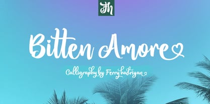 Bitten Amore is script font with hand-lettering brush style, and includes OpenType features. It is suitable for design, element design, weddings, events, t-shirts, logos, badges, sticker, and any other awesome work.
 - Magnekidz by Sipanji21,
$15.00 Magnekidz is a font that has a metal character, and has a simple look, with many characcters, and multilingual support. better used for band logos, music events, banners, posters, advertising, apparel, and others.
 - Hello Beauty by FHFont,
$17.00 Hello Beauty is a script in a hand-lettered, modern, calligraphy style. It is suitable for a variety of uses such as in design, weddings, events, t-shirt, logos, badges, sticker, and more.
 - Cuba by TrendGFX Design Studios,
$8.00 A Geometrical font. This idea flashed to me in one of the boring classes we had in college. Since its my special masterpiece we come really cheap at its price of just $8.
 - Annecy by Luke Thompson,
$25.00 A font family inspired by France's Lake Annecy, vintage travel posters, stamps, bars, and restaurants. Decorative enough to feel special, bold and simple enough to be suitable for a wide variety of applications.
 - Pierrot by Linotype,
$29.00Günter Jäntsch designed Pierrot in 1973. Its irregular flowing letterforms express the design from this time, where many personal irregular designs had been made. Pierrot is suitable for invitation cards, posters and signage. - Diamond Lake by Rillatype,
$15.00 Introducing, Diamond lake! This font have strong and bold charasteristics that will make your design more standout from the others. this font is perfect for magazine, headline, packaging, branding, logotype, badge,book, etc.
 - Fairbank by Monotype,
$29.99Monotype Bembo is generally regarded as one of the most handsome revivals of Aldus Manutius' 15th century roman type, but the original had no italic counterpart. The story is told that Stanley Morison commissioned Alfred Fairbank, a renowned calligrapher, to create the first italic for Bembo, which was released as metal fonts in 1929. Alfred Fairbank, however, claimed that he drew the design as an independent project and then sold his drawings to Monotype. According to him, the statement has been made that I was asked to design an italic for the Bembo roman. This is not so. Had the request been made, the italic type produced would have been different." Whichever version you believe, it was obvious that Fairbank's design - while undeniably beautiful - was not harmonious with Bembo roman. A second, more conventional italic was eventually drawn and added to the Bembo family. Fairbank's first design, which was based on the work of sixteenth-century writing master Ludovico degli Arrighi, managed to have a modest life of its own as a standalone font of metal type. It never made the leap into phototype fonts, however, and the face could have been lost, were it not for Robin Nicholas, Monotype Imaging's Head of Typography in the United Kingdom, and Carl Crossgrove, a senior designer for Monotype Imaging in the US. Nicholas and Crossgrove used the original drawings for Fairbank as the starting point for a new digital design, but this was only the beginning. They improved spacing, added subtle kerning and optimized the design for digital imaging. In addition, Nicholas created an alternative set of lowercase letters, fancy and swash capitals and enough alternate characters to personalize virtually any design project. By the time his work was complete, Nicholas and Crossgrove had created a small type family that included Fairbank, a revived version of the earlier metal font, and Fairbank Chancery, a more calligraphic rendition of the design. An additional suite of ornate caps, elegant ligatures, and beginning and ending letters accompanies both fonts, as does a full complement of lowercase swash characters. Now, instead of a failed Bembo italic, Fairbank emerges in its true glory: a sumptuous, elegant design that will lend a note of grace to holiday greetings, invitations, and any application where its Italianate beauty is called for." - Diehl Deco - Unknown license

- Rock Sevendie by Sipanji21,
$16.00 Rock Sevendie is a font that has a metal character, and has a simple look, with many characters, and multilingual support. better used for band logos, music events, banners, posters, advertising, apparel, and others.
 - Otago by Hanoded,
$15.00 Otago is a classic all caps Art Deco font. Clean, crisp and very, very legible. I took my inspiration for this font from a 1920's postcard. Otago comes with a bagful of diacritics.
 - Mangotea by FHFont,
$17.00 Mangotea is bold script brush font with a hand-lettering brush style, and includes Opentype features. It is suitable for design, element design, wedding, event, t-shirt, logo, badges, sticker, and awesome work, etc...
 - Flatpen by Autographis,
$39.50 Flatpen is a font that was written with a pen we used to call "Redis-Pen". It had a flat, round tip that enabled you to write letters, with the same width of stroke.
 - Bandolina by Hanoded,
$15.00 Bandolina is a fun, hand drawn typeface. Didone-ish, off-key, jumpy and full of happy glyphs. It comes with a bagful of quirkiness, a pinch of eccentricity and a full range of diacritics.
 - Schoolblock by Wiescher Design,
$39.50 Schoolblock is the typeface German schoolchildren learn to imitate when they are taught the printed letters. I just had to do this one for use in a German schoolbook. Your education-designer, Gert Wiescher
 - Ruly by Enrich Design,
$24.95 Ruly is my newest font creation. My roommate in college always had the coolest writing. I thought that it deserved to be a font. The font is a great choice for newsletters, cards, etc.
 - Guilloche B by Wiescher Design,
$24.00 »Guilloche B« is a set of graphics that join with each other to form very sophisticated, op-art-like borders. Try them on lots of different assignments, they form very surprising bands or patterns.
 - Crayon En Folie by Hanoded,
$15.00 Crayon En Folie ('Pencil Madness' in French) is a straightforward pencil font, created with an extra thick black pencil. Use it for books, posters and packaging. Comes with a coloring box full of diacritics.
 - Butter Luchy by FHFont,
$17.00 Butter Luchy is Handwritten script font with handlettering Brush Style, so much opentype feature include of the font. Suitable for design, element design, wedding, event, t-shirt, logo, badges, sticker, and awesome work, etc...
 - Kate Greenaway's Alphabet by Wiescher Design,
$49.50 Some time ago I bought my smallest book ever: Kate Greenaway’s Alphabet* 57 x 72 mm. I thought it was the sweetest little book I had ever seen. Not knowing about the fame of the designer Kate Greenaway (1846-1901), I put it in some dark drawer and looked at it from time to time. Kate’s books were all outstanding successes in English publishing history; she was an icon of the Victorian era. Some of those books are still being reprinted today. This little gem I had accidentally acquired has become very rare and I have not found any reprints yet. So I thought maybe I could adapt her drawings for use on today’s computers. I ventured to redraw her delicate illustrations, blowing them up 300 percent, being forced to simplify them without losing her touch. It took quite some time! While redrawing them, I discovered that she most certainly drew them in at least three different sessions as well. Then I scanned my drawings and put them in a font. To make the font more usable, I added the ten numerals in Kate’s style; the original does not have those. I hope she would have liked my adaptations. Yours in a very preserving mood, Gert Wiescher. * Kate Greenaway’s Alphabet, edited by George Rutledge & Sons, London and New York, ca. 1885.
 - ALS SyysScript by Art. Lebedev Studio,
$63.00 Handwriting of a strong Carelian personality revived: It’s autumn time once again, harvesting season, mushroom & berry time – the favourite season of my Karelian aunt Katri. A postcard she sent me more than twenty years ago had inspired me to SyysScript, “Script of Autumn” in Finnish. Katri had a very kind but also energetic personality, and I always thought her handwriting was a mirror of it. By making SyysScript I felt I could revive some of her unforgettable character. My Finnish autumn font has by now become a favourite for many and is branding fine food in both the Eastern and the Western hemisphere – even far beyond the arctic circle. “SyysScript“ is actually a growing family. For enhanced functionality in small sizes I added “SyysScript Eco” a year ago, a style with shortened extensions and simplified letterforms especially suited for packaging. And this autumn, a special one for Finland which is celebrating its 99th birthday, SyysScript grew again: Two long awaited newcomers, “SyysScript FeltTip” and “SyysScript FeltTip Eco” joined the family. They are bolder and softer than the previous styles but keep their positive, lighthearted feel. Use them to make a powerful individual mark on any background. – They are equally well suited for paper, packaging, a screen or even a concrete wall! Language support: Western and Central European, Extended Cyrillic.
 - Excelsius by Comicraft,
$19.00 Once upon a midnight dreary, this Comicraftsman pondered, weak and weary, For a name synonymous with Mighty and Marvelous comics lore. Solid, Outline, Inline was the nameless font I'd crafted, I nodded, nearly napping o'er the work I'd grafted When suddenly came a tapping, As of someone gently rapping, rapping at my cubicle door. "'Tis some visitor," I muttered, "tapping at my cubicle door-- Calling out "EXCELSIOR!" Then an Amazing Vision beguiled my sad fancy into smilin', By the Spectacular decorum of the countenance it wore, "Though thy crest be shorn and shaven," he said, "thou art sure no craven, And thy font should not remain nameless here forevermore!" Eagerly I wished the morrow; vainly I had sought to borrow From comic books surcease of sorrow, letters that called out "EXCELSIOR!" Then, upon the velvet sinking, I betook myself to linking Fancy unto fancy, thinking of the nominative neuter singular thing Like Some Silvered Surfer wandering from the Nightly shore-- The Vision shrieked, upstarting--"Tell me what thy lordly name is thus!" Quoth the Craftsman: "EXCELSIUS!"
 - Leprechaun Vomit by Bellafonts,
$39.00 Leprechaun Vomit is just a pretty way of saying Lucky Charms, which I had to use something else besides the name of a cereal anyway. Leprechaun Vomit is a ding bat of luck including images of rainbows, horseshoes, clovers, diamonds, moons, the number 7, japanese "lucky" calligraphy, The Maneki Neko (the Beckoning Cat which is a lucky symbol), and some shooting stars (make a wish). You can use these images to create Irish themed designs like St. Patrick's Day art, or you can use them for lucky purposes. Bellafonts' user license allows for commercial use, so you can make products for re-sale, including services offering graphic design. You can choose from a variety of clovers for your own version of a "Kiss me I'm Irish" T-shirt, and you can add some shooting stars and rainbows to make any design for any occasion extra special. If you are a graphic designer with any clients like a ranch, horseback riding schools, and so forth, you may like these lucky horseshoes for your library.
 - Palmilla 2.0 by RodrigoTypo,
$25.00 Palmilla 2.0 is a continuation of palmilla which added more glyphs such as Alphabets, Cyrillic was added like Greek, in addition to Alternatives such as Ligatures, more Ligatures were also added in Latin to play more with the title, in total there are six special weights for informal and creative titles.
 - Kremlin Starets - Unknown license

- Kremlin Comrade - Unknown license

- Kremlin Imperial - Unknown license

- KREMLIN ADVISOR - Unknown license

- Kremlin Kommisar - Unknown license

- Electrack - Unknown license

- ElectricLiquorGoggles - Unknown license


