8,044 search results
(0.014 seconds)
- AM Consist by Alexey Markin,
$50.00 This font I had, had only to wake up, sit down and draw it.
 - Paralucent by Device,
$39.00 Paralucent is versatile all-purpose modern sans. Available in seven weights, from Thin to Heavy, and in two widths each with corresponding italics, it avoids some of the more eccentric calligraphic quirks of Akzidenz or Helvetica or the cool precision of Univers for an elegant, functional, yet warm design. There are two additions to the core 28-weight family: a three-weight stencil set, and a four weight text family. The text weights have been adjusted for use at small point sizes, and feature more open character shapes, looser inter-letter spacing for improved readability, and lining numerals for use in listings and tables. Several core ideas inform Paralucent’s design. Prime attention has given to the negative space between characters, giving a more even “colour”, especially in text. For example, the J, L and T have shorter arms than comparable sans typefaces, while the M and W are wider. The A has a lower bar, opening up the interior counter. An unusually high lower-case x-height again helps to give a more even colour and improve legibility. Care has been taken to rationalise repeated elements like the tails on lower-case letters, or the Q and the “ear” of the g. Typographic design solutions that are consistent across all these features add more stylistic cohesion. ‘Ink traps’ are exaggerated incisions used to open up a letter's narrower internal angles, which can become clogged with ink, especially in small point sizes. Now largely redundant due to the high quality of modern print, they are still sometimes used as a stylistic quirk or design feature. Now that digital fonts are often reversed or outlined, or enlarged to enormous sizes, these can also lead to unexpected or obtrusive results. Paralucent takes these inevitable digital manipulations into account, and adds optical corrections without resort to ink traps. The family has been picked up by many UK and US publishers, featuring heavily in magazines like Loaded, Heat and TV Quick, as well as high-end coffee-table photography books and gallery websites. A perennial Device bestseller.
 - BadAcid™ - Unknown license

- False Idol by Barnbrook Fonts,
$30.00 False Idol is based on bad rub-down lettering from 1970s pornographic magazines and home-made religious leaflets. The letterforms were intended to mimic a feeling of cheap glamour but just became seedy. Somehow an alluring beauty emerges from this mix of sleaze and chic...
 - Bicicleta by Dear Alison,
$24.00 The Bicicleta family recaptures the ambiance of a bicycle journey I took many years ago along the Portuguese coast and embodies a vintage flair that appeals to me. A little reminiscing is always never a bad thing. The Bicicleta family is classic, clean and stylish.
 - Wickenburg by VersusTwin,
$21.99 Wickenburg is a rough and tumble grunge slab typeface that has taken a lickin' but keeps on coming back for more. It is a powerful heavyweight serif that makes a strong design statement. Pick up this bad boy and take him for a ride!
 - Gianira by Scratch Design,
$9.00 Introducing Gianira Script is a modern handwritten with monoline shape font. This font will work for design such as poster, name card, quote, website landing page, title, packaging, clothing, prints ads, logos, branding projects, product packaging, mugs, shopping bags, t-shirts, book covers, name cards, invitation cards, greeting cards, label, photography, watermark, special events, etc. This font is complete with multi-language supports, uppercase & lowercase, punctuations, and stylistic alternates
 - Lyodra by Putracetol,
$16.00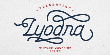 Lyodra is a vintage monoline script typeface. This font is inspired from a modern, vintage style, with added flourishes to add elements of beauty. It includes OpenType features with a lot of alternates to give you different options in lettering. This font is also includes multi-language support. Lyodra is perfect for vintage design, badges, logos, t-shirts, posters, branding, packaging, signage, book cover and so much more!
 - Father Frost by Hanoded,
$15.00 Father Frost, or Grandfather Frost is the Santa Claus of Slavic countries. He used to wear a red coat, like his ho-ho-ho colleague, but when that was deemed too Bourgeois and Western by the Soviets, he changed into a blue coat. Father Frost is a very happy, very legible font, ideal for Christmas cards, posters and ads! Father Frost comes with a bagful of language support.
 - Motorix by Ampersand Type Foundry,
$24.00 Motorix is a typeface of alternatives. A versatile and highly flavorful constructivist design in three weights with corresponding italics, and hundreds of variant forms. Motorix’ interchangeable letterforms yield a multitude of combinations that elicit electronic rhythms and at times take on humanistic forms. The name Motorix is a pseudo-feminized variant (the ‘-ix’ suffix being derived from ‘-trix’) of the German word ‘motorik’, which refers to both electronic music and human motor skills. The typeface lives up to its energetic name, synthesizing precise rhythms and alphabetic waveforms into a uniquely upbeat and spunky typeface.
 - Starboard by Hanoded,
$15.00 The term starboard derives from the Old English steorbord, meaning the side on which the ship is steered. Before the steering wheel, boats were steered by an oar at the stern of the ship. Since most sailors were right handed, this is where you would find your steering oar! Starboard font is a rough, handmade, brushy kinda font. It was, of coarse, made with my favourite cheep brush and Chinese ink - resulting in a slightly eroded looking font. Starboard comes with all the trimmings, including double letter ligatures for the lower case.
 - Zart by DSType,
$40.00 Zart is a heavy yet delicately sensitive display typeface filled with character, a free interpretation of the classical French styles from the late eighteenth century, reimagined for modern use. While it’s vertical strokes carry the typical weight of this style, the thinness of the horizontal strokes is further extended into the characters with the introduction of large vertical ink traps. This allowed us to design slightly narrower letters which, coupled with shorter serifs, result in a overall darker expression, creating really impactful headlines. Zart is available in three versions: Regular, Italic and Script.
 - Clootie by Hanoded,
$15.00 My wife was watching a baking show in which a Scottish guy attempted to cook a clootie. A what?? A clootie??? Never heard of a clootie! Apparently it is a suet dumpling, containing dried fruits (like raisins) and boiled in a piece of cloth (clootie means ‘rag’ or ‘strip of cloth’ in Scottish). Clootie font is a handmade bundle of happiness. It is rounded, soft and legible and will look particularly good on book covers. And I promise you all: one day I will cook clooties to find out what they taste like!
 - Deco Eccentrique JNL by Jeff Levine,
$29.00 The inspiration for Deco Eccentrique JNL was initially hand drawn contoured lettering from a mid-1920s piece of sheet music; the style of the letters showing influences of the upcoming Art Deco movement. This was made into a digital font entitled Poster Contoured JNL. Once all of the excess parts of the previous design were stripped away to only the inner letters, the pre-Art Deco influences remained along with characters of varying stroke widths and shapes. This non-conformist type face is available in both regular and oblique versions.
 - Molly Louie by Pelavin Fonts,
$18.00 Conceived on a cold evening to the hot Jazz of the Eri Yamamoto Trio at Arthur’s Tavern in the Village, font Molly Louie is best described by the person for whom it was named. “Very intricate, like a whole little world in each of them” and “The solid is nice too, like little cut up sandwiches.” The detailed and solid versions facilitate a variety of two-color applications. You might not use this decorative display font at smaller sizes, but you are encouraged to let your imagination guide you.
 - Bertram by ITC,
$29.00Bertram Plain is the perfect font for setting titles in comic strips and similar designs. UK designer Martin Wait created this font 1991, after he was inspired by the casual style of circus graphics. In fact, this jolly and lighthearted font was even named after one circus in particular: the Bertram Mills Circus. Bertram Plain is an all-caps font, with capital letters placed on both the upper and lowercase keyboard strokes. Additionally, Bertram Plain letters sport a 3D-like drop shadow, a distinctive feature when comparing this to many other display fonts. - Magnify PRO by XdCreative,
$32.00 About Magnify Pro Magnify Pro Geometric sans 2 Style in 1. Magnify PRO Geometric sans is the latest version of "Magnify" by. Faldykudo. Comes up with more complete language support and features, including ink-trap and reverse contrast will add more different taste & style to the art of modern typography. Magnify PRO has two style in one font, normal & inverse contrast. If you are like normal: just type with regular letters, if you are like reverse contrast: just access your opentype features to find the alternate letters. Thank You.
 - Kurdis by That That Creative,
$32.00 Kurdis Varibel Font Family is a modern sans serif family with six widths and five Weights Making 30 Set Styles and of course 10,000 more combinations when considering the Variable options. This Typeface is a real work horse for titles. At its condensed Width it is sophisticated and professional with well considered ink traps that help it really stand out at Large Sizes. the Regular width works well for longer bodies of text on websites or posters and the Wide Styles give an elevated look to your average wide sans serif.
 - Hairy Blood by Mvmet,
$18.00 Hairy Blood is a cool ink drips font with bold characteristic inspired by vintage horror movies, comics, and Metal music that makes this font looks so cool and fun to use. It will be perfect for your horror and Halloween themed needs! You can use it for anything ranging from t-shirts and clothing, for your scary book designs, Halloween party needs, greeting cards, stickers, posters, banners, or anything that needs a horror touch. Try it to create fabulous designs and feel the horror and Halloween vibes with it!
 - Dalek by K-Type,
$20.00 DALEK is a distressed, small caps typeface based on the lettering used in the Dalek Book of 1964 and in the Daleks strip in TV21 comic. The fonts have overtones of Greek, Phoenician and Runic alphabets. The updated Dalek fonts contain a full complement of Latin Extended-A characters, and also include Greek capitals and small caps. In addition to the original Regular font, Heavy and Light weights are available, and optically corrected obliques for each weight. Also check out Dalek Pinpoint, a clean and precise version of the Dalek typeface.
 - Toonerville NF by Nick's Fonts,
$10.00The original sheet music for Ted (Is Everybody Happy?) Lewis’ signature tune, When My Baby Smiles at Me, inspired this whimsical wonder. The sheet music was discovered in the Library of Congress American Memory Collection, an incredible online resource. The typeface gets its name from a slightly loony early 1900s comic strip by Fontaine Fox. This new and improved version has beefed-up outlines, so it renders well even at smaller sizes. Both versions contain the complete Unicode 1252 (Latin) and Unicode 1250 (Central European) character sets, with localization for Romanian and Moldovan. - PR Cauldron by PR Fonts,
$9.02 Whether your subject is scary, or just ancient, this font can help get the right feeling across. PR-Cauldron has capitals based on Uncials, and lowercase based on Celtic Minuscule. “Potion” has a rough finish, and “Curse” has the same letters dripping with gore, suitable for Halloween. Letters are size matched in both fonts, so you can put in as much, or as little messiness as you like. Combines well with: PR Bramble Wood 1, PR Bramble Wood 2, PR Hallow Doodles 01, PR Hallow Doodles 02, PR Swirlies 01, PR Swirlies 05
 - Ongunkan Wardruna Arabic Runes by Runic World Tamgacı,
$50.00 Wardruna Arabic is a method of writing Arabic with a Runic-like alphabet devised by Devin Lester. He imagined that if some vikings had settled in the Middle East, they might have started speaking Arabic and writing it with a version of the Runic alphabet. This particular alphabet is based on Tolkien's Cirth Runes. A band of vikings went to Baghdad after raiding in Europe. The markets in Constantinople were closed as the Turks had just sacked the city. These men had heard of the great market in Baghdad and went there to sell their wares, seeing that this land was warm and fertile they decided to stay. They ended up settling the land and taking Arab wives and having children, because of thier Northern European accent their Arabic evolved into a part-Arabic dialect of Iraqi arabic. This is why today you see a few Arabs with green eyes and dark blonde or red hair. The Arabic alphabet was too fluid for them and vikings disdained the use of paper as a persons writings could be burned, so the evolved their runes to fit Arabic.
 - Manganese by Comicraft,
$29.00The entire Headquarters Building of Active Image Comicraft has been ripped from the ground by a giant lizard monster which has unexpectedly risen from the sea! It has the power of bodily transformation! By merely willing it, it can transform its atomic structure into any form and shape. It is completely hostile. It regards our entire island nation as its enemy. Run! RUN! Run from the Giant Monster! - Prussak BC by Jujumisur’s Ficus,
$19.00 I wanted to do somewhat like Blackletter, but Blackletter is hard to read sometimes, so I tried to solve this problem and to do something unique. This font is able to be used with all European languages including ancient and reconstructed languages like Old Church Slavonic (it can be written by Cyrillic or Glagolitic script), Proto Slavic, Ancient Greek etc. It also includes IPA, so it can be used in education.
 - Scratch by ITC,
$29.99Scratch was designed by Andrew Smith in 1995. It looks as thought many fine lines were drawn next to and over each other with a felt-tipped pen. Small bits of white peek out among the strokes and give the font its dynamic character. Flexible and sketchy, the forms are based on those of a classic sans serif cursive typeface. Scratch is meant exclusively as a headline or display font. - ITC Blaze by ITC,
$29.00ITC Blaze was designed by Patty King in 1995. It is a typeface which looks as though it were written by hand with a broad tipped pen on rough paper. The pointed ends of the characters and the leaning to the right give the font a dynamic, energetic feel. Blaze shows the influence of the late 1940s and is best suited for headlines and short to middle length texts. - Basik by Superfried,
$32.50 As the name suggests, Basik is a simple, clean and versatile sans-serif typeface designed by Superfried. It is equally apt in both body and display scenarios. There are already numerous san-serif fonts available which is why we have tried to create some unique styles and cuts throughout the typeface. Basik has been featured on the Behance curated typography gallery TypographyServed.com. It is available in two styles, book and stencil.
 - Gavotte by Linotype,
$29.99Linotype Gavotte was designed by Rudo Spemann in 1940. His style was unmistakable, marked by original ideas and completely new forms. His tendency toward the unusual and adventurous resulted in unique, decorative characters. When he wrote, the tip of his pen flew across the page, leaving behind rows of letters which displayed an almost unbelievable regularity of form and flow. Gavotte is a perfect example of the best of Spemann’s calligraphy. - Bentband by Vishnu Sathyan,
$4.90 Introducing "Bentband" - a unique and playful typeface inspired by the way a pipe bends. This typeface features curved lines, bold and geometric shapes that tries to mimic a pipe. With its distinct style, Bentband is perfect for creating eye-catching headlines and titles that stand out. The font is available in both uppercase and lowercase letters, a range of symbols and numerals. Bentband is available in 66 languages.
 - Catastrophique by Comicraft,
$19.00 It’s a Towering Inferno of a Font! It’s a Poseidon Adventure, an Earthquake and a Sharknado of Devastating Proportions! Don’t Look Up -- these cracked and chunky letterforms are signifiers of a Magnificent Disaster! A Perfect Storm of Tip Top Type by Comicraft's Starkings & Roshell with artist Lisa Davighi. Dante’s Peak has exploded and the Deluge has begun. Don’t save this font for the Day After, when worlds collide — Armageddon is Now!
 - Al American Legend by Aluyeah Studio,
$125.00 Hello Aluyeaholics! So we tried playing with the script, we hope you like it. American Legend is inspired by vintage handwriting. Comes with 220+ stunning alternates and ligatures. Super easy to use alternates and ligatures. Super Easy to Use alternates - You can easily call alternates using special combination like a.2 a.3 b.5 e.r a.r l.l etc. To get results like the preview just type Ame.rican Leg.9end
 - Boo Boo Kitty by Lauren Ashpole,
$15.00 Boo Boo Kitty is a blocky font with a halftone style gradient texture. One of the big inspirations for this font was retro comic printing so I tried to keep the background slightly messy to capture that look. It was originally released in 1997 as an all-caps font with mixed plain and textured characters but was recently updated it to include lowercase letters and full versions of both background options.
 - Adverse Stencil JNL by Jeff Levine,
$29.00If you're old enough to remember having a lettering stencil in school, then you might have tried to save all of the waste paper punched out of the letters and numbers; hoping to do something with them later on. Jeff Levine took his Tramp Steamer JNL stencil font and gave it the look of those waste paper pieces - lined up to form erratic characters with a personality all their own. - Piano Keys by Funk King,
$10.00 Piano Keys is a musically-inspired font. It can be used for commercial as well as educational projects. In other versions, I tried to accurately replicate the pattern of black and white keys across the character set. Of course when used, the randomness of text and characters often produced less than realistic results when needed. This version allows black and white keys to be accurately arranged, if desired.
 - Nosara by Never Better,
$9.00 Inspired by a trip to Costa Rica and named after its famous beach town, Nosara is a layered vector font that's perfect for projects that require a realistic, hand-painted desert-island look. It comes in three styles: Regular, Outline, and Fill. The styles can be layered to create authentic-looking hand-painted letters and icons—in vector! You can create outlines from this font in order to customize to your heart's desire. Millions of bespoke combinations are possible. This typeface was made by hand, meaning each letter was painted with real paint and digitized, not created on an iPad, which is why this font looks great and has a warm natural quality even at large sizes. Nosara is perfect for packaging, parties, signage, and even looks great in long-form text! Nosara Xtra is a set of pictograms, also in 3 styles that can be layered for the same effect, evoking the imagery and happy vibes of a sunny tropical vacation.
 - Caplosy by Craft Supply Co,
$20.00 Caplosy – Trippy Font is a font that transcends the boundaries of conventional typography, drawing inspiration from the mesmerizing world of psychedelia. Its letterforms twist and twirl in a captivating dance, inviting you to explore a typographic realm that’s equal parts strange and spellbinding. This font is your passport to the extraordinary, a choice that says “ordinary” is simply not an option. Whether you’re designing album covers, posters, or any creative endeavor that craves a mind-bending twist, Caplosy adds a touch of mystique and magic. Its unconventional, serpentine design transports viewers into a realm of altered perception, where the typography itself becomes a hypnotic journey. Caplosy is like a wormhole into a trippy, surreal dimension within the world of fonts. It’s the ideal choice for projects that want to challenge reality, creating a visually tantalizing, thought-provoking experience that’s nothing short of an artistic adventure. Choose Caplosy when you’re ready to take your design on a mind-bending trip through the extraordinary.
 - Pratfall by Jeff Levine,
$29.00 For 138 years, the Milton Bradley Company (of Springfield, Massachusetts) has been the leading producer of board games, toys and educational/instructional materials. The company was acquired by Hasbro in 1984. It was merged with the also-acquired Parker Brothers in 1991 and became Hasbro Games until both brand ID's were dropped in 2009. “The Moving Picture Game” was a 1920s-era board game created by Howard R. Garis (credited as ‘the author of the Uncle Wiggily game’) and capitalized on the still-new motion picture industry. On top of the storage box is the game’s name – hand lettered in a free-flowing Art Nouveau sans serif that more closely resembles the titles found within animated cartoons or in the ‘bubble letters’ a school child doodles on notebook paper. Recreated as a digital typeface, Pratfall JNL (named after the slips, trips and falls taken by silent era film comedians) is available in both regular and oblique versions.
 - Bleqcki by Twinletter,
$17.00 Welcome to the nostalgic world of typography! Bleqcki is a retro serif display font that brings the strength and beauty of a classic look to your projects. If you are looking for the perfect solution to bring a classic and vintage look to various visual branding design projects, then Bleqcki is an unmatched choice. What makes Bleqcki so interesting? This font not only brings a strong classic feel but also comes with several features that allow you to express your creativity. With families that include regular, shadow, outline, and slant, as well as alternate ligatures and characters. You have various options to create a look that suits your brand identity. We understand that branding and design projects can be very diverse and reach different audiences worldwide. That's why Bleqcki supports multiple languages, allowing you to communicate with your audience without restrictions. So, make each branding project an enchanting trip back in time. Get Bleqcki now and enjoy the nostalgic feel it brings to your projects.
 - Spillsbury by Greater Albion Typefounders,
$9.50 Spillsbury was inspired by some examples of 1920s signwriting (principally seen on the side of some vintage vans-good thing they were in a photograph and not on the move!). Spillsbury draws inspiration from these sources to provide a unique combination of legibility and flair, which echoes the charm of advertising and publicity material from the halcyon days of the 1920s. A basic range of four display faces os offered - Regular, Plain (not all that plain really!), Shaded and Shadowed. In a new departure for Greater Albion, three pairs of 'Duo' faces are also offered. These are designed to be used in pairs-and only sold on that basis for little more than the cost of a single face-to provide for two-coloured typographic design, enabling the recreation of those evokative two coloured blocked lettering styles that were used to such good effect in the past. Take a trip back to more colourful times today with Spillsbury!
