10,000 search results
(0.036 seconds)
- Peter Schlemihl - Unknown license

- Churchward Newstype by BluHead Studio,
$20.00 Originally released in 2008, Churchward Newstype is a workhorse text family, designed by the late Joseph Churchward back in the early 2000’s. If you’re familiar with Churchward’s typefaces, you might know that he always brought a little something quirky to his designs. Churchward Newstype doesn’t disappoint. The exaggerated concave serifs make a statement that is subtle, yet gives the typeface a unique flavor. The proportions and scale of the letters lend themselves to very good legibility in text applications, and the Bold weights are strong enough for headlines. Churchward Newstype is good for text copy, and headlines, and at giant point sizes, great for adding emphasis to posters! The Churchward Newstype family has four weights, Light to Bold, with 13 degree slanted italics. Each font has a second set of tabular figures. In this updated release, each weight now has an extended character set that supports most Western and Eastern European languages.
 - PGF Qualta by PeGGO Fonts,
$24.00 "Qualta" was initially designed in 2017 as a submission for a type design assignment while at typography school, originally launched under Alt-A Foundry, "PGF Qualta" was developed specially for Publishing Agency under the supervision of Peggo Fonts Foundry, now with a complete Small Caps set, classic and old style numeric figures, lining and tabular forms, scientific and fractional notation set, arrows set, light parenthesis set. Set on producing a geometric sans, it started with the circular form drawn from a 50s television screen. The bloated shape gave an illusion of protrusion and so much open space to the rounded letters. A broken stem was then added to the lowercase to provide a notch that allowed the typeface legibility in smaller sizes. The typeface was then developed into eight cuts with their corresponding italics. The lower case g includes a variation with a transitional link derived from the upper case Q’s tangent tail. Qualta’s original concept was designed by Isabel Gatuslao and was developed by Pedro Gonzalez.
 - Zombie Apocalypse by Matthias Luh,
$30.00 Zombie Apocalypse is way more versatile as its name would suggest. It might be used as a horror font (red color tones in horror games, movie covers) or in ads for an Offroad Experience Tour (or wherever it comes to dirt, mud and spatters in combination with brown tones). When used with light blue/red/yellow/orange colors, the font can express creativity and freedom (on fashion, inspirational art and advertising) because it is not bound to classic straight-lined fonts. In various shades of gray or in black, it can be used to support a "worn out" look. Zombie Apocalypse - with its "worn out" look and many details - is espacially designed for use with large font sizes, for example in high resolution print media or in large images on digital media. The font is designed to be used in many different languages. It has a large set of accented characters and diacritical marks.
 - Cabo Soft by Design A Lot,
$15.00 Cabo Soft is the 2.0 version of our original Cabo Rounded Typeface, created back in 2015. With this new version, Cabo Soft, we have brought multiple upgrades and updates compared with the original version. Some of those consist in the addition of more glyphs and accents, alternate designs for many of the glyphs (including an alternate for @, #, some of the numbers and more), and most importantly, we have done a slight update in the design of the letters, which we'll give more details in the following paragraphs. The main style and thought behind our Cabo fonts has always been the rounded corners and the soft and welcoming vibe that it gives. It's friendly and familiar, but also modern and slightly elegant, especially the Thin and Light styles. With Cabo Soft we have worked on adding an extra touch to the design of the letters by working on the termination edges of each letter. If Cabo Rounded had an exact round termination for each letter, with Cabo Soft we have developed a unique non-equally rounded shape that is applied to all types of terminations for each letter. This new design approach makes it have a more clean style, a more modern and unique look, but it also gives stylish, exclusivist and elegant vibes, while still being friendly and familiar. Thanks to it's variety in weights and styles, you can use Cabo Soft in almost any design project. It works well with headlines and paragraphs, it's a perfect match for logo design and branding, but can also do wonders in videos, signage and many other elements. The typeface covers most likely the entire Latin Alphabet, it comes with multiple design alternates for many of the letters, glyphs and numbers, with accents applied for all of the available alternates. As a finishing note, with the help of our Cabo Soft typeface you can create an friendly and welcoming designs, as well as stylish, elegant and exclusivist. It has all the necessary glyphs and accents for any Latin Alphabet projects, and you can play around with all of the alternates to create unique designs right from the start.
 - VNI-Thufapfan - Unknown license

- Picture this: "Teen Spirit" by Steven J. Lundeen is not just a font; it's the embodiment of youth rebellion, a visual shout that echoes through the halls of high school, sticking it to the man with e...
- Retroxoid by PizzaDude.dk,
$20.00 You may recognize the looks of Retroxoid - if not, then let me help you out: Retroxoid is actually a font I made back in 2007. I ran prints of the font, through a very bad copymachine, used a wet cloth to make the print look worn, scanned the prints and voila! Retrozoid, my very first Open Type font, was born! Now in 2010, Retroxoid has risen from the past, and is ready to burst your designs with clean, round and futuristic shapes!
 - Hokitika by Hanoded,
$15.00 Hokitika is a township in the West Coast Region of New Zealand's South Island. It has some amazing beaches, stunning scenery, but above all, it has Pounamu (greenstone or jade). This is THE place to buy a beautiful Maori greenstone pendant. Don't buy it for yourself, as it is supposed to bring bad luck. Hokitika font is a tall and thin all caps Art Deco typeface. It is classy, elegant and very legible. Comes with a full range of diacritics.
 - Kaira by Gassstype,
$25.00 Hello Everyone, introduce our new product KAIRA is Bad Black Metal Font with a natural feel. This handmade font will make your design has a beautiful natural touch for each details. It is perfect for any design project as Invitation,logo, book cover, craft or any design purposes. KAIRA is Inspired by Logo style and combination with Unique Craft style. that will fulfill your design needs for quotes,sporty theme, logotype, wordmark, etc. This has many opentype features and support multi language.
 - Marseillette NB by No Bodoni,
$39.00 These four typefaces, Berlinette NB, Lyonette NB, Marseillette NB and Parisette NB, were designed from the same basic shape, a fanciful geometric form that avoids strict horizontals and uses more offbeat triangular shapes. Marseillette is the nasty one, with sharp hook terminations that require careful use. Don�t slip and accidentally stick one in your hand � it will hurt pretty bad and make you blubber like a baby. It�s good for surreal warning signs on dark, forbidding docks where gooey monsters live.
 - Pseudonym by Monotype,
$20.99 Pseudonym is a low-contrast, subtly-flared serif available in four weights across three styles in both roman and italic. As with all of my typeface designs, I am creating fonts that I would use myself for branding purposes—typefaces with style and purpose that are intended for use in creating logos and distinctive branding typography. I wanted to create a typeface that had incisive flared serifs combined with the strength and solidity of modern grotesque faces. The result is Pseudonym, which I feel has great presence, style and legibility. Although I must admit, I had to tone down the flared serifs during the design process in order to achieve that :) I’m sure you will have great fun playing with some of the Open Type features that I’ve added to Pseudonym. There’s a full set of true small caps with their corresponding diacritics and figures. There are also a number of discretionary ligatures, these are chosen from the glyphs palette in your layout app to replace pairs of standard characters. You’ll also enjoy making use of the catchwords – these have been created to harmonise with each style, again, giving you more flexibility and scope to create some innovative typography. Finally, there are some alternate characters for /C/D/O/. You may wish to use these when creating logos that include standard contractions for limited, number, incorporated, etc. Key features: • Pseudonym is a low-contrast, subtly-flared serif that has great presence, style and legibility • 3 styles – Narrow, Regular and Wide • 4 weights in roman and italic: • Light | Regular | Medium | Bold • Full set of small caps with diacritics and figures • 30+ discretionary ligatures, catchwords and alternate characters • Full European character set • 600 glyphs per font
 - Torrid Tango JNL by Jeff Levine,
$29.00 1920s-era sheet music for "Tangos Pour Manon" from Brussels, Belgium had the title hand lettered in an unusual style. The alphabet was square, had serifs and the thick-and-thin stroke weights that were more popular in the upcoming Art Deco years of the 1930s and 1940s. This became the working model for Torrid Tango JNL, which is available in both regular and oblique versions.
 - SP Isis by Remote Inc,
$39.00They say the Nile has many secrets and she was the most sacred of them all. Isis. I met her in a small tavern outside of Edfu, hidden like a jewel between Luxor and Aswan. I had journeyed to Egypt to study the mating habits of homosexual hippos. I had no idea it was the journey that would teach me the true nature of love. - Pagoda by Studio K,
$45.00 This display font has an oriental character reminiscent of brush stroke calligraphy and all things Japanese. My original working title for this font was ‘Spanner’, because the lower case ‘c’, with which the design began, looked rather like the head of a spanner. I originally had in mind something more mechanical, but as it evolved and developed the font itself obviously had other ideas!
 - Jawbox by Chank,
$49.00In 1995, when indie rock hipness was just reaching its pique, Chank was really into Jawbox, a post-punk band from DC. It was their music he was listening to when he made this font for the Space Ghost web site. The band broke up in 1997, but the font named in their honor lives on. This font family includes Jawbox, Jawbox Chanky, and Jawbreaker. - Maigreds by Maculinc,
$18.00 Maigreds is a display font vintage simple typography and easy to read so comfortable to wear. You can use them as logos, badges, badges, packaging, headlines, posters, t-shirts / clothing, greeting cards, business cards, and wedding invitations and more. The flowing character is ideal for creating interesting messages to your taste. mix and match a group of alternate characters to fit your project. Thank you! Maculinc
 - Calligraphe by Meutuwah,
$20.00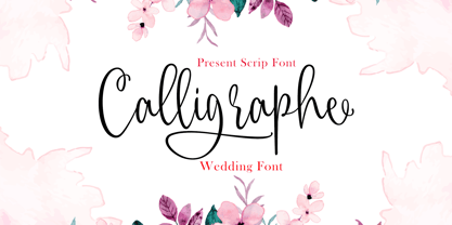 INTRODUCING Calligraphe Script is a stylish calligraphy font that features a varying baseline, smooth line, classic and interesting touch. Can be used for various purposes. such as headings, signature, logos, posters, t-shirt, signage, lable, wedding invitation, badges etc. Programs that support in this font is a Microsoft Office Adobe Photo Shop, Adobe Illustrator, Adobe Indesign, and Corel Draw, and badges etc. Thank you so Much.....!
 - Daugtha by Meutuwah,
$25.00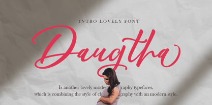 INTRODUCING Daugtha is a stylish calligraphy font that features a varying baseline, smooth line, classic and interesting touch. Can be used for various purposes. such as headings, signature, logos, posters, t-shirt, signage, lable, wedding invitation, badges etc. Programs that support in this font is a Microsoft Office Adobe Photo Shop, Adobe Illustrator, Adobe Indesign, and Corel Draw, and badges etc. Thank you so Much.....!
 - Palm Canyon Drive by RetroSupply Co.,
$19.00 Mid-century California was a magical place. Post-war optimism fueled the popularity of everything from Hollywood to roadside diners. Palm Canyon Drive is a monoline script inspired by retro matchbook covers, travel postcards, Tiki bars and Hollywood. With a classy yet unpretentious tone Palm Canyon Drive is as comfortable on a Tiki bar matchbook cover as it is on a Hollywood movie poster.
 - Raspberry Sherbet by Hanoded,
$15.00 I have actually never had a sherbet. When I made this font family, I wish I had one, as it was a whopping 38 degrees (Celsius, not Fahrenheit…) outside. Raspberry Sherbet is a cute little font family, consisting of a rounded fat kids font and an inline version. Comes with all the bells & whistles, plus a super duper cooling effect when you use it!
 - Chamberlane by Meutuwah,
$20.00 INTRODUCING Chamberlane Script is a stylish calligraphy font that features a varying baseline, smooth line, classic and interesting touch. Can be used for various purposes. such as headings, signature, logos, posters, t-shirt, signage, lable, wedding invitation, badges etc. Programs that support in this font is a Microsoft Office Adobe Photo Shop, Adobe Illustrator, Adobe Indesign, and Corel Draw, and badges etc. Thank you so Much.....!
 - Carmel by Type Associates,
$24.95 This font has been on my drawing board since the late eighties. It was based on drawings provided to me by an old sign-painter family friend and we used it extensively as a caps-only font in the early 90s on a cellphone ad campaign. It loves to be tight set and stacked and provides real grunt when you need it. Small caps have been added and have been weight and proportion adjusted so as to complement the caps. At Type Associates we believe that a font is not complete until the spacing is optimal. Carmel is another example of quality through extensive experience, testing, adjusting and refining.
 - Bernhard Signature by Jonahfonts,
$40.00I started to work at the Bernhard Studio in 1952 to 1959 in New York. I helped with some type designs and many other projects, this two tiered signature was added on all of Bernhard’s art that was produced in the past and in his later years. In the 50’s I thought Bernhard’s Gothic face was quite a bit outdated but as you may know it has become one of todays most used faces. His signature is based on his Bernhard Gothic Font. With todays computer technology I have digitized the caps and added lower case glyphs with lower ascenders and other slight changes. - Authentic Romantic by SilverStag,
$14.00 A brand new year is here and a brand new font is here as well. I have to say I had so much fun working on this funky slab serif typeface. I have created some quirky letters and over 100 ligatures + the font comes in four weights - light, regular, medium & italic. The font also includes full language support, punctuation, numerals and detailed instructions how to use ligatures in most of the apps on your computer, as well as in Canva. I invite you to check out the preview images, and I hope you will be immersed in my vision for this creative typeface that, I am sure, will work for all kinds of interesting projects you might be working on this year. If you end up publishing your designs on Instagram, tag me - @silverstagco and I will make sure to showcase your design and work to my audience as well! Authentic Romantic - Slab Serif Font Includes: 100+ Ligatures Numerals & Punctuation Language Support Detailed instructions on how to use alternates in most of the apps on your computer as well for Canva Happy creating everyone!
 - Viktorie by Three Islands Press,
$39.00 Viktorie might easily be mistaken for the handwriting of a note-taker in a hurry: it looks swiftly jotted down. These energetic characters pay little heed to such arbitrary contraints as baseline or x-height -- taken together, they give the effect of casual penmanship that's both curiously legible and inspiringly unleashed. Viktorie has a single, medium-light weight and comes, of course, with a full character set.
 - Pulchra SPF by S6 Foundry,
$25.00 Pulchra is a stylish Brutalist font. The font displays a playfulness personality, vitality, with a strong and elegant appearance. The typeface has the right visual consistency for branding communications. It comes with unique lower and uppercase plus numbers, punctuation & multilingual letters. Its thick curves give the 60s & 70s groovy vibe. What you get: - Letters, numbers, punctuation, multilingual support, alternate and ligature - Light, Regular, Medium, and Bold version.
 - Salmond by Arterfak Project,
$19.00 Meet Salmond, a geometric and modern sans serif font designed with a tight letterspace, exuding a unique, minimalist charm. Consists with six weights, ranging from Light, Regular, News, Medium, Semibold, and Bold, matching with Oblique styles and multilingual support. This font family offers versatility for various design needs, designed especially for display such as titles, branding, logos, books, UI/UX, and impactful editorial work.
 - Elemental Sans Pro by Latinotype,
$39.00 Elemental is a font created in 1997 and launched in 2001. It is a Sans Serif of humanist type and its principal characteristic is a hybrid between different form of calligraphic outlines. In 2010 it was redesigned for Chile’s bicentenary in Opentype version and an improved italic. It is offered in eight weights: Light, Regular, Bold and Extrabold and small capitals for each one of them.
 - Creepygirl - Unknown license

- Debug by Mussett,
$11.00As as a computer programmer, it is my job to stare at screens of text all day. As soon as I learned the mechanics of font design, I boldly set out to design a typeface from my own handwriting that I could use to make my life easier. First, it had to have very distinctive numerals (trust me, it can be easy to mistake an 8 for a 3 in code), it had to have huge punctuation characters (even Perl code like '[lN*1lK[d2%Sa2/d0' looks good in Debug), and it had to be a bit friendlier than Courier (so that I don't give up hope when my code won't compile). I had so much fun designing it that I decided to give it strange lower-case 'i's and 'm's as a bonus. I also spent far too much time hinting it so that it would look as nice as possible at low resolutions. - manu - Unknown license

- Reverie OT by District,
$20.00 Reverie is a cheerful band of letters that bounce across the page and get together to create words in four weights. Generous spacing and a modest x-height project an airy typeface that's open but not frail. Quirky without being too whimsical. Use the regular weight for surprisingly readable text or put the light and heavy weights to use for decorative headlines and titles. Reverie OT is the follow-up to the popular Reverie. This version comes loaded with new features: ligatures, small caps, swash caps, a larger numeral set, more language glyphs, and a fourth, heavy weight. This all adds up to a vastly more functional and flexible family of fonts.
 - VNI-HLThuphap - Unknown license

- Conformyst - Unknown license

- OregonDry - Unknown license

- ActionIs - Unknown license

- VIDEO - Unknown license

- Electrack - Unknown license

- Metropolitaines by Linotype,
$29.99This art nouveau style typeface is the one that had been used for the signage of the historic Paris metro stations.


