10,000 search results
(0.029 seconds)
- Zero Death by Hatftype,
$17.00 Zero Death - Blackletter Display Font is a display font that is inspired by gothic and horror style because its shape is very unique and is perfect for any project that you will use with this theme. Zero Death with opentype features such stylistic alternates, stylistic sets & ligatures good for logotype, poster, badge, book cover, tshirt design, packaging and any more. Features : 1.Uppercase & Lowercase 2.Multilingual support 3.Number 4.Symbol 5.Punctuation. 6.Extra Dingbat 7.Support in Mac and Windows OS -Support in design application (photoshop, illustrator, and more). There it is. I really hope you enjoy it. Comments & likes are always welcome and accepted.
 - Black Ruby by NJ Studio,
$19.00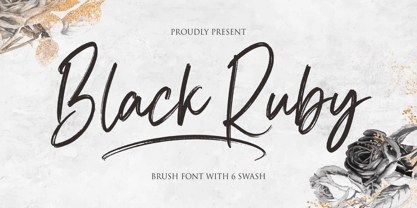 Hi...Thank for your visit :) Black Ruby a handwritten brush font. It features ligatures characters that will take your projects to the next level! This font is PUA code which means you can easily access all the glyphs that are full of brush! It also features many special features including glyphs. font designs that are made for various vector designs, printing such as digital wedding blogs, online shops, social media, while printing can be used in the field of product clothing, accessories, bags, pins, logos, business cards, watermarks and many others ... so it can make your product look brush and attractive, and also Multilingual support!!! Happy design ...
 - Master of Magic by NJ Studio,
$19.00 Hi...Thank for your visit :) Master of Magic a magical script font. It features ligatures characters that will take your projects to the next level! This font is PUA code which means you can easily access all the glyphs that are full of magic! It also features many special features including glyphs. font designs that are made for various vector designs, printing such as digital wedding blogs, online shops, social media, while printing can be used in the field of product clothing, accessories, bags, pins, logos, business cards, watermarks and many others ... so it can make your product look beautyful and attractive, and also Multilingual support!!! Happy design ...
 - Monarch Cultivation by Hatftype,
$17.00 Monarch Cultivation - Blackletter Display Font is a display font that is inspired by gothic and horror style because its shape is very unique and is perfect for any project that you will use with this theme. Vamps Crime with opentype features such stylistic alternates, stylistic sets & ligatures good for logotype, poster, badge, book cover, tshirt design, packaging and any more. Features : 1.Uppercase & Lowercase 2.Multilingual support 3.Number 4.Symbol 5.Punctuation. 6.Extra Dingbat 7.Support in Mac and Windows OS -Support in design application (photoshop, illustrator, and more). There it is. I really hope you enjoy it. Comments & likes are always welcome and accepted.
 - Ancient World by Hatftype,
$17.00 Wild Inferno - Blackletter Font Style is a display font that is inspired by gothic and horror style because its shape is very unique and is perfect for any project that you will use with this theme. Wild Inferno with opentype features such stylistic alternates, stylistic sets & ligatures good for logotype, poster, badge, book cover, tshirt design, packaging and any more. Features : 1.Uppercase & Lowercase 2.Multilingual support 3.Number 4.Symbol 5.Punctuation. 6.Extra Dingbat 7.Support in Mac and Windows OS -Support in design application (photoshop, illustrator, and more). There it is. I really hope you enjoy it. Comments & likes are always welcome and accepted.
 - LiebeFish by LiebeFonts,
$19.90 LiebeFish is a collection of 172 individually hand-drawn fish. Each has its very own personality; some are happy, some are sad. Some like company, some are bored, most are cute and a few are weird. If you look closely, some fish will surely look like people you know. LiebeFish probably is the most comprehensive collection of hand-drawn fish ever. They look great on almost any greeting card, birthday card or invitation. LiebeFish also serve as a perfect companion to any informal graphic design that needs a personal, handmade touch. If you like this font, have a look at our other cute fonts such as LiebeTweet and LiebeRobots.
 - Brush Effect by NJ Studio,
$19.00 Hi...Thank for your visit :) Brush effect a handwritten brush font. It features ligatures characters that will take your projects to the next level! This font is PUA code which means you can easily access all the glyphs that are full of brush! It also features many special features including glyphs. font designs that are made for various vector designs, printing such as digital wedding blogs, online shops, social media, while printing can be used in the field of product clothing, accessories, bags, pins, logos, business cards, watermarks and many others ... so it can make your product look brush and attractive, and also Multilingual support!!! Happy design ...
 - Altmann Grotesk by Ateljé Altmann,
$50.00 Altman Grotesk was initially planned as an internal studio typeface for the graphic design studio Ateljé Altmann based in Stockholm, Sweden. After thoroughly researching both classic and contemporary sans serif typefaces, the aim for Altmann Grotesk was set at joining unobtrusiveness yet distinctiveness in one look. As a result, the sans serif successfully embraces a polarizing image of minimalism and uniqueness. During the design process of Altmann Grotesk, it soon became clear that it had the potential to be more than a studio typeface—which ultimately led to a sans serif font family with five distinctive weights that are perfected to fit every possible typography use case.
 - Panic Night by Hatftype,
$15.00 Panic Night - Halloween Display Font is a display font that is inspired by gothic and horror style because its shape is very unique and is perfect for any project that you will use with this theme. Panic Night with opentype features such stylistic alternates, stylistic sets & ligatures good for logotype, poster, badge, book cover, tshirt design, packaging and any more. Features : 1.Uppercase & Lowercase 2.Multilingual support 3.Number 4.Symbol 5.Punctuation. 6.Extra Dingbat 7.Support in Mac and Windows OS -Support in design application (photoshop, illustrator, and more). There it is. I really hope you enjoy it. Comments & likes are always welcome and accepted.
 - Back To Teacher Outline by NJ Studio,
$19.00 Hi...Thank for your visit :) Back to school (Outline & Inline) a simple handwritten font. It features fun characters that will take your projects to the next level! This font is PUA code which means you can easily access all the glyphs that are full of simple! It also features many special features including glyphs. font designs that are made for various vector designs, printing such as digital wedding blogs, online shops, social media, while printing can be used in the field of product clothing, accessories, bags, pins, logos, business cards, watermarks and many others ... so it can make your product look simple and attractive, and also Multilingual support!!! Happy design ...
 - Biblia Serif Display by Hackberry Font Foundry,
$12.95 What I needed in my projects was a solid oldstyle serif typeface with impact for heads. I had an old engraving font, which I’d never really finished. It happened to be built on the Minister/Diaconia base drawings I used to create Biblia Serif, so I took a shot at it. It’s wide enough to minimize the large solid ink shapes of many of the bolder display headline faces. It’s not readable, but it’s very legible. This is exactly what I needed for headlines, callouts, and special subheads. It uses the same vertical metrics of the Biblia Serif book Production Group It helps keep fiction designs comfortable
 - The Flash by NJ Studio,
$19.00 Hi...Thank for your visit :) the flash a signature font with beginning and ending swash. It features ligatures characters that will take your projects to the next level! This font is PUA code which means you can easily access all the glyphs that are full of swash! It also features many special features including glyphs. font designs that are made for various vector designs, printing such as digital wedding blogs, online shops, social media, while printing can be used in the field of product clothing, accessories, bags, pins, logos, business cards, watermarks and many others ... so it can make your product look swash and attractive, and also Multilingual support!!! Happy design ...
 - Goliath by Kavoon,
$12.00 Goliath is a brush typeface with personality. You can use it as a logo, badge, insignia, packaging, headline, poster, t-shirt/apparel, greeting card, and wedding invitation. The flowing characters are ideal to make an attractive messages, mix and match Goliath with a bunch of alternative characters to fit your project. The alternative characters in this font were divided into several OpenType features such as Stylistic Alternates, Stylistic Sets, and Ligature. The OpenType features can be accessed by using OpenType program such as Adobe Illustrator, Adobe Photoshop, and Adobe InDesign. More importantly, please don't hesitate to drop me a message if you have any issues or queries: kavoonme@gmail.com
 - Samui Script by Eclectotype,
$40.00 Named for the island that I had the pleasure of calling home for four years, Samui Script is a lovingly made, hand-lettering-style, script font, with a bouncy baseline and exuberant character. Taking mid 20th century commercial lettering as its inspiration, it is no revival, or pale imitation of past forms. This font can be as contemporary as you need it to be, or as retro, or somewhere in between. A wealth of sophisticated OpenType features lie beneath the bouncy exterior, making for a versatile script font that performs well at headline sizes, but is also legible enough to set small amounts of copy.
 - Pisonest by Meutuwah,
$20.00 INTRO Pisonest is perfect for modern projects, headings, blogs, logos, brandings, invitations and more! Programs that support in this font is a Microsoft Office Adobe Photo Shop, Adobe Illustrator, Adobe Indesign, and Corel Draw, badges etc. Languages supported. Breton, Catalan, Czech, Danish, Estonian,French, German, Hungarian, Icelandic, Italian, Romanian, Scottish Gaelic, Slovak, Latvian, Lithuanian, Norwegian, English, Finnish, Polish, Portuguese, Slovenian, Spanish, Swedish, Turkish, Welsh. Basically, all European languages that are based on latin alphabet. To enable the OpenType Stylistic alternates, you need a program that supports OpenType features such as Adobe Illustrator CS/CC, Adobe Indesign CS/CC, Adobe Photoshop CS/CC, CorelDraw X6-X7 & Microsoft Office. THANK YOU SO MUCH.
 - Julianti by Sulthan Studio,
$12.00 Julianti script new elegant font! This font was created specifically for those of you who need a touch of elegance, cute, fresh, to design your next project with perfect and amazing results. Julianti Script that is very beautiful and attractive, and is equipped with lines that are perfect for use for various purposes. Such as titles, signatures, logos, correspondence, wedding invitations, letterhead, sign boards, labels, bulletins, posters, badges, Branding, Greeting Cards, etc. Julianti Script is built with OpenType features and includes a beginning and an end. It comes with OpenType Stylistice, Initial, swash, ligatures and everything to add touches to your design and also support other languages :)
 - Scene by Monotype,
$29.99 Work on Scene began some time after designer Sebastian Lester joined Monotype Imaging in 2000. Clean, calm, and highly legible — thus the design brief Lester set for himself. With Scene, he wanted to provide graphic designers and creative directors with a suite of fonts that would serve as a strong foundation for identity projects, incorporating what he had learned about on-screen and print legibility. Scene was developed during two years of after-hours and weekend work. The family comes in six weights with matching italics, there is a set of “semi-sans” characters to introduce more expressive word rhythms into headlines and blocks of copy.
 - Pitcher by Fenotype,
$35.00 Pitcher is a bold brush with roots in 1940s and 1950s Americana. Pitcher is great for sports team or bar logos, beer labels or anything where you need a strong sturdy script with lots of character. Pitcher is equipped with several OpenType features - keep on Standard Ligatures and Contextual Alternates for smooth connections between letters. Try Swash or Titling Alternates when you need more customised headlines or when designing a logo and look for Glyph Palette for even more alternates. Pitcher Printed is the same font with a worn-out texture and a bit softer corners. Combine Pitcher Ornaments with the script to complete your designs!
 - Rengoku by Skinny Type,
$14.00 Rengoku is a bold script font with smooth curves is great for Branding, Logo Design, Lettering, Logotype, Clothing, Poster, magazine, packaging, posters, shopping bags, t-shirts, book covers, photography, special events and other design projects. Features : - Uppercase & Lowercase - Numerals - Punctuations (OpenType Standard) - Accents (Multilingual characters) - Ligatures and Alternate - Works on PC & Mac - Underline swashes - Simple installations - Accessible in the Adobe Illustrator, Adobe Photoshop, Adobe InDesign, even works on Microsoft Word. How to access alternate glyphs? you can see it on this link ( http://goo.gl/1vy2fv ) I hope you enjoy this font. If you have any questions please don't hesitate to drop me a feedback :)
 - SK Boncuk by Salih Kizilkaya,
$9.99 SK Boncuk is a very special font family I designed for my pet. Bead is a very smart and special rabbit. It can understand all commands and do whatever is said. It is very lively and fun in his daily life, but also monotonous. For this reason, I designed a fun font for him, with a single weight but with surprises. This font represents Boncuk's fun but monotonous life. SK Boncuk offers full support for the Latin alphabet and includes all the typographic elements you will need. This font family consists of 8 different fonts and 3288 glyphs and it supports hundreds of different languages thanks to the characters it contains.
 - Jacky Brushes by NJ Studio,
$19.00 Hi...Thank for your visit :) Jacky Brushes all caps textured brush typeface. It features ligatures characters that will take your projects to the next level! This font is PUA code which means you can easily access all the glyphs that are full of brush! It also features many special features including glyphs. font designs that are made for various vector designs, printing such as digital wedding blogs, online shops, social media, while printing can be used in the field of product clothing, accessories, bags, pins, logos, business cards, watermarks and many others ... so it can make your product look brush and attractive, and also Multilingual support!!! Happy design ...
 - ITC New Esprit by ITC,
$29.99Originally drawn in 1985, Jovica Veljović had intended to add a few kerning pairs and make some minor refinements to the letterforms. However, his work lead him to take a fresh look at the family. Veljović recalls, … I soon realized that some characters could benefit by more refined shapes and proportions. By the time I was done, I had worked on just about every character in the original design." In fact the end result is two systems: one optimized for extended texts; the other for display settings. The original elegance of the design is not lost, but the new design brings with it letterforms that are altogether more harmonious and balanced. The roman is dynamic and spirited, just oozing character. The italic by contrast is a little more restrained, but nonetheless an elegant and fitting accompaniment. The text-optimized fonts come with a generous x-height, and slightly less contrast; though its marginally wider proportions let in the light, making it very legible even at small sizes. ITC New Esprit ® is a versatile family, brought to you in four weights from regular to black. OpenType features like small caps, alternates, and a broad character set make this a welcome addition to everyone's font library. Whether you want elegant and legible text, or dynamic and personable headlines, then you'll want to click through to see more of ITC New Esprit. " - ITC Oldbook by ITC,
$29.99For some time, Eric de Berranger had wanted to create a distressed typeface design - one that gave the appearance of antique printing and showed signs of wear, yet was still highly readable. He was busy designing a new face called Maxime, when an idea struck: I realized that I could use these lettershapes as the basis for my antique typeface," he says. The two faces ended up being designed in tandem. While ITC Oldbook clearly captures the flavor of aged, uneven and imperfect printing, it also meets de Berranger's goal of being exceptionally readable in text sizes. Beginning with well-drawn characters was the key, and these were carefully modeled into the distressed forms. "The process was more difficult than I originally thought," says de Berranger. "The antique letters had to be tested and modified several times to work correctly." ITC Oldbook elegantly simulates antique printing in both text and display sizes. And while stroke weights are uneven and curves are irregular, the design has remarkably even color when set in blocks of text copy. Add to this the design's inherent legibility, and ITC Oldbook acquires a range far beyond replication of things old; it's suitable for any project that calls for warm and weathered typography. ITC Oldbook is available in roman and bold weights with complementary italic designs. Small caps, old style figures and a suite of alternate characters and ornaments provide additional flexibility and personality to the design." - Tyma Garamont by T4 Foundry,
$49.00The TYMA Garamont Roman was inspired by the Berner-Egenolff type sample from the 1560s. The Italic was inspired by a sample from Robert Granjon, also from the 1560s. The name TYMA is short for AB Typmatriser, a Swedish company founded 1948, because the Second World War stopped all import of matrices for Linotype and Intertype typesetting machines. It took until 1951-52 before the import was up to speed again. Until then, Sweden had to fend for itself. TYMA produced all technical equipment needed for type production, including the pantograph to cut the matrices, a complete set for each size and version. The templates for Garamont Roman were initiated by Henry Alm 1948. Bo Berndal was hired the following year, and continued the work by drawing and cutting templates for the rest of Garamont Roman, as well as for the remaining Garamont family. Bo Berndal stayed at TYMA until it went bankrupt in 1952. At that time Bo Berndal had already kick-started his career as type designer by drawing the typeface Reporter for one of the big daily newspapers, Aftonbladet, a version of Cheltenham for another daily, Dagens Nyheter, and copied several old typefaces for other customers. Librarian Sten G. Lindberg at The Royal Library of Stockholm, Kungliga Biblioteket, procured copies of original type samples. Henry Alm started the work in 1948, and Bo Berndal completed it - finally in this OpenType version. - Stabia by Eurotypo,
$29.00 Stabia is a multi-purpose typeface with large wedge-angular serifs. It is delicate and highly readable at very small sizes but reveals all its strength and personality when used at big sizes. The contrast of the sharped serifs provides a fresh and very contemporary look. The family has 5 weights, ranging from Light to Black (including italics) and is ideally suited for advertising and packaging, book text, editorial and publishing, logo and branding, small text as well as web and epub. Stabia provides advanced typographical support with features such as ligatures, small capitals, alternate characters, case-sensitive forms, fractions, and super- and subscript characters. It comes with a complete range of figure set options – oldstyle and lining figures, each in tabular and proportional widths. As well as Latin-based, the typeface family also supports Central European languages. Stabiae was an ancient Roman town, located close to the modern town of Castellammare di Stabia approximately 4.5 km southwest of Pompeii. According to the account written by his nephew, Pliny the Elder was at the other side of the bay in Misenum when the Mount Vesuvius eruption started. He travelled by galley ship across the bay, partly to observe the eruption more closely, and partly to rescue people from the coast near the volcano. Pliny died at Stabiae the following day, probably during the arrival of the sixth and largest pyroclastic surge of the eruption caused by the collapse of the eruption plume.
 - Steelplate Textura - Personal use only

- JBP Pro by PizzaDude.dk,
$25.00 Wicked, cheeky and geeky! That's what went through my mind when updating this font. Originally made around year 2000, and now it comes in a restored and updated version. I cleaned up all curves and lines, added multilingual support and kerning. Based upon classic typefaces like Bodoni and Baskerville, but far more unpredictable and wild.
 - Madani by NamelaType,
$49.00 Madani is a geometric sans serif consisting of 9 weights ranging from Thin to Black and matching Oblique. With a touch of character choice, adding tails to some glyphs on the stylistic set 1 and pointing joined at some of the tapered characters in the stylistic set 2, suitable for display and body text font.
 - Malibu Waves by Epiclinez,
$18.00 Sometimes you just need a little bit of that old-fashioned charm. That's why we created Malibu Waves. With a beautiful, handwritten style, this font is perfect for those who love the classic look with a modern twist. It’s timeless, perfect for adding some natural flair to your designs, and works great with any project.
 - Raconteur NF by Nick's Fonts,
$10.00Lettering in a 1923 ad for Piera Nova, designed by Hernando G. Villa, inspired this delightful Deco offering. Like its namesake, this font is a talented teller of tales, both elegant and entertaining. This font contains the complete Latin language character set (Unicode 1252) plus support for Central European (Unicode 1250) languages as well. - Berliner Fraktur by Resistenza,
$49.00 Designed with a flat brush and inspired by the modern fraktur from Rudolf Koch, Berliner Fraktur is composed by broken strokes, adding a handmade feeling to this geometric kind of calligraphy. The font contains some interesting alternates and ligatures that make this type more real. We recommend to combine Berliner Frakture with: Turquoise Nautica
 - Bracesso by Almarkha Type,
$35.00 Hello Introducing, Bracesso - Stylish Display Serif is an unique font that uses ligatures to smoothly link letters. Perfect for adding a unique twist to word-mark logos, monograms or pull quotes. Bracesso has 11 ligatures as well as numbers and punctuation making it super fantastic. Ligature can be turned off if required standard writing needs.
 - Political Trend JNL by Jeff Levine,
$29.00 An ad in the May 27, 1939 issue of "Motion Picture Herald" for the film "Young Mr. Lincoln" featured the film's title hand lettered in a squared, bold pen lettering with rounded terminals along with an incised 'engraving' line. This formed the basis for Political Trend JNL, which available in both regular and oblique versions.
 - Belle Epoque Stencil JNL by Jeff Levine,
$29.00 An old ad for Cointreau Triple Sec Liquor featured a bolder variant of the lettering style found in a set of vintage tin stencils that were the model for French Stencil JNL. This is now available as Belle Epoque Stencil JNL, in both regular and oblique versions. “Belle Epoque” means “beautiful era” in French.
 - Bucinta by Goodigital13,
$20.00 It easily cooperating together For Magazine, Movies, or Book Titles. For Photography, Wedding Invitation, Restaurant Menu or T-shirt Design. For Flyers, Banner Ads, web and printing. From Food and Fashion to a Cosmetics product beautiful typographic harmony for a diversity of design projects, including logos & branding, wedding designs, social media posts, advertisements & product designs.
 - Sil Vous Plait NF by Nick's Fonts,
$10.00Morris Fuller Benton's 1917 typeface named Invitation provided the pattern for this elegant and endearing face. Classic Engravers Roman style caps are exquisitely balanced with a sinewy lowercase, adding warmth and charm. All versions of this font include the Unicode 1250 Central European character set in addition to the standard Unicode 1252 Latin set. - Tilly by Angele Kamp,
$20.00 Tilly is a lovely font with a feminine, whimsical feel. This gorgeous font will look lovely on wedding invites, logos, quotes and it has nice smooth lines which makes it perfect for crafters and cutting machines. I've also added a lovely set of bonus clipart which will make designing so much easier and more fun.
 - Minnesota by Solotype,
$19.95Another of the “must have” wood types for those doing poster work with an old-time flavor. Very readable, therefore very useful. We did ads for an old western tourist railroad, and used this often. William Page was a prolific designer of wood types, and his fonts were at every poster print shop we visited. - Always Busy by Bogstav,
$15.00 Always busy is. my easy-to-read and simple kids comic font. You can tell that it is handmade, because I really didn't do much about the inkblobs and the lines that are a bit off here and there. I added 4 different versions of each lowercase letter, and they automatically cycle as you type!
 - Beyond Comfort by Tom Chalky,
$16.00 Introducing Beyond Comfort - A classy and stylish font duo inspired by 80's editorial type. At first glance, they look pixel perfect, but on further inspection, you'll notice perfect imperfections, revealing that the fonts are in fact entirely hand-drawn; As all of my fonts are, adding to the overall character of the duo.
