10,000 search results
(0.07 seconds)
- MUMIA DEMO VERSION - Unknown license

- Syphon Spritz - Personal use only

- Flim-Flam - Personal use only

- Raslani American letters - Unknown license

- Jangly walk - 100% free

- Be Aggressive - Unknown license

- Xenippa - Unknown license

- Xirwena - Unknown license

- WirWenzlaw - Unknown license

- Koerier by Hanoded,
$15.00
- Hand Drawn by ITC,
$29.00 - Margarita Ville NF by Nick's Fonts,
$10.00 - Oo Boodlio Doo NF by Nick's Fonts,
$10.00 - Avergent by Variatype,
$16.00
- Bestan by Konstantine Studio,
$17.00
- Hugehito Brush by ijemrockart,
$13.00
- The Pablo Meganta Signature by Letterena Studios,
$10.00
- Lillian Smith by Lemonthe,
$13.00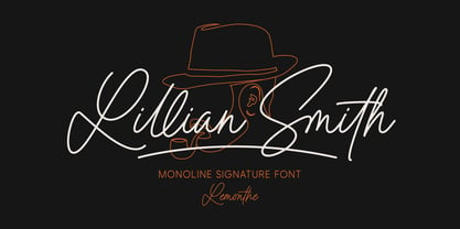
- Morsan by Typebae,
$15.00
- Great Lakes Shadow NF by Nick's Fonts,
$10.00 - Office Staff JNL by Jeff Levine,
$29.00
- Vanities by Solotype,
$19.95 - Meow ROB by TypeSETit,
$20.00
- Phoenix Pro by Red Rooster Collection,
$60.00
- Spiral by ARTypes,
$35.00
- Quadrille 2 by Solotype,
$19.95 - Melistany by Typebae,
$15.00
- Sejen by Differentialtype,
$10.00
- Crude Stencil JNL by Jeff Levine,
$29.00
- Bataler by Eldertype Studio,
$13.00
- Alaska by Solotype,
$19.95 - Movie Production JNL by Jeff Levine,
$29.00
- Concord by Soneri Type,
$39.00
- Mariné Rounded by TipoType,
$19.90
- Tusch Touch 3 is a distinctive display font created by Måns Grebäck, a renowned typeface designer known for his craftsmanship in calligraphy and script fonts. This font stands out for its unique blen...
- Signatria, a captivating and versatile font crafted by Blankids Studio, stands out as a quintessential example of artistry meeting functionality in the realm of typography. Embellished with a delicat...
- The font named "Kids" by Corel Corporation encapsulates the whimsy and creativity of childhood with its playful and cheerful design. Crafted to embody the essence of youthful handwriting, this font f...
- "**Walshes**" is a distinctive font crafted by the renowned font designer Ray Larabie, known for his prolific and diverse typeface creations. Walshes stands out in the typographic crowd for its uniqu...
- Commando 2011 - 100% free

- Doublethink by Barnbrook Fonts,
$30.00


