7,893 search results
(0.022 seconds)
- Schoolblock by Wiescher Design,
$39.50 Schoolblock is the typeface German schoolchildren learn to imitate when they are taught the printed letters. I just had to do this one for use in a German schoolbook. Your education-designer, Gert Wiescher
 - Ruly by Enrich Design,
$24.95 Ruly is my newest font creation. My roommate in college always had the coolest writing. I thought that it deserved to be a font. The font is a great choice for newsletters, cards, etc.
 - Guilloche B by Wiescher Design,
$24.00 »Guilloche B« is a set of graphics that join with each other to form very sophisticated, op-art-like borders. Try them on lots of different assignments, they form very surprising bands or patterns.
 - Crayon En Folie by Hanoded,
$15.00 Crayon En Folie ('Pencil Madness' in French) is a straightforward pencil font, created with an extra thick black pencil. Use it for books, posters and packaging. Comes with a coloring box full of diacritics.
 - Butter Luchy by FHFont,
$17.00 Butter Luchy is Handwritten script font with handlettering Brush Style, so much opentype feature include of the font. Suitable for design, element design, wedding, event, t-shirt, logo, badges, sticker, and awesome work, etc...
 - Fairbank by Monotype,
$29.99Monotype Bembo is generally regarded as one of the most handsome revivals of Aldus Manutius' 15th century roman type, but the original had no italic counterpart. The story is told that Stanley Morison commissioned Alfred Fairbank, a renowned calligrapher, to create the first italic for Bembo, which was released as metal fonts in 1929. Alfred Fairbank, however, claimed that he drew the design as an independent project and then sold his drawings to Monotype. According to him, the statement has been made that I was asked to design an italic for the Bembo roman. This is not so. Had the request been made, the italic type produced would have been different." Whichever version you believe, it was obvious that Fairbank's design - while undeniably beautiful - was not harmonious with Bembo roman. A second, more conventional italic was eventually drawn and added to the Bembo family. Fairbank's first design, which was based on the work of sixteenth-century writing master Ludovico degli Arrighi, managed to have a modest life of its own as a standalone font of metal type. It never made the leap into phototype fonts, however, and the face could have been lost, were it not for Robin Nicholas, Monotype Imaging's Head of Typography in the United Kingdom, and Carl Crossgrove, a senior designer for Monotype Imaging in the US. Nicholas and Crossgrove used the original drawings for Fairbank as the starting point for a new digital design, but this was only the beginning. They improved spacing, added subtle kerning and optimized the design for digital imaging. In addition, Nicholas created an alternative set of lowercase letters, fancy and swash capitals and enough alternate characters to personalize virtually any design project. By the time his work was complete, Nicholas and Crossgrove had created a small type family that included Fairbank, a revived version of the earlier metal font, and Fairbank Chancery, a more calligraphic rendition of the design. An additional suite of ornate caps, elegant ligatures, and beginning and ending letters accompanies both fonts, as does a full complement of lowercase swash characters. Now, instead of a failed Bembo italic, Fairbank emerges in its true glory: a sumptuous, elegant design that will lend a note of grace to holiday greetings, invitations, and any application where its Italianate beauty is called for." - Kyboshed - 100% free

- Kate Greenaway's Alphabet by Wiescher Design,
$49.50 Some time ago I bought my smallest book ever: Kate Greenaway’s Alphabet* 57 x 72 mm. I thought it was the sweetest little book I had ever seen. Not knowing about the fame of the designer Kate Greenaway (1846-1901), I put it in some dark drawer and looked at it from time to time. Kate’s books were all outstanding successes in English publishing history; she was an icon of the Victorian era. Some of those books are still being reprinted today. This little gem I had accidentally acquired has become very rare and I have not found any reprints yet. So I thought maybe I could adapt her drawings for use on today’s computers. I ventured to redraw her delicate illustrations, blowing them up 300 percent, being forced to simplify them without losing her touch. It took quite some time! While redrawing them, I discovered that she most certainly drew them in at least three different sessions as well. Then I scanned my drawings and put them in a font. To make the font more usable, I added the ten numerals in Kate’s style; the original does not have those. I hope she would have liked my adaptations. Yours in a very preserving mood, Gert Wiescher. * Kate Greenaway’s Alphabet, edited by George Rutledge & Sons, London and New York, ca. 1885.
 - ALS SyysScript by Art. Lebedev Studio,
$63.00 Handwriting of a strong Carelian personality revived: It’s autumn time once again, harvesting season, mushroom & berry time – the favourite season of my Karelian aunt Katri. A postcard she sent me more than twenty years ago had inspired me to SyysScript, “Script of Autumn” in Finnish. Katri had a very kind but also energetic personality, and I always thought her handwriting was a mirror of it. By making SyysScript I felt I could revive some of her unforgettable character. My Finnish autumn font has by now become a favourite for many and is branding fine food in both the Eastern and the Western hemisphere – even far beyond the arctic circle. “SyysScript“ is actually a growing family. For enhanced functionality in small sizes I added “SyysScript Eco” a year ago, a style with shortened extensions and simplified letterforms especially suited for packaging. And this autumn, a special one for Finland which is celebrating its 99th birthday, SyysScript grew again: Two long awaited newcomers, “SyysScript FeltTip” and “SyysScript FeltTip Eco” joined the family. They are bolder and softer than the previous styles but keep their positive, lighthearted feel. Use them to make a powerful individual mark on any background. – They are equally well suited for paper, packaging, a screen or even a concrete wall! Language support: Western and Central European, Extended Cyrillic.
 - Excelsius by Comicraft,
$19.00 Once upon a midnight dreary, this Comicraftsman pondered, weak and weary, For a name synonymous with Mighty and Marvelous comics lore. Solid, Outline, Inline was the nameless font I'd crafted, I nodded, nearly napping o'er the work I'd grafted When suddenly came a tapping, As of someone gently rapping, rapping at my cubicle door. "'Tis some visitor," I muttered, "tapping at my cubicle door-- Calling out "EXCELSIOR!" Then an Amazing Vision beguiled my sad fancy into smilin', By the Spectacular decorum of the countenance it wore, "Though thy crest be shorn and shaven," he said, "thou art sure no craven, And thy font should not remain nameless here forevermore!" Eagerly I wished the morrow; vainly I had sought to borrow From comic books surcease of sorrow, letters that called out "EXCELSIOR!" Then, upon the velvet sinking, I betook myself to linking Fancy unto fancy, thinking of the nominative neuter singular thing Like Some Silvered Surfer wandering from the Nightly shore-- The Vision shrieked, upstarting--"Tell me what thy lordly name is thus!" Quoth the Craftsman: "EXCELSIUS!"
 - Leprechaun Vomit by Bellafonts,
$39.00 Leprechaun Vomit is just a pretty way of saying Lucky Charms, which I had to use something else besides the name of a cereal anyway. Leprechaun Vomit is a ding bat of luck including images of rainbows, horseshoes, clovers, diamonds, moons, the number 7, japanese "lucky" calligraphy, The Maneki Neko (the Beckoning Cat which is a lucky symbol), and some shooting stars (make a wish). You can use these images to create Irish themed designs like St. Patrick's Day art, or you can use them for lucky purposes. Bellafonts' user license allows for commercial use, so you can make products for re-sale, including services offering graphic design. You can choose from a variety of clovers for your own version of a "Kiss me I'm Irish" T-shirt, and you can add some shooting stars and rainbows to make any design for any occasion extra special. If you are a graphic designer with any clients like a ranch, horseback riding schools, and so forth, you may like these lucky horseshoes for your library.
 - Palmilla 2.0 by RodrigoTypo,
$25.00 Palmilla 2.0 is a continuation of palmilla which added more glyphs such as Alphabets, Cyrillic was added like Greek, in addition to Alternatives such as Ligatures, more Ligatures were also added in Latin to play more with the title, in total there are six special weights for informal and creative titles.
 - Kremlin Starets - Unknown license

- Kremlin Comrade - Unknown license

- Kremlin Imperial - Unknown license

- KREMLIN ADVISOR - Unknown license

- Kremlin Kommisar - Unknown license

- Electrack - Unknown license

- ElectricLiquorGoggles - Unknown license

- Kaleidoscope by Mysterylab,
$18.00 Kaleidoscope is a groovy retro font with roots in the Art Nouveau movement and the psychedelic sixties. Works great for trippy band or festival posters, logos, invitations, and anything that needs a flowing funky vibe.
 - Sea of Japan JNL by Jeff Levine,
$29.00 A 1922 piece of sheet music entitled “Japanese Sailor” had its title hand lettered in a Far Eastern motif. This design is now available as Sea of Japan JNL, in both regular and oblique versions.
 - Amassian by Akifatype,
$12.00 Amassian is a modern smooth brush and natural handwritten font, organic, dynamic and energetic sytle.Can used for various purposes. such as the title, signature, logo, correspondence, wedding invitations, letterhead, signage, labels, newsletters, posters, badges, etc.
 - Rolling Story by Bejeletter,
$12.00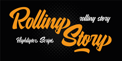 Rolling Story is a highligter script, connecting script that can appear both retro and contemporary. Suitable for design, element design, fashion blogs, vintage, wedding, event, t-shirt, logo, badges, sticker, and awesome work, and more.
 - Milk Child by HafisHidayat,
$20.00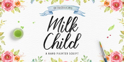 Milk Child is an organic, energetic, dynamic and modern handwriting script that can be used for various purposes, such as with titles, correspondence, wedding invitations, letterheads, signage, labels, signature newsletters, logos, posters, badges, and more.
 - Abagail Jackson by Ingrimayne Type,
$6.00 Abagail Jackson is a wild-looking face that was one of my early designs. I had no particular use in mind when I designed it and I no longer remember what inspired this whimsical font.
 - Merriment JNL by Jeff Levine,
$29.00 Within the pages of the 10th edition of the Speedball Lettering Book (1927) is an alphabet called “Vanitie”. This had been redrawn digitally as Merriment JNL, and is available in both regular and oblique versions.
 - Retroking by Putracetol,
$25.00 Retroking is a retro style font and comes with regular and rough versions. Retroking is perfect for vintage and retro design, badges, logos, t-shirt, posters, branding, packaging, signage, book covers and so much more!
 - Silent Comedy JNL by Jeff Levine,
$29.00 A poster for the 1917 Charlie Chaplin comedy “Easy Street” had Chaplin’s name hand lettered in thick, round cornered block characters. This inspired Silent Comedy JNL, which is available in both regular and oblique versions.
 - Granding Script by Romie Creative,
$13.00 Granding Script is a very easy to read Script typeface, a beautiful, classy and elegant typeface. Can be used for various purposes such as logos, wedding invitations, t-shirts, letterhead, signage, news, posters, badges etc.
 - Mercadillo by Monotype,
$16.99 Mercadillo is a casual script typeface based on the hand painted signs you can see in markets, shops and bars. Comes in 4 different weights (Black, Bold, Regular and Light) and it has OpenType features.
 - ITC Photoplay by ITC,
$29.99ITC Photoplay is another gem from Nick Curtis. Unearthed from the 1927 edition of Samuel Welo's Studio Handbook for Artists and Advertisers, the design's original suggested use was for title and caption cards for silent movies. A monoweight design that bridges the gap between turn-of-the-century decorative type and Art Deco, ITC Photoplay is both casual and stylish. And, yes, the cap S" is supposed to look that that. To expand this already handy typeface's versatility, a Black weight has been added to the original design. Curtis has also created an array of alternate characters, a couple of conjunctions, and a handful of "bishop's fingers" to help make your point. ITC Photoplay is eminently suitable for all those occasions when you need to say, "Unhand that fair damsel, you dastardly cad!", and really mean it." - Largo EF by Elsner+Flake,
$35.00The typefaces Largo Mager (Light) and Largo Halbfett (Medium) were cast for the first time in 1937 by Ludwig & Mayer based on the designs by Hans Wagner. One weight Largo Licht (Outline) was added in 1956. All fonts were only configured with capitals. The digital version of Largo has pointed serifs and not the slightly rounded ones seen in the hot metal versions which gives the typeface a more elegant note. Largo is often used for fine printing jobs as business cards or formal invitations, or in the fashion and cosmetics fields. Hans Wagner was born in Munich in 1894 and died in 1977 in Altenburg where he had worked as a painter, graphic designer and book designer. In addition to the Largo typeface, he developed, among others, the Altenburger Gotisch (1928), the Welt-Antiqua (1931-1934) and the Wolfram (1930). - Ongunkan Wakanda Runic by Runic World Tamgacı,
$50.00 Wakandan is an alphabet designed by Hannah Beachler, and used in the 2018 film Black Panther. It is based on Nsibidi symbols. In the film it is used to transliterate English text in the credits and other on-screen text. Another script used in the film was developed by Oluwaseun Osewa and inspired by Nsibidi, a system of symbols used in southeastern Nigeria between about 400 and 1400 AD. In addition, the symbols of several different ancient languages were also used for the alphabet. Like Old North Arabia, Old Tifinagh. I did not draw for this font, except for a few letters. I transferred the sound values from the ancient writing languages fonts that I had made before to the Wakanda font, so I did not take much time, I finished it in 4-5 hours.
 - Gumbo by Hanoded,
$17.00Lately I have been experimenting with different foods. At home, we eat a lot of Asian food, but I thought it would be nice to broaden my culinary horizon a bit. So far I have (successfully) added Georgian beef and walnut soup, Tacos (after a suggestion by my friend Stuart), Surinam Roti and various vegetarian dishes to our menu. When I created this font, I had to think of Gumbo - a dish I have never made. Gumbo is a handmade display font that comes in a rotund regular and an obese bold (with Italics). Use it for your book covers, product packaging and sticky notes. Gumbo comes with cute ‘end of word’ ligatures - just type the glyph + space and presto: you have a little swash. As for the dish Gumbo, well, I will make that this weekend! - Tee Franklin by Suomi,
$19.00 The British Vogue commissioned this typeface for their magazine re-design in 2001. After studying the originals of Morris Fuller Benton and the existing versions, this font was designed with all new thin weights. Just when the family was finished, Vogue informed that they had decided to use American Typewriter instead. Bastards. But here is a true classic typeface with a facelift. The pun intended. Tee Franklin has seven weights with obliques, the Heavy being just slightly heavier than the existing versions from Adobe and ITC, and moving down to totally new Ultra Light, using Luc(as) de Groot's formula to keep the weights optically correct. The glyphs are the same as the Morris Fuller Benton's original from 1902, except for the upper case Q, which was re-designed with a loop in the counter for added differentiation.
 - Huerto by Stiggy & Sands,
$24.00 A Geometric Angular Sans & Italic with Pizazz The Huerto Family began as a digitization of a film typeface from LetterGraphics known simply as "Horino Bold". The original specimen included standard Capitals and Lowercase, Numerals and limited punctuation. We've fleshed out the original style and added a true italic with swash alternates to the family. Where the original had a feeling of rugged permanence to it, the italic with swashes adds a fleeting dynamic appeal. Opentype features include: - Full set of Inferiors and Superiors for limitless fractions. - A small collection of Standard Ligatures. - A small set of Stylistic Alternates - Swash Capitals for the Italic style only. Approx. 423 Character Glyph Set: Each style of Huerto comes with a glyphset that includes standard & punctuation, international language support, and additional features. Huerto Italic has a 565 character glyphset due to additional swash and alternates.
 - 825 Karolus by GLC,
$38.00 In the beginning of the 800s, during the reign of Carolus Magnus (or “Karolus”, as he signed himself), a great reformation of the written characters was conducted under the authority of Alcuin, Paul Diacre and Theodulfe. The new style, named “Caroline” script, was completely set up between 820 to 830. It was a regular script, with few ligatures, very legible, but only with lowercase. The capitals remained the old Romans ones. We have created the font to serve contemporary users, making a difference between U and V, and also between I and J, which had no relevance for ancient Latin scribes. We also added Thorn, Oslash, Lslash, W, and and the usual accented characters that did not exist at the time. Titlings (initial letters, without accents), historical and contextual alternates completes the set (in two separate files for MacOS9).
 - Neonstar by Mokatype Studio,
$24.00 Introducing the Neon Sci-fi Futuristic Font called Neonstat a unique font with a futuristic style that can make your futuristic logotype more interesting. Inspired by real-world neon light signs, this font is perfect for adding your own glowing light effects or can be used to actually design real-world neon signs. Neonstar font is suitable for your design and allows you to create beautiful designs, headlines, posters, logos, badges, and much more. It is also best used for posts, logos, posters, labels, and more. Works on PC & Mac, simple installations, accessible in Adobe Illustrator, Adobe Photoshop, Adobe InDesign, and even works on Microsoft Word. PUA Encoded Characters - Fully accessible without additional design software. Fonts include multilingual support Image used: All photographs/pictures/vectors used in the preview are not included, they are intended for illustration only. Thank You
 - SAV PT by Puckertype,
$29.00SAV Display PT is directly inspired from hand-painted commercial signage found around Savannah, Georgia. There is a strong tradition of hand-painted signs adorning small car wash stations, to beauty salons, to mechanics and restaurants. Currently a collection of about four to five painters account for the majority of the signs. This font was derived from 10 uppercase letters that seemed to represent the aesthetic thread found throughout the signs. There are no lowercase letters found in these signs, so the lowercase of the font had to be designed from scratch. I felt this added versatility to the font and its possibilities for usage. This font is strictly a display font. However, because of the apparent roots (intended or unintended) of the lettering to transitional/modern modulated fonts, it does read surprising well at smaller sizes. - Sunwind by Wiescher Design,
$39.50 Sunwind is not really made to write long copy. It is a font for shopsigns and short sentences that need that hot, sunny and windy touch. And that is how I got around to designing it: I saw some letters on a shopsign in Cannes when driving into town. I shouted at my son Julius: "Quick take a picture of that sign, the blue one." That's what he did, only he used the macro setting, so I had a very small sign but lots of nice background. Anyway I got the basic idea! Then I made a lot of sketches and this is what came out. I added a smallcaps set and I also made some initials as a rough version, so they look like written with a brush on heavygrain paper. Swinging that brush is yours truly Gert Wiescher


