10,000 search results
(0.031 seconds)
- Brayles by Blankids,
$20.00 Introducing a new layered bold script called Brayles. It is inspired by hand-lettering, bold script logotype and kids fonts. Brayles comes with OpenType features such stylistic alternates, contextual alternates, swash, ligatures good for logotype, poster, badge, book cover, t-shirt design, packaging and any more.
 - Paviljoen by Hanoded,
$15.00 Paviljoen (meaning Pavilion or Gazebo in Dutch) is an Art Deco typeface which was modeled on cast-iron lettering on some monumental buildings in Amsterdam. I only had a few glyphs to work with, so I designed the remaining ones myself. Paviljoen comes with extensive language support.
 - Orlande by Blankids,
$18.00 Introducing a new script font called Orlande. Orlande was created with a brush pen. It comes with opentype features and multilingual support. Orlande is good for logotype, poster, badge, book cover, t-shirt design, packaging and any more. FEATURES : - Uppercase - Lowercase - Number - Punctuation - Multilingual - PUA Encode - Opentype
 - Jakobenz by Grezline Studio,
$8.00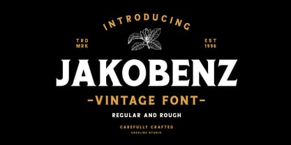 Jakobenz is a vintage serif font crafted very carefully, available in two styles : Clean and Rough version. Jakobenz is perfect use for a logo for branding, typography design, badge design, product packaging, invitation, quotes, t-shirt design, label poster, special events and anything that need vintage taste.
 - Reds Aglonema by Zeenesia Studio,
$13.00 Introducing Reds Aglonema. new font for all of your fun projects! perfect for large design project like Tshirt, mugs, Advertising, bags, quotes, food , poster, fashion, custom sticker, magazine, and many others. It completed with numbers and punctuation. Multilingual support, alternate, ligatures and came with PUA encoded.
 - Letter Gothic by Monotype,
$29.99Letter Gothic font was designed by Roger Roberson for IBM sometime between 1956 and 1962. Inspired by Optima, the typeface originally had flared stems. A monospaced sans serif font designed for use on an IBM Selectric typewriter, Letter Gothic font is a good choice for tabular material. - Hebrew Latino by Wiescher Design,
$39.50 Hebrew Latino was started out of frustration. I could not find a font that looked like Hebrew - actually I found one, but it had only capitals. So I decided to make my own. Strangely enough it looks a little bit Jugendstylish! Here it is. Shalom! Gert Wiescher
 - Callephane by Viswell,
$9.00 Callephane is our newest font. Its retro style is inspired by a unique design in the 60s. This fonts is perfect for any project, posters, clothing, labels, logos, badges, and many more, that would benefit from a retro look. Callephane has 3 styles: Light, Regular and Rough.
 - Qoxiem by Almarkha Type,
$29.00 Introducing our latest Modern Slab called Qoxiem can make your logotype become more interesting. inspired by the decorative arts and architecture movement Qoxiem fonts is perfect for your project and allows you to create designs, headlines, posters, logos, badges, t-shirts and many more that are beautiful.
 - Condensed Chamfer JNL by Jeff Levine,
$29.00 Sheet music published in the 1860s for "The Soldier’s Chorus" [from the Gounod opera "Faust"] had the title and the arranger’s name hand lettered in a bold, condensed chamfer font. This was the basis for Condensed Chamfer JNL, which is available in both regular and oblique versions.
 - Assay by Solotype,
$19.95This is our name for Antique Tuscan, of which there were many variations. This font came from a large lot purchased around 1970 from an east coast newspaper shop. Subsequently, we acquired several more versions of the face, but this one had lowercase so we used it. - Wenzel by FaceType,
$15.00 This work is the result of an assignment to digitize and complete a typeface that was used for the intertitles of Kleider machen Leute from 1921. We only had a basic alphabet with some glyphs missing. Sure, Wenzel is not a beaut, but ... what the heck!
 - Show Card Brush JNL by Jeff Levine,
$29.00 A movie poster for the 1952 Dean Martin & Jerry Lewis comedy “Sailor Beware” had the text rendered in a casual style of brush lettering similar to that found on store show cards. This inspired Show Card Brush JNL, which is available in both regular and oblique versions.
 - Chalk Hand Lettering by Fontscafe,
$39.00 If you are into the vintage feel, you will love this one. This is as vintage as it probably gets. There are probably only a handful of places in the world where schools still use blackboards and chalk – they’ve given way to their white board and marker counterparts for decades now. White boards are definitely more practical and less messy when compared to chalk, but then if you are creatively inclined you will agree that a little bit of mess is worth it if you are going to get the effects that you desired! Well, we can give you the effects minus the mess with our chalk hand lettering fonts! As the name suggests, this font gives you that distinctly unique chalk on slate feel, and if you are wondering what’s distinct about it; writing on slate or blackboard was a slow process which required deliberated and concentrated efforts resulting in a handwriting which was usually quite different to a person’s handwriting on paper. Typography of chalk on slate was an everyday event in the classrooms of yesterday, and today we hardly ever get to see one of these if it all. Writing on a black board with chalk was quite an interesting achievement in its own right, if you ended up with anything legible and if your writing remained focused and ‘in-line’! But of course like everything else, his took time to master and when you did get it right, chalk hand lettering was quite an enjoyable experience! For semi-permanent designs, say for example an eventful day at school; students of the day would create beautiful typography on the boards, and add a solidarity to it sometimes by shading one side of the lettering – usual y the right side towards which the lettering leaned. This is the effect our chalk hands lettering shaded variation gives you. You could get this font individually, but we strongly advise you check out the “chalk hand lettering pack” font. It includes the simple “chalk hand lettering” (minus the shading effect) and also a “chalk hand elements” bag of tricks. The elements is a collection of graphic art which resemble shapes and designs that used to be added to chalk art, to beautify the typography. If you enjoyed seeing the effects of our Chalk Hands font, and the shaded variant – you are simply going to go gaga over Chalk Hand Elements! The chalk hand font of course enables you to make typographic art similar to the effect of chalks on slates and black boards. This was quite the art form in the days gone by! The shaded variation added a bit of solidarity and the technique was commonly used to make semi-permanent designs say for example a welcome note when somebody important was to visit. Classic chalk hand designs, especially the semi permanent ones often had little pieces of art to help beautify the creation as a whole. It could simply be symmetrical graphics appearing before and after the title and headings, maybe just an interesting shape to fill in an empty area on the board, and such…our Chalk Hand Elements offers you a ton of such graphics. The two chalk hand variations and the elements are all included in the Chalk Hand Family, and this is strongly recommended if you want to make designs that are truly reminiscent of the days of chalk on slate.
 - Pobla by Tipo Pèpel,
$22.00 Optimum readability in small bodies with scarce interlining, under poor printing conditions such as in newspapers, where velocity and bad quality’s irregular surface papers, truly distort strokes was the challenge taken. Pobla was designed with this in mind, hence Patau present a hybrid between the conventional strokes of a serif’s classical roman type and markedly “fractured” forms inside, providing a unique personality to this typographic family, where calligraphic’s humanistic axis is visibly broken with the straight axis of the fabricated letters. Subtle details in the serifs, give it a modern look to a classic skeleton. Very pronounced ink traps get the shapes rounded in the printed product to artificially increase the average medium-eye and promote reading in the small sizes it was designed for. An absolutely handwriting look for the italics, where the rupture of the stroke marks a white’s subtle change to only whisper in the printing surface a slight difference, but without fuss and so not to break the rhythm of reading. And as we are used to, a complete set of OpenType features, where you will find small caps, fractions, ligatures, old numerals and tabular, discretionary ligatures and support for 220 languages; and all available in twelve weights to meet the needs of any newspaper printing.
 - Natural Rough by Letterhend,
$13.00 Introducing Natural Rough, the perfect font for adding a touch of organic charm to your designs. This Handwritten font boasts a beautifully natural texture, adding a unique and rustic feel to your typography. This font perfectly made to be applied especially in logo, and the other various formal forms such as invitations, labels, logos, magazines, books, greeting / wedding cards, packaging, fashion, make up, stationery, novels, labels or any type of advertising purpose. Features : Uppercase & lowercase Numbers and punctuation Alternates & Ligatures Multilingual PUA encoded We highly recommend using a program that supports OpenType features and Glyphs panels like many of Adobe apps and Corel Draw, so you can see and access all Glyph variations.
 - Macho by Dada Studio,
$29.00 Macho has a complex nature. He’s a true “gentle giant”. He kicks asses as a splendid fighter, but also, being a gentle lover, leaves girls breathless. You can count on him in any situation and it’s always good to have him by your side. The brave Macho supports all Latin languages, as well as Cyrillic. His família consists of nine weights plus matching italics. It is stuffed up with various OpenType features such as small capitals, fractions, local forms, ordinals, alternates, ligatures and a full set of superscript and subscript glyphs. A good buddy of Clavo, Servus and Sharik.
 - Amfibia by ROHH,
$40.00 Amfibia™ is a soft, flat-sided geometric grotesk family with a lot of character, equipped with tons of ligatures and swashes. Its main function is display use of all kinds, however it is prepared to serve as paragraph text typeface thanks to its 5 widths, giving total amount of 100 fonts. It is crafted for a broad variety design situations - from posters, magazine editorial use, logo design & branding, to web design, user interfaces and mobile applications. Main features: - 5 widths (Narrow, Condensed, Normal, Expanded, Wide), each consisting 20 fonts - 10 weights for each width (from Hairline to Black) - handdrawn, carefully crafted obliques - over 900 glyphs, full of swashes, initial forms, terminals and ligatures - pronounced ink traps and large x-height improving legibility in small sizes as well as adding strong personality to display sizes - flat-sided letter shapes adding vertical rhythm and elegance to narrow widths - extended latin language support - OpenType features (swashes, initials, terminals, standard and discretionary ligatures, stylistic sets, contextual alternates, case sensitive forms, lining, oldstyle and tabular figures, slashed zero, fractions, superscript and subscript, ordinals, currencies and symbols)
 - Thumbnail Text SG by Spiece Graphics,
$39.00 With its slightly rough edges, Thumbnail Text works well where lettering is required. Letterforms wiggle a bit here and there but are generally quite uniform. Characters are a bit imprecise - but not showy or bouncy. They appear more adult-looking than childish and are very legible. Put Thumbnail Text to work as drafting notation or on blueprint projects that need to be easily read. It¹s also useful when concept or sketch stage lettering needs to look serious but not highly stylized. You might experiment with it inside cartoon thought balloons or in callouts. This design is based on an old showcard style from the 1940s. It's been dusted off and reissued for modern use. A lowercase has been added for greater functionality. Thumbnail Text Regular is now available in the OpenType Std format. Some additional characters have been added to this OpenType version as stylistic alternates. This advanced feature works in current versions of Adobe Creative Suite InDesign, Creative Suite Illustrator, and Quark XPress. Check for OpenType advanced feature support in other applications as it gradually becomes available with upgrades.
 - Obvia Wide by Typefolio,
$29.00 'Obvia' appeared as a result of direct observation on typefaces classified as geometric and the plan to explore for the first time width axes Condensed, Narrow (soon), Normal and new Wide and Expanded. The idea behind 'Obvia's design was to create a distancing from geometrically pure shapes, in this case, square shapes. Then some details were added, such as subtle inktraps, concave endings of the stems and carefully drawn alternate characters, giving a 'geohumanist' tone to the font. This first family of 'Obvia' has 9 weights ranging from Thin to Black, delivering a strong typographic identity, from the paper to the pixel.
 - Obvia Expanded by Typefolio,
$29.00 'Obvia' appeared as a result of direct observation on typefaces classified as geometric and the plan to explore for the first time width axes Condensed, Narrow (soon), Normal and new Wide and Expanded. The idea behind 'Obvia's design was to create a distancing from geometrically pure shapes, in this case, square shapes. Then some details were added, such as subtle inktraps, concave endings of the stems and carefully drawn alternate characters, giving a 'geohumanist' tone to the font. This first family of 'Obvia' has 9 weights ranging from Thin to Black, delivering a strong typographic identity, from the paper to the pixel.
 - Tabarnak by Canada Type,
$24.95 Tabarnak started out as an assessment and correction of an old concept by George Wilkens. The original idea was for a bold upright alphabet reminiscent of Oz Cooper’s work, but ornamented with some shocard/signage traits. That idea was radically redrawn and reinvented to become a simple 21st century font made to turn heads and induce a friendly rush. Tabarnouche is Tabarnak’s “jittery” incarnation. Just as great for packaging as they are for ads, posters, book and magazine covers, both Tabarnak and Tabarnouche come with about 600 characters, including tons of alternates, and support for the majority of Latin-based languages.
 - My Script by Wiescher Design,
$39.50 MyScript is exactly that: my script; only this one is for everybody’s use! Originally I designed it as a Christmas present for my friends and clients; they liked it. So I thought other people might like it as well. I cleaned it up just enough so that it did not lose its character. And, of course, I made all glyphs so that it is really useful as an everyday, unpretentious script. And I added a small cap version and a swashes version to give you even more reason to use it. It turned out a really readable script. Your scribe, Gert Wiescher
 - Obvia Condensed by Typefolio,
$29.00 'Obvia' appeared as a result of direct observation on typefaces classified as geometric and the plan to explore for the first time width axes Expanded, Wide, Normal, Narrow and Condensed The idea behind 'Obvia's design was to create a distancing from geometrically pure shapes, in this case, square shapes. Then some details were added, such as subtle inktraps, concave endings of the stems and carefully drawn alternate characters, giving a 'geohumanist' tone to the font. This first family of 'Obvia' has 9 weights ranging from Thin to Black, delivering a strong typographic identity, from the paper to the pixel.
 - Obvia Narrow by Typefolio,
$29.00 'Obvia' appeared as a result of direct observation on typefaces classified as geometric and the plan to explore for the first time width axes Condensed, Narrow, Normal, Wide and Expanded. The idea behind 'Obvia's design was to create a distancing from geometrically pure shapes, in this case, square shapes. Then some details were added, such as subtle inktraps, concave endings of the stems and carefully drawn alternate characters, giving a 'geohumanist' tone to the font. This first family of 'Obvia' has 9 weights ranging from Thin to Black, delivering a strong typographic identity, from the paper to the pixel.
 - Letterpress by FaceType,
$18.00 Meet the Letterpress! Jakob Erbar’s Phosphor was released by the Ludwig & Mayer Foundry before 1923. The origins of Aurora date back to 1912 (Johannes Wagner Foundry). Permanent Headline was designed by Karlgeorg Hoefer, also known simply as Headline. It was fun making a mix out of the three classics – with Letterpress Bastard you will quickly get astounding results. To complete the family we added a font containing random symbols we also found in the metal type boxes. Please note that we provided loads of ligatures for double-letters to make your design look as authentic as possible.
 - Bonsai by Three Islands Press,
$29.00 Years ago, I developed an interest in the Japanese art of dwarfed potted trees, bonsai. I bought some books on the subject from Brooklyn Botanic Garden. In one -- Handbook on Bonsai: Special Techniques (seventh printing, February 1976) -- the type was bad. Old worn lead type, I suspect, spread wide in the tops of characters and disappearing on the bottoms. Two decades later, I came across my Brooklyn Botanic Garden collection and was struck again by this interesting type. Inspired, I made a typeface. Didn't take me long to decide on a name for it, either: a name with a double-meaning, based both on its look and its inspiration. Bonsai, the typeface, has two styles, a roman and a true italic.
 - Vaccine Sans by ParaType,
$30.00 Vaccine Sans is a humanist sans-serif font family with soft terminals, but stem junctions on the contrary use hard constructions. Such combination of basic design features makes the font distinct and strong in setting and delicate and soft in appearance. This design peculiarity, together with very low contrast, produces a range of qualities needed for small sizes, low quality print and bad reading conditions. Vaccine Sans has a modern stylish design and takes its rightful place among popular faces. The family consists of 10 members — five weights with the corresponding italics. It can be used in a wide range of applications — magazines, advertising, corporate identity, urban navigation, packaging, children books, etc. Designed by Manvel Shmavonyan with the participation of Alexandra Korolkova and Gayaneh Bagdasaryan.
 - Wisdom Teeth by DM Founts,
$20.00 Wisdom Teeth is the fifth typeface released by DM Founts. It's a modern and personal take on the original Baby Teeth font by Milton Glaser, and inspired by the lettering used for the Pac-Man series of games (and its clones). This typeface was around 25 years in the making, and was made in response to the large number of hideously bad clones of Baby Teeth circulating around the Internet. Version 1.0 Included in Version 1.0 are a number of accent characters, and alternate characters for A and Y, along with the usual ASCII characters. For the time being this is an all caps typeface. Please let me know your thoughts and suggestions, and I may add some more characters in the near future.
 - Conium by MKGD,
$13.00 I designed Conium to be a sister font to Nightshade. It was meant to have the appearance of the hemlock plant without being too derivative; it’s thin drooping stems conjure images of Hamlet’s mad Ophilia clutching sickly weeds while thinking them to be flowers. It also projects the appearance of an ice cold, wrought iron, cemetery gate. The sort that one might pass on a damp overcast day. A fitting compliment to an Edward Gorey illustration from top, right down to the frigid ground from which it sprang. Conium has a glyph count of 388 and supports the following languages Afrikaans, Albanian, Asu, Basque, Bemba, Bena, Bosnian, Catalan, Chiga, Colognian, Cornish, Croatian, Czech, Danish, Embu, English, Esperanto, Estonian, Faroese, Filipino, Finnish, French, Friulian, Galician, German, Gusii, Hungarian, Icelandic, Indonesian, Irish, Italian, Kabuverdianu, Kalaallisut, Kalenjin, Kamba, Kikuyu, Kinyarwanda, Latvian, Lithuanian, Low German, Lower Sorbian, Luo, Luxembourgish, Luyia, Machame, Makhuwa-Meetto, Makonde, Malagasy, Malay, Maltese, Manx, Meru, Morisyen, North Ndebele, Norwegian Bokmål, Norwegian Nynorsk, Nyankole, Oromo, Polish, Portuguese, Romanian, Romansh, Rombo, Rundi, Rwa, Samburu, Sango, Sangu, Scottish Gaelic, Sena, Shambala, Shona, Slovak, Slovenian, Soga, Somali, Spanish, Swahili, Swedish, Swiss German, Taita, Teso, Turkmen, Upper Sorbian, Vunjo, Walser, Zulu
 - Galix Mono by Eclectotype,
$25.00 This monospaced version of Galix was commissioned in 2037 by the space exploration company Earth2, as part of a major overhaul of their branding, which had used, since 2021, a generic sans serif (much like every other company). Many specialists in both design and space exploration suggested that this very rebrand started a chain of events that concluded with the invention of time travel in 2041. Contrary to the perceived notion put forward in popular Science Fiction, time travel is only (as of now) possible in the digital realm. It was considered fitting that included among the first files sent back in time should be the Galix Mono typeface, which was remade in OTF format to ensure that it would work with the technology available in 2019. Earth2, for all their insight, did not foresee that the release of the typeface in September of 2019, would lessen the impact of their rebrand. What kind idiots would rebrand a forward looking company with a font that was, by then, almost 18 years old? The subsequent lacklustre response to the redesign didn’t inspire the tidal wave of R&D funding Earth2 had anticipated, and the company went into administration in the summer of 2039, having never invented the time travel which made the release of Galix Mono in 2019 possible. Experts believe that the files sent back in time, although their very sending made it impossible for them to be sent, remained as “time relics” of the future that might have been.
 - Front Page by Jonahfonts,
$35.00 Usage recommendations: Captions, packaging, cards, posters, ads, book jackets, manuals, menus.
 - Ka Boink by BA Graphics,
$45.00A loose fun design; great for childrens' books and happy ads. - Scentogram by PizzaDude.dk,
$20.00Scentogram is a deco font inspired by some 1950-60 ads. - Calafragalistic by BA Graphics,
$45.00A loose fun design; great for childrens' books and happy ads! - Trigomy by Markus Reiter,
$24.90 Trigomy is a proportional pixel font designed on a 5 pixel grid. It is intended for either very small text or as huge display font for posters and the like. To get a crisp look this font should be used at 10 pt or multiples of 10 pt. (A tip for Adobe Creative Suite applications is to change the standard anti-aliasing method from “sharp” to “crisp” and to align the text to whole pixels. Also avoid centered text.) To get started with type design I thought it was best to start with a pixel font because you don't have to focus much on the design itself, but rather have to focus on how kerning and spacing works and the various features you can implement with OpenType. And of course I wanted to have a pixel font that had all that I was missing from other pixel fonts. We were learning trigonometry at the time I started designing Trigomy, and most of the time I misspoke it “trigometry”. So, when I had to come up with a name for my first font I thought: "Why not go with Trigomy?"
 - Bartosh by jpFonts,
$19.90 Bartosh is the American short form for Bartholomew. Although I chose this font name because of its sound and its short conciseness, I also liked the fact that Bartholomew had been one of the 12 apostles who had worked in India and Iran and the idea that his spirit could be the inspiration for my work.Bartosh was designed for display on the screen: the large x-height and the clear, open shapes facilitate readability. As a result, it develops a strong expression of character and makes it ideal for headings or highlighting individual text passages – it is ideal for captions of any kind. In each of the six weights, it unfolds its own and special charm. The extra-bold version is particularly noteworthy because fonts in this stroke width are rare and it is precisely these extreme bolds that give them a special graphic appeal.For all fonts there are matching italics in a well-developed set of 677 characters. In addition, it is possible to change the digits and currency characters from proportional to tabular or OldStyle via the OpenType feature, and small caps are also available in all fonts.
 - Chopper by Canada Type,
$24.95 In 1972, VGC released two typefaces by designer friends Dick Jensen and Harry Villhardt. Jensen’s was called Serpentine, and Villhardt’s was called Venture. Even though both faces had the same elements and a somewhat similar construct, one of them became very popular and chased the other away from the spotlight. Serpentine went on to become the James Bond font, the Pepsi and every other soda pop font, the everything font, all the way through the glories of digital lala-land where it was hacked, imitated and overused by hundreds of designers. But the only advantage it really had over Venture was being a 4-style family, including the bold italic that made it all the rage, as opposed to Venture’s lone upright style. One must wonder how differently things would have played if a Venture Italic was around back then. Chopper is Canada Type’s revival of Venture, that underdog of 1972. This time around it comes with a roman, an italic, and corresponding biform styles to make it a much more attractive and refreshing alternative to Serpentine. Chopper comes in all popular formats, boasts extended language support, and contains a ton of alternate characters sprinkled throughout the character map.
 - Konga Next by RodrigoTypo,
$25.00 Konga has gone through different changes, the first idea was born in 2014 with the help of Andrey Kudryavtsev, then some time passed and the Rough version was developed, and a long time passed and in 2022 the idea of redesigning was taken with Bruno Jara, in addition to making many styles such as Rough, Inline, Shadow, as well as dingbats which was based on Stefania Ahumada's graphics, which results in a family of 6 styles, with different Alternatives, perfect for informal titles.
 - Beef'd - 100% free

