10,000 search results
(0.054 seconds)
- Stangith by Mokatype Studio,
$19.00Hello Introducing, stangith - Ligatures modern Serif is an elegant, unique font that uses ligatures to smoothly link letters. Perfect for adding a unique twist to word-mark logos, monograms or pull quotes. stangith has 45 ligatures and 10 Alternates as well as numbers and punctuation making it super fantastic.Ligature can be turned off if required standard writing needs. - Deglion by Almarkha Type,
$33.00 Hello Introducing, Deglion - Classy Elegant Display Serif is an unique font that uses ligatures to smoothly link letters. Perfect for adding a unique twist to word-mark logos, monograms or pull quotes. Deglion has 12 ligatures as well as numbers and punctuation making it super fantastic. Ligature can be turned off if required standard writing needs.
 - Pantura by Locomotype,
$15.00 Pantura is a simple yet playful handmade font. Based on casual handwriting, it makes your typographic design very personal. Several ligatures are added to make your design unique and attractive. Pantura font is suitable for poster, invitation, label, logotype, packaging and more. Available in two styles, regular and bold as well as supports multilingual and PUA encoded.
 - Clinica Pro by Mint Type,
$- Clinica Pro is a modern take on Swiss grotesques, with a little bit of an added personality. It features 8 weights, italics, 6 sets of figures, small caps and a bunch of ligatures. Still relatively neutral, it lets a brand stand out of the grotesque-crowded environment with support for multiple languages as well as Cyrillic script.
 - Fox Sans Pro by TipografiaRamis,
$39.00 Fox Sans Pro – an upgraded version of Fox Sans TRF (2008), with careful refinements to glyph shapes and extension of glyph amounts, which enabled support of more Latin languages as well as support of Cyrillic. Four more styles have been added to the original six styles. This typeface is released in OpenType format with some OpenType features.
 - La Bamba by ITC,
$29.99La Bamba is the work of British designer David Quay and heavily influenced by the style of the 1950s. It comes with complete upper and lowercase alphabets as well as a set of decorated initialling capitals for added variety. La Bamba is a casual design with wedge-shaped serifs and radiates a gay, light-hearted mood. - Modernica by Quintana-Font,
$29.00 Modérnica is a sans serif type including roman & oblique styles in 9 weights. Originally published in 2014, then in 2020 we released version 2.0, in which we expanded the language coverage and character set, adding a new Fat weight, tabular figures, smart fractions & arrows. We’ve improved the OpenType features adding new Stylistic Sets. Besides this, we have retuned the letters spacing in the whole family. Seeking for the best performance, we added a bit of spacing between letters in the text versions (middle weights from Book to Bold), while as for the display variants (extreme weights from Thin to Fat) we made them gain space in the light versions and loose it in the blacks.
 - Crop by Thinkdust,
$10.00 Crop is the guy who works till 3am, striving for greatness. Crop is the one in the gym at six in the morning, pushing harder every time. Taking no for an answer, just isn't part of the deal. Crop is the one with fire in his heart and eye intense enough to achieve the unthinkable. If you've never stopped pushing boundaries, if you think second place isn't worth getting out of bed for, if you can stand on the top of the world and ask, 'What's next?' - Crop might just be the one for you!
 - VLNL TpBarPaco by VetteLetters,
$35.00 Sometimes, especially after a long night of drinking in a bar or bodega, you do not want fancy, sophisticated food. You want to bite into a big, juicy burger. TpBarPaco is exactly that. A straight-forward, big and bold typeface. Like if Paco has done it himself. VLNL TpBarPaco, designed by Martin Lorenz of TwoPoints, was inspired by the vernacular type found at traditional spanish bars in Barcelona. It’s simple and friendly shapes make it the perfect typeface for HUGE typographic solutions.
 - Lost Arcade by Chris Rogers Fonts and Symbols,
$19.00 Are you a game developer, retro enthusiast or lover of pixel art? Ever had trouble tracking down an 8-bit display font that's classy, coherent and truly complete? This type enthusiast and veteran pixel artist once had the same problem, and cut no corners to solve it. Lost Arcade features four styles, a myriad of special characters, broad language support and an accompanying symbol font with 64 pixel art symbols. For the purists out there, each square is proportional to its neighbor.
 - F2F Provinciali by Linotype,
$29.99Heavy techno music, a personal computer, a font creation program and some inspiration had been the sources to the Face 2 Face font series. Alessio Leonardi and his friends had the demand to create new unusual faces that should be used in the leading german techno magazine Frontpage". Even typeset in 6 point to nearly unreadability it was a pleasure for the kids to read and decrypt the messages. The Provinciali letters look like they would be reversed in the spotlight." - NorB ARCHITECT LINE by NorFonts,
$35.00 NorB Architect Line architectural fonts will add a beautiful architectural hand-lettering style to all your CAD project drawings. Architects have always wanted their CAD drawings to look more like they were drawn by hand, rather than by a CAD program. These AutoCAD fonts are the first step in bringing back that “artistic hand-drawn” feel to your CAD drawings or any graphic design project that can use true type fonts. They even can be used with any word processing program for text and display use, print and web projects, apps and ePub, comic books, graphic identities, branding, editorial, advertising, scrapbooking, cards and invitations and any casual lettering purpose… or even just for fun! NorB Architect Line is a retracing from scratch of my "NorB Architect" font coming in a sharp and round look, featuring small caps with some long stems of the following letters: b, d, f, h, k, l so resulting in more dynamic lettering font. It comes with 8 weights: Regular Italic Bold Bold Italic Round Round Italic Bold Round Bold Italic Round Note: The Italic versions are intentionally set to 20° rather to 12° for more dynamic lettering look.
 - Maestro by Canada Type,
$24.95 Out of a lifelong inner struggle, Philip Bouwsma unleashes a masterpiece that reconciles classic calligraphy with type in a way never before attempted. Maestro takes its cue from the Italian chancery cursive of the early sixteenth century. By this time type ruled the publishing world, but official court documents were still presented in calligraphy, in a new formal style of the high Renaissance that was integrated with Roman letters and matched the refined order of type. The copybooks of Arrighi and others, printed from engraved wood blocks, spread the Italian cancellaresca across Europe, but the medium was too clumsy and the size too small to show what was really happening in the stroke. Arrighi and others also made metal fonts that pushed type in the direction of calligraphy, but again the medium did not support the superb artistry of these masters or sustain the vitality in their work. As the elegant sensitive moving stroke of the broad pen was reduced to a static outline, the human quality, the variety and the excitement of a living act were lost. Because the high level of skill could not be reproduced, the broad pen was largely replaced by the pointed tool. The modern italic handwriting revival is based on a simplified model and does not approach the level of this formal calligraphy with its relationship to the Roman forms. Maestro is the font that Arrighi and his colleagues would have made if they had had digital technology. Like the calligraphic system of the papal chancery on which it is modelled, it was not drawn as a single finished alphabet, but evolved from a confluence of script and Roman; the script is formalized by the Roman to stand proudly in a world of type. Maestro came together on screen over the course of several years, through many versions ranging widely in style, formality, width, slant, weight and other parameters. On one end of the spectrum, looking back to tradition it embodies the formal harmony of the Roman capitals and the minuscule which became the lower case. On the other it is a flowing script letter drawing on the spirit of later pointed pen and engravers scripts. As its original designers intended, it works with simple Roman capitals and serifs or swash capitals and baroque flourishes. The broad pen supplies weight and substance to the stroke which carries energy through tension in balanced s-curves. Above all it is meant to convey the life and motion of formal calligraphy as a worthy counterbalance to the stolid gravity of metal type. The Maestro family consists of forty fonts distributed over two weights. The OpenType version compresses the family considerably down to two fonts, regular and bold, each containing the entire character set of twenty fonts, for a total of more than 3350 characters per font. These include a wide variety of stylistic alternates, ligatures, beginning and ending letters, flourishes, borders, rules, and other extras. The Pro version also includes extended linguistic support for Latin-based scripts (Western, Central and Eastern European, Baltic, Turkish, Welsh/Celtic, Maltese) as well as Greek. For more thoughts on Maestro, its background and character sets, please read the PDF accompanying the family.
 - Fuel Uni by VersusTwin,
$39.00 The Fuel Uni typefaces are a modern update on the techno sans, adding further versatility with unicase design complete with soft rounded corners as well as decorative inktraps. Stylistic Alternates included within all styles are alternates for the capital B, E, and R, as well as lowercase g characters, as well as all of their accented siblings. The Fuel Complete package bundles all of the dynamic styles of the Fuel, Fuel Extended, Fuel Uni, Fuel Uni Extended, and Fuel Script typefaces into one powerhouse of a collection.
 - Deborah Fancy Dress - 100% free

- Kremlin Orthodox Church - Unknown license

- Rightside by FHFont,
$18.00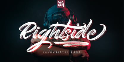 Rightside is a script font designed with a dry brush. The font includes OpenType features. Suitable for element design, events, t-shirts, logos, badges, stickers, awesome artwork, and more.
 - Esmetralda by FHFont,
$17.00 Esmetralda is a Modern Calligraphy Script with opentype features included in the font. Suitable for design, element design, wedding, events, t-shirt, logo, badges, sticker, and other awesome work.
 - Hearst Italic by Solotype,
$19.95Carl Schraubstadter of the Inland Type Foundry probably had more to do with the design of this italic than he did with the roman. Great for Craftsman Era projects. - FS Joey Paneuropean by Fontsmith,
$90.00Kangaroo FS Joey was the offspring of a project with Rudd Studio to develop a logotype for an online streaming TV service, in 2008. While under wraps, the secret project was code-named Kangaroo. The logotype led to a second project, to design a corporate typeface for the service. It was the first big project Fernando Mello had worked on with Jason Smith. “Like any designer who just joined a team, I was very excited about it, drawing and sketching lots of ideas. I remember Jason and I experimenting with lots of possibilities, for both the logo and the typeface.” Online As the font for a Spotify-style, internet-based service, FS Joey needed to be highly legible on-screen, including at very small sizes. There had to be a range of weights, and they’d have to work well in print, too. It was also important that it felt corporate, not too quirky, while still having a strong character of its own. Quirkiest “We designed three weights specifically for use on the Web,” says Jason Smith. “There was the usual fight between me and my team. I wanted at least one identifiable letter that was a quirk. As always I went straight for the lowercase ‘g’, and it was drawn numerous times with lots of variation. I got the quirkiest one accepted by the client.” But, later in 2009, the Competition Commission blocked Project Kangaroo, and Fontsmith were left with a couple of weights of an as yet unused font. From Kangaroo, Joey was born. A favourite “Straight away, people started to notice the typeface,” says Jason. “I can take the credit for pushing the art direction and standing up for the quirks. But it was Fernando who was the key to pulling it all together and adding his own distinct flavour. Now it’s one of my favourite designs in our library.” Fresh and friendly, geometric and energetic, Joey is available in five weights, all with italics, all finely-tuned for both screen and print. - FS Joey by Fontsmith,
$80.00 Kangaroo FS Joey was the offspring of a project with Rudd Studio to develop a logotype for an online streaming TV service, in 2008. While under wraps, the secret project was code-named Kangaroo. The logotype led to a second project, to design a corporate typeface for the service. It was the first big project Fernando Mello had worked on with Jason Smith. “Like any designer who just joined a team, I was very excited about it, drawing and sketching lots of ideas. I remember Jason and I experimenting with lots of possibilities, for both the logo and the typeface.” Online As the font for a Spotify-style, internet-based service, FS Joey needed to be highly legible on-screen, including at very small sizes. There had to be a range of weights, and they’d have to work well in print, too. It was also important that it felt corporate, not too quirky, while still having a strong character of its own. Quirkiest “We designed three weights specifically for use on the Web,” says Jason Smith. “There was the usual fight between me and my team. I wanted at least one identifiable letter that was a quirk. As always I went straight for the lowercase ‘g’, and it was drawn numerous times with lots of variation. I got the quirkiest one accepted by the client.” But, later in 2009, the Competition Commission blocked Project Kangaroo, and Fontsmith were left with a couple of weights of an as yet unused font. From Kangaroo, Joey was born. A favourite “Straight away, people started to notice the typeface,” says Jason. “I can take the credit for pushing the art direction and standing up for the quirks. But it was Fernando who was the key to pulling it all together and adding his own distinct flavour. Now it’s one of my favourite designs in our library.” Fresh and friendly, geometric and energetic, Joey is available in five weights, all with italics, all finely-tuned for both screen and print.
 - Flamenca by Eurotypo,
$28.00 Flamenco is an Andalusian art. Who think in flamenco, think in Spain. Is the result of a cultural mix: Gypsies, Arabs, Jews and Christians mixed elements of their respective cultures with traditional Andalusian elements. It incorporate dance, song and guitar music. Known for its emotional intensity, flamenco is distinguished by the graceful arm movements, ferocious stomping’s flamenco dancer, deep groans and strumming guitar. Flamenco is an art of passion. Flamenca Regular and Flamenca Luz is a brush script inspired by the flamenco dance. Flamenca is an organic, modern and casual calligraphy family font that has preserved in its glyphs its original textured appearance for a more personalized effect even more authentic. As an exclusively Open Type release, with 747 glyphs, it has several special alternatives for all letters with lots of possibility an infinity of combinations. There are plenty of options to allow you to create something unique and special: standard and discretionary ligatures, several swashes, initial and terminal forms and stylistics alternates for each letter, catchwords, ornaments that can be added to the beginning or end of each letter, and much more. Ornaments has been created inspired in the bars of the Andalusian patios where flamenco is danced. These lovely fonts have already an extended character set to support Central and Eastern as well as Western European languages. As a whole, Flamenca was made to make your project more beautiful and attractive! Have fun with it! Flamenca is fancy, delicious & fresh!
 - Sugar Junk by Bogstav,
$17.00 Sugar Junk is my all-caps brush font with soft edges and rough lines. Use it when you need something stated with clear legible and organic looking letters! I've added 5 different versions of each letter, and they automatically cycles as you type!
 - Tangy Cream by Bogstav,
$18.00 Tangy Cream is handmade with a slightly geometric look. And to break the geometry, just a little bit, I have added 3 different versions of each lowercase letters. These automatically cycles as you type, leaving your text even more lively and organic looking!
 - Besley Clarendon by HiH,
$12.00 Besley Clarendon ML is our version of the Clarendon registered by Robert Besley and the Fann Street Foundry in 1845. Besley Clarendon ML represents a significant change from the slab-serif Antiques & Egyptians that had become so popular in the prior three decades. Like Caslon’s Ionic of 1844, it brackets the serifs and strongly differentiates between the thick and thin strokes. Besley Clarendon is also what today is considered a condensed face, as a comparison to the various contemporary Clarendons will show. Robert Besley’s Clarendon was so popular that many foundries quickly copied it, a fact that caused him to complain vigorously. The reason it was so widely copied is simple ó it was extremely useful. It provided the attention-getting boldness to highlight a word or phrase, yet at the same time was compact and easier to read than the fat faces and antiques of the period. It wasn't until sixty years later that the concept of a typeface family of different weights was developed with DeVinne and Cheltenham. Until then, Clarendon served as everyone’s all-purpose bold face. It can be used for ads, flyers, headers or even short text. Don't leave home without it. Besley Clarendon ML includes the following features: 1. Glyphs for the 1250 Central Europe, the 1252 Turkish and the 1257 Baltic Code Pages. Added glyphs to complete standard 1252 Western Europe Code Page. Special glyphs relocated and assigned Unicode codepoints, some in Private Use area. Total of 353 glyphs. 158 kerning pairs. 2. OpenType GSUB layout features: pnum, salt, liga, dlig, hist and ornm. 3. Inclusion of tabular (std) and proportional (opt) numbers. 4. Kreska-accented letters.
 - Coventry Garden NF Pro by CheapProFonts,
$10.00 I have improved and added diacritics to this elegant alphabet, and generally cleaned it up to a professional standard. It is well suited to logos, menus, invitations and other things wanting a touch of elegance. Nick Curtis says: "I came across this particular treatment for swash caps in an old book on letterhead design. The original had been handlettered, but I though it might be convenient to have a ready-made font to accomplish the same effect, and here it is. As an extra added feature, the “§” sign is an ampersand with a long tail." ALL fonts from CheapProFonts have very extensive language support: They contain some unusual diacritic letters (some of which are contained in the Latin Extended-B Unicode block) supporting: Cornish, Filipino (Tagalog), Guarani, Luxembourgian, Malagasy, Romanian, Ulithian and Welsh. They also contain all glyphs in the Latin Extended-A Unicode block (which among others cover the Central European and Baltic areas) supporting: Afrikaans, Belarusian (Lacinka), Bosnian, Catalan, Chichewa, Croatian, Czech, Dutch, Esperanto, Greenlandic, Hungarian, Kashubian, Kurdish (Kurmanji), Latvian, Lithuanian, Maltese, Maori, Polish, Saami (Inari), Saami (North), Serbian (latin), Slovak(ian), Slovene, Sorbian (Lower), Sorbian (Upper), Turkish and Turkmen. And they of course contain all the usual “western” glyphs supporting: Albanian, Basque, Breton, Chamorro, Danish, Estonian, Faroese, Finnish, French, Frisian, Galican, German, Icelandic, Indonesian, Irish (Gaelic), Italian, Northern Sotho, Norwegian, Occitan, Portuguese, Rhaeto-Romance, Sami (Lule), Sami (South), Scots (Gaelic), Spanish, Swedish, Tswana, Walloon and Yapese.
 - Black Wizard by Mans Greback,
$59.00 Black Wizard is a bold and funky sans-serif font that is perfect for adding a touch of playfulness to your designs. With its wobbly and uneven letters, Black Wizard exudes a playful and cartoonish quality that is sure to make your project stand out. This font is ideal for Halloween-themed designs, as its bold and scary appearance can add an extra element of spookiness to your work. But it's not all frights and scares - the funny and lighthearted nature of Black Wizard also bring a touch of humor. Black Wizard comes in four styles: Regular, Italic, Straight, and Straight Italic, giving you plenty of options to choose from for your design needs. Additionally, a Symbols font is included with various Halloween-themed symbols that can be added to your text to enhance the spooky vibe. Use the character ¤ anywhere in a word to make a Halloween symbol. Example: Scare¤Crow. To add different symbols like ghosts and bats, use multiple ¤ characters. Example: Dark¤¤¤Night. The font is built with advanced OpenType functionality and has a guaranteed top-notch quality, containing stylistic and contextual alternates, ligatures and more features; all to give you full control and customizability. It has extensive lingual support, covering all Latin-based languages, from Northern Europe to South Africa, from America to South-East Asia. It contains all characters and symbols you'll ever need, including all punctuation and numbers.
 - The PunkerChicksinLeatherJackets font by Donald Synstelien is an evocative and distinctive typeface that seemingly transports its audience straight into the heart of the punk rock scene. This font is...
- Ah, the Armalite Rifle font, designed by the infamous Vic Fieger. If fonts had personalities, Armalite Rifle would be that one friend who thinks camouflage print is suitable for every occasion and be...
- 1906 Titrage by GLC,
$38.00 We have created this family as a complement to 1906 French News since the two type families were commonly in use in the same publications, including newspapers, popular books, calendars, almanacs and posters. This font, as its name suggests, was mainly used for titlings and subtitles. Small caps, included in the single file of the TTF and OTF versions, are added as a separate file in the MacTT version.
 - Mati by Sudtipos,
$19.00 Father's Day, or June 17 of this year, is in the middle of Argentinian winter. And like people do on wintery Sunday mornings, I was bundled up in bed with too many covers, pillows and comforters. Feeling good and not thinking about anything in particular, Father's Day was nowhere in the vicinity of my mind. My eleven year old son, Matías, came into the room with a handmade present for me. Up to this point, my Father's Day gift history was nothing unusual. Books, socks, hand-painted wooden spoons, the kind of thing any father would expect from his pre-teen son. So you can understand when I say I was bracing myself to fake excitement at my son's present. But this Father's Day was special. I didn't have to fake excitement. I was in fact excited beyond my own belief. Matí's handmade present was a complete alphabet drawn on an A4 paper. Grungy, childish, and sweeter than a ton of honey. He'd spent days making it, three-dimensioning the letters, wiggle-shadowing them. Incredible. A common annoyance for graphic designers is explaining to people, even those close to them, what they do for a living. You have to somehow make it understandable that you are a visual communicator, not an artist. Part of the problem is the fact that "graphic designer" and "visual communicator" are just not in the dictionary of standard professions out there. If you're a plumber, you can wrap all the duties of your job with 3.5 words: I'm a plumber. If you're a graphic designer, no wrapper, 3.5 or 300 words, will ever cover it. I've spent many hours throughout the years explaining to my own family and friends what I do for a living, but most of them still come back and ask what it is exactly that I do for dough. When you're a type designer, that problem magnifies itself considerably. When someone asks you what you do for a living, you start looking for the nearest exit, but none of the ones you can find is any good. All the one-line descriptions are vague, and every single one of them queues a long, one-sided conversation that usually ends with someone getting too drunk listening, or too tired of talking. Now imagine being a type designer, with a curious eleven year old son. The kid is curious as to why daddy keeps writing huge letters on the computer screen. Let's go play some ball, dad. As soon as I finish working, son. He looks over my shoulder and sees a big twirly H on the screen. To him it looks like a game, like I'm not working. And I have to explain it to him again. This Father's Day, my son gave me the one present that tells me he finally understands what I do for a living. Perhaps he is even comfortable with it, or curious enough about that he wants to try it out himself. Either way, it was the happiest Father's Day I've ever had, and I'm prouder of my son than of everything else I've done in my life. This is Matí's font. I hope you find it useful.
 - Sagebrush JNL by Jeff Levine,
$29.00 Sagebrush JNL was modeled from examples of a vintage French Clarendon wood type in which many of the characters had rounded parts rather than the traditional all-slab serif approach.
 - Drexel JNL by Jeff Levine,
$29.00 The bold hand lettered title on the 1940 sheet music for the band piece "Drexel Marching Song" was the inspiration for Drexel JNL; available in both regular and oblique versions.
 - Bartender by Tour De Force,
$15.00 Small family called Bartender, for the lovers of retro style typefaces. Ideal for product names, packages, labels, old fashioned coffee shops, bars and everything with specific characteristics of past times.
 - Artics Snow by FHFont,
$17.00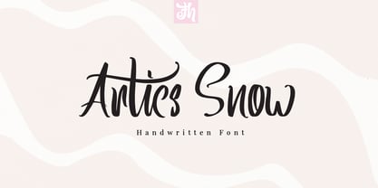 Artics Snow is beautiful script font with modern calligraphy style, with many OpenType features. Suitable for design, element design, wedding, event, t-shirt, logo, badges, sticker, and other awesome work.
 - DF Tapa by Dutchfonts,
$39.00 DF Tapa is a typeface based on the vernacular, popular graphics used in Spain. They proudly announce the daily fresh snacks which are homemade and served in every proper bar.
 - Mellnik by ParaType,
$25.00Mellnik is a sans serif of humanist style (in a way) that was developed by Oleg Karpinsky for ParaType in 2006. The type family contains nine styles with a number of alternate characters in each ones. For use as a text font in long text passages of advertising booklets, catalogues or magazines, as well as for accident setting. Mellnik may be also applied as a corporate typeface. Five condensed styles were added in 2007 by the same designer. - Konrad Kachelofen by Proportional Lime,
$9.99 Konrad Kachelofen was a printer in the city of Leipzig beginning around 1483. He printed many works by contemporary authors and also many of the classics. He acquired an unusually large amount of typefaces for his shop, a place that included a wine bar and book store. This type face is based on Typ.11:340G GfT510 Gesamtkatalog der Wiegendrucke and is similar to Proportional Lime’s “Kachelofen'' font. The major differences are that the whole miniscule set is slimmer and the majuscule set has different style glyphs and this face was used solely for titles and section headings because of its sharper and clearer appearance at large point values. Konrad probably died in 1529 after passing his business on to his son-in-law Melchior Lotter, who also went on to fame as an industrious and illustrious printer.
 - TELETYPE 1945-1985 - Unknown license

- Ribbons by Positype,
$20.00 Ribbon type. Holy grail of complex-lettering-turned typeface or an elusive Loch Ness monster that is often teased, possibly seen in the wild, but never confirmed? From the amazing lettering artist and author Martina Flor and masterful type designer Neil Summerour, comes the aptly named Ribbons. Ribbons is a sincere and well-conceived approach to providing a reliable solution to ribbon and ribbon-styled type for creative professionals when a lettering artist just isn’t available. Ribbons provides both flat and ‘folded’ options with the Regular and Fold styles, but then raises the bar with separate layer styles that will allow you to easily create the elegant back and forth movements produced with ribbon-style lettering we have all come to appreciate. These layer options are provided in both ‘smooth’ and ‘pleated’ connected styles. Flor and Summerour didn’t stop there. Each typeface was expanded with a number of stylistic alternates, additional swashed and flourished letters, ligatures, and even more in order to provide as many decorative options as possible to the creative. To round out the nine fonts available in the typeface and to ‘put a bow on it’, they’ve added a separate Shadow style and two different color fonts (available exclusively with family purchases).


