10,000 search results
(0.028 seconds)
- Hoods And Capers by Dismantle Destroy,
$29.00 This font was inspired by music from the band Asteria.
 - Hagada Mesugnan MF by Masterfont,
$59.00 Custom designed letterforms for the Hagada, published by Gad Ulman.
 - Brave Mountains by Dismantle Destroy,
$9.00 This font was inspired by music from the band Silverstein.
 - Helium Rifther by Maulana Creative,
$14.00 Helium Rifther badges display font, bold stroke, fun character with a bit of ligatures. To give you an extra creative work. Helium Rifther badges display font support multilingual more than 100+ language. This font is good for logo design, Social media, Movie Titles, Books Titles, a short text even a long text letter and good for your secondary text font with script or serif. Make a stunning work with Helium Rifther badges display font. -Uppercase Cheers, Maulana Creative
 - Rose Town by Maculinc,
$17.00 Rose Town is a thick typeface with unique angles and is easy to read so that it is comfortable to wear. This font is made with old nuances that are suitable for vintage / retro themed events. You can also use it as logos, badges, badges, packaging, titles, posters, t-shirts / clothing, greeting cards, business cards, and wedding invitations and more. Flowing characters are ideal for making interesting messages to your taste. Mix and match with many alternative characters to fit your project. It would be more interesting if you add Extruded Fonts and alternatives. Alternative characters in this font are divided into several OpenType features such as Stylistic Alternate, Ligature and Ligature Alternate. Mail support: maculinc@gmail.com Thank you! Maculinc
 - Lifeform by Supremat,
$12.00 Lifeform is a modern display font created as a result of my experiments on the forms of letters. While working on the font, I had ambivalent feelings, on the one hand I liked the individual curved lines, on the other hand they seemed very strange, alien and illogical. It was like looking into a microscope and seeing something strange. I wanted to develop and study these forms as something new, because I had never seen anything similar before. The result is a contrasting font that has both curves and sharp, and smooth lines that resemble some kind of organic matter. The font is well suited for large headlines, posters and covers. Its strange design catches the eye and will not leave the viewer indifferent.
 - Scoundrel by Comicraft,
$19.00 Leathery and Loopy Letterer of Legend, Richard Starkings has pointed his Apple Pencil at Procreate on his iPad and proceeded to raise the bar on lower case for this scandalous series of squiggles we had to call Rendered in the style of ShoutOut, this jaunty new Comicraft offering features both upper and lower case and recreates a pen lettering style of which we honestly thought Old Man Starkings was no longer capable! Suitable for jolly journal entries, hand-written notes to loved ones and sundry laundry lists, SCOUNDREL does more than Shout, and it does it quite quietly too! Scoundrel includes four weights (Regular, Italic, Bold & Bold Italic) with upper and lower case alphabets plus Western and Central European international characters.
 - Acton by Device,
$29.00 Acton is a deceptively simple, grid-based design. Though derived from a 2 by 3 arrangement of blocks, it uses white spaces to allow for more complex shapes – for example as the R – where the underlying 3 by 5 arrangement is apparent. It also departs from this strict grid-based logic for characters such as the the T, L, f and r, whose cross-bars are shorter than they would otherwise be in order to promote optical evenness. No elegant solution could be found for the V, which in geometric fonts can appear very similar to the U, lacking as it does the cross-bar that can differentiate a square A from the capital form of the n. However, the resultant diagonal retroactively proved useful on the lower-case e and a, characters that otherwise would have more uninteresting design solutions.
 - ITC Bolthole by ITC,
$29.99I fell in love at the age of twelve in Wales, recalls Bernard Philpot. "My father brought me to a small graveyard in the Welsh hills to show me two headstones carved by the great Eric Gill. I instantly fell in love with the beauty of the carving and the perfection of the letterforms. I still go back to marvel at these works of art." However, the ITC Bolthole™ design, Philpot's first commercial typographic endeavor, is quite unlike the works of Eric Gill that first captured his heart. Bolthole is a craggy sans serif with a definite grumpy attitude. It's not terribly legible, and, if more than a few words are set in the design, it's not very readable. To round out its cranky personality, Bolthole does not like to be set in small sizes. Like Cheez Whiz® and bullfights, you either love or hate this typeface. But whichever emotion dominates, there is no denying that Bolthole has a personality to be reckoned with - one with ample magnetism to ensure reader attraction. If used to set brief blocks of display copy, the typeface makes a powerful statement. Bolthole was originally designed to complement a whimsical ad for the Royal Society for the Prevention of Cruelty to Animals. As Philpot recalls, "although the ad didn't win any awards, the type attracted some very positive comments for its original look and feel." Philpot studied graphic design and typography at the London School of Printing, and soon after graduation found himself working in a large advertising agency in London. According to Philpot, "After designing type for everything from packaging to ads, I thought it time to convert one of my designs into a complete font - and Bolthole was born." ITC Bolthole could very well be the Shrek™ of typeface design - which might not be such a bad thing." - Kremlin Duma - Unknown license

- Polias by Esintype,
$23.00 Polias is an all-caps uniwidth typeface inspired by an ancient inscription carved on a monoblock stone in hybrid characters — between no-contrast linear sans to low-contrast flared serif. The inspiring inscription is the dedication by Alexander the Great, discovered in the Temple of Athena Polias in the ancient Ionian city of Priene. Stanley Morison mentioned this inscription in one of his lectures: “The distinctive feature of this inscription consists of a consistent thickening towards the ends of perpendiculars and horizontals.” … “We have not the right to say that the serif was invented for Alexander the Great's inscription, only that this is its first datable appearance.” The letter proportions are almost identical to the original, but the stroke features have been reinterpreted and characterized. Serif-like nodes at the end of the strokes are subtle extensions that serve to accentuate rather than break its monoline elegance. With an analogy, they are not flowers, but like blooming buds. Polias is a flared sans typeface which is closer to sans-serif forms on the spectrum between sans and serif. It’s especially light looking by design to convey rather thin and white typographic color of its original monumental look. It comes in eight weights and a variable font, scaled from Thin to Bold. It is multiplexed, so the weights do not affect text lengths. Light weights are closely based on the actual carving of the inscription. Thicker weights can be used on smaller typesettings to compensate for the weight difference of larger letters’ strokes, and to keeping the monoline appearance of the entire text block intact. This method can be used for any purpose, such as setting a hierarchy between the lines or to justify their lengths. Some of the original letterforms have been preserved and stylistic alternatives such as Ionic four-bar Sigma, dotted Theta, palm Y are provided as open type feature. Some of the other ancient forms, such as the three-bar Sigma (S), the pointed U, were also added for both the Greek and Latin scripts. Polias is preferable for big type settings such as logos and headlines as a modern representation of perennial classical forms. Its a fine fit for product branding, movie posters, book covers, packaging materials, and more, which require an epic look to attracting attention with a distinctive elegance. Polias can be considered for distinctiveness wherever Roman Capitals work. As a noun, Polias is one of the epithets of Athena / Minerva, and in this case referring to her role as the protector of the city of Priene. Polias is one of the seven typeface designs in Esintype's ancient scripts of Anatolia project, Tituli Anatolian series.
 - Polias Varia by Esintype,
$140.00 Polias Varia is an all-caps uniwidth variable weight typeface inspired by an ancient inscription carved on a monoblock stone in hybrid characters — between no-contrast linear sans to low-contrast flared serif. The inspiring inscription is the dedication by Alexander the Great, discovered in the Temple of Athena Polias in the ancient Ionian city of Priene. Stanley Morison mentioned this inscription in one of his lectures: “The distinctive feature of this inscription consists of a consistent thickening towards the ends of perpendiculars and horizontals.” … “We have not the right to say that the serif was invented for Alexander the Great’s inscription, only that this is its first datable appearance.” In Polias Varia, the letter proportions are almost identical to the original, but the stroke features have been reinterpreted and characterized. Serif-like nodes at the end of the strokes are subtle extensions that serve to accentuate rather than break its monoline elegance. With an analogy, they are not flowers, but like blooming buds. Polias Varia is a flared sans typeface which is closer to sans-serif forms on the spectrum between sans and serif. It’s especially light looking by design to convey rather thin and white typographic color of its original monumental look. It comes in eight weights and a variable font, scaled from Thin to Bold. It is multiplexed, so the weights do not affect text lengths. Light weights are closely based on the actual carving of the inscription. Thicker weights can be used on smaller typesettings to compensate for the weight difference of larger letters’ strokes, and to keeping the monoline appearance of the entire text block intact. This method can be used for any purpose, such as setting a hierarchy between the lines or to justify their lengths. Some of the original letterforms have been preserved and stylistic alternatives such as Ionic four-bar Sigma, dotted Theta, palm Y are provided as open type feature. Some of the other ancient forms, such as the three-bar Sigma (S), the pointed U, were also added for both the Greek and Latin scripts. Polias Varia is preferable for big type settings such as logos and headlines as a modern representation of perennial classical forms. Its a fine fit for product branding, movie posters, book covers, packaging materials, and more, which require an epic look to attracting attention with a distinctive elegance. Polias Varia can be considered for distinctiveness wherever Roman Capitals work. As a noun, Polias is one of the epithets of Athena / Minerva, and in this case referring to her role as the protector of the city of Priene. Polias (family) is one of the seven typeface designs in Esintype’s ancient scripts of Anatolia project, Tituli Anatolian series.
 - Dreamworld by Hanoded,
$10.00 The last couple of years felt like I was living in a bad dream: I witnessed crazy leaders, climate change and now Covid. I usually name my fonts after things that affect me and this one is not different. Dreamworld is a font I made with a cheap marker pen I liberated from my kids’ pencil box (I will put it back, pinky promise…). It is a bit rough, but also very easy to read and distinctive enough to make your work stand out. Of course it comes with extensive language support (let me mention Vietnamese again…) and two sets of alternate glyphs, that cycle as you type.
 - Groovy 3D Caps JNL by Jeff Levine,
$29.00 It all started with a simple idea back in 1998: do a digital version of a "lost" 70's typeface, and make up the missing letters that were not present in the only available example Jeff Levine had to work with. Jeff wasn't yet doing his own digital font creation, so he hooked up with Brad Nelson who owns a small foundry called Brain Eaters Fonts. Together, they collaborated on "Action Is"- a freeware font named after the source of the type example. This was a title page for a commemorative photo album of images from the 60's TV music show "Where the Action Is", formerly hosted by Jeff's employer at the time, singer-writer-producer Steve Alaimo. The free font took off like a rocket, being released just at the peak of the 60’s/70’s retro craze in the late 1990’s, and it was EVERYWHERE! It showed up on TV shows, packaging and web design -- and was even spotted on signage used on the side of a major amusement resort’s retro-themed hotel. From that point on, Jeff kept getting requests for a version with a lower case. Although they shared the copyright in the freeware version, Brad Nelson gave Jeff his blessing to re-work and take Action Is into the realm of commercial type. Newly improved and re-released as Groovy Happening JNL, it became one of Jeff's better selling type designs. A simplified, yet similar font was issued called Groovy Summer JNL. Now, after about a decade, Jeff had decided to clean up the 3-D (drop shadow) version that was originally freeware with many minute design flaws and re-release it commercially. Groovy 3D Caps JNL is an all-caps, limited character set font which ties in well with the previous releases, yet retains itís 1960s-1970s era charm. The font flag art is courtesy of Barbara D. Berney and is used by permission.
 - RMU Koralle by RMU,
$25.00 Koralle was an abundant family of grotesque font styles which had been released by Schelter & Giesecke in the first quarter of the previous century. Out of this family four of the most impressive styles were revived, whereby I stuck as close to the original as possible. All styles contain even the weird-looking capitalized German double-s of which I am a strong opponent.
 - Horseman by Ngene,
$10.00 Horseman Font Duo is handmade vintage script monoline and sans-serif inspired by classic western culture and combining with vintage touch. These two fonts would be perfect to combine in your design, especially on vintage design. This fonts are great for logotype, badges, clothing, poster, and much more. This fonts comes with OpenType features as well as many alternative characters to improve your design.
 - Urban Black by Subectype,
$17.00 Urban Black is An Urban Font. This font was created to help you designing logotype with urban style for your Brand or your clients, and also you can use it for designing all of the graphic stuff such as badge, sign, Esport, headline, urban design, T-shirt/apparel, Poster, etc. Urban Black was designed for personal characters such as strong, confidence, dynamic, readable, Energic, dynamic, etc.
 - Bardella by IM Studio,
$19.00 Bardella is designed in a natural handwriting style, and has a modern and unique writing form. It includes Alternative Styles and Contextual Alternatives. Bardella be used for various purposes such as posts, logos, wedding invitations, t-shirts, letterheads, signage, labels, news, posters, badges, etc. To enable OpenType style changes, you need a program that supports OpenType features such as Adobe Illustrator CS, Adobe Indesign & CorelDraw X6-X7.
 - Goth Chic by Comicraft,
$19.00 This pale face -- a Byronic offering from the disaffected youth section of our library -- will provide that slightly sad, sunken eyed feeling most closely associated with Doc Martins, heavy crosses and clothes as black as the blaquest heart... so if you're looking for tragic tramp stamp typography, we think our tattoo parlor maid to wear font will provide just the right amount of Goth Chic.
 - Brainoise by Ronny Studio,
$19.00 Punk-looking fonts usually embody the rebellious and edgy spirit of the punk subculture. It is characterized by its bold, jagged, and distorted letterforms, which often feature exaggerated or irregular shapes. This font is perfect for your design needs such as: for posters, magazines, covers, brands, logotypes, band logos, etc
 - See You Later JNL by Jeff Levine,
$29.00 The sheet music cover of Lew Brown and Albert Von Tilzer's 1917 wartime song "Au Revoir, But Not Goodbye (Soldier Boy)" had its title hand-lettered in a condensed sans serif design with the influence of Art Nouveau styling. This has now been re-drawn digitally as See You Later JNL.
 - Lord Mayor by Solotype,
$19.95We know very little about this font. A printer in Lisbon had it, but said it came from England. Nicolette Gray shows it in her Nineteenth Century Ornamented Type Faces as Lord Mayor from the British Typefoundry. We never got the complete font, but drawing the missing letters was not difficult. - Omarbig by Dhan Studio,
$27.00 Omarbig is a beautiful hand-painted font that looks more natural, fun and combines a mixture of small and large letters, making it look attractive and unique. This fonts can be used for various purposes such as headings, signature, logos, wedding invitations, t-shirts, letterhead, signage, labels, news, posters, badges etc.
 - Madista Vintage by IM Studio,
$20.00 Madista Vintage is inspired by retro style combined with hand lettering style. Madista Vintage comes with OpenType features such as style switching, style sets & binders which are great for any type of logo, poster, badge, book cover, t-shirt design, handwritten quote, product packaging, header, poster, merchandise, social media & greeting cards.
 - The Lord Of Bronze by Rockboys Studio,
$23.00 The Lord Of Bronze is a unique handwritten font. It includes elegant swashes which can be used to give a luxurious look to your designs. It can be used for various purposes such as logos, wedding invitations, headings, t-shirts, letterhead, signage, labels, news, posters, badges and so much more.
 - Autelan by Aqeela Studio,
$20.00 Autelan Script is a contemporary calligraphy typeface. It's a mix of retro and modern sans serif script. With Autelan, your designs will get a classic and elegant touch. Autelan can be used for various purposes such as logos, wedding invitations, T-shirts, letterheads, signage, labels, news, posters, badges etc. Thank You
 - Ussr by Indian Summer Studio,
$20.00 The main 20-th century handwritten display font in the USSR, usually performed with a flat brush or a wide poster pen for all kinds of signage during 1920-1990s. It had also many analogues in other countries, but never was that popular as in the Soviet Union, used everywhere.
 - Hayken Script by Lemonthe,
$10.00 Hayken Script is a brush script font with a dynamic and energetic style. There are two types of styles (clean and textured). It can used for various purposes such as titles, logotypes, t-shirt designs, letterheads, signage’s, labels, newsletters, posters, badges, and every other design which needs an unique, striking font.
 - Top Tune JNL by Jeff Levine,
$29.00 The 1955 British edition of the sheet music for Frank Sinatra's hit "I'm Walking Behind You" had its title hand lettered in a sans serif design straight out of the Art Deco era. This bold, condensed type style is now available as Top Tune JNL; in both regular and oblique versions.
 - Great Mammoth by Dikas Studio,
$15.00 The Great Mammoth is a bold and vintage type with high contrast character. They have a rough character with handdrawn touch. The Great Mammoth have 2 style : regular and oblique. It's very suitable for vintage, retro and adventure theme design such as logo, branding, badge, label, t-shirt, merchandise etc.
 - Stepira by Gatype,
$12.00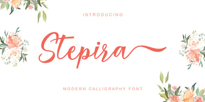 Stepira Script is a modern calligraphy font, with characters dancing along the baseline and an elegant touch. OpenType features such stylistic alternates, ligatures and multilingual support. Stepira Script can be used for various purposes such as logos, wedding invitations, headings, t-shirts, letterhead, signage, labels, news, posters, badges and more.
 - Saylon Brush by Stripes Studio,
$20.00 Saylon is a super casual hand brushed script with detailed brush stroke texture, and a quirky, Can be used for various purposes. such as the title, signature, letterhead, signage, labels, newsletters, posters, logos, correspondence, wedding invitations, badges, etc. Saylon Font international Support for a review of most Western languages included.
 - Choc by Linotype,
$29.99Choc is the work of French designer Roger Excoffon, based on the traditions of Japanese brush calligraphy, thick yet graceful. Choc light was designed by Phil Grimshaw, who had to redraw many times in different weights before finding one that worked as a text face and remained true to the original. - Bridgeta by Nk Studio,
$14.00 The Bridgeta is a very legible Elegant Calligraphy, which is simply beautiful, classy, and elegant. Can be used for various purposes. Such as logos, wedding invitations, t-shirts, letterheads, signboards, news, posters, badges etc. The Bridgeta features 389 glyphs, including initials and terminal letters, alternates, ligatures, and multiple language support.
 - Calaveras by Design is Culture,
$29.00 In August of 2009, I was commissioned by Zoo York, a New York City based skateboard company, to visit Buenos Aires to study and document street typography. As soon as my taxi driver took the bustling street Entre Ríos, it was clear that the city and I were going to be good friends. Many of the independently owned businesses on Entre Ríos are adorned with handmade signage. These signs are painted in a style called Fileteado which is a century-old Argentinian type of lettering and floral ornamentation. Nowadays, Fileteado is still a prominent part of the city’s landscape, coloring the façades of restaurants, bars and coffee shops. Calaveras and Diablitos are two new typefaces that were inspired by Fileteado. Stylistically, the fonts are a return to a rhythmic and playful sensibility reminiscent of Vitrina and Cuba, two fonts that I designed in 1996. Along with dynamism and dance, these new fonts incorporate a rigor and functionality essential to labelling any font a ‘workhorse.’ The names Calaveras and Diablitos, came from the name of a song by the infamous Buenos Aires rock band, Los Fabulosos Cadillacs. —Pablo A. Medina
 - Diablitos by Design is Culture,
$29.00 In August of 2009, I was commissioned by Zoo York, a New York City based skateboard company, to visit Buenos Aires to study and document street typography. As soon as my taxi driver took the bustling street Entre Ríos, it was clear that the city and I were going to be good friends. Many of the independently owned businesses on Entre Ríos are adorned with handmade signage. These signs are painted in a style called Fileteado which is a century-old Argentinian type of lettering and floral ornamentation. Nowadays, Fileteado is still a prominent part of the city’s landscape, coloring the façades of restaurants, bars and coffee shops. Calaveras and Diablitos are two new typefaces that were inspired by Fileteado. Stylistically, the fonts are a return to a rhythmic and playful sensibility reminiscent of Vitrina and Cuba, two fonts that I designed in 1996. Along with dynamism and dance, these new fonts incorporate a rigor and functionality essential to labelling any font a ‘workhorse.’ The names Calaveras and Diablitos, came from the name of a song by the infamous Buenos Aires rock band, Los Fabulosos Cadillacs. —Pablo A. Medina
 - Libertat by Elyas Beria,
$9.00 In a not-too-distant future, humanity was ruled by a powerful, technologically advanced empire known as the Synod. The Synod controlled all forms of communication, and through this, they controlled the minds of the people. But a small group of rebels, known as the Resistance, had managed to evade the Synod's surveillance and formed a secret underground movement. They were determined to overthrow the Synod and restore freedom to the people. One of the Resistance's key members was a young artist named Trystån. He had a unique talent for creating powerful, visually striking posters that captured the spirit of the Resistance's message and spread it to the masses. Trystån had just completed a new poster, one that would be critical to the Resistance's plans. It depicted a single, outstretched hand holding a traditional Kimarii laser staff, with the words "Libertat!" emblazoned across the top. The poster featured a striking and powerful font that perfectly captured the spirit of the Resistance's message. The font was a combination of bold lines, elegant confident curves, and strong angles, giving it a sense of strength and determination. The lettering was large and prominent, filling up much of the poster, making it hard to miss. The letters seemed to be almost carved into the surface, giving the impression of something that was permanent and unshakable. The font was colored in dark shades, and was a sans serif typeface, that gives the message a very modern and current feel yet also feels vintage and retro, connecting the present with the struggles of the past. And with multilingual support, the typeface ensured that the message of the Resistance could be disseminated in every language on the planet. The background was minimalistic and in contrast, with a neutral palette, with just a hint of a sand-like color, representing the harsh conditions of the land that the people were fighting for their rights. The focus was all on the lettering, and how it conveyed the message. The poster was indeed a moving piece of graphic design, with its strong, striking font, and powerful imagery. It was clear that Trystån had put a lot of thought and care into its design. The poster, he hoped, would connect with people on an emotional level and inspire them to rise up against the oppression of the Synod Empire. The poster was set to be distributed at a major rally in the capital, where the Resistance was hoping to gain the support of thousands of citizens. But the Synod was not about to let this happen. They had long suspected the existence of the Resistance and had been working to infiltrate their ranks and discover their plans. The night before the rally, the Synod launched a surprise raid on the Resistance's hideout, capturing Trystån and several other members of the Resistance. Trystån was thrown into sand pits and interrogated by the Synod's top agents. They wanted to know everything about the Resistance's plans, including the details of the poster and the rally. Trystån, knowing the importance of the poster, refused to give in, even under the harshest of conditions. Meanwhile, the rally was drawing near, and the Resistance was desperate to get the poster out to the public. They knew that it was their only hope of gaining the support they needed to overthrow the Synod. They came up with a plan to smuggle the poster out of the hideout, but it would be a risky endeavor. As the rally began, the Resistance made their move, slipping the poster into the hands of the crowd. Trystån's poster had made a big impact in the rallies, and soon it became the symbol of hope for the resistance, and the visual representation of their struggle for freedom. The poster had become the catalyst for the revolution, and it would be remembered for many years to come as the symbol of the fight for freedom and democracy. The image of the outstretched hand holding the Kimarii laser staff struck a chord with the people, and they began to rise up against the Synod's oppression. Trystån, still locked away in the sand pits behind a stasis feild, could only imagine the scene unfolding outside. But he knew that his work had helped to spark a revolution, and he felt a sense of pride and accomplishment. The Resistance, with the help of the rally, was able to overthrow the empire, and Trystån was released, celebrated as a hero and hailed as the artist who helped to bring about the new era of freedom and democracy. The poster Trystån had designed had become the symbol of a new era, and it would hang in museums and public places as a reminder of the power of resistance and art, in the face of oppression. Features: regular and light weights numbers and punctuation multilingual characters
 - Coin Operated by Dismantle Destroy,
$9.00 This font was inspired by music from the band The Dresden Dolls.
 - Cupcake by Sudtipos,
$49.00 Cupcake is a font for those with a sweet tooth. It flares the taste buds with its creamy construct and makes them drool over a sandwich, a pasta, a cupcake, or a sweet beverage in your favourite café. Another packaging accomplishment by Koziupa and Paul, Cupcake was designed specifically to appeal to the masses of the food and service industries. It covers all Latin-based languages.
 - Dont Walk Run - Unknown license


