10,000 search results
(0.082 seconds)
- Tooting Sans by HamburgerFonts,
$39.95 Tooting Sans is a well-crafted, contemporary humanist sans. Designed for the needs of editorial, advertising and signage, Tooting Sans is not only suitable for setting large amounts of text at small sizes, it also has a presence and robustness for powerful headlines. Tooting Sans has slightly condensed letters with clean lines, open forms and predominantly straight terminals, although some vertical strokes have angled terminals for variation. This helps to keep the flow of the copy alive whilst being economical with space and legible in both text and headline usage. Released as an OpenType font, Tooting Sans expands upon the standard sans serif character set to include Greek and Cyrillic glyphs, small caps, oldstyle figures, proportional figures, ligatures and improved support for Latin-based languages.
 - DT Paper Type by Dragon Tongue Foundry,
$9.00 DT PaperType has evolved and morphed over time from quite distant origins. I previously created DT Paperside. It was neither Papyrus nor SSI Countryside, but was inspired in some ways by the Papyrus form, although untextured and smoother, and had the more open dimensions and proportions, similar to that of Countryside SSi, with its larger easily readable lowercase body, and more consistent, shorter stems. DT Paperside had an open scripted feel which was pleasing to the eye and easy to read. DT PaperType has since been crafted from of the original Paperside font. The Organic flow and comfortable form of Paperside has been retained, but it has been shifted very much from the feel of a script font, into a quality, extremely readable, organic and friendly, serif font, retaining its clarity, while adding a great deal of pose and class. This font is primarily suited to body text, and as such is extremely readable. It does however also make an excellent Display font, and comes with a full set of over sized Caps that drop below the line to stand out on a headline when required. Paperside can also automatically enhance the first letter of most sentences, and changes other letters to suit their position within words, and the letters they appear beside. Now comes with an italic that curves and softens various letters. For best results, use this ‘smart font’ with Contextual Ligatures turned on. Mulitiple Stylistic Alternatives are included. Inspiration for this fonts predecessor (Paperside) came from two other fonts. Papyrus: designed by Chris Costello and created in 1982, it is a hand-drawn textured typeface, emulating texts written in biblical times. One of the most used (and misused) fonts of all times. Owned by Letraset, and currently published by the Internation Typeface Corporating (ITC). Countryside SSi: The serif font of an unknown designer, currently licensed by Southern Software Inc. Feel free to preview some other Dragon Tongue fonts that are yet to be released, at https://www.dragon-tongue.com/fonts
 - Sigmund Freud Typeface by Harald Geisler,
$29.00 “For those who regret what keyboards and touch screens have done to their penmanship, typographer Harald Geisler has an answer: Sigmund Freud.” — The Wall Street Journal Sigmund Freud was a neurologist who lived from 1856 to 1939. His research and studies led to the foundation of ‘Psychoanalysis’. When I first saw Freud’s century old letters, I was fascinated by the beauty of these historic manuscripts. It made me smile to imagine a person writing his or her shrink a letter set in Freud’s handwriting. I started to plan creating a font based on his manuscripts. I contacted the Sigmund Freud Museum Vienna and Freud Museum London. To start the creation I selected eight handwritten documents from the archive in Vienna – This selection of specimen was my orientation during the design process. The Samples were created between 1883 to 1938 and are of various character such as handwritten scientific papers, personal letters, notes and a telegram. A successful Kickstarter Campaign "The Sigmund Freud Typeface - A Letter to your Shrink" with over 1400 Backers enabled me to visit the archive in Vienna and study the original manuscripts of Sigmund Freud. After a year of preparation and design work, I finished four alphabets based on Freud’s handwriting. What are the different Versions PRO, Kurrent, #1, #2, #3 and #4 about? “This project gives people the convenience afforded by the computer while maintaining the romantic nostalgia, beauty, and character of letter writing with real handwriting.” — Daniel Vahab, The Huffington Post When you write with your hand, every letter looks a little different. When you write a text on your computer every letter looks exactly the same. In order to make type look like handwriting, I chose four different variations of each letter from Freud’s manuscripts, drew and stored them in the font. The font is then programmed to exchange letters while you are typing. This makes the rendered result on your screen or print look like unique handwriting. PRO While you are typing… the PRO Version actively combines all four alphabets and exchanges them automatically. Through this mechanism never the same two o’s will stand next to each other. With every touch a unique look is generated. This works in certain applications i.e. Word 2010(or newer), Pages, TextEdit, Editor(Pre-installed on Windows 7 or newer), InDesign, Illustrator… →Here you can see an animation of what this effect looks like in action. (Please Note: some applications like LibreOffice, OpenOffice do currently not support this feature. Date: December 2013) #1 #2 #3 and #4 The Sigmund Freud Typeface #1, #2, #3 and #4 each hold one individual lowercase alphabet based on Freud’s handwriting. Kurrent Most of Freud’s correspondence was written in German. Until the 1950′s a different handwriting was taught throughout German speaking countries (Switzerland, Austria, Germany). This style is called Kurrent. The name Kurrent and Cursive derive from the Latin word currere - to run, hurry - both styles were designed to write fast. As you can see in the samples above, Freud practiced both Kurrent and when writing english Cursive (Latin script or Joined-up). Kurrent has three significantly different letters (s,h,e). Use Kurrent to render the authentic look of an historic Sigmund Freud letter in German. Bundle On the Top of this page you can get all six fonts of the Sigmund Freud Typeface Family in a bundle. International Typeface All styles of the Sigmund Freud Typeface feature a wide range of accented letters so you can write to all your friends in Sweden (Bjørn) France (Chloé & Zoë), Ireland (Dáirine), Poland (Łucja), Germany (Jörg) and almost everywhere around the globe (Find a complete list in the tech specs). Usage recommendations I hope that this design will be valuable to you and most of all that you have fun with this typeface! 1. Point Size — To reproduce the size of Sigmund Freud’s handwriting adjust the type size between 18-24 point in your word processor. If you are using an imaging software like Photoshop set the resolution to 300dpi and adjust the point size between 18-24. 2. Line Spacing — Narrow the line hight until swashes of capital letters touch the baseline above. This also happens when you write a letter and gives the document a unique handwritten look. 3. Right Aligned — Freud had the habit to write towards the right edge of the page and start loosely on the left. Set your text alignment to ‘right’ to incorporate this dramatic expression also to your documents. What do other People say about the Sigmund Freud Typeface? “Wouldn’t you love to write a letter to your shrink using the Sigmund Freud typeface?” — Dorothy Tan, Design TAXI ''“JUST DON’T WRITE A LETTER TO YOUR MOTHER WITH IT… …until the reader looks a bit closer, and they see 70+ years of modern science weighing in on turn-of-the-century pop psychology."'' — Mark Willson, Fast Company “Doctor, what does it mean if you dream of creating a font of Freud’s handwriting?” — Ayun Halliday, Open Culture “…geekily romantic, at once artistic and scientific” — Edie Jarolim, Freud’s Butcher “…sympathisch” — Jürgen Siebert, Fontblog !WOW! Thank you for reading the complete font description! You are awesome! If you still have a question please contact me through MyFonts or my website haraldgeisler.com. Credits This project was made possible by the help of 1481 Backers on Kickstarter and the kind support of the Sigmund Freud Museum Vienna and the Freud Museum London. Thank you. All of Freud’s Manuscripts shown are © Sigmund Freud Museum Vienna. Poster Image: IN17 - Sigmund Freud, Germany 1932. © Freud Museum London. Flag Image: IN19 - Sigmund Freud 1930’s. © Freud Museum London.
 - DT Partel by Dragon Tongue Foundry,
$9.00 DT Portal: This stylised, partially serifed font, made with a slightly rounded square form, may have been inspired initially by old cathode ray tubes and computer screens. Although not intended to be purely a ‘tech’ font, it can have a strong tech feel to it. More suited to being a headline font than body text. It also appears to have a monospaced look to it, since most letters, (other than letters like ‘i, l and t’), do have the same width. There is some automatic contextual shape adjustment happening in places, to avoid taking up too much space, so contextual ligatures should be turned on. As is the case with most of my fonts, when given the choice, ‘metric’ spacing should be used in preference to ‘optical’. Initially this font was going to be called ‘DT Portal’, because its form was similar to that of a window or doorway. But due to other fonts already having that name, I chose to rename it as ‘DT Partel’, for no reason other than it is only a very small change visually.
 - Victorian Decade by Fontsgood,
$14.00 Introducing "Victorian Decade" a dimensional letters with artistic devices of optical illusionism and forced perspective from 19th century. Forged with opentype features give you easiest way to access all 250 alternate characters, discretionary ligature, swash and ligature. It is possible to combine and options to create label designs, headlines, logotypes, signage, posters, greeting cards, letterheads, t-shirts and much more.
 - Rothena by Haksen,
$14.00 Hand-lettered with style, Rothena Script is a must have for all your design needs. Perfect for greeting cards, branding, stationery design, social media, packaging, magazine layouts, prints and more! Utilize all caps for a completely alternate style, or mix and match lowercase script + all caps for creative designs. Rothena Script has a variety of unique, coded features to create compelling, handmade outcomes: 4 stylistic alternates, 5 initial characters, 4 end characters, 1 discretionary ligature and 25 standard ligatures. Multilingual support is included for Western European languages. PUA Encoded. OTF is included for the full, Rothena Script font. Happy Designing! This is the personal license font that can be used for all personal needs. If you want to use this font on items you are going to sell or on anything promoting your business, please purchase the extended license version.
 - Cardilan Tatto by Romie Creative,
$21.00 Introducing our new product called Cardilan font. Cardilan includes upper and lower case letters, numbers, various kinds of punctuation and ligatures. All lowercase letters include line endings and alternative fonts.
 - LD Deck The Halls by Illustration Ink,
$3.00Deck the halls with boughs of holly..." The fun letters of this font are sure to get you in that holiday spirit! The capital letters each have a hanging ornament. - Literaturnaya by ParaType,
$30.00 Musician with the stage name of Pelle Piano, with an interest in irregular and informal lettering, 1950s style lettering, and a childhood influenced by Letraset sheets and a Letraset catalog.
 - Song And Dance JNL by Jeff Levine,
$29.00 The hand lettering of a piece of 1930s sheet music's title has once more yielded an interesting take on the popular "thick and thin" lettering of the Art Deco period.
 - Arroyo by Gajana Aslanjan,
$45.00 Arroyo is based on water flow. Little creeks on the surface of the earth formed by the action of fast-flowing water, this phenomenon inspired me to create this font. The little gaps/creeks form the letters of the font.
 - Yellow Tamarin by Flawlessandco,
$9.00 Yellow Tamarin is a blackletter font, also a yellow font with decorative elements and a metal or tattoo-inspired look. This makes it a highly unique and versatile font, with many potential uses in design. There's some connected letters and some alternates that suitable for any graphic designs such as branding materials, t-shirt, print, business cards, logo, poster, t-shirt, photography, quotes .etc This font support for some multilingual. Also contains uppercase A-Z and lowercase a-z, alternate character, numbers 0-9, and some punctuation. If you need help, just write me! Thanks so much for checking out my shop!
 - Golden Motion by Allouse Studio,
$16.00 Golden Motion a Modern Handwritting Calligaraphy Font that give you ton extras for your need. Beginning Swash Uppercase, Lowercase, Ending Swash Lowercase, Stylistic ampersand and letter t, stylistic set for b, d, f, h, k, l, g, j, y, z. We highly recommend using a program that supports OpenType features and Glyphs panels like many of Adobe apps and Corel Draw, so you can see and access all Glyph variations. Golden Motion is perfect for any tittles, logo, product packaging, branding project, megazine, social media, wedding, or just used to express words above the background. Golden Motion also come with Multi-Lingual Support.
 - Ollieva by Yeen Studio,
$19.00 Introducing Ollieva - Handwritten Script Font This Font can be used for any variety of purposes, such as: Photography, Wedding Invitation, Packaging Product, Logo Type, Brand, and also can be used for personal purpose. This Font Template contains Modern, Elegant, creative, Professional and Unique Concept. FEATURES Uppercase & Lowercase letters Numbering and Punctuations Ligatures Multilingual Support Works on PC or Mac Simple Installation Support Adobe Illustrator, Adobe Photoshop, Adobe InDesign, also works on Microsoft Word. All images on the demo is just for preview purpose only and not actually included on the files Hope you Like it. Thanks.
 - Necis by Twinletter,
$14.00 This font is designed with smooth and beautiful curves, as well as a geometric sans serif font family with a distinct twist of character. Simple yet sleek, this typeface design gives it a clean and modern look while bringing some quirk to the alternative. Especially, capital letters for branding your name or your brand title, and of course there are also alternative styles to help give the impression of an elegant appearance when you need it. This font is perfect for strong text with displays for a wide variety of branding, advertising, posters, banners, packaging, news headlines, magazines, websites, logo design, and more.
 - Sassoon Felt by Sassoon-Williams,
$48.00 Sassoon Felt’s more casual letterforms can be used either as informal text or for the teaching of reading and handwriting; having the letterforms most taught in UK schools. These fonts are an educators alternative to Comic Sans (from Microsoft) and Chalkboard (from Apple), which are more appropriate for ‘Print’ style writing in United States Elementary schools and may also be appropriate for parts of Australia, which can be identified usually by crucifix t, diagonal y downstroke, short f, two-stroke and there may be more. Free to download resources: How to access Stylistic Sets of alternative letters in these fonts
 - Mindless Games by Epiclinez,
$18.00 Are you looking for a classic and timeless idea for your next project? Let Mindless Games fuel your creativity! This fresh handwritten script font offers a natural look that's perfect for anything creative and fun. Use it on social media to spice up your posts, use it in logos to create a new brand, or use it in lettering to show off your versatility. So what’s included : Standard Latin Numbers, symbols, and punctuations Ligatures and Swashes Multilingual Support. Accented Characters : ÀÁÂÃÄÅÆÇÈÉÊËÌÍÎÏÑÒÓÔÕÖØŒŠÙÚÛÜŸÝŽàáâãäåæçèéêëìíîïñòóôõöøœšùúûüýÿžß PUA Encoded and fully accessible without additional design software Simple Installations Works on PC & Mac Thank You!
 - Jamitha by Yeen Studio,
$19.00 Introducing Jamitha - Signature Script Font This Font can be used for any variety of purposes, such as: Photography, Wedding Invitation, Packaging Product, Logo Type, Brand, and also can be used for personal purpose. This Font Template contains Modern, Elegant, creative, Professional and Unique Concept. FEATURES - Uppercase & Lowercase letters - Numbering and Punctuations - Ligatures - Multilingual Support - Works on PC or Mac - Simple Installation - Support Adobe Illustrator, Adobe Photoshop, Adobe InDesign, also works on Microsoft Word. All images on the demo is just for preview purpose only and not actually included on the files Hope you Like it. Thanks.
 - Serious Damage by PizzaDude.dk,
$15.00 It came from a distant solar system, beyond any space we know. With superior knowledge and the ability to totally destroy the world as we know it...unless we act now...and find the strength to...arghhh... Naaah, I am just pulling your leg. The Serious Damage font could be used for something dramatic as the font for a movie poster, featuring the next "earth will be destroyed by aliens" movie. But it is suitable for more than that! With its straight lines and chunky letters, dramatic or not, Serious Damage could be a good choice!
 - Jesselyne Script by Moovied Co.,
$13.00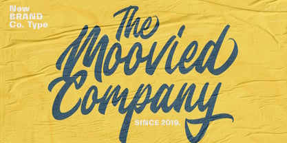 Jesselyne Script is inspired by urban, streetwear and vintage made with a lovely hand-lettering style. It is ideal for branding, logos, handwriting quotes, product packaging, headers, posters, merchandise, social media Books / Cover titles, special events, etc. To enable the OpenType Stylistic alternates, you need a program that supports OpenType features such as Adobe Illustrator CS, Adobe Indesign & CorelDraw X6-X7. There are additional ways to access alternates, using Character Map (Windows), Nexus Font (Windows), Font Book (Mac) or a software program such as PopChar (for Windows and Mac). Thank you for your purchase! Happy creating!
 - Ivoor by Cloveron Media,
$18.00 Meet Ivoor, a new sans serif typeface of the 21st century. It has distinct letter accents and comes with beautiful ligatures. It's a very versatile font that works as standalone or paired with other fonts. It is a great design choice for branding, logo, labels, packaging, magazine headers & so much more. Features: Weights - Regular & Bold Lowercase & Uppercase Classy Ligatures Numerals & Punctuation Multilingual Characters In .otf file Language Support: Western Europe Follow my shop for upcoming updates and new products that you might be interested in next time. Please message me for any suggestions and support. I would like to hear it. Thank you!
 - Mega Arsyta by Yeen Studio,
$19.00 Introducing Mega Arsyta Script Handwritten Font This Font can be used for any variety of purposes, such as: Photography, Wedding Invitation, Packaging Product, Logo Type, Brand, and also can be used for personal purpose. This Font Template contains Modern, Elegant, creative, Professional and Unique Concept. FEATURES - Uppercase & Lowercase letters - Numbering and Punctuations - Ligatures - Multilingual Support - Works on PC or Mac - Simple Installation - Support Adobe Illustrator, Adobe Photoshop, Adobe InDesign, also works on Microsoft Word. All images on the demo is just for preview purpose only and not actually included on the files Hope you Like it. Thanks.
 - Bastion by Volcano Type,
$19.00 Are you looking for a font? One that makes every single word stand out like a bastion? That's been the motive for the design of this font, of every single letter. The font Bastion works at its best if used just for a couple of words, standing by themselves! You can label a subculture brand as well as a very sophisticated space! And don't worry, you won't miss a single character. The Font is fully developed and serves you no matter what you want to set with it, whether in Latin, Cyrillic, Greek, or Hebrew. Have fun with it and enjoy the possibilities.
 - Frontage by Juri Zaech,
$20.00 Frontage is a charming layered type system with endless design possibilities using different combinations of fonts and colors. Achieve a realistic 3D effect by adding the shadow font or just use the capital letters of the regular and bold cut for stark artwork. The typeface’s design is based on a simple grid, which creates the friendly, handcrafted look of facade signs. It is generously spaced for maximum impact of your message. As a display typeface Frontage loves color and is suitable for headlines and logotypes. Details include 224 characters in six styles and manually edited kerning.
 - The Quality Moment by Mokatype Studio,
$25.00The Quality Moment is an elegant, unique font that uses Alternates to smoothly link letters. inspired by the famous minimalist logo, perfect for the purposes of designing templates, brochures, videos, advertising branding, logos, and more. Perfect for adding a unique twist to word-mark logos, monograms, or pull quotes. International Accent Works on PC & Mac Simple installations Accessible in Adobe Illustrator, Adobe Photoshop, Adobe InDesign, even work on Microsoft Word. PUA Encoded Characters - Fully accessible without additional design software. Fonts include multilingual support Image used: All photographs/pictures/vectors used in the preview are not included, they are intended for illustration purposes only. - JWX Memo by Janworx,
$15.00 Memo, designed by Janet Valdez of Janworx, is a digital version of her own personal penmanship, currently displayed in abundance on sticky notes all over her desk and monitor. Although its basis is in actual handwriting, it's perfectly legible, offering a casual alternative typeface for everyday correspondence or simple things, ranging from event flyers to children's birthday party invitations. Memo performs well at regularly used correspondence sizes, but at a larger size can also be manipulated in graphics software for interesting effects. The letters can be moved randomly from the baseline, overlapped, and then contoured with good results for a casual look.
 - Lontare by RGB Studio,
$17.00 Lontare script typeface works really well for Logos and Apparel Design. It's also great for creating Prints or Merchandise, as you can use the illustrative qualities of the shapes to create an art piece. Lontare script typeface includes many different alternates for each lowercase letter. It's extremely fun to use as each word can be transformed to your liking. Files Include : Basic Latin A-Z and a-z Numbers Symbols PUA Encode Multilanguage Support Thanks and have a wonderful day, If you have any questions, please get in touch with us Don't forget to check out our other products.
 - Lunette by Reyrey Blue Std,
$18.00 Introducing, Lunette Typeface. It's strong and classy with an elegant touch of typeface. A unique modern font that is a mix of old and new. Lunette boasts 3 stunning styles, with beautiful upper and lower case letters, numbers, and punctuation marks. Lunette Typeface is perfectly suitable for a layout design for quotes or body copy, best used as a display for headings, logos, branding, magazines, product packaging, invitations: logotypes, and much more. Don't wait to add this font to your collection and explore the uniqueness of this typeface! Features : All Uppercase and Lowercase Number & Symbol Supported Languages Ligatures PUA Encoded
 - Petulante by PintassilgoPrints,
$20.00 Petulante is a striking and creative hand-drawn face with a scribbled feel. It's an all-caps font and brings two options for each letter and numeral for a more organic and natural look. There are yet a few ornaments to add an extra something here and there. Petulante is ideal for book covers, packaging, apparel, album art, posters, or any situation where you want a stylish and uncommon hand-crafted look. And let's not forget to mention the broad language coverage: Petulante speaks more than 208 languages, including Russian and Greek. Yes, just take it everywhere!
 - CAL Bodoni Ferrara by California Type Foundry,
$47.00 Bodoni Ferrara™ Fashionable, Luxury Heritage: The Original Bodoni Ferrara Sculpted from hi-res photos and scans of Bodoni's original Ferrara Font—his 1818 Manuale Tipografico and 1768 specimens. It has never before been available. This cut of Bodoni specially selected by Dave Lawrence from rare book specimens. Part of the California Type Foundry Origin Series. 3 Display Fonts in One!! And 6+ style mixes. Bodoni's 1st Draft - Transitional Serif Bodoni was often inspired by French type designs. His first draft of Ferrara was inspired by Pierre Simon Fournier. But Bodoni added his own Italian sensibilities. Bododni’s first, transitional style can pair with humanist sans, and transitional fonts. Bodoni's Rework - Modern Serif Later, Bodoni reworked Ferrara to match the later neo-classic style or modern serif of Firmin Didot¹. Bodoni’s modern style can pair with geometric sans, grotesque sans, neo-grotesque sans, gothic sans, copperplate script, . Informal On™ - Informal Mode by CAL Type Foundry This can pair with “infant” fonts. Geometric sans, and other sans or serifs with one-storied a’s. + Bodoni’s Tivoli a for another option! Works great with Fournier¹ fonts and grotesques, since the terminals will match. Font Pairing Guide This font includes a 78 page Ferrara Pairing Guide. This book shows you 131 pairings with text fonts. 47 pairings with subheader fonts! We want to help you get more out of your font collection. Design Features • Subtle forward angle (0.5-1.5°) makes Ferrara more lively and engaging than most Bodoni or Didot fonts. • Round curves make this font feel letter-pressed. • Bodoni's original tall x-height and slightly condensed proportions: great for headlines, where space is at a premium. • Better uppercase. Uppercase punctuation for design apps. • Proportional oldstyle and lining figures, both modern style and transitional numbers. Every pair of numbers is kerned for display sizes: no unsightly gaps! • Multiple special symbols for whenever you need a design to pop, including 3 of Bodoni’s amazing ampersands. Language Features Latin standard for western European and other languages. +Advanced support for: German, French, Spanish, Portuguese, Italian, and French. Special, uppercase umlauts for titles! Compare to metal Bauer¹ Bodoni! Special context kerning for French, Spanish, Portuguese, Italian, and French, to allow better better words like L'Angelique & “¿Nosotros?”. This kerning gets rid of unsightly gaps between “¿ and other combinations. Can’t Find the Pairing Guide? Can't find the pairing guide? Google “California Type Foundry” and grab the pairing guide. Get another free pro font while you’re there! Ferrara: many sizes, styles, moods and situations. It's a classic, fashionable font for display, headlines, and titles. Grab Ferrara today! ----------- ¹Trademarks of their respective owners. Ferrara™ is a trademark of the California Type Foundry.
 - FM Bolyar TypeCraft by The Fontmaker,
$29.00 A super font family mastered to an unparalleled level of precision, Bolyar TypeCraft is a collection multiple textured styles that represent historical printing techniques. A proud member of our successful Bolyar lineage this unique type family provides unlimited options for your creativity and is quite able to satisfy every typographic taste. If you are addicted to classic vintage style, then you could easily use Bolyar TypeCraft for almost any project of desire - from letterheads, logos and catchy headlines to elegant packaging, book covers and wine labels. Alternates, Swashes and Ligatures will help you customize almost every single letter and fit perfectly to your artwork. Bolyar TypeCraft provides a broad range of advanced typographical features: Multiple subfamilies each packing the two classic Bolyar styles - Regular (N) and Ornate (O). Five weights per style ranging from thin (100) to black (900) with full multilingual support for all Latin based languages as well as Cyrillic. A 1000+ glyphs per weight including three multilingual stylistic sets, swash designs and useful discretionary ligatures. Sub- and superscript basic Latin and Cyrillic glyphs as well as figures. Two positional models for lowercase accessed as OpenType case sensitive forms - baseline (default) or vertical centering. Contextual alternates and special stylistic set with different contour roughness exclusively developed for Bolyar Rough subfamily. A multifunctional Bolyar Shadow family witch can be flawlessly paired with any of the sub-family styles provided. Check out some great examples of Bolyar TypeCraft in use by the Labelmaker
 - Mundenge Rock by Holland Fonts,
$30.00Borrowed vernacular from African hair studio signs. manually drawn with drop shadow. Used first as cover and label lettering of a cd with music from Zimbabwe, and completed later as a full character set for the typographic issue 'National Typographica' of I-Juici Magazine, in South Afrika. - Pleasant Show Card JNL by Jeff Levine,
$29.00 A beautiful and stylish pen lettered alphabet appears within the pages of the 1921 publication “How to Write Show Cards” and its Art Nouveau stylings made it a perfect candidate for a digital revival. Pleasant Show Card JNL is available in both regular and oblique versions.
 - Margarita Ville NF by Nick's Fonts,
$10.00A whimsical monoline slab-serif font with understated elegance, based on lettering from an old ad discovered by a friend in Spain. Both versions of this font contain the complete Unicode 1252 (Latin) and Unicode 1250 (Central European) character sets, with localization for Romanian and Moldovan. - LD Old Country by Illustration Ink,
$3.00This old fashion font looks like it belongs on a saloon sign. If you've got old west style photos, finish up your scrapbook page with title and journaling done in this cool font. It's perfect for lettering on western themed invitations, newsletters, sign, flyers, even menus. - Praitor by Scriptorium,
$18.00Praitor is based on a devotional inscription to the goddess Diana found a short distance from Rome in 1887. It is an early style from before 100 BC and has some characteristics of Etruscan lettering. It's a rough, strong font which works very well for distinctive titles. - Prospect by ParaType,
$25.00 PT Prospect™. An original serif family designed in 1997-2001 by Natalia Vasilyeva and licensed by ParaType. A face of wide proportions and free lettershapes. The serifs have slanted edges. Based partially on the hand lettering of the author. For use in titling and display composition.
 - Infrastructure JNL by Jeff Levine,
$29.00 A 1930s-era poster to "See America - Welcome to Montana" was issued by the United States Travel Bureau; one of the WPA (Works Progress Administrations) projects promoting travel and tourism within the country. The hexagon-inspired angular lettering on the poster provided the inspiration for Infrastructure JNL.
 - Brown Sugar by Muntab Art,
$18.00 Brown Sugar fonts includes uppercase letters, numerals, a large range of punctuation. Serif font with modern stylish style. Created for poster, web design, branding, illustrations, badges and some other works. Please contact us if you have any question, we are happy to help you! Thank you!
 - Solitude JNL by Jeff Levine,
$29.00 A piece of vintage sheet music with the hand lettered title "Solitude" is the namesake and inspiration for Solitude JNL. Purely Art Deco in its typographic curves and angles of the period, this typeface typifies the "Streamline" style that permeated designs of the 30s and 40s.