10,000 search results
(0.021 seconds)
- Sidiqie by Chococreator,
$5.00 Sidiqie is a modern sans serif with a monoline and minimalist style. With smooth, neat lines, and with just a hint of contrast, Sidiqie works beautifully for logos, branding, and web titles. See examples for some examples of how you can use them. Includes Sidiqie Light Sidiqie Reguler Sidiqie Bold Sidiqie Black Support for western languages
 - ITC Deelirious by ITC,
$29.99ITC Deelirious is the first typeface of Dee Densmore-D'Amico and its name comes from the astounding number of D's packed into her name. The design came from her own handwriting. The differences between capital and lowercase letters are sometimes arbitrary, but this characteristic and the many alternate letterforms give ITC Deelirious the spontaneity and naturalness of true handwriting. - Planca by Vertigo,
$18.00 Planca is a sans serif typeface with medium contrast and distorted rhythm of the line. Spaced and mastered for optimal readability. All lines are of equal thickness. Its morphology is based on the study of traditional writing with a wide tip stick. It comes in 4 different weights (Light, Regular, Bold and Black) and provide multilingual support.
 - Bricola by K-Type,
$20.00 Bricola (rhymes with Nicola) is a condensed display face that contrasts soft curved outlines with sharp cuts and counters. Sturdy and idiosyncratic, Bricola is an eye-catching blend of functional and funky, appropriate for headlines, labels and branding. The licensed family includes Regular and Bold weights that both pack a punch, and also two handy italics (obliques).
 - Magnel by Eimantas Paškonis,
$10.00 Magnel is designed for headlines, posters and big sizes. Besides most Latin alphabet languages, it packs dozens of (accented) ligatures and every single letter has a smart swash variant that when enabled in OT-aware application, conveniently occurs at the start/end of line. Other OT features include: lining/oldstyle numerals, ordinals, popular fractions, capital spacing, scientific superiors/inferiors.
 - Sunbird by Hanoded,
$15.00 Sunbird is a happy, rounded, cartoonish font family. It comes in three weights: regular, medium and black - each with its very own Italic style. Sunbird is quite versatile: it looks good as a display font, but setting a (short) text in it could work as well. Its versatility makes Sunbird an ideal font for product packaging and posters.
 - Bonega by Locomotype,
$16.00 Bonega is a display font inspired by classic typography on ancient stone inscriptions. Consist of 4 weight (light, regular, bold, black) with each matching italics. With sharp and manly characteristics, Bonega family is suitable for powerful headlines, logotypes, beautiful signs, posters and more. Contains more than 400 glyphs including stylistic sets that make your typographic design more attractive.
 - Hierra by John Moore Type Foundry,
$29.90 Hierra is a reinterpretation or redraw letter design of a font that appears in the collection of fonts of Dan X. Solo. Strong German flavor this is a letter of rough edges and a special blackness that recalls ancient typefaces Art & Crafts. Hierra is also presented in the Rough version which increases their antique woodtype appearance.
 - Kithen Mellogia by IM Studio,
$19.00 Kithen Mellogia is a natural handwritten font produced by IM Studio. You'll get a full set of lowercase and uppercase letters, numbers and punctuation, multilingual symbols, alternative lowercase letters, and a binder pack. This font is suitable for branding, signatures, wedding invitations, promotions, product packaging and other needs. This font is natural, simple, yet authentic and very stylish.
 - AT Move Frutta by André Toet Design,
$39.95 FRUTTA (Fruit) is a new typeface made with the ever expanding food industry in mind. But don’t let that deter you from using our font on the cover of the forthcoming cd of the Black Keys or Beady Eye or Damon Albarn or Paul Weller or Daft Punk or Whatever... Concept/Art Direction/Design: André Toet © 2017
 - Sign Work Deco JNL by Jeff Levine,
$29.00 The prolific hand lettering of Samuel Welo is showcased in his “Studio Handbook for Artists and Advertisers” (published in both 1927 and 1960). A thick and thin Art Deco design in the 1960 edition – somewhat reminiscent of Futura Black (but with significant differences) is now available as Sign Work Deco JNL in both regular and oblique versions.
 - Dance and Sing JNL by Jeff Levine,
$29.00 A 1932 fan magazine from Spain entitled “Films Selectos” (“Select Films”) had those words hand lettered in a decorative Art Deco type style that was a cross between the “Futura Black” style of stencil influenced display lettering and “Fiesta” lettering. This hybrid design is now available digitally as Dance and Sing JNL in both regular and oblique versions.
 - Curlaight by Outerend,
$18.00 The type family “Curlaight” has whimsical curly shapes but has some level of uniformity with straight lines and angles. These modern retro feel fonts look great for children’s books, posters, book covers, packaging labels, or even logos like TV and movie titles. Seven weights - thin, light, regular, medium, semibold, bold, and black - are available for your creative projects.
 - Birch Beer JNL by Jeff Levine,
$29.00Birch Beer JNL comes from lettering spotted on a European business sign found in some stock footage that was used for an old black and white film about World War II. The name is derived from a popular root beer-like soda sold by the Royal Castle Restaurants that were popular in Florida from the 1930s through the 1970s. - Muscleman by Big Typephoon,
$20.00A strong, heavy font that really packs a punch. Muscleman is there when your design needs a little extra lift. Originally created for a poster project, the font juiced up and grew quickly into the large fat size it is today. It works well for logos, posters, and t-shirt designs and has a slight deco look. - Railway Point by Melissa Lapadula,
$11.95This typeface has been influenced by the ongoing traffic congestion in Melbourne, and its lack of functional and reliable public transport as a possible solution. The font shapes are square-edged constrained angles, reflecting the way the Melbourne population feels when using the public transport system or roads. Use as headings and body copy in any graphic situation. - Breathless by Wiescher Design,
$39.50 Breathless was inspired by movie posters of the Nouvelle Vague era when Jean Seberg and Jean-Paul Belmondo were young and films where in black and white. So I named this very spiky affair after that phantastic movie of my youth A bout des souffle or like it was called in English, Breathless. -Your breathless type designer, Gert Wiescher
 - Pass the Port by Comicraft,
$39.00There are Rum doings in the harbor tonight, me hearties! Black-hearted buccaneers are gatherin' in the tavern and there's talk of gunpowder, treason and plot. Even if there are ladies in the room, we advise that you Pass the Port, put away your pieces of eight and weigh anchor until the Pirates have Caribbean and gone. - MyCard by John Moore Type Foundry,
$15.00 MyCard is a display sans serif font of modernist spirit, where uppercase letters take the height of the lowercase letters (unicase), where only ascending and descending exceed the x-height. MyCard is ideal for creating logos, packaging, labels, advertising and short titles, in texts produced interesting textures. MyCard comes in three weights Regular, Bold and Black.
 - 3D Cursive by Okaycat,
$29.95 3D Cursive is an extruded cursive family with multiple styles. The 3D Cursive font is extruded in delicate outline. 3D Cursive Stencil is an alternate style in bold black. 3D Cursive Simple provides a perfectly matching, yet non-extruded style. 3D Cursive is extended, containing West European diacritics & ligatures, making it suitable for multilingual environments & publications.
 - Brush Marker by Fenotype,
$18.00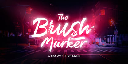 Brush Marker is a strong hand drawn dry brush font. Brush Marker is great for headlines and logotype use. Brush Marker is packed with automatic Contextual Alternates and Standard Ligatures that keep the text vivid. Brush Marker has a wide language support and it is PUA encoded so you can access extra glyphs in most graphic design softwares.
 - AT Nezue by Amera Type,
$10.00 Nezue is our first font family consisting of neat and elegant lowercase and uppercase letters, comes with 9 styles (Thin, Extra Light, Light, Regular, Medium, Semi Bold, Bold, Extra Bold, and Black) Formed in a modern style that can help your visual branding look younger, detailed letterforms for optical contrast can make this font even more attractive
 - Iago NF by Nick's Fonts,
$10.00Two classics from American Type Founders specimen catalogs of the 1880s—Othello and ATF Black Caps—inspired this powerful headline face with a decidedly menacing quality. Suitable for creepy, eerie and spooky occasions. Both versions of the font include complete Latin 1252, Central European 1250 and Turkish 1524 character sets, with localization for Moldovan, Romanian and Turkish. - Marthiline by Motokiwo,
$15.00 Introducing Marthiline: a sweet beauty handwritten font that is perfect for beauty branding, book covers, posters, magazines, or quotes. Marthiline is packed with uppercase, lowercase, numeral & punctuation, multilingual and ligature that already PUA encoded. With its real brush texture and natural stroke gesture you can use this font stand alone or combine it with a thin sans serif.
 - Pragnea by Hazztype,
$20.00 Introducing Pragnea, a modern sans serif font with a unique touch. It had many unique quirks such as its distinctive e, curved stroke on R, K, V, W, and many others. The type family consists of three weights plus matching italics. Packed with 300+ glyphs, it works well both for impactful headlines and for reading sizes.
 - Eastport JNL by Jeff Levine,
$29.00 Eastport JNL is the interpretation by Jeff Levine Fonts’ of the classic Stymie Extra Bold (a/k/a Stymie Black), designed in 1931 for American Type Founders by Morris Fuller Benton. Stymie and the somewhat similar Beton were both derivations of the popular European typeface Memphis. Eastport JNL is available in both regular and oblique versions.
 - SF Tobba by Sultan Fonts,
$19.99 Tobba is an Arabic typeface for desktop applications, for websites,designed for Newspapers, magazines and cover titles. Tobba font family is Modern style and contains 3 weights: Regular, bold and black. The font includes support for Arabic, Persian, and Urdu. It also includes proportional and tabular numerals for the supported languages. Sultan typeface comes with many opentype features.
 - Vida Bandida by Vozzy,
$20.00 Introducing vintage label font named Vida Bandida. It is based on my other font, Black Widow. All available characters you can see at the screenshots. This font has six styles: Regular, Full, Shadow, Shadow FX, Texture and Texture FX. This font will look good on any vintsge styled designs like a poster, T-shirt, label, logo, etc.
 - Noah by Fontfabric,
$39.00 [Noah PDF Type Specimen] [Download 4 Free Fonts] Noah is more than just another geometric sans. With sharp details and a distinctive arrangement, it further extends the limits of the x-height, providing unparalleled flexibility. The specific structure is paired with normal width proportions, moderate contrast and vertical stress – making Noah well suited for a wide range of typographic purposes. This type family consists of 72 fonts divided into four subfamilies with different x-heights – ranging from Noah Grotesque at the bottom, through Noah and Noah Text, and extending to the highest one – Noah Head. The entire set includes styles from Thin to Black, with matching true italics and supports Extended Latin and Cyrillic scripts in more than 130 languages. The inclusion of terminals with a humanistic flavor and typographic letter alternates, such as the binocular “g” or the geometric “a”, offers a blend of the best aspects of both geometric and grotesque typeface classics. Noah features 4 weights that are available completely FREE. Features: • Over 650 glyphs in 72 styles (Thin to Black) • Extended Latin and Cyrillic scripts for more than 130 languages; • 4 different x-heights; • Normal width proportions; • Moderate contrast and vertical stress; • Geometric characteristics and terminals with humanistic flavor.
 - Lazare Grotesk by Nootype,
$40.00 A dynamic and strong new Grotesk, Lazare Grotesk is a family of 21 styles. The family comprises seven weight, from UltraThin to Black, with not only italic but with backslanted too, which allows to make fun and cool layout. In the black weight the font is particularly contrasted. This family contains many OpenType features, such as Alternates, Proportional Figure, Tabular Figures, Old Styles Figures, Numerators, Superscript, Denominators, Scientific Inferiors, Subscript, Ordinals and Fractions, which make that typeface useful in various projects. The fonts have an extended characters set to support Central, Eastern and Western European languages. Lazare Grotesk supports Latin and Cyrillic, all these languages are covered: Latin language support: Afar, Afrikaans, Albanian, Asturian, Azeri, Basque, Bosnian, Breton, Bulgarian, Catalan, Cornish, Corsican, Croatian, Czech, Danish, Dutch, English, Esperanto, Estonian, Faroese, Filipino, Finnish, Flemish, French, Frisian, Friulian, Gaelic, Galician, German, Greenlandic, Hungarian, Icelandic, Indonesian, Irish, Italian, Kurdish, Latin, Latvian, Lithuanian, Luxembourgish, Malagasy, Malay, Maltese, Maori, Moldavian, Norwegian, Occitan, Polish, Portuguese, Provençal, Romanian, Romansch, Saami, Samoan, Scots, Scottish, Serbian, Slovak, Slovenian, Spanish, Swahili, Swedish, Tagalog, Turkish, Walloon, Welsh, Wolof Cyrillic language support: Adyghe, Avar, Belarusian, Bulgarian, Buryat, Chechen, Erzya, Ingush, Kabardian, Kalmyk, Karachay-Balkar, Karakalpak, Kazakh, Komi, Kyrgyz, Lak, Macedonian, Moldovan, Mongol, Permyak, Russian, Rusyn, Serbian, Tatar, Tofa, Tuvan, Ukrainian, Uzbek
 - Idiom by Reserves,
$39.99 Idiom is an extra-condensed, tightly spaced display face with congruent forms exuding a strong sense of rhythm and elevation. The basic stenciled geometric shapes are reminiscent of the decorative style found with P22 Albers and Futura Black. Careful consideration of each letter's construction, relative to all characters, lends Idiom a decided sense of cohesion and sophistication. The included non-traditional 'weights' (Medium and Bold) are completely blacked out, creating entirely new letterforms that exhibit a very stark, contemporary sense. Increasing the versatility of the Idiom family, a selection of OpenType features allow access to a set of contrasting linear punctuation forms, unconventional ligatures, case-sensitive punctuation and more. Features include: Basic Ligature set including 'f' ligatures (ae, oe, fi, fl, ff, fh, fj, ft, fa, ct, st, rt, ot, ta, sa, mi, si, vi, su, oc, oo, ru, ib) Alternate characters (M, W, T, ß, _, $, @, (), {}, [], /, \, |, -, –, —, +, -, ±, ≤, ≥, , «, », and more) Case forms (shifts various punctuation marks vertically to a position that works better with all-capital sequences, in this case the numerals or letters with ascenders) Slashed zero Full set of numerators/denominators and superscript/subscript Automatic fraction feature (supports any fraction combination) Extended language support (Latin-1 and Latin Extended-A) *Requires an application with OpenType and/or Unicode support.
 - Albertina by Monotype,
$29.99Albertina was a typeface ahead of its time. It was in the early 1960s when designer Chris Brand, an accomplished calligrapher, aspired to draw a typeface based on the principles of calligraphy. Unfortunately, typesetting machines of that era put many restrictions on designers. Characters had to be drawn within a very coarse grid, which also defined their spacing. Technological limitations meant that italic designs often had to share the same character widths as the romans. Designers were forced to draw italic faces much wider and with more open spacing than what would be typical in calligraphic lettering or hand-set type. Not surprisingly, production of the first Albertina fonts went very slowly. Brand would submit his character drawings, and the Monotype Drawing Office would modify them to be compatible with the company's typesetting equipment. The new drawings would then be sent back to Brand for approval or rework. Most were reworked. The process took so long, in fact, that by the time the face was completed it was once again out of phase with the times: instead of being released as metal type for the Monotype composing machines it had been tailored for, Albertina debuted as phototype fonts for the Monophoto typesetter. The design's first use was for a catalog of the work of Stanley Morison, exhibited at the Albertina Library in Brussels in 1966. Sales of the design were not remarkable. With the advent of digital type technology, Albertina's story took a far happier turn. Frank E. Blokland, of the Dutch Type Library, used Brand's original, uncompromised drawings as the foundation of a digital revival. The Monophoto version had taken a considerable battering from the limitations of Monotype's unit system," recalls Blokland, "but there was no need for me to incorporate these restrictions in the digital version." With the full backing of Monotype and original designer Brand looking over Blokland's shoulder, a new design for Albertina emerged, displaying all the grace and verve of Brand's original drawings. The basic family drawn by Brand also grew into three weights, each with an italic complement and a suite of small caps and old style figures." - Les Tulipes Pro by Fontforecast,
$29.00 We present Les Tulipes Pro. A smart, classy, modern calligraphy layered type system that offers an array of versatility. Les Tulipes Pro is hand drawn with dip pen and ink, with great attention for details. To name a few: - Elongated entrance and exit strokes ( type ++1 to ++10 in front and __1 to __10 at the back of any letter) - 5 different connecting spaces that make it appear as if the pen was never lifted from the paper (type space1 to space5 wherever you want the connecting spaces to appear) - 9 alternate ampersands (type &1 to &9) - 2 alternate at signs (type @1 or @2) - 5 stylistic sets for alternate characters Note: Discretionary ligatures must be ON The various designs of Les Tulipes Pro harmonize beautifully. Les Tulipes Pro Sans was designed to complement and support the other styles. The more straight forward appearance of the Sans styles enable you to balance out your designs perfectly. The Bold and Closed versions offer even more possibilities to combine or highlight words and phrases. On top of that Les Tulipes Pro Extra, with its 85 gorgeous swirls and swashes tempts you to further embellish your design.
 - Thread Starter by Colllab Studio,
$19.00 "Hi there, thank you for passing by. Colllab Studio is here. We crafted best collection of typefaces in a variety of styles to keep you covered for any project that comes your way! Not being able to communicate trustworthiness, authority and professionalism? Is your brand lacking personality too? That’s where Thread Starter come in. Our fonts have been exclusively designed to communicate trustworthiness, authority, and professionalism. We are here to serve you with the right fonts to help your brand stand out. Use Thread Starter to communicate trustworthiness, authority and professionalism straight into your audience’s heads. Your ideal clients will love the unique and high perceived quality of your brand on its own merit. A Million Thanks www.colllabstudio.com
 - Apricosa by SG Type,
$19.00 Apricosa – A beautiful bold serif with vintage swashes, alternate letters and ligatures. Apricosa is a delightful, modern take on a vintage font. Packed with plenty of alternates and ligatures to really bring it to life! Create stunning designs that are truly unique to your brand. Vary between a light and heavy vintage look based on how many letters you alter. Due to its large selection of alternate letters and ligatures, Apricosa is very versatile, covering a wide range of project types, from unique branding, to bold magazine design, to vintage wedding invitations, and so much more. FEATURES Uppercase alphabet Lowercase alphabet 41 alternate glyphs 36 ligatures big range of numbers, symbols & punctuation comprehensive language support
 - Arlon by Marc Lohner,
$28.00 Arlon makes it easy to give any brand or advertising a cool & futuristic look. Thanks to its spurless letterforms and some uncommonly shaped letters, this typeface creates a strong visual impact even in small sizes. Having generously rounded angles and terminals, Arlon also spreads warmth and friendliness. To sum up, Arlon communicates an affinity for technology – in a friendly way. The family contains a really wide span from thin to black and has many Opentype features as well as many numerical variations to offer, making it a versatile font. From Afrikaans via romanized Chinese through to Zulu: Arlon comes with 631 glyphs per font, covering more than 200 languages. Designed by Marc Lohner in 2018.
 - Merrymakers JNL by Jeff Levine,
$29.00 A throwback design reminiscent of 1950s signage and print ads, Merrymakers JNL takes a previous release (Bluesman JNL) and places the letters and numbers inside parallelograms with ‘TV screen’ openings. Merrymakers JNL is available in both regular and oblique versions. The upper case A-Z characters have the taller side of the shape to the left, while the lower case a-z has the taller side to the right. To make a ‘fan fold’ or zig-zag message, simply alternate upper and lower cases as in this example: C-a-R D-e-A-l-E-r-S You can type spaces between words, but if you prefer blank connectors, use the following: Upper case solid black connector – left bracket key Lower case solid black connector – right bracket key Upper case ‘TV screen’ connector – left brace key Lower case ‘TV screen’ connector – right brace key There is a very limited set of punctuation available. The upper case ampersand, question mark, exclamation point, period, comma, single quote and double quote are all on their respective key positions, but to accommodate the lower case [smaller side] versions, those glyphs have been reassigned to other standard keyboard positions: Type @ to get & Type # to get ? Type $ to get ! Type ^ to get . Type * to get , Type - to get ’ Type = to get ” Additionally, to access the lower case [smaller side] versions of the numerals, type the following keys: Type % to get 0 Type ( to get 1 Type ) to get 2 Type + to get 3 Type / to get 4 Type : to get 5 Type ; to get 6 Type < to get 7 Type > to get 8 Type \ to get 9
 - Once upon a paragraph, in the mythical realm of typography, there emerged a legend from the creative foundry of deFharo – The Black Box. Picture this: if fonts were a grand dinner party, The Black Bo...
- 1510 Nancy by GLC,
$20.00 This set of decorated initial letters was inspired by those used in 1510 in Nancy (France, Lorraine) for printing of "Recueil ou croniques des hystoires des royaulmes d'Austrasie ou France orientale[...]" Author Symphorien Champion, unknown printer. There were three sorts of initials family, but only one complete and clear, except a very few characters. The printer used some letters to represent others, as V, turned over to make a A, D to make a Q, M for E, So, the reconstruction was a little less difficult. Thorn, Eth, L slash and O slash were also added. The original font's letters was only drawn in white on a black background only, but it was tempting to propose a negative version in black on white. A few letters have multiple appearance, but only the A was clear enough to be reproduced. It can be used as variously as web-site titles, posters and flyer design, publishing texts looking like ancient ones, or greeting cards, all various sorts of presentations, as a very decorative, elegant and luxurious additional font... This font supports strong enlargements revealing its fine details and remaining very smart. Its original medieval height is about one inch equivalent to about three to four lines of characters. This font may be used with all our blackletter fonts, but as well with "1543 Humane Jenson", "1557 Italic" and "1742 Civilite", without any fear about anachronism.
 - Brinar by Hackberry Font Foundry,
$24.95 I've been working on a usable sans serif for body copy since the mid-1990s (though I certainly did not know it at the time). This one works well. It started life back in the mists of time as a scan of an old German font by Carl Fahrenwaldt. It was developed fully as a synergized serif with strong traditional roots and released as Bergsland Pro. Now it finally makes it to where I was headed all along as a sans text font. This is a well modulated humanist, sans serif font family with many OpenType features and over 600 characters: Caps, lower case, small caps, ligatures, swashes, small cap figures, old style figures, numerators, denominators, accents characters, ordinal numbers, and so on. It is designed for text use in body copy. But it also works very well for elegantly stylized display.