6,500 search results
(0.013 seconds)
- Los Lana Niu by Latinotype,
$45.00 Los Lana Niu was designed by Bruno Jara and Luciano Vergara. The typeface is based on Los Lana (2007). Along with the redesign, the font has increased from 1 to 24 different styles. This new version preserves the rustic aesthetics of the original typeface, but it lacks of curves and it visually looks as if it was a nirregular font. Los Lana Niu comes with a wide range of ligatures included in every weight: from Thin to Black. In order to offer a wide array of uses, the typeface has been structured by adding acomplete family of small caps, which makes this font well-suited for headlines, posters, branding and publishing design. Los Lana Niu comprises 3 subfamilies: Los Lana Niu Essential (392 glyphs) – including both regular and alt versions, Los Lana Niu Small Caps (392 glyphs) and Los Lana Niu (820 glyphs), which includes a variety of OpenType features such as stylistic ligatures, contextual alternates and small caps.
 - Lagosi by Jetsmax Studio,
$- Lagosi is a pointed serif typeface inspired by the features on the lagosi fabric found in wajo. They range in weight from light cuts that are bold and elegant to black and strong. Packed with more sets of Italic gestures and other custom bindings, this typeface is perfect for adding sparkle and elegance to your designs. What’s Included: Ligature & Unique Works on PC & Mac Simple installations Accessible in the Adobe Illustrator, Adobe Photoshop, Adobe InDesign, even work on Microsoft Word. PUA Encoded Characters – Fully accessible without additional design software. Fonts include multilingual support for; Afrikaans, Albanian, Catalan, Danish, Dutch, English, French, Hungarian, Icelandic, Italian, Spanish, Portuguese, German, Swedish, Norwegian, Polish, Indonesian, Turkish, Zulu Lagosi is very suitable for branding projects and many designs purpose like advertising, posters, invitations, branding, logos, magazines, merchandise, presentations, etc. Get Free one weight from the Lagosi family for Free! Apply to your amazing projects and enlarge your creative tools by adding the complete Lagosi family to your font library.
 - Arbour Soft by TypeUnion,
$35.00 Arbour Soft is the cheeky version of it's big brother, Arbour. The soft version creates a smooth finish that flows perfectly across screens and print. Arbour Soft comes in 7 weights, from a delicate extra-light to a soft, strong black, with matching soft italics for each upright. The soft black weights are perfect for your new brand or article headlines, and the light weights are great for calling out text. The mid weights are perfect for longer texts.
 - ITC Woodland by ITC,
$29.99ITC Woodland is the work of Japanese designer Akira Kobayashi. It is based on Kobayashi's hand lettering with a flat brush or square-edged pen. I wanted to design each weight to act its own part," says the designer. "The light version tends to look almost fading in small sizes, but the heavy weight is as black as Cooper Black." The cheerful ITC Woodland is ideal for graphics, greeting cards, correspondence, and other applications requiring a light touch. - Knip by Hanoded,
$15.00 Knip, in Dutch, means ‘cut’. You can tell by the glyphs that I made this font by cutting out the shapes from black paper, gluing it onto white paper and photographing the result so I could digitalise it! I don’t make too many cut out fonts, as it is a lot of work and it often leads to nothing. Besides that, I depend on the paper supply from my kids and they happened to have black paper this time!
 - Alphacal JNL by Jeff Levine,
$29.00Alphacal JNL and Alphacal Black JNL are variants of the same lettering style found in Jeff Levine's Juneway JNL font... all based on water-applied decals once made by the Duro Decal Company (now Duro Art Industries) of Chicago, Illinois. Alphacal JNL can be used alone as an outline font (best at 18 pt. and above) or with Alphacal Black JNL as a backfill. Note: Perfect registration is not guaranteed. Some user adjustments may be necessary. - Black Jack Personal Use is a font that perfectly captures the essence of spontaneity and elegance, skillfully crafted by the talented designer Billy Argel. This font stands out with its unique blend ...
- Cucaracha by Characters Font Foundry,
$9.95 Cucaracha is a freaky, crazy, flowery-kinda looking family of two fonts: Cucaracha Font & Cucaracha Wixa. Cucaracha Font is like a plant starting to bloom in spring. It comes with an assortment of 8 additional icons all available through the standard keys. They are easily positioned so you can combine the icons and make an endless variety of patterns, structures and frames. Cucaracha is custom made for the Volcano ‚Bastard Project’ and was published in the project book.
 - Maurice Dufrene Initials by Celebrity Fontz,
$24.99Luxurious high-quality ornamental initials superimposed on elaborate Art Deco drawings of plants and flowers, inspired by 18th and 19th Century French designs, with a modern approach. Includes one set of A-Z ornamental initials conveniently assigned to both the upper and lower case alphabet characters. Beautifully ornate and perfect for the beginning of paragraphs in publications and texts conveying the feel of the 1920s and the Art Deco movement, garden-themed texts, or fairy tales. - Kurtistown by Maulana Creative,
$12.00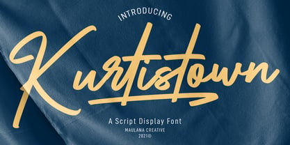 Kurtistown is a script font. With sharp felt-tip stroke, uslanted and fun character with a bit of ligatures and swashes. To give you an extra creative work. Kurtistown font support multilingual more than 100+ language. This font is good for logo design, Social media, Movie Titles, Books Titles, a short text even a long text letter and good for your secondary text font with sans or serif. Make a stunning work with Kurtistown font. Cheers, MaulanaCreative
 - Romper by DearType,
$29.00 Romper is a slightly narrow handwritten sans in four weights and it is perfect if you want to convey a casual and friendly feel. It was designed with the idea to be used on comic books, mobile applications and children’s books, thus it has a Dancing Baseline version (Romper DB) and a Slanted version (each of them in four weights as well). The family is equipped with 450+ glyphs, has Latin Extended and Cyrillic Support (both Russian and Bulgarian) and a lovely set of extras. The family includes a lot of discretionary ligatures and alternate letters for more variety in the design. Overall, Romper is cute, amiable and really versatile, so it will fit most applications - think greeting cards, menus, merchandise, books, packaging, websites, etc.
 - Gazzetta by TipoType,
$24.00 Gazzetta is a condensed font family with a display character and neo-grotesque nature, friendly and energetic. It exhibits softened features and curves, very sharp joins between some strokes, and a slight reverse contrast in its thicker weight. Characteristics that give it a lot of personality and display capacity.The family is made up of 8 weight variables and their respective slanted versions, with substitutions in some glyphs that seek to maintain an italic flavor. It has a repertoire of OpenType features, including Stylistic Alternates, Case Sensitive Forms and Old Style Figures. In addition to decorative resources such as circled numbers, arrows and quotation marks. Its aesthetic and technical attributes can be used in the design of book covers, newspapers, magazines, posters, large format materials, websites and apps.
 - Sheepman by Dharma Type,
$19.99 Sheepman inspired by and based on retro William Page’s No.506 typeface which is popular wooden type fonts of the 19th century. To make soft and natural impressions, the original polygonal design was changed to rounded design. All glyphs had been designed carefully to be retro-looking of the old time and to fill all with nostalgia. This modern wood type includes 3 weights and their matching slanted style and all style have sprayed ends(beginning) alternates for F, H, L, M, N, P, U, f, h, j, m, n, p, q, and u which can be accessed by using OpenType Stylistic alternates or swash alts. Sheepman will be the best solution for posters, titles and anywhere you need vintage lettering.
 - Sandokan by Matyas Machat,
$30.00 Sandokan is a brush script font with a character and morphology that nears Oriental calligraphy, Art Nouveau typefaces, psychedelic “flower power” fonts from the Sixties and Tuscan poster fonts from the 19th century. Its main features are the high contrast between thick and thin strokes and the extreme slanted angle in the typewriter imprints, creating inverse shadowing. The letter set is further accentuated by exotic decorative details and the often unusual connectors between small letters. The typeface supports all languages using the universal Latin character set. Sandokan is a slightly sweetened cultural cocktail. As such it looks best on everything that needs to come across as exotic and rather solid but unmistakeably eccentric - such as labels and packaging on exotic delicacies or circus posters.
 - Cutmark by J Foundry,
$25.00 INDUSTRIAL-STRENGTH UTILITY. Designed for function. Cutmark fonts features common 45˚ chamfered corners, flattened ink traps and wide apex forms. Customize the look with alternates including an Angled Set, Straight Set, Beam I, single-story a, and hooked l. The OpenType version includes 10 weights in 3 widths with matching italics. Variable Font Cutmark Variable contains the full family of styles in a single file! Select variations along width, weight and slant axes. Test and explore at jfoundry.com. Cutmark Variable is included in the complete package at no additional cost. Use which ever font format you prefer! Please email hello@jfoundry.com for any questions. Variable Fonts require MacOS 10.14 or higher. For browser and software support visit: v-fonts.com/support
 - Flash Script by FadeLine Studio,
$19.00 Flash Script is a modern script font. This is a beautiful font with slanted handmade style. Made by soft and slowly aims to give the character of modern writing that is smooth, cute, simple, stylish, sweet and dancing. This font can be used anywhere as the main font or as a pairing font. With a style like this, this font will be suitable in use for lettering logo's, branding projects, homeware designs, product packaging, mugs, quotes, posters, shopping bags, t-shirts, book covers, name card, invitation cards, greeting cards, and all your other lovely projects. Available 611 glyphs in it! So you can freely and comfortably use it when you make your best design work. This Font support with Opentype Feature! Thank you
 - SomaSlab by ArtyType,
$29.00 The 'Somatype' range has expanded further with this latest addition to the collection, titled SomaSlab. Although the basic letterforms are the same as in the generic Somatype family, the introduction of slab-serifs to appropriate characters has transformed the typeface into something new, creating a completely different styling in the process and striking a pleasing balance between classic & contemporary styles. The fishtail and curved serifs on certain characters also introduces a unique quirkiness, making SomaSlab stand out alongside most classic slab serif fonts. Some alternative characters are available too, together with an extended Latin glyph set, allowing users a variable choice and great versatility for text settings. SomaSlab comes in both Regular & Slanted styles, each in 4 practical weights, providing plenty of flexibility on any creative project.
 - Heket by Eurotypo,
$48.00 Heket was a goddess of childbirth and fertility in Ancient Egypt. She was depicted as a frog, or a woman with the head of a frog. Frogs symbolized fruitfulness and new life. Heket font is an expressive handwritten font, it is available in four versions: Regular and slanted. They have many advantages of the OpenType futures to choose from: stylistic alternates, swashes, contextual alternates, and a full set of standard and discretionary ligatures. Heket supports all diacritics for CE languages; they come also with a huge variety of ornaments, underlines, beginnings and word endings that will allow you to work in a creative way. They've been specially thought to use in packaging design, children books, advertising, logotypes, greeting cards, web sites and much more.
 - Matahati by Locomotype,
$15.00 Matahati is a script font that is created based on the modern calligraphic style which is reprocessed by combining passion and deep feelings to create beautiful artwork and memorable. Besides bringing charming basic characters, Matahati also offers OpenType features that will facilitate the work of typography and graphic design. It includes Standard Ligatures, Stylistic Alternates, Terminal Swashes, Regular Swashes, Stylistic Set and PUA (Private Use Area) Unicode. This font also presents the beautiful ornaments of Matahati Swash, so it will be easier to mix and match your design. Matahati is suitable for the design of posters, invitations, quotes, headlines etc. Matahati comes in various styles — Regular, Slant, and Swash — each with its own unique personality to suit the style you need for your design.
 - Soul Drifter by Ana's Fonts,
$15.00 Soul Drifter is a handwritten font collection of 6 fonts that were designed to go together nicely. All six fonts were drawn using the same brush pen, so that their weight and design are consistent, and you can mix and match them easily. Soul Drifter includes: - a brush script font in regular and slant versions, with over 100 ligatures - a matching set of swashes to ornament your texts and designs - a cute sans font in two weights, regular and bold (true bold, drawn separately) - a tall serif font in all caps, with two sets of caps All you need for beautiful and easy designs with a hand-lettered feel, such as postcards and notes, creating logotypes, social media posts, branding and packaging, etc.
 - Deliscript by Alphabet Soup,
$29.00 Although initially inspired by the neon sign in front of Canter’s Delicatessen in Los Angeles, the design of Deliscript Upright and Deliscript Slant soon took on a life of its own–and its own distinctive look. Like its sibling Metroscript, Deliscript has many features that expand its usability such as the the variable length tails which can be accessed in 6 different styles, and the never before seen crossbars which can be extended outward in either direction from the lower case “t”. Throw in the special “WordLogos”, tons of ligatures and foreign accented characters, and you have a recipe for typesetting that approaches the look of hand-lettering. For a better understanding of its unique features please download The Deliscript User Manual—available in the Gallery section.
 - Chiefland by Letterhend,
$17.00 Garetra Serif s a sophisticated variable serif font with with many weight you can choose. It has 12 weight styles which you can play around to match your project, whether for a standout headline, or for a tagline, you name it. Perfect to be applied to the other various formal forms such as invitations, labels, logos, magazines, books, greeting / wedding cards, packaging, fashion, make up, stationery, novels, labels or any type of advertising purpose. Features : variable font with 6 weight style regular and slant uppercase & lowercase numbers and punctuation multilingual alternates & ligatures PUA encoded We highly recommend using a program that supports OpenType features and Glyphs panels like many of Adobe apps and Corel Draw, so you can see and access all Glyph variations.
 - Axion by Type Innovations,
$39.00 Axion is an original design by Alex Kaczun. It is a display font not intended for text use. It was designed specifically for display headlines, logotype, branding and similar applications. The entire font has an original look which is strong, dynamic, machine generated and can be widely used in publications and advertising. Axion is a futuristic, techno-looking and dynamic typeface with elements of machined-like parts containing sharp and rounded edges. This attractive display comes in roman with lower case and lining figures. The font is also available with true-drawn slant italics. Other design style variations include small capitals with old style figures. The large Pro font character set supports most Central European and many Eastern European languages.
 - Hermitage by Larin Type Co,
$15.00 Hermitage is a modern, elegant serif font that includes six typefaces regular, outline, oblique, outline oblique, rough and rough oblique. This font has a light weight and looks amazing in logos, branding, arranging wedding invitations, business cards, packaging, cosmetics, also works perfectly with text, it is very readable and recognizable, book cover, magazine headers, or simply as a stylish text overlay to any background image. This font includes alternates for Uppercase and Lowercase, with them you can make your project more elegant and unique and the slanted style will add dynamics to your design. Use a rough style on the craft paper, it will look great on it and create an atmosphere of handwriting. This font is easy to use has OpenType features.
 - Mondish by Tour De Force,
$25.00 Mondish is an elegant sans serif family that comes in five weights with matching Italics. Commonly recognized as fashionable font by its design and main purpose, Mondish is actually much more than that. Characteristic by high contrasted stems, gentle calligraphic endings of lowercase letters, slightly condensed Italics and slanted letter axis through the entire family, it leaves an impression as a designer's charming partner for a wide variety of projects. Mondish is equipped with OpenType features such as Stylistic and Contextual Alternates, Oldstyle Figures, Ordinals, Subscript and Superscript, Initial Forms, Denominator, Numerator and Fractions with Standard and Discretionary Ligatures followed with Small Caps. Beside basic and extended Latin character set, Mondish comes with Cyrillic support. Exactly 700 glyphs in total.
 - Auteur by Up Up Creative,
$29.00 Introducing Auteur, a graceful, full-featured script font with tons of alternate characters and OpenType features. Hand-lettered with a heavy right slant and realistic disconnected letters (connected versions also included), Auteur’s casual elegance is particularly well-suited to invitations, branding, and editorial design. Auteur comes with more than 1200 glyphs! Specific OpenType features include contextual alternates, stylistic alternates, optional initial and final forms, multiple alternate glyphs for many letters (accessed through the glyphs panel), multilingual support (including multiple currency symbols), ligatures, multiple numeral forms (standard, tabular, proportional oldstyle), and ten ampersand styles. Perhaps the most fun thing about Auteur is that it includes multiple versions of all ascending and descending letters, making it lots of fun to play with layouts and compositions.
 - Hijabella by IbraCreative,
$17.00 Hijabella, a natural handwriting font, weaves an organic elegance into the realm of digital typography. With fluid strokes and a graceful rhythm, this font emulates the authenticity of hand-scripted messages. Each letter carries a unique charm, reflecting the imperfections and nuances found in real handwriting. The subtle variations in line thickness and the gentle slant of characters create an inviting and personal touch, reminiscent of pen meeting paper. Whether used for invitations, heartfelt notes, or creative projects, Hijabella’s natural flow captures the essence of a handwritten message, adding warmth and sincerity to the digital medium. Its versatile and effortless aesthetic makes it a perfect choice for those seeking a font that seamlessly blends the convenience of technology with the personal touch of genuine penmanship.
 - Lirio by Eurotypo,
$48.00 Lirio is a decorative and expressive typeface, it’s elegant yet eccentrically handwritten font. Lirio is presented in two versions: Regular and Slanted. They have many advantages of the OpenType futures to choose from: stylistic alternates, swashes, contextual alternates, and a full set of standard and discretional ligatures. Lirio supports all diacritics for CE languages; they come also with a huge variety of ornaments, underlines, beginnings and word endings that will allow you to work in a creative way. Lirio can fit into many clients’ design brief. They've been specially thought to use in packaging design, children books, advertising, logotypes, greeting cards, restaurants, web sites and much more. These fonts may enlarge your graphic capabilities and your work can be more competitive.
 - Rotulo Variable by Huy!Fonts,
$195.00 Rotulo Variable is a contrasted sans family which combines the Thick & Thin signpainter's style and some 70s feeling in a huge font family with three axis: Width, Weight and Slant. A visit to an exhibition of Spanish movie posters by Jano was the beginning of Rótulo (Spanish for Sign) project. Classic thick & thin signpainter style was featured in many letterings of those posters, as it was a very common style in 60s and 70s Spanish design. Unfortunately, today very few Contrasted Sans are seen, something that was quite common years ago has fallen into disuse in favor of Helvetic monotony. Rótulo recapture all that personality, with an extense range of weights and widths to be used in striking headlines and short texts.
 - Analogia by George Tulloch,
$21.00 Analogia is a digital interpretation of types used in the mid-18th century in books printed at Leuven by Martin van Overbeke. It is intended primarily for use in running text. The roman is businesslike, yet with a distinct personality; it has a generous x-height and is slightly condensed, though without appearing cramped. It is complemented by a more lively italic, which retains some irregularities in the angle of slant that are characteristic of the original. Analogia provides wide support for west, central, and east European languages that use the roman alphabet. Among its OpenType features are ligatures, small caps, several sets of numerals, contextual alternates, intelligent implementation of long ‘s’, and fractions. For more detail, please see the pdf available in the Gallery.
 - Vanitas Stencil by Reserves,
$49.00 Vanitas Stencil is an elegant high contrast contemporary sans. It is rooted in the style of a classic didone, excluding the typical serifs and ball terminals as well as being designed with a cleaner, more reductionist appearance. Strict attention was given to the cohesiveness and balance between letterforms as well as the careful refinement of all curves. The careful, atypically placed stencil marks complement Vanitas’ refined character, presenting a distinct slant on the average stencil treatment. Stylistically, Vanitas Stencil’s alluring, sophisticated sensibility is directly inspired by high fashion. The upright styles are complemented by a pairing of optically adjusted true italics, which were purposefully adapted to retain the sharpness of their counterparts. Abandoning traditionally executed cursive italic letterforms retains Vanitas Stencil’s distinct characteristic through each style.
 - Picaflor Soft by RodrigoTypo,
$29.00 Picaflor soft, is a continuation of "Picaflor" now in a rounded version, especially for titles, it contains different styles from Thin-Black, in addition to multiple languages
 - PIXymbols Flagman by Page Studio Graphics,
$40.00The numerals and alphabet of the Semaphore Flagging Code, as well as black and white version of the flags and pennants of the International Code of Signals. - Loyola Pro by RodrigoTypo,
$30.00 It is a redesign of "Loyola". This family contains Light, Regular, Bold, ExtraBold, Black, also a set of shadows and dingbats, special for short titles and children.
 - Ardball JNL by Jeff Levine,
$29.00Rack 'em up or take a swing at 'em! It's Ardball JNL. Letters inside spheres can add a novelty touch to your next project... Wanna play Ardball? - MB SIXTYTHREE by Ben Burford Fonts,
$20.00 A heavy black display face with lots of retro 'cool'. Modernist to the extreme MB SIXTYTHREE oozes 'mod' culture. Great for magazines & headlines, logotypes, posters, album artwork.
 - Ticketbook by Suomi,
$20.00 Univers and Helvetica Compressed are most often used for movie posters, but they lack variants. Therefore I made a compressed family with seven weights for more versatility.
 - Rufina STD by TipoType,
$13.00 Rufina was as tall and thin as a reed. Elegant but with that distance that well-defined forms seem to impose. Her voice, however, was sweeter, closer, and when she spoke her name, like a slow whisper, one felt like what she had come to say could be read in her image. Rufina's story can only be told through a detour because her origin does not coincide with her birth. Rufina was born on a Sunday afternoon while her father was drawing black letters on a white background, and her mother was trying to join those same letters to form words that could tell a story. But her origin goes much further back, and that is why she is pierced by a story that precedes her, even though it is not her own. Maybe her origin can be traced back to that autumn night in which that tall man with that distant demeanor ran into that woman with that sweet smile and elegant aspect. He looked at her in such a way that he was trapped by that gaze, even though they found no words to say to each other, and they stayed in silence. Somehow, some words leaked into that gaze because since that moment they were never apart again. Later, after they started talking, projects started coming up and then coexistence and arguments, routines and mismatches. But in that chaos of crossed words in their life together, something was stable through the silence of the gazes. In those gazes, the silent words sustained that indescribable love that they didn't even try to understand. And in one of those silences, Rufina appeared, when that man told that woman that he needed a text to try out his new font, and she saw him look at her with that same fascination of the first time, and she started to write something with those forms that he was giving her as a gift. Rufina was as tall and thin as a reed, wrote her mother when Rufina was born.
 - Shentox by Emtype Foundry,
$69.00 During a visit to London in 2008 I fell in love with the square font used on the British car number plates. I was immediately inspired to start working on this font and have been developing it intermittently ever since. Several more trips to London and the project evolved before it finally took off and became Shentox. Despite the starting point being inspired by simple, everyday car plates, the font soon evolved into something fine and very rich in detail. Even though the square genre is very restrictive, Shentox is a highly legible contemporary font with a full range of weights, useable not only as a display family for headlines and posters, but as a distinct, clean font family for branding and general editorial use (Especially magazines). It has been carefully drawn paying extra attention to the details, high end finishes that makes Shentox a safe font for use in large scale work. For example, the curves of every individual corner have been adjusted character by character to avoid the common problems encountered with square fonts (Eg. darker corners between weights or a visually inconsistent radius between the Upper and Lowercases as a result of copy/paste). Shentox italic, which has a 12 degree slant, has been corrected to avoid distortion when slanted. The radius of the upper-right and lower-left corners are more pronounced, giving it a more fluid Italic feel. Shentox is available in Open Type format and includes ligatures, tabular figures, fractions, numerators, denominators, superiors and inferiors. It supports Central and Eastern European languages. This type family consists of 14 styles, 7 weights (Thin, UltraLight, Light, Regular, Medium, SemiBold and Bold) plus italics. Shentox PDF
 - Sixties Pin Buttons JNL by Jeff Levine,
$29.00 During the turbulent era of the 1960s, the youth of America found various ways to protest against "The Establishment". Whether it was campus unrest, protest songs, sit-ins or other methods, the message was the counter-culture movement. Arising from this disenchantment with traditional social standards, a small but effective means of protest arose that made no sound, yet spoke volumes - the pin button. Statements against the war in Vietnam, free love, drug use and other messages popped up on little metal discs pinned to tee shirts, suspenders, head band and hats. Sixties Pin Buttons JNL recreates twenty-six of these messages in both white on black (upper case keys) and black on white (lower case keys). Blank buttons in both white and black are found on the parenthesis keys.