10,000 search results
(0.025 seconds)
- ITC Bodoni Ornaments by ITC,
$29.99Giambattista Bodoni (1740-1813) was called the King of Printers; he was a prolific type designer, a masterful engraver of punches and the most widely admired printer of his time. His books and typefaces were created during the 45 years he was the director of the fine press and publishing house of the Duke of Parma in Italy. He produced the best of what are known as modern" style types, basing them on the finest writing of his time. Modern types represented the ultimate typographic development of the late eighteenth and early nineteenth centuries. They have characteristics quite different from the types that preceded them; such as extreme vertical stress, fine hairlines contrasted by bold main strokes, and very subtle, almost non-existent bracketing of sharply defined hairline serifs. Bodoni saw this style as beautiful and harmonious-the natural result of writing done with a well-cut pen, and the look was fashionable and admired. Other punchcutters, such as the Didot family (1689-1853) in France, and J. E. Walbaum (1768-1839) in Germany made their own versions of the modern faces. Even though some nineteenth century critics turned up their noses and called such types shattering and chilly, today the Bodoni moderns are seen in much the same light as they were in his own time. When used with care, the Bodoni types are both romantic and elegant, with a presence that adds tasteful sparkle to headlines and advertising. ITC Bodoni™ was designed by a team of four Americans, after studying Bodoni's steel punches at the Museo Bodoniana in Parma, Italy. They also referred to specimens from the "Manuale Tipografico," a monumental collection of Bodoni's work published by his widow in 1818. The designers sought to do a revival that reflected the subtleties of Bodoni's actual work. They produced three size-specific versions; ITC Bodoni Six for captions and footnotes, ITC Bodoni Twelve for text settings, and ITC Bodoni Seventytwo - a display design modeled on Bodoni's 72-point Papale design. ITC Bodoni includes regular, bold, italics, Old style Figures, small caps, and italic swash fonts. Sumner Stone created the ornaments based on those found in the "Manuale Tipografico." These lovely dingbats can be used as Bodoni did, to separate sections of text or simply accent a page layout or graphic design." - ITC Bodoni Brush by ITC,
$29.99Giambattista Bodoni (1740-1813) was called the King of Printers; he was a prolific type designer, a masterful engraver of punches and the most widely admired printer of his time. His books and typefaces were created during the 45 years he was the director of the fine press and publishing house of the Duke of Parma in Italy. He produced the best of what are known as modern" style types, basing them on the finest writing of his time. Modern types represented the ultimate typographic development of the late eighteenth and early nineteenth centuries. They have characteristics quite different from the types that preceded them; such as extreme vertical stress, fine hairlines contrasted by bold main strokes, and very subtle, almost non-existent bracketing of sharply defined hairline serifs. Bodoni saw this style as beautiful and harmonious-the natural result of writing done with a well-cut pen, and the look was fashionable and admired. Other punchcutters, such as the Didot family (1689-1853) in France, and J. E. Walbaum (1768-1839) in Germany made their own versions of the modern faces. Even though some nineteenth century critics turned up their noses and called such types shattering and chilly, today the Bodoni moderns are seen in much the same light as they were in his own time. When used with care, the Bodoni types are both romantic and elegant, with a presence that adds tasteful sparkle to headlines and advertising. ITC Bodoni™ was designed by a team of four Americans, after studying Bodoni's steel punches at the Museo Bodoniana in Parma, Italy. They also referred to specimens from the "Manuale Tipografico," a monumental collection of Bodoni's work published by his widow in 1818. The designers sought to do a revival that reflected the subtleties of Bodoni's actual work. They produced three size-specific versions; ITC Bodoni Six for captions and footnotes, ITC Bodoni Twelve for text settings, and ITC Bodoni Seventytwo - a display design modeled on Bodoni's 72-point Papale design. ITC Bodoni includes regular, bold, italics, Old style Figures, small caps, and italic swash fonts. Sumner Stone created the ornaments based on those found in the "Manuale Tipografico." These lovely dingbats can be used as Bodoni did, to separate sections of text or simply accent a page layout or graphic design." - ITC Bodoni Six by ITC,
$40.99Giambattista Bodoni (1740-1813) was called the King of Printers; he was a prolific type designer, a masterful engraver of punches and the most widely admired printer of his time. His books and typefaces were created during the 45 years he was the director of the fine press and publishing house of the Duke of Parma in Italy. He produced the best of what are known as modern" style types, basing them on the finest writing of his time. Modern types represented the ultimate typographic development of the late eighteenth and early nineteenth centuries. They have characteristics quite different from the types that preceded them; such as extreme vertical stress, fine hairlines contrasted by bold main strokes, and very subtle, almost non-existent bracketing of sharply defined hairline serifs. Bodoni saw this style as beautiful and harmonious-the natural result of writing done with a well-cut pen, and the look was fashionable and admired. Other punchcutters, such as the Didot family (1689-1853) in France, and J. E. Walbaum (1768-1839) in Germany made their own versions of the modern faces. Even though some nineteenth century critics turned up their noses and called such types shattering and chilly, today the Bodoni moderns are seen in much the same light as they were in his own time. When used with care, the Bodoni types are both romantic and elegant, with a presence that adds tasteful sparkle to headlines and advertising. ITC Bodoni™ was designed by a team of four Americans, after studying Bodoni's steel punches at the Museo Bodoniana in Parma, Italy. They also referred to specimens from the "Manuale Tipografico," a monumental collection of Bodoni's work published by his widow in 1818. The designers sought to do a revival that reflected the subtleties of Bodoni's actual work. They produced three size-specific versions; ITC Bodoni Six for captions and footnotes, ITC Bodoni Twelve for text settings, and ITC Bodoni Seventytwo - a display design modeled on Bodoni's 72-point Papale design. ITC Bodoni includes regular, bold, italics, Old style Figures, small caps, and italic swash fonts. Sumner Stone created the ornaments based on those found in the "Manuale Tipografico." These lovely dingbats can be used as Bodoni did, to separate sections of text or simply accent a page layout or graphic design." - Mistoni by Gatype,
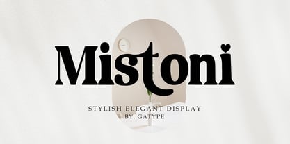
$15.00Mistoni An elegant font designed when in a creative mood and perfect shape, inspired by the bold, natural look of serifs so beautiful for today's fashion. bold, balanced and varied, born for luxury and beauty. including uppercase letters, numbers, and various kinds of punctuation Mistoni is perfect for invitations, logos & branding, photography, advertising, watermarks, social media posts, product packaging, product designs, labels, wedding designs, stationery. - Fagetone by Prioritype,
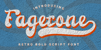
$15.00Dating back to the 60s 70s, this retro script font comes in bold bold and thin, perfect for your projects and supports multilingualism and other character additions. Can be applied to various print and digital media such as food packaging, clothing stores, accessories, clothing, creative goods, antique workshops, sports, entertainment and even logos. For reference, see preview. Features: -Uppercase -Lowercase -Numeral -Punctuation -Ligature -Multilingual - Pulp Fiction by Comicraft,
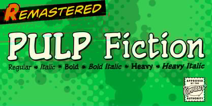
$19.00The name's Heironymous Flask. Some of my acquaintances call me 'Hip.' Those that know me really well don't call me at all. In my game, you don't make friends. You make excuses. Like it says on the door, I'm a private hippopotamus. This is my story. This is my font. Features: Six weights (Regular, Italic, Bold, Bold Italic, Heavy & Heavy Italic) with upper and lowercase alphabets. - Killer Ants by Cool Fonts,
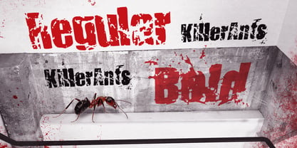
$24.00There are two versions of Killer Ants, regular and bold. Regular is a very cool cracked up looking font that will be great for all kinds of stuff. Bold is on of the most distressed fonts I've ever seen - there's crap everywhere - adjust your leading (line spacing) so the grunge overlaps and you have one awesome effect. Yes, those dots are actually smashed ants. Killer! - Hendbras by Seniors Studio,
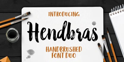
$15.00Hendbras is handcrafted font duo created with a brush and ink, bold and irregular baseline. Contains a complete set of lowercase, uppercase, alternates, ligatures, punctuation, numbers, and multilingual support. This font ideal for use in watercolor design or lettering style bold hand, such as posters, wedding elements, t-shirt, apparel, cover books, business cards, greeting cards, branding, merchandise, invitations and handmade quotes and more. - Saphira by Sarid Ezra,
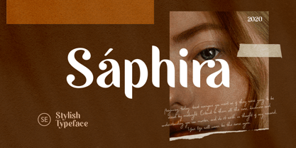
$15.00Introducing, Saphira - a stylish bold typeface with a bunch of ligatures and alternates! Saphira is a bold and elegant typeface with a bunch of ligatures and alternates that will make your presentation, logo, or your wedding invitation even more stunning and stand out! Saphira also support Multi Language. and already PUA Encoded! Features Uppercase & Lowercase Number & Symbol Multi language Ligatures Alternates for each characters PUA Encoded - Kagok by Twinletter,
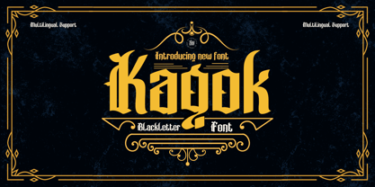
$15.00Introducing Kagok Blackletter font Kagok is typography designed with a classic blackletter font style, resulting in a bold and unique anatomical shape. Kagok is a strong and vintage font inspired by the classic Victorian typeface style combined with a strong style so that it looks bold in your projects. This font is perfect for use on projects that need a futuristic, vintage, and elegant style. - Ameliana by HandletterYean,
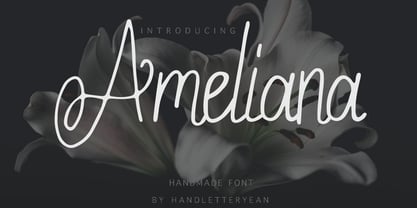
$4.00Ameliana is an amazing handwritten font, it created by the inspiration of women’s smile. the simplicity of this font tries to resemble that smile which is simple yet beautiful and amazing. Ameliana has a great readability and is perfect for adding a natural look to your designs. This font comes in regular, bold, italic, bold italic style and can be use for multi language. - NorB Marker by NorFonts,
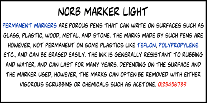
$28.00NorB Marker is a handwritten text font emulating a marker pen. The fonts set can be used with any word processing program for text and display use, print and web projects, apps and ePub, comic books, graphic identities, branding, editorial, advertising, scrapbooking, cards and invitations and any casual lettering purpose… or even just for fun! The fonts set features 4 weights: Regular Italic Bold Bold Italic - Maggie Sims by Gleb Guralnyk,
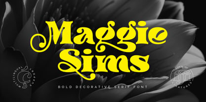
$15.00Hello! Introducing a bold serif font — Maggie Sims. It's a decorative shape bold typeface with lot's of extra characters. Available ligatures and alternative letters helps to create an original lettering compositions. Please make sure that OpenType features are supported & enabled in your software. Maggie Sims Font has a multilingual support (check out a screenshot with available letters and signs). Thank you and wish you a peaceful sky! - Diastema by Issam Type,
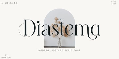
$22.00Diastema is a modern ligature serif typeface comes with joining ligatures that give it a fancy and unique style. This font perfect for branding, logos, invitation, watermark and more. Diastema typeface comes with regular, italic, bold and bold italic font styles. Uppercase & lowercase letters, numbers, punctuation, ligatures, alternates Multilingual support. If you have any questions, please feel free to get in touch. Thank you - FF Rosetta by FontFont,
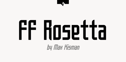
$41.99Dutch type designer Max Kisman created this display FontFont in 1991. The family contains 4 weights: Regular, Italic, Bold, and Bold Italic and is ideally suited for advertising and packaging, logo, branding and creative industries, poster and billboards, software and gaming as well as sports. FF Rosetta provides advanced typographical support with features such as ligatures and case-sensitive forms. It comes with proportional lining figures. - Unblock by Reyrey Blue Std,
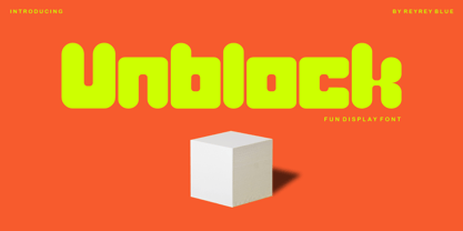
$16.00Introducing, Unblock Typeface. A bold display typeface with strong character and soft features. It's bold, fun, and playful. It can make your design unique, modern, and stunning. Unblock is perfectly suited for Comic Posters, Childish headlines, Decorative letters, Notices, Logo Designs, Big funny Banners: creative and decorative Typography Web Design, and much more. Features : All Uppercase and Lowercase Number & Symbol Supported Languages PUA Encoded - Blunt by Miller Type Foundry,
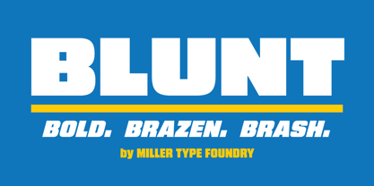
$16.99Blunt is a refreshing new bold headline typeface, designed to be an alternative to overused headline typefaces such as Impact. Blunt is more than just a one-trick-pony though, but includes 4 weights (Condensed - Wide) each with matching italics. This gives Blunt a lot more versatility when it comes to headline use. Try Blunt today and shout your most important messages with boldness! - Engage by Sohel Studio,
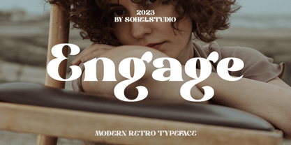
$14.00"The 'Emerge Font' is a captivating typeface with a unique and bold serif display style. Featuring distinctive thick lines, each letter exudes strength and firmness. This font combines classic serif elements with modern touches, creating a visually striking and bold appearance. Emerge Font evokes elegance while maintaining a modern edge, making it ideal for graphic design projects, posters, and layouts that require unforgettable visual appeal." - Listing Packs by Jehansyah,
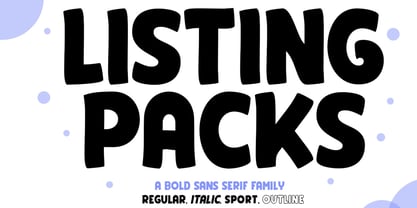
$9.00Listing Packs family this is a font family with a bold and large appearance, this font is perfect for all types of displays that look unique and bold, there are several variants of the character you use, and make sure you don't miss it, very suitable for all types of design, crafts, social media , magazines, books, banners, and this design is very potential for you to have - Economica by TipoType,
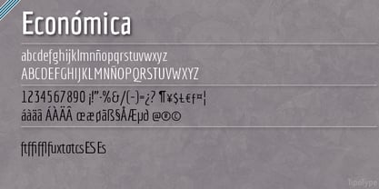
$19.90Typography created in Montevideo, Uruguay. The project's development typography Economica covered much of 2007 and received assistance of colleagues from all over Latin America. Economica has four basic versions: normal, bold, italic and bold italic. It was inspired by saving space for publishing texts without loss of height. Includes a comprehensive set of characters that lets you deal with diverse languages in its four variants. - FeggoliteMono by Ingrimayne Type,
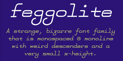
$6.95FeggoliteMono is a decorative, monospaced typeface family with a small x-height and long descenders. Two styles (plain and bold but renamed in 2020 as light and regular) were created in 1994 and revised in 2010. In 2020 a bolder bold was added along with italics versions for each of the three weights. The design was an attempt to create a decorative typewriter font. - Kings Hutand by Multype Studio,
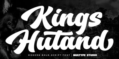
$29.00Kings Hutand is a script type family of two fonts, a modern script font with bold style and modern looks. Have a unique style that will make your design look iconic. Kings Hutand can be used for logo, branding, packaging and and anything that requires bold script font. This font has of alternative characters,swashes, and ligatures that will make your design unique and beautiful. - History Walker GT by Gartype Studio,
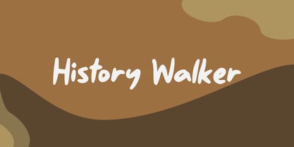
$10.00Inspired by bold and slanted handwriting style, we present to you History Walker, a handwritten font with bold and slanted characters that was comes with alternates and multilingual glyphs to help people around world with that unique accent with this font. History Walker is very suitable like as text, cover book, poem, handwritten style, and more.That way easily change the glyphs to make more unique glyphs. - Viking Drink by Fo Da,
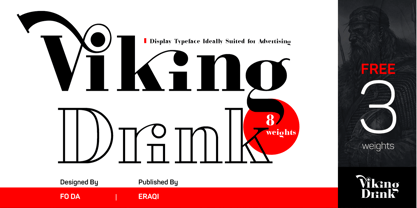
$15.00Viking Drink is a display font derivative from serif family of eight weights ranging from Regular to Bold and matching Italics, which gives it a full range of expression and suitability for advertising, interfaces and corporate design. Viking Drink provides 3 FREE weights ( Regular, Italic and Bold ). It has 17 ligatures that add powerful effect when used for creating logos or headlines. It also supports many languages. - South Canyon by Rillatype,
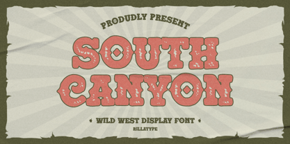
$15.00Saddle up and embrace the untamed spirit of the Wild West with South Canyon, a captivating display font inspired by fearless cowboys and rugged landscapes. With its bold and distinctive letterforms, South Canyon brings an authentic and powerful presence to your designs. Choose between the regular version for a perfect balance of legibility and boldness or the stamp version for a vintage, weathered look. - Oase by HIRO.std,
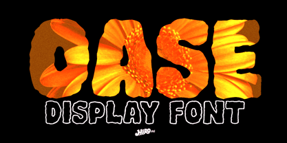
$15.00Oase is Display Font This font describes about about huge, bold, brush, handmade, movie. FEATURES - Uppercase letters - Numbering and Punctuations - PUA Encoded Characters - Multilingual Support - Works on PC or Mac USE Oase works great in any branding, logotype, magazines, poster, social media posts, clothing, advertisements, product packaging, product designs, label, company profile, quotes and any projects that need Huge and Bold taste. Enjoy using! Thanks. HIRO.std - Brandbe by Roman Polishchuk,
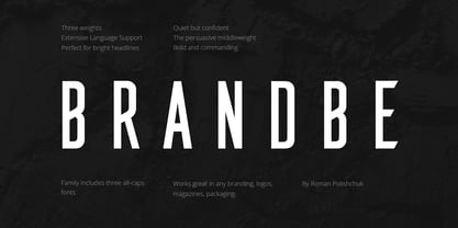
$40.00Brandbe is perfect for bright headlines, in web as well as in printing. FEATURES: Family includes three all-caps fonts: Three weights / Numbers & Punctuation / Extensive Language Support Brandbe Light - quiet but confident Brandbe Regular - the persuasive middleweight Brandbe Bold - bold and commanding USE: Brandbe works great in any branding, logos, magazines, packaging. Each style contains a set of 406 characters supporting 207 different languages.. - Salsiccia by Bech Type,
$19.00Inspired by bold and rounded typefaces on signs from the 1970s, Salsiccia can promote both your hot dog stand and your international toy store enterprise. Its boldness and roundness is combined with classical proportions, with wide letters — like the O — next to little nubby ones — like the T. This not only looks nice, but helps us even out the white spaces across words and sentences. - Kithan by Ixipcalli,
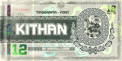
$26.00Kithan is a font that provides three weights and three compressed from semi-fine to bold, while the compressed have a reduced contrast creating a tall and soft look. Bold font sizes allow letterforms to be appreciated, with the same restraint and focus. Creates a smooth texture for small font sizes and long reads. Kithan's theme is inspired by the Mexican currency of the year 2000. - Amberine by Hazztype,
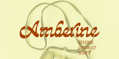
$15.00Amberine is a captivating reverse contrast script font that defies convention with its unique and striking design. The thick, bold lines flow gracefully, creating a sense of dynamism and movement, while the delicate, thin strokes provide an elegant contrast. This font evokes a sense of drama and sophistication, making it perfect for titles, branding, invitations, and any design where you want to make a bold statement. - Margadeth by Hanzel Space,
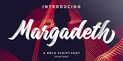
$25.00Introducing, Margadeth Bold Script Margadeth is a bold script that contain Uppercase, Lowercase, Numerals, Accents, Punctuations, 5 set alternates, Ligatures, Swash, and also Underline. You can use to make a logo for branding, best for apparel design, and quotes. This font also already PUA Encoded. Opentype feature, including 5 Set Alternates, Ligatures, End Swash, and Underlines. PUA Encoded Foreign Languages Support: ÀÁÂÃÄÅÇÈÉÊËÌÍÎÏÐÑÒÓÔÕÖØÙÚÛÜÝßàáâãäåæçèéêëìíîïðñòóôõöøùúûüýÿ Happy Designing! - Phoveus by Youngtype,
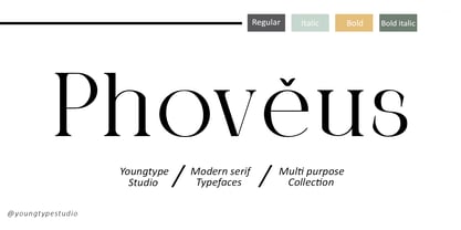
$15.00Phoveus Modern Serif, This professional resource is also powerful because each font has its own magical design. Comes with four versions Regular, Italic, Bold, Bold Italic. You can use it for almost anything like blog headers, posters, wedding elements, t-shirts, clothing, book covers, business cards, greeting cards, branding, invitations and quotes and so on. Feature: Uppercase Lowercase Number Accent (multilingual character) Thank you for your purchase! - Modernline by Ef Studio,
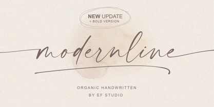
$10.00NEW UPDATE : BOLD VERSION Modernline is an organic handwritten font that is suitable for branding, signature, wedding invitation, promotion, product packaging, and other needs. This font is modern, simple, but still authentic. You will get full set of lowercase and uppercase letters, numerals and punctuation, multilingual symbols, lowercase beginning and ending swashes, ligatures and extra swashes. Now come with 2 weights, regular and bold. - Back Wild Graffiti by Sipanji21,
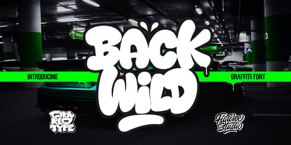
$15.00"Back Wild" is a bold and chubby graffiti font that includes swash characters. Fonts with these attributes generally feature bold and wide letterforms, often with playful and rounded elements. Swash characters add decorative and stylish touches to the font, If you have any specific questions or if there's anything specific you'd like to know or discuss about graffiti fonts or design, feel free to ask! - Havelock Titling by XO Type Co,
$40.00Havelock Titling builds upon the essential geometry of Havelock , adding new weights for spacious, authoritative text. Made to combine with Havelock’s display capabilities for more traditional reading scenarios. Built on the same weight range as Rocinante Titling , which broadens your design options. Light matches Light, Bold matches Bold, and so on. Both Havelock and Havelock Titling collections are included in Havelock Complete for a lower price. - Lost Signal by Zamjump,
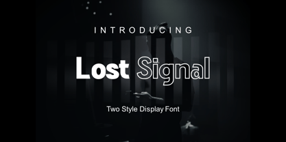
$11.00Lost Signal is a two-style display that's absolutely perfect for editorial headlines. Her bold and characterful figure makes her perfect for posters, extreme sports, automotive and magazine covers. Reserved for upper and lower case in each style, featuring fl and fi ligatures, this calm and bold typeface is a content creator's best friend. Including: Uppercase, Lowercase. Numbers, Punctuation & Symbols. Diacritic for Multilingual Support - Tallings by Grontype,
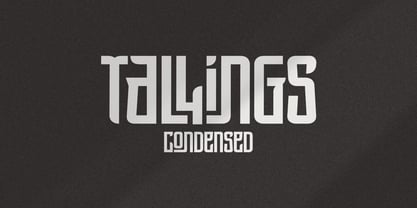
$14.00TALLINGS is a bold modern, urban-condensed font, inspired by street urban poster that combines the classic and modern style. TALLINGS will be best suited for creating logotypes, branding, headlines, corporate identities, Invitation card, and other graphic design elements. TALLINGS Features: Bold condensed font Punctuation & Characters Ligatures and alternates Glyphs included superscript & Symbol Currencies Multilingual Thankyou for picking up this font. Happy creating! Regard, Grontype - Bodoni FB by Font Bureau,
$40.00Working at American Type Founders from a Bruce Foundry recutting, Morris Fuller Benton worked out the dramatics of the English Fat Face, and in 1928 produced Ultra Bodoni, a headline spectacular. Using Benton’s 1933 Ultra Bodoni Extra Condensed, Richard Lipton digitized Bodoni FB Bold Condensed, then took compression even further and designed Bodoni FB Bold Compressed, a real technical tour de force; FB 1992 - Octavia VV by STARSsoft,
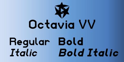
$10.90The "Octavia VV" font family includes Regular, Italic, Bold, and Bold Italic fonts. Sans serif font type. The whole font family includes a large set of additional characters and letters with diacritics. Standard and Latin Extended support such languages - English, Danish, Spanish, German, Norwegian, Polish, Portuguese, French, Swedish. Standard and extended Cyrillic are supported by languages - Russian, Belarusian, Bulgarian, Macedonian, Serbian, Ukrainian, Kazakh, Kyrgyz. - Subway Ticker by K-Type,
$20.00
