1,434 search results
(0.007 seconds)
- Burford by Kimmy Design,
$10.00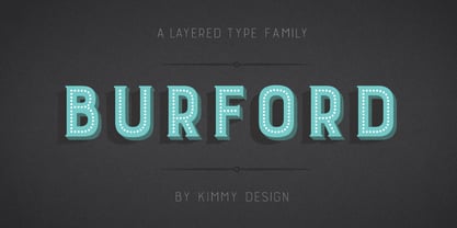 Burford is a font family that I sketched while traveling through Europe. I was mesmerized by all the unique typography that was showcased throughout the five countries I visited. Inspired by all that I had seen, I found myself spending 4-5 hours per day in Amsterdam’s Vondel Park drawing characters. Once back in the states I digitalized Burford, deciding it would make for a beautiful layer-based font. Burford Pro package comes with all 18 layering fonts including 5 base layers, 3 top layers, 5 bottom layers and 2 sets of graphic elements. They are strategically made to build on top of each other, creating a cohesive and easy to use layer-based family. Each font also comes with a set of Stylistic Alternatives for letters A C E F G H P Q R. Burford Basic package is created for users who don’t have access to premiere design programs (such as Illustrator, InDesign, Photoshop, etc) and are unable to use the layering effect. Burford can still be a powerful tool as each font can also be used on its own. It includes every font file not needed for the layering effect. (Include 13 fonts - Burford Basic, Dots, DropShadow, Extras Set A, Extras Set B, Extrude B, Extrude C, Inline, Line, Marquee, Outline, Stripes A and Stripes B). The Burford Extras set uses all basic keyboard characters - around 100 total elements per set. They are designed to go specifically with Burford and complement its varying styles perfectly. The set includes: banners, borders, corners, arrows, line breaks, catchwords, anchors and many more!
 - Meyer Two by Font Bureau,
$40.00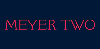 Meyer Two captures the early Hollywood flavor and nostalgia of silent-film intertitles. From 1922 through 1928, Mergenthaler Linotype cut five fonts to Louis B. Meyer’s personal specifications. Meyer Two, drawn in 1926, curiously combines Cleland’s ATF Della Robbia capitals of 1902 with lowercase and figures from ATF Post Monotone No. 2, also from the same period. Meyer Two was revived, with a Condensed added, by David Berlow; FB 1994
 - Thorowgood Wide by Wooden Type Fonts,
$20.00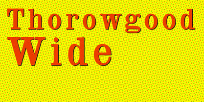 One of the original Clarendon types, an English design, here derived from a specimen taken from an American foundry, no identifying marks. With a tall x-height, wide version, unlike more traditional Clarendons, not a square serif but bracketed. Unique to this Clarendon are the rounded openings at the points where the horizontal and vertical stems meet in the capital B, D, P and R, not common in other Clarendons.
 - Kiez by Blackmoon Foundry,
$24.00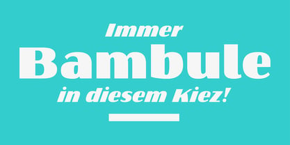 The “Kiez“ is an old school style font designed by Elena Albertoni in 2016. Inspired by shop and bar signage of the sixties and seventies, which can still be found today in the so called “Kiez“ in Hamburg St. Pauli or in one or another “Kiez“ in Berlin, which means neighborhood here. It also has a cinematic touch, again: think of the sixties and seventies or your favorite b-movie.
 - Al Baratheon by Aluyeah Studio,
$125.00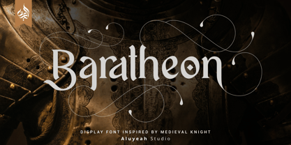 Hello Aluyeaholics! Be the King or Queen of your project with Baratheon. This display font is inspired by Medieval Knights and crafted with attention to detail. Feel like a Lord or Lady and show your inner King or Queen with Baratheon. Coming with 200+ stunning and super easy to use alternates and ligatures with quick access. To get results like the preview just type B.2a.7r.ath.17eo.2n.14
 - Al Mother Bakery by Aluyeah Studio,
$125.00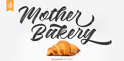 Hello Aluyeaholics! Mother Bakery, a handwriting inspired by the warm and fussy nature of a mother baking cakes for her children and grandchildren. Coming with 100+ stunning and super easy to use alternates and ligatures. Super Easy to Use alternates - You can easily call alternates using special combination like a.2 k.3 b.4 th cc etc. To get results like the preview just type Mother.2 Bak.7ery.2
 - Enge Journal Antiqua by RMU,
$30.00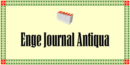 Hermann Zehnpfundt’s Enge Journal Antiqua, released by the Emil Gursch Foundry, Berlin, in 1910, revived and redesigned. This font contains also a long s, which can be reached by typing option + b, or turning the round s into the long one by using the OT feature historical forms. It is recommended to also use the OT feature discretionary ligatures to get access to all ligatures in this font.
 - Al American Legend by Aluyeah Studio,
$125.00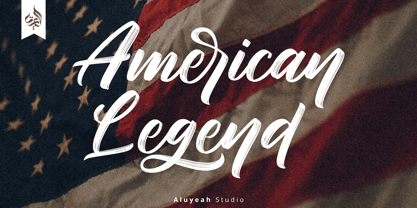 Hello Aluyeaholics! So we tried playing with the script, we hope you like it. American Legend is inspired by vintage handwriting. Comes with 220+ stunning alternates and ligatures. Super easy to use alternates and ligatures. Super Easy to Use alternates - You can easily call alternates using special combination like a.2 a.3 b.5 e.r a.r l.l etc. To get results like the preview just type Ame.rican Leg.9end
 - Ah, B de Bonita by deFharo - the font that dances on the line between elegance and fun, dipping its typographical feet into pools of style and whimsy! Picture this: you're walking through a garden of...
- Sextan Cyrillic by deFharo,
$12.00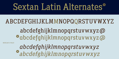 Sextan serif is a Cyrillic typeface family with 10 styles designed for editorial, corporate, advertising or web use. The excellent readability allows the use in long texts, the coherence of forms make these fonts have a great personality. The fonts have an extra set of lower case letters accessible through the Discretional Ligatures. Also support for Open Type Functions such as Old Style Number, Superiors, Inferiors, Dynamic Fractions, etc. Includes the Bitcoin symbol: b #
 - FF Marselis Serif by FontFont,
$58.99FF Marselis crossbreeds geometric and humanistic forms, creating a freshly dynamic sans serif family. All of the counters in the typeface are open; this aids readers’ eyes quickly flow across lines of text, without experiencing hang-ups. Certain superfluous strokes have been eliminated – there are no spurs on the b or q, for instance. The alphabet’s diagonals all bow outwards slightly, adding flavor to the “A”, “K”, “R”, “V”, “W”, “X”, “Y” and “Z”. - Graffix by Studio K,
$45.00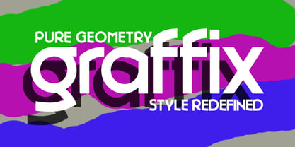 Graffix is best described as a modern classic. A crisp geometric sans serif with just a hint of Art Deco in the roll of the capital A, D & R, and the curvaceous lines of the capital M, V & W. The distinctive tear shaped counters of the lower case a, b, d, p & q give it its essential character, together with such quirky features as the angular descenders of the lower case g and j.
 - Sextan Serif by deFharo,
$12.00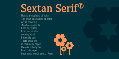 Sextan serif is a typographic family with 10 styles designed for editorial, corporate, advertising or web use. The excellent readability allows the use in long texts, the coherence of forms make these fonts have a great personality. The fonts have an extra set of lower case letters accessible through the Discretional Ligatures. Also support for Open Type Functions such as Old Style Number, Superiors, Inferiors, Dynamic Fractions, etc. Includes the Bitcoin symbol: b #
 - Al Blue Cashews by Aluyeah Studio,
$125.00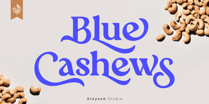 Hello Aluyeaholics! Blue Cashews' alternates are inspired by the curved shape of a cashew with a blunt tip. Blue Cashews give the impression that we often see in the packaging of snacks, cereals, milk, and so on. So warm, sweet, fresh, crunchy and full of love!Coming with 220+ stunning and super easy to use alternates and ligatures. To get results like the preview just type B.2l.3ue.2 C.2ash.2ew.2s.3
 - Monograph by Pelavin Fonts,
$25.00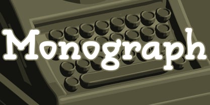 Monograph conjures ancient typewriters, telephone switchboards, vintage office machines past visions of the future. As though it were drawn with the rounded nib a of a Speedball "B" style pen, the soft curves and rounded serifs speak of a gentler less complicated time. It is nuanced with traces of the Arts and Crafts movement at the turn of the 20th Century which stressed craftsmanship and preserving and emphasizing the qualities of construction and materials.
 - Linotype CMC-7 by Linotype,
$29.00Linotype CMC-7 is a MICR barcode font. It contains machine-readable numbers, letters, and punctuation. These characters are used on checks and for other banking needs in several countries. Linotype CMC-7 can also be used like any other font in visual graphic work; like the Universal MICR Pi or OCR A and B typefaces, this is a real" computer fonts, carrying all of the connotations of the days of early technology." - Bermuda LP by LetterPerfect,
$39.00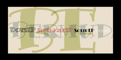 The Bermuda Family was designed by Garrett Boge and Paul Shaw, in the vein of freely-drawn showcard lettering — jaunty, fun and friendly. In fact the drawings were made with a Speedball™ B-series pen nib, the stock tool of the showcard letterer. Bermuda Open is a stroked outline version and its character shapes are repeated in the other three styles, each with a separate fill variant — Solid, Dots and Squiggles.
 - La Sonnambula by deFharo,
$18.00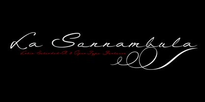 The Sonnambula is a handwritten and expanded font with terminal ornaments, designed to write very elegant titles or calligraphic texts. The name of this typography is dedicated to the opera La Sonnambula by Vincenzo Bellini. - Use the following characters for terminal ornaments: () [] - 380 glyphs. Latin Extended-A • OTF & TTF - OpenType Functions: Discretionary Ligatures, Kerning, All Alternates, Additional languages, Standard Ligatures, Slashed Zero, Capital Spacing, Ornaments, Ordinals, Mathematical Greek, Fractions, Localized Forms. - Bitcoin symbol: b# (ligatures)
 - Herkimer Bunrab NF by Nick's Fonts,
$10.00Eh, what's up, Doc? This cuddly little oddball of a typeface was originally released under the rather unlikely name of Hercules by the Amsterdam Typefoundry in 1926. This face includes OpenType Stylistic Alternates for b, h, h, k and l, which feature very tall ascenders with a "bunny ear" vibe. Both versions include the complete Latin 1252, Central European 1250 and Turkish 1254 character sets, as well as localization for Moldovan and Romanian. - Ambulatoria by Pepper Type,
$30.00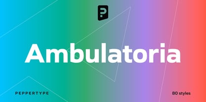 Ambulatoria is a sturdy open aperture sans-serif that comes in four variations. Each variation, A, B, C, and D, contains alternative variants for certain glyphs that allow the designer to change character and texture of the text. The font family contains 80 fonts altogether, each sporting rich language support including pan-European Latin and Cyrillic. The typeface is intended to work in both large and small text sizes, which makes it a versatile workhorse.
 - Pacific Clipper SG by Spiece Graphics,
$39.00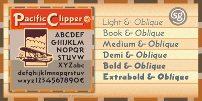 Pacific Clipper has its roots in an old 1930s showcard lettering style. An extra bold version of this sign painter’s relic is shown in Carl Holmes' wonderful book on lettering. It may be described as what happens when Rudolf Koch's Kabel Heavy meets ATF's Novel Gothic. Also known as Sam’s Tune, Pacific Clipper’s noteworthy features include wedged crossbars in the capital A, E, F, and H. Overcurving is present in the capital B, D, P, and R while vertical strokes in the lowercase b, d, h, k, l, and t are chopped off obliquely. Figures in Pacific Clipper are also refreshingly different, particularly the number 4. This lettering favorite turned retro typeface has been extended to include a variety of weights. Pacific Clipper is now available in the OpenType format. Some new characters have been added to this OpenType version as Stylistic Alternates and Historical Forms. These advanced features work in current versions of Adobe Creative Suite InDesign, Creative Suite Illustrator, and Quark XPress. Check for OpenType advanced feature support in other applications as it gradually becomes available with upgrades.
 - DT Lythmore by Dragon Tongue Foundry,
$9.00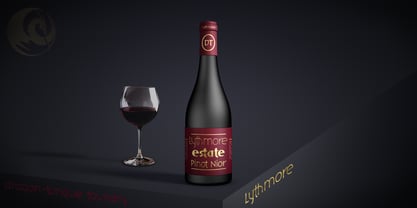 Lythmore This font is called Lythmore and is inspired by Lithos. Lithos was originally designed for Adobe by Carol Twombly in 1990, based it on the lettering from ancient Greek inscriptions. The Capitals are similar in feel and design, but is totally original and built from scratch. It is designed to be similar intentionally, but it is not a clone or rip off. Lithos is an example of a simple blocky san serif font style, with subtly concave sides, angled ends, and off centred curves. Lythmore is also an example of that same style. But is also different in places where I felt it could be improved. And it has a complete lower case set, which Lithos doesn't. I built Lythmore with 8 different weights. Lythmore can be very effective when used in advertising and general display work, but it can also be used for much more. Although it was never designed to be body copy, when used as such, it is still perfectly readable and adds its own version of sans serif style and flavour. I have included two versions of the Lythmore family. Lythmore A and Lythmore B. In the Lythmore A family, the lighter 4 weights all vary in weight in both the horizontal and vertical axis. The heavier 4 weights all vary in the horizontal axis only. In the Lythmore B family, the transition is even in both directions across the entire family. The result of this difference is that the A and B versions difference is most noticeable between the Regular and Medium weights. While the extreme ends of each family version are virtually identical.
 - Passeig B is a font that exudes a blend of modern sophistication and charming nostalgia, drawing inspiration from classic typography while embracing contemporary aesthetics. Its name, suggestive of a...
- Mono Hexular by PizzaDude.dk,
$20.00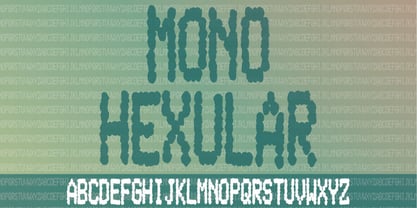 A wrecked, monospaced font containing 278 ligatures and unique accented characters! You will need to use OpenType supporting applications to use the autoligatures.
 - Quavo by Quatype,
$10.00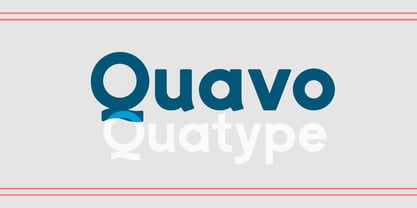 Quavo is a round sans font family, including regular and oblique font styles. Round corner of letters show the soft and friendly vibe and some letters for instance: letter a, b and d, they all have a tail at the end. It's sort of personal preference, for I want to add some ornamental elements in this font. Quavo can be applied in lots of areas. Including but not limited in titles, posters, book pages and big display canvas.
 - Brice by Studio Sun,
$10.00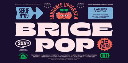 Brice refers to cultural products of the 80s such as music, art, literature, fashion, dance, film, that are consumed by the majority of society population. The Characteristic of Brice are in the small bouncy serif with a dynamic contrast, like R, B, S, K, P, etc. Perfect for Logotype, Caption, & Header. Brice are available in 5 Widths (Condensed - SemiCondensed - Normal - SemiExpanded - Expanded) with matches 6 weights (ExtraLight - Light - Normal - SemiBold - Bold - Black) and support for 75+ language.
 - Qonitta by Zamjump,
$17.00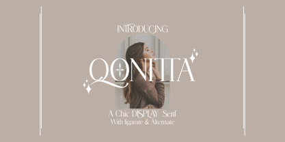 Called QONITTA is a serif display with a character that is beautiful, and elegant. With the addition of beautiful ligatures and alternatives to make your typography truly unique. No special software is required to type standard Typeface characters. To access Opentype Ligatures and Alternates, you need software that supports the Opentype feature in fonts. multi language support File Included : - Upper case and Lower case - Ligature - Alternate - Uniq dot (a underscore underscore, b underscore underscore, c underscore underscore)
 - Hanse Textura by RMU,
$30.00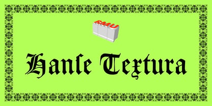 Inspired by a former Hermann Zapf design, Hanse Textura was completely redrawn and redesigned as an English-style blackletter font with a calligraphic touch. It comes also with the historical long s which can be reached either by typing [alt] + b or by using the OT feature historical forms. I strongly recommend to activate both OT features, standard and discretionary, to access all ligatures built in the font. The keys pi and product are occupied with beautiful border elements.
 - Template Sans by Jeff Levine,
$29.00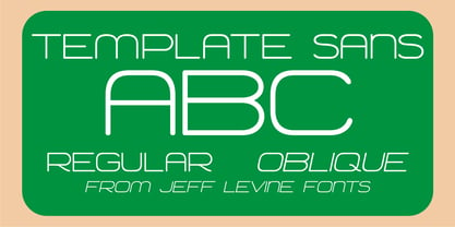 The Wright-Regan Instrument Company (Wrico) was one of the leading manufacturers of lettering templates for many years. Aside from their own line of products, they also did custom manufacturing. A series of lettering guides called “Mimeostyle” for the A. B. Dick Company of Chicago (produced for use in making mimeograph machine printing stencils) featured an art Deco squared letter design with rounded corners. This is now available digitally as Template Sans JNL, in both regular and oblique versions.
 - Rockport BF by Bomparte's Fonts,
$39.00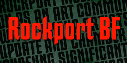 The roots of Rockport BF run deep. 19th century woodtypes, display gothics of the 40s and 50s, are inspiration for this distinctive font style. Its OpenType programming features automatic fractions, stylistic sets and alternates for a, b, q, r, t, u, y, M, N, U, Y, and dollar symbol. Tempered by somewhat humanistic elements, these condensed, geometrically-structured letterforms bring a strong but friendly presence to posters, logos, bookjackets, signage headlines, and many other typographic environments.
 - Be Me by One Line Design,
$15.00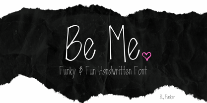 When your handwriting is that good... make a font! Now you can "Be Me." Give your text a little attitude with this fun font! This font is great for beauty, fashion, announcements and so much more! With a variety of swashes and fun symbols to create quirky posters. Regular & Bold fonts include: 1821 Glyphs Including Basic Latin, Latin-1 Supplement, Latin Extended-A, Latin Extended-B, Greek and Coptic, Cyrillic, Thai, Miscellaneous Symbols, Hiragana, Katakana, CJK Unified Ideographs, & More.
 - Work Yard Stencil by Jeff Levine,
$29.00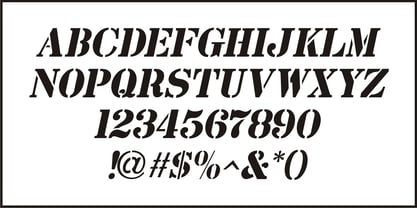 The image of a set of vintage French tin stencils spotted online was the starting point in designing Freight Yard Stencil JNL. A more traditional ‘B’ and ‘R’ replaces the original characters (which looked kind of awkward due to extra ‘stencil breaks’ within the letters). However, there are a few interesting variants in other characters to set the design apart from similar stencil fonts. Work Yard Stencil JNL is available in both regular and oblique versions.
 - Happenstance by Just My Type,
$25.00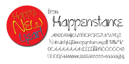 Happenstance came out of a play session with Bezier curves with a sense of fun built into its being. First came play, then came work. Thomas Edison once said,”Creativity is 1% inspiration and 99% perspiration.” Nikola Tesla thought the opposite. In this case, what started as inspiration took a lot of perspiration to corral into a usable font. So maybe the reality is a) different for different people or b) somewhere in the middle. Just sayin’.
 - Gaufre de Bruxelles by TypeAddiction,
$10.80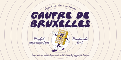 TypeAddiction presents “Gaufre de Bruxelles”, a playful handmade uppercase font. Lowercase letters have filled letters (A, B, D, O etc) and the uppercase letters have unfilled letters. "Gaufre de Bruxelles" means a Brussels waffle in English. The Brussels waffle is a rectangular-shaped waffle and is a Belgian culinary speciality. The characters of the font were inspired by the waffle dough and more specifically the shape that the dough takes when it is poured into the waffle iron.
 - Al Boulevard Signature by Aluyeah Studio,
$125.00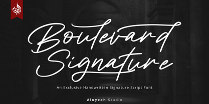 Hello Aluyeaholics! Boulevard Signature, an exclusive handwritten signature font. Coming with 100+ stunning and super easy to use alternates and ligatures. Very suitable for your wedding invitation, packaging, apps, magazine, headline, website, ads and all type of design project you have. Super Easy to Use alternates - You can easily call alternates using special combination like a.2 k.3 b.4 t.h c.c etc. To get results like the preview just type Boul.4evard.3 Sig.4nature
 - Fuel by VersusTwin,
$39.00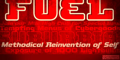 The Fuel typefaces are a modern update on the techno sans, complete with soft rounded corners as well as decorative inktraps. Stylistic Alternates included within all styles are alternates for the capital B, E, G, and R characters, as well as all of their accented siblings. The Fuel Complete package bundles all of the dynamic styles of the Fuel, Fuel Extended, Fuel Uni, Fuel Uni Extended, and Fuel Script typefaces into one powerhouse of a collection.
 - Apolline Std by Typofonderie,
$59.00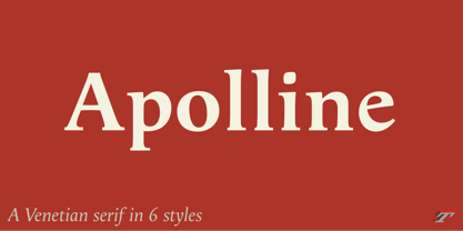 A Venetian serif in 6 styles The Apolline typeface family was created by Jean François Porchez as a means to study the transition from Renaissance writing into the first printing types. Rather than sticking to the method commonly used these days for the creation of revivals of Jenson or Bembo types, it seemed more interesting to try and get in the same mindset as those exceptional designers during this pivotal period in the history of typography. Thus Apolline is an exploration of the design methods used by people like Nicolas Jenson and his contemporaries for adapting handwriting with its multiple occurrences (a, a, a, b, b, b…) into single, unique signs (a, b…). Initially Jean François made drawings modelled after his own calligraphy. They were done at a very small size on tracing paper (2 cm high for the capitals) to preserve the irregularity of human handwriting. Besides emphasising the horizontal parts of the letter forms, the serifs were designed asymmetrically to reinforce the rhythm of the writing. The final drawings were produced at a large size (10 cm high for the capitals) to allow for subtle optimisation of specific details. The very narrow and fluid Apolline italic Influenced by various concepts for an ideal italic by Van Krimpen, Gill, etc. Apolline italic was designed at 8° degrees. Although the structure of the letterforms were informed by chancery scripts, the italic has full serifs like the roman. Very narrow and fluid, its unique design creates a good contrast when used in combination with its upright counterparts. Thanks to the presence of the serifs similar to roman typefaces it sets very neatly in large sizes. The next step was digitising the drawings with Ikarus (the pre-Bézier-curves era) to create the final roman and italic fonts. Two years later, when the family was expanded to six series the same method was used, this time with Fontographer. This was necessary for correcting a few problems caused by the conversion to Bézier outlines, and to add intermediate weights. Before the advent of feature-rich OpenType, quality type families consisted of several separate fonts for each weight to provide users with various sets of numerals, an extended ligature set and alternates, ornaments, and so on. Introducing Apolline Morisawa Awards 1993
 - Mono Orxith by PizzaDude.dk,
$20.00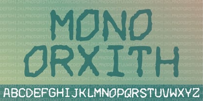 A wrecked, monospaced font containing 272 ligatures, alternate letters and unique accented characters! You will need to use OpenType supporting applications to use the autoligatures.
 - Mono Litrox by PizzaDude.dk,
$20.00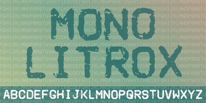 A wrecked, monospaced font containing 273 ligatures, alternate letters and unique accented characters! You will need to use OpenType supporting applications to use the autoligatures.
 - DesignPartsOne - 100% free

