3,340 search results
(0.011 seconds)
- P22 Torrone by IHOF,
$29.95 Precursors to Torrone, the fonts are found among the type experiments of Art Deco artists in 1930’s Europe. Fonts of this type with chunky, geometry-driven lower case letters combined with somewhat flamboyant, brush-influenced upper case can be found in the logotypes for Mignon Chocolate Factory in Germany and Baci bon-bons still in use today by Italy’s Perugina Candies. Torrone includes alternate lower case characters and full Central European glyph sets with over 550 characters included!
 - Oblonga by Eurotypo,
$28.00 Oblonga shows thin, elegant lines. The continuity of the trace is only suggested through the curves of the letters, a soft effect of bonding that maintains the identity of each character. Oblonga is an Art-Déco font proposed in a modern key, a revival performed without aggression. More than three hundred glyphs (regular and Italic) that ensure legibility in Central-European and Slavic languages, enriched by some appropriate discretionary ligatures that enhance the charme of a time gone away.
 - Savigny by insigne,
$22.00 Savigny began as an offshoot of Le Havre. Le Havre met my design objective of a geometric sans serif with a strong art deco touch. Le Havre’s primary inspiration came from the art deco titling of the 1930’s, and the lower case was just icing. The art of the 1930’s is of particular interest to me, and I love the art deco era and its art, and the simplicity of geometric shapes. I am mostly interested in designing display typefaces. In many ways Le Havre was the exact opposite of another popular insigne offering, Aviano Sans. Le Havre has very high ascenders, a lower case and is very condensed. Aviano Sans has no lowercase and extremely extended capitals. With the rise of webfonts I began to see Le Havre being used frequently online. It’s short x-height and very tall ascenders made it difficult to read in on screen text settings as it was intended as display type. With this observation, I felt that there is more room for a geometric sans in the insigne catalog. So I set about to design a new geometric sans using the successful skeleton of the Le Havre family. Although I planned to extend the Le Havre line, the new family is so drastically different I decided on a new name: Savigny. The face evolved and began to take on a few humanist touches. Designed from the very beginning as a webfont, the design is open and pleasing to the eye, with a tall x-height. To optimize it for onscreen settings, the spacing is generous. In addition, it includes extended and condensed members, making it insigne’s first superfamily. The family includes over 100 OpenType alternate characters. These include several style sets. Some are stemless, others are purely geometric, and in a nod to Savigny’s origins, Art Deco titling alternates. Please see the informative .pdf brochure to see these features in action. OpenType capable applications such as Quark or the Adobe suite can take full advantage of the automatically replacing ligatures and alternates. This family also includes the glyphs to support a wide range of languages. Savigny is a great choice for a professional designer who wants a well rounded typeface family that is ready for the web.
 - Spiderfingers - 100% free

- Eclipse - Unknown license

- Castro - Unknown license

- LT Cushion Light - 100% free

- Nicomedia by Artegra,
$29.00 Nicomedia is a modern sans serif type family with a contemporary, technical look that reflects the high-tech industrial age that we're living in. From thin to black, it contains 18 fonts in 9 weights with their true italic counterparts. With 529 glyphs, it offers support for all the languages with Latin script. When it comes to OpenType features it has stylistic alternates (for a, g, l, 0, 1), tabular lining, ligatures, superscript, subscript, denominators, numerators and fractions. It's perfect to create engaging brands, ads, websites, apps, animations and user interfaces.
 - Bali Sky by Epiclinez,
$18.00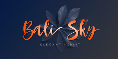 Bali Sky is a stylish and elegant script font. It looks stunning on wedding invitations, thank you cards, quotes, greeting cards, logos, business cards, and every other design which needs a handwritten touch. The font Bali Sky contains 229 glyphs. Supporting more than 66 languages, from English to Zulu. This font is PUA encoded which means you can access all of the glyphs and swashes with ease! So what's included: Basic Latin A-Z & a-z. Numbers, symbols, and punctuations Ligatures Stylistic sets Multilingual Support. Accented Characters : ÀÁÂÃÄÅÆÇÈÉÊËÌÍÎÏÑÒÓÔÕÖØŒŠÙÚÛÜŸÝŽàáâãäåæçèéêëìíîïñòóôõöøœšùúûüýÿžß Thank You
 - LFT Iro Sans by TypeTogether,
$49.00 Milan-based Leftloft studio developed LFT Iro Sans, an expansive family that solves the significant, wide-ranging challenges of branding, wayfinding, pictographic language, and complex editorial use. LFT Iro Sans began as the clear and welcoming wayfinding project of San Siro stadium in Milan. Over time many other styles and weights have been added. LFT Iro Sans never finds itself outmatched by the task at hand. The primary aim was to design a technical typeface that was readable in any low visibility condition, for instance in a poorly lit area with awkward wall shapes and overhangs. This worked well for stadium and large lettering use, but other problems also needed to be addressed, such as complementary iconography. A location developer was left mixing — clashing, really — one type family with a different family of icons, resulting in a cobbled-together look which diluted the brand and the experience. They set out to radically simplify and clarify each shape and its meaning, accepting uniqueness as part of the final visual language. LFT Iro Sans pictograms answers the need for having a consistent and large group of icons, perfectly suited to the text typeface. As it concerns public spaces, this didn’t exist before. LFT Iro Sans incorporated a branding project too, so they decided to let LFT Iro Sans go out on a limb and created a unicase style that demands attention. Each unicase letter is a combination of the lowercase and capital form, quite noticeable in the ‘i’, ‘m’, ‘t’, and unique ‘d’ and ‘b’, balanced by more restrained forms of ‘a’, ‘s’, ‘c’, and ‘e’. LFT Iro Sans is not only a technical typeface, but, thanks to letters’ proportions, can also be used for editorial purposes. Assertive and economical in stature, the text weights are clear and assured. And a display version for headlines in Ultralight and Heavy (with italics) was developed for stunning headlines. For enthusiasts of every stripe, LFT Iro Sans can be a brand’s rallying cry with its arresting unicase, be a developer’s go-to pictogram choice, or set the most demanding editorial text in digital or print. With its many OpenType features, simplified pictogram commands (even available in Apple’s Pages and Microsoft Word), and a total of 30 targeted family members, LFT Iro Sans is a brilliant, easy choice. As with the rest of the TypeTogether catalogue, the complete LFT Iro Sans family, designed by Lefloft and developed by Octavio Pardo, has been optimised for today’s varied screen uses.
 - Carnivale - Unknown license

- Scalactic J - Unknown license

- LHF Spencer by Letterhead Fonts,
$42.00 LHF Spencer exemplifies the quirkiness of late 1800's lettering. Uppercase is set below the baseline, adding a hand drawn look. Curved swashes juxtaposed with traditional thick and thin strokes make Spencer's letters stand out in a design. Includes 29 OpenType alternates.
 - Brown Pro by Shinntype,
$39.00 At text size, Brown is a classic grotesque, distinguished by its semi-condensed proportions—especially in the capitals, which harmonize well with the lining figures—and an exceptional clarity in certain high-resolution media, such as offset printing, achieved by micro-detailing. At display size, the detailing provides the otherwise austere forms of the neo-grotesque with a subtle wealth of visual interest.
 - Smartburst by Bogstav,
$14.00 Are you throwing a party, growing eco friendly potatoes or having a babyshower? Is so - go ahead and give Smartburst a try for the design. The friendly and rounded edges makes the letters look soft and legible. I've added 5 different versions of each letter, and they automatically cycle as you type. Or, you can choose them individually from the glyph menu.
 - Unhuman by AN Studio,
$22.90 Inspired by a futuristic cyberpunk and Neo-Tokyo vibe, UNHUMAN is a typeface that embodies the essence of technology and innovation. With its simple shapes and wide form featuring 45° cuts, this font brings a sleek and hi-tech aesthetic to your designs. Created by AN Górski, UNHUMAN is the perfect choice for projects that require a modern and cutting-edge look. **Uppercase
 - Vinkel by Typolar,
$72.00 Composed, clean and slightly angular, as its name says. It's organic, warm and round in the right places too. A sanserif typeface family Vinkel is a handsome androgyne with an excellent balance of Neo-grotesque and Humanist DNA. Vinkel comes in eight weights from Thin to Extra Black, all with italics, small caps, several sets of numerals, arrows, alternate characters, and more.
 - Emblema by Corradine Fonts,
$29.95 Emblema is an evocative font that exudes Art Deco style from early decades of the 20th Century. Its geometric shapes give a clean and modern look to any design where it is applied. Emblema was designed in 12 subtly different weights and is ideal for achieving the same weight in a single word when using different point sizes. Open Type users can access an extensive set of alternative and ornamental characters including 3 different size sets of caps, providing the utmost in versatility.
 - ITC Atelier Sans by ITC,
$29.99ITC Atelier Sans began as one of Curtis's renovations. His goal was to create a monoline design with Art Deco “sensibilities,” but without the geometric precision and relatively small x-height of faces like Futura or Kabel. Gentle curves and suggestions of serifs create a crisp, clean and open face that is at once sleek, sensuous and still affable. Available as a two-weight family with complementary italics, ITC Atelier Sans is another successful and usable revival from Nick Curtis. - Hokitika by Hanoded,
$15.00 Hokitika is a township in the West Coast Region of New Zealand's South Island. It has some amazing beaches, stunning scenery, but above all, it has Pounamu (greenstone or jade). This is THE place to buy a beautiful Maori greenstone pendant. Don't buy it for yourself, as it is supposed to bring bad luck. Hokitika font is a tall and thin all caps Art Deco typeface. It is classy, elegant and very legible. Comes with a full range of diacritics.
 - Decorretro by Sorriso Design,
$18.80 Introducing a stunning geometric Art Deco style typeface, inspired by the retro aesthetics of 1930s Shanghai posters. This font design boasts clean, crisp lines and a modern look while still honoring the classic design elements of the past. Its carefully crafted curves and angles create a perfect balance between simplicity and sophistication, making it an excellent choice for a wide range of design projects. This typeface is sure to captivate and engage your audience, adding a touch of timeless elegance to any design.
 - Apparel JNL by Jeff Levine,
$29.00 An image spotted online showed a rendering of a ladies’ fashions storefront that had appeared in the Libbey-Owens-Ford Glass Company’s 1939 brochure. The signage consisted of the hand lettered word ‘Apparel’, and was done in a variant of the Art Deco stencil style of lettering that’s most recognizable in Futura Black. From these few sign letters came the inspiration for a digital font of the same name, Apparel JNL – which is available in both regular and oblique versions.
 - Rectory by Kavoon,
$15.00 Introducing our new typeface, Rectory - a contemporary, Art Deco-inspired display typeface full of character, quirky ligatures, and glyphs to keep your designs fresh. This is a display font that we recommend using in the following types of work; magazines (titles and layouts), logos and branding, invitations, quotes, blog headers, posters, and advertising. Language Support: Afrikaans, Albanian, Catalan, Danish, Dutch, English, French, German, Italian Norwegian, Portuguese, Spanish, Swedish and Zulu. What's included: Uppercase and lowercase glyphs Punctuation Numbers Multilingual support Unique ligatures glyphs
 - theLUXX by Resistenza,
$39.00 The Luxx font was born in 2010 and in the 2013 has been redesigned. Luxx is based on a style of lettering often seen on Italian art deco posters and advertising of the 1930s. This font is very modern, and is inspired by the “velocitá-speed” of this artistic period. TheLuxx is perfect for when you want to use eye-catching big texts for anything from posters and retro-advertisements, and art, but it´s especially striking for printed projects.
 - Natasha Walker by Hadiftype,
$16.00 Natasha Walker is Thin sans serif that gives it a high class appeal. Comes in 2 weights, Regular and Bold. The inspiration for this typeface comes from the Art Deco era, feels modern and contemporary. Thick and thin branches are done daintily. Giving this entire font a highly polished look. Perfectly in luxury designs. Also contains 150 discretionary ligatures uppercase characters, giving you a variety of layout options. It’s perfect for fashion and lifestyle themes and even for branding purposes.
 - LTC Globe Gothic by Lanston Type Co.,
$24.95 This series of faces was designed initially by Morris Fuller Benton, circa 1900. The design is a refinement of Taylor Gothic from 1897. It features a sans serif thick and thin design with angular stems. Pre-dating art deco, this design feels quaint, yet it still has a touch of modernism. Frederic Goudy designed a bold version of Globe Gothic in 1905 for ATF. The Bold and Bold Italic digital versions have been added to the LTC library in early 2007.
 - Cover Letter JNL by Jeff Levine,
$29.00 The handmade title on the cover for the 1939 edition of “A Wand’ring Minstrel” [from Gilbert and Sullivan’s “The Mikado”] was rendered with a round nib lettering pen in an Art Deco style. This type design is now available as Cover Letter JNL in both regular and oblique versions. However, the font’s name is a bit of a pun, as it has nothing to do with cover letters, but rather the lettering found on the cover of the sheet music.
 - HGB Memento by HGB fonts,
$32.00 HGB Memento was designed to replace 12 bronze plaques with the names of those who died in World War I. The 12 plaques were stolen in 2016. Stone tablets were made on which the original writing was engraved using sandblasting. Memento is therefore suitable for commemorative plaques and for texts of a sacred nature. Extremely short ascenders and descenders allow very narrow lines. The design language of the Memento comes from the 1920s with echoes of Art Nouveau and Art Deco.
 - Funny Papers JNL by Jeff Levine,
$29.00 Sheet music for the 1910 composition "Good-By Betty Brown" has its title hand lettered in a thick and thin, condensed sans serif design reminiscent of lettering found in later comic strips and books of the 1930s and 1940s. Transcending both the Art Nouveau and Art Deco styles, Funny Papers JNL gets its name from the slang reference Americans of the early 20th Century gave the Sunday comics pages in their local newspapers, and is available in both regular and oblique versions.
 - Marseille by Louise Fili Ltd,
$35.00 Marseille is an Art Deco-inspired typeface which is based on Louise Fili’s iconic cover design for the hauntingly beautiful Marguerite Duras novel, The Lover. The font is available in six irresistible weights: thin, light, regular, medium, semibold, and bold. Each weight features both caps and lower case, and supports over 200 languages. Marseille will satisfy all your typographic needs, from book jackets to monograms to packaging, logos, and even wedding invitations—timelessly elegant, with a distinctive flair that exudes La Belle France.
 - Aglaia by Wildstripe,
$19.00 Aglaia is an elegant geometric sans serif typeface that comes in three weights. Designed in part inspired by Art Deco, but with a modern minimalist approach that makes it a versatile and excellent contemporary display font for titles, editorials and short texts. Font features: Uppercase & Lowercase Numerals, Punctuation & Symbols Alternates & Ligatures Multiple Languages Support (Latin characters + Diacritics) How to access Alternate Characters: The alternate characters can be accessed via the glyphs panel in your favorite software. Or with OpenType features turned on.
 - Odenburgh by Mans Greback,
$59.00 Odenburgh is a Medieval-style calligraphy typeface. Hand-drawn by Måns Grebäck during 2018-2020, this high-quality lettering is inspired by historical Gaelic, British and Irish handwriting. It comes as a regular, clean style as well as the additional Odenburgh Deco style. The typeface is perfect for calligraphic headlines, products and logotypes in Middle Ages projects. The font supports all European, Latin-based languages. In addition to that, it contains numbers and all punctuation and symbols you'll ever need.
 - Art School by AVP,
$25.00 Faithfully reproduced from my father’s design drawings made at The Municipal School of Arts and Crafts, Wolverhampton in 1939. Strong nostalgic influences of Art Nouveau and Art Deco. What caught my eye was the consistency with which each particular character was formed: every ‘R’ like every other, every ‘S’ the same. Tight letter spacing and loose word spacing characterised his titling but he didn’t trust himself to print without first ruling guidelines, a hint of which remain in this font.
 - 2030 by Noir Typo,
$26.00 2030 font is inspired by the typography of the early 20th century, the Futura of Paul Reener, Cassandre and Charles Loupot’s works and, on a broader level by modernism and art déco mouvements. Geometric, with classicals proportions, this typefaces is a re-interpretation, in a actual form, of the alphabets from this period. The lines are straight, but the letters are easy to read and nice to watch thanks to optical corrections. Build with 9 weights of 700 glyphs, italics and small caps.
 - Palembang by Hanoded,
$15.00 Palembang is the second largest city on the Indonesian island of Sumatra. It is also one of the oldest cities in Indonesie and used to be the capital of the powerful Buddhist Kingdom of Srivijaya. After finishing Semarang and Semarang Kolonial fonts, I sort of stayed in the Indonesian mood and named this font Palembang. It is a narrow, tall, all caps Art Deco typeface and would be most suited for headlines, cards, headers and luxury packaging. Palembang comes with royal language support.
 - Sailem by Kaer,
$19.00 Introducing my new Art Deco inspired typeface Sailem with line in the middle. This is a display font perfect for contemporary magazines, vintage branding, space posters, steampunk headers, and advertising. What's included? * Middle line style * Uppercase * Numbers * Symbols * Punctuation I hope you enjoy this font. Follow my shop to receive updates of products and the very hottest news! If you have any question or issue, please contact me: kaer.pro@gmail.com Please request to add additional characters and glyphs if you need! Thank you!
 - Office Visit JNL by Jeff Levine,
$29.00 Dan Hardie, a Miami-based graphic artist and creative consultant at Mutiny, Inc. shared an image he’d spotted online of some interesting signage formerly on the front of the Miami Medical Building. Comprised of hand-cut metal characters (with a thoroughly avant-garde “Art Deco meets Modernist” approach), this instantly became a font design idea unusual and quirky enough to develop as a digital typeface. The end result is Office Visit JNL, which is available in both regular and oblique versions.
 - Decour Soft by Latinotype,
$26.00 Decour Soft is the rounded-edged version of Decour. It is a slab serif humanist low contrast typeface. The overall design also features strong curves, making it a very friendly face. The font retains the original elegant features of Decour—based on Art Deco design—such as high contrast between upper and lower case characters. Decour Soft is a suitable font for logotypes and packaging. Its design also allows it to be used with certain elegance in book titles and magazines subheadings.
 - Guest Invitation JNL by Jeff Levine,
$29.00 Samuel Welo was a sign painter who had published in the 1920s and again in 1960 editions of his “Studio Handbook – Letter and Design for Artists and Advertisers”. In-between, in 1930 Welo also published “Lettering - Practical and Foreign”. Within the pages is an Art Deco outline slab serif design using multiple thin lines to create an “incised” or “engraved” look within the characters. This intriguing type style is now available as Guest Invitation JNL, in both regular and oblique versions.
 - Grafilone by Linotype,
$29.99Linotype Grafilone is part of the Take Type Library, which features winners of Linotype’s International Digital Type Design Contest. In creating his font, Bo Berndal combined elements of the constructed and Art Deco styles. Slender and angular, Grafilone is mechanically exact and coolly resesrved. A distinguishing characteristic is the combination of angular and sloping strokes, which give the font a dynamic feel. Grafilone is particular good as a headline font and for initials when combined with constructed sans serif fonts.


