10,000 search results
(0.022 seconds)
- Boldstrom - Personal use only

- Crosshatcher - Personal use only

- Grinched 2.0 - Personal use only

- Neeskens by Type-Ø-Tones,
$40.00 Neeskens, by Enric Jardí. A few years ago we used to talk about Neeskens as the font preferred by the crew of Ganimedes' commercial vessels. Now we see it as one of most solid geometrics of our typefaces. Neeskens has two versions: solid and inline.
 - Bicicleta by Dear Alison,
$24.00 The Bicicleta family recaptures the ambiance of a bicycle journey I took many years ago along the Portuguese coast and embodies a vintage flair that appeals to me. A little reminiscing is always never a bad thing. The Bicicleta family is classic, clean and stylish.
 - Lotsa Lotta by ArFF,
$24.95Some years ago I was walking along a street on the eastside of Manhattan and stopped in front of an old building that housed a power station. Lotsa Lotta is my version of the concrete letters displayed over the entrance that spoke the buildings purpose. - Cherry Parsley by Abo Daniel,
$13.00 introducing CHERRY PARSLEY - swirly handwritten font - It is great for quotes, cards, banners, books, cutting, silhouettes, social media content, and anything about craft projects. This font is all uppercase. Features: - Uppercase - Number & punctuation - Multilingual - PUA encoded I hope you love it. regards, Abo Daniel Studio
 - Argento by Librito.de,
$10.00 The design for this typeface is based upon four sheets of an old latin book I purchased in Hanover (Germany) a couple of years ago. The letters preserve the rough edges of the original printing, I just added a few missing letters and some ligatures.
 - Apocalyptic by Artisticandunique,
$9.00 Apocalyptic - Sans Serif Font Family - Multilingual - 24 Style (2022) Apocalyptic - Sans serif font family is a futuristic-modern font. The emotional integrity it creates due to its structure is suitable for use in technology, science, space and similar subject contents.Apocalyptic - sans serif font family, from Thin to Heavy, offers a full range of expression for interfaces and corporate design; in multiple languages, from print to screen media.It offers rich solutions to your creative projects with its alternative versions.You can easily use the sans serif font feature in many areas.You can create your text with normal characters and highlight Heavy characters and titles. It is functional in many sizes and environments that you can use as a main actor in strong headlines. If you are looking for a font with these features, Apocalyptic sans serif font family may meet your needs. With this font you can create your unique designs. If you have a question, please contact me. Have a good time.
 - Birly by Orenari,
$18.00 A few nights ago, I was dreaming about making a cute font that the children in the city would love. I only remember some characters of the font but I thought that it was a sign to make a new font. So, here it is, Birly. A new font and I think its cute yet playful for your fun projects. Birly was made with all my heart, I love it, and I hope you like it too. Birly has 2 styles, the regular and solid. You can choose, these all in the package! Please take a look and enjoy the preview pictures of Birly. I made it seriously, so you can see how is Birly looks on some projects.
 - The Ronita by Letter Muray,
$15.00 The Ronita is a unique Font. like dance letters, smooth, clean and simple. The Ronita is a perfect Font for weddings, events, invitations, companion cards, menu headers, displays, logos, blog sliders, packaging, greeting cards, etc. The Ronita includes alternate glyphs and beautiful swirls in fonts including style sets, Ligatures etc. The Open Type feature can be accessed using intelligent Open Type programs such as Adobe Illustrator CS, Adobe Indesign & CorelDraw X6-X7 and Microsoft Word. And this Font has provided PUA unicode (custom coded font). so that all alternative characters can be easily accessed in full by a craftsman or designer. Features: Basic Latin AZ and az Numbers & Punctuation Style Sets & Fasteners PUA Encode (Custom Encoded Fonts) If you don't have a program that supports OpenType features such as Adobe Illustrator and CorelDraw X Version, you can access all the alternative glyphs using Font Book (Mac) or Character Map (Windows). Using Windows Character Map with Adobe Photoshop ( PS)
 - Script Betiya by Petterco,
$13.00 Betiya is a unique Font. like dance letters, smooth, clean and simple. Betiya is a perfect Font for weddings, events, invitations, companion cards, menu headers, displays, logos, blog sliders, packaging, greeting cards, etc. Betiya includes alternate glyphs and beautiful swirls in fonts including style sets, Ligatures etc. The Open Type feature can be accessed using intelligent Open Type programs such as Adobe Illustrator CS, Adobe Indesign & CorelDraw X6-X7 and Microsoft Word. And this Font has provided PUA unicode (custom coded font). so that all alternative characters can be easily accessed in full by a craftsman or designer. Features: Basic Latin AZ and az Numbers & Punctuation Style Sets & Fasteners PUA Encode (Custom Encoded Fonts) If you don't have a program that supports OpenType features such as Adobe Illustrator and CorelDraw X Version, you can access all the alternative glyphs using Font Book (Mac) or Character Map (Windows). Using Windows Character Map with Adobe Photoshop ( PS)
 - An Electronic Display LED LCD LED7 Seg 3 by Fortune Fonts Ltd.,
$15.00 * For when you need the most realistic looking electronic display. * See User Manuals Main advantages: - Spacing between characters does not change when entering a decimal point or colon between them. - Custom characters can be produced by selecting any combination of segments to be displayed. Low cost electronic displays have a fixed number of segments that can be turned on or off to represent different symbols. A digital watch would be the most common example. Fonts typically available for depicting electronic displays are often in the artistic style of these common LED or LCD displays. They provide the look-and-feel, but fall short when technical accuracy is required. Failure to represent an accurate and consistent representation of the real thing can be a cringe-worthy experience for the product design and marketing team, or even the hobbyist for that matter. To solve this problem, Fortune Fonts has released a range of fonts that accurately depict the displays typically found on low cost electronic devices: watches, answering machines, car stereos, alarm clocks, microwaves and toys. These fonts come with numbers, letters and symbols predefined. However, they also allow you to create your own segment combinations for the custom symbols you need. When producing manuals, marketing material and user interfaces, accuracy is an all-or-nothing concept. Instructions in the user manual describe how to turn these fonts into realistic displays according to your own design, in the manner of the images above. If you cannot see a license option for your specific application, such a license may be purchased from here. By purchasing &/or using &/or distributing the fonts the buyer user and distributor (including Monotype Imaging Inc. & Monotype Imaging Hong Kong) agree to (1) indemnify & hold harmless the foundry, for any consequential, incidental, punitive or other damages of any kind resulting from the use of the deliverables including, but not limited to, loss of revenues, profits, goodwill, savings, due to; including, but not limited to, failure of the deliverables to perform it’s described function, or the deliverable’s infringement of patents, copyrights, trademarks, design rights, contract claims, trade secrets, or other proprietary rights of the foundry, distributor, buyer or other parties (2) not use the fonts to assist in design of, or be incorporated into, non-software displays
 - An Electronic Display LED LCD LED7 Seg 2 by Fortune Fonts Ltd.,
$15.00 * For when you need the most realistic looking electronic display. * See User Manuals Main advantages: - Spacing between characters does not change when entering a decimal point or colon between them. - Custom characters can be produced by selecting any combination of segments to be displayed. Low cost electronic displays have a fixed number of segments that can be turned on or off to represent different symbols. A digital watch would be the most common example. Fonts typically available for depicting electronic displays are often in the artistic style of these common LED or LCD displays. They provide the look-and-feel, but fall short when technical accuracy is required. Failure to represent an accurate and consistent representation of the real thing can be a cringe-worthy experience for the product design and marketing team, or even the hobbyist for that matter. To solve this problem, Fortune Fonts has released a range of fonts that accurately depict the displays typically found on low cost electronic devices: watches, answering machines, car stereos, alarm clocks, microwaves and toys. These fonts come with numbers, letters and symbols predefined. However, they also allow you to create your own segment combinations for the custom symbols you need. When producing manuals, marketing material and user interfaces, accuracy is an all-or-nothing concept. Instructions in the user manual describe how to turn these fonts into realistic displays according to your own design, in the manner of the images above. If you cannot see a license option for your specific application, such a license may be purchased from here. By purchasing &/or using &/or distributing the fonts the buyer user and distributor (including Monotype Imaging Inc. & Monotype Imaging Hong Kong) agree to (1) indemnify & hold harmless the foundry, for any consequential, incidental, punitive or other damages of any kind resulting from the use of the deliverables including, but not limited to, loss of revenues, profits, goodwill, savings, due to; including, but not limited to, failure of the deliverables to perform it’s described function, or the deliverable’s infringement of patents, copyrights, trademarks, design rights, contract claims, trade secrets, or other proprietary rights of the foundry, distributor, buyer or other parties (2) not use the fonts to assist in design of, or be incorporated into, non-software displays
 - An Electronic Display LED LCD LED7 Seg Platz by Fortune Fonts Ltd.,
$15.00 * For when you need the most realistic looking electronic display. * See User Manuals Main advantages: - Spacing between characters does not change when entering a decimal point or colon between them. - Custom characters can be produced by selecting any combination of segments to be displayed. Low cost electronic displays have a fixed number of segments that can be turned on or off to represent different symbols. A digital watch would be the most common example. Fonts typically available for depicting electronic displays are often in the artistic style of these common LED or LCD displays. They provide the look-and-feel, but fall short when technical accuracy is required. Failure to represent an accurate and consistent representation of the real thing can be a cringe-worthy experience for the product design and marketing team, or even the hobbyist for that matter. To solve this problem, Fortune Fonts has released a range of fonts that accurately depict the displays typically found on low cost electronic devices: watches, answering machines, car stereos, alarm clocks, microwaves and toys. These fonts come with numbers, letters and symbols predefined. However, they also allow you to create your own segment combinations for the custom symbols you need. When producing manuals, marketing material and user interfaces, accuracy is an all-or-nothing concept. Instructions in the user manual describe how to turn these fonts into realistic displays according to your own design, in the manner of the images above. If you cannot see a license option for your specific application, such a license may be purchased from here. By purchasing &/or using &/or distributing the fonts the buyer user and distributor (including Monotype Imaging Inc. & Monotype Imaging Hong Kong) agree to (1) indemnify & hold harmless the foundry, for any consequential, incidental, punitive or other damages of any kind resulting from the use of the deliverables including, but not limited to, loss of revenues, profits, goodwill, savings, due to; including, but not limited to, failure of the deliverables to perform it’s described function, or the deliverable’s infringement of patents, copyrights, trademarks, design rights, contract claims, trade secrets, or other proprietary rights of the foundry, distributor, buyer or other parties (2) not use the fonts to assist in design of, or be incorporated into, non-software displays
 - An Electronic Display LED LCD LED7 Seg dots1 by Fortune Fonts Ltd.,
$15.00 * For when you need the most realistic looking electronic display. * See User Manuals Main advantages: - Spacing between characters does not change when entering a decimal point or colon between them. - Custom characters can be produced by selecting any combination of segments to be displayed. Low cost electronic displays have a fixed number of segments that can be turned on or off to represent different symbols. A digital watch would be the most common example. Fonts typically available for depicting electronic displays are often in the artistic style of these common LED or LCD displays. They provide the look-and-feel, but fall short when technical accuracy is required. Failure to represent an accurate and consistent representation of the real thing can be a cringe-worthy experience for the product design and marketing team, or even the hobbyist for that matter. To solve this problem, Fortune Fonts has released a range of fonts that accurately depict the displays typically found on low cost electronic devices: watches, answering machines, car stereos, alarm clocks, microwaves and toys. These fonts come with numbers, letters and symbols predefined. However, they also allow you to create your own segment combinations for the custom symbols you need. When producing manuals, marketing material and user interfaces, accuracy is an all-or-nothing concept. Instructions in the user manual describe how to turn these fonts into realistic displays according to your own design, in the manner of the images above. If you cannot see a license option for your specific application, such a license may be purchased from here. By purchasing &/or using &/or distributing the fonts the buyer user and distributor (including Monotype Imaging Inc. & Monotype Imaging Hong Kong) agree to (1) indemnify & hold harmless the foundry, for any consequential, incidental, punitive or other damages of any kind resulting from the use of the deliverables including, but not limited to, loss of revenues, profits, goodwill, savings, due to; including, but not limited to, failure of the deliverables to perform it’s described function, or the deliverable’s infringement of patents, copyrights, trademarks, design rights, contract claims, trade secrets, or other proprietary rights of the foundry, distributor, buyer or other parties (2) not use the fonts to assist in design of, or be incorporated into, non-software displays.
 - An Electronic Display LED LCD LED14 Seg 1 by Fortune Fonts Ltd.,
$15.00 * For when you need the most realistic looking electronic display. * See User Manuals Main advantages: - Spacing between characters does not change when entering a decimal point or colon between them. - Custom characters can be produced by selecting any combination of segments to be displayed. Low cost electronic displays have a fixed number of segments that can be turned on or off to represent different symbols. A digital watch would be the most common example. Fonts typically available for depicting electronic displays are often in the artistic style of these common LED or LCD displays. They provide the look-and-feel, but fall short when technical accuracy is required. Failure to represent an accurate and consistent representation of the real thing can be a cringe-worthy experience for the product design and marketing team, or even the hobbyist for that matter. To solve this problem, Fortune Fonts has released a range of fonts that accurately depict the displays typically found on low cost electronic devices: watches, answering machines, car stereos, alarm clocks, microwaves and toys. These fonts come with numbers, letters and symbols predefined. However, they also allow you to create your own segment combinations for the custom symbols you need. When producing manuals, marketing material and user interfaces, accuracy is an all-or-nothing concept. Instructions in the user manual describe how to turn these fonts into realistic displays according to your own design, in the manner of the images above. If you cannot see a license option for your specific application, such a license may be purchased from here. By purchasing &/or using &/or distributing the fonts the buyer user and distributor (including Monotype Imaging Inc. & Monotype Imaging Hong Kong) agree to (1) indemnify & hold harmless the foundry, for any consequential, incidental, punitive or other damages of any kind resulting from the use of the deliverables including, but not limited to, loss of revenues, profits, goodwill, savings, due to; including, but not limited to, failure of the deliverables to perform it’s described function, or the deliverable’s infringement of patents, copyrights, trademarks, design rights, contract claims, trade secrets, or other proprietary rights of the foundry, distributor, buyer or other parties (2) not use the fonts to assist in design of, or be incorporated into, non-software displays
 - ITC Stone Humanist by ITC,
$40.99 Type designers have been integrating the design of sans serifs with serifed forms since the 1920s. Early examples are Edward Johnston's design for the London Underground, and Eric Gill's Gill Sans. These were followed by Jan van Krimpen's Romulus Sans, Frederic Goudy's ITC Goudy Sans, Hermann Zapf's Optima, Hans Meier's Syntax and Adrian Frutiger's Frutiger. Now, ITC Stone Humanist joins this tradition. It is a careful blend of traditional sans serif shapes and classical serifed letterforms. ITC Stone Humanist grew out an experiment with the medium weight of ITC Stone Sans, a design that already showed a relationship to these sans serif-serif hybrids. ITC Stone Sans has proportions based on those of ITC Stone Serif, and its thick-and-thin stroke contrast suggests the bloodline of humanistic sans serif typefaces. But other aspects of ITC Stone Sans are more closely aligned to the gothics and grotesques, a tradition that accounts for the largest portion of sans serif designs. Enter ITC Stone Humanist. During his experiments with the earlier design, Sumner Stone recalls, I was actually quite surprised at how seemingly subtle changes transformed the face," moving the design firmly into the humanist tradition. "The form of the 'g,' 'l,' 'M,' 'W,' and more subtly the 'a' and 'e' are part of the restructuring of the family," he explains. The top endings of vertical lower case strokes have been cropped on an angle, as have the ascender and descender stroke endings. ITC Stone Humanist is a full-fledged member of the ITC Stone family. It has been produced with the same complement of weights, and the x-heights, proportions, and underlying character shapes are completely compatible with the three original designs. The original ITC Stone Sans is a popular typeface, in part because of its notable versatility. ITC Stone Humanist shares this virtue, and can be used successfully at very small sizes, in long passages of text copy, and even as billboard-sized display type."
 - Epica Pro by Sudtipos,
$49.00 Epica is a contemporary interpretation of the Venetian Renaissance types. A humanist type family with a contemporary design. This family encompasses different typographic scenarios with emphasis in style and functional equilibrium. Its letterforms show the visual richness of Epica that includes some calligraphic reminiscences perfectly legible in small and display sizes. Its strong personality makes it distinguish, because it perfectly combines the elegance of antique typographies and the forcefulness of contemporary ones. This family has been designed in two different moments. Epica Serif, which have a more classical design, was finished 5 years ago in its first version. The first sketches were drew 8 years ago during the Master of Type Design at the University of Buenos Aires. Through the years was re design in several times to the point of reaching its current version. On the other hand, Epica Sans was completed in 2020 and is the counterpart of Epica Serif. A complementary system designed to enrich the serif version and give new options for hierarchy and composition. This is a versatile type family perfectly fit for books, editorial, and usage in print and on screens. It possesses great legibility in body texts, which makes it ideal for extended reading and supports a variety of languages.
 - Vemanem Pro by ffeeaarr,
$11.00 Vemanem is dynamic sans serif display fonts, you can use it for advertising, movie, titles & more.
 - Daisy Lovers by Sarid Ezra,
$15.00 Introducing, Daisy Lovers, a tall handwritten sans! Daisy Lovers is a sans font with handwritten touch. This font will make your project or your design more human. You can use this font for your brands, quotes, book covers, etc. With unique lowercase, Daisy Lovers can make your project more stand out! This font also support multi language. Happy Creating!
 - Cognac by Solotype,
$19.95Many years ago, we bought a bunch of proofs that had apparently come from the defunct Van Loey-Nouri foundry in Belgium. Cognac was an incomplete alphabet among them, which we completed. Just a guess, but 1910 seems like a probable date for this art nouveau design. - Pigalle Swing by Autographis,
$39.50 Pigalle Swing is a very elegant script from the 1950s which I found some time ago in a similar but not so elegant version on Place Pigalle in Paris. I designed lots of alternate capitals and lowercase letters to make the font more usable and interesting. Enjoy!
 - Big Bright by loryn ipsum,
$14.00 Meet Big Bright, a (very) tall sans serif inspired by some photo of a vintage mid-century furniture catalogue I saw on instagram. It's perfect for logos, headings and posters. Big Bright has a vintage edge yet and modern feel and can sway from soft and gentle to striking and bold depending on how it's styled. Hope you have big love for Big Bright
 - Vertical by Alias,
$60.00 Alias Vertical is a sans serif typeface with a vertical cut-off point for letter endings. The vertical cut-offs bend round characters (b, c, o, etc) into a squarish, high-shouldered shape, suggesting Roger Excoffon’s Antique Olive. In mid-weights, the typeface mixes Antique Olive with typefaces such as Gill or Johnston, for example the shape of the t, the l borrowing Johnston’s flick. Vertical has the same minimal difference in weight between verticals and horizontals as Gill and Johnston, and the same sharp connection point where curves meet straight lines. Like Antique Olive, Vertical has a narrow connection point here, adding contrast and definition. The overall effect feels austere at lighter weights and strident and graphic at bolder weights, and sharp and incised throughout. In the Bold and Black weights, the squarish and top heavy shape of Antique Olive is most noticeable. For example the wide uppercase, with the B having almost-even width between top and bottom curves, and the almost-overhang of the top curve of the G. But Vertical does not have as extreme an aesthetic or square shape as Antique Olive. As well as its wide design, the upper case is given extra authority by being a slightly heavier weight than the lower case. This is a device borrowed from Gill, and other ‘old’ typefaces, where the upper case is presented as a titling design. Modern sensibilities are more focussed on an even colour between upper and lower case. Vertical was originally intended as a sister typeface to Ano, like AnoAngular or AnoStencil. Vertical developed into a similar but separate design. Ano was designed for use in Another Man — in its modular, circle-base design, and the way there aren’t the amendments usually made in bolder weights to ensure letter clarity. This is for layouts where different weights are used together in different sizes so that the overall letter weight is the same, a feature of the magazine. Where Ano is simple and graphic, Vertical has nuance and texture. It is a pragmatic, utility design. In the balance between graphic and typographic, its focus is the latter.
 - Fd Flawless by Fortunes Co,
$19.00 flawless is a experimental typographic that combines san serif and groovy fonts, with the liquify technique, to create an elastic and fun impression, can be combined with sans serif, fixed width, script fonts, suit for branding, titles, clothing.
 - Delmon Delicate by Atharuah Studios,
$19.00 Delmon Delicate is a classy font duo, with elegant sans and script fonts. The two fonts are made with a balance that produces a beautiful blend to support all your design needs. For example, social media content, branding, merchandising, advertising, packaging, etc. Delmon Delicate includes 2 fonts: Delmon Delicate (Sans Serif) and Delmon Delicate Script, each of which has uppercase, lowercase letters, numbers, punctuation, and multilingual support. That's it! I hope you enjoy it. Feel free to comment if there are issues or queries. You can also say hello to me on Instagram: https://www.instagram.com/atharuah_ Thank You!
 - Gelico Milk by Abo Daniel,
$15.00 introducing GELICO MILK - The Sweetest Script - Gelico Milk is great for t-shirt design, stickers, tote bag design, cards, banners, branding, packaging, quotes, logo, signature, social media, and any projects. Features: - Uppercase - Lowercase - Number & Punctuation - Multilingual - Swash - PUA encoded I hope you love it. regards, Abo Daniel Studio
 - Joyce Kitchen by Abo Daniel,
$16.00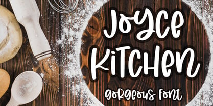 introducing JOYCE KITCHEN - gorgeous quirk font - It is great for branding, packaging, logo, quotes, t-shirt design, card, banner, and anything your craft project. Uppercase and lowercase characters match each other. What's included? - Uppercase - Lowercase - Numeral & Punctuations - Multilingual - Ligatures - PUA encoded Hope you love it. regards, Abo Daniel Studio
 - Guildford Pro by Red Rooster Collection,
$60.00 Our Guildford is based on the Stephenson Blake typeface, Guildford Sans. Guildford Sans is identical to Elegant Grotesque, the 1928-29 design by Hans Möhring. Guildford contains all the high-end features expected in a quality OpenType Pro font.
 - Gorva by Dasukreation,
$9.20 Gorva is a geometric sans serif typeface affected by other geometric sans like Product Sans and Avenir. There are more 400 glyphs with special characters with circles on a, g, and r. All special characters are PUA Encoded, which means that you can access all special characters through Windows and Mac and that you can load them into any application. This typeface is suitable for many projects, such as designing for print and digital media. Also supports multilingual languages from Western European to Eastern European.
 - Besans by NJ Studio,
$19.00 Hi...Thank for your visit :) Besans Handmade sans font. It features tall characters that will take your projects to the next level! This font is PUA code which means you can easily access all the glyphs that are full of sans! It also features many special features including glyphs. font designs that are made for various vector designs, printing such as digital wedding blogs, online shops, social media, while printing can be used in the field of product clothing, accessories, bags, pins, logos, business cards, watermarks and many others ... so it can make your product look sans and attractive, and also Multilingual support!!! Happy design ...
 - Rocky by NJ Studio,
$19.00 Hi...Thank for your visit :) Rocky modern sans font. It features tall characters that will take your projects to the next level! This font is PUA code which means you can easily access all the glyphs that are full of sans! It also features many special features including glyphs. font designs that are made for various vector designs, printing such as digital wedding blogs, online shops, social media, while printing can be used in the field of product clothing, accessories, bags, pins, logos, business cards, watermarks and many others ... so it can make your product look sans and attractive, and also Multilingual support!!! Happy design ...
 - Megapolis by Artisticandunique,
$9.00 Megapolis - Sans Serif Font Family - Multilingual support - 16 Styles With its elegant and clean structure with 16 styles and multilingual supports, you can easily use the sans serif font feature in many areas. From body text to big headlines, from classic to modern and bold styles, you can develop your projects. Ideal for books and magazines, magazine covers, editorials, headlines, websites, logos, branding, advertising and more. You can create your unique designs with this font. Have a good time.
 - LT Panneaux - 100% free

- Aron Grotesque - Personal use only

- xscale - Unknown license

- Negotiate Free - Unknown license

- Gill Sonos - Unknown license

- junction regular - 100% free


