10,000 search results
(0.286 seconds)
- Antartida by Latinotype,
$26.00 Antartida is a sans serif typeface, while it is monolinear simple structure give it a kind of neutral feeling, is functional, clean and minimal. Is a family of 8 fonts, 4 weights and italics. This typeface contains alternate glyphs that help to emphasize text or headlines. You can also see AntartidaEssential, a simpler and less expensive version.
 - Sugar & Spice by Brittney Murphy Design,
$8.00 Sugar and Spice is a sweet & scrumptious font duo! Designed with short descenders, so there’s less of that awkward white space, these work great for multi-line designs! Both include lots of alternates, the script includes plenty of ligatures, and the hand-sans has small-caps, so you can mix and match to create a custom look!
 - Ranger by Letterena Studios,
$10.00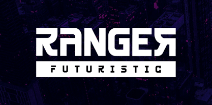 Ranger is a modern and classy sans-serif font with a futuristic style and fancy look. This typeface is perfect for an elegant & luxury logo, book or movie title design, fashion brand, magazine, clothes, lettering, quotes, and so much more. This font is PUA encoded, which means you can access all of the glyphs and swashes with ease! **Uppercase
 - Grand Scoth by Rhd Studio,
$11.00 Introducing, Grand Scoth - The Essential Duo Font Collection Grand Scoth is the perfect and essential combination of a duo of fonts including , round sans and authentic signature. This font duo also supports multilingual, numeric and symbol. You can use this font for any purpose. The best part is, you don't have to look for a partner Thank you....
 - Orplid Pro by RMU,
$40.00 Hans Bohn’s Orplid, a shadowed sans serif font strongly influenced by the then prevailing Bauhaus style, and released by Klingspor in 1929, was revived and vastly extended for multilingual use. In addition, a filling style was made to easily accomplish colorful headlines, ads and posters. Both styles come with alternatives for A, M, N and W.
 - Black Forte by TypeClassHeroes,
$15.00 Black Forte is a sans serif display with various width and weight that you can explore and combine. use this font for any branding, product packaging, invitation, quotes, t-shirt, label, poster, logo etc. Feature Uppercase & Lowercase Number & Symbol International Glyphs Multilingual support Feel free to drop us a message f you have any questions Hope you enjoy it.
 - ITC Syndor by ITC,
$29.99ITC Syndor is the work of Swiss designer Hans Eduard Meier, a font which is almost, but not quite, a sans serif. The beginnings and endings of strokes display a hint of the calligrapher's hand and these tiny serifs optimize legibility. This legibility and the typeface's simple forms make ITC Syndor an excellent choice for business and presentation graphics. - Romantis Natalies Duo by Rastype Studio,
$12.00 Romantis Natalies Script and Sans are beautiful and romantic writing fonts. Looks amazing on wedding invitations, thank you cards, quotes, greeting cards, logos, business cards and any other design. This font is PUA encoded which means you can access all glyphs and swashes with ease! The font includes OpenType features with alternative styles, ligatures, and multiple language support.
 - Facility Signage JNL by Jeff Levine,
$29.00 A famous 1971 photo shows boxing champ Muhammad Ali making faces through a window at Joe Frazier at the challenger’s training facility. A small sign sits in the window that says “Joe Frazier Training Headquarters” and is lettered in a simple sans serif condensed typeface. This is now available as Facility Signage JNL in both regular and oblique versions.
 - Open Range by FontMesa,
$20.00 Open Range is a new font design based on an old classics sans serif font from the 1800s. Some may say that this font looks like a western version of the more modern Benguiat but samples of lettering from the 1800s show a similar design to Benguiat and may have been the inspiration for that font.
 - Norma by Linotype,
$29.99Norma was my second sans serif. You can find a few details in common with Dialog, but the graphic impression of Norma is totally different.Every typeface has some characters that are the favourites. In Norma I simply love the lowercase roman a. Don't you, too, think that it is perfection itself? Norma was released in 1994. - COCOTA by Top Type,
$9.00 Cocota is a sans serif/display font. This font has a gentle and authoritative character. You can use this font to make banners, advertisements, websites, business cards, quotes, and more. The advantages of this font include features such as : Regular, Italic, All Caps, Stylistic Alternate. Cocota is the best choice for you. Don't hesitate to own it.
 - Kopi Senja by Orenari,
$10.00 Kopi means coffee, and Senja means sunset. The inspiration of Kopi Senja Font Duo is indie music fans. Every curves of the character is originaly drawn by my hand with heart. Kopi Senja has sans and script version, mix and match it with your own imagination. Be creative and make your project stand out with Kopi Senja.
 - KNF Damryl by Kenan Nasibov Fonts,
$29.00 KNF Damryl is a monospaced display font that can also be described as a modern geometric sans serif. Inspired by geometrics and postmodernist typefaces like Gridnik and FRAC, KNF Damryl is most suitable for headlines, posters, magazines, and logos. KNF Damryl has a bold presence and an artfully utilitarian feel, making it an incredible addition to your typeface library.
 - Ravager by Rillatype,
$15.00 Ravager is an organic typeface that consist of 10 fonts that you can choose. With Sans and Serif combo to make your project more stand out! Suitable for branding logo, hand lettering, or apparel design. this font also support multilingual. We hope you enjoy the font, please hit us if you have any question Rillatype@gmail.com
 - Hotel District JNL by Jeff Levine,
$29.00 The sans serif type style for the specialty font Nameplate JNL was given a serif treatment and is now Hotel District JNL complete with a full character set. Originally inspired by two Art Deco-era metal door signs saying "Men" and "Ladies", the thin lettering lends itself well to period pieces as well as contemporary design work.
 - QSansPro by Fontop,
$11.00 Create bold headlines and elegant designs with a versatile QSansPro font family. Excellent for large type as well as logos, quotes, advertisements and more. QSansPro is a strong and sophisticated sans serif, yet classic and you'll keep coming back to it again. Each font in this family is full of character and can stand on its own.
 - Formetic by Bülent Yüksel,
$19.00 The Formetic family can be used for logos, advertising slogans, posters and banners,etc. Designed for use in many different kinds of materials. The design is Sans-serif, modern, geometric and I created digital fonts when designing this first for numbers and players names for a football team. Formetic comes in 6 styles, 3 weighted with corresponding Oblique versions.
 - Roxon by Fo Da,
$7.00 Roxon is a sans serif typeface of 4 weights from Extra Light to Bold and can be used as both a headline and text face. Roxon is recommended for using in long-form writing and articles, since a serif is far more readable for longer passages of text. The typeface has a carefully crafted weight range, with ligatures.
 - Poster Linear by Jehansyah,
$9.00 Poster Linear Natural sans serif font is simple but looks very futuristic and very stylish, it adds to your confidence to make your designs look bolder and modern. Perfect for stickers, media posts, social media statuses, magazines, books, covers, game covers, banners, wall magazines, sports shades, and more, plus a few families you can incorporate into your designs.
 - Marthiline by Motokiwo,
$15.00 Introducing Marthiline: a sweet beauty handwritten font that is perfect for beauty branding, book covers, posters, magazines, or quotes. Marthiline is packed with uppercase, lowercase, numeral & punctuation, multilingual and ligature that already PUA encoded. With its real brush texture and natural stroke gesture you can use this font stand alone or combine it with a thin sans serif.
 - IngrianaCasual by Ingrimayne Type,
$9.95 IngrianaCasual features a hand-drawn sans-serif family with an italics that has semi-script lower-case letters. The five upright weights are relaxed and informal and the five italics styles are decorative and elegant. The family is very legible and can be be used for many purposes including brochures and advertising, though probably not for book text.
 - Magnox Display by Eliezer Grawe,
$9.00 Magnox Display is a family of geometric and expanded display fonts. It brings impact and strength to titles and can be combined with many other sans serif types. It has smallcaps glyphs, alternates and rounded variation and their oblique versions. In 1.1 version you now have a variable version that has two axes: inclination and rounded edges.
 - Harsey by Letterhend,
$16.00 Introducing, Harsey Type Toolbox. One of our best-designed product that we ever created. This product consist of many styles such as script, sans, serif, and also includes dingbats, catchwords and badges all comes in font format. What makes this product even more special is you can use and combine all these fonts perfectly matched altogether.
 - Golred by Canden Meutuah,
$15.00 Introducing Golred is a simple, minimalist and neat sans serif font. It can be easily adapted to a very large range of projects, such as advertising, titles, blogs, logos, branding, invitations, business cards and more! So add it to your creative ideas and watch how it makes it stand out! you will not be disappointed with the results.
 - Ghakity by Letterena Studios,
$17.00 Ghakity is a modern and classic sans serif font with a unique style and modern look. This typeface is perfect for an elegant & luxury logo, book or movie title design, fashion brand, magazine, clothes, lettering, quotes, and so much more. This font is PUA encoded, which means you can access all of the glyphs and swashes with ease!
 - Grimpt by Typesketchbook,
$45.00 Grimpt is a fashion and modern type, made up of three sub-families. Brush (with alternate version), Print (made from beautiful Sans-Serif font “More”), and Script. In these families , you can choose the original and rust styles (offers different feels in different effects). The complete family has 12 individual typefaces that serve your projects every purpose.
 - Deco Power JNL by Jeff Levine,
$29.00 A June 18, 1929 issue of the Hollywood trade paper “The Film Daily” ran an ad for a film called “The Power House”. The film’s title was hand lettered in an extra bold sans serif design with strong Art Deco influences. This is now available digitally as Deco Power JNL in both regular and oblique versions.
 - FF Milo Slab by FontFont,
$68.99 FF Milo Slab is not just the sans with slabs attached. It has undergone a wide range of careful adjustments from increased contrast, longer ascenders and descenders and modified glyphs in the heavier weights. All these changes amount a typeface that feels enough like Milo but also can stand on its own as a new and fresh typeface.
 - YT Steel Latin by Yangtype,
$9.00 The concept of this letter is a tall, well-dressed man with moderate muscles, decent appearance, and manners. We are always impatient. I miss someone who can give me some space. This letter gives you some leeway that you can rely on for a moment.
 - Madison Street by Studioways,
$40.00 Madison Street is a font family with 8 fabulously fun typefaces! Eliza Gwendalyn & Jim Lyles of Studioways have teamed up with Spencerian calligrapher Elaina DeBoard to create a classic pointed pen calligraphy font. From its ornamental monograms, to its variety of complimentary text styles, and to its Madison Street Pro, with its elegant stylistic swashes and OpenType goodies, there is a font for every designer. Enjoy the sleek Madison Street Sans, Serif or Script, paired with the Ornaments font, complete with ornate monograms, or use each typeface on its own! Madison Street Pro has all the OpenType bells and whistles. The Ligature feature automatically substitutes beginning and ending letterforms, as well as 100 ligatures. Turn on the Swash feature for elegantly sweeping swash lowercase forms. Enable Stylistic Alternates for even more variations. There are also 10 Style Sets to chose from. And many more OT features! Madison Street is a basic version of the Pro font, intended for users who do not have OpenType savvy applications. Madison Street Stylistic is also a basic version of the Pro font, intended for users who do not have OpenType savvy applications. It has stylistically different ascenders and descenders. Madison Street Swash is intended to be used with the basic fonts, Madison Street and Madison Street Stylistic. It has lowercase beginning and ending swash glyphs and cannot be used to set text by itself. Madison Street Sans, Serif, and Script are text fonts modeled after the handwriting of Elaina. They are intended to be complimentary to any of the script fonts. However, you'll need to set them at a smaller point size (about 1/3 the size) in order to get the preferred scale and weight. Finally, the hairline weight of the Madison Street script fonts is very thin, and at small sizes up to 40 pt, you may notice some breaking up when printing to desktop printers. To remedy this, we recommend outline stroking the text a small amount (.1 -.3 value). this should improve the output without adding to much weight overall.
 - Rufina by TipoType,
$16.00 Rufina was as tall and thin as a reed. Elegant but with that distance that well-defined forms seem to impose. Her voice, however, was sweeter, closer, and when she spoke her name, like a slow whisper, one felt like what she had come to say could be read in her image. Rufina’s story can only be told through a detour because her origin does not coincide with her birth. Rufina was born on a Sunday afternoon while her father was drawing black letters on a white background, and her mother was trying to join those same letters to form words that could tell a story. But her origin goes much further back, and that is why she is pierced by a story that precedes her, even though it is not her own. Maybe her origin can be traced back to that autumn night in which that tall man with that distant demeanor ran into that woman with that sweet smile and elegant aspect. He looked at her in such a way that he was trapped by that gaze, even though they found no words to say to each other, and they stayed in silence. Somehow, some words leaked into that gaze because since that moment they were never apart again. Later, after they started talking, projects started coming up and then coexistence and arguments, routines and mismatches. But in that chaos of crossed words in their life together, something was stable through the silence of the gazes. In those gazes, the silent words sustained that indescribable love that they didn’t even try to understand. And in one of those silences, Rufina appeared, when that man told that woman that he needed a text to try out his new font, and she saw him look at her with that same fascination of the first time, and she started to write something with those forms that he was giving her as a gift. Rufina was as tall and thin as a reed, wrote her mother when Rufina was born. Photo (Fragilité): Karin Topolanski / Post: Raw (www.raw.com.uy) - María Pérez Gutiérrez
 - Hardley Brush by Negara Studio,
$17.00 Hardley x Rocky Sanz is Font Duo, modern brush style and modern sans. The best for labels, poster, project designs look modern, authentic and cool . It’s perfect for labels, quotes, posters, DIY projects, branding, packaging, greeting cards, websites, photos, photography overlays, signs, scrapbooking, tags and so much more! That is why Hardley has a textured, and authentic characteristic more natural look. You can activate Alternates glyphs OpenType panel. What’s Included : Standard glyphs Alternates glyphs Bonus extra font (52 swashes) Web Font Works on PC & Mac Simple installations Accessible in Adobe Illustrator, Adobe Photoshop, Adobe InDesign, even work on Microsoft Word. Image used: All photographs/pictures/vectors used in the preview are not included, they are intended for illustration purposes only. Hardley x Rocky Sanz supports the following languages; English, French, Italian, Spanish, Portuguese, German, Swedish, Norwegian, Danish, Dutch, Finnish, Indonesian, Malay, Hungarian, Polish, Croatian, Turkish, Romanian, Czech, Latvian, Lithuanian, Slovak, Slovenian ~Anugerah
 - Oxford Press by Set Sail Studios,
$17.99 Recreate authentic letterpress typography with Oxford Press, a set of chunky uppercase Serif & Sans fonts designed using real vintage metal letterpress blocks sourced from old printing companies. The Serif & Sans fonts each have two variations, 'Clean' and 'Rough'—with the latter having real, highly detailed hand-made letterpress textures applied to each letter. Each letter of the 'Rough' fonts also has an alternate texture, which can be accessed simply by switching between upper and lowercase characters. The 'Rough' fonts can make a striking impact as bold header text for posters, adverts, prints and packaging, whereas the 'Clean' versions are more suited for smaller accompanying text, cleaner designs or for applying your own textures and styles. Language Support • English, French, Italian, Spanish, Portuguese, German, Swedish, Norwegian, Danish, Dutch, Finnish, Indonesian, Malay, Hungarian, Polish, Croatian, Turkish, Romanian, Czech, Latvian, Lithuanian, Slovak, Slovenian.
 - Gothiks Round Condensed by Blackletra,
$50.00 Gothiks Round Condensed is the rounded version of Gothiks Condensed. It is a 6-weight display sanserif influenced by Texturas. The rhythm and verticality of Texturas can be easily identified on the letters with diagonal strokes like A N M K k V v W w X x Y y Z z: here they are all vertical. This kind of morphology was chosen because it accepts condensation in a very natural way, giving to this sans-serif a very unique personality. It has an extensive character set—with extensive language support—and many OpenType features like fractions, small capitals and different figure sets. Default figures align with lowercase. The typeface’s name refers to the plural of the word Gothic, which in turn can refer to both san-serifs or Blackletter, depending on geographic location. Use it BIG!
 - TT Ricordi Marmo by TypeType,
$29.00 TT Ricordi Marmo useful links: Specimen | Graphic presentation | Customization options TT Ricordi Marmo extends the series of experimental projects within the TT Ricordi fonts collection. The main goal of the TT Ricordi project is to look for gems in old signs and on stone and bringing those inscriptions back to life in the form of contemporary fonts with the umbrella name TT Ricordi. TT Ricordi Marmo is an original experimental project by Eugene Tantsurin inspired by inscriptions at Basilica di Santa Croce in Florence. Working on it, we wanted to create a contemporary typeface that would unite the elements of a Florentine sans-serif mixed with more traditional visual solutions typical for the period's serifs. As a result, we got a bright and somewhat provocative typeface with irregular serif distribution, some unusual contours and a free spirit. In small body size TT Ricordi Marmo makes a neutral impression, but as the size gets bigger, the user is taken on a playful quest to search for interesting moves, graphic peculiarities and unusual solutions. TT Ricordi Marmo is great for poster design, packaging, and setting large and medium-sized inscriptions. Thanks to its idiosyncrasy, the typeface may look nice both at a poster in a grand academic theater and at an acid rave party. You can find a set of icon patterns that can be used in several ways. First, you can substitute letters with these patterns, thus getting an inscription with a visible graphic element. Then you can also construct borders and interval marks, or just use them as icons. All patterns are perfectly adapted to the design of letters in the font. TT Ricordi Marmo consists of 2 styles and one variable font. Each of the styles contains over 630 glyphs and 18 OpenType features. As we have conceived TT Ricordi Marmo as a poster typeface from the very beginning, it features small capitals instead of lowercase characters. In addition, the typeface has a set of interesting ligatures, stylistic alternates, pointers, hands, and pattern icons. TT Ricordi Marmo OpenType features list: AALT, CCMP, LOCL, NUMR, ORDN, TNUM, PNUM, CASE, SS01 (Alternative latin E), SS02 (Alternative Eszett), SS03 (Alternative Cyrillic I), SS04 ( Alternative Amper- sand), SS05 (Romanian Comma Accent), SS06 (Dutch IJ), SS07 (Catalan Ldot), DLIG, CALT, SALT.
 - Silex by Our House Graphics,
$14.00 A different kind of beauty. Silex began life in the labs of R.U.S.S.T Institute a number of years ago, starting with a skeleton of C.A.D./C.A.M system fonts, a disused tungsten carbide blade off an old milling machine for a soul and a little box of OpenType features for brains. This family of 3 solid, Silex is a hard-edged, hard-working display fonts. Suitable for headlines, logos, heavy equipment and... If you are a wrestler or mixed martial arts fighter, your resume. OpenType features include stylistic alternates, discretionarily ligatures, case sensitive glyphs, small caps, dozens of standard and discretionary ligatures.
 - Robusto by Galapagos,
$39.00Thirteen or 14 years ago I admired, out loud, a book I found on a shelf in Matt Carter's office. That Christmas I was pleasantly surprised to find that Matt had found another copy of the book and he gave it to me. The book was about the life of Oswald Cooper and it contained numerous specimens of Cooper's lettering jobs. Among them was an interesting image of 7 letter that spelled out the word 'Robusto'. These letters were used as the model for the font Robusto. All I needed to do was develop 221 other glyphs to finish the font. - Aethelred NF by Nick's Fonts,
$10.00This unicase typeface, with alternate characters in several of the lowercase positions, is patterned after Mosaik, designed by Martin Kausche for Schriftgeißerei Stempel in 1954. A stencil treatment has been employed, and the outlines have been roughened to enhance its ancient feel. The typeface is named for a king of England, Æðelred the Unready, who ruled over a millenium ago. Unlike its namesake, this typeface is quite ready to do yeoman's duty on your next project. The Opentype, Truetype and Windows Postscript versions of this font contain both the Windows 1252/ANSI character set and the 1250/Central European character set. - Lastones by Nathatype,
$29.00 Have you been looking for a vintage font? Do you dream of creating headings that stand out and inspire modern and artistic? Lastones - A Vintage Font Lastones is a display font made all in uppercase typeface that shows retro looks. A great display font that appears to drip down on the page, as if sprayed there only moments ago. Well suited to titles, poster designs, branding, and logos. Our font always includes Multilingual Support to make your branding reach a global audience. Features: Swashes Stylistic Set PUA Encoded Numerals and Punctuation Thank you for downloading premium fonts from Nathatype