10,000 search results
(1.593 seconds)
- Sabine by Arabetics,
$45.00 Sabine is an Arabetic type design with a calligraphic flavor. It follows the guidelines of the Mutamathil Taqlidi type style with one glyph for every basic Arabic Unicode character or letter, as defined in Unicode Standards version 5.1, and one additional, final-position, glyph for each Arabic letter that is normally connected with other letters from both sides in traditional cursive Arabic strings. Sabine employs variable x-height values. It includes all required Lam-Alif ligatures and uses ligature substitutions and selected marks positioning but it does not use any other glyph substitutions or forming. Text strings composed using types of this family are non-cursive with stand-alone isolated glyphs. Tatweel (or Kashida) glyph is a zero width space. Keying it before any glyph will display that glyph isolated form. In Sabine Kashidah, Irsal, and Tasmim keying Tatweel (shift J) after certain glyphs will replace it with a long stroke glyph. In Sabine Tasmim, keying it a second time will replace glyph with a final form swash (Irsal) glyph. In Sabine Irsal all final forms are swash glyphs. Keying Tatweel before Alif Lam Lam Ha will display the Allah ligature. Sabine family includes both Arabic and Arabic-Indic numerals; all required diacritic marks, Allah ligature, in addition to standard English keyboard punctuations and major currency symbols. Fonts are available in regular and italic styles.
 - Yasmine by Arabetics,
$39.00 The Yasmine type family follows the guidelines of the Mutamathil Taqlidi type style. It has one glyph for every basic Arabic Unicode character or letter and one additional, final-position, glyph for each Arabic letter that is normally connected with other letters from both sides in traditional cursive Arabic strings. Yasmine employs four fixed x-height values, two above and two below the x-axis. Values are high to give a slight vertical overall look. Its design uses full curves with equally distributed weight. Yasmine family includes all required Lam-Alif ligatures and uses ligature substitutions, and marks positioning but it does not use any other glyph substitutions or forming. Text strings composed using types of this family are non-cursive with stand-alone isolated glyphs. It employs our “natural Arabic input” method where first glyph is displayed in its non-isolated form. Tatweel (or Kashida) glyph is a zero width space. Keying it before any glyph will display that glyph isolated form. Keying it before Alif Lam Lam Ha will display the Allah ligature. Yasmine family includes both Arabic and Arabic-Indic numerals, all required diacritic marks, Allah ligature, in addition to all standard English keyboard punctuations and major currency symbols. The fonts in this family support the following scripts: Arabic, Persian, Urdu, Pashtu, Kurdish, Baluchi, Kashmiri, Kazakh, Sindhi, Uyghur, Turkic, and all extended Arabic scripts.
 - Amudi by Arabetics,
$39.00 The Amudi type family follows the guidelines of the Mutamathil Taqlidi type style. It has one glyph for every basic Arabic Unicode character or letter and one additional, final-position, glyph for each Arabic letter that is normally connected with other letters from both sides in traditional cursive Arabic strings. Amudi employs four fixed x-height values, two above and two below the x-axis.. Values are high to give a slight vertical overall look. Amudi family includes all required Lam-Alif ligatures and uses ligature substitutions, and marks positioning but it does not use any other glyph substitutions or forming. Text strings composed using types of this family are non-cursive with stand-alone isolated glyphs. It employs our “natural Arabic input” method where first glyph is displayed in its non-isolated form. Tatweel (or Kashida) glyph is a zero width space. Keying it before any glyph will display that glyph isolated form. Keying it before Alif Lam Lam Ha will display the Allah ligature. it Amudi family includes both Arabic and Arabic-Indic numerals, all required diacritic marks, Allah ligature, in addition to all standard English keyboard punctuations and major currency symbols. The fonts in this family support the following scripts: Arabic, Persian, Urdu, Pashtu, Kurdish, Baluchi, Kashmiri, Kazakh, Sindhi, Uyghur, Turkic, and all extended Arabic scripts.
 - Slowglass by Adam Jagosz,
$29.00 Slowglass is a geometric semi-serif accompanied by geohumanist italics. Softly rounded edges lend it a friendly tone. The typeface includes two categories of stylistic alternates, available as font features as well as complementary font subfamilies. Text forms for increased legibility (Slowglass Text) and uncial-inspired unicase variants (Slowglass Alt). At over 1500 glyphs per weight, the fonts support 80+ Latin-based languages (incl. Vietnamese), 14 Cyrillic-based languages and polytonic Greek. OpenType features: Six sets of figures: proportional / tabular × oldstyle / lining / petite (ss20) Superscript and subscript figures Fractions, numerators, denominators Optional slashed zero Case-sensitive forms Glyph composition/decomposition (support for Navajo and Greek) Localization (Dutch, Marshallese, Bulgarian) Stylistic Sets: ss01 Roman: Two-story a, loopy α / Italic: Loopy α ss02 Roman: Simple g / Italic: Simple k ss03 Unicase r ss04 Alt f t г п т γ ss05 Descending η χ ss06 Unicase β ζ θ ξ ss07 Alt в г д ж з к п т ю ss08 Latinized ς, cursive и й ss09 Round Δ Λ Д д Л л Љ љ ss10 Full-stem a q ss11 Seriffed I ss12 Unicase A ss13 Unicase E Ω ss14 Descending F T Г П ss15 Descending G P Q Y ss16 Unicase M N И H Y ss17 Extending Φ Ψ ss20 Petite figures
 - Kufi Mutamathil by Arabetics,
$39.00 Kufi Mutamathil is an Arabetic (extended Arabic) typeface design with heavy Arabic Kufi calligraphy accent, both on a single letter level and in an overall text look and feel. Although Kufi, the earliest Arabic calligraphy style, is often described as “stiff”, it is in fact a very flexible style. The Kufi Mutamathil typeface design underlines this calligraphy style flexibility and openness through visualizing a very legible Mutamathil design with Kufi shapes. The Mutamathil type style utilizes only one isolated glyph per Arabic Unicode character or letter, as defined in Unicode Standards. It is a very light style which does not require any standard glyph substitution or the shaping engine. The Kufi Mutamathil font family employs variable, unrestricted, x-height values. It comes in regular and left-slanted italic styles. Kufi Mutamathil includes all required Lam-Alif ligatures. Soft-vowel diacritic marks, or harakat, are selectively positioned with the majority of them appearing on the same level, over or below, following a letter, to ensure that they would not interfere with individual glyphs appearance. Kashida, or tatweel, (shft-j) is a zero-width character. Keying it before Alif-Lam-Lam-Ha will display the Allah ligature. Kufi Mutamathil includes both Arabic and Arabic-Indic numerals, in addition to all Standard English keyboard punctuations and major currency symbols.
 - Meier Kapitalis by Elsner+Flake,
$39.00 As a late work the “Meier Kapitalis” forms an arch within the typographic creations of the Swiss type designer Hans Meier who died in 2014. The first sketches of this typeface can be found in the teaching manual “The Development of Script and Type” (German: “Die Schriftentwicklung”; French “Le développement des caractères”) which was published in 1994, however, under the title “Roman Lapidary, 1st Century”. The booklet was first published by the Syntax Press, Cham, Switzerland and contains an introduction by Max Caflisch in which he writes: „The present work, „The Development of Script and Type“ is a concise, authoritative textbook, concentrating on the essentials in a wide survey from ancient Greek inscriptions to the printer’s typefaces of the present day. His (Meier’s) 72 varieties of letterforms enable the student or general reader to understand the history of script and type, while more than 60 of his own calligraphic specimens provide excellent models for all who practice this art.“ Unfortunately, the “Meier Kapitalis” is one of the few typeface families in this publication which has been digitized. It was to be the last type project fully realized by Meier. In cooperation with Elsner+Flake, the typeface family was developed and expanded and now contains the four cuts: Roman, Medium, Demi Bold and Bold with either a complement of characters for 78 Latin-based languages (EL=EuropaPlus) or in West-Layout.
 - Akagi by Positype,
$25.00 Akagi started as a rough sketch while on a really long plane ride to Tokyo in 2007. I wanted to develop a sans that was a complete departure from my successful Aaux Pro (now Aaux Next) sans serif family. Whereas Aaux and its siblings are rather unforgiving and stark in their presentation, I wanted this new sans serif to "smile" at you when it's on the page. When the plane landed and I realized I did not sleep through the 15 hour trip, my brain shut off, the laptop closed and I hopped in the car to the hotel—forgetting the "new sans" folder on my desktop. Fast forward a few months and I found myself seeing a lot of crisp, rigid, robot-like sans serif typefaces everywhere... I enjoy these new crop of faces but wanted to see something "friendlier" and remembered my earlier sketch work. The groundwork was there screaming at me to complete and Akagi arose from the ashes. To be truly satisfied with it personally, a great deal of time was spent trying to create a harmony between line and curve in an attempt to show that you can be crisp, clean and legible and still keep some personality. The Light and Fat weights (regular and italic) are my favorites and I hope to see them as the workhorses of the typeface.
 - Plausible by Create Big Supply,
$17.00 Introducing Plausible, a captivating stylized handwritten font that adds elegance and charm to your designs. With its beautiful style and versatile features, Plausible is perfect for creating exquisite wedding invitations, stunning stationery art, eye-catching social media posts, and more. Let your imagination soar as you explore the creative possibilities with this remarkable font. Plausible offers a comprehensive set of features, including both uppercase and lowercase letters, numbers, and punctuations. Its multilingual support ensures seamless integration of various languages, allowing you to connect with a diverse global audience and communicate your message effectively. Whether you're designing for personal projects or professional endeavors, Plausible provides the tools you need to create visually striking and impactful compositions. With PUA encoding, accessing the amazing glyphs and ligatures of Plausible is a breeze. These special characters add unique flourishes and connections, elevating the visual appeal of your text and giving it a personalized touch. The monoline style of Plausible enhances its sophistication, making it a versatile choice for a wide range of design applications. Unleash your creativity and make a lasting impression with Plausible. This font combines elegance and handcrafted beauty, allowing you to create designs that stand out from the crowd. Whether you're a graphic designer, a creative professional, or an enthusiast, Plausible is the perfect addition to your font collection, offering endless possibilities for captivating and memorable designs.
 - Limes by Piñata,
$9.90 The idea of Limes emerged at the seashore last year in late summer. Getting ready in advance for a dark winter, we've decided to design a special fontfamily which would bring a bit of vitamins and summer sun into the rough everyday routine and help us survive the cold winter. Limes is both a dream of the sun while it’s gone and a refreshing breeze for the time when it finally gets warm! Limes is a completely handwritten fontfamily and consists of 23 typefaces. To create Limes Sans and Limes Slab families, we've used regular watercolor brushes, and to create monolinear Limes Script, as well as for Catchwords and Dingbats, we've used a felt-tip pen with circular section. Limes Sans and Limes Slabs fonts work perfectly together with Limes Script due to the general handwritten idea, as well as due to the widths contrast – despite its width, Limes Script mixes well with narrower opponents and adds a bit of human spontaneity into the general handwritten concept. The Limes collection includes: Limes Sans (Thin, Light, Regular, Bold, Black & italics), Limes Slab (Thin, Light, Regular, Bold, Black & italics), Limes Script, Catchwords and Dingbats. Limes Sans and Limes Slab widely support OT features: tnum, ordn, frac, case, numr, dnom, subs, sups, and Limes Script uses a large number of context alternatives.
 - Ingy Ding MCD by Ingrimayne Type,
$21.00 This font began as an attempt of draw alternatives to the images of Microsoft’s Wingdings, but then grew beyond that. This new version from late 2010 has over 1400 characters, including almost all of the geometric shapes in unicode 2500 and 2B00 ranges, almost all of the arrows in the unicode 2100, 2700, 2900, and 2B00 ranges, almost all of the dingbats and symbols in the unicode 2600 and 2700 ranges, many of the pictures, symbols, and emoticons in the 1F300 to 1F600 ranges, and a few of the miscellaneous technical items in the 2300 range. There are also pictures on the standard open type letters, most of which can be accessed from the keyboard. However, most of the characters in this typeface have to be accessed using their unicode designation. In Windows this is done with the alt key and the unicode hex number. On the Macintosh the easiest way (and for the five digit unicode characters, perhaps the only way) is to use the “Special Characters” window under the Edit Menu in the Finder. A unicode index of the font is provided in a pdf file that was generated using FontLab. However, it only has four of the unicode digits for the five-digit elements. Almost all of the unicode numbers starting with F should have a 1 in front of the F.
 - Grandhappy by Journey's End,
$18.00 Have you ever searched for a font that looked like it was really someone's handwriting, only to find that it was too feminine or too hard to read? I used to want a font like that, too, until I discovered that a font like that had been residing in my attic, in letters to me from my late grandfather. Not only was I thrilled to have a font like this at hand, but also one that would be a memory of my grandfather every time I used it. He was a hard-working man, raising a family during the Depression, yet was still fun-loving, kind, and generous. We called him Grandhappy. As a wedding present, I received from him rolling pins and a cutting board made of 8 different kinds of wood that he pieced together. In this font, the bullet is a rolling pin in honor of that! Other than the fact that this is a font from the hand of one greatly loved, my favorite thing is that although a True Type Font, it has some features of an Open Type font. There are many alternative letter choices available through the use of little-used keys on the keyboard and alt codes. This font was chosen to portray Jay Gatsby's handwriting in The Great Gatsby (2013).
 - Juvelo - 100% free

- BOSS M - 100% free

- Alvarisky by Putracetol,
$24.00 Alvarisky is a stylish script font that inspired by combination of streetwear, bouncy and hand lettering styles. Ideal for logos, badge, label, apparel, club, event, handwritten quotes, product packaging, header, poster, merchandise, social media & greeting cards. Alvarisky come with opentype feature like ligature and a lot of alternates character. Its help you to make beautiful lettering. This font is also support multi language.
 - P.I. by Hanoded,
$20.00 As he eyed the bloody corpse of Lefty Jones in the hallway, Mac figured the crook had it coming: he always seemed to end up in the wrong place at the wrong time. Mac sighed, his head heavy with last night's alcohol; this meant another day behind his desk, typing endless reports and drinking the bureau's poor excuse for coffee…
 - Rummy by Bunny Dojo,
$23.00 Rummy is powerful, precise, and packed with personality. Simple and initially unassuming, Rummy may seem a reluctant hero. But, when called upon, Rummy will lend you all of its considerable strength and versatility in order to win the day. Influenced by sports branding and 1940s film, Rummy is an underdog that won't let you down. Need more height? Try Rummy Tall!
 - Used Cars JNL by Jeff Levine,
$29.00Used Cars JNL is based on one of the many unique alphabets created by the late Alf R. Becker for Signs of the Times magazine from the 1930s through the 1950s. Special thanks to Tod Swormstedt of ST Media (who is also the curator of the American Sign Museum in Cincinnati, Ohio) for providing the reference material for this design - Night Clown by Putracetol,
$20.00 Night Clown - Quirky Clown Font. With its quirky, decorative, and playful design, this font captures the essence of clowns, parties, and April Fools' festivities. Offering a delightful range of seven variations - regular, clown hat, mask, surprise, laughter, decorative, and funny face - Night Clown is a perfect fit for children-oriented projects, kids' events, posters, greeting cards, birthday invitations, and even logos.
 - Bornia by Yukita Creative,
$14.00 Introducing the Bornia Sans Serif Modern Minimal Font Family – a typeface that exudes sophistication and simplicity. This is a font that exudes a contemporary feel and minimalist look that is sure to captivate your audience. With a variety of bold, Light-to-black variants, this font provides a lot of flexibility in use, giving your designs extra charm and appeal.
 - Merilland by Prioritype,
$15.00 Hello everyone, here is a font that comes with a beautiful impression and is equipped with alternative characters that can be processed at will. You can apply this font in various print and digital media such as logos, wedding invitations, craft products, promotions on social media and many more. Lots. For reference, see preview. Features: -Uppercase -Lowercase -Numeral -Punctuation -Multilingual -Alternate -Ligature -Swash
 - Jeames by Kyle Wayne Benson,
$6.00 Jeames brings familiarity to the often detached feeling extended serif genre. The curved, heavy, joints let the letters bounce along while the proportions and contrast keep your eyes grounded. This mid century inspired family of three weights is intended for large titles and display. The set includes language support, opentype fractions, and other fun glyphs. You can learn more about its development here.
 - Balpoine by Krntype Studio,
$18.00 Introducing Balpoine! a wonderful Handwritten, monoline font display. made with a unique and high curve style that makes it look different Balpoine is an eye-catching, and clean handwritten font. balpoine comes with an accent language and ligatures. This font is suitable for handwriting logos, Wedding invitation cards, T-shirts, merchandise, quotes, social media posts, advertising, and a lot more!
 - Mahameru Arabic by NamelaType,
$39.00 Mahameru Arabic is sibling of Mahameru with the addition of Arabic glyphs, for Arabic, Urdu, and Farsi. With still gives a firm and soft character, with the terminal point on straight and curved strokes. The family has 9 weights ranging from Thin to Black and offers a lot of features flexibility that will help you find the best typographic color for your project.
 - Arial by Monotype,
$45.99 Arial is one of the most widely used designs of the last 30 years. Drawn in 1982 by Robin Nicholas and Patricia Saunders for use in an early IBM® laser printer, Arial has become a staple for textual content. While it is widely believed that Arial's design was based on Helvetica, it is more accurate to consider Monotype Grotesque as its ancestor.
 - Bastion by Scriptorium,
$12.00Bastion is an ultra-bold text-style font derived from some turn of the century hand lettered signage. It is characteristic of the very bold lettering used in a lot of advertising and product packaging in the early 1900s, a style of lettering which was also the inspiration for the Cooper font, though we think Bastion has a much more attractive overall look. - Vibertus by Cercurius,
$19.95 A revival of “Gras Vibert”, a French fat face originally cast by the Didot typefoundry in Paris. It was cut in 1840 by Vibert, an engraver employed by the foundry. The capitals are heavier than the lowercase letters, and the characters g, k, y and & are rather peculiarly shaped, exaggerating the vertical stress. The font is designed for large sizes.
 - Quick by Pen Culture,
$15.00 Quick is modern elegant serif typeface. this font perfect for branding, logo design, product packaging, magazine headers, and so much more. I really hope you enjoy it - please do let me know what you think, comments & likes are always hugely welcomed and appreciated. More importantly, please don't hesitate to drop me a message if you have any issues or queries. Thank you
 - Hoakey by PizzaDude.dk,
$20.00 Hoakey is not really a grunge font, although it comes with rugged edges and a worn surface. This may sound like a grunge typeface, but Hoakey is a lot more than that! It oozes romance. Hoakey has curly alternate uppercase letters, and ligatures for both double lowercase and double numbers. You will need to use OpenType supporting applications to use the autoligatures.
 - Sweeper by Gustav & Brun,
$12.00 Sweeper is a font with several personalities; it’s friendly and scary at the same time, almost like Santa Claus, but nicer. Sweeper has got a handy touch with a lot of different possibilities. You can use it in several occasions. Sweeper is suitable in any environment: the business district in London or the shores of Oxelösund. It’s hella wide and hella fun!
 - Darling Town by Epiclinez,
$18.00 Introducing Darling Town, a cut-out font that can make your headlines, product packaging, logos, and children's books come alive! Imagine the possibilities as this quirky yet charming typeface adds a touch of playfulness to your designs. With its unique and eye-catching shapes, Darling Town will instantly capture attention and leave a lasting impression on your audience. Thank You
 - Lovely Couple by Putracetol,
$19.00 Introducing a new romantic and a beautiful handwritting script font called "Lovely Couple". Come with open type feature with a lot of alternates, its help you to make great lettering. Lovely Couple best uses for invitation, wedding, heading,cover, poster, logos, quotes, product packaging, header, merchandise, social media & greeting cards and many more. This font is also support multi language.
 - Red Letter by Ingrimayne Type,
$9.00 In late 1988 or early 1989 I noticed that the circular form of the sickle and the linear form of the hammer could be used to form all the letters of the alphabet. The result of that realization was RedLetter, a novelty or letterbat font. It is caps-only with the lower-case letters containing smaller versions of upper-case letters.
 - Solid Stencil JNL by Jeff Levine,
$29.00 In 1962, the late Robert Libauer of the Stenso Lettering Company (of Baltimore, MD) revised two of his popular stencil lettering guides to offers users two choices: “traditional” stencil letters and numbers and "solid" letters for tracing and coloring. Solid Stencil JNL was modeled from one of those lettering guides, and contains all of the character anomalies found within that vintage stencil.
 - Mahameru by NamelaType,
$29.00 Mahameru is the name of the peak of Mount Semeru, mean "The Great Mountain" in Sanskrit. This font gives a firm and soft character, with the terminal point on straight and curved strokes. The family has 9 weights ranging from Thin to Black and offers a lot of features flexibility that will help you find the best typographic color for your project.
 - Eastgood by Wacaksara co,
$12.00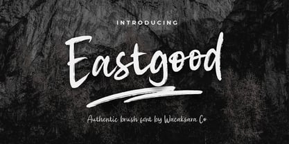 Eastgood Font is a hand brush script font and dramatic movement. This font is great for your next creative project such as Logotype, printed quotes, invitations, cards, product packaging, headers, Letterhead, Poster, Apparel Design, Label, and etc. Eastgood comes with uppercase, lowercase, numerals, punctuations and so many variations on each character include OpenType alternates, and common ligatures to let you customize your designs.
 - Riveruta by Andfonts,
$14.00 Working as a graphic designer for a long time, I realized importance of alternates. Riveruta is a modern typeface designed especially for those who like to experiment with letters. Lots of alternative letters help in creating logos or names. Create your own unique combination using different options. Suitable for any business, this font is gender neutral and should appeal to most people.
 - Quiky by Scratch Design,
$10.00 Introducing our Quiky! A playful, hand lettered font. It has smooth lines, a heavy weight, sweet curves and a lot of character that you can name it. Quiky suits for your design such as invitation design, stationery, branding, blog design, advertising design, card, art quote, home decor, book title, special events and more. This font also includes Latin Characters for language support.
 - Royal Blossom by Wiescher Design,
$39.50 Royal Blossom belongs to my extended family of blackletter fonts that are derived from the famous Royal Bavarian Fraktur. Ayres Royal and Monkeytails also belong to this elaborate set of blackletter fonts; that's why I now offer the lot for an exceptional price. All fonts can be mixed and used together. Your type designer with a crunch for history, Gert Wiescher.
 - Panelope sugar by Cocodesign,
$10.00 Panelope is a handwriting design font duo, including Regular. This font is casual and beautiful with swash. Can be used for various purposes. such as logos, product packaging, wedding invitations, branding, headlines, signage, labels, signatures, book covers, posters, quotes, and more. If you need help or have questions, please let me know. I am happy to help :) Thank you & Congratulations on Designing!
 - Statue Of Liberty's Underwear by Vic Fieger,
$6.99Inspired by a handwritten Cyrillic placard seen in a book about the Soviet Union, Statue of Liberty's Underwear was envisioned as having been written with a very thick pen with a flat tip held horizontally. Additionally, the letterforms were sculpted to resemble lettering common in early 20th-century Russian constructivism pieces. A Cyrillic alphabet, or "azbuka", set was included in the font.

