10,000 search results
(0.023 seconds)
- Roney JNL by Jeff Levine,
$29.00If it's at all possible to "Deco-ize" an Art Deco font even more, it's been done with Roney JNL. Named for one of the classic hotels built during the heyday of Miami Beach, this font is a stylized version of Jeff Levine's Metalet Modern; a design derived from an actual 1940s home movie titling set. - Parfum De Paris JNL by Jeff Levine,
$29.00 Parfum de Paris JNL is an all lower case Art Deco-inspired design that features counterless letters in a thick-and-thin style reminiscent of 1930s text styles. Casual and at the same time elegant, this font is perfect for perfume labels, menu headings and other 'stylish' titling evoking the look and feel of the 'Streamline Era'.
 - Herold by ParaType,
$30.00 The typeface was designed at ParaType (ParaGraph) in 1993 by Vladimir Yefimov based on Herold Reclameschrift by Heinz Hoffman of H. Berthold (Berlin), 1901, and Russian Herold typeface of the Berthold typefoundry (St. Petersburg). The bold style based on Herold Heavy of H. Berthold (Berlin), 1904, of the same designer. Advertising and headline typeface in Art Nouveau style.
 - Old Songs JNL by Jeff Levine,
$29.00 Hand lettering of the song title on the 1914 sheet music for “Dear Old Girl” was the working model for Old Songs JNL. A condensed Roman typeface available in both regular and oblique versions, this titling font exhibits a casual, nonconformist design that isn’t quite traditional, nor is it part of the Art Nouveau movement popular at the time.
 - Kunstgewerbe NF by Nick's Fonts,
$10.00J. M. Bergling called the inspiration for this typeface “modern”—at least, it passed for modern in 1914. Its bold, sinuous forms and unusual decorative treatment suggest stained glass of a certain era, and so its name is German for “Arts and Crafts”. Both versions of the font include 1252 Latin, 1250 CE (with localization for Romanian and Moldovan). - Andreis by Tipo Pèpel,
$28.00 Andreis is a typeface inspired by the art nouveau shapes that appear in the letters of a metal box, made at the beginning of the 20th century by the company G. De Adréis from Badalona in Spain. Its organic and feminine forms evoke the aesthetics of those years and add elegance to the projects where it is used.
 - CA Saygon by Cape Arcona Type Foundry,
$40.00 CA Saygon was originally conceived for a large corporate design project, but as this was never implemented, the way was free to make a public font. As a striking corporate typeface, it transports the fractions of a society after the post-modernist phase. After hundreds of sketches a bunch full of letters were selected, some of them quite twisted, others rather conventional. The combination of these letters reflects a rebellion of individuality but also leads to a coherent typeface. Additionally there are alternative letterforms in the Stylistic Sets or in the glyphs palette, which keeps the font always exciting to the designer. Thanks to the Cyrillic and Latin Extended character sets, a huge language area is covered that even extends to Vietnam! Numerous OpenType features make life easier for the professional typographer: There are fractions, superscript and subscript numbers, as well as proportional and tabular numbers.
 - Delivery Matrix AOE by Astigmatic,
$19.95 The Delivery Matrix typestyle is inspired by the high bleed stamp printing on some shipped packages I've received over the years. An extended techno dot matrix style, good for so many uses at a wide variety of sizes, even with the tight "e" and "s" characters. Do you send out packages to friends...? Do you make techno style art/flyers...? Here is a typestyle for you. Put the power of the Digital and Postal systems in your computer and at your fingertips, get Delivery Matrix today!
 - Bayer Sans by Victory Type,
$20.00Bayer Sans, is based on the typography of the Austrian-born artist Herbert Bayer. Bayer worked as a teacher and graphic designer at the Bauhaus, a revolutionary German art school, during the 20's. His specialty was commercial art and he had many "radical" views on typography and its interaction with society. Bayer felt that written language should be merely a graphic version of spoken language. Thus, he advocated a single alphabet without majuscules and miniscules. Bayer's designs are simple, geometric letterforms that lend themselves to lowercase form. This font, based on the typography of Bayer and his students at the Bauhaus Werkstatt (studio), was digitally modeled by Noah Rothschild. Bayer Sans features a complete character set including European characters, alternate letters with adjusted widths and designs and ligatures. Included are the "f" characters and a special linked double-o. - Lethal Fake by Brush Art Design Office,
$39.80My name is Teruyoshi Matsui. I am a Brush Art Designer. My foundry ‘Brush Art Design Office’ is situated at the foot of an active volcano ‘ Mt. Aso ’ in the Kumamoto Prefecture, the southern part of Japan. I design the letters of the alphabet with a Japanese brush. I have created the brush font named ‘ Lethal Fake ’ in my unique brush style. At the beginning of making the font I was going to name it ‘BrushType Lethal’ and tell you, “ Be careful using it. That’s because it ’s Lethal ”. But actually I was very disappointed when it was finished. I tried to make it lethal, but it was not. So I changed the font name into ‘ Lethal Fake ’. This time I have to say to you, “ Be careful using it. That’s because it’s not Lethal ”. Thank you. - Engria by Eclectotype,
$40.00 Engria is a type family of four weights with corresponding italics that treads the fine line between sans and serif. There are serifs, of a sort, inspired by the brush. Not the marks made by a brush, but the actual splayed shape the bristles make when clamped together. Wedge-like chunks that resemble engraved forms, as the name Engria hints at. But it also has the appearance of a stressed, flared sans. This mixed approach lends a unique voice. Highly legible at text sizes, as indeed it is optimized for, Engria does however shine at display sizes thanks to its characteristic details – flared stems, angular counterforms, rugged ink traps and fluid curves. (I would recommend tracking it a little tighter at larger sizes.) Engria started life way back in 2014, and has been worked and reworked tirelessly to get to this finished product. My intent was to really push the idea of the white shapes being as important, if not more so, than the black. Engria is equipped for typographically demanding applications, boasting as it does an array of OpenType features, including small caps, automatic fractions, stylistic sets, various figure styles, arrows, case sensitive forms and more. It will make a very useful addition to your typographic arsenal, with a flare (ahem) for editorial work, but the individuality for packaging, branding, and logo work.
 - Telder HT Pro by Huerta Tipográfica,
$45.00 Telder HT Pro is a humanist sans serif family with 10 weights, conceived as a web font with nice legibility at normal text sizes. Originally based on grid fitting shapes it became a multi-purpose typeface with low contrast, open counter forms, wide proportions and a touch of freshness. It is ideal for paragraph text on websites as blogs and news sites and works great for printed text. Its extreme weights are suitable for display sizes. This PRO version contains 10 weights and 2 styles. All the fonts contain small caps, alternate glyphs in stylistic sets (such as B, P, R, a, f, g, w, x, y & z), four number sets (lining and old style, proportional and tabular), ordinals, superiors, inferiors, fractions, disctretionary ligatures, arrows and more. Each font contains +1000 glyphs.
 - Como by Dharma Type,
$24.99 Como is a modern rounded sans-serif family designed by Ryoichi Tsunekawa and the whole family consists of 8 weights from ExtraLight to Heavy. The basic skeleton of their letterform was designed geometrically and their ends were rounded out. The sophisticated geometric design gives them universality, neutrality and sense of unity for the use in all media, all purposes. And their large x-heights makes this family legible and readable. While at the same time, the rounded ends characterizes this family and it makes them very friendly and natural. This rounded feature will also accentuate your design work moderately. Como supports almost all European languages: Western, Central, South Eastern Europeans and afrikaans. And superior figures, inferior figures, denominators, numerators and fraction can be accessed by using OpenType features.
 - Sharik Sans by Dada Studio,
$29.00 Sharik Sans (named after the brave and smart dog-hero from my favorite TV series) has a warm and gentle personality. It does not shout; it does not stand out. Sharik serves his master in everyday work. Although it is a sans serif, you can feel a calligrapher’s touch in its subtle details and endings. They shine out, especially at display sizes. The family consists of nine weights plus matching italics. It meets most of the needs designers deal with on a daily basis, including web usage. It is stuffed up with various OpenType features such as small capitals, a wide set of numerals, fractions, ordinals, alternates, and, of course, ligatures. And it perfectly harmonises with my other serif-like typeface family Clavo. NB: This font is NOT style linked by weight!
 - Abnormal by Jan Buble,
$20.00 Are you getting bored by the growing number of sans-serif fonts that absolutely lack character? Do clean typography and sleek curves repulse you? Maybe it’s time to forget the normal and set sail into the murky waters of abnormality. Abnormal features four styles, ranging from an almost monolinear Light to a reverse-contrast Bold. The design pays homage to 19th century poster typefaces, with their crude character and unconventional means of catching the eye. It is one of the few typefaces out there that features reversed contrast and no serifs. These properties make it an ideal choice for large headlines, posters, flyers and essentially all applications where getting attention is a paramount. Abnormal offers extended language support, standard ligatures, alternative lowercase “a”, fractions, ordinals and a plethora of quirkiness at your disposal.
 - Grand Hotel Pro by Stiggy & Sands,
$39.00 Our Grand Hotel Pro finds its inspiration from the title screen of the 1937 film “Cafe Metropole” starring Tyrone Power. This condensed upright connecting script has a classic flair and weight to it that feels subtly tied to Holiday and Bakery themed designs, even though it can work outside that genre. Stylistic Alternates offer a non-swash set of Capitals, and a SmallCaps feature gives this upright script an exciting visual twist. Elegant, reserved, sophisticated, and yet festive all at once. Grand Hotel Pro is a style revival that still finds a strong visual appeal today. Opentype features include: - SmallCaps. - Full set of Inferiors and Superiors for limitless fractions. - Tabular, Proportional, and Oldstyle figure sets. - Stylistic Alternates for less stylized traditional Capitals. - Contextual Alternates for some initial and final forms.
 - Rig Sans by Jamie Clarke Type,
$25.00 Rig Sans is a streamlined geometric typeface, that speaks in a confident, affable tone. Its open, clean structure lends text a neutral, transparent quality. Distinct features enable Rig Sans to thrive, both in print and on screen: Minimalist Design Terminals clipped at 90º Generous x-height Wide apertures Distinct I,l,1 (uppercase i, lowercase L, Number 1) Rig Sans’ sturdy characters produce text settings with excellent clarity and readability. Their shape has been adapted from robust letterforms originally designed to withstand 3D distortions. This unique approach has resulted in an original sans serif rendition and an adaptive, durable type family. Rig Sans is comprised of eight weights and accompanying italics. Each weight contains 514 glyphs. OpenType features include: Alternate characters Three figure styles All caps punctuation Fractions Ordinals Superscript Subscript
 - Maecenas by Dada Studio,
$29.00 Maecenas is an elegant professional. It stands out from other typefaces due to it’s timeless style and versatility. It will add smartness to all texts, regardless of the user’s expectations. In a quick and flashy way it will make an impression on anyone, who requires from his tool character and reliability. Maecenas won’t be lost in the crowd, and thanks to it neither will you. This font, marked by chivalry, is an AUGUST friend for good and bad. Light and bold weights, due to their strong personality, are perfect for display uses. At the same time, Regulars create a harmonious structure that provides excellent legibility in long texts. Maecenas covers all latin languages and cyrillic. It contains a wide set of numerals, small capitals, fractions, ligatures and other OpenType goodies.
 - Revla Round by Eclectotype,
$40.00 Squeezing yet more life out of the Revla skeleton! This is Revla Round, a child-friendly version of Revla Sans, completely overhauled so there's no chance of cutting yourself on any corners. Every rounded terminal and corner has been painstakingly drawn, rather than using a round-corners filter. OpenType contextual alternates make for text that is lively and bouncy, without the monotony of obviously repeating letterforms. It's shamelessly fun, but pretty serious at the same time. The range of weights can be used to maintain an even colour across different sizes - use lighter weights for bigger sizes and vice versa. OpenType features include automatic fractions, ordinals, contextual alternates, standard and discretionary ligatures, and case-sensitve forms. Obviously, in sharing a common skeleton, it will work well with other members of the ever-growing Revla Superfamily.
 - Edith by Dominik Krotscheck,
$12.00 Edith is a handmade serif typeface that can be used for long texts. To make it even better suitable, it is equipped with all the major features you’d expect from a traditional text-font, such as case sensitive forms, old style figures (lining figures are accessible via an opentype feature), fractions and good kerning. To keep up the handwritten appearance, two versions of each letter (A-Z & a-z with diacritics) and number are available and substituted automatically if the same ones meet. Edith is also nice to look at in larger sizes and therefore a great fit for any packaging, advertisement or headline. Edith is for you, if you plan on doing childish things, DIY things, traditional things, illustrated things, nautical things, grungy things or any handmade related things.
 - Bhamious by Rometheme,
$18.00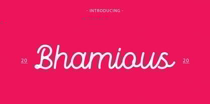 Bhamious is a Monoline Font, It has a elegant, classy look and cool. It’s a great font for fashion, apparel projects, signature, album cover, logo, branding, magazine, social media, & advertisements, but also works great for other projects. Highlights: Standard glyphs (Uppercase, Lowercase, Numeral & Punction) Work on PC or Mac PUA Encoded Support Fonts include multilingual support for; ä ö ü Ä Ö Ü ß ¿ ¡ No special software is required, The fonts can be opened and used in Adobe Illustrator, Adobe Photoshop, Adobe InDesign, even work on Microsoft Word.
 - Creslina by Rometheme,
$22.00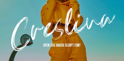 Creslina – Open SVG Brush Script font. It has a elegant, classy look and beauty. It’s a great font for fashion, apparel projects, signature, album cover, logo, branding, magazine, social media, & advertisements, but also works great for other projects. Highlight : Standard glyphs (Uppercase, Lowercase, Numeral & Punction) Work on PC or Mac PUA Encoded Support Fonts include multilingual support for; ä ö ü Ä Ö Ü ß ¿ ¡ No special software is required, The fonts can be opened and used in Adobe Illustrator, Adobe Photoshop, Adobe InDesign, even work on Microsoft Word.
 - Bandleader JNL by Jeff Levine,
$29.00 How does one arrive at a font name? With the thousands of digital typefaces available, it's not an easy process. Bandleader JNL was modeled from the hand-lettered title on a piece of sheet music called "Largo", which means "slow tempo". Since the names "Largo" and "Tempo" were already taken, what other musical theme would fit? The lettering is in an Art Deco style, and Big Band was all the rage of the Art Deco period; therefore "Bandleader". Sometimes the road to naming a font takes on many twists and turns but the end result is always gratifying.
 - Used Servers by AltaTech,
$17.99 Jump back to the future with both faces of the Used Servers family. This blocky titling font comes ready with ligatures and diacritics for all of your English, French, and German retro-future needs. Art Deco density combines with subtly-weighted horizontals for a slight 3D effect. As a retro omni-technical font with roots in OCR and n-segment displays, Used Servers is equally at home as: Titling in an 80s cassette-punk text adventure Environmental advertising in a cyberpunk megalopolis Art Deco filigree worked into a sacred orb Glyphs holding secrets from before time
 - Calle 26 by Christian Gamba Pardo,
$9.90 This group of icons has graffiti as central theme, based on the most representative images and styles of the artists; Guache, Toxicomano and DjLu. In addition, the 26th Street corridor (also known as El Dorado Avenue) was taken as the main reference because it brings together the work of many important exponents in this type of art; at least locally and nationally. Some icons are characterized by have a similar appearance with the Stencil technique or by have a loose stroke with high contrast. This font can be used in projects and works related to street art.
 - BLT Balfour by Black Lab Type,
$12.00 BLT Balfour : Art Deco Revival Font Balfour is a modern Art Deco typeface revival. Built from historic references in architecture during this time period, Balfour exudes class and elegance, yet still honors the style with unapologetic bold geometric forms. Pay close attention to the letterforms B and R, and how their extreme x-heights play off of the elongated strokes of C, D and G. Unique features throughout the character set make it less predictable and more unique than any Art Deco typeface before it. The geometry of this typeface plays from one letter to the next. Fill and Outline styles work well in headlines, logos and large type. The Line style is effective at all sizes and can be used in combination with other styles to achieve visual hierarchy.
 - BD Megatoya by Balibilly Design,
$25.00 Overview of BD Megatoya Consists of 41 fonts, including nine upright, nine italics, nine extended, nine extended italics, all in nine weights from thin to black. 4 outline version in black weight. 1 variable with three axes (weight, width, slant). 1,470 glyphs in each font. Opentype features include small caps, stylistic alternates, ligatures, complete numeral figures, ordinal, case-sensitive forms. language support: Western European, Central European, and Southeastern European. About BD Megatoya Taking a geometric sans serif approach, we designed the letterform with details on round characters to pursue harmony and leave a slightly boxy feel to the extended style. The stylistic alternate is one of our concentrations to make them versatile yet still preserve consistency in stem and metrics to provide good readability in small text. Overall, the various treatments for each character will encourage each other to dynamic colours, flexible, and functional impressions in their application. Slicing edges The edge of the letter slice in 45 degrees will give the impression of a sparkle of light when you look at them for the first 2 seconds (our experience). This is what we did a few years ago when working on automotive branding. The word-mark logotype with slicing form gives an exclusive and different impression from its crowds. If you agree with us, does BD Megatoya deserve to be called a problem solver in branding projects? Jump over to .ss07, .ss08, .ss09, and .ss10 to find them! The Features BD Megatoya font family includes 41 great fonts in nine weights, an extended character set of over 1400 glyphs, multilingual support such as Southeastern Europe, Central Europe, Western Europe. Also advanced & useful open-type features: case-sensitive forms, small caps, standard and discretionary ligatures, stylistic alternates, ordinals, fractions, numerator, denominator, superscript, subscript, circled number, slashed zero, old-style figure, tabular and lining figure. Use BD Megatoya BD Megatoya is very suitable for branding projects and many designs purpose like advertising, posters, invitations, branding, logos, magazines, merchandise, presentations, etc. It's a FREE Get one weight from the BD Megayoya family for Free! Apply to your amazing projects and enlarge your creative tools by adding the complete BD Megatoya family to your font library.
 - Stone by Tipos do aCASO,
$14.95Let your mind wander, think about new cultures, missing links. After discovering a bamboo pen, the founder of the first digital type foundry in the northeast of Brazil proposed a set of graphic signs for a fictional civilization. Stone, established in 1999, is the only record of a mystical culture from the age of rocks. - Scandinavia Brush by Mans Greback,
$69.00 Scandinavia Brush is a wild calligraphy font by Mans Greback, inspired by the untamed beauty of Nordic nature. It captures a rugged essence, with each stroke reflecting the raw energy and grace of natural environments. This brush-painted typeface is perfect for logos, handwritten designs, and tattoo art with its active and streetwise feel. Designed with a professional touch and high-quality craftsmanship, Scandinavia Brush comes in six versatile styles: Regular, Upright, Bold, Italic, and the combinations Bold Italic and Bold Upright. The range of styles allows you to create unique, expressive designs that capture the spirit of adventure, speed, and beauty. Use underscores _ anywhere in a word to make an underline swash. Example: Nord___ic Bru_sh Ideal for designer and art projects, or high-end handcrafted products, Scandinavia Brush brings a bold, authentic, and captivating touch to your creative endeavors. The font is built with advanced OpenType functionality and has a guaranteed top-notch quality, containing stylistic and contextual alternates, ligatures, and more features; all to give you full control and customizability. It has extensive lingual support, covering all Latin-based languages, from Northern Europe to South Africa, from America to South-East Asia. It contains all characters and symbols you'll ever need, including all punctuation and numbers. Mans Greback is a Swedish typeface designer with a passion for creating unique and versatile fonts. With an extensive background in design and typography, Mans has built a reputation for his meticulous attention to detail and prolific craftsmanship. His many fonts are widely used by designers around the world, making his work synonymous with creativity and innovation.
 - Saga by Linotype,
$29.99Saga is a rather narrow typeface designed for a typeface competition arranged by a Scandinavian graphic arts magazine. It had to be based on ancient runic characters, that's the reason of some peculiar angular shapes. Saga is not att all a new runic typeface, but a usable one when the columns are narrow. The name is taken, of course, from the Nordic mythology. But saga" in the meaning of "story" contributed to the decision about the name. Saga was released in 1992. - ITC Tyke by ITC,
$29.99Tomi Haaparanta got the idea for the Tyke typeface family after using Cooper Black for a design project. He liked Cooper's chubby design, but longed for a wider range of weights. “I wanted a typeface that was cuddly and friendly,” recalls Haaparanta, “but also one that was readable at text sizes.” He started tinkering with the idea, and Tyke began to emerge. Even though Haaparanta knew his boldest weight would equal the heft of Cooper Black, he began drawing the Tyke family with the medium. His goal was to refine the characteristics of the design at this moderate weight, and then build on it to create the light and bold extremes. Haaparanta got the spark to design type in 1990, when he attended a workshop held by Phil Baines at the National College of Art and Design in Dublin. “I've been working and playing with type ever since,” Haaparanta recalls. He released his first commercial font in 1996, while working as an Art Director in Helsinki. After about two dozen more releases, he founded his own type studio, Suomi Type Foundry, early in 2004. At five weights plus corresponding italics, Tyke easily fulfills Haaparanta's goal of creating a wide range of distinctive, completely usable designs. The light through bold weights perform well at both large and small sizes, while the Black is an outstanding alternative to Cooper for display copy. - Tenacious Brush by PintassilgoPrints,
$26.00 Tenacious Brush is an expressive font, provocative, free spirited and wild hearted. It's an all-caps face, with 4 alternates for each letter and 2 for each numeral — some letters also have stylistic choices. For that spontaneous hand-painted feel, you know. Turn on the contextual alternates feature to automatically cycle all these variety of glyphs. Or... pick your choices manually, which is quite a playful task now in some applications like Adobe Illustrator and Photoshop — just select a glyph and you see its alternates. The font brings yet some useful ornaments to give an extra buzz here and there. And let's not forget to mention the extended language coverage. And there are even fractions available! And ordinals! Definitely not just a rad face. This is a cool brush font with a contemporary tone, offering endless design possibilities: logos, poster art, branding, bold imagery, packaging, t-shirts, apparel and much more... With loads of attitude included. Step into it!
 - Frock by Wahyu and Sani Co.,
$28.00 Please welcome Frock! It is a sans serif typeface for broad range of usage. It is designed with a slightly slanted oval shaped counters, medium contrast and based on American gothic typefaces with "not so formal" feel. The italic styles are flowy and almost true italic. Swash alternates for some uppercases and lowercases are useful for logo, display and poster. This family comes with 16 styles, uprights and matching italics, consisting of 8 weights from thin to ultra. It is also equipped with useful OpenType features such as Ordinals, Superiors, Stylistic Sets, Proportional Lining Figures, Standard Ligatures, Discretionary Ligatures, Fractions, Numerators & Denominators. Each font has 770+ glyphs including swash alternates which covers Western & Eastern Europe, and other Latin based languages – over 200 languages supported! Frock will be suitable for many creative projects. This typeface will be perfect for logos, packaging, greeting cards, presentations, headlines, lettering, posters, branding, quotes, titles, magazines, headings, web layouts, mobile applications, art quotes, advertising, invitations, packaging design, books, book title, and more!
 - Blimone by Degarism Studio,
$40.00 Blimone Inspired from beautiful Art Nouveau styled and pop culture, Blimone approach with geometric shapes and dynamic humanist blends several calligraphic concepts to create a modernist style but with a strong and unique look. The subfamily Blimone ink-traps and the italic characters to appear monumentally "Sharp" in large sizes and jaggedly imperfect in small sizes. The Bilmone font family includes 24 fonts, Support for the variable version of the font, you can choose the individual thickness and the slopes. Support has many fancy ligatures, common standard ligatures are found in some fonts include fi, ff, ffi, fy, ti, tt, ty, tti, ttl , ffk, ft and the discretionary ligatures are gi, ggi, gt, gk, gj, gl, ggl, gh, gti,ct, cti, cty, et, eti, ety, st, and more. all intended to create a natural look that imitates the flow and spontaneous joins of handwriting.OpenType also supports tabular lining numbers, fractions, Numerator and Denominator.
 - Genera Grotesk by Wahyu and Sani Co.,
$25.00 Genera Grotesk is a strong & clean modern sans serif font family. It is total rework of Genera typeface which was released in late 2019. This totally new version of its predecessor has closer aperture, some new letterforms, new italic style and new weight distribution ranging from Thin to Extra Black. Genera Grotesk also available in variable fonts for more flexibility in choosing the right weight. This typeface also equipped with useful OpenType features such as Ordinal, Superior, Stylistic Alternates, Proportional Figure, Fraction, Numerator & Denominator. Each font file covers Western & Eastern Europe Latin language, as well as other Latin based languages – over 200 languages supported! This is a new real multi-purpose typeface that will be perfect for logo, packaging, greeting cards, presentations, headlines, lettering, posters, branding, quotes, titles, magazines, headings, web layouts, mobile applications, art quote, typography, advertising, invitations, packaging design, books, book title, & nearly any other type of creative design you’re working on.
 - Palatino Sans Informal by Linotype,
$29.99 Palatino Sans Informal was designed as part of a group of three font families: Palatino nova, Palatino Sans, and Palatino Sans Informal. Together these three families act as the fulfilment of Herman Zapf’s original Palatino idea. Palatino, which was born as a metal typeface in 1950, proved to be one of the 20th Century’s most popular designs. Not only is Palatino Sans Informal a completely new typeface, it is also a completely new interpretation of the entire sans serif genre. Its letterforms are curved, rounded, and soft, not hard and industrial. In comparison with Palatino Sans, Palatino Sans Informal offers eccentricities that are somewhat artistic and more individual looking. The fonts in the Palatino Sans Informal family include several OpenType features, such as an extended character set covering all Latin-based European languages, old style figures, small caps, fractions, ordinals, ligatures, alternates, and ornaments. Palatino Sans Informal can be mixed well with Palatino and Palatino Sans.
 - Wasser - Unknown license

- Riddleprint - Unknown license

- Futura by Linotype,
$42.99 First presented by the Bauer Type Foundry in 1928, Futura is commonly considered the major typeface development to come out of the Constructivist orientation of the Bauhaus movement in Germany. Paul Renner (type designer, painter, author and teacher) sketched the original drawings and based them loosely on the simple forms of circle, triangle and square. The design office at Bauer assisted him in turning these geometric forms into a sturdy, functioning type family, and over time, Renner made changes to make the Futura fonts even more legible. Futura’s long ascenders and descenders benefit from generous line spacing. The range of weights and styles make it a versatile family. Futura is timelessly modern; in 1928 it was striking, tasteful, radical — and today it continues to be a popular typographic choice to express strength, elegance, and conceptual clarity. NEW: the new Futura W1G versions features a Pan-European character set for international communications. The W1G character set supports almost all the popular languages/writing systems in western, eastern, and central Europe based on the Latin alphabet including Vietnamese, and also several based on Cyrillic and Greek alphabets Futura® font field guide including best practices, font pairings and alternatives.
 - Meow Tails by Yumna Type,
$16.00 Meow Tails is a cute, adorable display font inspired by cat theme. All of its letters and characters are designed in flowing and round shapes to express soft and smooth nuances like a sleeping cat. Furthermore, the insertion of additional objects to the letters functions to suggest a cat’s characteristics, such as cute eyes, whiskers, and a long tail. Meow Tails, of which available features and a clipart bonus you can enjoy, will live up and charm your designs in order to attract the audience with the theme you have. In fact, it will also help you build up your brand identity to be unique and memorable, particularly brands related to cats or pets. Features: Alternates Multilingual Supports PUA Encoded Numerals and Punctuations Meow Tails fits best for various design projects, such as brandings, headings, magazine covers, quotes, printed products, merchandise, social media, etc. Find out more ways to use this font by taking a look at the font preview. Thanks for purchasing our fonts. Hopefully, you have a great time using our font. Feel free to contact us anytime for further information or when you have trouble with the font. Thanks a lot and happy designing.

