10,000 search results
(0.145 seconds)
- Florest Display by Kaligra.co,
$19.00 Florest Display is a clean bold and simple vintage sans serif font, with smooth edges and touch of many beautiful alternate characters make this font look Elegant & stylist. It contains an uppercase alphabet with numbers and symbols. Designed with Stylistic Alternates and Contextual Alternate in some characters that allows you to mix and match pairs of letters to fit your design.
 - Hello Hana Script by madjack.font,
$13.00 Hello Hana Script is an elegant and flowing handwritten font. It is PUA coded which means you can access all glyphs and swashes with ease! It features varied baselines, smooth lines, gorgeous glyphs and stunning alternatives. It maintains a classy calligraphic influence while feeling contemporary and fresh. Fall in love with this font and take your projects to the highest level!
 - Hello Shilla by AEN Creative Studio,
$12.00 Hello Shilla is an elegant and flowing handwritten font. It is PUA encoded which means you can access all of the glyphs and swashes with ease! It features a smooth lines, gorgeous glyphs and stunning alternates. It maintains its classy calligraphic influences while feeling contemporary and fresh. Fall in love with Hello Shilla and bring your projects to the highest levels!
 - Unhuman by AN Studio,
$22.90 Inspired by a futuristic cyberpunk and Neo-Tokyo vibe, UNHUMAN is a typeface that embodies the essence of technology and innovation. With its simple shapes and wide form featuring 45° cuts, this font brings a sleek and hi-tech aesthetic to your designs. Created by AN Górski, UNHUMAN is the perfect choice for projects that require a modern and cutting-edge look. **Uppercase
 - Modern Monarch by RagamKata,
$16.00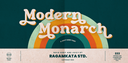 Modern Monarch is a retro display serif font that exudes a classic charm and bold character. With its design inspired by retro styles, this font brings an elegant touch and evokes a sense of the past. Modern Monarch Features: • Uppercase And Lowercase • Alternates And Ligatures • Numerals & Punctuation • Accented characters • Multilingual Support • Unicode PUA Encoded Thanks and have a wonderful day .
 - Goldie Sans by Blythe Green,
$15.00 Goldie Sans is a clean sans serif that is perfect for logos, quotes, long-form copy, and more. Both uppercase and lowercase are included in light and bold, but I am particularly fond of using it as an all caps font for logos, headlines, and short quotes. INCLUDED uppercase letters lowercase letters numbers & punctuation light and bold fonts foreign language characters
 - Wild Nebraska by Larin Type Co,
$10.00 Inspired by wildlife, endless plains, breathtaking mountains and a vintage style, I created a duet of fonts in a rough style. Wild Nebraska is an authentic and brave font duo with many alternates, ligatures and swathes that give multiple options for creating your project and help you to be exclusive and emphasize your personality. All characters of this font PUA encoded.
 - Zanjabeel Arabic by Boharat Cairo,
$20.00 Zanjabeel is an Arabic typeface with a hybrid design between the Naskh and Modern Kufi styles, comes in 9 weights, and some italic letters that give a unique and dynamic feel. the typeface works well with large sizes, headlines, and short text. also, works in printing and digital uses. The typeface is a collaboration with the Egyptian designer Ibrahim Hamdi
 - Sincerity by Océane Moutot,
$32.90 Sincerity is an elegant and strong typeface identified by its high contrast, its sharp shapes and triangular serifs. Inspired by the Didone style, Sincerity adds modernity and some unique features to it. It offers a large choice of uses, from titles of magazines to newspapers, logotypes and so on. Sincerity is available in 16 styles, from thin to black in roman and italic.
 - Hello Billy by Skinny Type,
$15.00 Hello Billy is a modern, handwritten, modern calligraphy font. The shape is modern and unique and the writing style is very natural. Hello Billy features a varied baseline, smooth lines, gorgeous glyphs, and stunning alternatives. Hand-drawn design elements allow you to create many beautiful typographic designs in an instant like branding, web design and editorial, prints, crafts, quotes, It's great for logotypes, wedding invitations, romantic cards, labels, packaging, spelling of names and others. Add to your most creative ideas and watch how they bring them to life! Hello Billy includes OpenType stylistic alternates, ligatures and International support for most Western Languages. To enable the OpenType Stylistic alternates, you need a program that supports as Adobe Illustrator CS, Adobe Indesign & CorelDraw X6-X7, Microsoft Word 2010 or later versions. How to access all alternative characters using Adobe Illustrator: https://www.youtube.com/watch?v=XzwjMkbB-wQ Hello Billy is coded with PUA Unicode, which allows full access to all the extra characters without having special designing software. Mac users can use Font Book , and Windows users can use Character Map to view and copy any of the extra characters to paste into your favorite text editor/app. How to access all alternative characters, using Windows Character Map with Photoshop: https://www.youtube.com/watch?v=Go9vacoYmBw
 - US Bill Sans by Unidaas,
$39.00 US Bill™ Sans A Humanist typefaces sans serif. US Bill Sans has 12 weights, ranging from Light to Extrabold (including italics) and is ideally suited for advertising and packaging, book text, logo, branding and creative industries, small text, wayfinding and signage as well as web and screen design. Provides with features such as ligatures, small capitals, alternate characters, fractions, and super—and subscript characters. It comes with a complete range of figure set options as well as Latin-based languages. Designed and produced by Firman Suci Ananda, Fajar Wahyu Pribadi & Irfan Ulya. Published under Unidaas® Std — Formatika Aksa IDN, 2018.
 - Fendesert by Edignwn Type,
$18.00 Elevate your designs with Fendesert – the ultimate vintage and stamp font duo. This collection features a pair script and san serif font in regular, rough, and stamp styles. Plus, you get 20 hand-drawn western illustrations for added creativity. Perfect for logos, branding, apparel, and more. Unlock vintage charm with Fendesert. Fendesert font features : - 3 style typefaces (regular, rough and stamp) - Uppercase, lowercase, numeral, symbol, punctuation and alternate in script font - All-caps, numeral, symbol and punctuation in sans serif font - Multilingual - PUA Encoded Fendesert includes : - 7 fonts (script, sans serif and dingbat) - 20 hand-drawn illustrations in dingbat
 - FF Marselis by FontFont,
$62.99 Danish type designer Jan Maack created this sans FontFont in 2012. The family has 8 weights, ranging from Light to Black (including italics) and is ideally suited for advertising and packaging, logo, branding and creative industries as well as web and screen design. FF Marselis provides advanced typographical support with features such as ligatures, alternate characters, case-sensitive forms, fractions, super- and subscript characters, and stylistic alternates.The typeface was selected as one of Typographica’s favorite typefaces of 2012. It comes with a complete range of figure set options – oldstyle and lining figures, each in tabular and proportional widths.
 - Slashmine by Din Studio,
$29.00 Slashmine is authentic and modern blackletter font. The font is suitable for any branding project like logo, t-shirt printing and many more. Outstanding in a wide range of contexts. Featured : Alternates Accents (Multilingual characters) PUA encoded Numerals and Punctuation (OpenType Standard) Thanks for downloading premium font from Din Studio
 - Impressive by Ghuroba Studio,
$11.00 Impressive is a light and charming handwritten font with incredible style, and comes in two styles: Regular and Italic. Get inspired by its modern simplicity. It's perfect for logos, branding, photography, invitations, watermarks, advertisements, product designs, stationery, labels, product packaging, special events or anything that need a hand-written style.
 - Alyson Signature by Subectype,
$14.00Alyson Signature is a Handwritten Signature Font, font with a touch of handwriting style. This font is perfect for creating signature logos and watermarks for photography studio or wedding invitation. Alyson Signature includes full set of beautiful hand lettered uppercase and lowercase letters, numerals and a large range of punctuation - Metavoria by Invasi Studio,
$17.00 Introducing Metavoria Font, a playful and quirky display typeface with a hand-drawn style. This font comes with so many ligatures and alternates, that you can use that for more fun on your projects. Metavoria font is ideal for branding projects or packaging that need a quirky and playful feel.
 - Mousseline Pro by fontcastle,
$100.00 Mousseline Pro is hand drawn font a fresh, sans serif font family. Simple and adaptable, this font will make each of your designs look great. Have fun with this beautiful font and explore its endless variations. The typeface is versatile and can be successfully used in Magazines, Posters, Branding, Websites etc.
 - Black Indie by Din Studio,
$29.00 Black Indie is a bold and authentic display font. The font is suitable for any branding project like logo, t-shirt printing and many more. outstanding in a wide range of contexts. Featured : Accents (Multilingual characters) PUA encoded Numerals and Punctuation (OpenType Standard) Thanks for downloading premium font from Din Studio
 - Agave Azul by Fat Hamster,
$25.00 Agave Azul - Hand made old typewriter font Agave Azul Artisan font is perfect for tequila & mezcal label and packaging design, social media quotes, logo & branding design, apparel design, whiskey, beer label and packaging design, heading, scrapbooking, calendars, book covers. Don't forget to use bonus logos, marks and labels for your designs.
 - Macklin by Monotype,
$50.99 Designed by Malou Verlomme of the Monotype Studio, Macklin is a superfamily, which brings together several attention-grabbing styles. Macklin is an elegant, high contrast typeface that demands its own attention and has been designed purposely to enable brands to appeal more emotionally to modern consumers. Macklin comprises four sub-families —Sans, Slab, Text and Display— as well as a variable. The full superfamily includes 54 fonts with 9 weights ranging from hairline to black. The concept for Macklin began with research on historical material from Britain and Europe in the beginning of the 19th century, specifically the work of Vincent Figgins. This was a period of intense social change--the beginning of the industrial revolution. A time when manufacturers and advertisers were suddenly replacing traditional handwriting or calligraphy models and demanding bold, attention-grabbing typography. Typographers experimented with innovative new styles, like fat faces and Italians, and developed many styles that brands and designers continue to use today, such as slabs, serifs, and sans serifs. Verlomme pays respect to Figgins’s work with Macklin, but pushes the family to a more contemporary place. Each sub family has been designed from the same skeleton, giving designers a broad palette for visual representation and the ability to create with contrast without worrying about awkward pairings. With Macklin, Verlomme shows us it’s possible to create a superfamily that allows for complete visual expression without compromising fluidity. Macklin™ font field guide including best practices, font pairings and alternatives. Featured in: Best Fonts for Websites
 - Houlding Script by Zane Studio,
$20.00 Houlding Script, a new & modern script with a handmade calligraphy style, decorative characters, and an eye-catching baseline! Very beautiful in invitations like greeting cards, branding materials, business cards, quotes, posters and more !! Houlding Script is equipped with 440 glyphs. Alternative characters are divided into several Open Type features such as Swash, Stylistic Sets, Stylistic Alternates, Contextual Alternates. The Open Type feature can be accessed using programs that understand Open Type such as Adobe Illustrator, Adobe InDesign, Adobe Photoshop Corel Draw X version, and Microsoft Word. And this font has provided PUA unicode (custom coded font). so that all the stunt doubles characters are fully accessible to the craftsman or designer. Foreign Language Support: ÀÁÂÃÄÅÇÈÉÊËÌÍÎÏÐÑÒÓÔÕÖØÙÚÛÜÝßàáâãäåæçèéêëìíîïðñòóôõöøùúûüýÿ Houlding Script: Uppercase & Lowercase International Languages & Symbols Support Punctuation & Numbers Unicode Ranges PUA Standards Alternative Style Alternatives Set Styles 1-17 Characters Contextual Variation. If you don't have a program that supports OpenType features such as Adobe Illustrator and CorelDraw X Version, you can access all alternative glyphs using Font Book (Mac) or Character Map Windows). If you have any questions, feel free to contact me. Thank you and happy designing :-)
 - Wicked Hearts by Set Sail Studios,
$26.00 Wicked Hearts Is a chunky Serif font with an edge - it's a cool modern take on a retro classic, and it's ready to make a lasting impression on your merchandise, quote designs, header text, logos & branding, advertisements and much more. It's packed with plenty of alternates and ligatures to really bring it to life, and give you a wide range of customisation options. FAQs; Accessing Alternate Characters • Many letters of this font have multiple alternate versions (see image). In order to access each one, simply make sure 'Standard Ligatures' are enabled, and follow your letter with a number. For example, typing 'A1, A2, A3, A4' will generate the 4 alternate versions for capital A. Accessing Ligatures • There are 12 lowercase ligatures (double letters) included. In order to access these, simply make sure 'Standard Ligatures' are enabled, and the ligatures will automatically generate as you type. Standard Ligatures are supported by most desktop graphics & text software (not just the fancy ones!), including Photoshop, Illustrator, InDesign, Word, Pages & Keynote. Language Support • Wicked Hearts supports the following languages; English, French, Italian, Spanish, Portuguese, German, Swedish, Norwegian, Danish, Dutch, Finnish, Indonesian, Malay, Hungarian, Polish, Croatian, Turkish, Romanian, Czech, Latvian, Lithuanian, Slovak, Slovenian
 - Finest Vintage by Din Studio,
$20.00 Choosing fonts for design projects can be a daunting task because there’s thousands of fonts out there all over the web that you could use. Here it is. A font that can add touch of magic whether you’re looking to create a big, bold logo for your business, work on a poster for an event, or whatever your project may be. Finest Vintage-A Retro Script Font Finest Vintage is a beautiful font, employing the iconic bubble style with strong outlines and fat strokes. This font features thick and angular letters that easy on the eyes and nice to look while it’s also easy to read. It is well suited for making your logos really stand out. The font comes with a range of multilingual glyphs and is one of those bubble fonts styles that’s hard to take your eyes off. Finest Vintage becomes more special with extruding version option. Perfect to create amazing headings, logos, menus, social media graphics, and many more. Our font always includes Multilingual Support to make your branding reach a global audience. Features: Ligatures Stylistic Alternates Swashes PUA Encoded Numerals and Punctuation Thank you for downloading premium fonts from Din Studio
 - Goodies by Linotype,
$29.99German designer Anne Boskamp created the Goodies font family in 2002. These two fonts, Goodies A and Goodies B, are both very illustrative, and their letterforms look similar to the drawings and paintings of Joan Miro. Using Goodies in your work adds a personal, sensitive creative touch. The design of the Goodies fonts lend it to use in larger point sizes, where the expressive quality of the line may be seen inside these elegant creations. Both fonts are included in the Take Type 5 collection from Linotype GmbH." - Thwaites by Eyad Al-Samman,
$20.00 ‘Thwaites’ typeface is fully dedicated to one of my best Canadian friends who I do cherish and value highly. This great and industrious Canadian friend is ‘James Douglas Thwaites’ who lives along with his good-natured family in British Columbia, Canada. For me, James is like a source of inspiration and I do consider him as an ideal in my life. Our strong friendship has started since 1999 and I hope that it will endure just to the last moment of my life. Sometimes I see him as the writer and poet that I learn a lot from, sometimes I see him as a devoted religious minister that I try to understand more about his teachings, and other times I see him as the educator that I strive to imitate verbatim in my life. When I want to talk more about this Canadian friend, I will not be able to give him his due in full. Thus, I will instead mention some excerpts of his biography that he wrote himself saying that: “James D. Thwaites is a self-accomplished man. Having worked in various fields including restaurant management and cleaning, he has achieved his goals of being a full-time teacher, past-time writer, and volunteer religious minister for the Christian Congregation of Jehovah's Witnesses. His personal and academic pursuits have led him to be published in various magazines, newspapers, self-published books, and websites, including his now defunct ‘poetryofthemonth.com’ website. He continues to learn and augment the craft of writing while working primarily in early literacy and delayed literacy learners, teaching reading and literature to a wide age range of students. He views his religious endeavors as an extension of his academic ones. He teaches others both as a public speaker and in one-on-one situations, teaching about the benefits of submission to God and to His teachings. His future goals include expanding his ministry and continuing his writing.” The name ‘Thwaites’ itself comes from Great Britain and originated from the last Viking raids upon England, being an Anglicized version of a Scandinavian term meaning—depending on the source material—either "a place that is difficult to approach" or "a small thicket of trees." Another recitation mentions that ‘Thwaites’ can be described also as an English surname but one of pre 7th century Norse-Viking origins. It may be either topographical or locational, and is derived from the word "thveit", meaning a clearing or farm. As a locational surname it originates from any one of the various places called "Thwaite", found in several parts of Northern England and East Anglia to the south. The various modern spelling forms include Thwaite, Thwaites, Thwaytes, Thoytes, Twaite, Twatt, Twaites, Tweats and Twite. The name, although often appearing unique to outsiders, can often be found within other famous names like Braithwaite, Goldthwaites, or Misslethwaites. With various spellings, some families not including the ‘e’ or the ‘s’ at the end, Thwaites and its derivations—although not exceedingly common—is a name found worldwide. ‘Thwaites’ typeface is simply a sans-serif streamlined, stylish, and versatile font. It is designed using a combination of thick and thin strokes for its +585 characters. Its character set supports nearly most of the Central, Eastern, and Western European languages using Latin scripts including the Irish language. The typeface is appropriate for any type of typographic and graphic designs in web, print, and other media. It is also absolutely preferable to be used in the wide fields related to publication, press, services, and production industries. It can create a very impressive impact when used in headlines, posters, titles, products’ surfaces, logos, medical packages, product and corporate branding, and also signage. It has also both of lining and old-style numerals which makes it more suitable for any printing or designing purposes. ‘Thwaites’ typeface is really the cannot-miss choice for anyone who wants to possess unique artistic and modern designs produced using this streamlined typeface.
 - Anselm Sans by Storm Type Foundry,
$63.00One of the good practices of today’s type foundries is that they release their type families as systems including both serif and sans serif type. Usually, the sources of inspiration need to be well tried with time and practice, since production of a type family is such a laborious and complex process. From the beginning, it needs to be clear that the result will be suited for universal use. Such systems, complete with the broad, multi-lingual variations permitted by the OpenType format, have become the elementary, default instrument of visual communication. Non-Latin scripts are useful for a wide scope of academic publications, for packaging and corporate systems alike. And what about outdoor advertisement designated for markets in developing countries? Cyrillics and Greek have become an integral part of our OpenType font systems. Maybe you noticed that the sans serif cuts have richer variety of the light – black scale. This is due to the fact that sans serif families tend to be less susceptible to deformities in form, and thus they are able to retain their original character throughout the full range of weights. On the other hand, the nature of serifed, contrasted cuts does not permit such extremes without sacrificing their characteristic features. Both weights were drawn by hand, only the Medium cut has been interpolated. Anselm Ten is a unique family of four cuts, slightly strengthened and adjusted for the setting in sizes around 10 pt and smaller, as its name indicates. The ancestry of Anselm goes back to Jannon, a slightly modified Old Style Roman. I drew Serapion back in 1997, so its spirit is youthful, a bit frisky, and it is charmed by romantic, playful details. Anselm succeeds it after ten years of evolution, it is a sober, reliable laborer, immune to all eccentricities. The most significant difference between Sebastian/Serapion and Anselm is the raised x-height of lowercase, which makes it ideal for applications in extensive texts. Our goal was to create an all-round type family, equally suitable for poetry, magazines, books, posters, and information systems. - Anselm Serif by Storm Type Foundry,
$63.00 One of the good practices of today’s type foundries is that they release their type families as systems including both serif and sans serif type. Usually, the sources of inspiration need to be well tried with time and practice, since production of a type family is such a laborious and complex process. From the beginning, it needs to be clear that the result will be suited for universal use. Such systems, complete with the broad, multi-lingual variations permitted by the OpenType format, have become the elementary, default instrument of visual communication. Non-Latin scripts are useful for a wide scope of academic publications, for packaging and corporate systems alike. And what about outdoor advertisement designated for markets in developing countries? Cyrillics and Greek have become an integral part of our OpenType font systems. Maybe you noticed that the sans serif cuts have richer variety of the light – black scale. This is due to the fact that sans serif families tend to be less susceptible to deformities in form, and thus they are able to retain their original character throughout the full range of weights. On the other hand, the nature of serifed, contrasted cuts does not permit such extremes without sacrificing their characteristic features. Both weights were drawn by hand, only the Medium cut has been interpolated. Anselm Ten is a unique family of four cuts, slightly strengthened and adjusted for the setting in sizes around 10 pt and smaller, as its name indicates. The ancestry of Anselm goes back to Jannon , a slightly modified Old Style Roman. I drew Serapion back in 1997, so its spirit is youthful, a bit frisky, and it is charmed by romantic, playful details. Anselm succeeds it after ten years of evolution, it is a sober, reliable laborer, immune to all eccentricities. The most significant difference between Sebastian/Serapion and Anselm is the raised x-height of lowercase, which makes it ideal for applications in extensive texts. Our goal was to create an all-round type family, equally suitable for poetry, magazines, books, posters, and information systems.
 - Patihan Variable by Jehoo Creative,
$119.00 Introducing Patihan Variable, a variant that makes it easy for you to access fonts with sharp, strong, bold characters. Patihan Variable is a combination of three different styles – Sans, Slab, and Serif – which are united into 2 Axes weight axes and serif axes, where weight axes have instances: Thin, Extra Light, Light, Regular, Medium, Semibold, Bold , Extrabold, and Black. This font has beautiful Ligature and Stylistic Alternate settings, Patihan font is also equipped with the Smallcaps feature which gives more control over typography, allowing you to create elegant and unique typography. The sans version of this typeface is versatile and easy to read, with a minimalist but impactful aesthetic. The Slab version is characterized by its solid and powerful strokes, while the Serif style has that extra classic flair with elegant curves and a stark contrast to the look. Patihan Variable is optimized to make it easier to access each variation, all you have to do is slide the slide in the software, and then you can access the style you want. Without sacrificing easy readability, this makes it a great choice for headlines, titles, and any long-form content. Ligature settings and discretionary styling add an extra layer of sophistication, making this font a great choice for magazines, branding and advertising. Overall, this font is a great choice for those looking to make a lasting impression. Its versatility, readability and unique features make it an excellent choice for any project.
 - Shameless by Positype,
$79.00 I will spare you the long-winded description this time and all of the motivations and witty innuendoes. Quite frankly, I forgot about creating this typeface and it sat on my hard drive for almost a year. Luckily, my daughter Isobel saw the initial drawings one day and ask me about those pretty letters and I remembered… yep, that happened. That said, time made this a better typeface… with fresh eyes and time, much was redrawn, retooled and expanded to something I truly enjoy playing with. Shameless makes extensive use of Contextual alternates to create a proper ebb and flow from letter to letter. Interestingly, there are only a handful of ligatures… instead many special combinations are accounted for solely by relying on Contextual Alts. Mix in Stylistic Alts, Swashes, responsive Titling Alts, numerous Style Sets, etc and you can have a lot of fun. I created 2 versions. A ‘Standard’ version that has 2200+ characters and a ‘Deluxe’ version that has 2400+ characters and an interesting caveat… I plan on expanding the Deluxe version any time I have an idea to add to the typeface… and as such, buyers will receive all of those updates at no charge (with updates going directly to the distributors). You get what you pay for… no insane discounts. Oh, and if you are wondering… Shameless is based on my handwriting using Kuretake Zig CocoIro pens. I love these pens.
 - Rockyeah by Majestype,
$19.00 Rockyeah is 3 style fonts: brush, serif and sans serif who have strong personalities and work very well in many design projects. - Rockyeah Brush made with fine brush pen with the fastest stroke movement. Comes with over 300 glyphs that will give you a vast possibility to play with each character. - Rockyeah Serif is an interpretation of Rockyeah brush. A serif font that focuses on legible, elegant and unique. With light and bold stroke combination this serif will give a modern-classic vibes on your design project. - Rockyeah Sans a geometric sans serif that focuses on legible, clean and useful for any project. This sans is an interpretation of Rockyeah Serif with the same caps height and bold stroke. This font is suitable for poster, tattoo, tees graphic, headline and etc :) Just play and rock it!
 - Konrad Kachelofen by Proportional Lime,
$9.99 Konrad Kachelofen was a printer in the city of Leipzig beginning around 1483. He printed many works by contemporary authors and also many of the classics. He acquired an unusually large amount of typefaces for his shop, a place that included a wine bar and book store. This type face is based on Typ.11:340G GfT510 Gesamtkatalog der Wiegendrucke and is similar to Proportional Lime’s “Kachelofen'' font. The major differences are that the whole miniscule set is slimmer and the majuscule set has different style glyphs and this face was used solely for titles and section headings because of its sharper and clearer appearance at large point values. Konrad probably died in 1529 after passing his business on to his son-in-law Melchior Lotter, who also went on to fame as an industrious and illustrious printer.
 - Northstream Wind by Monotype,
$-Northstream is a Neo-Grotesque in motion. The typeface was inspired by an attempted photograph of an interesting shop sign that was interrupted by a passing truck. The resulting effect was a blur of movement and designer, Hendrik Weber, wanted to capture that feeling within the typeface. The result is a whirlwind of a design and the shadow behind the letterforms creates a very interesting effect. This typeface is meant for graphic designers to enjoy and play around with, and it is best suited for display text and large sizes such in posters and billboards. Northstream was designed as part of the Font Marathon that was run at the Monotype London office in November 2016. This version is available for free and because of the short time frame is supporting a Basic Latin character set and a few alternates. - Kageb Bold by Product Type,
$13.00 Introducing Kageb Bold Serif Display Font, a font that exudes boldness and confidence. With its sharp and pointed serifs and thick lines, this display font makes a strong and impactful statement. The font is perfect for creating headings, titles, and logos that demand attention. Kageb Bold Serif Display Font is ideal for designs that require a bold and daring look. The font’s character is unmistakably strong and powerful, making it suitable for branding, advertising, and other marketing materials. It can also be used in editorial design, such as magazine layouts, where the boldness of the font can make a statement. With multilingual support, Kageb Bold Serif Display Font is accessible to a wider audience, enabling designers to reach out to different markets. Whether you’re designing for a fashion brand, a sports team, or an event, this font will give your design a bold and unforgettable presence. What’s Included : - File font - All glyphs Iso Latin 1 - We highly recommend using a program that supports OpenType features and Glyphs panels like many Adobe apps and Corel Draw, so you can see and access all Glyph variations. - PUA Encoded Characters – Fully accessible without additional design software. - Fonts include Multilingual support
 - Social Gothic by Canada Type,
$29.95When Social Gothic first launched in 2007 as a basic single font, it became an instant branding and advertising favourite. It was used widely by a few major fashion outlets and department stores, then soared to new heights of exposure when it became the billboard-cause standard face for a few charity outfits and political organizations throughout Canada’s major urban centres. Social Gothic is a unicase font that combines standard sans serif elements with some distinct “wooden” shapes and oval lowercase components, to make for a totality that achieves a handmade look while maintaining a clean, legible, understated and easy message delivery. It is a gothic with quite a few humanist leanings, something seldom found in the sans serif genre. This retail Social Gothic family is the re-conceptualized, refined and optimized redux of the many bespoke versions that were commissioned and customized for various proprietary brands and projects over the years. The remastered set consists of four multi-script weights, rough and soft variations, and a very unique stencil treatment. Each of the Social Gothic fonts contains over 550 glyphs and support for Latin, Greek and Cyrillic languages. - Baskerville by Linotype,
$40.99John Baskerville (1706-1775) was an accomplished writing master and printer from Birmingham, England. He was the designer of several types, punchcut by John Handy, which are the basis for the fonts that bear the name Baskerville today. The excellent quality of his printing influenced such famous printers as Didot in France and Bodoni in Italy. Though he was known internationally as an innovator of technique and style, his high standards for paper and ink quality made it difficult for him to compete with local commercial printers. However, his fellow Englishmen imitated his types, and in 1768, Isaac Moore punchcut a version of Baskerville's letterforms for the Fry Foundry. Baskerville produced a masterpiece folio Bible for Cambridge University, and today, his types are considered to be fine representations of eighteenth century rationalism and neoclassicism. Legible and eminently dignified, Baskerville makes an excellent text typeface; and its sharp, high-contrast forms make it suitable for elegant advertising pieces as well. The Linotype portfolio offers many versions of this design: ITC New Baskerville® was designed by John Quaranda in 1978. Baskerville Cyrillic was designed by the Linotype Design Studio. Baskerville Greek was designed by Matthew Carter in 1978. Baskerville™ Classico was designed by Franko Luin in 1995." - Baskerville Classico by Linotype,
$29.99John Baskerville (1706-1775) was an accomplished writing master and printer from Birmingham, England. He was the designer of several types, punchcut by John Handy, which are the basis for the fonts that bear the name Baskerville today. The excellent quality of his printing influenced such famous printers as Didot in France and Bodoni in Italy. Though he was known internationally as an innovator of technique and style, his high standards for paper and ink quality made it difficult for him to compete with local commercial printers. However, his fellow Englishmen imitated his types, and in 1768, Isaac Moore punchcut a version of Baskerville's letterforms for the Fry Foundry. Baskerville produced a masterpiece folio Bible for Cambridge University, and today, his types are considered to be fine representations of eighteenth century rationalism and neoclassicism. Legible and eminently dignified, Baskerville makes an excellent text typeface; and its sharp, high-contrast forms make it suitable for elegant advertising pieces as well. The Linotype portfolio offers many versions of this design: ITC New Baskerville® was designed by John Quaranda in 1978. Baskerville Cyrillic was designed by the Linotype Design Studio. Baskerville Greek was designed by Matthew Carter in 1978. Baskerville™ Classico was designed by Franko Luin in 1995." - Baskerville LT by Linotype,
$40.99 John Baskerville (1706-1775) was an accomplished writing master and printer from Birmingham, England. He was the designer of several types, punchcut by John Handy, which are the basis for the fonts that bear the name Baskerville today. The excellent quality of his printing influenced such famous printers as Didot in France and Bodoni in Italy. Though he was known internationally as an innovator of technique and style, his high standards for paper and ink quality made it difficult for him to compete with local commercial printers. However, his fellow Englishmen imitated his types, and in 1768, Isaac Moore punchcut a version of Baskerville's letterforms for the Fry Foundry. Baskerville produced a masterpiece folio Bible for Cambridge University, and today, his types are considered to be fine representations of eighteenth century rationalism and neoclassicism. Legible and eminently dignified, Baskerville makes an excellent text typeface; and its sharp, high-contrast forms make it suitable for elegant advertising pieces as well. The Linotype portfolio offers many versions of this design: ITC New Baskerville® was designed by John Quaranda in 1978. Baskerville Cyrillic was designed by the Linotype Design Studio. Baskerville Greek was designed by Matthew Carter in 1978. Baskerville™ Classico was designed by Franko Luin in 1995."
 - Monotype Baskerville by Monotype,
$29.99 John Baskerville (1706-1775) was an accomplished writing master and printer from Birmingham, England. He was the designer of several types, punchcut by John Handy, which are the basis for the fonts that bear the name Baskerville today. The excellent quality of his printing influenced such famous printers as Didot in France and Bodoni in Italy. Though he was known internationally as an innovator of technique and style, his high standards for paper and ink quality made it difficult for him to compete with local commercial printers. However, his fellow Englishmen imitated his types, and in 1768, Isaac Moore punchcut a version of Baskerville's letterforms for the Fry Foundry. Baskerville produced a masterpiece folio Bible for Cambridge University, and today, his types are considered to be fine representations of eighteenth century rationalism and neoclassicism. Legible and eminently dignified, Baskerville makes an excellent text typeface; and its sharp, high-contrast forms make it suitable for elegant advertising pieces as well. The Linotype portfolio offers many versions of this design: ITC New Baskerville® was designed by John Quaranda in 1978. Baskerville Cyrillic was designed by the Linotype Design Studio. Baskerville Greek was designed by Matthew Carter in 1978. Baskerville™ Classico was designed by Franko Luin in 1995."
 - Baskerville LT Cyrilic by Linotype,
$29.99John Baskerville (1706-1775) was an accomplished writing master and printer from Birmingham, England. He was the designer of several types, punchcut by John Handy, which are the basis for the fonts that bear the name Baskerville today. The excellent quality of his printing influenced such famous printers as Didot in France and Bodoni in Italy. Though he was known internationally as an innovator of technique and style, his high standards for paper and ink quality made it difficult for him to compete with local commercial printers. However, his fellow Englishmen imitated his types, and in 1768, Isaac Moore punchcut a version of Baskerville's letterforms for the Fry Foundry. Baskerville produced a masterpiece folio Bible for Cambridge University, and today, his types are considered to be fine representations of eighteenth century rationalism and neoclassicism. Legible and eminently dignified, Baskerville makes an excellent text typeface; and its sharp, high-contrast forms make it suitable for elegant advertising pieces as well. The Linotype portfolio offers many versions of this design: ITC New Baskerville® was designed by John Quaranda in 1978. Baskerville Cyrillic was designed by the Linotype Design Studio. Baskerville Greek was designed by Matthew Carter in 1978. Baskerville™ Classico was designed by Franko Luin in 1995."