10,000 search results
(0.043 seconds)
- Monk by 4RM Font,
$27.00 Monk font is made with an extra expanded style and combined with the value of beauty and authenticity so that it looks like it has a solid impression. suitable for use in graphic design such as logos, billboards, posters, and large graphic designs.
 - Olivier by Letters&Numbers,
$28.00 Olivier is based on painted black ink letters. Inspiration for this typeface is fluidity of wine. Shifting base-, mean- and cap lines, varying tails and ascenders give it an organic, playful feel. The font is suitable for logo types, short paragraphs and headings.
 - Angler NF by Nick's Fonts,
$10.00 The 1895 specimen book from Barnhart Brothers and Spindler featured this whimsical typeface, originally called Anglo. An unusual combination of elegance and quirky charm. Both versions of this font support the Latin 1252, Central European 1250, Turkish 1254 and Baltic 1257 codepages.
 - Wonc Honesok by Warisand,
$17.00 Wonc Honesok is a Vintage Font inspired by beautiful vintage sign art and lettering. The font comes with unique alternate design characters to give your designs an elegant and artistic look. It is perfect for logo and packaging design, short phrases or headlines.
 - Andielly by Warisand,
$17.00 Andielly is a Vintage Font inspired by beautiful vintage sign art and lettering. The font comes with unique alternate design characters to give your designs an elegant and artistic look. It is perfect for logo and packaging design, short phrases or headlines.
 - Vivala Slab by Johannes Hoffmann,
$15.99 The family includes eight styles being seven uprights and an inline style. Vivala Slab is ideal for use in headline sizes, but it also works properly within text blocks and information design. Opentype features are ligatures, ordinals, fractions, numerators, denominators, superscript and subscript.
 - Catthy Wellingten by Stringlabs Creative Studio,
$29.00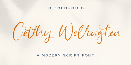 The Catthy Wellingten is a modern script font. It has a playful and feminine look, which is great for wedding invitations and anniversaries, blogs and logos. Catthy Wellingten is a handwritten font, described by an elegant touch, perfect for your favorite projects.
 - Kids Yock by PizzaDude.dk,
$20.00 Kids Yock is an updated and cleaner version of my popular comic font Kids Rock. Even though this font is more steady and clean, I did my best to keep the characteristics of the original font, which includes influences from grafitti and comics.
 - Aequitas by Fenotype,
$25.00 Aequitas is an expressive Roman Display typeface with three weights. Aequitas is great for fashion, branding, packaging or editorial use. Each weight of Aequitas is equipped with Swash & Titling Alternates.
 - JH Hadi by JH Fonts,
$70.00 JH Hadi is an Arabic Naskh typeface, including three weights; it is typical for long running text, headlines, branding & signage... The diacritic positioning is fine tuned per the publishers requirements.
 - Sketchura by Open Window,
$19.95 Sketchura offers a gritty twist on a classic font style -Futura- It was completely hand sketched which makes the font an organic centerpiece to any of your grungy design applications.
 - Undercoat by Open Window,
$19.95 Undercoat offers a gritty twist on a classic font style (Helvetica). It was completely hand painted which makes the font an organic centerpiece to any of your grungy design applications.
 - FS Albert Arabic by Fontsmith,
$150.00 Brother To create a truly global font family, FS Albert needed an Arabic script sibling. Emanuela Conidi set about the delicate task of creating an alphabet to harmonise visually with its Latin sans serif counterpart so that the two could be used side-by-side in bilingual publications. Working with the Kufic style of script, with its simpler, geometric forms, Emanuela sculpted letters with the a similar optical size, weight and rhythm as FS Albert, with open counters and monolinear strokes. It never hurts to Naskh But there’s more to FS Albert than a simple, geometric structure. To match Albert’s cheery, charming character, FS Albert Arabic needed an injection of warmth and informality. Emanuela incorporated some of the more expressive, calligraphic shapes of the Naskh script style, which lent the letterforms a looser, softer, more handwritten quality, while remaining functional and structured. The Naskh influence is most noticeable in the bowl of characters such as Jim, Qaf and Nun, in the curved tail of Waw and Reh, and the deep joining of Tah. Follow the script The end result is an Arabic script that’s the perfect partner to FS Albert: open counters, monolinear strokes and a friendly, rounded appearance. FS Albert Arabic is available in Opentype format, in five weights from Thin to ExtraBold. It supports Persian and Urdu, with proportional and tabular numerals for both, plus full vocalisation and the Hijra feature.
 - Schnorr by HiH,
$10.00 Schnorr is a family of three fonts drawn by a German designer, Peter Schnorr. Schnorr Dekorativ is one of the less frequently seen of the alphabets he designed and one of the few for which he designed as lower case. Like many of the alphabets of the period, Schnorr Dekorativ is a delicate design. To provide a little more presence, we have added a DEMIBOLD version. Included in both Schnorr Dekorativ and Schnorr Demibold are an ornament of Schnorr’s design, seven T-ligatures and an alternate lower case t. 123=Ta, 125=Te, 135=Th, 137=Ornament, 167=Ti, 172=To, 188=Tr, 190=Tu and 177=alternate t. Schnorr’s design for the lower case t is unusual and not readily recognized. The alternate may be used to improve readability. Schnorr Initialen was designed as an upper case only design and as such is quite popular. It is often seen under the name of Odessa. Our font is a fresh scan and is paired with our Schnorr Demibold to provide a compatible lower case, along with all the rest of the auxiliary characters. Schnorr Initialen includes all the extras supplied with Schnorr Dekorativ and Schnorr Demibold: 123=Ta, 125=Te, 135=Th, 137=Ornament, 167=Ti, 172=To, 188=Tr, 190=Tu and 177=alternate t. In addition, Schnorr Initialen also includes an alternate uppercase I (172) and five lotus ornaments (123, 125, 167, 188 and 190).
 - Varius by Linotype,
$29.99The shapes of the f-holes on a violin reminded German designer André Maaßen of an italic letter "f". Maaßen used these captivating contours as the theme for his type family, Varius. The name "Varius" is an homage to the manufacturer of the violin that inspired Maaßen's project, Antonio Stradivarius, the most famous manufacturer of violins in music history. Varius has three separate styles. Varius 1 and its italic are the base style of the family, and are typefaces in the baroque serif manner. Varius 2 and its italic are slab serif egyptiennes, slightly heavier than Varius 1's more classical forms. Varius 3 and its italic are semi serif faces; their characters are serifed, but some of the serifs have been cut off. The family is rounded out with two pi faces: an ornaments font (which can be used in conjunction with the text fonts, or on its own to create beautiful borders or individual decorative elements), and a font of musical symbols and notations. Each of the six text fonts has dozens of supplemental ligatures included in their character sets. When these fonts are used in an OpenType-supporting application, such as Adobe InDesign, these ligatures automatically appear in text when the "Discretionary Ligatures" feature is activated. Additionally, the character sets include added alternate glyphs, such as a swash "m" or "n" to finish off a line of text. These can be inserted manually in applications that include glyph palettes (e.g., Adobe InDesign or Illustrator CS). All of the Varius family's letterforms appear slightly narrow, and traces of the wide-nibbed pen can be seen within their forms. Additionally, the shape of a violin's f-hole is a reminiscent element within all of the family's curves. Varius is particularly suited for use many applications, such as body text, newspaper text, display text, headlines, posters, books, screen design, and corporate identity. Use in sizes ranging from body copy text to display and poster format allow the different facets of the typeface to effectively present themselves. The effects can be as versatile as the possibilities! Due to its special character, the typeface could be used in the design of a logo, or within an appropriate corporate design context, to particularly stress individuality. - Leader Kids by Awan Senja,
$14.00 Leader Kids is a fun and unique display font. It will elevate a wide range of design projects to the highest level, be it branding, headings, wedding designs, invitations, signatures, logos, labels, and much more!
 - Decor by Haniefart,
$17.00 Decor is a classic style font made by hand, modified with various ornaments so that it looks attractive, modern and elegant, can be used for company brands, logos, film titles, drink bottles and so on.
 - Maron Rose by Balevgraph Studio,
$12.00 Maron Rose is a luxurious and stylish serif font. It will elevate a wide range of crafting ideas, from cards, to branding, labels, logos and much more. Maron Rose Features: Multilingual Ligatures Alternates PUA encoded
 - Evita by ITC,
$29.99Gérard Mariscalchi is a self-made designer. Born in Southern France of a Spanish mother and an Italian father, he has worked as a mechanic, salesman, pilot, college teacher – even a poet (with poetry being the worst-paying of these professions, he reports.) “Throughout all this, the backbone of my career has always been design,” Mariscalchi says. “I’ve been drawing since I was five, but it wasn’t until I was twenty-four that I learned that my hobby could also help me earn a living.” It was about this same time that Mariscalchi fell in love with type. He studied the designs of masters like Excoffon, Usherwood and Frutiger, as well as the work of calligraphers and type designers such as Plantin, Cochin and Dürer. With such an eclectic background, it’s no surprise that Mariscalchi’s typeface designs are inspired by many sources. Baylac and Evita reflect the style of the art nouveau and art deco periods, while Marnie was created as an homage to the great Lithuanian calligrapher Villu Toots. However, the touch of French elegance and distinction Mariscalchi brings to his work is all his own. Baylac Who says thirteen is an unlucky number? Three capitals and ten lowercase letters from a poster by L. Baylac, a relatively obscure Art Nouveau designer, served as the foundation for this typeface. The finished design has lush curves that give the face drama without diminishing its versatility. On the practical side, Baylac’s condensed proportions make it perfect for those situations where there’s a lot to say and not much room in which to say it Evita Mariscalchi based the design of Evita on hand lettering he found in a restaurant menu, and considers this typeface one of his most difficult design challenges. “The main problem was to render the big weight difference between the thin and the thick strokes without creating printing problems at small point sizes,” he says. Unlike most scripts, Evita is upright, with the design characteristics of a serif typeface. Mariscalchi named the face for a close friend. The end result is a charming design that is light, airy, and slightly sassy. Marnie Based on Art Nouveau calligraphic lettering, Marnie is elegant, inviting, and absolutely charming. Mariscalchi paid special attention to letter shapes and proportions to guarantee high levels of character legibility. He also kept weight transition in character strokes to modest levels, enabling the face to be used at relatively small sizes – an unusual asset for a formal script. Marnie’s capital letters are expansive designs with flowing swash strokes that wrap affectionately around adjoining lowercase letters. The design easily captures the spontaneous qualities of hand-rendered brush lettering. - Baylac by ITC,
$29.99Gérard Mariscalchi is a self-made designer. Born in Southern France of a Spanish mother and an Italian father, he has worked as a mechanic, salesman, pilot, college teacher – even a poet (with poetry being the worst-paying of these professions, he reports.) “Throughout all this, the backbone of my career has always been design,” Mariscalchi says. “I’ve been drawing since I was five, but it wasn’t until I was twenty-four that I learned that my hobby could also help me earn a living.” It was about this same time that Mariscalchi fell in love with type. He studied the designs of masters like Excoffon, Usherwood and Frutiger, as well as the work of calligraphers and type designers such as Plantin, Cochin and Dürer. With such an eclectic background, it’s no surprise that Mariscalchi’s typeface designs are inspired by many sources. Baylac and Evita reflect the style of the art nouveau and art deco periods, while Marnie was created as an homage to the great Lithuanian calligrapher Villu Toots. However, the touch of French elegance and distinction Mariscalchi brings to his work is all his own. Baylac Who says thirteen is an unlucky number? Three capitals and ten lowercase letters from a poster by L. Baylac, a relatively obscure Art Nouveau designer, served as the foundation for this typeface. The finished design has lush curves that give the face drama without diminishing its versatility. On the practical side, Baylac’s condensed proportions make it perfect for those situations where there’s a lot to say and not much room in which to say it Evita Mariscalchi based the design of Evita on hand lettering he found in a restaurant menu, and considers this typeface one of his most difficult design challenges. “The main problem was to render the big weight difference between the thin and the thick strokes without creating printing problems at small point sizes,” he says. Unlike most scripts, Evita is upright, with the design characteristics of a serif typeface. Mariscalchi named the face for a close friend. The end result is a charming design that is light, airy, and slightly sassy. Marnie Based on Art Nouveau calligraphic lettering, Marnie is elegant, inviting, and absolutely charming. Mariscalchi paid special attention to letter shapes and proportions to guarantee high levels of character legibility. He also kept weight transition in character strokes to modest levels, enabling the face to be used at relatively small sizes – an unusual asset for a formal script. Marnie’s capital letters are expansive designs with flowing swash strokes that wrap affectionately around adjoining lowercase letters. The design easily captures the spontaneous qualities of hand-rendered brush lettering. - Marnie by ITC,
$29.99Gérard Mariscalchi is a self-made designer. Born in Southern France of a Spanish mother and an Italian father, he has worked as a mechanic, salesman, pilot, college teacher – even a poet (with poetry being the worst-paying of these professions, he reports.) “Throughout all this, the backbone of my career has always been design,” Mariscalchi says. “I’ve been drawing since I was five, but it wasn’t until I was twenty-four that I learned that my hobby could also help me earn a living.” It was about this same time that Mariscalchi fell in love with type. He studied the designs of masters like Excoffon, Usherwood and Frutiger, as well as the work of calligraphers and type designers such as Plantin, Cochin and Dürer. With such an eclectic background, it’s no surprise that Mariscalchi’s typeface designs are inspired by many sources. Baylac and Evita reflect the style of the art nouveau and art deco periods, while Marnie was created as an homage to the great Lithuanian calligrapher Villu Toots. However, the touch of French elegance and distinction Mariscalchi brings to his work is all his own. Baylac Who says thirteen is an unlucky number? Three capitals and ten lowercase letters from a poster by L. Baylac, a relatively obscure Art Nouveau designer, served as the foundation for this typeface. The finished design has lush curves that give the face drama without diminishing its versatility. On the practical side, Baylac’s condensed proportions make it perfect for those situations where there’s a lot to say and not much room in which to say it Evita Mariscalchi based the design of Evita on hand lettering he found in a restaurant menu, and considers this typeface one of his most difficult design challenges. “The main problem was to render the big weight difference between the thin and the thick strokes without creating printing problems at small point sizes,” he says. Unlike most scripts, Evita is upright, with the design characteristics of a serif typeface. Mariscalchi named the face for a close friend. The end result is a charming design that is light, airy, and slightly sassy. Marnie Based on Art Nouveau calligraphic lettering, Marnie is elegant, inviting, and absolutely charming. Mariscalchi paid special attention to letter shapes and proportions to guarantee high levels of character legibility. He also kept weight transition in character strokes to modest levels, enabling the face to be used at relatively small sizes – an unusual asset for a formal script. Marnie’s capital letters are expansive designs with flowing swash strokes that wrap affectionately around adjoining lowercase letters. The design easily captures the spontaneous qualities of hand-rendered brush lettering. - Midnight Romance by Rochart,
$25.00 Midnight Romance is a type of handwritten font that features an elegant and romantic handwriting style. This font is perfect for designs that require a personal and feminine touch, such as wedding invitations, greeting cards, or merchandise designs. The cursive strokes of Midnight Romance flow smoothly and gracefully, lending a touch of sophistication and charm to any design. The letters are delicately formed with an intricate attention to detail, making them ideal for designs that require a more refined and delicate look. Overall, Midnight Romance is a beautiful-handwritten font that exudes a sense of elegance and intimacy, making it a perfect choice for any project that requires a touch of personalization and romance.
 - DEXTER by Type Innovations,
$39.00 Dexter is an original new typeface creation by Alex Kaczun. It is a warmer, more sophisticated grotesque that is both fun and interesting. Its tight letter spacing and narrow proportions make the typeface particularly well suited for display sizes and headlines. This intriguing sans with distinctive letter shapes is typical for display fonts of the late 19th and early 20th centuries. Dexter is ideal for titles and headlines looking for impact and style. Dexter is also an excellent choice for magazines, books, posters, brochures, flyers, etc. The large Pro font character set, which supports most Central European and many Eastern European languages, also includes a corresponding small caps font along with old style figures.
 - Write Now by Scholtz Fonts,
$15.00 Write Now: Write Now is an elegant, informal, handwritten script font, developed from the designer's handwriting, and carefully crafted to create a flowing, legible image. The large, opulent capitals, with their loose loops and curves create a perfect foil for the more subdued lower case characters, presenting a strong but gentle message . Write Now is perfect for: -- invitations -- advertising material where an informal and personal mood is required -- greeting cards -- menus -- book covers Write Now comes in two styles, Write Now Regular and the delicate Write Now Thin. The font has been carefully letterspaced and kerned. A full character set (all upper and lower case characters, punctuation, numerals and accented characters) is present.
 - Reading Frequency by Vladvertising,
$10.00 Ever wonder what language looks like? This type decided to dive into this idea... how audible and visual forms play with each other. The forms you see also have been waterjet-cut out of stainless steel sheets. With these physical forms, one day in a recording studio and a mallet in hand later... we get this. Link to Audio Files: http://vladrudakov.com/files/Reading%20Frequency%20Audio.zip (If you use for samples– have fun, just shoot me an email w/ final product) vlad (at) vladvertising.com
 - Douglass Pen by Three Islands Press,
$39.00 Douglass Pen was inspired by the handwriting of Frederick Douglass, who was born an American slave but died a distinguished 19th century statesman, orator, and abolitionist leader. He also had fine penmanship. Douglass Pen is modeled chiefly after Douglass's handwritten account of John Brown's famous 1859 raid on Harpers Ferry, Virginia. It simulates his somewhat condensed cursive, dashed off in a swift, bold style. The OpenType release has more than 800 glyphs, including scores of ligatures, alternative upper cases, inkblots, crossouts, and Eastern European characters.
 - Mocha Mattari by Dharma Type,
$19.99 Mocha Mattari is a distressed font designed based on Bebas Neue released as a free font in 2010. The Original Bebas Neue has an inordinate level of popularity and it has often been used as a web font in recent years. This Mocha Mattari was made by damaging the original and tweaked by hand work. Basically, Mocha Mattari does not have lowercases but alternative Uppercases. Exceptionally “g, m, oz, fl, lb” for “gram, milli, ounce, fluid, pound” can be available by opentype dlig or salt features.
 - Silent Drama JNL by Jeff Levine,
$29.00 An ad in the April 19, 1919 edition of Motion Picture News for the (now lost) silent drama "Josselyn's Wife" featured some wonderfully stylized Art Nouveau hand lettering. Primarily a condensed character set with rounded serifs, there are a number of letters that take liberties in both width and character shape. Adding to this, [mostly vertical] parallel lines are cut through the characters to create a "striped' type of "double engraved' effect. Silent Drama JNL is available in both regular and oblique versions. **Uppercase
 - Berlinette NB by No Bodoni,
$39.00 These four typefaces, Berlinette NB, Lyonette NB, Marseillette NB and Parisette NB, were designed from the same basic shape, a fanciful geometric form that avoids strict horizontals and uses more offbeat triangular shapes. Berlinette is the medieval Gutenbergian version of the four. It’s like a weird black letter font from the 1930s. It would work well advertising an obscure brand of German beer on the side of a Zeppelin as it circles the soccer stadium during the last match. In a William Burroughs novel.
 - Elagern by Sealoung,
$20.00 Elagern is a serif font with an elegant, modern design. It features multiple alternates and ligatures, making it a versatile choice for a wide range of applications. Its elegant serifs and classic proportions make it perfect for everything from body text to headlines, making it a perfect choice for any project. Accessible in the Adobe Illustrator, Adobe Photoshop, Coreldraw, even work on Microsoft Word. PUA Encoded Characters – Fully accessible without additional design software. Fonts include multilingual support. Thanks so much for checking out my shop!
 - Original Garamond by ParaType,
$30.00 The Stempel foundry in Germany produced this version of Garamond in 1925 as a replica of a typeface of a French punchcutter Claude Garamond (middle of the 16th century). This design has an angular incised appearance which is unlike other Garamond types. It is also slightly heavier in weight, and is highly readable as a text face. Well suited for a wide range of applications and treatments. Original Garamond is the Bitstream version of Stempel Garamond. Cyrillic version was developed for ParaType in 2002 by Gayaneh Bagdasaryan..
 - Aegiste by Flawlessandco,
$9.00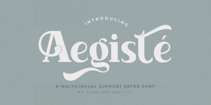 Aegiste is a Serif Retro Font with some font swashes that can add a touch of vintage to each letter. An Original typeface that suitable for any graphic designs such as branding materials, t-shirt, print, business cards, logo, poster, t-shirt, photography, quotes .etc This font support for some multilingual. Modern Serif Retro that contains uppercase A-Z and lowercase a-z, alternate character, numbers 0-9, and some punctuation. If you need help, just write me! Thanks so much for checking out my shop!
 - Changing Times JNL by Jeff Levine,
$29.00 Changing Times JNL was inspired by the hand lettering on the cover of the 1929 sheet music for "Wedding Bells (Are Breaking Up that Old Gang of Mine)". While the font’s name is an extremely vague reference to the subject of the song itself, it also represents the fact that the lettering style (still reflecting some Art Nouveau influence) welcomes the dawning of the Art Deco movement with the thick-and-thin line letter forms. The type design is available in both regular and oblique versions.
 - XXII Geom Slab by Doubletwo Studios,
$- XXII GeomSlab are the additional slab-serif styles to the geometric sans-serif XXII Geom. XXII Geom and XXII Geom Slab are modern geometric type systems designed with focus on functionality & legibility and with an eye on the old masters. Their well balanced low contrast letter shapes come with a tall x-height. With its range of Opentype features it is designed to fulfill the needs your content deserves (Smallcaps, Case Sensitives, Ligatures…) as well as serving your individual taste (Stylistic alternates & Sets). More information on Behance.
 - Starlight Lovers by Hanoded,
$15.00 I have always loved gazing at the stars. Too bad that you don’t get to see a true starry night these days - mostly because of light pollution. Starlight Lovers is a messy serif. It is hand painted, using a brush and Chinese ink, so the edges may be a bit rough. In my opinion, this adds to the font’s character! Starlight Lovers is an ideal font for (Christmas) cards, book covers, posters and product packaging. Comes with a milky way of diacritics as well!
 - Eleanore Typeface by IKIIKOWRK,
$17.00 Proudly present Eleanore Typeface, created by ikiiko. A decorative typeface that has own unique style & modern look. This typeface is perfect for an elegant & luxury logo, book or movie title design, fashion brand, magazine, clothes, lettering, quotes, and so much more. What's Included? Uppercase & Lowercase Number & Punctuation Multilingual Support Format File : TTF & OTF Works on PC & Mac Get also a good offer & FREEBIE at our site : www.ikiiko.com Enjoy our font and if you have any questions, you can contact us by email : ikiikowrk@gmail.com
 - Javin by Flawlessandco,
$9.00 Javin is a Sweet Script Font with some font swashes that can add a touch of sweetness to each letter. An Original typeface that suitable for any graphic designs such as branding materials, t-shirt, print, business cards, logo, poster, t-shirt, photography, quotes .etc This font support for some multilingual. Modern Script that contains uppercase A-Z and lowercase a-z, alternate character, numbers 0-9, and some punctuation. If you need help, just write me! Thanks so much for checking out my shop!
 - Horse Drawn Carriage JNL by Jeff Levine,
$29.00 Picture if you will, a balmy autumn evening in Manhattan during the 1930s and a well-dressed couple out on the town. They hail one of the hansom cabs located near Central Park and climb in for an old-fashioned romantic ride around the green. Such are the type of images the stylized Art Deco hand-lettering comprising Horse Drawn Carriage JNL evokes. The inspiration for this font was the title card for a 1935 Bette Davis feature entitled "The Girl from 10th Avenue".
 - Chatarina by Flawlessandco,
$9.00 Chatarina is a Sweet Script Font with some font swashes that can add a touch of sweetness to each letter. An Original typeface that suitable for any graphic designs such as branding materials, t-shirt, print, business cards, logo, poster, t-shirt, photography, quotes .etc This font support for some multilingual. Modern Script that contains uppercase A-Z and lowercase a-z, alternate character, numbers 0-9, and some punctuation. If you need help, just write me! Thanks so much for checking out my shop!
 - Hollgati by Grontype,
$4.00 Hollgati is a bold sans serif font with moderate and elegance lines, It is based on the combining a variety of styles available in both an elegant regular weight as well as outlined weight.The font is simply work with bold scary touch which is great for halloween titles. Holgati font is Suitable for Logo, greeting cards, quotes, posters, branding, name card, stationary, design title, blog header, art quote, typography. Please contact us if you have any questions. Enjoy the font and thanks for supporting us. Regards, Grontype.