10,000 search results
(0.031 seconds)
- Shinobu by Lurinzu Studios,
$15.75 "Shinobu" is an elegant psychedelic display font that combines characteristics of Art Nouveau and Modren San serif types. The name "Shinobu" comes from the anime character " Shinobu Kocho" from an anime called "Demon Slayer". Like "Shinobu's" characteristics, This exudes elegance and poshness while still having that quirkiness. This display font is intended to be used in big-scale designs such as headlines, posters, flyers, apparel, quotes, greeting cards, product packaging, album covers, movies, and more. *This font includes letters, numbers, alternates, and all essential marks needed.
 - Remus by RMU,
$25.00 Both fonts of the Remus family are complete redesigns of turn-of-the-century fonts. The regular style is based upon an inhouse design of Schelter & Giesecke in 1889, called Romanisch. This font was adopted by other German foundries and slightly modified and a bold version was added. Due to their proportions, these fonts fit perfectly into narrow columns, and still they are very legible. In January 2023, an Italic style was added. Here too it is recommended to use both ligature features Standard and Discretionary.
 - Goldbarre by Greater Albion Typefounders,
$19.95 Goldbarre is a finely engraved slab serif face in the spirit of ‘between the wars’ commercial confidence. It’s a solid and dependable face of distinction for use on certificates and posters which need to convey an emphatic yet refined message. The letterforms of Goldbarre combine finely hatched shading with and embossed, three-dimensional, quality. The utility of the family is further enhanced with Goldbarre No 2 - a solid shaded face, Goldebarre No 3 - an open embossed face, and Goldbarre No 4 - a basic black slab-serif face.
 - Revla Serif by Eclectotype,
$40.00 Meet Revla Serif, an unashamedly spirited font, with a spring in its step and a lust for life. Loosely based on a few letterforms from a mid century poster, it takes the feel of Madison Avenue print ads and runs with it. OpenType acrobatics ensure letters don't repeat monotonously, using the contextual alternates feature. Also included for your viewing pleasure - automatic fractions, case sensitive forms and one solitary stylistic alternate, an alternative ampersand. And that's it! Put the fun back into your text with Revla Serif.
 - Brozas by Pesotsky Victor,
$12.00 «Brozas» is a contemporary font for modern design. Created for digital art, Web-design, magazine layout. Brozas font is an unusual experience and an experiment on the edge of decorativeness. Drawing letters has a sharp, contrasting character and combined with smooth arcs. Different weights change not only the thickness of the strokes but also their shape. Brozas supports Basic Latin and Extended Latin, Cyrillic — in total about 200 languages are supported. The font has three weights: Thin, Regular and Black. Brozas font was designed by Viktor Pesotsky.
 - Sierra by Linotype,
$29.99Sierra is an antiqua with a high x-height and generous, open counters. Many curves of the letters are almost right angles, which was particularly suited to the Digiset machines from Dr. Ing. Rudolf Hell, Kiel. The forms of Sierra with their flowing stroke contrast and half serifs have a calligraphic touch, which is especially highlighted in the italic weights. This is a graceful text type and its bold weights look almost like woodcuts. Sierra is an excellent choice for both texts and headlines. - Rigular Script by Gloow Studio,
$18.00 Rigular Script has inspirated from retro style and funky designs like signs and old poster. This font comes with an extra extrude to make the font look more retro/unique and save your time on making it. Font has an opentype features that allow you to modify it as you like as needed. Andala perfect for poster, logo, book covers, tshirt designs, packaging and more. Features : Uppercase Lowercase Number Punctuation Ligature Multilingual Language PUA encode Opentype Features Just enjoy with our product! Thank you
 - Geometrix by d[esign],
$17.38 The handprinted Geometrix font family is an alternative to the usual distressed typeface. Rather than drawing on a sans-serif style and tearing it to shreds, Geometrix provides an intresting and compelling set of shapes which ties into a nice worn effect. The Geometrix font family consists of two fonts; Geometrix and Geometrix Nero. Geometrix and Geometrix Nero can be used together to create a fill for Geometrix's letters, by layering Geometrix above a differently coloured Geometrix Nero in your image editor of choice.
 - Cookie Treat by Tanincreate,
$18.00 Cookie Treat casual hand-lettered font. It is suitable for recipe and cook books, promotional, packaging designs, labels, greeting cards, cosmetic brands, posters, title, typography based branding, quotes, children's book, brochure, advertising, creative headers and so much more. Fun and casual, with uneven letters, this font brings a dynamic vibe to your projects.
 - Manwriting by Miller Type Foundry,
$39.00 Manwriting is an extensive typeface with hundreds of ligatures used to simulate human handwriting. Perfect for forging papers and love-letters!
 - Free Money by Jeremy Woods,
$10.00 Free money is an organic-looking display font. It was inspired by gig poster art, alternative comics and b-grade movies.
 - Paihuen Rough by RodrigoTypo,
$25.00 It is an Alternative version of "Paihuen Pro" containing 3 styles that can be combined and all in a rough style.
 - Type Vendor JNL by Jeff Levine,
$29.00 Type Vendor JNL gives a solid treatment to the dual-line Type Catalog JNL, and offers an oblique version as well.
 - Bilanthy by Maulana Creative,
$13.00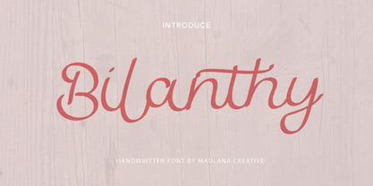 Give your designs an authentic handcrafted feel. � Bilanthy Handwritten Font� is perfectly suited to stationery, logos and much more. Many Thanks!
 - 57 Rodeo by Baseline Fonts,
$24.00A practical yet unique display face designed to offer attention-getting headlines and an alternative to the normal wild west faces. - Marc Anthony by Zang-O-Fonts,
$25.00An imperfect mix between a Roman and a Modern font, Marc Anthony can be used easily for display or body text. - Elongated Roman by Aboutype,
$24.99An ultra light thins all caps Victorian design with a slight stroke contrast. Elongated Roman requires subjective display kerning and compensation. - Rough Marker by XTOPH,
$22.00 Rough Marker is an uppercase handwritten typefaces. It comes with 2 letter-variations, swashes & lines and a variety of bonus symbols.
 - Guess What by Resistenza,
$39.00 Guess What? A new hand-drawn font family has arrived! 5 different sets of letters were sketched using a felt tip marker on paper to get a realistic handmade feeling. The magic comes activating the Opentype features, the letters will randomly combined by an advance code creating a more human feeling. More than 1500 glyphs available to customize your text. Guess what is also a font system, composed by four styles; Regular, Inline, Shadow and Papercut. All styles can be easily overlapped. Works perfectly for many purposes adding a casual natural mood to the text. Try it on a book cover, digital ads, kids stuff, comics, branding, advertising, packaging...
 - Morelinia by Gatype,
$12.00 Morelinia is a modern, handwritten, modern calligraphy font. The shape is modern and unique and the writing style is very natural. Morelinia features a varied baseline, smooth lines, gorgeous glyphs, and stunning alternatives. Hand-drawn design elements allow you to create many beautiful typographic designs in an instant like branding, web design and editorial, prints, crafts, quotes, It's great for logotypes, wedding invitations, romantic cards, labels, packaging, spelling of names and others. Add to your most creative ideas and watch how they bring them to life! Morelinia is coded with PUA Unicode, which allows full access to all the extra characters without having special designing software. Mac users can use Font Book , and Windows users can use Character Map to view and copy any of the extra characters to paste into your favorite text editor/app. Morelinia includes OpenType stylistic alternates, ligatures and International support for most Western Languages. To enable the OpenType Stylistic alternates, you need a program that supports as Adobe Illustrator CS, Adobe Indesign & CorelDraw X6-X7, Microsoft Word 2010 or later versions.
 - Hinnual by Jipatype,
$27.00 Hinnual เป็นฟอนต์ที่ผสมผสานระหว่างรูปทรงสี่เหลี่ยมและทรงกลมเพื่อสร้างสไตล์ที่ไม่เหมือนใคร ชื่อมาจากคำไทย 2 คำ คือ Hin แปลว่า หิน และ Nual แปลว่า อ่อน ผสมผสานองค์ประกอบที่แข็งและอ่อนนี้สะท้อนให้เห็นในแบบอักษร ซึ่งมีเส้นที่สะอาดตาและเส้นคมซึ่งถูกทำให้อ่อนลงด้วยมุมโค้งมน ฟอนต์มีให้เลือกถึง 18 แบบ มีตัวเลือกหลากหลายให้คุณได้เลือกใช้ Hinnual เหมาะอย่างยิ่งสำหรับใช้ในพาดหัวและพาดหัวย่อย ซึ่งลักษณะที่โดดเด่นสามารถช่วยดึงดูดความสนใจของผู้อ่านได้ เส้นสายที่สะอาดตาและสไตล์ที่เป็นเอกลักษณ์ยังทำให้เป็นตัวเลือกที่ยอดเยี่ยมสำหรับแบรนด์ โลโก้ และงานออกแบบอื่นๆ ที่ต้องการภาพลักษณ์ที่น่าจดจำ โดยรวมแล้ว Hinnual เป็นฟอนต์อเนกประสงค์และสะดุดตาที่ผสมผสานองค์ประกอบทั้งความแข็งแกร่งและความนุ่มนวล การออกแบบที่เป็นเอกลักษณ์ทำให้เป็นตัวเลือกที่ยอดเยี่ยมสำหรับนักออกแบบที่ต้องการสร้างผลงานที่น่าจดจำ Hinnual is a font that combines the square and rounded shapes to create a unique visual style. Its name comes from two Thai words - Hin, which means stone, and Nual, which means soft. This juxtaposition of hard and soft elements is reflected in the font's design, which features clean, sharp lines softened by rounded corners. The font comes in 18 styles, providing a range of options for designers to choose from. Hinnual is particularly well-suited for use in headlines and sub-headlines, where its bold and distinctive appearance can help to grab the reader's attention. Its clean lines and unique style also make it a great choice for branding projects, logos, and other design elements that require a memorable. Overall, Hinnual is a versatile and eye-catching font that combines elements of both strength and softness. Its unique design make it an excellent choice for designers looking to create impactful visual content.
 - Pitch by Device,
$39.00 A heavy block sans in chrome and solid variants. The high lower-case x-height and short ascenders and descenders permit tight line spacing for an impactful, punchy effect. The chrome variant works well at larger sizes and in shorter settings.
 - Bokeseni by AukimVisuel,
$9.00 Bokeseni is a cute and casual sans serif font with an undeniably clean feel. It includes a condensed, and expanded version. With its neat and beautiful arrangement of letters, this typeface will look outstanding in both formal and non-formal designs.
 - Hoho Christmas by Brithos Type,
$11.00 Hoho Christmas is an elegant and flowing handwritten font. Not too thin and not too thick, balanced and varied. Hoho Christmas is perfect for each of your winter designs. Add it confidently to your projects, and you won’t be disappointed.
 - Veronia by Cultivated Mind,
$15.00 Meet Veronia! An elegant, handwritten mono-line font family designed by Cindy Kinash and Callie Hegstrom. Available in four weights, with floral elements and decorative alternate letters. Veronia is perfect for stationery, greeting cards, invitations, magazines and websites and more.
 - Actium by Type Mafia,
$45.00 Actium is a contemporary multilingual sans serif typeface developed to help perfect typography automatically. Type Mafia has focussed on words with odd combinations of capital letters and numbers, such as product names and postal codes such as WD40 and H1N5, jump out of the text. They sit awkwardly together as the numerals have been designed to work with the lowercase, not the uppercase letters – affecting readability.To fix this Type Mafia invented Smart Capo™. Smart Capo™ Smart Capo is a feature that automatically activates once you type an uppercase letter together with a number. When a capital letter is sat next to a numeral, Smart Capo converts the letter to a mid-cap — a contemporary alternative to small caps — and the default old-style numeral to a lining numeral. Actium’s mid-caps and lining numerals have been designed with the same height (between cap and x-height) so they sit comfortably next to each other and fit more harmoniously into text. Smart Capo applies equal attention to capitalised words without any numbers, such as NAVO and USA, and are also automatically set into mid-capitals. Working on its own, Smart Capo saves time and money for the typographer — taking the pain out of text formatting — and makes it a more pleasurable experience for the reader. This feature is made possible by the use of ‘contextual alternates’, an OpenType feature used in modern font software, working with a set of characters specially designed at mid-cap height. By default these changes automatically take place so it doesn't need to be switched on, it will just work. Actium Actium’s design has an unusual diagonal contrast — much more common in a serifed face than in a sans serif — giving it more bite. The typeface looks elegant when set in large sizes and remains very legible when shown in small sizes. The family consists of six weights in two styles, making a dozen fonts. Weights range from light to black in roman and true italic. All fonts are fully loaded with functional elements. Actium boasts an extended Latin character set and with Greek. This means a wide range of Western languages are supported: perfect for use in bilingual publications and packaging. For numerals, each font includes old-style and lining figures in both proportional and tabular widths, with superiors and inferiors. These allow you to select the right set of numbers for the right task.
 - Faible by Identity Letters,
$29.00 An open-hearted humanist sans-serif. Playful and friendly. Faible is everybody’s darling. You cannot not like this good-natured humanist typeface. Sure, it’s a typeface for serious work—but all serious work is better when you put a smile on your face and a whistle on your lips. The typeface itself isn’t rooted in calligraphy, but there are quite some details in Faible that reference handwriting and add a friendly, humanist facet to its appearance. Take the bowls of B, P, and R: they are merrily bulged, like balloons about to take off. The curved leg of the R adds to this joyful mood. Faible’s italics are rendered playfully, too: they’re not merely sloped Roman styles. Rather, they were designed independently with an internal dynamic that sets them apart on the page. With its trademark glyphs, the swooshin’ K and k, and its friendly details, Faible will radiate optimism in display sizes, titles, and headlines. That makes it a great choice for book covers, posters, editorial design, branding, corporate design, advertising, and packaging. Nontheless, it’s carefully spaced and equipped with plenty OpenType features—a reliable tool for short texts and body copy, too. The font family consists of six weights (ranging from Thin to Black), each with its corresponding italic style. Faible’s glyph set contains more than 600 characters, allowing you to enhance your layouts with ligatures, different sets of figures, case sensitive forms, arrows, and other necessities for the ambitious typographer. Faible is the typeface that puts “fun” back into “functional”.
 - Tsotsi by Scholtz Fonts,
$19.00Tsotsi, a recent addition to the Scholtz Fonts range, is highly legible, strong, African and contemporary in design. It is a sans serif font, however, the gently splayed terminals to the strokes subtly hint at a serif. It has been designed to be easy on the eye and readable at all font sizes and can be used either as a body (text) font or in headings and larger scale design. The font has an irreverent insouciance which is suggested by the verticals which all vary from true perpendicular by a few degrees, and by the slightly top-heavy nature of all characters - hence the name "Tsotsi" -- a rascal who is very sure of himself (and a little big-headed). Above all, however, the Tsotsi (both the font and the person) has an appealingly cheeky and mischievous style. It includes characters for English, French, Italian, German, and Portugese. all upper and lower case letters, all special characters as well as all numerals and punctuation. The numerals are mono-spaced so that they will line up correctly in columns of figures. The letters of the alphabet are correctly kerned so that they appear correctly in text. - ITC Charter by ITC,
$40.99 Charter was designed in the mid-1980s by Matthew Carter. The typeface was designed with the limitations of low- and middle-resolution output devices in mind; hence the squared off serifs and the economy of diagonals and curves. The design, however, became an instant success on its own merits. It is an excellent everyday typeface for a wide variety of uses including books and technical manuals. Charter offers small cap, extension and alternate typographer sets that help to make it more versatile and functional. ITC bought the Charter designs in 1993, but Bitstream retained the right to sell the original designs.
 - Diamonds by HVD Fonts,
$30.00 The Diamonds type family was designed by Hannes von Döhren in 2012. It is an experimental search for geometric new letterforms, which are still easy to read and generate some unexpected attention. Hannes wanted to create a straight and clear typeface but pull away from the path of classic and well learned letter shapes. The Diamonds type family is equipped for complex, professional typography. The OpenType fonts have an extended character set to support Central and Eastern European as well as Western European languages. Each font includes alternate letters, fractions, scientific superior/inferior figures and a set of arrows and geometric forms.
 - Tabarnak by Canada Type,
$24.95 Tabarnak started out as an assessment and correction of an old concept by George Wilkens. The original idea was for a bold upright alphabet reminiscent of Oz Cooper’s work, but ornamented with some shocard/signage traits. That idea was radically redrawn and reinvented to become a simple 21st century font made to turn heads and induce a friendly rush. Tabarnouche is Tabarnak’s “jittery” incarnation. Just as great for packaging as they are for ads, posters, book and magazine covers, both Tabarnak and Tabarnouche come with about 600 characters, including tons of alternates, and support for the majority of Latin-based languages.
 - Sensual Initials JNL by Jeff Levine,
$29.00Sensual Initials JNL is a revamped and cleaned-up version of an old freeware font by Jeff Levine. Redrawn, and now utilizing the typeface French Art Initials JNL - Chimphand by One Fonty Day,
$6.00 Chimphand is an organic, natural and contemporary handwritten typeface with their tall x-height. Weights of light, regular and bold for both normal width and condensed allow you to play with the typeface more. In addition, you will have an access to their style sets ( Gap ) to add stencil-ish character to every weights. This gap style is much more subtle than normal stencils, but unique and nicely fit to the typeface. Gaps are more visible on larger fonts and bolder weights. Chimphand is good for any purpose, but works more on shorter text. Thanks and enjoy!
 - P22 Pooper Black Pro by IHOF,
$39.95 Pooper Black Pro is based on a brush ethic and has an extreme axis that lends a certain amount of speed to the font while the lack of connectors slows it down. The pro version expands on the original and popular Pooper Black with the addition of full Central and Eastern European character sets and plenty of alternate characters for those who have applications that support Opentype features. Almost all of the lower case characters now include an in stroke and out stroke version for greater design flexibility. A wonderful face for packaging, titling, and short bursts of text.
 - Fou Serif CN by URW Type Foundry,
$49.99 The "Fou" typeface family was designed as an alternative to "Trade Gothic condensed bold". During the design process of a normally wide font variant a system developed that responds to white space and changing proportions. Thus, round transitions become rectangular and vice versa, space is made and space is taken away. This system and the associated changes are continued on a model with semi-serifs. "Fou" can also be used as an alternative to Din or the wider Q-Type, but in comparison offers more room for emphasis with its italics and condensed styles, expert sets and numerous special characters.
 - Basreng by Bluestudio,
$20.00 Basreng is our newest font brush. Basreng fonts are suitable for today’s projects such as clothing, covers, watermarks, web design, posters, branding. Basreng also comes with an underscore sweep bonus which can be perfectly matched. Just do it with your own creativity, Basreng is an easy to use font, will make your project easier.
 - Odile by Kontour Type,
$50.00 Odile is a text typeface with bracketed head and bracket-free bottom lower case serifs, a quality that counters rigidness most traditional slab serif typefaces possess. This contemporary design draws inspiration from an experimental typeface named Charter originally designed by the American book and type designer William Addision Dwiggins. It consisted of an informal lowercase alphabet, a narrow seemingly non-inclined vertical letter with script attributes, featuring non-joining letterforms. Dwiggins’ contemplated Charter as the italic companion to Arcadia, Experimental No. 221. The Charter project progressed sporadic stalled during the Second World War and came to a halt in 1955. Charter remained incomplete and was never commercially released. Assessing Charter’s whimsical design, its fragments were rethought and developed into a comprehensive text family. Odile Upright Italic reveals recognizable similarities shared by Dwiggin’s Charter and defines the design approach for the family. The steep calligraphic outstroke and low junctions off the stem as in the upright italic “n” or “r”, for example, are gradually lessened in the italic and moved up for the roman weights. The six optically balanced weights range from the delicate Light to stark Black, accompanied by display variants with feminine flair and ardent Ornaments. Two sorts of Initials, one amplified with interweaving swashes, the other more restrained, both are clearly derived from the Upright Italic. This mid-contrast serif offers a wide range of tools for text and display typographies with a palette of strict to playful. This family shines in magazine, book and display use. The graceful serifed type harmonizes perfectly with Elido, Odile’s sans companion. Sans and serif share the family array and OpenType features in perfect tune. Odile offers an extensive character set, numerous OT features including roman and italic Small Caps, five sets of numerals, alluring ligatures, and many more. OT stylistic variants (with accents) offer a one-story “a” for the roman weights, alternate “g” and “s” designs for the italics, and a variant “s” for the Upright Italic.
 - Krul by Re-Type,
$99.00 ‘Krul’ is a typographic interpretation of the lettering style created by Dutch letter painter Jan Willem Joseph Visser at the end of the 1940s, which decorated the traditional brown bars of Amsterdam. In the beginning, these letters were strongly associated with the pubs connected to the Amstel brewery, given that Visser was the company’s official painter. As the years passed, the style became increasingly popular, and various business owners in Amsterdam and other Dutch and Belgian cities also commissioned its use. In the 1970s and 1980s, Leo Beukeboom, another talented letter painter, continued and expanded this lettering tradition while employed under the Heineken brand. Much of his work can still be found in the Jordaan and De Pijp neighborhoods in Amsterdam. The Amsterdamse Krulletter, or Amsterdam’s curly letter, is strongly inspired by the calligraphic works of the 17th century Dutch writing masters, of which Jan van den Velde was a central figure. However, distinct characteristics of this style, for example, its unusual and beautiful ‘g’, originate from a model that was published by Johannes Heuvelman in 1659, which J. W. J. Visser referenced. Typographic circles have somehow overlooked the Amsterdamse Krulletter and its heritage. The Dutch calligraphic hands preceded and influenced the formal English penmanship which has inspired numerous typefaces in the Copperplate style. In contrast, the models from van den Velde, Heuvelman, and Jean de la Chambre, among others, are a missing chapter in Dutch typographic history, and had never been turned into typefaces until now. Conscious of the cultural and identity issues that arise in reviving a unique style, and concerned about the speed with which the lettering style was disappearing, Ramiro Espinoza focused the project of designing ‘Krul’ on digitally recreating the calligraphic complexity of these beautiful letters. Created through several years of research, ‘Krul’ is not a direct digitization of the Amsterdamse Krulletter, but instead, an interpretation that incorporates numerous alternative characters absent in the original model, and improves upon details where necessary, resulting in an optimal performance on the printed page. The typeface is presented in Open Type format, with an abundance of intricate ligatures, fleurons, and swashes, which permit the creation of numerous calligraphic effects. The very high contrast and rhythm of the strokes in this typeface make it especially suited for media applications conveying a sense of elegance and sophistication. Designers of feminine magazines, advertisements, and corporate identities within the fragrance and fashion industries will find in this typeface to be an extremely useful and appropriate resource.The great Amsterdamse Krulletter is finally back, and we are proud to make it available to you.
 - Modernique by Monotype,
$29.99The Modernique font has an Art Deco flair. Contrast between thick and thin strokes is extreme, making this font only suitable for display. The Lowercase f, i and j are unusual. - Poster 1492 by LightHouse,
$49.00A bold typeface with very very extensive cap height, and short descenders. Poster 1492 is suitable for headlines, titles, newspapers, magazines, and advertisements. Poster 1492 is an OpenType/TTF Unicode font.