10,000 search results
(0.136 seconds)
- AZ Plug Italic by Artist of Design,
$20.00AZ Plug Italic font is inspired from a combination of original early 1900’s Edward Penfield and Franz Hazenplug poster art. This font is designed for use as a worn and antiqued headlines or subheadlines. - Deeney by DawnCreative.Id,
$13.00 Deeney is a handwritten style font. The natural form will make your work look more natural, like normal handwriting. This font is perfect for you to use in art, invitation, video, children's books and more.
 - Visualism by Arendxstudio,
$15.00 Visualism Font is a free style font that has the characteristics of street art that shows freedom and is filled with unique characters Features : • Character Set A-Z • Numerals & Punctuations (OpenType Standard) • Accents (Multilingual characters)
 - Artifex Regina by Adorae Types,
$29.00 Created for designs that require a handcrafted and handwritten look with a majestic touch. Artifex Regina is a blend of fantasy, wizardry, and charming delight. What's even better? IT'S VARIABLE! Designed to be a fun variable font, it allows Artifex Regina to be used as an animated typography adding a hint of magic through styles & transitions. Need a brighter inline? Need a softer shade? We got you! As an extra feature, you might want to try and play with its sliders and navigate throughout its 2 axes plus a swirly style handler to get a fully customized style! FEATURES: · Alternates: With an easy access at hand and through various stylistic sets that may contain many or a few alternates, leaving the choice to the designer for the right combination of sets and alternate characters. This includes a set of swirly ends available for static fonts as well as an axis for the variable font. · Contextual alternates: a few characters that provide some variety when used together. · Ligatures: Common used connectors with a playful twist. · Swashes: Accesible through OpenType Swashes feature there's a set of initial, final and middle swashes with passionate, elegant, and expressive strokes. Also, through stylistic sets, there's a set of monoline swashes for a cleaner look or limited spaces.
 - Rubis by Nootype,
$45.00 Rubis is a contemporary serif typeface with a sharp aspect designed for long running text. It’s a family with a serious aspect but it keeps a certain charm. The idea behind Rubis was to create a typeface with flawless curves, every letter and symbol has been designed in this idea, it can be seen in the terminals which finish the letter with an extreme fluidity. It’s a family which mixes classical influence such as the calligraphic terminaison and the sharpness of a modern typeface. The Regular and Medium are optimized for long text while the Light and Black can be useful for Title. The range of style give a good flexibility to this family. It’s an excellent family for editorial use. Rubis consists in a 10 styles family, from Light to Black with their corresponding italics. Each font includes OpenType Features such as Small Caps, Proportional Figure, Tabular Figures, Numerators, Superscript, Denominators, Scientific Inferiors, Subscript, Ordinals, Fractions and ligatures. Rubis family supports Latin and Cyrillic, all these languages are covered: Latin language support: Afar, Afrikaans, Albanian, Asturian, Azeri, Basque, Bosnian, Breton, Bulgarian, Catalan, Cornish, Corsican, Croatian, Czech, Danish, Dutch, English, Esperanto, Estonian, Faroese, Filipino, Finnish, Flemish, French, Frisian, Friulian, Gaelic, Galician, German, Greenlandic, Hungarian, Icelandic, Indonesian, Irish, Italian, Kurdish, Latin, Latvian, Lithuanian, Luxembourgish, Malagasy, Malay, Maltese, Maori, Moldavian, Norwegian, Occitan, Polish, Portuguese, Provençal, Romanian, Romansch, Saami, Samoan, Scots, Scottish, Serbian, Slovak, Slovenian, Spanish, Swahili, Swedish, Tagalog, Turkish, Walloon, Welsh, Wolof Cyrillic language support: Adyghe, Avar, Belarusian, Bulgarian, Buryat, Chechen, Erzya, Ingush, Kabardian, Kalmyk, Karachay-Balkar, Karakalpak, Kazakh, Komi, Kyrgyz, Lak, Macedonian, Moldovan, Mongol, Permyak, Russian, Rusyn, Serbian, Tatar, Tofa, Tuvan, Ukrainian, Uzbek .
 - Saveur Sans by Arkitype,
$10.00 Saveur Sans is inspired by art deco and French cafes. This display family has clean, simple letterforms that feel modern but at the same time have a retro, art-deco styling. This family can add a sophistication to any layout whether it be print or online. Saveur Sans is a great selection for headlines, logotypes and branding. it is an all-caps display family with some neat alternates including an alternate O and E that instantly give your copy that retro-deco look. The promos have been inspired by french food and design. This family is perfect for use in packaging and branding of food products as well as menus and restaurant or cafe branding.
 - Sweet Treats by Jeff Levine,
$29.00 A piece of British sheet music for “You’re Sweeter than I Thought You Were” [from the 1935 film “Jack of All Trades” starring Jack Hulbert] provided inspiration for a digital typeface based on the credits for Hulbert and the film that rather than the song’s title. What’s interesting is the lettering style was influenced by Art Nouveau at a time when Art Deco was gaining in popularity. The result is Sweet Treats JNL, which is available in both regular and oblique versions. (According to Wikipedia, John Norman ‘Jack’ Hulbert (April 24, 1892 – March 25, 1978) was a British actor, director, screenwriter and singer, specializing primarily in comedy productions, and often working alongside his wife Cicely Courtneidge.)
 - Avenir Next Thai by Linotype,
$79.00 Avenir Next Pro is a new take on a classic face—it’s the result of a project whose goal was to take a beautifully designed sans and update it so that its technical standards surpass the status quo, leaving us with a truly superior sans family. This family is not only an update though; in fact it is the expansion of the original concept that takes the Avenir Next design to the next level. In addition to the standard styles ranging from ultralight to heavy, this 32-font collection offers condensed faces that rival any other sans on the market in on and off—screen readability at any size alongside heavy weights that would make excellent display faces in their own right and have the ability to pair well with so many contemporary serif body types. Overall, the family’s design is clean, straightforward and works brilliantly for blocks of copy and headlines alike. Akira Kobayashi worked alongside Avenir’s esteemed creator Adrian Frutiger to bring Avenir Next Pro to life. It was Akira’s ability to bring his own finesse and ideas for expansion into the project while remaining true to Frutiger’s original intent, that makes this not just a modern typeface, but one ahead of its time. Avenir Next Variables are font files which are featuring two axis, weight and width. They have a preset instance from UltraLight to Heavy and Condensed to Roman width. The preset instances are: Condensed UltraLight, Condensed UltraLight Italic, Condensed Thin, Condensed Thin Italic, Condensed Light, Condensed Light Italic, Condensed, Condensed Italic, Condensed Demi, Condensed Demi Italic, Condensed Medium, Condensed Medium Italic, Condensed Bold, Condensed Bold Italic, Condensed Heavy, Condensed Heavy Italic, UltraLight, UltraLight Italic, Thin, Thin Italic, Light, Light Italic, Regular, Italic, Demi, Demi Italic, Medium, Medium Italic, Bold, Bold Italic, Heavy, Heavy Italic.
 - Avenir Next Rounded by Linotype,
$42.99Avenir Next Pro is a new take on a classic face—it’s the result of a project whose goal was to take a beautifully designed sans and update it so that its technical standards surpass the status quo, leaving us with a truly superior sans family. This family is not only an update though; in fact it is the expansion of the original concept that takes the Avenir Next design to the next level. In addition to the standard styles ranging from ultralight to heavy, this 32-font collection offers condensed faces that rival any other sans on the market in on and off—screen readability at any size alongside heavy weights that would make excellent display faces in their own right and have the ability to pair well with so many contemporary serif body types. Overall, the family’s design is clean, straightforward and works brilliantly for blocks of copy and headlines alike. Akira Kobayashi worked alongside Avenir’s esteemed creator Adrian Frutiger to bring Avenir Next Pro to life. It was Akira’s ability to bring his own finesse and ideas for expansion into the project while remaining true to Frutiger’s original intent, that makes this not just a modern typeface, but one ahead of its time. Avenir Next Variables are font files which are featuring two axis, weight and width. They have a preset instance from UltraLight to Heavy and Condensed to Roman width. The preset instances are: Condensed UltraLight, Condensed UltraLight Italic, Condensed Thin, Condensed Thin Italic, Condensed Light, Condensed Light Italic, Condensed, Condensed Italic, Condensed Demi, Condensed Demi Italic, Condensed Medium, Condensed Medium Italic, Condensed Bold, Condensed Bold Italic, Condensed Heavy, Condensed Heavy Italic, UltraLight, UltraLight Italic, Thin, Thin Italic, Light, Light Italic, Regular, Italic, Demi, Demi Italic, Medium, Medium Italic, Bold, Bold Italic, Heavy, Heavy Italic. - NoweAteny by Linotype,
$29.99Linotype Nowe Ateny is part of the Take Type Library, which features the winners of Linotype’s International Digital Type Design Contest from 1994 to 1997. Designed by Dariusz Nowak-Nova, Nowe Ateny is a frantic handwriting font whose capital letters include technical-looking grid lines and end points. These seem to anchor the letters without reducing their volatility. The font consciously lacks elements which increase legibility, sacrificing them for the sake of more design oriented ideals. Nowe Ateny is thus good for headlines in larger point sizes, especially when the look of the text is as important as its content. - Pumpkin Boy by PizzaDude.dk,
$14.00 October is the season for pumpkins - some of them are meant for soups, salad or other kinds of food. Others are cut into creepy looking pumpkinheads...and then there are the ones that are used for fun and games only! And that is exactly what this font is about! Pumpkin Boy is my laid back comic font with a jumpy x-height and crunchy lines. If you choose to write in uppercase only, the letters are a bit less funky, but still crunchy and great for headlines. I've added ligatures for double letters substitution for the most common letter combinations.
 - The Billates by Letterhend,
$14.00 Looking for a script font with a casual flair? Look no further than Billates! With its natural and free-flowing style, this font exudes a relaxed and informal look that is perfect for capturing a laid-back atmosphere. From handwritten notes to product packaging, Billates brings a touch of casual elegance to your design projects. Features : Uppercase & lowercase Numbers and punctuation Alternates & Ligatures Multilingual PUA encoded We highly recommend using a program that supports OpenType features and Glyphs panels like many of Adobe apps and Corel Draw, so you can see and access all Glyph variations.
 - Borscena by IbraCreative,
$17.00 Borscena is a luxury classic serif font that exudes timeless elegance and sophistication. Its meticulously crafted letterforms feature exquisite, ornate detailing and graceful, high-contrast strokes, making it the epitome of refined typographic design. Borscena’s regal presence and intricate serifs harken back to the golden age of print, offering a sense of opulence and exclusivity, ideal for conveying a sense of prestige and tradition in branding, editorial, or decorative applications. This font stands as a symbol of timeless beauty and an embodiment of the grandeur of bygone eras, making it the perfect choice for projects seeking a touch of sophistication and sophistication.
 - Authority by RetroSupply Co.,
$19.00 Inspired by public fonts in New York in the 1970s. Authority pays tribute to the almost unnoticed but powerful effect type have on our lives. From waiting on a cold morning to catch the 307 to Morton West High School, to the rain and snow worn stencil on a postal box. Public typography is a part of the little spaces in your lives where life actually happens. Government designed fonts were chosen to communicate authority and help grease the gears of the day-to-day grind. Authority beckons back to these days with it's mildly condensed feel, squared corners and weight presence.
 - Planetary Steam by PizzaDude.dk,
$15.00 Are you ready for the 1MB processing powerful performance? Step into the future with my wanna-be retro 8-bit powerful performance digital grafitti inspired computer font from the future...or rather...the past! I was inspired by old posters and commercials for old 8-bit computers from the late 70-ies and 80-ies. Despite the lack of powers (compared to computers and phones today) they seemed to be able to both rule the world and ease your everyday jobs. Well, the thought of all that, combined with my love for grafitti and comic text, inspired me to do this font!
 - Azuza by Parkinson,
$20.00 In the 1990s I drew a text face for the San Francisco Chronicle. It was based on W. A. Dwiggins’ Electra and incorporated many features of the Linotype Legibility Series: More compact, with a taller lowercase X-height, etc. That type was called Electric and it was the Chronicle’s text face for nearly a decade, surviving several redesigns. From that, I made Azuza, a more detailed and sensitive style. Azuza was recognized in the TDC2 type competition in 2001. Then it went into hibernation as a Type 1 font family. Today it is back. Six fonts. Open Type.
 - Stiana by WDC Fonts,
$30.00 Stiana font is a venetian serif in modern design. The general idea was inspired by beautiful masterpieces of Nicolas Jensen and William Morris. Stiana holds fine, balanced readability of venetian serif, and both 21st century trends. Letterforms are expressive and bold enough to use font as display, but it also fits nicely for text. Stiana supports Western Europe, Cyrillic and Greek languages. Stiana is surely a good choice both for screen applications and print media. Its multipurpose spreads over package design, logos, headlines, body texts, stationary and back labels. Also very good for books and magazines.
 - Blowing Vesicle by Letterhend,
$19.00 Blowing Vesicle is a retro bold font which will bring you back to 60s feel. This font perfectly made to be applied especially in logo, and the other various formal forms such as invitations, labels, logos, magazines, books, greeting / wedding cards, packaging, fashion, make up, stationery, novels, labels or any type of advertising purpose. Features : uppercase & lowercase numbers and punctuation multilingual ligatures alternates swashes PUA encoded We highly recommend using a program that supports OpenType features and Glyphs panels like many of Adobe apps and Corel Draw, so you can see and access all Glyph variations.
 - Brostone by Rockboys Studio,
$17.00 Brostone Brush is a magical script font carefully created with a touch of elegance. Whether you’re looking for fonts for Instagram or calligraphy scripts for DIY projects, this font will turn any creative idea into a true piece of art!
 - Wonderella by Almarkha Type,
$29.00 Wonderella is a cute and casual sans serif font with an incredibly friendly feel. Whether you’re looking for fonts for Instagram or calligraphy scripts for DIY projects, this font will turn any creative idea into a true piece of art!
 - Sweet Barbrown by TM Type,
$20.00 Sweet Barbrown is a cute and bold script font with an incredibly friendly feel. Whether you’re looking for fonts for Instagram or calligraphy scripts for DIY projects, this font will turn any creative idea into a true piece of art!
 - NIghtvandals by Sipanji21,
$15.00 Night Vandal is an awesome graffiti font that features the street art vibe. This font is suitable for designs like logos, advertising, apparel, jerseys, sportswear, skateboard designs and more. Take your concepts to the next level with this stunning font!
 - Beach Party by Cititype,
$9.00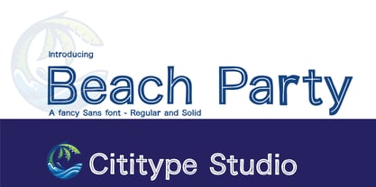 Beach Party is a cute and casual display font with an incredibly friendly feel. Whether you’re looking for fonts for Instagram or calligraphy scripts for DIY projects, this font will turn any creative idea into a true piece of art!
 - The Comic Struves by Stringlabs Creative Studio,
$25.00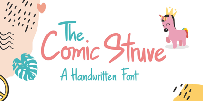 The Comic Struve is a cute and casual display font with an incredibly friendly feel. Whether you’re looking for fonts for Instagram or calligraphy scripts for DIY projects, this font will turn any creative idea into a true piece of art!
 - Lemon Rolls by Illushvara,
$12.00 Lemon Rolls is a cute and casual handwritten font with an incredibly friendly feel. Whether you’re looking for fonts for Instagram or calligraphy scripts for DIY projects, this font will turn any creative idea into a true piece of art!
 - Verdana Pro by Microsoft,
$40.00 The Verdana typeface family was designed specifically to address the challenges of on-screen display. Verdana was originally designed by world-renowned type designer Matthew Carter, and tuned for screen display by the leading TrueType hinting expert, Tom Rickner. The Verdana fonts are unique examples of type designed specifically for the computer screen.The Verdana family received a major update in 2011 as a collaboration between The Font Bureau, Monotype Imaging and Matthew Carter. The original Verdana family included only four fonts: regular, italic, bold and bold italic. The new and expanded Verdana Pro family contains 20 fonts in total. The Verdana Pro and Verdana Pro Condensed families each contain 10 fonts: Light, Regular, Semibold, Bold and Black (each with matching italic styles).Verdana exhibits characteristics derived from the pixel rather than the pen, the brush or the chisel. The balance between straight, curve and diagonal were meticulously tuned to ensure that the pixel patterns at small sizes are pleasing, clear and legible. Commonly confused characters, such as the lowercase i j l, the uppercase I J L and the number 1, have been carefully drawn for maximum individuality - an important characteristic of fonts designed for on-screen use. Another reason for the legibility of the Verdana fonts on the screen is their generous width and spacing.Designed by David Berlow and David Johnathan Ross of the Font Bureau, with typographic consultation by Matthew Carter, the new Verdana Pro includes a variety of advanced typographic features including true small capitals, ligatures, fractions, old style figures, lining tabular figures and lining proportional figures. An OpenType-savvy application is required to access these typographic features. The expanded weights and completely new condensed range of fonts provide designers with an expanded palette of typographic options for use in print and on-screen, in both small text sizes and headlines.
 - VLNL Bromfiets by VetteLetters,
$30.00 Vette Letters are thrilled to add maverick designer Dirk Uhlenbrock to the family, with the release of VLNL Bromfiets. Bromfiets (the Dutch word for moped) is a ‘holiday child’, the basic idea coming from a stop at a road junction in the Dutch coastal province of Zeeland. The Dutch signage, the black and white rings of traffic light poles, the symbols for brom- and snorfiets have always appealed to Dirk. While on vacation in Zeeland the first scribbles and digital drafts were created, always in mind that the typeface had to be striking, clear and friendly. The end result is more than that, a strong and instantly recognisable font with a matching dingbat weight full of icons and arrows. Stencil fonts have always interested Dirk, the informal character and the possible universal use as a paint- or spray-stencil on a wide variety of surfaces makes this type of font so interesting for me. The technically necessary dissolution of closed font contours always ensures a special aesthetic: What’HAT and HOW MUCH has to be removed or left, in order to make words easy to read and to avoid a fractal impression. Dirk Uhlenbrock has been working as graphic designer and illustrator in his hometown Essen, Germany for over 30 years. Always interested in typedesign he got in contact with Fontographer in 1996 and started to create and distribute loads of free fonts through his online platforms ‘Eyesaw’ and ‘Fontomas’. A bunch of these type experiments have been extented on request to complete fonts. Still located in Essen in 2009 Dirk started his second owner-based business erste liga büro für gestaltung - ersteliga.de
 - Sapore by Fonderia Serena,
$23.90 Sapore is a script font family, mostly monoline, inspired by the elegant handmade signs in the beautiful city of Venice, Italy, where I work and live. Many of these signs were made at the beginning of the 20th century by skillful craftsmen and artists, carrying that distinct vintage Italian flavour, and this is why I named the font Sapore, which means precisely flavour (also, one of the signs is from a pastry shop that makes the most delicious things). The design takes this retro vibe into the 21st century, making it up-to-date and fresh, while keeping it authentic. It is a script font, but I added some stand alone capitals that you can use in all caps words and texts effortlessly, as the open type code is taking care of using the right set of letters at the right time, I could have made two separate fonts, but I wanted to give you the best value I could and ease of use. Make sure contextual alternates are always on! There are also swashes, alternate styles, stylistic sets, small caps, 2 figure sets and decorative elements, all accessible through open type. I think the font is particularly suited for display use, as in logos, packaging design, branding, but it is readable enough for small text blocks. You can access the non-linking caps by clicking on the discretionary ligatures button. You can access the loopy caps by clicking on the titling alternates button. The main version has straight terminals but I included a round version and a calligraphic one, called “classico”. Hope you like it!
 - Hatchery JNL by Jeff Levine,
$29.00 A photo from Gene Gable (a regular contributor of ideas to Jeff Levine Fonts) shows the vintage signage for the Lasher Hatchery in a slightly different take on the classic Art Deco solid letter style. Since good ideas, like eggs can be hatched, thus the font's name of Hatchery JNL.
 - Hero If Plus by Ingo,
$12.00 A type of “handwriting” discovered by chance, extremely abstract On April 8, 1948 a certain Walter Plaga wrote a crude poem about a hero on a commemorative plaque. The very poor reproduction of the handwritten original, etched into a metal sheet, produced extremely abstract forms so that — even if unintentional — a script completely void of bowls was created. That which originally was the normal clumsy handwriting of a layman thus transformed into a pseudo-modern deconstructive typeface, which in the 21st century appears contemporary. The capital letters especially reflect the original: in part they show forms labeled incorrectly ”old German“ handwriting, which is actually Latin, in the letters A D G I J K L S V W X Z , whereas C H N O P R appear very modern. Truly a form of handwriting: without joining the letters, especially between the lower case characters, a silhouette effect is formed. To a great extent Hero is impressive due to its driven-to-the-limit abstraction and to a lesser extent by retaining an antiquated and nearly illegible effect.
 - Samo Sans by CarnokyType,
$- Samo Sans is a modern sans-serif typeface with low contrast strokes and is balanced between technical shapes and dynamic feeling. The primary type family is consisted of complete set of Latin glyphs for lower and upper case. It also supports diacritics of all European languages including lining numerals, standard ligatures and other characters sufficient for regular typesetting. Characteristic features are lower spurs (a, b, d, u), and upper spurs (m, n, p, q, r) with distinctive wedge-shaped cuts. These parts are complemented by homogeneously designed diacritics, which is not disturbing and harmonizing with the whole unit. Another very strong feature of the type drawing are lower terminals of the round glyphs, which are finished by moderate narrowing. The type has got decreased caps height, also decreased numerals and optimal x-height, which makes it suitable for more extensive text typesetting. It can be effectively applied in corporate identities or in display typesetting. The narrowness of the basic set of Samo Sans typeface is supplemented by extended type family Samo Sans Pro .
 - Oman by Par Défaut,
$35.00 With five weights and four contrasts, all grouped in three version : sans-serif, slab, serif and all this doubled by a true italic, Oman regroup 120 different styles declined in four variables. Perfect from headlines to text, Oman will meet your needs with a many languages to support (Latin pro, Cyrillic), 14 OpenType features (Fraction, Numerator, Denominator, Tabular figure, Oldstyle figure, Small capital, Small capital from capital, Ordinal, Stylistic set, Case sensitive, Discretionary ligature, Contextual alternate and All access alternate). • Numerator and Denominator includes numerals and currency • Tabular Figure includes : numerals, currency, OldStyle numerals, small capital numerals, small capital currency. • Small Capital features includes the Latin & Cyrillic alphabet with the accents. • Ordinal feature includes the Latin & Cyrillic alphabet. • Two Stylistic set for “a” & “g” includes accents. • Discretionary Ligature includes “AE”, “AÉ”, “IJ”,“OE”, available in lowercase, small capital and ordinal. • Contextual Alternate includes ligatures for arrows : <-->^|v|<->v^|. Add n, d or +, for numerator, denominator or case arrows. All Case sensitive characters become after the uppercase and number.
 - Kalvesta JNL by Jeff Levine,
$29.00 A bit of experimentation with the Art Deco-flavored Sign Card JNL brings forth a hybrid alphabet where Art Deco meets Western. The result is Kalvesta JNL. This font's unusual character shapes defy and yet redefine the notion of the classic Western alphabet. The name is from a town in Kansas.
 - Stribe by Fateh.Lab,
$10.00 Stribe, this is an amazing work. Why? ... because this is not just talking about fonts, but more than that, with the spirit of Street Art, stribe invites you to explore with your wild ideas, I'm sure this will really make you feel happy in creating the work that you will wake up to the front. Supported by 3 font choices that are very sweet and also strong, stribe answers all your difficulties in choosing font support that suits your taste. And the most exciting thing is, you get a free bonus vector illustration that is very detailed and also has a very strong Street Art spirit, and is made very original, so what are you waiting for, have Stribe as soon as possible. Thank You
 - Palomino by My Creative Land,
$40.00 Palomino Clean - “Clean” version of Palomino is also available Please welcome Palomino - a new modern calligraphy font family created using amazing Palomino Blackwing 602 pencils (it took 3 pencils to create the whole family!). All fonts work perfectly well together, allowing you to create stylish elegant designs with a handwritten look. The script font is loaded with initial, medial, and terminal alternates and swashes. With the help of three other fonts (condensed sans, simple sans, and design elements), you’ll be able to create stunning designs with a click of a mouse. This versatile font family will work perfectly for fashion, e-commerce brands, wedding boutiques, photography, quotes design, and a lot more. It has extensive language support and is fully unicode mapped. Palomino Clean - digitized version of Palomino is also available
 - Gauntly by Ali Hamidi,
$12.00 Gauntly is a stunningly sweet and delicious single line handwritten font with a cool vibe. It will turn any design idea into a true piece of art.
 - Altra by Hackberry Font Foundry,
$24.95Altra is a family based on a tracing of an old clip art font. I liked the gentle calligraphic look. Consider it a sans serif with style. - Syage by Nirmana Visual,
$19.00 Syage a classy, contemporary of Serif font, inspired by Art Deco Era. Ideally suited for advertising and packaging, festive occasions, editorial and publishing, creative industries and posters.
 - Airosol by Firstype Studio,
$15.00 Airosol is an edgy and expressive graffiti font that captures the essence of street art with a style that's undeniably urban. It's the perfect choice for designers and artists looking to infuse their projects with a raw and rebellious vibe, complete with striking swashes for added flair. Gritty Street Art Aesthetics: Airosol is a graffiti font that channels the raw energy and aesthetics of street art. Its bold and expressive letterforms showcase the essence of rebellious creativity, making it a standout choice for projects that demand an urban edge. Street Art Style: What sets Airosol apart is its authentic street art style. Every character exudes a sense of authenticity, as if it were lifted directly from a city wall, ready to make a statement. Swashes for Added Impact: Airosol comes with dynamic swashes, allowing you to accentuate your text with unique and artistic flourishes. These swashes are your tool for adding that extra touch of graffiti-inspired artistry to your designs. Versatile Expression: Airosol is more than just a font; it's a versatile form of expression. Whether you're working on urban branding, event posters, or any project that demands a street-smart aesthetic, Airosol will be your creative companion. Unleash Your Inner Rebel: With Airosol, you're not just selecting a font; you're unleashing your inner rebel and embracing the power of street art in your designs. Choose Airosol for Your Urban Adventures: Explore the creative possibilities with Airosol, and experience how its graffiti-inspired aesthetics and swashes breathe life into your projects, from the streets to the screen.
 - Nondescript JNL by Jeff Levine,
$29.00 One good pun is worth a simple description… Nondescript JNL… 'Non' - not. 'de' - of, in Spanish. script - a cursive (handwritten) letter form. So… while nondescript generally means lacking any defining description, in this case it also means "not of a script"… which is precisely what a typeface such as this one is!