10,000 search results
(0.06 seconds)
- Raven Hell by Creativemedialab,
$20.00 Raven Hell is a simple and modern gothic font. What's unique about Raven hell is that it can be sans or blackletter, depending on your choice of design theme. Raven Hell can be used in many types of modern designs ranging from product labels to tattoos, badges, logos, poster titles, and much more.
 - Vendor JNL by Jeff Levine,
$29.00Vendor JNL is Jeff Levine's take on the popular ribbon font of the Victorian Era, but using a vertical type (Trade Journal JNL) rather than skewed letters. End caps for the ribbon can be found on the left and right parenthesis, and a blank panel is on the hyphen key. Limited character set. - Kurtzberg by Nerfect,
$15.00Kurtzberg was created after the bold type on the splash pages of many of the classic comics of the 'fifties and 'sixties. Thick and chunky and filled with all those symbols basic comic book fonts rarely come with. Kurtzberg is always ready to swing into action when injustice rears its ugly face. - Miss Rhythm JNL by Jeff Levine,
$29.00 An early 1960s hand-lettered trade publication ad for an upcoming single 45 rpm release inspired the type design of Miss Rhythm JNL. The nickname of "Miss Rhythm" was given to Ruth Brown because of her popular "jump tunes"; that is rhythm and blues with an uptempo beat. Because the trade ad for her record was the inspiration for the font, it was only fitting to use that nickname as the font's name in honor of her.
 - PF Centro Serif Pro by Parachute,
$79.00 Centro Serif Pro is an award-winning typeface. It received a Gold Award from the European Design Awards 2008 and an Excellence Award from the International Type Design Competition 2009 as part of the Centro Pro type system. This large series of 40 fonts with 1519 glyphs each is composed of three superfamilies (serif, sans and slab), includes true italics and supports Latin, Greek and Cyrillic. According to the jury of the European Design Awards “...Centro Pro is an almost ‘invisible’ typeface with distinct personality, it has legibility as its main attribute and is ideal for a wide range of design works. It does not attract any unnecessary attention, but rather serves its purpose. A rare case of contemporary type family working across three alphabets. Centro Pro meets an ever-growing demand for such typefaces among pan-European companies and institutions”. Centro Pro has become very popular among printed media and is ideal choice for newspapers, magazines and corporate applications. Furthermore every font in this series has been completed with 270 copyright-free symbols, some of which have been proposed by several international organizations for packaging, public areas, environment, transportation, computers, fabric care and urban life.
 - Sunetta by Linotype,
$29.99An inkstone, a brush, ink, and paper. In China, one speaks of “wenfang sibao” — the four treasures of the scholar’s study. With these centuries-old hand tools, Werner Schneider created a calligraphic type trilogy of the highest aesthetic order; he named this typeface family after Buddha’s stepbrother, Sunetta. Sunetta is an outstanding choice for contemporary display type purposes. Its combination of lively forms overcome sterile text passages, lending them a more personal note and feeling. But Sunetta is not only recommended for documents bestowing distinction and accolades; the fonts are superb for shorter text passages as well. Sunetta’s spirited flow raises it above the fray that so many generic letterforms find themselves mired in, creating an unforgettable impression. Sunetta’s three complementary styles, Sunetta Flair, Sunetta Charme, and Sunetta Magic, offer three varying degrees of calligraphic verve. The family’s base font, Sunetta Flair, harkens back to the showcard lettering styles of the 1950s, while remaining distinctly European in taste. Sunetta Charme has a more swash-type appearance, while Sunetta Magic is joyfully decorative — its brush-written strokes dance across the line. Together, they may help you reach typographic nirvana. - HWT Bon Air by Hamilton Wood Type Collection,
$24.95 Bon Air was one of a series of script typefaces cut into wood by the Hamilton Manufacturing Company for the Morgan Sign Machine Co. (makers of the Line-o-Scribe showcard press) in the mid 20th Century. These were some of the last new designs cut into wood by Hamilton until the museum revival in the early 2000s. Bon Air was created in 1958 and trademarked in 1961. The wood type made for Morgan was used largely in department stores to make their own signage. The script styles are reminiscent of sign painters alphabets and evoke a Mad Men era advertising aesthetic. The font was only cut in four sizes: 12, 18, 36 and 72 line. It was distributed by Morgan for use in their presses, but as type high wood type, it could be used on any press. The font was issued with several alternate letters and ligatures to simulate the effect of hand lettering. Its lively strokes and odd details give it an exotic flavor suitable for advertising display work. The digital version includes all of the original alternates plus new characters to fill out a full European character set.
 - PF Centro Slab Pro by Parachute,
$79.00 Centro Slab Pro is an award-winning typeface. It received a Gold Award from the European Design Awards 2008 and an Excellence Award from the International Type Design Competition 2009 as part of the Centro Pro type system. This large series of 40 fonts with 1519 glyphs each is composed of three superfamilies (serif, sans and slab), includes true italics and supports Latin, Greek and Cyrillic. According to the jury of the European Design Awards “...Centro Pro is an almost ‘invisible’ typeface with distinct personality, it has legibility as its main attribute and is ideal for a wide range of design works. It does not attract any unnecessary attention, but rather serves its purpose. A rare case of contemporary type family working across three alphabets. Centro Pro meets an ever-growing demand for such typefaces among pan-European companies and institutions”. Centro Pro has become very popular among printed media and is ideal choice for newspapers, magazines and corporate applications. Furthermore every font in this series has been completed with 270 copyright-free symbols, some of which have been proposed by several international organizations for packaging, public areas, environment, transportation, computers, fabric care and urban life.
 - PF Centro Sans Pro by Parachute,
$79.00 Centro Sans Pro is an award-winning typeface. It received a Gold Award from the European Design Awards 2008 and an Excellence Award from the International Type Design Competition 2009 as part of the Centro Pro type system. This large series of 40 fonts with 1519 glyphs each is composed of three superfamilies (serif, sans and slab), includes true italics and supports Latin, Greek and Cyrillic. According to the jury of the European Design Awards “...Centro Pro is an almost ‘invisible’ typeface with distinct personality, it has legibility as its main attribute and is ideal for a wide range of design works. It does not attract any unnecessary attention, but rather serves its purpose. A rare case of contemporary type family working across three alphabets. Centro Pro meets an ever-growing demand for such typefaces among pan-European companies and institutions”. Centro Pro has become very popular among printed media and is ideal choice for newspapers, magazines and corporate applications. Furthermore every font in this series has been completed with 270 copyright-free symbols, some of which have been proposed by several international organizations for packaging, public areas, environment, transportation, computers, fabric care and urban life.
 - PopFraxFrankfurt - Unknown license

- Mistress Script - Alternates - Unknown license

- Beast vs Buttercrumb - Unknown license

- Apogee 013 by zero-13,
$28.00 Apogee 013 is a contemporary yet futuristic typeface with a Sci-Fi aesthetic which contains subtle asymmetrical cues, this display font is ideal for illustrative work, logos, headlines and digital art.
 - Nagarawa by Beewest Studio,
$50.00 Nagarawa is an Asian style font, very suitable for various logotypes for Asian nuanced products, such as Asian food, martial arts clubs, music, novel and comic titles, apharel clothing and others.
 - Bubblegum Cartoon by WAP Type,
$20.00 Bubblegum is a font made in styles: With its nice and sweet appeal, it is perfect for scrapbooking, print design, stationery, blog header, greeting cards, posters, blog header and art quote.
 - Aqem by Nirmana Visual,
$22.00 Aqem contemporary of Sans Serif font, Inspired by art nouveau Era. Aqem offers beautiful typographic harmony for a diversity of design projects, including logos & branding, social media posts, advertisements & product designs.
 - Mr Palker by Letterhead Studio-YG,
$35.00 A slab serif Mr Palker and grotesque Mr Palkerson build one superfamily together. These are blank types. In a way even the display ones. Typefaces for newspapers, announcements, cheap advertising and police posters. Mr Palker and Mr Palkerson will turn every language into a fence. And due to six types of faces one can choose what material should the fence be made from — from Thin steel rods to the Black stone blocks. In their simplest appearance Mrs P&P are intended for the solid blank composition in victorian or industrial style. They are quite decent, a bit old-fashioned slab serif and grotesque with closed aperture. All my types have layers. Walker and Palkerson also do. Besides the standard set of symbols, they have 4 add-ons. 1. Alternate glyphs, including unicase ones. 2. Ligatures with A letter. 3. Extra tall small caps. 4. Two-storey ligatures. All this options are intended for the complex composition. The additional letters are rather eccentric as their main function here is to imitate the victorian oddities. Imitate, parody, just not repeat. There are lower-case As and Es in the set in height of small caps and uppercases. They can turn every writing into the unicase. The lower-case A (as well as uppercase and small caps version of it) has deliberately by my taste grown a ludicrous tail. To compensate it I’ve built all the possible ligatures - ад, ал, ая. There are 35 of this ligatures all together. Take a closer look at the Russian letters D, L, K, Ya from the main set as well as their alternates. The additional glyphs are one more comic than the other — on purpose to imitate (not to repeat!) the victorian set. This sets have lowercase numbers. And small caps numbers as well. What a modern typeface without them. They also have an У-letter with a generously curvy tail. As if before the WWI. The Latin of course has alternates as well. It has letters to make the perfect French sound more like the russian provincial version of it. The tails of Js and Ts can be made a little bit more open — or a little bit closed. My favorite feature here, an invention of a kind - extra tall small caps. It allows to compose logos with the small caped uppercases directly from the keyboard. The small caps of this typefaces are usually much taller than the customary ones. This is the kind of small caps that Palker and Palkerson have. More to that, the strokes’ weight and the letters width are corresponded to the uppercases. Just a ready set for making a logo a la 1913 style. With a unicase, one has to mind! One more trick with the tall small caps is a possibility to make them work like lower uppercases. Their height is just in between of lower- and uppercases. Isn’t it great to have an additional set of uppercase working ponies in stock for the case of emergency. And finally — the trademark of Palkers family, two-storey ligatures. They are made in the height of uppercases and turn every writing into an ornament or a puzzle of a kind, while at the same time making them much shorter. Each face has 90 of them. Mainly those are twins: CC, BB, DD and so on. ll this things are for the unhasty compositing, even for lettering. Which means that for the things which are not there you always should have Command+Option+O and some patience. Also — among the two storey ligatures one also can find some belvedere villas. All my types are glasses from the one kaleidoscope. The P&Ps family was preliminary part of the victorian set, which already has 1 Cents and Clarendorf - optionally one can add Costro, Gordoni, Handy, Guardy, Surplus, Red Ring, Red Square, Babaev to the list. And also Sklad, Odessa, Dreamland, Romb, Platinum - here, at Letterhead’s, every second one is victorian. All together our typefaces can allow one to set advertisement of any kind, even the trickiest one, and compose everything, from the coffee place’s menu to the antiquarian magazine.
 - Mr Palkerson by Letterhead Studio-YG,
$35.00 A grotesque Mr Palkerson and slab serif Mr Palker build one superfamily together. These are blank types. In a way even the display ones. Typefaces for newspapers, announcements, cheap advertising and police posters. Mr Palker and Mr Palkerson will turn every language into a fence. And due to six types of faces one can choose what material should the fence be made from — from Thin steel rods to the Black stone blocks. In their simplest appearance Mrs P&P are intended for the solid blank composition in victorian or industrial style. They are quite decent, a bit old-fashioned slab serif and grotesque with closed aperture. All my types have layers. Walker and Palkerson also do. Besides the standard set of symbols, they have 4 add-ons. 1. Alternate glyphs, including unicase ones. 2. Ligatures with A letter. 3. Extra tall small caps. 4. Two-storey ligatures. All this options are intended for the complex composition. The additional letters are rather eccentric as their main function here is to imitate the victorian oddities. Imitate, parody, just not repeat. There are lower-case As and Es in the set in height of small caps and uppercases. They can turn every writing into the unicase. The lower-case A (as well as uppercase and small caps version of it) has deliberately by my taste grown a ludicrous tail. To compensate it I’ve built all the possible ligatures - ад, ал, ая. There are 35 of this ligatures all together. Take a closer look at the Russian letters D, L, K, Ya from the main set as well as their alternates. The additional glyphs are one more comic than the other — on purpose to imitate (not to repeat!) the victorian set. This sets have lowercase numbers. And small caps numbers as well. What a modern typeface without them. They also have an У-letter with a generously curvy tail. As if before the WWI. The Latin of course has alternates as well. It has letters to make the perfect French sound more like the russian provincial version of it. The tails of Js and Ts can be made a little bit more open — or a little bit closed. My favorite feature here, an invention of a kind - extra tall small caps. It allows to compose logos with the small caped uppercases directly from the keyboard. The small caps of this typefaces are usually much taller than the customary ones. This is the kind of small caps that Palker and Palkerson have. More to that, the strokes’ weight and the letters width are corresponded to the uppercases. Just a ready set for making a logo a la 1913 style. With a unicase, one has to mind! One more trick with the tall small caps is a possibility to make them work like lower uppercases. Their height is just in between of lower- and uppercases. Isn’t it great to have an additional set of uppercase working ponies in stock for the case of emergency. And finally — the trademark of Palkerson family, two-storey ligatures. They are made in the height of uppercases and turn every writing into an ornament or a puzzle of a kind, while at the same time making them much shorter. Each face has 90 of them. Mainly those are twins: CC, BB, DD and so on. ll this things are for the unhasty compositing, even for lettering. Which means that for the things which are not there you always should have Command+Option+O and some patience. Also — among the two storey ligatures one also can find some belvedere villas. All my types are glasses from the one kaleidoscope. The P&Ps family was preliminary part of the victorian set, which already has 21 Cents and Clarendorf - optionally one can add Costro, Gordoni, Handy, Guardy, Surplus, Red Ring, Red Square, Babaev to the list. And also Sklad, Odessa, Dreamland, Romb, Platinum - here, at Letterhead’s, every second one is victorian. All together our typefaces can allow one to set advertisement of any kind, even the trickiest one, and compose everything, from the coffee place’s menu to the antiquarian magazine.
 - Saint Bartogenia by Mans Greback,
$79.00 Saint Bartogenia is a handscript font that elegantly bridges the gap between handwriting and formality. Exuding a beautiful and lovely aura, this font is a perfect choice for wedding invitations and other elegant stationery. Its script form is both classy and fine, mirroring the artistry of traditional calligraphy with a modern twist. The thin, delicate lines of Saint Bartogenia create a sense of sophistication and grace, making each character swirl across the page like a light wind. Use underscore _ anywhere in a word to make a swash. Example: Ele_gant Use multiple underscores to make longer underlines. Example: Wonder___world The font is built with advanced OpenType functionality and guaranteed top-notch quality, containing stylistic and contextual alternates, ligatures and more automatic and manual features; all to give you full control and customizability. It has extensive lingual support, covering all Latin-based languages, from North Europa to South Africa, from America to South-East Asia. It contains all characters and symbols you'll ever need, including all punctuation and numbers. Saint Bartogenia is a manifestation of Mans Greback's commitment to combining aesthetic beauty with practical usability, making it a go-to choice for designers seeking to infuse their projects with a touch of finesse.
 - Scaryfemita by TM Type,
$12.00 Scaryfemita – Classic Elegant Copperplate Calligraphy Script Font – Beauty Classic Luxury Royal Font Scaryfemita comes with glyph variations such as Ligature, Alternate, and Swash. You can combine it to make a perfect typography design. It is perfect for your upcoming projects such as luxury logo and branding, classy editorial design, woman’s magazines, cosmetic brands, fashion promotional, art gallery branding, museum, boutique branding, stationery design, blog design, modern advertising design, card invitation, art quote, home decor, book/cover title, special events and any more. This font is PUA encoded, which means you can access all of the glyphs and swashes with ease!
 - SK Klyaksa by Shriftovik,
$32.00 SK Klyaksa is an experimental font inspired by the most striking and unusual artistic techniques of graffiti art. Its non-standard shapes, rounded points and hypnotic curved lines immerse you in the world of bright colors and unlimited creative freedom on the streets of the city. The SK Klyaksa font plays on the contrast between lightness and heaviness, creating an effect of brightness and dynamism, creating bright and emotional compositions that perfectly emphasize youth and individuality. Like graffiti art, the font speaks its own language and provokes bold decisions in graphic design, bringing originality and character to any project.
 - Sour Crunch by DM Studio,
$15.00 Introducing Sour Crunch! It's a 'crunchy' comical Display Font, inspired by pop art style comic fonts. It's a good choice for both personal and commercial project purpose, for creating logos, packaging, posters, headers, wall arts, cafe banners, t-shirt designs, advertisements, kids stuff, social media posts and much more! Sour Crunch feature : - All in CAPS with standard character set, including numeric and symbols. - Multilingual Supports ( Afrikaans, Albanian, Catalan, Danish, Dutch, English, Estonian, Finnish, French, German, Italian, Norwegian, Portugese, Spanish, Swedish, Zulu ) If you have any question please kindly send us a message. Hope you enjoy this font. Thanks and Stay Creative!
 - Aronia by Struvictory.art,
$14.00 Aronia is a thin line uppercase font with floral motives. The typeface includes a Decorative and a Symbol version. To get an elegant and unique design, combine letters with elements. The font is easy to use in various design programs or without any program. Aronia is suitable for feminine business branding, eco-friendly and minimalistic art, social media design. The font works great for craft products branding and packaging (organic cosmetics and food, jewelry, handmade soap ect.) Also use individual letters and symbols to create logos and monograms. Aronia combines well with modern graphics: abstract shapes and line art.
 - Manhattan Midnight by Scholtz Fonts,
$19.95 Manhattan Midnight owes its style to Art Deco fonts of the early 20th century. It has the opulence of New York City in the 20s and 30s, the glitter of city lights, the glamour of movie stars, the razzmatazz of Manhattan in the bad old days. You can use Manhattan Midnight for all advertising with an art deco flavor, for music media needing a bluesy, retro look, for movie posters reminiscent of the era, and so many more applications. The font has all the features usually included in a fully professional font. Language support includes all European character sets.
 - 1456 Gutenberg B42 Pro by GLC,
$42.00 Is it necessary to tell the Gutenberg story? 1456 Gutenberg Pro is the second Gutenberg typeface produced by GLC foundry (look at our 1456 Gutenberg). This font was created from the so called "B42" character set used for the two Gutenberg Latin Bibles (42 and 36 lines), but with a better and finer design than in our first version, more faithful to the finest original printed books appearance. We offer also now a larger choice of the original ligatures and Latin abbreviations, as complete as possible to be usable with OTF specifications. The complete basic alphabet (with "long s" naturally)is strictly looking like the real one (including the curious twisted "X"). We have only recreated the capitals W and J, who was not existing in the time. The numerals, no more existing in the original type set, were inspired from those in use a few years later by early following printers, but matching with the Gutenberg font's pattern. The font includes West (including Celtic), East, Central European, Baltic and Turkish glyphs.
 - Lavire by Nathatype,
$29.00 Elevate your design projects with the distinctive and captivating Lavire. Lavire is an uppercase display serif font that is effortlessly made in a truly unique typographic masterpiece. Each uppercase letter in Lavire is a work of art in itself. The serifs, which are typically known for their traditional elegance, take on a modern and imaginative twist with Lavire's addition of artistic lines and flairs. The artistic lines and flairs in this font are carefully crafted to enhance the overall composition of each letter. They bring a sense of motion and dynamism to the font, making it particularly well-suited for projects that seek to convey a sense of movement or elegance. Lavire fits in headlines, logos, posters, flyers, branding materials, print media, editorial layouts, and many more designs. Find out more ways to use this font by taking a look at the font preview.
 - Sea Angel by Zane Studio,
$18.00 Sea Angel - Elegant Beauty Expressive Serif Font - Fashion Classy Luxury Font Sea Angel comes with several binders, so you can combine them to create the perfect typographic design. The Sea Angel Elegant Serif font is perfect for your upcoming project. Such as luxury logo and branding, classy editorial design, women's magazine, cosmetic brand, fashion promotion, art gallery branding, museum, architectural history, boutique branding, stationery design, blog design, modern advertising design, invitation card, art quote, home decoration , book titles/covers, special events, and more. Hope you enjoy my fonts and if you have any questions feel free to message & I'm happy to help :) Zane Studio
 - M Marker HK by Monotype HK,
$523.99 M Marker is a humanistic script design characterised by its italic, modern, box marker pen-like style. M Marker incorporates features of carton box marker pen, its strokes beginning and ending are rough, parallel without flare. Contrast of strokes is high. Its extra bold stems (豎) make it suitable for large display text to catch attention. Crossbars (橫) and stems (豎) are straight but slanted while angles (折) are smooth and well rounded. Dots (點), ticks (剔), hooks (勾) and downstrokes (撇、捺) are irregular, smooth and long to create softness, liveliness. It is best suited for casual and lively display, illustrations, set upright (naturally slanted), non-condensed.
 - M Marker PRC by Monotype HK,
$523.99 M Marker is a humanistic script design characterised by its italic, modern, box marker pen-like style. M Marker incorporates features of carton box marker pen, its strokes beginning and ending are rough, parallel without flare. Contrast of strokes is high. Its extra bold stems (豎) make it suitable for large display text to catch attention. Crossbars (橫) and stems (豎) are straight but slanted while angles (折) are smooth and well rounded. Dots (點), ticks (剔), hooks (勾) and downstrokes (撇、捺) are irregular, smooth and long to create softness, liveliness. It is best suited for casual and lively display, illustrations, set upright (naturally slanted), non-condensed.
 - Retroguard by Mevstory Studio,
$15.00 Retroguard is a typeface that was inspired by classic movies and frequently makes people nostalgic for the height of cinema. This typeface is distinguished by its strong, dramatic letterforms, which frequently evoke the early 20th-century Art Deco and Art Nouveau movements. Images that enhance boldness and drama, including black-and-white photos, antique movie posters, or pictures of film reels, are frequently used in conjunction with this font.
 - Luis Serra by Homelessfonts,
$49.00 Homelessfonts is an initiative by the Arrels foundation to support, raise awareness and bring some dignity to the life of homeless people in Barcelona Spain. Each of the fonts was carefully digitized from the handwriting of different homeless people who agreed to participate in this initiative. Please Note: these fonts include only the latin alphabet; no accented characters, no numbers or punctuation. MyFonts is pleased to donate all revenue from the sales of Homelessfonts to the Arrels foundation in support of their mission to provide the homeless people in Barcelona with a path to independence with accommodations, food, social and health care. Luis Serra was born in Alicante. There he grew up and even started a family His life was there. But at the age of 35 he split up with his wife and decided to go to Barcelona in search of a new life. And it wasn’t easy for him. He had to turn his hand to all kinds of jobs and didn’t manage to find the stability he needed. Luis is a shy, retiring person who takes great pleasure in the little things in life such as walking in the mountains or celebrating the victories of his football team, Barça. After four years living in Barcelona, Luis found himself in a position he’d never imagined. “The street’s much worse now, there’s more trouble, there’s more tension,” says Luís. In the street he had to learn, as he always had, to move fast, to find a place to sleep and something to eat. Luís is one of those people who don’t let circumstances mould him, but adapts to them and always tries to do his best.
 - Hello Berlin by Hrz Studio,
$14.00 Hello Berlin is a sweet, all round and flexible handwritten font. Warm, romantic and jolly, this font will turn each of your project ideas into real works of art. This font is PUA encoded which means you can access all of the glyphs and swashes with ease!
 - Rustler Barter by Showup! Typefoundry,
$20.00 RustlerBarter is an elegant display font inspired by the Art Deco era. It perfectly represents vintage aesthetics in a modern and minimalist way. The font includes special uppercase letters, alternate characters, and beautiful ligatures. Furthermore, the font is perfect for elegant logo design, packaging or invitation cards.
 - Caballero Script by T4 Foundry,
$21.00 Caballero Script is a calligraphic font from from Swedish type designer Bo Berndal and the T4 font foundry. Caballero is inspired by Spanish handwriting from 15th and 16th century, minus the extremely long ascenders. If it would be music or a dance, it would be a Flamenco – there is fire as well as discipline. It is an OpenType creation, for both PC and Mac.
 - Sunny Bay by Gleb Guralnyk,
$12.00 Introducing a hot summer font Sunny Bay. It's a bold typeface with a smooth vintage look. Sunny Bay font has a west european multilingual support and additional swash characters. To access swash glyphs, just type underscore character and number 1-9, like this _1. Using "standard ligature" feature this symbols will be automatically replaced with one of the swash symbols. Thank you and have a nice day!
 - HU Noodle KR by Heummdesign,
$25.00 HU NoodleKR is a stencil-type font designed for drawing with one brush and writing in stroke order. It is composed of large grapheme for good visibility, and fine curves are added to the shape based on straight lines to create a soft feel. In particular, it is a full-bodied square font where personality is felt in double consonants. HU NoodleKR includes Korean.
 - The Warlock by Rillatype,
$15.00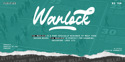 Introducing, our latest font The Warlock! The Warlock is a font that specially designed to meet your design needs. The Warlock is perfect for branding, packaging, logo, etc. to access the underline swash simply type underscore + number 1-4 in the middle of your word. example, War_1lock, War_2lock, War_3lock, War_4lock. Features : lowercase and uppercase numbers and punctuation swash multilingual PUA encoded stylistic alternates character
 - MRK Amentus by Marka Design,
$11.00 MRK Amentus is an elegant and modern sans serif font inspired by mixing humanistic and Grotesk styles. Horizontal oblique lines are the main visual style for this type. It gives an aesthetic dynamic look that is perfect for modern elegant brandings and for headlines. This font is suitable for various purposes such as movies, posters, logos, labels, packaging, branding, editorial design, and any modern purposes.
 - Ramllast by Thanoestd,
$15.00 INtroduction, Ramllast, This font is natural handwriting style, so if you need digital signature or natural hand writing for quotes, this is the perfect typeface for you! This font perfectly made to be applied especially in logo, and the other various formal forms such as invitations, labels, logos, magazines, books, greeting / wedding cards, packaging, fashion, make up, stationery, novels, labels or any type of advertising purpose.
 - India Ink by CounterPoint Type Studio,
$29.99 A heavy, bold font based on two hand lettered type specimens from the 1920s. Original designer unknown. The font has a unique combination of both Old World and Asian influences, while still maintaining a fun, upbeat casual feel. Contains a full set of Alternate Caps found under the "Stylistic Alternates" OpenType feature. Contains language support for both Latin-based and most Eastern European languages.


